10 Principles Of Good Web Design

Email Newsletter
Weekly tips on front-end & UX.
Trusted by 182,000+ folks.
This article has been kindly supported by our dear friends at CreativeWeb who focus on creating bespoke and interactive web experiences for aspiring and established businesses and enterprises. Thank you!

Usability and the utility, not the visual design, determine the success or failure of a website. Since the visitor of the page is the only person who clicks the mouse and therefore decides everything, user-centric design has become a standard approach for successful and profit-oriented web design. After all, if users can’t use a feature, it might as well not exist.
We aren’t going to discuss the design implementation details (e.g. where the search box should be placed) as it has already been done in a number of articles; instead we focus on the main principles, heuristics and approaches for effective web design — approaches which, used properly, can lead to more sophisticated design decisions and simplify the process of perceiving presented information.
Please notice that you might be interested in the usability-related articles we’ve published before:
- Designing A Perfect Accordion
- Designing A Perfect Responsive Configurator
- Designing A Perfect Birthday Picker
- Designing A Perfect Date and Time Picker
- Designing A Perfect Mega-Dropdown
- Designing A Perfect Feature Comparison
- Designing A Perfect Slider
- 30 Usability Issues To Be Aware Of
- Subscribe to our email newsletter to not miss the next ones.
Principles Of Good Website Design And Effective Web Design Guidelines
In order to use the principles properly we first need to understand how users interact with websites, how they think and what are the basic patterns of users’ behavior.
How Do Users Think?
Basically, users’ habits on the Web aren’t that different from customers’ habits in a store. Visitors glance at each new page, scan some of the text, and click on the first link that catches their interest or vaguely resembles the thing they’re looking for. In fact, there are large parts of the page they don’t even look at.
Most users search for something interesting (or useful) and clickable; as soon as some promising candidates are found, users click. If the new page doesn’t meet users’ expectations, the Back button is clicked and the search process is continued.
- Users appreciate quality and credibility. If a page provides users with high-quality content, they are willing to compromise the content with advertisements and the design of the site. This is the reason why not-that-well-designed websites with high-quality content gain a lot of traffic over years. Content is more important than the design which supports it.
- Users don’t read, they scan. Analyzing a web-page, users search for some fixed points or anchors which would guide them through the content of the page.
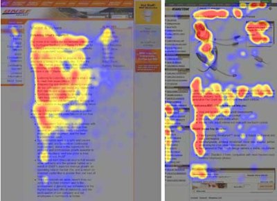
Users don’t read, they scan. Notice how “hot” areas abrupt in the middle of sentences. This is typical for the scanning process. - Web users are impatient and insist on instant gratification. Very simple principle: If a website isn’t able to meet users’ expectations, then designer failed to get his job done properly and the company loses money. The higher is the cognitive load and the less intuitive is the navigation, the more willing are users to leave the website and search for alternatives. [JN / DWU]
- Users don’t make optimal choices. Users don’t search for the quickest way to find the information they’re looking for. Neither do they scan webpage in a linear fashion, going sequentially from one site section to another one. Instead users satisfice; they choose the first reasonable option. As soon as they find a link that seems like it might lead to the goal, there is a very good chance that it will be immediately clicked. Optimizing is hard, and it takes a long time. Satisficing is more efficient. [video]
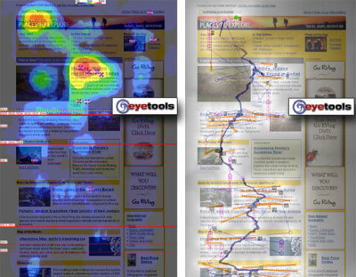
Sequential reading flow doesn’t work in the Web. Right screenshot on the image at the bottom describes the scan path of a given page. - Users follow their intuition. In most cases users muddle through instead of reading the information a designer has provided. According to Steve Krug, the basic reason for that is that users don’t care. “If we find something that works, we stick to it. It doesn’t matter to us if we understand how things work, as long as we can use them. If your audience is going to act like you’re designing billboard, then design great billboards.”
- Users want to have control. Users want to be able to control their browser and rely on the consistent data presentation throughout the site. E.g. they don’t want new windows popping up unexpectedly and they want to be able to get back with a “Back”-button to the site they’ve been before: therefore it’s a good practice to never open links in new browser windows.
1. Don’t Make Users Think
According to Krug’s first law of usability, the web-page should be obvious and self-explanatory. When you’re creating a site, your job is to get rid of the question marks — the decisions users need to make consciously, considering pros, cons and alternatives.
If the navigation and site architecture aren’t intuitive, the number of question marks grows and makes it harder for users to comprehend how the system works and how to get from point A to point B. A clear structure, moderate visual clues and easily recognizable links can help users to find their path to their aim.
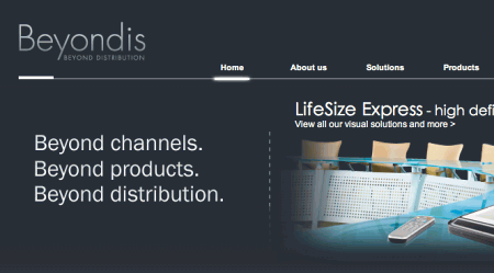
Let’s take a look at an example. Beyondis.co.uk claims to be “beyond channels, beyond products, beyond distribution”. What does it mean? Since users tend to explore websites according to the “F”-pattern, these three statements would be the first elements users will see on the page once it is loaded.
Although the design itself is simple and intuitive, to understand what the page is about the user needs to search for the answer. This is what an unnecessary question mark is. It’s designer’s task to make sure that the number of question marks is close to 0. The visual explanation is placed on the right hand side. Just exchanging both blocks would increase usability.
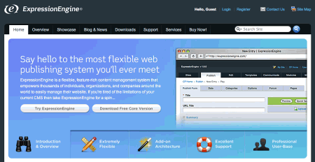
ExpressionEngine uses the very same structure like Beyondis, but avoids unnecessary question marks. Furthermore, the slogan becomes functional as users are provided with options to try the service and download the free version.
By reducing cognitive load you make it easier for visitors to grasp the idea behind the system. Once you’ve achieved this, you can communicate why the system is useful and how users can benefit from it. People won’t use your web site if they can’t find their way around it.
2. Don’t Squander Users’ Patience
In every project when you are going to offer your visitors some service or tool, try to keep your user requirements minimal. The less action is required from users to test a service, the more likely a random visitor is to actually try it out. First-time visitors are willing to play with the service, not filling long web forms for an account they might never use in the future. Let users explore the site and discover your services without forcing them into sharing private data. It’s not reasonable to force users to enter an email address to test the feature.
As Ryan Singer — the developer of the 37Signals team — states, users would probably be eager to provide an email address if they were asked for it after they’d seen the feature work, so they had some idea of what they were going to get in return.
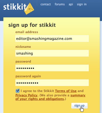
Stikkit is a perfect example for a user-friendly service which requires almost nothing from the visitor which is unobtrusive and comforting. And that’s what you want your users to feel on your web site.
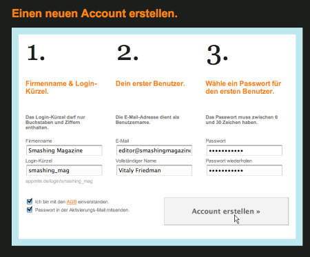
Apparently, Mite requires more. However the registration can be done in less than 30 seconds — as the form has horizontal orientation, the user doesn’t even need to scroll the page.
Ideally remove all barriers, don’t require subscriptions or registrations first. A user registration alone is enough of an impediment to user navigation to cut down on incoming traffic.
3. Manage To Focus Users’ Attention
As websites provide both static and dynamic content, some aspects of the user interface attract attention more than others do. Obviously, images are more eye-catching than the text — just as the sentences marked as bold are more attractive than plain text.
The human eye is a highly non-linear device, and web-users can instantly recognize edges, patterns and motions. This is why video-based advertisements are extremely annoying and distracting, but from the marketing perspective they perfectly do the job of capturing users’ attention.
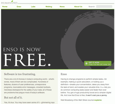
Humanized perfectly uses the principle of focus. The only element which is directly visible to the users is the word “free” which works attractive and appealing, but still calm and purely informative. Subtle hints provide users with enough information of how to find more about the “free” product.
Focusing users’ attention to specific areas of the site with a moderate use of visual elements can help your visitors to get from point A to point B without thinking of how it actually is supposed to be done. The less question marks visitors have, the better sense of orientation they have and the more trust they can develop towards the company the site represents. In other words: the less thinking needs to happen behind the scenes, the better is the user experience which is the aim of usability in the first place.
4. Strive For Feature Exposure
Modern web designs are usually criticized due to their approach of guiding users with visually appealing 1-2-3-done-steps, large buttons with visual effects etc. But from the design perspective these elements actually aren’t a bad thing. On the contrary, such guidelines are extremely effective as they lead the visitors through the site content in a very simple and user-friendly way.
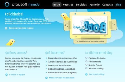
Dibusoft combines visual appeal with clear site structure. The site has 9 main navigation options which are visible at the first glance. The choice of colors might be too light, though.
Letting the user see clearly what functions are available is a fundamental principle of successful user interface design. It doesn’t really matter how this is achieved. What matters is that the content is well-understood and visitors feel comfortable with the way they interact with the system.
5. Make Use Of Effective Writing
As the Web is different from print, it’s necessary to adjust the writing style to users’ preferences and browsing habits. Promotional writing won’t be read. Long text blocks without images and keywords marked in bold or italics will be skipped. Exaggerated language will be ignored.
Talk business. Avoid cute or clever names, marketing-induced names, company-specific names, and unfamiliar technical names. For instance, if you describe a service and want users to create an account, “sign up” is better than “start now!” which is again better than “explore our services”.
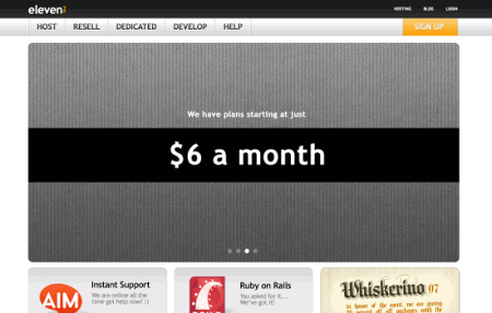
Eleven2.com gets directly to the point. No cute words, no exaggerated statements. Instead a price: just what visitors are looking for.
An optimal solution for effective writing is to
- use short and concise phrases (come to the point as quickly as possible),
- use scannable layout (categorize the content, use multiple heading levels, use visual elements and bulleted lists which break the flow of uniform text blocks),
- use plain and objective language (a promotion doesn’t need to sound like advertisement; give your users some reasonable and objective reason why they should use your service or stay on your website)
6. Strive For Simplicity
The “keep it simple”-principle (KIS) should be the primary goal of site design. Users are rarely on a site to enjoy the design; furthermore, in most cases they are looking for the information despite the design. Strive for simplicity instead of complexity.
From the visitors’ point of view, the best site design is a pure text, without any advertisements or further content blocks matching exactly the query visitors used or the content they’ve been looking for. This is one of the reasons why a user-friendly print-version of web pages is essential for good user experience.
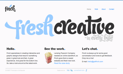
Finch clearly presents the information about the site and gives visitors a choice of options without overcrowding them with unnecessary content.
7. Don’t Be Afraid Of The White Space
Actually it’s really hard to overestimate the importance of white space. Not only does it help to reduce the cognitive load for the visitors, but it makes it possible to perceive the information presented on the screen. When a new visitor approaches a design layout, the first thing he/she tries to do is to scan the page and divide the content area into digestible pieces of information.
Complex structures are harder to read, scan, analyze and work with. If you have the choice between separating two design segments by a visible line or by some whitespace, it’s usually better to use the whitespace solution. Hierarchical structures reduce complexity (Simon’s Law): the better you manage to provide users with a sense of visual hierarchy, the easier your content will be to perceive.
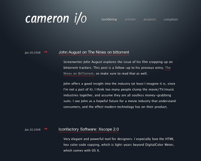
White space is good. Cameron.io uses white space as a primary design element. The result is a well-scannable layout which gives the content a dominating position it deserves.
8. Communicate Effectively With A “Visible Language”
In his papers on effective visual communication, Aaron Marcus states three fundamental principles involved in the use of the so-called “visible language” — the content users see on a screen.
- Organize: provide the user with a clear and consistent conceptual structure. Consistency, screen layout, relationships and navigability are important concepts of organization. The same conventions and rules should be applied to all elements.
- Economize: do the most with the least amount of cues and visual elements. Four major points to be considered: simplicity, clarity, distinctiveness, and emphasis. Simplicity includes only the elements that are most important for communication. Clarity: all components should be designed so their meaning is not ambiguous. Distinctiveness: the important properties of the necessary elements should be distinguishable. Emphasis: the most important elements should be easily perceived.
- Communicate: match the presentation to the capabilities of the user. The user interface must keep in balance legibility, readability, typography, symbolism, multiple views, and color or texture in order to communicate successfully. Use max. 3 typefaces in a maximum of 3 point sizes — a maximum of 18 words or 50-80 characters per line of text.
9. Conventions Are Our Friends
Conventional design of site elements doesn’t result in a boring web site. In fact, conventions are very useful as they reduce the learning curve, the need to figure out how things work. For instance, it would be a usability nightmare if all websites had different visual presentation of RSS-feeds. That’s not that different from our regular life where we tend to get used to basic principles of how we organize data (folders) or do shopping (placement of products).
With conventions you can gain users’ confidence, trust, reliability and prove your credibility. Follow users’ expectations — understand what they’re expecting from a site navigation, text structure, search placement etc.
A typical example from usability sessions is to translate the page in Japanese (assuming your web users don’t know Japanese, e.g. with Babelfish) and provide your usability testers with a task to find something in the page of different language. If conventions are well-applied, users will be able to achieve a not-too-specific objective, even if they can’t understand a word of it.
Steve Krug suggests that it’s better to innovate only when you know you really have a better idea, but take advantages of conventions when you don’t.
10. Test Early, Test Often
This so-called TETO-principle should be applied to every web design project as usability tests often provide crucial insights into significant problems and issues related to a given layout.
Test not too late, not too little and not for the wrong reasons. In the latter case it’s necessary to understand that most design decisions are local; that means that you can’t universally answer whether some layout is better than the other one as you need to analyze it from a very specific point of view (considering requirements, stakeholders, budget etc.).
Some important points to keep in mind:
- according to Steve Krug, testing one user is 100% better than testing none and testing one user early in the project is better than testing 50 near the end. Accoring to Boehm’s first law, errors are most frequent during requirements and design activities and are the more expensive the later they are removed.
- testing is an iterative process. That means that you design something, test it, fix it and then test it again. There might be problems which haven’t been found during the first round as users were practically blocked by other problems.
- usability tests always produce useful results. Either you’ll be pointed to the problems you have or you’ll be pointed to the absence of major design flaws which is in both cases a useful insight for your project.
- according to Weinberg’s law, a developer is unsuited to test his or her code. This holds for designers as well. After you’ve worked on a site for few weeks, you can’t observe it from a fresh perspective anymore. You know how it is built and therefore you know exactly how it works — you have the wisdom independent testers and visitors of your site wouldn’t have.
Bottom line: if you want a great site, you’ve got to test.