Web Design Industry Jargon and Web Terms: Glossary and Resources

Email Newsletter
Weekly tips on front-end & UX.
Trusted by 182,000+ folks.


 Custom Web Forms for Angular, React, & Vue. Your backend.
 Celebrating 10 million developers
There are specialized web terms referring to all sorts of aspects of web design. For someone just getting started in web design, or someone looking to have a site designed, all the technical jargon can be overwhelming. Especially the acronyms.
Below is a guide to industry terms that should get you well on your way to understanding what web designers are talking about. In addition, we’ve provided some resources for each term to give you more in-depth information.
A
Accessibility
Basically, this is the ability of a website to be used by people with disabilities, including visually impaired visitors using screen readers, hearing impaired visitors using no sound, color blind people, or those with other disabilities. A website with low accessibility is basically going to be impossible for those with disabilities to use. Accessibility is particularly important for sites providing information to those with disabilities (healthcare sites, government sites, etc.), though it is an important aspect to consider when designing any site.

- Resources on Accessible Web Design from the University of Washington.
- An Introduction to Accessible Web Design from Sitepoint.
AJAX
Stands for Asynchronous JavaScript and XML. AJAX is typically used for creating dynamic web applications and allows for asynchronous data retrieval without having to reload the page a visitor is on. The JavaScript on a given page handles most of the basic functions of the application, making it perform more like a desktop program instead of a web-based one.
Anchor Text
The text a link uses to refer to your site. This can make a big difference in your site’s search engine results. See also: Backlink.
- Anchor Text Explained from AssociatePrograms.com
- Anchor Text Optimization from WebProNews
- Backlink Anchor Text Analysis from webconfs.com
Automagically
A portmanteau that combines “automatically” and “magically.” Generally, it refers to something that has a complex technical process that’s hidden from users, so that something almost appears to work by magic. If you think about it, many modern internet-based technologies could be classified as “automagical.”

- Automagical from Wiktionary
- What’s the Origin of Automagically? from Feld Thoughts
B
Back End
The back end of a website is the part hidden from view of regular website visitors. The back end generally includes the information structure, applications, and the CMS controlling content on the site.
- Building the Back-End of a Photo Site from Nettuts+
Backlink
Backlinks are links from other sites back to your own. They’re sometimes also referred to as “trackbacks” (especially on blogs). Backlinks have a huge impact on your sites search rankings. Lots of backlinks from high-ranking sites can greatly improve your search engine results, especially if those links use keywords in their anchor text.
- Why That Site with 50 Backlinks Beats Your Site with 1000 Backlinks from Jim Boykin’s Blog.
- The Importance of Backlinks from webconfs.com
Bad Neighborhood
A “bad neighborhood” refers to the server where your site is hosted. A site hosted on a server that hosts other sites that spam or use black-hat SEO practices can end up penalized by search engines solely because of their proximity to those sites. In other words, be very careful about which web host you choose, what their terms of service are, and how strictly they enforce those terms if you want to avoid being penalized because of what your neighbors are doing. Linking to sites in bad neighborhoods can also have a negative effect on your search rankings.

- Is Your Site Living in a Bad Neighborhood? from RSS Pieces
- Text Link Checker Tool from Bad Neighborhood
Bandwidth
Bandwidth can refer to two different things: the rate at which data can be transferred or the total amount of data allowed to be transferred from a web host during a given month (or other hosting service term) before overage charges are applied. It is generally referred to in term of bits-per-second (bps), kilobits per second (kbs), or other metric measurements. Lower bandwidth internet connections (such as dial-up) mean data loads slower than with high bandwidth connections (like cable or fiber).
- Speed Test from Speakeasy
- Bandwidth Explained from FindMyHosting.com
Below the Fold
This term is a carry-over from newspaper publishing days. In newspaper terms, “below the fold” means content was on the bottom half of the page (below the physical fold in the paper). In web design terms, “below the fold” refers to the content that is generally going to be below the point first viewable to the average website visitor in their browser (in other words, viewers would have to scroll down to see the content).

Resources
- Scrolling Research Report V2.0—Part 1: Visibility and Scroll Reach from ClickTale
- Blasting the Myth of the Fold from Boxes and Arrows
- Below the Fold: Why Scrolling Isn’t a Bad Thing from Build Internet!
Bounce Rate
A website’s bounce rate is the percentage of people who leave the site from the same page they entered the site, without clicking through to any other pages. This can be a good indicator of how good a website’s navigation is, as well as an indicator of the quality of the site’s content (a very high bounce rate doesn’t bode well for either of those things).
- What is Your Bounce Rate? from Lunartics
- What Your Bounce Rate is Trying to Tell You form FutureNow’s GrokDotCom
Breadcrumb
Breadcrumbs are the bit of navigation elements that generally appear near the top of a give web page that show you the pages and subpages the appear before the page you’re on. For examples, on a blog, the breadcrumbs might look something like: Home > Category > Year > Month > Post (or they might be a lot simpler that that). The breadcrumbs term comes from the fairy tale “Hansel and Gretel.”
- Breadcrumb Navigation from Web Design Practices
- Breadcrumb Navigation Increasingly Useful from Jacob Nielsen’s Alertbox
- Breadcrumbs In Web Design: Examples And Best Practices from this site.
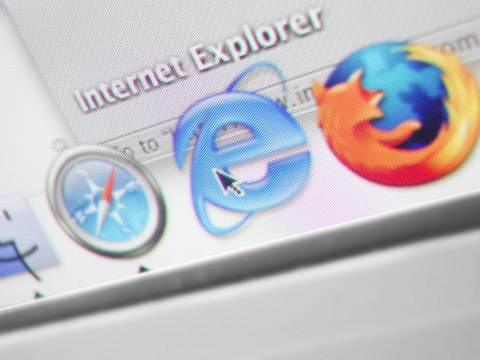
Browser
Browser refers to the program a website visitor is using to view the web site. Examples include Safari, Firefox, Google Chrome, Opera, and Internet Explorer.
- BrowserShots lets you check cross-browser compatibility of any site
- Accessible Design Guide from Viewable with Any Browser
C
Cache/Caching
Cached files are those that are saved or copied (downloaded) by a web browser so that the next time that user visits the site, the page loads faster.
- Caching Tutorial from mnot.net
- How Caching Works from HowStuffWorks
- Web Caching and Content Delivery Resources on web-caching.com
Cascading Style Sheets
Also referred to simply as CSS, Cascading Style Sheets are used to define the look and feel of a web site outside of the actual HTML file(s) of the site. In recent years, CSS has replaced tables and other HTML-based methods for formatting and laying out websites. The benefits to using CSS are many, but some of the most important are the simplification of a site’s HTML files (which can actually increase search engine rankings) and the ability to completely change the style of a site by changing just one file, without having to make changes to content.
- Cascading Style Sheets from Web Design Group
- CSS Basics from splashpressmedia
- CSS from the Ground Up from Webpage Design for Designers
Client-Side
Client-side refers to scripts that are run in a viewer’s browser, instead of on a web server (as in server-side scripts). Client-side scripts are generally faster to interact with, though they can take longer to load initially.
Content Management System
Also known as a CMS, the Content Management System is a backend tool for managing a site’s content that separates said content from the design and functionality of the site. Using a CMS generally makes it easier to change the design or function of a site independent of the site’s content. It also (usually) makes it easier for content to be added to the site for people who aren’t designers.
- OpenSourceCMS lets you try out different CMSs without downloading or installing.
- List of Content Management Systems from Wikipedia
- 10 Things To Consider When Choosing The Perfect CMS from this site
Comment
In web design terms, a comment is a bit of information contained in a site’s HTML or XHTML files that is ignored by the browser. Comments are used to identify different parts of the file and as reference notes. Good commenting makes it much easier for a designer (whether the original designer or someone else) to make changes to the site, as it keeps it clear which parts of the code perform which functions. There are different comment formats for different programming and markup languages.
CSS
See Cascading Style Sheets.
CSS Framework
A CSS framework is a collection of CSS files used as the starting point to make XHTML and CSS web sites quickly and painlessly. They usually contain CSS styles for typography and layout.

- Top 12 CSS Frameworks and How to Understand Them from Speckyboy Design Magazine
- Blueprint: A CSS Framework
- Guidelines for Developing Your Own CSS Framework from W3Avenue
D
Deprecated
Deprecated code is code that is no longer included in the language specifications. Generally this happens because it is replaced with more accessible or efficient alternatives.
Deprecation from Wikipedia
Deprecated Tags and Attributes in HTML
Disabling Deprecated HTML Using CSS from David’s Kitchen
DHTML
Stands for Dynamic HyperText Markup Language. DHTML fuses XHTML (or any other markup language), the DOM, JavaScript (or other scripts), and CSS (or other presentation definition languages) to create interactive web content.
- DHTML/CSS Tutorials from JavaScript Kit
- DHTML Explained from HTMLSource
Dither
In GIF and certain other image formats, there is a limited color palette used for each image. Because of this, not all colors in an image are presented. Dither is used to approximate these colors by combining pixels of different colors side by side.

- Color Dithering in GIF Images from Web Developers Notes
- Dithering GIF Images: Optimizing GIF Files from Webdesign.About.com
DNS
Stands for Domain Name Service (alternately Domain Name System or Domain Name Server). Basically, it’s the thing that converts IP addresses into domain names. DNS servers are provided with the IP address of your web server when you assign your domain name to those servers. In turn, when someone types your domain name into their web browser, those DNS servers translate the domain name to the IP address and point the browser to the correct web server.
- How Domain Name Servers Work from HowStuffWorks
Doctype
The doctype declaration specifies which version of HTML is used in a document. It has a direct effect on whether your HTML will validate.
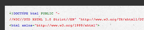
- Fix Your Site With the Right DOCTYPE! from A List Apart
- Choosing a DOCTYPE from Web Design Group
Dom, The
Stands for Document Object Model. It’s a language-indpendent, cross-platform convention for representing objects in XML, XHTML, and HTML documents. Rules for interacting with and programming the DOM are specified in the DOM API.
- DOM (Document Object Model) Reference from JavaScript Kit
- The Document Object Model Dissected from Web Developer’s Virtual Library
Domain
The domain is the name by which a website is identified. The domain is associated with an IP address. Domains can be purchased with any combination of letters, hyphens (-), and numbers (though it can’t start with a hyphen). Depending on the extension (.com, .net, .org, etc.), a domain can be anywhere up to 26 to 63 characters long.
- Domain Name Information from 4 Creating a Website
- ICANN stands for “Internet Corporation for Assigned Names and Numbers”
- Choosing the Domain Name for Your Blog from ProBlogger
DTD
Stands for Document Type Definition. DTD is one of several SGML and XML schema languages. It provides a list of the attributes, comments, elements, entities, and notes in a document along with their relationships to each other.
- XML DTD - An Introduction to XML Document Type Definitions from XMLFiles.com
- Document Type Definition (DTD) Tools from Stylus Studio
E
E-Commerce
Short for electronic commerce. It’s the buying and selling of goods online, through websites. Products sold through e-commerce can be physical products that require shipping, or digital products delivered electronically.
- E-Commerce Resources from Inc.com
- The Art of eCommerce Web Design from Sitepoint
- 25+ Magento Templates For Your E-Commerce Business from this site
- 5 Universal Principles For Successful eCommerce Sites from this site
- 35 Free High-Quality E-Commerce Templates from this site
Elastic Layout
An elastic layout is one that uses percentages and ems for widths paired with a max-width style to allow the site layout to stretch when font sizes are changed. It’s ability to flex to accommodate the browser width and reader’s font preferences are where it gets its name.

- Elastic Design from A List Apart
- The Incredible Em & Elastic Layouts with CSS from Jon Tangerine
- Archive for Elastic Layout from CSSGlance Gallery
Element
In XML, an element is the central building block of any document. Individual elements can contain text, other elements, or both.
- XML Element from tizag.com
- The Basics of Using XML Schema to Define Elements from IBM
Em
Em is a unit of measurement for sizing fonts and other elements within a web page relative to the item’s parent element. A 1em font is equal to the point size for the font already defined in the parent element (2em would be twice the current size; .5em would be half the current size).
- How to Size Text Using Ems from Clagnut
- The Amazing Em Unit and Other CSS Best Practices from InformIT
- Effective Style with em from Monday By Noon
Embedded Style
An embedded style is a CSS style written into the head of an XHTML document. It only effects the elements on that page, instead of site-wide as a separate CSS file does. Style in an embedded style sheet will override styles from the linked CSS file.
- Embedded Style Sheets from Quackit.com
- CSS Embedded Styles from htmlite
Ex
Ex is a measurement for font height or size relative to the height of a lowercase “x” in that font family.

- The CSS ex Unit from Web Matters
- Em Units Versus Ex Units from MozillaZine
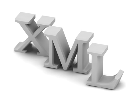
Extensible Markup Language
Otherwise known as XML. XML is a markup language used for writing custom markup languages. In other words, XML describes how to write new languages (it’s sometimes referred to as a “meta” language because of this). It also serves as a basic syntax that allows different kinds of computers and applications to share information without having to go through multiple conversion layers.
- A Technical Introduction to XML from XML.com
- XML for the Absolute Beginner from JavaWorld
External Style Sheet
This is a CSS document that is written in a separate, external document. The biggest advantage to using an external style sheet is that it can be linked to by multiple HTML/XHTML files (which means changes made to the style sheet will effect all the pages linked to it without having to change each page individually).
- How to Use External Cascading Style Sheets (CSS) on Web Pages from Webdesign.About.com
- Using External CSS Style Sheets from Tech-Evangelist
F
Favicon
Favicons are tiny (generally 16x16 pixels, though some are 32x32 pixels), customizable icons displayed in the web address bar in most browsers next to the web address. They’re either 8-bit or 24-bit in color depth and are saved in either .ico, .gif or .png file formats.
- favicon.cc is an online favicon generator
- FavIcon from Pics creates a favicon from an image
- How to Create a Favicon.ico from PhotoshopSupport.com
Fixed Width Layout
A fixed width layout has a set width (generally defined in pixels) set by the designer. The width stays the same regardless of screen resolution, monitor size, or browser window size. It allows for minute adjustments to be made to a design that will stay consistent across browsers. Designers have more control over exactly how a site will appear across platforms with this type of layout.
- Creating a Fixed-Width Layout with CSS from TechRepublic
- CSS Layouts: The Fixed. The Fluid. The Elastic. from Beast-Blog.com
- Fixed-Width CSS Layouts from Search Engine Friendly Layouts
Fluid Layout
See Liquid Layout
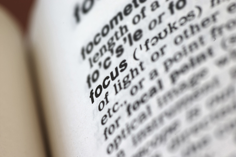
Focal Point
The focal point of a web site is the spot on a web page that they eye is naturally drawn to. This could be an image, a banner, text, Flash content, or just about anything else. You want to make sure that whatever is acting as your focal point is the most important part of your site.
- Create a Focal Point for Web Designs - Before and After Web Page Redesign from Webdesign.About.com
- The Focal Point is the Most Important Design Element from Stylish Design
Fold
The fold is a term carried over from newspaper design and pagination (where the fold referred to the physical fold in the paper). The fold in a website is the point on the webpage that rests at the bottom of someone’s browser (in other words, to see anything below the fold, they would have to scroll down). There are varying opinions on how important the fold is in web design.
- Infatuated with ‘Above the Fold’ Web Design? from 360innovate Blog
Font Family
Font family is a group designation for defining the typefaces used in CSS documents. The font family tag generally lists multiple fonts to be used, and usually ends with the generic font category (such as “serif” or “sans-serif’).
- How to Decide Which Font Family to Use from Webdesign.About.com
Font Style
In CSS, the font style refers solely to whether a font is italic or not.
- CSS Font Style from Hscripts.com
Font Weight
The font weight refers to how thick or thin (bold or light) a font looks.
- font-weight from Mozilla Developer Center
Front-End
The front-end is basically the opposite of the back-end. It’s all the components of a website that a visitor to the site can see (pages, images, content, etc.) Specifically, it’s the interface that visitors use to access the site’s content. It’s also sometimes referred to as the User Interface.
- Ten Usability Heuristics from Useit.com
- Writing an Interface Style Guide from A List Apart
G
Graceful Degradation
Graceful degradation refers to a website’s ability to have elements that may take advantage of the capabilities of newer browsers done in a way that allows users with older browsers to still view the site in a manner that at least allows access to basic content. It also applies to making sure that if one small portion of your site doesn’t work in someone’s browser, it doesn’t break your entire site for them.

- Graceful Degradation from Dan’s Web Tips
- Graceful Degradation from Viewable with Any Browser
Graphical User Interface
Also referred to by its acronym: GUI. A graphical user interface uses an input device (like the mouse) and visual representations of how the user is able to interact with a web application. In other words, it’s all the front-end stuff you see on a web application. It’s purpose is to allow you to interact with a web application without having to enter code.
H
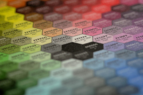
Hexadecimal
Also referred to a “hex” numbers, they are a base-16 numbering system used to define colors online. Hex numbers include the numerals 0-9 and letters A-F. Hexadecimal numbers are written in three sets of hex pairs. Because screen colors are RGB (Red, Green, Blue), the first pair defines the red hue, the second pair defines the green hue, and the third pair defines the blue.
- The Hex Hub is a chart to help choose hexadecimal colors
- 500+ Colors from cloford.com
- Color Charts from Webmonkey
Hit
Contrary to popular belief, a hit does not represent a single visitor to a website. A hit is actually a request for a single file from your web server. This means one page can actually generate multiple hits, as each page generally has more than one file (an html or other base file, a css file, multiple images, etc.) and each one is requested from the server whenever the page is loaded. Some marketing people like to quote hits to unknowing consumers as the number makes their site sound like it’s getting a whole lot more traffic than it actually is.
- The Difference Between Hits, Visitors, Visits, and Page Views from Opentracker
- Hits Explained from MediaCollege.com
.htaccess
The .htaccess file is the default directory-level configuration file on Apache servers. They are also known as “distributed configuration files.” Configuration directives contained in the .htaccess file apply to the directory in which the file is placed as well as all of its subdirectories. Within the .htaccess file things like authorization and authentication, rewriting of URLs, cache control and customized error responses can all be specified.
- Comprehensive Guide to .htaccess from JavaScriptKit
- .htaccess Cheatsheet from The Jackol’s Den
- Htaccess Tools gives tools to generate an .htaccess file
HTML
Stands for Hypertext Markup Language. It’s the primary language used to write web pages. HTML is primarily intended as a way to provide content on websites (with CSS handling the layout and stylistic options), though it can also be used to determine how that content is displayed.
- HTML Code Tutorial provides comprehensive HTML tutorials
- HTML Primer from HTML Goodies
HTML Tag
Also referred to as an HTML element, an HTML tag is the bit of code that describes how that particular piece of the web page it’s on is formatted. Typical tags specify things like headings, paragraphs, links, and a variety of other items.
- HTML Tags from Webdesign.About.com
- HTML Tags from HTML Dog
- HTML Tag Quick Reference Guide from DevX.com
HTTP
Stands for HyperText Transfer Protocol. HTTP is a set of rules for transferring hypertext requests between a web browser and a web server.

- HTTP - Hypertext Transfer Protocol from W3C
- HyperText Transfer Protocol from Web Developer’s Virtual Library
HTTPS
Similar to HTTP, HTTPS stands for HyperText Transfer Protocol over SSL (Secure Socket Layer) or, alternately, HyperText Transfer Protocol Secure. Like HTTP, it’s a set of rules for transferring hypertext requests between browsers and servers, but this time it’s done over a secure, encrypted connection.
- HTTP Secure from Wikipedia
- Hypertext Transfer Protocol over Secure Socket Layer from Freebase
Hyperlink
A hyperlink is a link from one web page to another, either on the same site or another one. Generally these are text or images, and are highlighted in some way (text is often underlined or put in a different color or font weight). The inclusion of hyperlinks are the “hyper” part of “hypertext.”
- Creating Hyperlinks from Iron Spider
- How to Create a Hyperlink in Dreamweaver from Webdesign.About.com
Hypertext
Hypertext is any computer-based text that includes hyperlinks. Hypertext can also include presentation devices like tables or images, in addition to plain text and links.
- Hypertext from Wikipedia
- The Definition of Hypertext and Its History as a Concept from Cyber Arts Web
I
iFrame
Short for Inline Frame. An iframe is used to display one or more web pages within another normal web page (one that isn’t a frameset page).
- Scripting iFrames—Tutorial and Examples from Dynamic Web Coding
- Remote Scripting with IFRAME from Apple Developer Connection
Image Map
An image map is used in XHTML to allow different parts of an image to become different clickable elements (and can also allow some portions of the image to have no clickable element).

- How to Make and Image Map from HTML Code Tutorial
- How-To: Creating Image Maps from Elated
- CSS Image Maps from Frank Manno
Inheritance
In CSS, elements that don’t have a pre-defined style will take on the style of their parent element within the document tree.
- Inheritance and Cascading Styles in CSS from Web Design from Scratch
- Cascading Order and Inheritance in CSS from David’s Kitchen
- CSS Cheat Sheet: Inheritance, Cascade, Specificity from Community MX
Inline Style
Elements with CSS written directly around the element it affects, instead of in a separate style sheet or header style.
- Inline Style Sheets from Quackit.com
- Css Tutorial—Inline Style from Howtocreate.co.uk
L
LAMP
Stands for Linux, Apache, MySQL, and PHP (or sometimes Perl or Python), and is referring to the specifications of a web server (defining the operating system, web server, database, and scripting language, in that order). One of the advantages of LAMP setups is that the software used is all free and open source.

- Building a LAMP Server from LAMP How To
- LAMP (Software Bundle) from VisWiki
Landing Page
A landing page is the page where a visitor first enters a website. Oftentimes, a special landing page is created to elicit a specific action from the new visitor (usually in connection with an advertising or marketing campaign).
- Landing Page Tutorials and Case Studies from Copyblogger
- 11 Ways to Improve Landing Pages from Digital Web Magazine
- 14 Instant Landing Page Upgrades from Conversation Marketing
Link Farm
A link farm is any website setup specifically to increase the link popularity of other websites by increasing the number of incoming links to that site. While some link farms are single pages listing unrelated links, others consist of networks of sites that contain multiple links back and forth to one another. Search engines can generally recognize these types of schemes and often remove link farms from their directories and penalize the sites linking to and from them.
- Promotion Tip: Link Farms Grow Spam from NetMechanic
- What is a Link Farm? from Webdesign.About.com
- Link Farm: What It Is and How You Can Identify It from SEO for Blogging
Liquid Layout
A liquid layout is one that is based on percentages of the browser window’s size. The layout of the site will change with the width of the browser, even if the visitor changes their browser size while viewing the page. Liquid layouts take full advantage of a person’s browser width, optimizing the amount of content you can fit onscreen at one time.

- Liquid Layouts the Easy Way from Max Design
- Create a Simple Liquid Layout from .net Magazine
- The Perfect 3 Column Liquid Layout from Matthew James Taylor
- Creating Liquid Layouts with Negative Margins from A List Apart
M
Markup
This refers to the coding applied to a text document to change it into an HTML, XML, or other Markup Language document.
- Bulletproof HTML: 37 Steps to Perfect Markup from Sitepoint
- Markup as a Craft from Digital Web Magazine
- Markup Guide from Mezzoblue
Meta Data
Meta data is the data contained in the header that offers information about the web page that a visitor is currently on. The information contained in the meta data isn’t viewable on the web page (except in the source code). Meta data is contained within meta tags.

- META—Metadata from Web Design Group
Meta Tag
A meta tag is an HTML tag used to include meta data within the header of your web page.
- How to Use HTML Meta Tags from Search Engine Watch
- Meta Tag Generator from AddMe.com
N
Navigation
Navigation refers to the system that allows visitors to a website to move around that site. Navigation is most often thought of in terms of menus, but links within pages, breadcrumbs, related links, pagination, and any other links that allow a visitor to move from one page to another are included in navigation.

- The 8 Types of Navigation Pages from User Interface Engineering
- Basic Principles of Web Site Navigation from Web Developer’s Journal
- CSS Menus from 13styles
Nesting
Nesting refers to putting one HTML element within another element. When this is done, the elements have to be closed in the reverse order from how they were opened.

- Nesting from Dan’s Web Tips
- Grouping and Nesting from HTML Dog
Non-Breaking Space
A non-breaking space (also referred to as ) is a white-space character that isn’t condensed by HTML. It’s primary function is to hold open table cells or add spacing between words (or a the beginning of paragraphs if an indent is desired).
- In HTML, What is a Non-Breaking Space? from Indiana University’s University Information Technology Service Knowledge Base
- Non-Breaking Space on Wikipedia
O
Open Source
Open source refers to the source code of a computer program being made available to the general public. Open source software includes both web-based and desktop applications. Open source programs are generally free or very low cost and are developed by teams of people, sometimes comprised mostly of volunteers.
- Open Source Initiative
- The Open Source Web Design Toolbox: 100 Web Design Template Sources, Tools and Resources from Design Vitality
- 30 Useful Open Source Apps for Web Designers from Six Revisions
P
Pageview
A pageview is a request for an entire web page document from a server by a visitor’s browser. In other words, for each page view your site had, someone (or a search engine spider) looked at that page.
- Pageviews are Obsolete from Evhead
- Page View Metrics? Bah, Humbug! from Matt Cutts
- Tyranny of the Page View Nearly Over? from ReadWriteWeb
Permalink
Short for “permanent link.” Generally used only on blogs, a permalink is a link that is the permanent web address of a given blog post. Since most blogs have constantly-changing content, the permalink offers a way for readers to bookmark or link to specific posts even after those posts have moved off the home page or primary category page.

- What is a Permalink and Why Do I Need It? from Blogging Basics 101
- Using Permalinks from the WordPress Codex
Plug-In
A plug-in is a bit of third party code that extends the capabilities of a website. It’s most often used in conjunction with a CMS or blogging platform. Plug-ins are a way to extend the functionality of a website without having to redo the core coding of the site. Plugins can also refer to bits of third-party software installed within a computer program to increase its functionality.
- 22 Firefox 3 Plugins Web Designers Can’t Live Without from Design Reviver
- Designing Plugins for Reuse from Intellectual Cramps
- Writing a Plugin from the WordPress Codex
Progressive Enhancement
Progressive enhancement is a strategy for web design that uses web technologies in a layered fashion that allows everyone to access the basic content and functionality of a web page, using any browser or Internet connection, while also providing those with better bandwidth or more advanced browser software an enhanced version of the page.
- Understanding Progressive Enhancement from A List Apart
- Progressive Enhancement with CSS by Aaron Gustafson
- Progressive CSS Enhancemen by John Resig
- Pragmatic progressive enhancement - why you should bother with it by Christian Heilmann
Property
Property is a CSS term and is roughly equivalent to an HTML tag. Properties are what define how a style should appear on a given web page.
- CSS Properties from HTML Dog
- CSS Properties Index from Jens Meiert
- Complete CSS Guide—Properties Introduction from Westciv
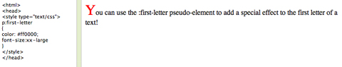
Pseudo-Element
A pseudo-element is an element used to add a special effect to certain selectors.
- Learn CSS, Part 7: Pseudo Elements from Dev Articles
- Understanding Pseudo-Elements from Snook.ca
Pseudo Class
Like pseudo-elements, pseudo classes are used to add special effects to certain CSS selectors.
- Learn CSS: Pseudo Classes from Dev Articles
- Pseudo Classes from HTML Dog
R
Really Simple Syndication
Also referred to as RSS. RSS is a standardized XML format that allows content to be syndicated from one site to another. It’s most commonly used on blogs. RSS also allows visitors to subscribe to a blog or other site and receive updates via a feed reader.

- What is RSS? RSS Explained from whatisrss.com
- RSS 2.0 Specification from RSS 2.0 at Harvard Law
- What is RSS? from Software Garden
Resolution
Refers to the physical number of pixels displayed on a screen (such as 1280x1024). Unlike in print, display resolution does not refer to the number of pixels or dots per inch on a computer screen, as this can be changed by changing the resolution of the screen (which, of course, does not change the physical size of the screen). The resolution of an image, however, is often referred to in terms of pixels per inch, though this has very little effect on how the image is displayed on screen.
- Display Resolution from Wikipedia
- Monitors: Resolution from thescreamonline.com
S
Schema
Generally, a schema is an XML document used in place of a DTD to describe other XML documents.
- Practical XML Schema from JavaWorld
- XML Schema Tools (XSD) from Stylus Studio
Script
Generally refers to a portion of code on an HTML page that makes the page more dynamic and interactive. Scripts can be written in a variety of languages, including JavaScript.
- PHP Tutorial: Writing Your First PHP Script: Feedback Form Script from thesitewizard.com
- HTML Scripts from tizag.com
- Basic JavaScript from HTMLSource
Selector
In CSS, the selector is the item a style will be applied to.
- Selectutorial CSS Selectors from Max Design
- Performance Impact of CSS Selectors from High Performance Web Sites Blog
- CSS Advanced Selectors—Functional and Design Specification from Adobe Open Source
Semantic Markup
In semantic markup, content is written within XHTML tags that offer context to what the content contains. Basic semantic markup refers to using items like header and paragraph tags, though semantic markup is also being used to provide much more useful context to web pages in an effort to make the web as a whole more semantic.
- Writing Semantic Markup from Digital Web Magazine
- Explaining Semantic Markup from Robert’s Talk
- The Definitive Guide to Semantic Web Markup for Blogs from Pearsonified
Server-Side
Server-side refers to scripts run on a web server, as opposed to in a user’s browser. Server-side scripts often take a bit longer to run than a client-side script, as each page must reload when an action is taken.
SGML
Stands for Standard Generalized Markup Language. It’s a markup language used for defining the structure of a document. SGML isn’t mentioned very often, but it’s the markup language that serves as the basis for both XML and HTML.
SOAP
Stands for Simple Object Access Protocol. It’s an XML-based protocol exchanging information across the internet to allow an application on one site to access an application or database on another site.

- Simple Object Access Protocol from scottnichol.com
- SOAP, the Simple Object Access Protocol from Web Developer’s Virtual Library
Specification
A specification is a document that offers an explicit definition and requirements for a web service or technology and generally includes how the technology is meant to be used, along with the tags, elements, and any dependencies.
- List of Web Service Specifications from Wikipedia
- W3C—Worldwide Web Consortium develops specifications for any internet technologies
T
Tag
A tag is a set of markup characters that are used around an element to indicate its start and end. Tags can also include HTML or other code to specify how that element should look or behave on the page. See also HTML Tag.
- HTML Tags / Codes / Web Page Design from Web Source
- Tag List from davesite.com
- Overview of All Tags from Web Design Group
Template
A template is a file used to create a consistent design across a website. Templates are often used in conjunction with a CMS and contain both structural information about how a site should be set up, but also stylistic information about how the site should look.
- Dreamweaver Tutorial: How to Use Templates to Manage Your Website in Dreamweaver CS3 from thesitewizard.com
- Making a Template in Photoshop from voidix
U
URL
Stands for Uniform Resource Locator. A site’s URL is its address, the item that specifies where on the Internet it can the found.

- Uniform Resource Locator from Wikipedia
- Uniform Resource Locators from W3C
Usability
Usability refers to how easy it is for a visitor to your site to use your site in its intended manner. In other words, are navigation, content, images, and any interactive elements easy to use, functioning the way they were intended, and that your intended target visitor will not need any special training in order to use your site.
- Website Design from Usability First
- 10 Principles Of Effective Web Design from this site
- 25-Point Website Usability Checklist from User Effect
V
Valid
Valid web pages are those that return no errors based on the type of HTML/XHTML specified in the doctype declaration at the beginning of the file. In other words, the code used on the page conforms to the specifications for that version of HTML/XHTML. This can be checked through various validation services, most commonly the one from W3C.
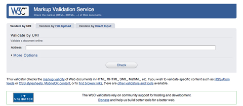
- W3C Markup Validation Service
- Validating a Website from the WordPress Codex
- How To: Validating Your Website The Easy Way—Part 1 from Blog Ingenuity
W
Web Page
A web page is a single document, generally written in HTML/XHTML, meant to be viewed in a web browser. In many cases, web pages also include other coding and programming (such as PHP, Ruby on Rails, or ASP). Web sites are generally built from multiple interlinked web pages.
- Web Page from Wikipedia
- How Web Pages Work from HowStuffWorks
Web Server
A web server is a computer that has software installed and networking capabilities that allow it to host web sites and pages and make them available to internet users located elsewhere. There are a few different setups that can be used for a web server, including the LAMP setup mentioned earlier.

- How Web Servers Work from HowStuffWorks
- Geek to Live: How to Set Up a Personal Home Web Server from Lifehacker
- The Apache Software Foundation provides the open source Apache web server software
Web Standards
Standards are specifications recommended by the World Wide Web Consortium for standardizing website design. The main purpose of web standards is to make it easier for both designers and those who create web browsers to make sites that will appear consistent across platforms.
- Web Standards from The Motive Web Design Glossary
- World Wide Web Consortium
- What Are Web Standards? A Comprehensive Explanation of What is Comprised in the Term from Robert’s Talk
- Web Standards Checklist from Max Design
X
XHTML
Stands for Extensible Hypertext Markup Language. Basically, XHTML is HTML 4.0 that has been rewritten to comply with XML rules.
- XHTML Reference
- XHTML Explained from HTMLSource
- XHTML Tutorial from Quackit.com
XML
Stands for Extensible Markup Language. XML is a specification for creating other, custom markup languages. It’s an extensible language because it allows for the user to define the mark-up elements.
Further Resources
- About.com’s Web Design Glossary Defines tons of different web-design related terms.
- The Motive Web Design Glossary Offers a very complete guide to different web terminology.


