Space Yourself

Email Newsletter
Weekly tips on front-end & UX.
Trusted by 182,000+ folks.
 Register for Free


 Celebrating 10 million developers
 Custom Web Forms for Angular, React, & Vue. Your backend.
There’s more to spaces than the key you instinctively hit between words with one of your thumbs. Let’s find out what other space characters there are, what their heritage is, and how they can be useful today.
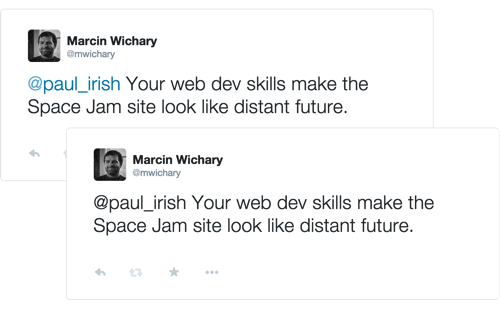
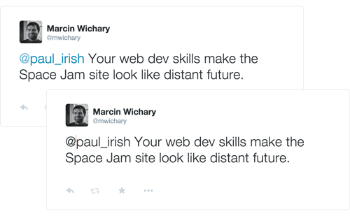
What you see below are two tweets. In one of them, Paul Irish will be notified of my taunt. In the other one, he’ll be completely oblivious. What’s the difference between the two? Read on!
The Age Of Physical Type
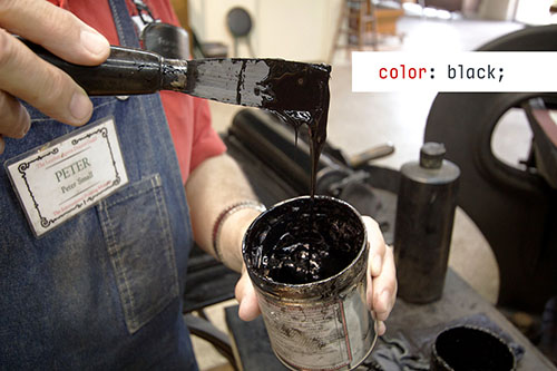
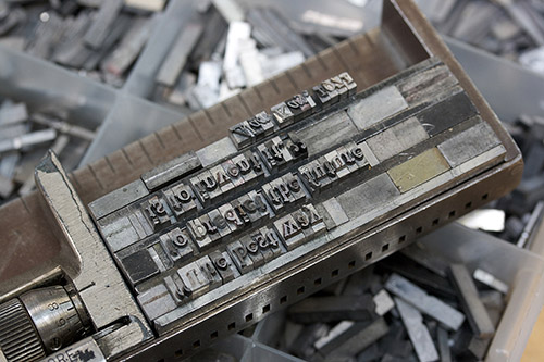
Typography and typesetting used to be surprisingly physical endeavors. Individual letters had to be picked up from cases as objects and put together, one by one, into words, then phrases, then columns. (Before fonts were heavy on websites, they were just heavy.) Colors were inks — actual substances that needed to be mixed and prepared. Preparing and cutting paper was a whole separate industry.
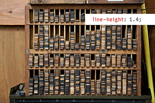
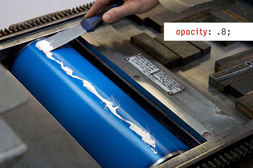
This extended to spacing. Whitespace was not the absence of atoms, it was just atoms… of a different kind. For your page composition to stay in place as it went through the press, you needed not just to put space blocks between sentences, but also pack the entire remaining area with blocks of lead or wood. What today you’d call letter spacing, line height, padding, margins… they were all physical.
In this world, running left-aligned (ragged) text required almost the same effort as full justification, since the spaces still needed to go somewhere. Every fraction of an inch had to be accounted for.
“That’s so cute,” you might say. “Today, I have position: absolute, negative margins and CSS transforms with more dimensions than my screen.” And you would be right. The relentless march of Moore’s Law gave us displays as highly alert collections of tiny pixels that you can command, at will, to become one out of millions of colors. You can do whatever you want!
Except, nobody does. Whenever dealing with text, we usually rely on browsers to be our typesetters, since that is so much more convenient. Many vestiges of physical typography remain today, and some of them are still genuinely useful. This is a story of physical spaces in the digital world.
Meet The Spaces
Did you ever take a walk through the entire Unicode table? No? You should. It is fascinating. It’s the history of our civilization expressed in typography. It might be organized in an arbitrary fashion and not explained well, but it’s all here: languages, cultures, concepts. Transport and Map Signals live next to Alchemical Symbols. Emoji share the screen with Counting Rod Numerals. Currency Symbols will make you want to explore the financial world, and Miscellaneous Technical to become an engineer. There are failed alphabet experiments and head-scratchers such as incomplete infinity. And, on a different page, you will find VCR playback symbols hanging out with a snowman. That must be one hell of a party.
A lot of typographical history is here, too. You can travel back in time with Dingbats, try to decipher the mysteries of Letterlike Symbols, and compare what must be about a dozen dashes — each, like the one your eyes just glanced at, with a specific purpose.
Spaces are here, too. There’s the one with an agent good enough to have gotten it the biggest key on everyone’s keyboard, but there are many more: the very narrow hair and thin spaces, the super-wide en and em spaces, and a few others in between:
- Hair space
- Six-per-em space
- Thin space
- Normal space
- Four-per-em space
- Mathematical space
- Punctuation space
- Three-per-em space
- En space
- Ideographic space
- Em space
You can use them like you would the normal space. Just copy an paste from the list above. But why would you?
Easy. Spaces of different sizes can be used to fine-tune how elements fit together. For example, Medium (where I work) uses hair spaces around em dashes so that those dashes don’t touch the letters in some gross way:
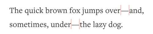
We do the same thing in one email that uses an en dash for a range. Without hair spaces around, it would feel too tight (and with a regular space, too loose).

Similarly, in one menu item that has a slash, we surround it with thin spaces for nice balance:
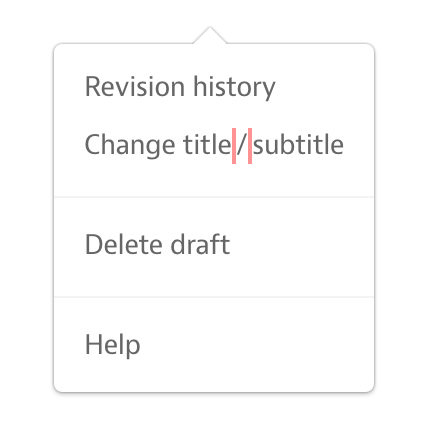
And so on. Many of the spaces are named after their width of choice (hair, thin, en, em), but a few of them reveal their purpose in their names. A punctuation space is meant to occupy the same amount of space as a typical punctuation character, and likewise for ideographic and mathematical spaces.
“This is not that exciting,” you might say. After all, any of these could be achieved by wrapping elements in <span>s and then applying horizontal padding, or by changing the word-spacing property and using regular spaces.
The problem with all those is that they’re much more cumbersome. Using a Unicode space will work anywhere, even outside of HTML — in a button label, in a text area, in an email subject line. Unicode spaces are versatile.
Spaces That Cannot Let Go
In our space quest, we then arrive at three spaces with magical properties:
- Narrow no-break space
- No-break space
- Figure space
All of these act as if glued to the characters around them. That means mostly one thing: they will keep things together if they need to wrap to a new line. This is useful if you want to prevent those solitary words or even characters that would look ridiculous if they just dropped to another line, unattended and forever alone (typographers dramatically call these orphans).
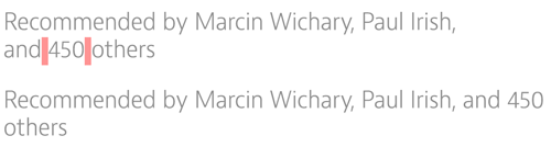
Here’s another example from Medium. We use non-breaking spaces within “and 3 others” so that string always stays in place, rather than being split in half:
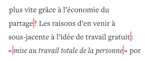
Likewise, the French language tends to put a narrow space before sentence-ending punctuation. That space needs to be of a non-breaking kind so that the question mark or quotation mark stay attached to their respective words:
You can imagine the same goes for large numbers with space thousand separators, phone numbers, and similar things you want to keep in one piece.
Again, you could do all of this by wrapping the entity with the vintage <nobr>, or by applying white-space property in CSS. But just like above, using the appropriate space character in proper context could be much simpler, and it works even if you can’t use any markup.
One more thing: even though they are invisible, non-breaking spaces have proper dimensions — both width and height. They can sometimes help with their container being measured properly. Some of you might remember the darker age of table-based layouts, where using non-breaking spaces was necessary to ensure table cells were visible. It was a hack on top of another hack. Today, we have better ways to do those things. And yet, just a few months ago, I had to put a non-breaking space in a piece of iOS software for the same reason — it was awaiting user input and without that space, it would not have been tall enough.
(Don’t discard yesterday’s hacks and learnings. Sometimes they’re still useful in the modern world.)
Invisible, But Not Quite
Let’s wrap up by talking about the most curious space of all — one that doesn’t have any size:
- Zero-widthspace
Yeah, it’s there somewhere. Be sure to copy and paste the whole selection, and then remove the characters around it. You will know the invisible space is there if you use your arrow keys to move the cursor left or right — it will get “stuck” when it goes around the space.
Widthless, this is the space for the modern, digital age. But what’s the use of a space that doesn’t really exist? Actually, there are two:
- It allows words to break.
- It fools any algorithms that do string pattern matching.
For the first one, a zero-width space effectively works as a word break (<wbr>) entity, even in places where no HTML is allowed. In its way, it’s the arch-nemesis of the non-breaking space. Here, for example, it allows the word to break after a slash:

As for the other use… remember the example at the top? It was the zero-width space that prevented Paul Irish’s name from being linkified in my tweet. It’s sitting there, quietly, right after the @ symbol, derailing the parser that’s looking for alphanumerical characters and gives up if it encounters anything but.
You can think of a few more uses:
- Preventing auto-tokenization. Do you want to talk on Twitter about @import or @extend without bothering people with those usernames? Zero-width space comes to the rescue.
- Fixing auto-linkification. Some algorithms don’t do very well with punctuation following a link, sucking it into the link itself. Putting a zero-width space in between can solve the problem.
- Preventing changing a combination of characters into emoticons. I’ve used it myself in Google Chat to have an old-school smiley :) safe and sound, not upgraded to some sort of a modern multicolor abomination.
- Rigging sorting algorithms so that things appear at the top or bottom without having to prepend visible characters.
- Allowing some fields to be left empty that are not supposed to be empty.
There are some nefarious or creative uses for the above, of course, and some parsers are smarter than others. But used sparingly, it’s just another tool, a magic wand to control parsers when they don’t do what we want them to do.
All Together Now
This is a list of all the spaces we’ve talked about. You can use this to copy and paste to your text — and also find the entities that work in iOS and Android:
| Space (Copy/Paste) | HTML Entity | iOS/Android Escape Sequence |
|---|---|---|
| Hair space | ` ` | \u200A |
| Six-per-em space | ` ` | \u2006 |
| Thin space | ` ` | \u2009 |
| Normal space | – | – |
| Four-per-em space | ` ` | \u2005 |
| Mathematical space | ` ` | \u205F |
| Punctuation space | ` ` | \u2008 |
| Three-per-em space | ` ` | \u2004 |
| En space | ` ` | \u2002 |
| Ideographic space | ` ` | \u3000 |
| Em space | ` ` | \u2003 |
| Narrow no-break space | ` ` | \u202F |
| No-break space | ` ` | \u00A0 |
| Figure space | ` ` | \u2007 |
| Zero-widthspace | `` | \u200B |
Things You Should Not Space Out On
When using more elaborate spaces, these are things worth thinking about:
- Spaces all look the same. It’s good to surround them with comments or other reminders of what they are.
- Users copying and pasting. Depending on the circumstances, the spaces you use might or might not appear as spaces after the user copies them and pastes elsewhere. This might matter to you (if you use spaces as number separators, for example), so double check before using.
- Font support. Spaces are regular glyphs and as such they must be supported by your fonts or the fallback fonts. Don’t be surprised if sometimes what you expected to be an absence of pixels ends up being a broken Unicode rectangle.
- And remember to put your space back in the box where it belongs! No, wait, phew, we don’t have to do that anymore.
The Mysteries Of Unicode
Unicode is full of other fascinations and oddities. There are a few more whitespace characters with weird properties, including the fascinatingly named zero-width non-joiner. There’s the soft hyphen, which is a hyphen that appears only when needed. There are things such as superscript numbers or strike-through characters that can be used even if the publishing platform you use doesn’t allow for it. And there are all the combining characters that piggyback on the previous ones, and can do that again, and again, and again. Check it out. Walk around. Make friends.
(I really think someone should put together a guided tour of Unicode. But that’s a whole different story.)
What uses do you find for spaces? What are your other favorite parts of Unicode? Leave your story in the comments.
Further Reading
- 16 Pixels: For Body Copy. Anything Less Is A Costly Mistake
- Introducing Responsive Web Typography With FlowType.JS
- 10 Principles For Readable Web Typography
- The Perfect Paragraph


