Designing For Print With CSS

Email Newsletter
Weekly tips on front-end & UX.
Trusted by 182,000+ folks.
 Register for Free
 Custom Web Forms for Angular, React, & Vue. Your backend.
 Celebrating 10 million developers


If you mention printing with CSS to many people who work on the web, print style sheets are the use that comes to mind. We are all well used to creating a style sheet that is called upon when a web document is printed. These style sheets ensure that the print version is legible and that we don’t cause a user to print out huge images. However, CSS is also being used to format books, catalogs and brochures — content that may never have been designed to be a web page at all.
In this article, we’ll take a look at the CSS modules that have been created not for use in web browsers, but to deal with printed and paged media. I’ll explain how the selectors, properties and values that they introduce work. I’ll finish up with a working example that you can use as a starting point for your own experiments. For that example, we’ll need a user agent that supports this specialized CSS. I’ll be using Prince, which is a commercial product. However, Prince has a free version that can be used for non-commercial use, making it a good tool to try out these examples.
Why HTML And CSS Make Sense For Print
It may seem a bit strange that content not particularly destined for the web should be maintained as HTML and formatted with CSS. It seems less strange when you realize that popular eReader formats such as EPUB and MOBI are HTML and CSS under the hood. In addition, even if the entirety of a manuscript or catalog isn’t to be published on a website, some of it likely will be. HTML becomes a handy format to standardize on, far easier to deal with than having everything in a Word document or a traditional desktop publishing package.
The Differences Between CSS For The Web And For Print CSS
The biggest difference, and conceptual shift, is that printed documents refer to a page model that is of a fixed size. Whereas on the web we are constantly reminded that we have no idea of the size of the viewport, in print the fixed size of each page has a bearing on everything that we do. Due to this fixed page size, we have to consider our document as a collection of pages, paged media, rather than the continuous media that is a web page.
Paged media introduces concepts that make no sense on the web. For example, you need to be able to generate page numbers, put chapter titles in margins, break content appropriately in order that figures don’t become disassociated from their captions. You might need to create cross-references and footnotes, indexes and tables of content from your document. You could import the document into a desktop publishing package and create all of this by hand, however, the work would then need redoing the next time you update the copy. This is where CSS comes in, whose specifications are designed for use in creating paged media.
Because the specifications are designed for paged media, we won’t be considering browser support in this article — it wouldn’t make a lot of sense. Later on, we’ll look at a user agent designed to turn your HTML and CSS into a PDF using these specifications.
The Specifications
Much of the CSS you already know will be useful for formatting for print. Specifically for print, we have the “CSS Paged Media Module” and the “CSS Generated Content for Paged Media Module” specifications. Let’s look at how these work.
The @page Rule
The @page rule lets you specify various aspects of a page box. For example, you will want to specify the dimensions of your pages. The rule below specifies a default page size of 5.5 by 8.5 inches. If you intend to print a book, perhaps by a print-on-demand service, then finding out the sizes you can use is important.
@page {
  size: 5.5in 8.5in;
}
In addition to specifying sizes with length values, you may also use paper size keywords, such as “A4” or “legal.”
@page {
  size: A4;
}
You may also use a keyword to specify the page’s orientation — “portrait” or “landscape.”
@page {
  size: A4 landscape;
}
Understanding The Page Model
Before going any further, we should understand how the page model for paged media works, because it behaves somewhat differently to how things work on screen.
The page model defines a page area and then 16 surrounding margin boxes. You can control the size of the page area and the size of the margin between the edge of the page area and the end of the page itself. The table in the specification explains very well how these boxes are sized.
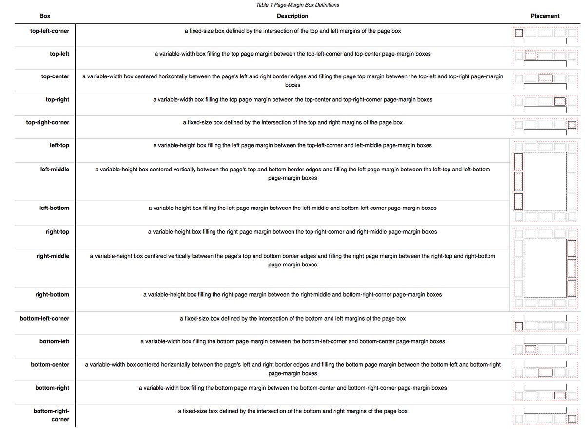
The page area is the space on the page into which your page’s content will flow. When it runs out of room, another page will be created. The margin boxes are used only for CSS-generated content.
Left And Right Page Spreads
Another aspect of the page model is that it defines pseudo-class selectors for the left and right pages of your document. If you look at any printed book you have on hand, you’ll probably see that the margin’s size and the margin’s content are different on the left and right pages.
We can use these selectors to define different margin sizes for our pages.
@page :left {
  margin-left: 3cm;
}

@page :right {
  margin-left: 4cm;
}
Two other pseudo-class selectors are defined. The :first selector targets the first page of a document.
@page :first {

}
The :blank pseudo-class selector targets any page that is “intentionally left blank.” To add this text, we can use generated content that targets the top-center margin box.
@page :blank {
  @top-center { content: "This page is intentionally left blank." }
}
Generated Content And Paged Media
In the last example, we used CSS-generated content to add the text to the top-center margin box. As you will discover, generated content is vitally important to creating our book. It’s the only way things can be added to our margin boxes at all. For example, if we want to add the title of the book to the bottom-left margin box of right-hand pages, we would do this using generated content.
@page:right{
  @bottom-left {
    margin: 10pt 0 30pt 0;
    border-top: .25pt solid #666;
    content: "My book";
    font-size: 9pt;
    color: #333;
  }
}
Page Breaks
Also part of the “Paged Media” specification is information about how to control page breaks. As already described, once the content fills a page area, it will move onto a new page. If a heading has just been written to the page, you might end up with a page that finishes with a heading, with the related content beginning on the next page. In a printed book, you would try to avoid this situation. Other places you might want to avoid a break are in the middle of a table and between a figure and its caption.
Starting a new chapter of a book with an h1 heading is common. To force this heading to always be the beginning of a page, set page-break-before to always.
h1 {
  page-break-before: always;
}
To avoid breaks directly after a heading, use page-break-after.
h1, h2, h3, h4, h5 {
  page-break-after: avoid;
}
To avoid breaking figures and tables, use the page-break-inside property.
table, figure {
  page-break-inside: avoid;
}
Counters
Books are all about numbering things — pages, chapters, even figures. We can actually add these numbers via CSS, saving us from having to renumber everything because we decided to, say, add a new figure partway through a chapter. We do this using CSS counters.
The obvious place to start is with page numbers. CSS gives us a predefined page counter; it starts at 1 and increments with every new page. In your style sheet, you would use this counter as the value of generated content, to put the page counter in one of your margin boxes. In the example below, we are adding page numbers to the bottom-right of right-hand pages and the bottom-left of left-hand pages.
@page:right{
  @bottom-right {
    content: counter(page);
  }
}

@page:left{
  @bottom-left {
    content: counter(page);
  }
}
We’ve also created a counter named pages. This counter will always be the total number of pages in your document. If you want to output “Page 3 of 120,” you can.
@page:left{
  @bottom-left {
    content: "Page " counter(page) " of " counter(pages);
  }
}
You can create your own named counters and increment and reset them as you require. To create a counter, use the counter-reset property, increment it with counter-increment. The CSS rules below will create a counter for chapters named chapternum and increment it with each h1 — being the start of a chapter in this book. We then use the value of that counter in generated content to add the chapter number and a period before the chapter’s actual title.
body {
  counter-reset: chapternum;
}

h1.chapter:before {
  counter-increment: chapternum;
  content: counter(chapternum) ". ";
}
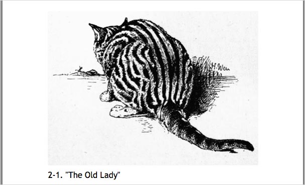
We can do the same for figures in the book. A common way to number figures is to use chapternum.figurenum. So, “Figure 3-2” would be the second figure in chapter 3. On the h1, we could reset figurenum in order that it starts from 1 for each chapter.
body {
  counter-reset: chapternum figurenum;
}

h1 {
  counter-reset: figurenum;
}

h1.title:before {
  counter-increment: chapternum;
  content: counter(chapternum) ". ";
}

figcaption:before {
  counter-increment: figurenum;
  content: counter(chapternum) "-" counter(figurenum) ". ";
}
Setting Strings
Take a look at a printed book again. As you leaf through a chapter, you’ll probably see that the chapter’s title is printed on the left or right page. As strange as it may sound, the “Generated Content for Paged Media” specification lets us achieve this using CSS.
We do this using a property named string-set in the selector that we want to take the content from. For the chapter title, this would be the h1. The value of string-set is the name you would like to give this content and then content(). You can then output this as generated content using string().
h1 {
  string-set: doctitle content();
}

@page :right {
  @top-right {
    content: string(doctitle);
    margin: 30pt 0 10pt 0;
    font-size: 8pt;
  }
}
When your paged media is generated, each time an h1 occurs, the content is written to doctitle and then outputted in the top-right margin box of right-hand pages, changing only when another h1 occurs.
Footnotes
Footnotes are a part of the “CSS Generated Content for Paged Media Module” specification. The way footnotes work is that you would add the text of your footnote inline, wrapped in HTML tags (probably a span), with a class to identify it as a footnote. When the page is generated, the content of that “footnote element” is removed and turned into a footnote.
In your CSS, use the footnote value of the float property to create a rule for your footnote class.
.fn {
  float: footnote;
}
In your document, use that class to wrap any footnote text.
<p>Footnotes<span class="footnotes">Footnotes and notes placed in the footer of a document to reference the text. The footnote will be removed from the flow when the page is created.</span> are useful in books and printed documents.</p>
Footnotes have a predefined counter that behaves in the same way as the page counter. Typically, you will want to increment the counter by 1 each time a fn class occurs and reset it at the beginning of each chapter.
.fn {
  counter-increment: footnote;
}

h1 {
  counter-reset: footnote;
}
The various parts of a footnote can be targeted with CSS pseudo-elements. The footnote-call is the numeric anchor in the text that indicates there is a footnote. This uses the value of the footnote counter as generated content.
.fn::footnote-call {
  content: counter(footnote);
  font-size: 9pt;
  vertical-align: super;
  line-height: none;
}
The footnote-marker is the numeric marker placed in front of the footnote text in the footer of your document. These behave in a similar way to the numbers generated for an ordered list in CSS.
.fn::footnote-marker {
  font-weight: bold;
}
The footnotes themselves are placed in the margin, within a special area of the page named @footnote. You would target and style that area as follows.
@page {
  @footnote {
    border-top: 1pt solid black;
  }
}
Cross-References
Before moving on to a working example of everything we’ve learned, let’s look at cross-references. On the web, we cross-reference things by adding links. In a book or other printed document, you would normally refer to the page number where that reference is to be found. Because page numbers might change according to the format that the book is printed in — and between editions — doing this with CSS saves us from having to go through and change all of the numbers.
We use another new property, target-counter, to add these numbers. Start by creating links in your document, giving them an href, which is the ID of the element in the document that you want to target. Also, add a class to identify them as a cross-reference, rather than an external link; I’m using xref.
<a class="xref" href="#ch1" title="Chapter 1">Chapter 1</a>
Then, after the link, use generated content again to output (page x), where x is the number of the location in the book where that ID can be found.
a.xref:after {
  content: " (page " target-counter(attr(href, url), page) ")";
}
We’ll be looking at this technique in practice when we create a table of contents for the working example.
Putting It All Together: An Example Book
We’ve looked at a lot of different properties here in isolation. They make more sense once you put them to use by building a book.
To actually create a book using this CSS, you’ll need a user agent that supports it. Currently, very few things implement this specification well; the one that is most accessible is Prince. A standalone commercial license for Prince is expensive, however, you may use Prince free of charge for non-commercial projects. This means that if you just want to try out these techniques, you can. Additionally, if you do have non-commercial uses for this technology, you may use Prince to format those books.
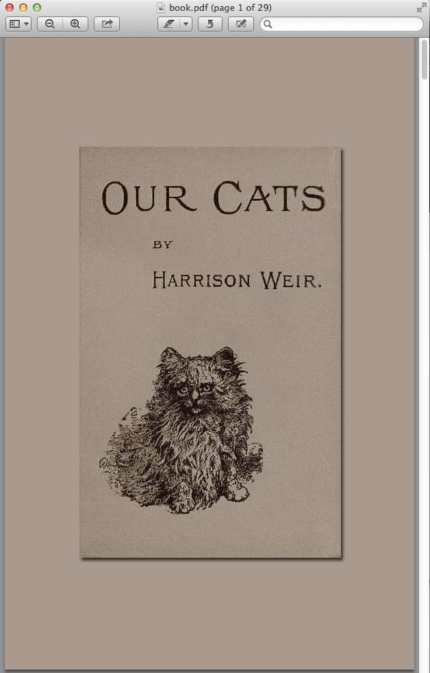
I have extracted passages from one of my favorite books on Project Gutenberg, Our Cats by Harrison Weir. I’ve chosen this book because I like cats and because it has images and footnotes that I can use to demonstrate formatting.
You can find the files I am using, plus a generated PDF, over on GitHub. If you want to experiment with the CSS and build the book yourself, then you will need to download and install Prince. Prince is a command-line tool on the Mac, and although there is a Windows GUI, I’ll use the command line because it really is very simple.
Using a Terminal window, switch to your book’s directory or the location where you downloaded my files from GitHub.
cd /Users/username/smashing-css-books
Now, run Prince:
prince -s pdf-styles.css book.html builds/book.pdf
This will create a PDF in the builds folder named book.pdf. Now, if you make any changes to the CSS or HTML, you can run Prince to see what is different.
The HTML Document
My entire “book” is compiled in a single HTML document. Compiling documents in Prince is possible, but I’ve found it simpler to just deal with one large document. Before the chapters, which start with an h1, I have a div that contains the cover image, and then the table of contents for the book.
The table of contents links to the IDs of the chapters’ h1 headings.
<!DOCTYPE html>
<html dir="ltr" lang="en-US">
<head>
<meta charset="utf-8" />
<title>Our Cats and All About Them</title>
<meta name="author" content="Harrison Weir"/>
<meta name="subject" content="Cats. Their Varieties, Habits and Management; and for show, the Standard of Excellence and Beauty"/>
<meta name="keywords" content="cats,feline"/>
<meta name="date" content="2014-12-05"/>
</head>
<body>
<div class="frontcover">
</div>
<div class="contents">
<h1>Extracts from Our Cats and All About Them by Harrison Weir</h1>
<ul class="toc">
<li><a href="#ch1">The First Cat Show</a></li>
<li><a href="#ch2">Trained Cats</a></li>
<li><a href="#ch3">General Management</a></li>
<li><a href="#ch4">Superstition and Witchcraft</a></li>
</ul>
</div>
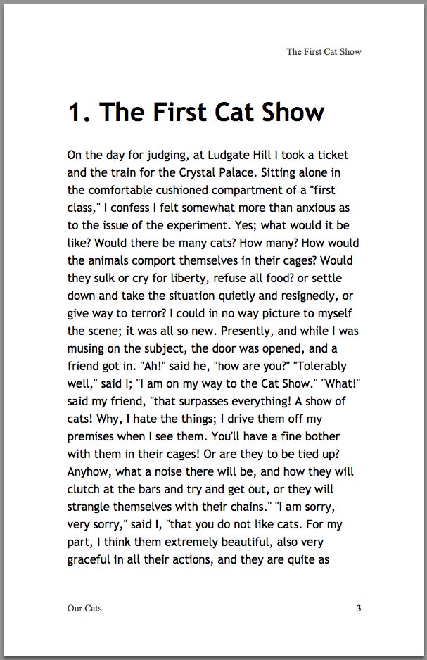
<h1 id="ch1" class="chapter">The First Cat Show</h1>
<p>… </p>
<h1 id="ch2" class="chapter">Trained Cats</h1>
<p>… </p>
<h1 id="ch3" class="chapter">General Management</h1>
<p>… </p>
<h1 id="ch4" class="chapter">Superstition and Witchcraft</h1>
<p>… </p>
</body>
</html>
The CSS then uses all of the things we have described so far. To start, we need to set up a size for the book using the @page rule. We then use the :first pseudo-class selector to remove the margin on page 1, because this page will have the cover image.
@page {
  size: 5.5in 8.5in;
  margin: 70pt 60pt 70pt;
}

@page:first {
  size: 5.5in 8.5in;
  margin: 0;
}
We then deal with the image for the front cover, making sure that it covers the whole page area.
div.frontcover {
  page: cover;
  content: url("images/cover.png");
  width: 100%;
  height: 100%;
}
Next, we deal with the specifics of the left- and right-hand pages, using the :right and :left spread pseudo-classes.
The right-hand spread will have the title of the book in the bottom-left margin box, a page counter in the bottom-right, and the chapter’s title in the top-right. The chapter’s title is set using string-set further down in the style sheet.
@page:right{
  @bottom-left {
    margin: 10pt 0 30pt 0;
    border-top: .25pt solid #666;
    content: "Our Cats";
    font-size: 9pt;
    color: #333;
  }

  @bottom-right {
    margin: 10pt 0 30pt 0;
    border-top: .25pt solid #666;
    content: counter(page);
    font-size: 9pt;
  }

  @top-right {
    content:  string(doctitle);
    margin: 30pt 0 10pt 0;
    font-size: 9pt;
    color: #333;
  }
}
The left-hand spread has the book’s title in the bottom-right and the page counter in the bottom-left.
@page:left {
  @bottom-right {
    margin: 10pt 0 30pt 0;
    border-top: .25pt solid #666;
    content: "Our Cats";
    font-size: 9pt;
    color: #333;
  }

  @bottom-left {
    margin: 10pt 0 30pt 0;
    border-top: .25pt solid #666;
    content: counter(page);
    font-size: 9pt;
  }
}
For the first page, which contains the cover image, we’ll make sure that no generated content appears by setting it to normal.
@page:first {
  @bottom-right {
    content: normal;
    margin: 0;
  }

  @bottom-left {
    content: normal;
    margin: 0;
  }
}
The next section of the style sheet deals with counters. In addition to the preset page counter, we are defining counters for chapters and figures.
/* Reset chapter and figure counters on the body */
body {
  counter-reset: chapternum figurenum;
  font-family: "Trebuchet MS", "Lucida Grande", "Lucida Sans Unicode", "Lucida Sans", Tahoma, sans-serif;
  line-height: 1.5;
  font-size: 11pt;
}

/* Get the title of the current chapter, which will be the content of the h1.
Reset figure counter because figures start from 1 in each chapter. */
h1 {
  string-set: doctitle content();
  page-break-before: always;
  counter-reset: figurenum;
  counter-reset: footnote;
  line-height: 1.3;
}

/* Increment chapter counter */
h1.chapter:before {
  counter-increment: chapternum;
  content: counter(chapternum) ". ";
}

/* Increment and display figure counter */
figcaption:before {
  counter-increment: figurenum;
  content: counter(chapternum) "-" counter(figurenum) ". ";
}
Chapters now have their number placed before the title. Figures also display their number.
We create footnotes as in the explanation earlier, superscripting the footnote’s call.
.fn {
  float: footnote;
}

.fn {
  counter-increment: footnote;
}

.fn::footnote-call {
  content: counter(footnote);
  font-size: 9pt;
  vertical-align: super;
  line-height: none;
}

.fn::footnote-marker {
  font-weight: bold;
}

@page {
  @footnote {
    border-top: 0.6pt solid black;
    padding-top: 8pt;
  }
}
We then add some rules to control where pages break. You need to be fairly careful about being too heavy handed with this. If your book has a lot of tables and figures, then adding many specific rules here could cause a lot of long gaps in the book. Experimenting and testing will show how far you can take the control of breaks. I have found the rules below to be a good starting point.
Remember that this is a suggestion to the user agent. In some cases, keeping a table from breaking will be impossible if the table doesn’t fit on a page!
h1, h2, h3, h4, h5 {
  font-weight: bold;
  page-break-after: avoid;
  page-break-inside:avoid;
}

h1+p, h2+p, h3+p {
  page-break-before: avoid;
}

table, figure {
  page-break-inside: avoid;
}
Finally, we style the table of contents, and we use an interesting trick here. When describing cross-references, I explained how we use target-counter to display the page number that the ID is on. This is what we’ll do for our table of contents. The rule below puts the page number after the link to each chapter in the table of contents.
ul.toc a::after {
  content: target-counter(attr(href), page);
}

Commonly in books, however, you would use leader dots to line up all of the page numbers against the right margin. Amazingly, CSS gives us a way to do this, by adding leader() before the number in the generated content.
ul.toc a::after {
  content: leader('.') target-counter(attr(href), page);
}

We now have a complete style sheet with which to build our book. I’ve avoided spending a lot of time on typography here, concentrating instead on the specifics of creating a book. From this point, however, you can experiment and add your own styles to create a unique book design.
Not Just Books!
Remember that these techniques are not just for books. You could use them to generate print and PDF versions of a product catalog directly from the HTML of a website that you have developed for a client. Or you could create flyers and brochures from web content.
If you want to create PDF documents from a website using Prince, then DocRaptor is a great option. This service uses Prince via an API. You can send documents via the API and receive a PDF — perfect for allowing users to download content as a PDF on the fly. Everything we have looked at in this article is possible via an API integration with DocRaptor.
Even if you don’t have an immediate need for PDF generation, it’s a fascinating aspect of CSS — and it’s a useful skill to have tucked away, so that you know what is possible when a use case presents itself.
Other Resources
- “CSS Paged Media Module Level 3,” W3C
- “CSS Generated Content for Paged Media Module,” W3C
- “Using CSS Counters,” Mozilla Developer Network
- “CSS Books: Living Standard,” WHATWG
- “User Guide for Prince 9.0” A lot of simple examples that work in Prince
- “How to Write a Book,” Jonathan Snook, 24 Ways
- “Building Books With CSS3,” Nellie McKesson, A List Apart
- “Printing a Book With CSS: Boom!,” Bert Bos and Håkon Wium Lie, A List Apart
- “HTML, EPUB, MOBI, PDF, WTF: Creating an Ebook,” Rachel Andrew
Further Reading
- Designing For Print With CSS
- 5 Powerful Tips And Tricks For Print Style Sheets
- Web Design Industry Jargon: Glossary and Resources
- Taking Pattern Libraries To The Next Level
 (vf, al, il, mrn)

