6 Easy Steps To Better Icon Design

Email Newsletter
Weekly tips on front-end & UX.
Trusted by 182,000+ folks.

 Custom Web Forms for Angular, React, & Vue. Your backend.
 Celebrating 10 million developers

This article discusses a set of design guidelines in six steps. The steps follow the basics of sound icon design, including consistency, legibility and clarity. The principles of effective icon design have been discussed at length by icon designer John Hicks of Hicks Design in his book The Icon Handbook, as well as by Google in its material design guidelines for system icons. The six steps discussed in this article should be seen as a guide, not a dogmatic list of rules. Part of becoming a great designer is learning when to break the rules and when to follow them, as we will demonstrate here.
Icon and vector marketplaces like Iconfinder (where I work) are making well-designed vector icons an inexpensive and readily available resource for web and print designers. Thousands of high-quality premium icon sets and hundreds of great free sets are available.
Every icon set submitted to Iconfinder is reviewed and evaluated for potential appeal to our website users and for potential commercial value as premium icons. When reviewing icon sets submitted to the website, we have a responsibility to our designers and to our customers to make sure all premium icons on the website are of the highest possible quality.
To achieve this, we are constantly aware of the difference between “not quite good enough” and “premium quality.” The difference is often very small and usually requires minimal changes, but it has a great impact on the design and value of the icon set. Unlike many other marketplaces, we rarely reject sets that don’t quite meet our quality requirements outright. Instead, we will share very specific, actionable suggestions for how the designer can improve the icons.
The Reworking Of An icon
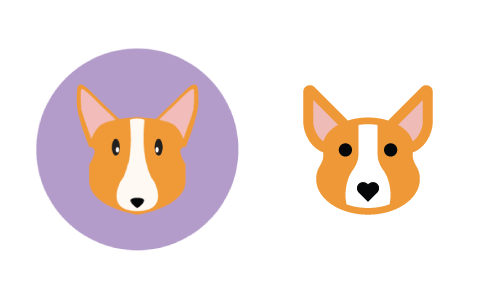
In the example images that follow in this article, the six steps discussed will be applied to a reworking of an icon of a dog (a Corgi, to be exact) that was recently submitted by an Iconfinder user named Kem Bardly. The icon had potential but was not quite polished enough to be considered “premium quality.” We provided Kem with some easy tips to follow, and, with a little reworking, his icons were ready for approval as a premium icon set. The image below shows the before and after versions of Kem’s icon. In the sections that follow, we will explain how to methodically go from before to after.
Note that while the guidelines discussed in the article are geared to web icons, they are generally applicable to print icons as well. The typical 300 dots per inch (DPI) of printed material makes pixel-perfection essentially meaningless. If you are a print designer reading this, all of the principles covered are applicable, but you can largely ignore the pixel-perfection pieces.
Three Attributes Of Effective Icon Design
Icons that are well designed exhibit a methodical and deliberate approach to the three major attributes that make up any icon design: form, aesthetic unity and recognition. When designing a new icon set, consider each of these attributes in an iterative approach, starting with the general (form) and proceeding to the specific (recognizability). Even if you’re creating a single icon, these three attributes are still implied and can be extrapolated from a single design.
No doubt, more than three attributes make up effective icon design, but the three elaborated below are a good place to start. For the sake of relative brevity, we have focused on what we consider to be the three main attributes.
Form
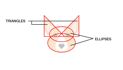
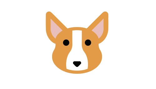
Form is the underlying structure of an icon, or how it is made. If you ignore the details of an icon and draw a line around the major shapes, do they form a square, a circle, a horizontal or vertical rectangle, a triangle or a more organic shape? The primary geometric shapes — circle, square and triangle — create a visually stable foundation for icon design. In our Corgi example by Kem Bardly, the dog’s head is made up of two triangles and two ellipses. Just as one would start a drawing by sketching the largest, simplest shapes and then refining towards greater and greater detail, one would start an icon from the simplest shapes and then add more detail — but only as much detail as is needed to communicate the concept being represented, be it an object, idea or action.
Aesthetic Unity
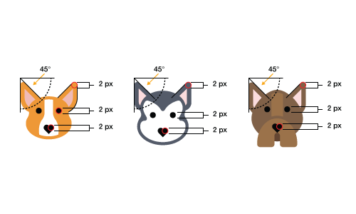
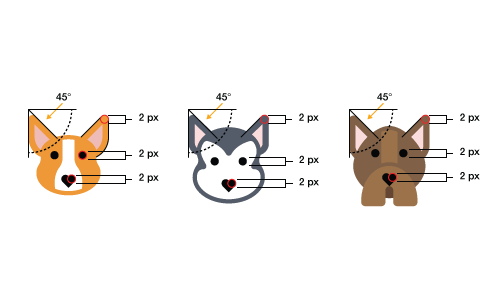
The elements that are shared within a single icon and across an icon set are what we call the aesthetic unity. These elements are things like rounded or square corners, the specific size of corners (2 pixels, 4 pixels, etc.), limited and consistent line weights (2 pixels, 4 pixels, etc.), the style (flat, line, filled line or glyph), the color palette and more. The aesthetic unity of a set is the collection of design elements and/or choices you repeat throughout the set to visually tie it together as a cohesive whole. In the examples below, notice that each of the three dogs from Kem’s set share common elements, such as the 2-pixel rounded corners, the 2-pixel-thick stroke around the dogs’ faces and the heart-shaped noses.
Recognizability
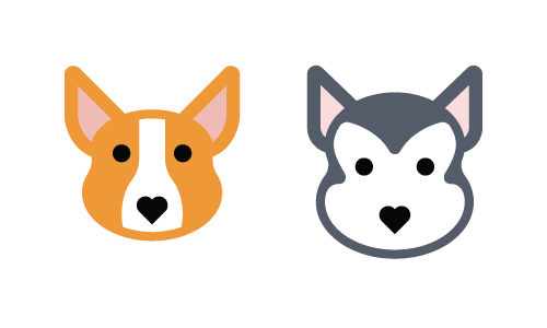
Recognizability is a product of an icon’s essence or what makes an icon unique. Whether an icon works ultimately depends on how easily the viewer comprehends the object, idea or action it depicts. Recognizability includes showing the properties that the viewer commonly associates with that idea, but it can also include elements that are unique or unexpected, such as the heart for the Corgi’s nose. Remember that recognizability refers not only to comprehension of the object, idea or action being depicted, but also to recognition of your unique icon set. In this respect, aesthetic unity and recognition can, and often do, overlap. In the image below, we recognize each of the two dogs as a Corgi and Siberian Husky, respectively, because of their unique colors, head shape and ears, while still recognizing them as part of the same set because of the shared design and style elements.
Thus far, we have looked at what we consider to be the three main attributes of effective icon design. In the next section, we will look in depth at six steps to properly address these three areas of concern.
The Six Steps
Always Start With A Grid
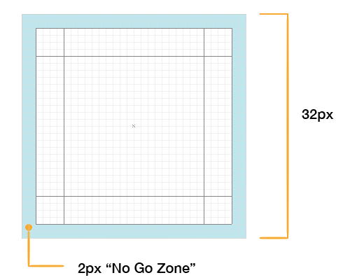
The benefits of various grid sizes would best be handled in a separate article. For our purposes, we’ll work with a 32 × 32-pixel grid. Our grid also contains some basic guides to help us create the underlying form of each icon design.
The outer 2 pixels of the grid are what we call the “no-go zone.” Avoid putting any part of the icon in this space unless absolutely necessary. The purpose of the no-go zone is to create some breathing room around the icon.
Part of the form of an icon is the general shape and orientation. If you draw a line around the outside edges of an icon — the bounding box, if you will — the shape will generally be a square, circle, triangle, horizontal rectangle, vertical rectangle or diagonal rectangle.
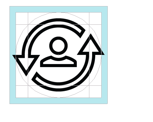
Circular icons are centered in the grid and will usually touch all four of the outermost edges of the content area, without going into the no-go zone. Note that a common reason for breaking the no-go zone rule is if some accent or minor element needs to extend beyond the circle in order to maintain the integrity of the design, as demonstrated below.
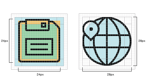
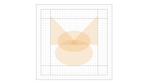
Square icons are also centered in the grid but do not, in most cases, extend all the way to the outermost edges of the content area. To maintain a consistent visual weight with circular and triangular icons, most rectangular and square icons will align to the key line in the middle (the orange area in the image below). When to align to each key line is determined by the visual weight of the icon itself; getting a feel for when to use which size just takes practice. Look at the square layout image below. The three concentric squares mentioned above are shown in light blue, orange and light green.
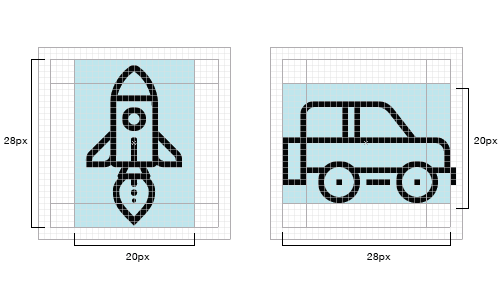
Inside the 32-pixel square, you will notice the 20 × 28-pixel vertical and horizontal rectangles. We loosely follow these rectangles for icons that are horizontal or vertical in orientation and try to make the dimensions of any icons oriented thus, to match the 20 × 28-pixel dimensions of these rectangles.
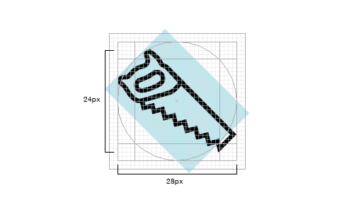
Diagonally oriented icons are aligned to the edges of the circular content area, as seen in the image below. Notice that the outermost points of the saw are approximately aligned to the edges of the circle. This is an area where you do not need to be exact; close is good enough.
Remember that you do not need to follow the grid and guides exactly every time. The grid is there to help you make the icons consistent, but if you have to choose between making an icon great and following the rules, break the rules — just do so sparingly. As Hemmo de Jonge, better known by his nickname Dutch Icon, has said:
"The essence of an individual icon outweighs the importance of set cohesion."
Start With Simple Geometric Shapes
Start your icon designs by roughly outlining the major shapes with simple circles, rectangles and triangles. Even if an icon is going to end up being mostly organic in nature, start with the shape tools in Adobe Illustrator. When it comes to making icons, especially for smaller sizes on screen, the slight variations in edges that result from hand drawing will make an icon look less refined. Starting with basic geometric shapes will make the edges more precise (especially along curves) and will allow you to adjust the relative scale of elements within a design quickly, as well as ensure that you follow the grid and form.
By The Numbers: Edges, Lines, Corners, Curves And Angles
As much as possible without making the design look overly mechanical and boring, corners, curves and angles should be mathematically precise. In other words, follow the numbers and don’t try to eyeball or freehand it when it comes to these details. Inconsistency in these elements can diminish the quality of an icon.
Angles
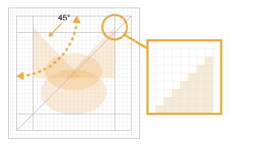
In most cases, stick to 45-degree angles, or multiples thereof. Anti-aliasing on a 45-degree angle is evenly stepped (the active pixels are aligned end to end), so the result is crisp, and the perfect diagonal of this angle is an easily recognized pattern, which the human eye likes very much. This recognizable pattern builds consistency across an icon set and unity within a single icon. If your design dictates that you must break this rule, try to do so in halves (22.5 degrees, 11.25, etc.) or in multiples of 15 degrees. Each situation is different, so decide case by case. The benefit of using halves of 45 degrees is that the stepping in the anti-aliasing will still be fairly even.
Curves
One of the most noticeable areas that can degrade the quality of an icon and that can mean the difference between professional- and amateur-looking is less-than-perfect curves. Whereas the human eye can detect very slight variations in precision, hand-eye coordination cannot always achieve a high level of precision. Rely on shape tools and numbers to create curves as much as possible, rather than drawing them by hand. When you do need to draw a curve manually, use Adobe Illustrator’s (or your vector software’s) constraint modifier key (the Shift key) or, even better, use VectorScribe and InkScribe by Astute Graphics for even more refined control over bezier curves.
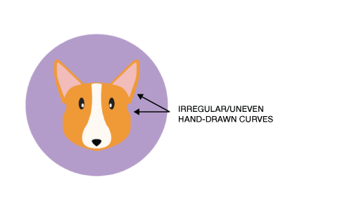
As we see in the “before” image above, hand-drawing lines creates irregular curves that detract from the quality of the design.
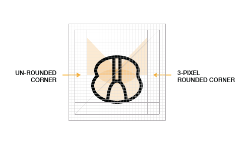
Corners
A common rounded-corner (or radius) value is 2 pixels. In a 32 × 32-pixel icon, a 2-pixel radius is large enough to be clearly seen as rounded but does not soften the corners so much as to change the personality of the design (giving that “bubble” look). The value you choose will depend on the personality you want to give the design. Whether you use rounded corners is an aesthetic decision to be made considering the overall aesthetics of the set.
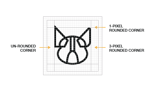
Having started with geometric shapes, we have now added a 2-pixel outline, demonstrating how the shape tools, along with consistency in details such as the rounded corners, are improving the design.
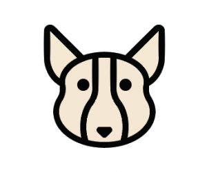
This greatly improved version shows the gist of the new design, with uniformly rounded corners, smooth curves and a basis for the weights of the lines around the ears.
Pixel-Perfection
Pixel-perfect alignment is important when designing for small sizes. Anti-aliasing on the edges of an icon at small sizes can make the icon appear fuzzy. Space between lines that don’t align to the pixel grid will be anti-aliased and appear blurry. Aligning the icon to the pixel grid will make the edges perfectly crisp on straight lines and more crisp on precise angles and curves.
As mentioned, 45-degree angles are best (after straight lines) because the pixels used to define the angle are stacked, or stepped, end to end perfectly diagonally. The same is true of corners and curves: The more mathematically precise they are, the crisper the anti-aliasing will be. Note, however, that pixel-perfection is less relevant, at least for anti-aliasing, at larger sizes and on higher-resolution screens, such as “Retina” displays.
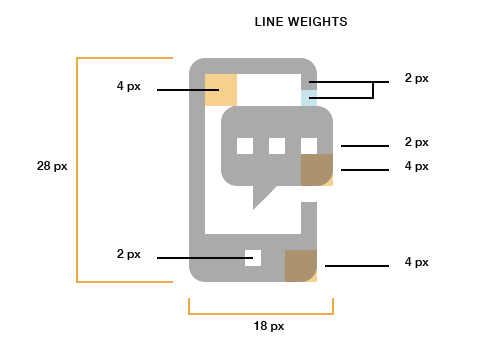
Line Weights
When it comes to line weights, two are ideal, but three are sometimes necessary. The goal is to provide visual hierarchy and variety, without introducing too much variety and thus destroying a set’s consistency. More than three and a set can lose its cohesion. The benefit of 2- and 4-pixel line weights is that they are multiples of 2 and, therefore, easily scale up and down in even increments. In most cases, avoid very thin lines, especially in glyph and flat icons. Unless you are deliberately creating a “line style” icons, rely on light and shadow, rather than lines, to define shape.
Use Consistent Design Elements And Accents Across Icons
Hemmo de Jonge of Dutch Icon gave a brilliant talk at Icon Salon 2015 in which he spoke at length about this aspect of icon design. In his two-years-and-counting icon system project for the Dutch government, Hemmo and his design partner incorporated a notch in each of the icons. Not every icon has the notch, but most do. This kind of accent, used conservatively but consistently across an icon set, can really tie the set together.
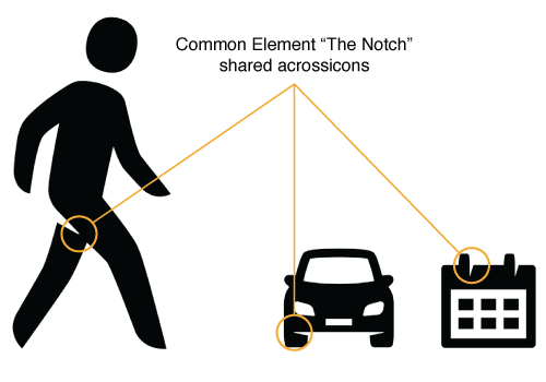
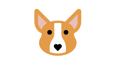
In our dog example, we have employed a common stylistic element with the heart-shaped nose. The visual quirk of using a heart for a nose not only ties the icons together, but adds a whimsical element and communicates an affection for our four-legged friends.
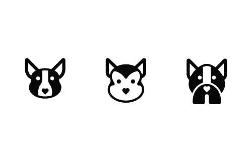
In many cases, even if major aspects of an icon set are changed — the style, for example — the elements that build aesthetic unity can still tie the set together, as seen below. We have recreated the same three dog icons in a glyph style, rather than a flat style, and they are still consistent in aesthetic.
Use Details And Decorations Sparingly
Icons should quickly communicate an object, idea or action. Too many small details will introduce complexity, which can make the icon less recognizable, especially at smaller sizes. The level of detail you include in a single icon or set of icons is also an important aspect of aesthetic unity and recognizability. A good rule of thumb for determining the right level of detail in an icon or set is to include the bare minimum of details needed to make the meaning clear.
In the version above, we are pretty close to our completed, improved design. The black outlines around the ears have become the fur-covered brown area around the ears. The black lines around the face are gone but still detectable in the 2-pixel space above the white marking on the Corgi’s face. Notice, however, that we still have some elements from the “before” version, such as the plain nose. We will address that in the next step.
Make It Unique
The number of talented designers who are creating high-quality icon sets, many of which are available for free, seems to be growing every day. Unfortunately, a lot of those designers rely too heavily on trends or the styles of the most popular designers. As creative professionals, we should be looking outside of the icon industry, to architecture, typography, industrial design, psychology, nature and any other area in which we can find inspiration. Because so many icon sets look alike these days, making your designs unique is ever more important.
In the final “after” image, we have a unique touch in the heart-shaped nose, which adds a dash of novelty and lightheartedness to the design.
These simple steps should be seen as a starting point, not a definitive guide. There is no single way to design icons. In this article, we have outlined the basics of a consistent approach to design, but other designers certainly have their own opinions and techniques. The best way to become a better designer is to look at as many visual references as you can, to read a variety of material, to sketch regularly (carry a sketchbook wherever you go), and to practice, practice, practice.
Conclusion
We have shared the fundamentals of how to create premium quality icons. These fundamentals are technical skills; anyone can learn and master them with practice. Remember that to create better icons, start from the general (form) and work toward the specific (recognizability). And keep your icons internally consistent, as well as consistent across the set, by paying attention to the shared elements (the aesthetic unity) of the icon or set. Once you have mastered the technical fundamentals, you can focus your energy on what makes an icon truly stand out: your unique creative vision.
Do you have your own techniques, tips or fundamentals that you’d like to share? Leave them in the comments below.
Other Resources
- Tutorials, The Iconfinder Blog
- Icon Tutorials, IconUtopia
- *The Icon Handbook, Jon Hicks
- Material Icons (design guidelines), Google
Further Reading
- How To Design Eye-Catching App Icons
- Icons As Part Of A Great User Experience
- How To Create Icons In Adobe XD
- Easy Steps To Better Icon Design
 (ah, ml, al, il, mrn)

