Designing With Grid-Based Approach

Email Newsletter
Weekly tips on front-end & UX.
Trusted by 182,000+ folks.

 Custom Web Forms for Angular, React, & Vue. Your backend.
 Celebrating 10 million developers
The main idea behind grid-based designs is a solid visual and structural balance of web-sites you can create with them. Sophisticated layout structures offer more flexibility and enhance the visual experience of visitors. In fact, users can easier follow the consistency of the page while developers can update the layout in a well thought-out, consistent way. However, it’s quite hard to find your way through all the theory behind grid systems: it isn’t easy at all. Some important notions and related key facts can help to learn basics and keep essential techniques in mind.
And this is what this article is all about. Inspired by Khoi Vinn’s and Mark Boulton’s presentation Grids are Good, we’ve decided to take a deep look in the articles about grid-based designs. We’ve read through over 50 articles and selected some of the most important and interesting facts web-developers should know about the grid-based approach. Besides, we’ve listed the most useful references, tutorials and tools we found - with precise descriptions of what the articles are about.
You may want to take a look at the following newer related posts:
- Grid-Based Web Design, Simplified
- Grid-Based Design: Six Creative Column Techniques
- CSS Grid, Flexbox And Box Alignment: Our New System For Web Layout
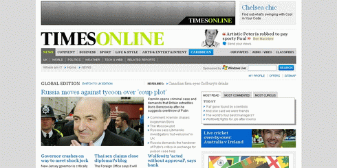
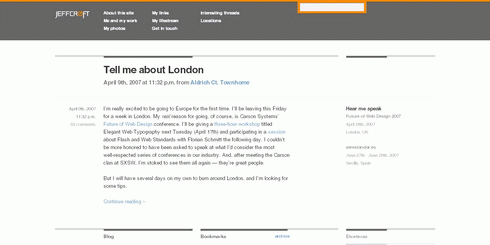
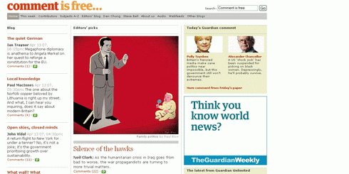
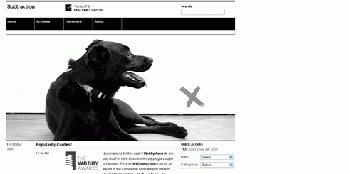
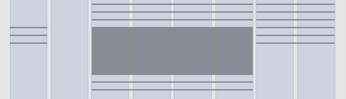
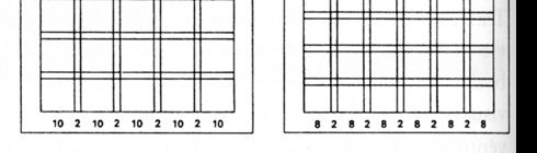
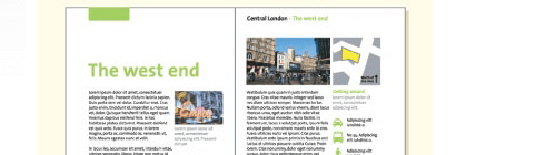
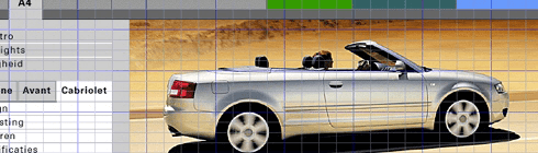
Examples of Grid-based design in 2007
But first few examples of grid-based designs to make clear what the article is about.


Things You Probably Don’t Know About Grid-based Design
- “The grid is the most vivid manifestation of the will to order in graphic design. […] Units are the basic buildung block of a grid. They’re all uniform. Columns are the grouping of units that create the visual structure of the page. They are not necessary uniform.”
- “A grid is a consistent system for placing objects. It works on two levels: At the unit level of cells (e.g. 20x20 pixels) and at the column level (e.g. 4 columns).” [ Grid-based Layout ].
- “A balanced and consistently implemented design scheme will increase readers’ confidence in your site. […] Your first step is to establish a basic layout grid. With this graphic “backbone” you can determine how the major blocks of type and illustrations will regularly occur in your pages. [..] To start, gather representative examples of your text, along with some graphics, scans, or other illustrative material, and experiment with various arrangements of the elements on the page. […] Your goal is to establish a consistent, logical screen layout, one that allows you to “plug in” text and graphics without having to stop and rethink your basic design approach on each new page.”
- “One of the larger problems in working with grids in web pages is that you often can’t do much about vertical proportions. Often your content is dynamic, so the best you can do is approximate. […] So the focus is usually on the horizontal layout, which usually means columns.” [ Dave Shea ]
- “On the Web, vertical rhythm – the spacing and arrangement of text as the reader descends the page – is contributed to by three factors: font size, line height and margin or padding. [..] The basic unit of vertical space is line height.” [ Richard Rutter ]
- “In order that typographic integrity is maintained when text is resized by the user we must use ems for all our vertical measurements, including line-height, padding and margins.” [ Richard Rutter ]
- “Designing Grid Systems in Graphic Design, 1. figure out the page size, 2. divide it into a grid, 3. start designing”. [ Josef Muller-Brockmann’s “Grid Systems in Graphic Design” ]
- “Use the canonical grid to adjust the sizes and positions of elements across rows. Short elements are extended to begin and end on grid boundaries, while long elements are allowed to span multiple grid units or are shortened to fit within the standard unit. In this way, the grid is merely being used to help establish consistent alignment relationships. […] For dynamic layouts, identifying the minimum size that can be accomodated by the layout is usually a better solution than trying to recompute the layout for arbitrarily small display sizes.” [ Module and Program ]
- “One of the most effective principles in grid design is called the Rule of Thirds, also known as the golden grid rule. The Rule of Thirds is a technique which is applied by dividing a space into thirds, both vertically and horizontally, creating a grid of rectangles.” — Mark Boulton
- “The Golden Section, Golden Ratio, and the grandiose Divine Proportion are all names for the same thing; a ratio of 1.618. Nodding off? Not yet? Good! Bear with me. Here?s the maths: the Golden Ratio is the ratio between two segments so that the ratio between point ac/bc is 1.618.” — Mark Boulton. You can also use Phiculator for your grids.
- “The Golden Section is a ratio which is evident throughout the universe as the number Phi. You can use this ratio to good effect in design by making sure that elements of your grid conform to this ratio. Using the Golden Section can ensure a natural sense of correct composition, even though it is based in mathematics it will ‘feel’ right.” — Mark Boulton
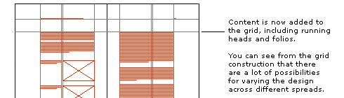
- “Grid Structures: Once you have answered most of the questions regarding the content, format and typography, you should begin sketching out grid structures based on the appropriate page sizes and formats. You should first begin by defining the Type Area. The Type Area is the area where your grid will be contained. It is surrounded on all sides by margins and in some cases running heads and page footers, numbers, marginalia, etc.” [ Typographic Grids ]
- “The main principle of the baseline grid is that the bottom of every line of text (the baseline) falls on a vertical grid set in even increments all the way down the page.” [ Wilson Miner ]
- “You can use relative sizes, but it quickly becomes a lot more difficult to maintain as the math becomes more complicated. It’s easy to get 12 out of 18 (just set the line-height to 1.5em), but when you want to adjust the text size but keep the same line-height, the fractions start to get messy”. [ Wilson Miner ]
- “Table layouts are great for grid designs. The markup itself reproduces a specific grid, and the tendency is for us to just fill up the boxes with the images, type, and interface elements that make up our design.” [ Molly Holzschlag ]
- “Ratios are at the core of any well designed grid system. [..] By using the size of the paper as a guide we can divide using that ratio to begin creating the grid. You can see this through diagrams 1 - 6 that we begin by simply layering division upon division to slowly build up the grid.” [ Mark Boulton ]
- “Well designed grid systems can make your designs not only more beautiful and legible, but more usable.” [ Mark Boulton ]
- “Gutters are the gaps in between columns. They are there so text, or image, from different columns don’t run into each other. In grid system design sometimes, depending on what theory you read, gutters are seperate to the columns.” [ Mark Boulton ]
- “The thing about designing to grids is that in order for the grid to work you must consistently align items on the grid lines.” [ Mark Boulton ]
- “One of the most useful ‘tools’ for creating pixel-perfect grid systems for the web is Khoi’s superb idea of using a grid as a background-image element on the body tag. To summarise: Using the grid I designed in photoshop, I save it out as a gif and then apply that to the background of the body tag. This provides me, throughout the build of the site, the grid so I can align all the content elements accordingly.” [ Mark Boulton ]
- “In your page layout, you’ve probably set margins. These margins often show up as light solid or dashed lines on the screen. These top, bottom, left, and right margins create a box in the middle of your page. Stop there and you have a single unit grid. Further divide the page into uniform parts and you’ve created a multiple unit grid.” [ Jacci Howard Bear ]
- “Grid units are the primary locations on your page where you will place text and images. They determine placement not necessarily size. That is, if you have a graphic image that is larger than your grid unit, it doesn’t mean you can’t use it. ” [ Jacci Howard Bear ]
- “1, 2, and 3 column grids are common. Each can accommodate lots of text, especially long articles. [..] 4 or more columns offer greater flexibility for publications with text, photos, and other graphic elements and a mix of long and short articles. [..] Grids based on an even number of grid columns can suffer from too much symmetry if text and graphics are confined to individual or double grid columns throughout.” [ Grids - Flexible Options ]
- “A grid is made up of vertical and horizontal lines and is the foundation of nearly every type of visual media. The structure is there to shape the content into proportions that are pleasing to the eye.” [ Anne Van Wagener ]
- “To add flexibility you can break the grid down into 10 or 12 columns. Half-columns are a good place to anchor mug-shots, refers, and other info.” [ Anne Van Wagener ]
- “You can have more than one grid. Your front page could be based on a five column grid while inside pages with ads on a six column. There is no one right way.” [ Anne Van Wagener ]
- “The grid is the mannequin and the comp is the pattern. [..] Using the grid-based design comps provided me with units of measurement that I could easily turn into divs for the style sheet. I figure out the areas of content in the same way I would work with a wireframe to block out content and graphics. I come up with a naming scheme for these blocks and turn them into CSS elements. Next, I measure out the blocks of content or graphics in the designer’s comp and record measurements for my style sheet.” [ Michael Angeles ]
- “You can use the grid like a wireframe (page schematic) by selecting areas of content and blocking them out, labeling them as you go.” [ Michael Angeles ]
- “Basic Outline for Grid-based Design: Content, Audience, Illustrations / Photography / Icons, Format, Typography.” [ Feeling your way around grids ]
Articles about Grid-based Design Approach
- Columns & Grids
Dave Shea talks about the difficulty of grid systems in web pages and the compromise of columns.
- Subtraction: Oh Yeeaahh! - "Grids Are Good" Download the "Grids are Good" presentation (8 MB PDF) created by Khoi Vinh and Mark Boulton. Layers Cake.
- Compose to a Vertical Rhythm On the Web, vertical rhythm – the spacing and arrangement of text as the reader descends the page – is contributed to by three factors: font size, line height and margin or padding. All of these factors must calculated with care in order that the rhythm is maintained.
- Design grids for Web pages No one design grid system is appropriate for all Web pages. Your first step is to establish a basic layout grid. With this graphic "backbone" you can determine how the major blocks of type and illustrations will regularly occur in your pages and set the placement and style guidelines for major screen titles, subtitles, and navigation links or buttons.
- Developing the grid that supports your design Just a few months ago when I created any design, I didn’t practice a grid system. I didn’t know much about it so I thought that I can live without it. Yes it’s true. You can live without a grid system, but should you? Why is the grid important? I will try to answer to all of your questions in this article.
- Grid-Based Design
Few basic rules and techniques in grid-based design.
- Typographic Grids Grids, Ratios and Typography. Theories, such as the golden ratio (also known as the golden mean, golden number, golden section, golden proportion, divine proportion and section aurea) arise from natural patterns and they are applied in the visual and creative fields to create "beauty" by way of considered composition. The Golden Section is derived from a naturally occurring number, called Phi (1.618), which has intrigued humanity for thousands of years.
- The Grid: The Structure of Design Using a grid is one of those basic design principles. Most news designers are working with a grid someone else designed. No matter what you think about it, you need to understand how to use it. And, at some point in your career you will likely be called upon to create a grid for a new section, or to do a re-design for a paper.
- Cutting and sewing grid-based design: Part 1,working with other people's comps
"In this article I'm going to discuss the steps I take when measuring and cutting a comp layed over a grid and turning that data into CSS. The point is to demonstrate the steps to site developers who are new to grids."
- The Principles of Design We can group all of the basic tenets of design into two categories: principles and elements. For this article, the principles of design are the overarching truths of the profession. They represent the basic assumptions of the world that guide the design practice, and affect the arrangement of objects within a composition.
- Grid-based design: Designing blog theme templates The previous grid article dealt with how to come up with a CSS strategy when you're working with another visual designer's comps. Now I'd like to discuss doing grid-based theme design for open source content management systems, e.g. Drupal and WordPress....
- Feeling your way around grids
Designing grids carefully and thoughtfully, using simple compositional theory, such as the Rule of Thirds or the Golden Section, increases the legibility of your designs. By using a grid a designer shows an understanding of systems within visual communication and a sympathetic knowledge of conventions.
- Grid-based Layout
A grid is a technique that comes from print design but easily be applied to web design as well. In its strictest form a grid is literally a grid of X by Y pixels. The elements on the page are then placed on the cell border lines and overall aligned on horizontal and vertical lines.
- Grid Computing… and Design A look at the layout grid behind the Subtraction's 7.0 redesign.
- Adobe Web Tech Curriculum - Page Layout Grids Introduction to Layout Grids. On each page layout grid, you'll want to decide placements for main content, branding or logo, page title, global and local navigation elements, copyright or contact information, etc.
- Setting Type on the Web to a Baseline Grid We web designers get excited about the littlest things. Our friends in the print world must get a kick out of watching us talk about finally being able to achieve layouts on the web that they’ve taken for granted for years. Let’s face it: it’s easier these days to embed a video on the web than it is to set type consistently or align elements to a universal grid....A List Apart Article by Wilson Miner
- The Funniest Grid You Ever Saw
An in-depth look at the complicated layout grid behind The Onion.

- Using a Background Image Grid to Lay Out Your Web Site "Simply put, you apply the grid to the body of your page as a background image so that it displays behind your site. Thus you can use it to precisely line up your layout." Article by Christian Watson.
- Why use a grid? Grid design is a fundamental skill of any designer. Understanding proportional relationships, white space and composition are all vital in constructing a grid for any delivery platform - web, print & real 3d environments.
- Wikipedia: Grid (page layout) A typographic grid is a two-dimensional structure made up of a series of intersecting vertical and horizontal axis used to structure content. The grid serves as an armature on which a designer can organize text and images in a rationalist, easy to absorb manner....
- Thinking Outside the Grid
“There is a new kid on the block, and her name is ‘I’ve never designed with a table in my career.’” An article by Molly E. Holzschlag

- Grids: Show 'em if you got 'em Grids are a topic that’s rarely discussed or disected in the online community, yet is one of the fundamental components of good design. Why is it that many designers have a hard time with the grid?
- Grid systems in Web Design An overview of grid-based techniques. Every design you make should have a clear grid system whether its print or for the web because they help to organise information into a clear easy to follow layout. Here we roundup the best articles and resources on the subject.
Tutorials
- Five simple steps to designing grid systems - Preface In the context of graphic design, a grid is an instrument for ordering graphical elements of text and images. The grid is a child of Constructivist art and came into being through the same thought processes that gave rise to that art movement.
- Five simple steps to designing grid systems - Part 1 The first part of this Five Simple Steps series is taking some of the points discussed in the preface and putting it to practice.
- Five simple steps to designing grid systems - Part 2
In part one of this Simple Steps series I talked about how to use a simple ratio, that of the paper size you are using, to create a symmetrical grid on which to create your designs. This, the second part in the series, will deal with other ratios and how they can be combined to create more complex grid systems.
- Five simple steps to designing grid systems - Part 3 The third installment to this series is going to be a little different. The previous installments have been talking through some of the basics of grid construction using ratios as the primary device.
- Five simple steps to designing grid systems - Part 4
For the purposes of this article, I'm going to be focussing on the theory of creating the grid rather than the implementation. I did mention in the last series that I would cover implementation using CSS, well I'm not going to.
- Five simple steps to designing grid systems - Part 5 Flexible vs Fixed. Which one to choose? Why choose one over the other? Well you won't find the answers to those questions here. What I'm aiming to do with this article is to investigate how the theory of grid design can be applied to a flexible web page.
- Grids make eyes happy: how to use Grids An example on how to create effective grid systems.
- Grids: Order Out of Chaos Invisible Structures: When and Why to Use Grids in Page Layout. Many of the pages that you see everyday have a grid. You may not see it but it is there, holding up the design, establishing structure, guiding the page elements.
- Designing Grid Systems for Flash I’ve decided that I’m going to write a little something up for those people interested in grids. I’m going to walk you through the process of creating a grid for a Flash based site that will work for screen resolutions of 1024×768 and up.
- How to Create Page Layouts in GoLive CS2 GoLive CSS-based or table-based layout grids enable you to create designs by freely positioning objects anywhere on the page. You can convert a CSS-based layout grid to a table-based layout grid. You can also convert a table-based layout grid to an HTML table.
Useful Tools for Grid-based Designs
- Adaptive Grid System based on the Golden Section The Columns are defined using em to keep line length consistent and varying text size using javascript to make the web page fill the browser window.
- Layout Grid Bookmarklet Inspired by Khoi Vinh’s post about using a background image of a grid for layout, and a subsequent post over at Smiley Cat about the same thing, I decided to knock up a quick Photoshop style Layout Grid Bookmarklet....
- Grid Overlay Bookmarklet Just a quick note to share my version of Andy Budd’s Layout Grid Bookmarklet.
- WPDFD Browser Grid This grid represents the maximum safe sizes for the three main monitor sizes in use today (June 2001). It takes into account such things as browser menubars and scrollbars and assumes that the browser window has been maximised. 640 x 480, 800 x 600, 1024 x 768
- Free Online Graph Paper / Grid Paper PDFs Downloadable and very printable
- Gridding the 960
Background image grid + pixel ruler + column divisions for 960px-width layout, all in one mean little package.
- Web Page Layout Grid Add this image as a background to the body of your page to help you lay it out.
- Position is Everything - Vertical Grids A method enabling the vertical positioning of elements across grids/columns
- CSS Grid Calculator Use the CSS Grid Calculator to quickly visualize page layout and draw grids in a variety of ways. It provides accurate visual feedback on how text blocks and page divisions will appear within a browser window, and returns style declarations for divisions and text to copy and paste into style sheets.
- TypoGridder To get to the heart of it: a baseline grid is added. You initialize the TypoGridder and it automatically gets the lineheight of an element (by default p, but you can choose any jQuery selector). Then it queries a little PHP script which creates a very simple image which is used for tiling. The result is an opaque layer with a tiling baseline grid.
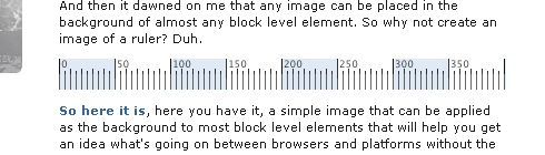
- Grid Ruler
A simple image that can be applied as the background to most block level elements that will help you get an idea what's going on between browsers and platforms without the need for another application.
- YUI: CSS Grid Builder A simple interface for Grids customization.
- YUI Grids CSS The foundational YUI Grids CSS file offers three preset page widths, seven core templates, and the ability to nest subdivided regions of one to four columns..
- How to play with Yahoo Grids CSS Yahoo released their Yahoo! User Interface. One part of which is their webpage templates, the Grids CSS. To follow along you will need to download the YUI library, a working test Drupal install and a text editor of some sort.
- Page Grids Successful web page design often leverages methods rooted in print design by utilizing an underlying grid system. First, establish a grid, or system of grids, that take into account advertising needs, dynamic elements, etc. Next, create templates and code to support designers and developers..
- Hacking Technique: Yahoo's Grid System (Part 1) "And what Yahoo! UI CSS Grid has to do with us? Well, I tried to integrate Yahoo! Grid into Blogger Beta, and the result was sweet. By injecting some additional CSS code and some div tags into the simplified version of the Beta template, one can rearrange one's layout without any CSS knowledge. This article will show you how to do that."
- Hacking Technique: Yahoo's Grid System (Part 2) In this post, I get into some technical details, and it also serves as a note for myself in finding interesting things about the Yahoo! CSS Grid system. Read on if you curious on how 3, 4, or 5 columns can be achieved.
- OS3Grid - Grid for Web Sites OS3Grid a JavaScript component allowing you to create and use powerful grids in your web sites. As you can see from the Examples OS3Grid is both flexible and powerful, with a rich set of features and an easy to use API for the developer.
Grid design-related books
- “Grid Systems in Graphic Design” by Josef Muller-Brockmann
- “Geometry of Design: Studies in Proportion and Composition” by Kimberly Elam
- “Grids for the Internet and Other Digital Media” by Veruschka Gotz
- “Geometry of Design” by Kimberly Elan
- “The Elements of Typographic Style” by Robert Bringhurst
- “Making and Breaking the Grid: A Graphic Design Layout Workshop” by Timothy Samara


