Smarter Grids With Sass And Susy

Email Newsletter
Weekly tips on front-end & UX.
Trusted by 182,000+ folks.
 Register for Free
 Celebrating 10 million developers
 Custom Web Forms for Angular, React, & Vue. Your backend.

If you’re a designer, you’ll know that grids are your friends. More often than not, they’re the vital architecture that holds a beautiful design together; they create rhythm, structure your page, lead the eye, and prevent the whole thing collapsing in a sloppy mess.
I’m a firm advocate for designing with the browser: prototyping with HTML and CSS has many clear advantages over static Photoshop comps, which have less value for the responsive web. Unfortunately, HTML, CSS and grids aren’t natural bedfellows: the progression of web standards over the years has been lacking in this area, meaning we have to grapple with floats (which were never designed to be used this way) and clearfixes — not ideal when you want to spend less time debugging layout and more time crafting experiences.
The relatively new implementation of the flexbox and CSS grid layout modules are on course to free us from the constraints of floats and allow us to create some pretty interesting layouts — which I’m excited about — but they’re not a magic bullet. Even with those, coding up a layout can still be a lengthy process for a designer, and require you to remember a bunch of not very intuitive properties.
Happily, lots of tools currently exist to enable you to quickly design grids for the web, from CSS frameworks like Bootstrap and Foundation, to sites like Responsive Grid System. However, frameworks have their drawbacks, such as requiring you to add a large number of classes to your markup, and delivering a bloated codebase that can be bad for performance.
Luckily for us, solutions exist to the problem of creating fast, responsive, fully customizable grids: Susy is a Sass-based grid framework. It’s very lightweight and enables you to create entirely custom grids in CSS without touching your markup.
Susy was developed by Eric M. Suzanne, with support from Chris Eppstein — creator of Compass and co-creator of Sass — so it’s very well supported in the Sass community and it’s rapidly gaining in popularity.
Framework Or Not?
I tend to refer to Susy as a framework, but it may be more accurate to call it a grid system. Unlike more traditional frameworks, Susy doesn’t require you to add classes to your HTML elements. Susy is written entirely in your SCSS file by adding mixins and functions, using media queries to customize your layout at your own specified breakpoints. It enables you to keep content and style entirely separate — not essential all the time, but widely viewed as best practice.
Before we continue, I should point out that Susy isn’t the only solution: Zen Grids by John Albin and Jeet by Cory Simmons are two others. Singularity is also a pretty interesting framework, which works in a similar way to Susy, using Sass mixins rather than adding classes to your HTML. However, Susy has a growing community and helpful documentation, making it a good choice to get started with.
Advantages
Why might you want to use Susy in your next project? There are several advantages:
- (Relatively) Easy to Learn
If you’ve used other frameworks (like Bootstrap or Foundation), and if you’re familiar with Sass at all, Susy shouldn’t be too difficult for you to pick up. Even if you’re fairly new to Sass, Susy doesn’t require in-depth knowledge and is a great way to start! The examples in this article assume a working knowledge of Sass, so it’s worth reading up a little if you’re not familiar. - Speed Up Your Workflow
Unlike many other frameworks, Susy doesn’t come with a bunch of default styling that you need to overwrite. In fact, Susy has no styling: it’s purely a grid layout system. Its purpose is to do the maths for you — anything else is for you to add. Once you’re familiar with a few of Susy’s mixins, you’ll find it’ll save you time and free you up to concentrate on design. - Use as Much or as Little as You Like
As with Sass, you can pick and choose what works for you. We’ll focus on a few fairly simple examples here, but you can use Susy to do some pretty complex things if you’re so inclined!
I should also point out that while Susy currently relies on traditional floats to position your grid, the documentation indicates that flexbox and CSS grid layout could well be forthcoming, which will make it even more powerful!
Getting Started
Susy was designed to work with Compass, so if you already have Compass installed then setting up Susy is straightforward. You don’t actually need to use Compass in order to use Susy — Susy is compatible with just about any Sass workflow — but for the purpose of getting started I’ll be using Compass as a primary example.
To install Susy, simply run the following in the command line:
$ gem install susy(If you get an error, you may need to prefix this command with sudo.)
Then set up your new project. If you’re using Compass, in your config.rb you need to add require 'susy'. Then, in your main SCSS file (in this case screen.scss) add @import "susy"; to import Susy into your project.
Alternatively, CodeKit is an excellent app for getting up and running with everything you need and allows you to add Susy to your project quickly and easily.
Finally, we need to create an index.html file in our project folder to house our markup, and link it to our style sheet.
Building Our First Susy Grid
Assuming you’ve gone through the necessary steps to run Susy in your project, we’re ready to create our first layout. First of all, we need to define some parameters for our grid in a map at the beginning of our main SCSS file. If you’ve come across Sass maps, you’ll be familiar with the syntax:
$susy: (
  columns: 12,
  container: 1200px,
  gutters: 1/4,
  global-box-sizing: border-box,
  debug: (image: show)
);
In this map you can define pretty much any of the global settings for your grid, from the number of columns to gutter width, all of which are listed in the Susy documentation. If you don’t enter a setting in your map, Susy will simply use its default settings. There are a few things we’ll need to define to create our grid:
- The number of columns we’ll use.
- The maximum width of the container. If you don’t specify a width, your container will be 100% of the width of the viewport, like any block element. You might want this in some cases but, especially while we’re learning, setting a maximum width allows us to see more clearly what’s going on.
- Gutters. By default Susy includes gutters as right-hand margins on your columns and at one quarter (
1/4) of the column width. You can change the gutter ratio here, or use[gutter-position](https://susydocs.oddbird.net/en/latest/settings/?highlight=gutters#gutter-position)to decide how you want gutters to behave. - Box-sizing. I always prefer to set this to
border-box. (Susy’s default iscontent-box.) - The debug image. Setting this to
showdisplays a background image showing your column grids, useful for making sure everything is aligned correctly and your elements behave as they should.
Creating A Basic Layout
We’re going to start by creating this simple layout using Susy:

See the Pen Susy Grid Example 1A by Michelle Barker (@michellebarker) on CodePen.
We’ll start with some markup containing a header, a main content area with article and sidebar, and a footer.
<main class="wrapper">
  <header></header>
  <article></article>
  <aside></aside>
  <footer></footer>
</main>
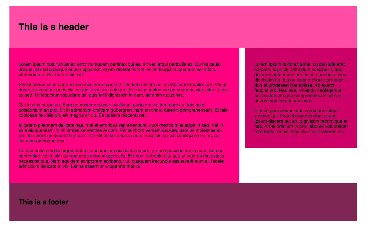
As I previously mentioned, Susy depends entirely on CSS and Sass to customize your grid, so you don’t need to add anything else to your HTML. The most important feature for creating grids in Susy is the span mixin. Use @include to include the mixin in your Sass. As you can see from the image, we want our header and footer to take up 100% of the container width, so we don’t need to do anything here. But we need our <article> and <aside> elements to take up eight columns and four columns respectively in our twelve-column grid. In order to achieve this we need to use the span mixin:
/* SCSS */

article {
  @include span(8 of 12);
  /* More styles here */
}

aside {
  @include span(4 of 12 last);
  /* More styles here */
}
There are a couple of things to note here:
- Susy depends on context: we could easily write
@include span(8)for the<article>element, which would produce the same result because we already defined our layout as four columns in the map. However, if we wanted to override the map for this particular element (say, subdivide this area of our layout into a greater number of columns), we need to specify the context — in this case, twelve columns. - We want the
<aside>to be the last item in the row, so we’ve added the wordlastto the mixin. This tells Susy to remove the right-hand margin on that element so that it fits on the row.
If we take a look at our CSS file, we’ll see the above Sass compiles to:
article {
  width: 66.10169%;
  float: left;
  margin-right: 1.69492%;
}

aside {
  width: 32.20339%;
  float: right;
  margin-right: 0;
}
You can see that Susy has calculated our column widths and gutters based on the settings we specified in our map.
In the Codepen example I’ve included some dummy content, as well as a little padding and a background color on our elements. Without these our grid would simply be invisible, as Susy has no default styling.
As we’re floating elements, we also need to remember to clear our footer:
header {
  padding: 2em;
  background-color: #FF4CA5; /* Of course, you can define your colours as variables if you prefer! */
}

article {
  @include span(8);
  padding: 2em;
  background-color: #ff007f;
}

aside {
  @include span(4 last);
  padding: 2em;
  background-color: #CC0066;
}

footer {
  clear: both;
  padding: 2em;
  background-color: #7F2653;
}
Finally, we’ll include the container mixin in our main element to give our content a maximum width and position it in the center of the page by setting the left and right margins to auto:
main.wrapper {
  @include container;
}
With these additions, we get this result:
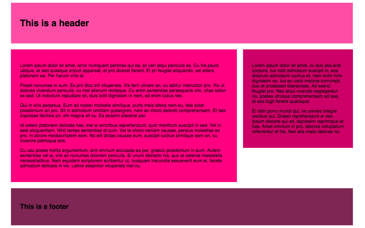
Refining Our Grid
We could do with separating the elements to make our layout more pleasing. Let’s add a bottom margin to our <header>, <article> and <aside> elements. What would make an even more appealing layout would be to make our bottom margins the same width as our column gutters. With Susy, we can do this using the gutter function (as opposed to the mixin):
header, article, aside {
  margin-bottom: gutter();
}
As we haven’t specified a value in the gutter function, Susy will use our map settings; that is, 1/4 column-width in a twelve-column layout. But if, for instance, the section we were working on was only eight columns wide, we may want to specify gutter(8) to create the same effect.
Our SCSS file now looks like this:
main {
  @include container;
}

header, article, aside {
  margin-bottom: gutter();
}

header {
  padding: 2em;
  background-color: #FF4CA5;
}

article {
  @include span(8);
  padding: 2em;
  background-color: #ff007f;
}

aside {
  @include span(4 last);
  padding: 2em;
  background-color: #CC0066;
}

footer {
  clear: both;
  padding: 2em;
  background-color: #7F2653;
}
Now our layout looks like this:
Mixins Vs. Functions
We just used gutter as a function, as opposed to including it in a mixin. It’s worth noting that span, gutter and container can all be used as both mixins and functions. The Susy documentation outlines use cases for each, but our next example should help give you an understanding of the circumstances in which a function might be useful.
Creating A Gallery
There’s one more thing that will no doubt be extremely handy to you as a designer: the gallery mixin. As the Susy documentation succinctly puts it, “Gallery is a shortcut for creating gallery-style layouts, where a large number of elements are layed [sic] out on a consistent grid.” It’s great for unordered lists, for example, if you want to create a portfolio page.
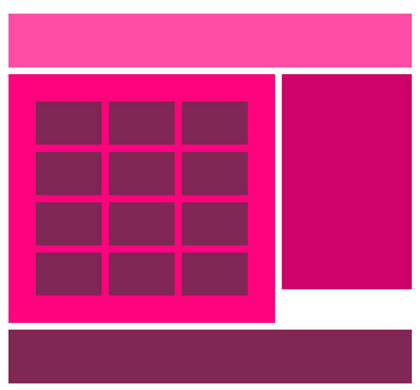
Below is the CodePen for this gallery layout.
See the Pen Susy Grid gallery example by Michelle Barker (@michellebarker) on CodePen.
We’ll use the following markup for a gallery of twelve items — again, I’ve added some placeholder content in the Codepen example:
<main>
  <header></header>
  <article>
    <ul class="gallery">
      <li></li>
      <li></li>
      <li></li>
      <li></li>
      <li></li>
      <li></li>
      <li></li>
      <li></li>
      <li></li>
      <li></li>
      <li></li>
      <li></li>
    </ul>
  </article>
  <aside></aside>
  <footer></footer>
<main>
We’ll keep the same SCSS from the previous example, with the addition of the following:
ul.gallery {
  padding: span(1 of 8);
  list-style: none;
}

.gallery li {
  @include gallery(2 of 6);
  margin-bottom: gutter(6);

  &:nth-last-child(-n + 3) {
    margin-bottom: 0;
  }
}
There are a few things going on here:
- First, we’re using
spanas a function to add one column-width of padding all the way around our gallery. As the element is eight columns wide, taking up one column-width on either side leaves us with the remaining six columns for our gallery items. - Using the
gallerymixin on our<li>element (@include gallery(2 of 6)), we’re telling Susy that each item should take up two columns in our six-column width. That means that each row will hold three gallery items. - Using the
gutterfunction (margin-bottom: gutter(6)) we’re adding a bottom margin the equivalent of one gutter-width in our six-column context to each item in our gallery. I’m using the:nth-childpseudo-class to remove the bottom margin from our last row, giving us a perfectly even amount of spacing around our gallery. - As we’re floating elements, we’ll also need a clearfix on the parent element (in this case the
ulelement). In the example, I’m using Compass’s clearfix, but you could create your own mixin, or write it longhand.
ul.gallery {
  @include clearfix;
}
Result:
Susy For Responsive Web Design
Although the examples we’ve walked through so far are based on fluid grids (Susy’s default), they aren’t responsive — yet. At the beginning of this article I mentioned that Susy is a great tool for designing responsively. Let’s look at one more example to see how we can use Susy to create a layout that adapts to different viewport sizes.
In this demo we’ll use use media queries in our Sass, along with Susy’s layout mixin to customize our grid for different breakpoints.
You’ll recall that at the beginning of our SCSS file we created a map with our global settings. In fact, we can create any number of maps and summon them at will into our layout with this mixin. This is useful if at a certain breakpoint you want to switch from, for instance, a twelve-column to a 16-column layout with no gutters. Our second map may look something like this:
$map-large: (
  columns: 16,
  container: auto,
  gutters: 0,
  global-box-sizing: border-box
);
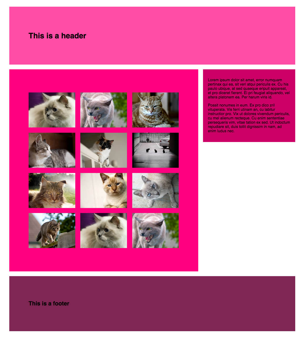
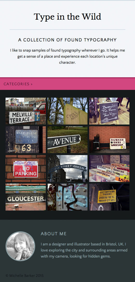
For this example I’ve created a simple gallery webpage displaying a collection of photos of found typography. Taking a mobile-first approach, our first step is to create a single-column view, where our main elements take up the full width of the page. However, in our gallery section, we want our images to display in rows of two once our viewport gets wider than, say, 400px and in rows of three after 700px. We’re using a twelve-column grid in our global settings, so all we need to do is instruct Susy to set our gallery items at six columns out of twelve, and four columns out of twelve respectively, in min-width media queries:
li {
  @media (min-width: 480px) {
    @include gallery(6);
    margin-bottom: gutter();
  }
  @media (min-width: 700px) {
    @include gallery(4);
    margin-bottom: gutter();
  }
}
At widths above 700px, this is what our webpage looks like:
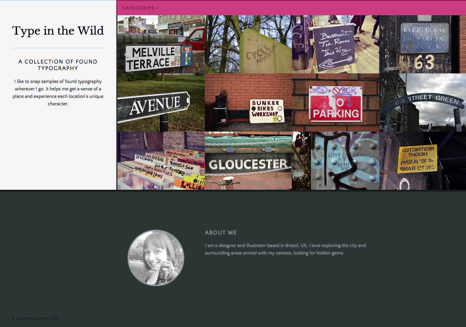
At desktop sizes we’re going to make our layout a little more complex. Here we want our header to display as a bar on the left-hand side and our gallery items to display in rows of four on the right of the screen, with no gutters. To achieve this we’re going to switch to a 16-column layout, as defined in the new map we created a moment ago.
We’re going to use the layout mixin as follows:
@media (min-width: 1100px) {
  @include layout($map-large);

  header {
    @include span(4);
  }

  main {
    @include span(12 last);
  }

  li {
    @include gallery(3 of 12);
    margin-bottom: 0;
  }
}
The layout mixin sets a new layout for our grid. Any code following this mixin will be affected by the 16-column layout we specified. (Note: if you want to revert back to a different layout, you’ll need to use this mixin again to call a different map, as your code will be affected by this mixin until you specify otherwise!)
In this instance, the <header> element will span 4 colomns out of 16 and the main content area will span the remaining 12 out of 16 columns. Because our gallery items are nested within this 12-column section, we should specify that they take up 3 columns out of 12 (rather than 16).
The above code gives us this layout at desktop sizes:
Here’s the CodePen for this responsive layout.
See the Pen Responsive layout with Susy by Michelle Barker (@michellebarker) on CodePen.
Dealing With Sub-Pixel Rounding
If you’re working with percentage-based grids you’re going to come up against sub-pixel rounding issues. These occur when percentages result in column widths that subdivide a pixel, so the browser rounds your column width up or down by a pixel to compensate. This may mean your layouts don’t always behave as you might expect. For a full explanation of sub-pixel rounding, read “Responsive Design’s Dirty Little Secret” by John Albin Wilkins.
Susy provides a workaround for dealing with sub-pixel rounding via its isolate technique, and it’s a handy port of call when your layouts aren’t playing nice.
Conclusion
I hope this article has helped you get started with Susy and provided a small taste of what is possible. Once you spend a little time getting the hang of it, you’ll see how easy and fast it is to create simple or complex layouts without a huge amount of code; and it really will save you time in the long run.
Here are some useful links and resources to help you get started with Susy:
- Zell Liew has (literally) written the book on Susy and regularly publishes easily accessible tutorials.
- “Sass Grids: From Neat to Susy”: this SitePoint article provides a useful introduction to some of Susy’s mixins.
- The Susy website has a comprehensive list of video tutorials and articles.
- “Build Web Layouts Easily with Susy”: this CSS Tricks article by Zell Liew is an excellent intro, and explains sub-pixel rounding.
Further Reading
- Extending In Sass Without Creating A Mess
- An Introduction To Object Oriented CSS (OOCSS)
- Getting Started With CSS calc()
- Responsive Typography With Sass Maps
 (ds, ml, og, mrn)

