Vitaly Friedman loves beautiful content and doesn’t like to give in easily. When he is not writing, he’s most probably running front-end & UX …More about
Vitaly ↬
Data presentation can be beautiful, elegant and descriptive. There is a variety of conventional ways to visualize data - tables, histograms, pie charts and bar graphs are being used every day, in every project and on every possible occasion. However, to convey a message to your readers effectively, sometimes you need more than just a simple pie chart of your results. In fact, there are much better, profound, creative and absolutely fascinating ways to visualize data. Many of them might become ubiquitous in the next few years.
Data presentation can be beautiful, elegant and descriptive. There is a variety of conventional ways to visualize data - tables, histograms, pie charts and bar graphs are being used every day, in every project and on every possible occasion. However, to convey a message to your readers effectively, sometimes you need more than just a simple pie chart of your results. In fact, there are much better, profound, creative and absolutely fascinating ways to visualize data. Many of them might become ubiquitous in the next few years.
So what can we expect? Which innovative ideas are already being used? And what are the most creative approaches to present data in ways we’ve never thought before?
Let’s take a look at the most interesting modern approaches to data visualization as well as related articles, resources and tools.
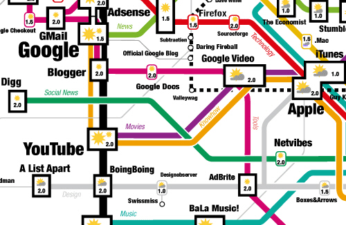
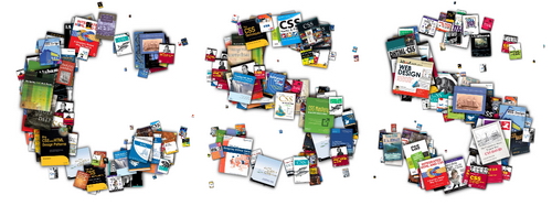
Informationarchitects.jp presents the 200 most successful websites on the web, ordered by category, proximity, success, popularity and perspective in a mindmap. Apparently, web-sites are connected as they’ve never been before. Quite comprehnsive.
2. Displaying News
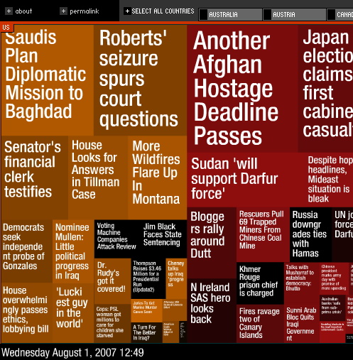
Newsmap is an application that visually reflects the constantly changing landscape of the Google News news aggregator. The size of data blocks is defined by their popularity at the moment.
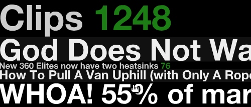
Digg BigSpy arranges popular stories at the top when people digg them. Bigger stories have more diggs.
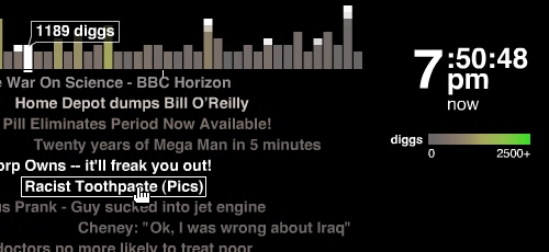
Digg Stack: Digg stories arrange themselves as stack as users digg them. The more diggs a story gets, the larger is the stack.
3. Displaying Data
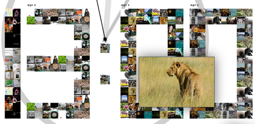
Amaztype, a typographic book search, collects the information from Amazon and presents it in the form of keyword you’ve provided. To get more information about a given book, simply click on it.
Similar idea is being used by Flickrtime. The tool uses Flickr API to present the uploaded images in real-time. The images form the clock which shows the current time.
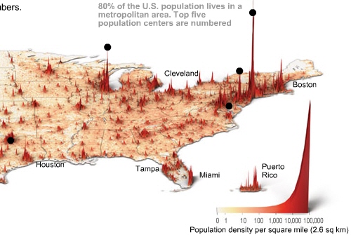
Time Magazine uses visual hills (spikes) to emphasize the density of American population in its map.
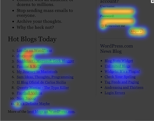
CrazyEgg lets you explore the behavior of your visitors with a heat map. More popular sections, which are clicked more often, are highlighted as “warm” - in red color.
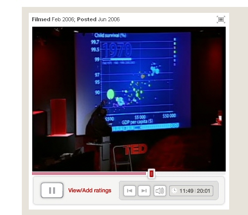
Hans Rosling TED Talk is a legendary talk of the Swedish professor Hans Rosling, in which he explains a new way of presenting statistical data. His Trendalyzer software (recently acquired by Google) turns complex global trends into lively animations, making decades of data pop. Asian countries, as colorful bubbles, float across the grid – toward better national health and wealth. Animated bell curves representing national income distribution squish and flatten. In Rosling’s hands, global trends – life expectancy, child mortality, poverty rates - become clear, intuitive and even playful.
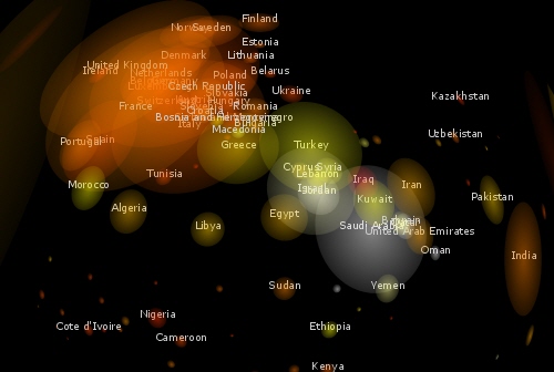
Three Views shows three views of the earth, in which each country is represented by a circle that shows the amount of money spent on the military (size of circle) and what fraction of the country’s earnings that uses (colour). Compact and beautiful presentation of data.
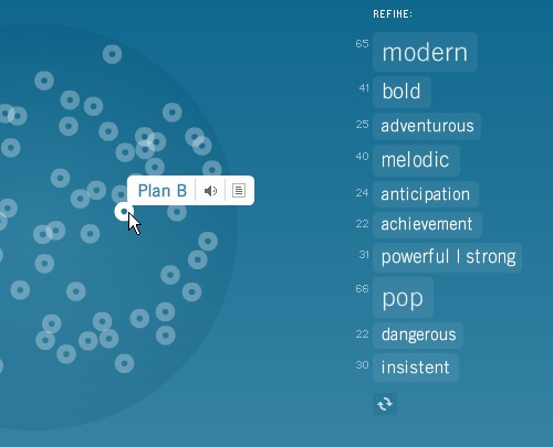
Burst Labs suggests similar or connected items to your search queries (favourite artists, tv shows, movies, genres etc.) in a bubble. Not really new, but still inspiring.
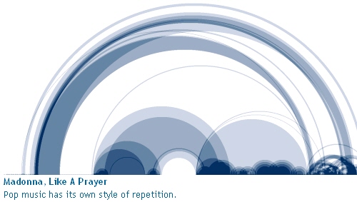
Shape Of Song: What does music look like? The Shape of Song is an attempt to answer this seemingly paradoxical question. The custom software in this work draws musical patterns in the form of translucent arches, allowing viewers to see - literally - the shape of any composition available on the Web.
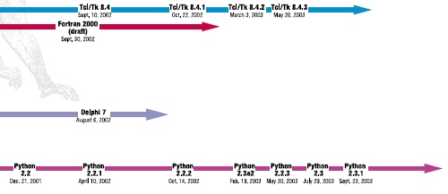
Lanuage Poster proves that even simple lines can be descriptive enough. The History of Programming Languages as an original timeline.
5. Displaying web-sites
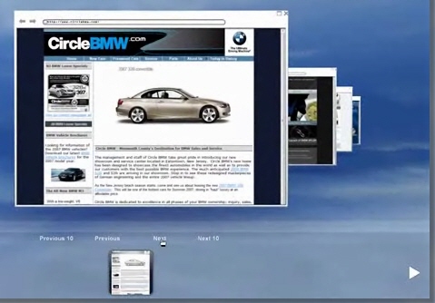
Spacetime /Flash)offers Google, Yahoo, Flickr, eBay and images in 3D. The tool displays all of your search results in an easy to view elegant 3D arrangement. Company promises that the days of mining through pages and pages of tiny thumbnails in an effort to find the item you are looking for are over.
6. Articles & Resources
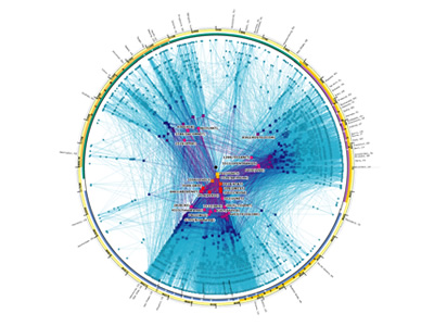
Visualcomplexity.com The project presents the most beautiful methods of data visualization as well as further references and book suggestions. The gallery has over 450 entries.

 SurveyJS: White-Label Survey Solution for Your JS App

 Celebrating 10 million developers
 Register Free Now