How To Draw A Cartoon In Illustrator

Email Newsletter
Weekly tips on front-end & UX.
Trusted by 182,000+ folks.

 Celebrating 10 million developers
 Custom Web Forms for Angular, React, & Vue. Your backend.

Drawing a cartoon is no trivial pursuit. It turns us into a director, writer, narrator. Through a cartoon or comic, you tell a story that takes place in a certain time, a certain environment, with certain characters.
This is why you will learn here not just how to draw a cartoon in Adobe Illustrator, but how to decide on character, place and situation. Before grabbing your pencil or software tool, ask yourself, “What will be my topic?”
- How many characters you will use, and who will they be?
- What background will they move against?
- What era will they live in?
- In what scene will you put them?
Through the steps in this tutorial, I will explain to you my own choices. Let’s begin.
1. The Subject
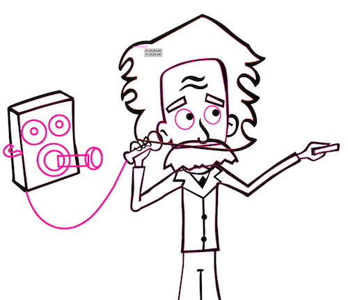
The topic I’ve chosen for my cartoon relates to a recent discovery. For the first time, we’ve picked up a signal caused by gravitational waves. Albert Einstein first theorized the existence of gravitational waves in 1918. Exciting!
So, what better topic for my cartoon?
2. The Character
The character I’ll draw, then, is Einstein.
Open Adobe Illustrator.
Insert the file I’ve provided in Illustrator by going to “File” → “Place.”
Now, adjust the artboard by going to “Object” → “Artboards” → “Fit to Artwork Bounds.” The dimensions of your artboard should now match the file you’ve just inserted: 2305 × 3250 pixels.
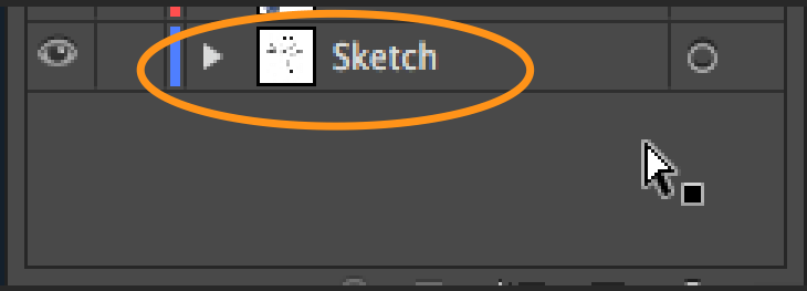
Block the layer where you’ve just put the file. Double-click on the layer’s name and rename it “Sketch.”
Create another layer above the “Sketch” layer by hitting Command + L on a Mac or Control + L on Windows, and call it “Lines.”
Now, we need to trace the image with the Pen tool (P), similar to how I showed you in my previous tutorial.
What we are going to learn here is not the mere tracing of shapes, but rather how to trace the black outline of a drawing.
We do this because we are drawing a cartoon, and cartoons usually have this black outline around the shapes to distinguish them.
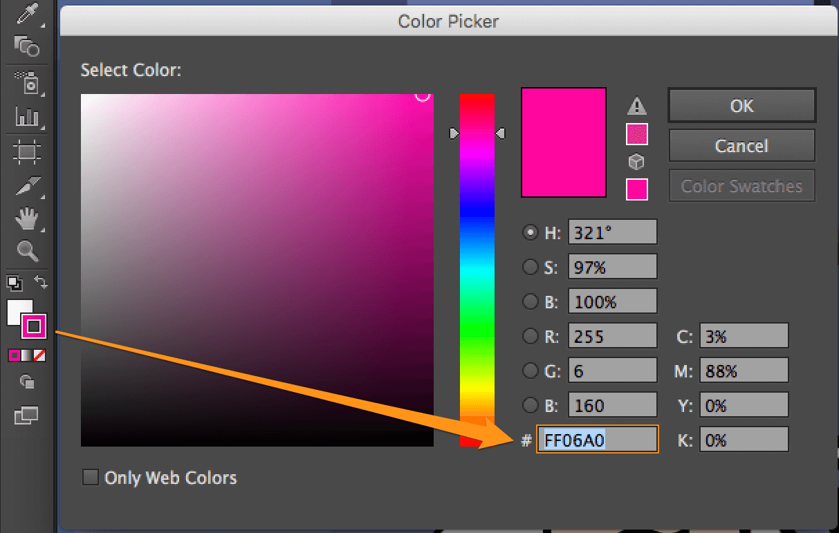
Double-click on the stroke’s color, and set the hexadecimal value to #FF06A0.
We use this color to distinguish our lines on the artboards. We will change it later.
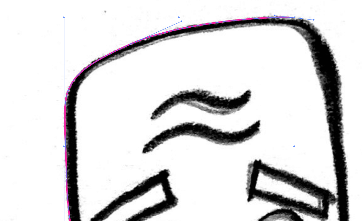
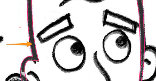
Zoom into the drawing at 200%, and begin to draw the face outline with the Pen Tool (P).
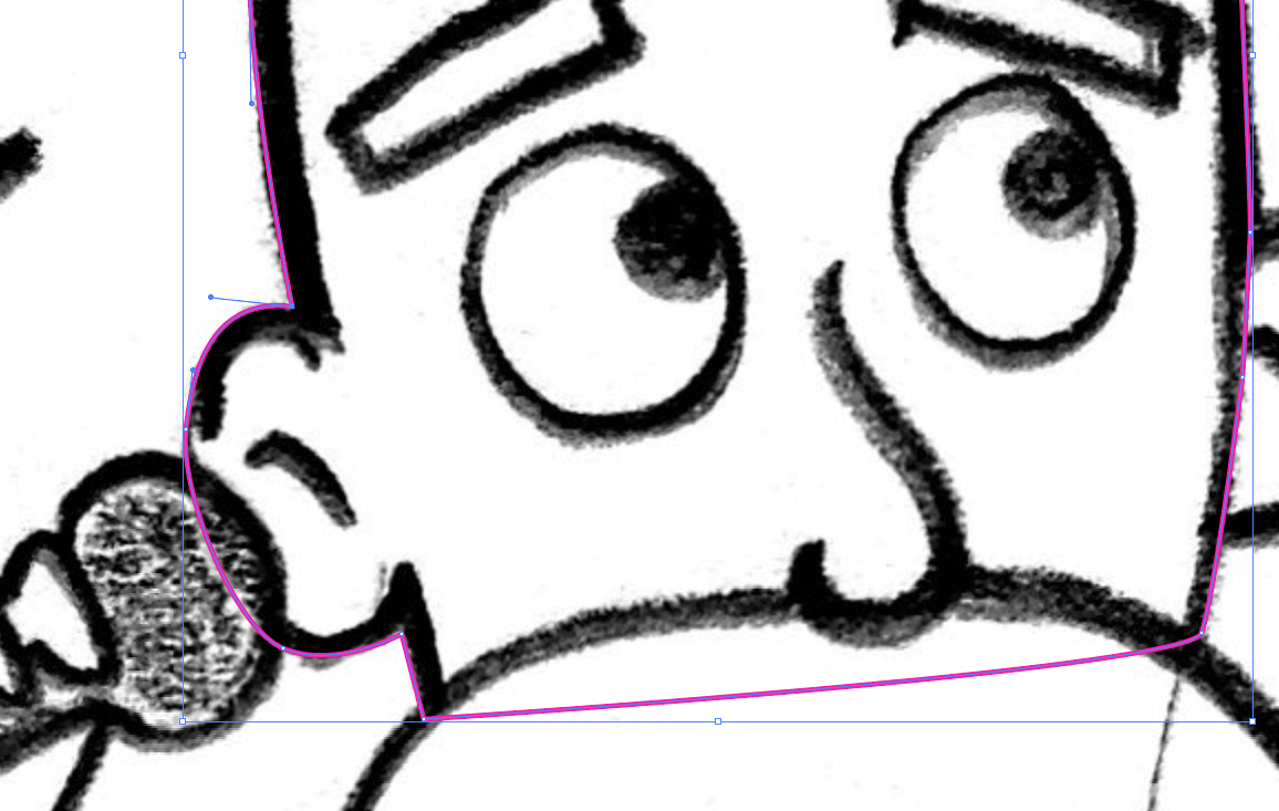
Do this until you’ve drawn the top of the head.
Once you’ve finished drawing the head’s outline, draw the internal outline.
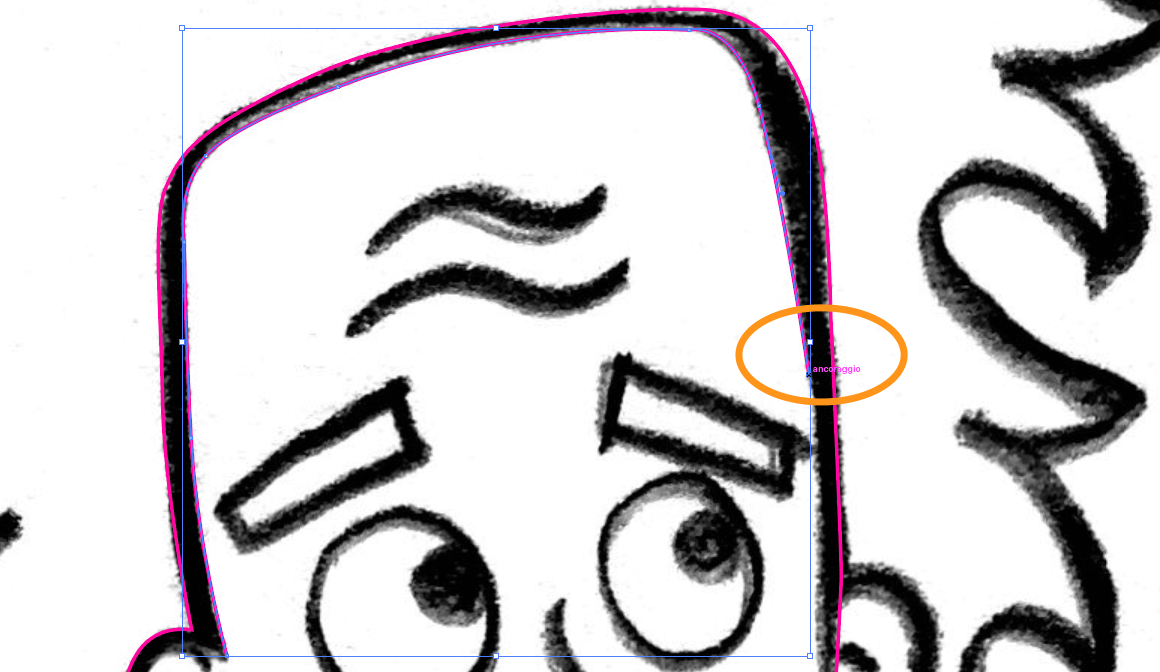
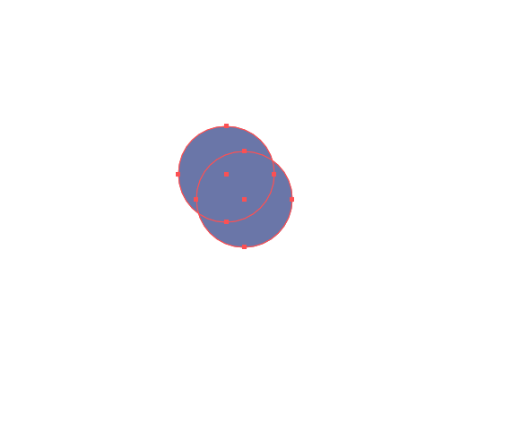
Now, select both outlines you’ve created, the external and internal one, and click on the Shape Builder tool (Shift + M).
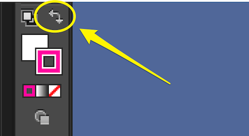
Go to the button to swap the fill and stroke color (Shift + X), and click on that little arrow. The stroke’s color should now be changed to the fill’s color.

Now, enable the Shape Builder tool (Shift + M), and put the cursor in the empty space between the two outlines we created before. You will see something like a transparent background, which indicates the space where the Shape Builder tool will create a shape.
Just click and you will see the selected area be given the fill color.
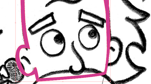
Thus, we’ve created a fill-colored outline for our cartoon.
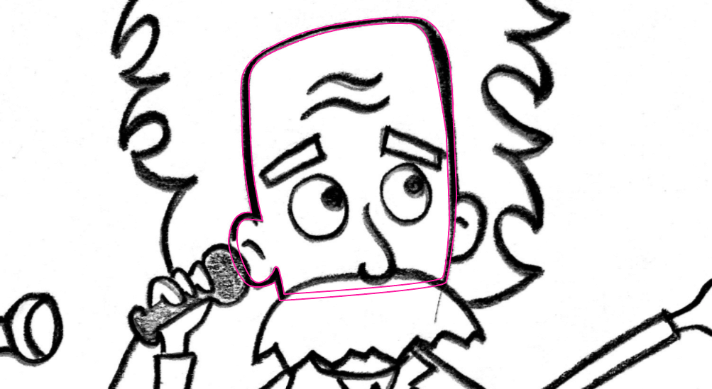
Now, let’s repeat the same action with the other body parts: mustache, eyes, ears, nose, hair and so on.
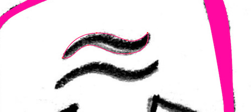
For the little shapes, like the forehead wrinkles, you can just draw a closed shape and then swap the stroke with the fill.
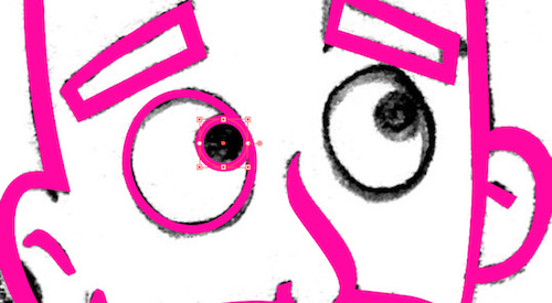
For shapes like the eyes, use the Ellipse Tool (L) and set the stroke weight to 8 points.
This is our work so far. Notice how I’ve closed the paths, even if they cover the face. I did that because we will be able to fill the shape with color with just a click, simply by creating a closed path.
Then, we will hide some parts, positioning one part over another. But we will see that later.

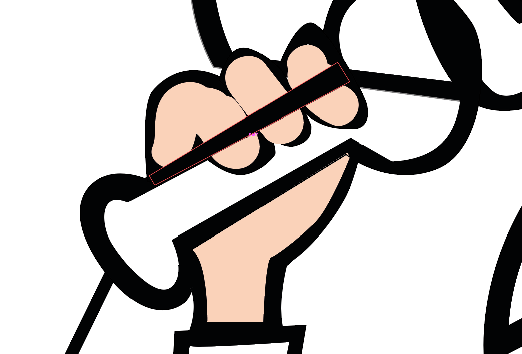
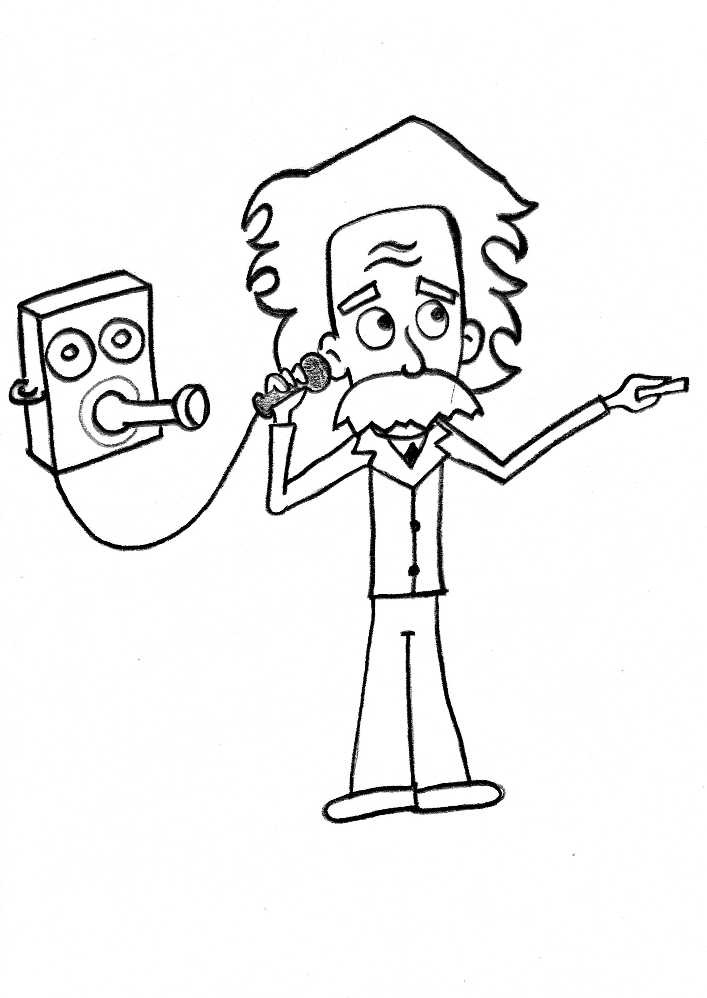
It’s a little different for the hand holding the old phone. Here, you have to draw the hand in two shapes: the fingers and the palm. Do it using Pencil Tool (N).
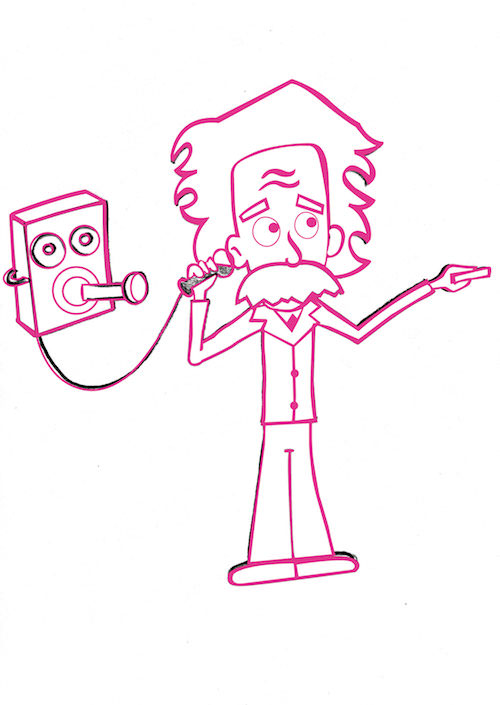
Et voilà! Here is our drawing:
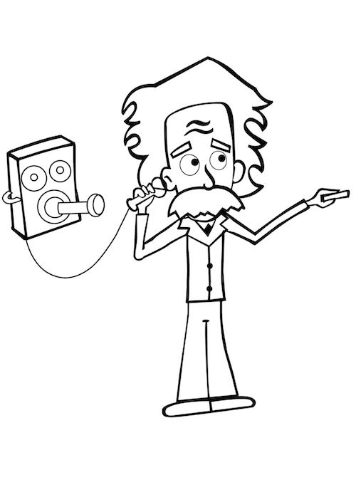
Hide the “Sketch” layer, and you will see your clean vector.
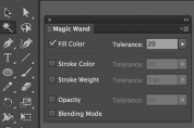
Now, double-click on the Magic Wand tool (Y), and select “Fill Color” in the popup window, setting the tolerance to 20.
After you’ve set the tool this way, it will select all objects with the same fill color. Just click on your work to see it in action.
After you’ve selected them, double-click on the fill color and set it to #000000. Your image should look like this:
Double-click again on the Magic Wand Tool (Y) and select “Stroke Color,” setting the tolerance to 20. Click on your image, and all strokes with the same color will be selected now. Set the color to #000000.
Now, our image will have all black outlines.
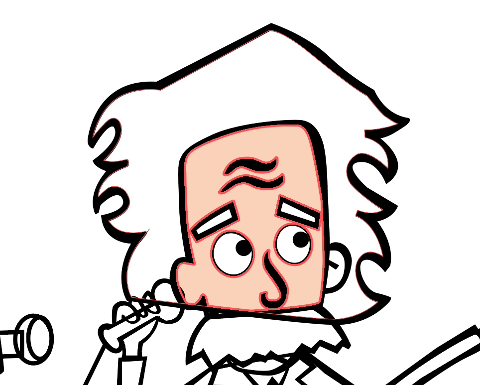
Let’s color Einstein.
Set the skin color to a hexadecimal value of #FBD2B7.
Select the head with the Selection tool (V), and then click on Live Paint Bucket (K). Click on the face to fill it with the selected color.
Do the same with the other shapes, giving them the same color: ears, chin, neck, hands. Remember that you have to select a group of objects first and then color them with the Live Paint Bucket (K), or else it won’t work.
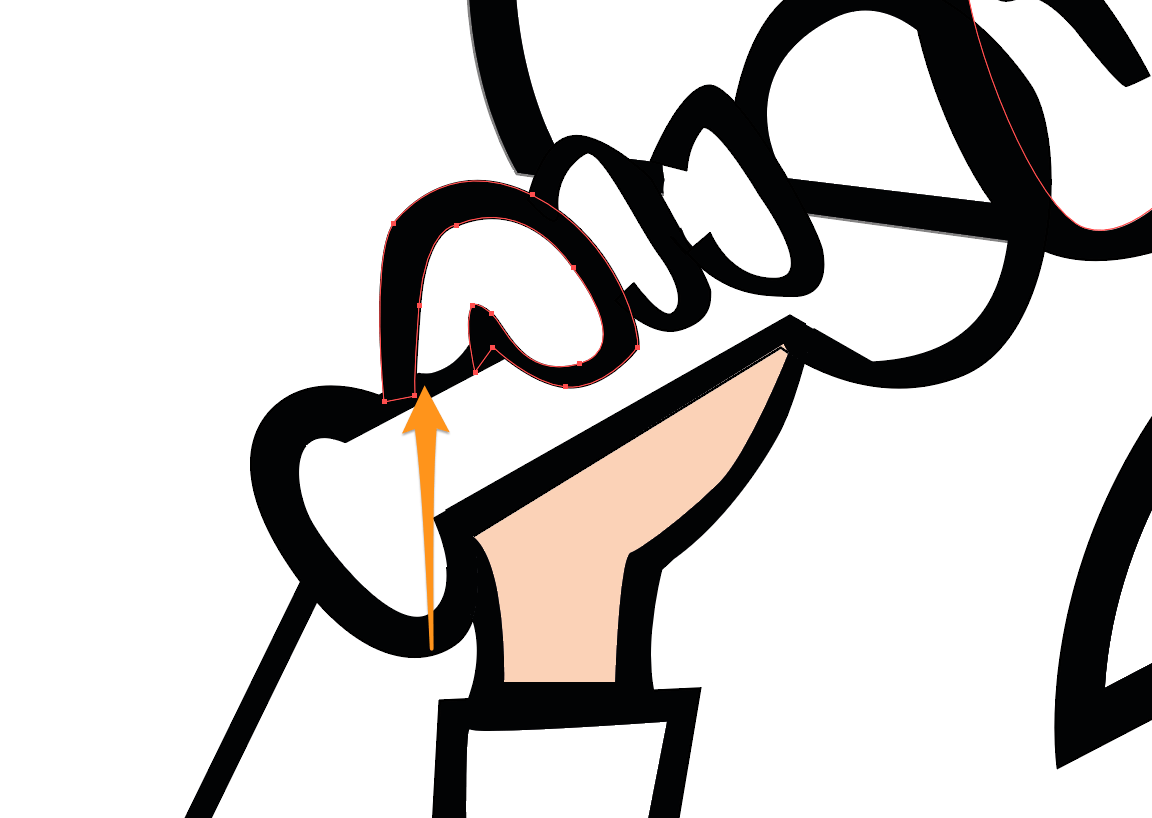
Note: If you are not able to color something with the Live Paint Bucket (K), it probably means your object has open paths. It happened to me with the fingers:

In this case, you can use the Blob Brush tool (Shift + B) to color the internal shape of the fingers. Set the color to #FBD2B7, set the brush’s weight to 30 points, and fill the fingers and other shapes that have open paths.
When you color in this way, the color is positioned above the path. To move it under the path, just select the color shape and hit ⌘ and [ to move it down.
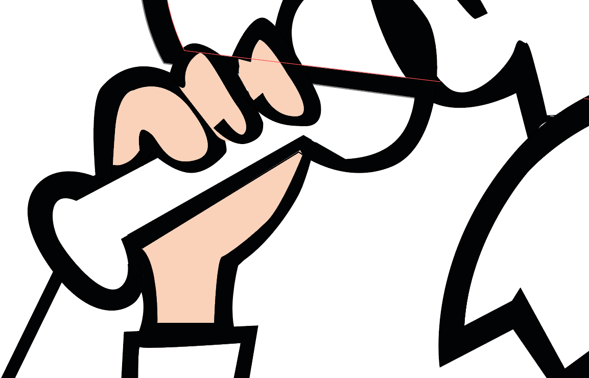
If other objects are overlying the fingers, select them and move them down the same way you did for the fingers’ color. Or you can right-click and select “Arrange” → “Send Backward” to send them back.
Go on coloring with these two methods.
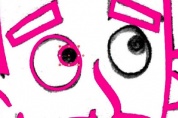
Note how the path under Einstein’s mustache disappears when you fill the mustache with color:

Remember that you can move objects forward (right-click → “Arrange” → “Bring Forward” or ⌘ + ] ) or backwards (right-click → “Arrange” → “Send Backward” or ⌘ + [ ) to find their right position.
Here’s our Einstein colored in.

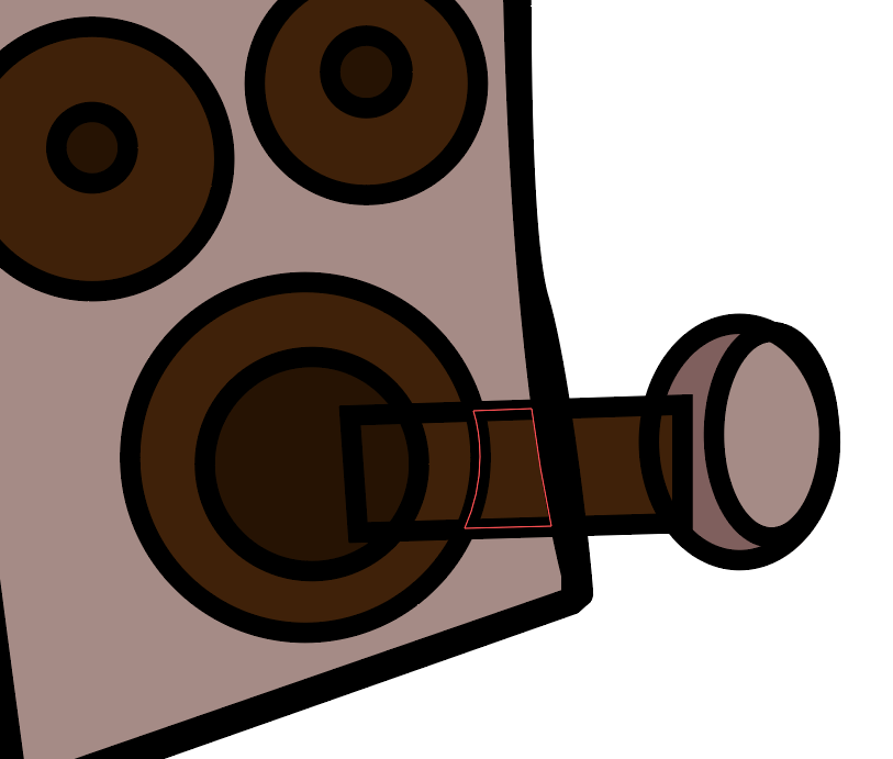
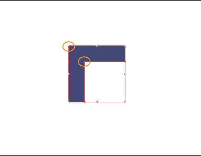
We still have to correct something. The antique phone’s handset is divided into pieces because of our previous tracing:

We have to unify these pieces into one. With the handset selected, enable the Shape Builder tool (Shift + M) and drag on the objects we need to unify:
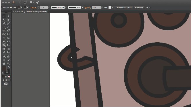
Now, we have to get rid of that line under Einstein’s ear:
We’ll use the Scissors tool ©. Select our two lines and cut them in four places as shown here:

Now, select the cut lines and delete them.

Here’s the result:

3. Environment (Laboratory)
Let’s move on to the next image.
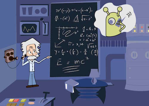
When we think of Einstein, the first objects that come to mind (well, to my mind) are a laboratory and a blackboard.
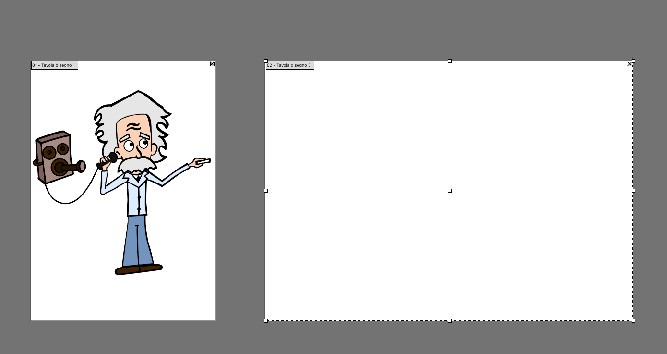
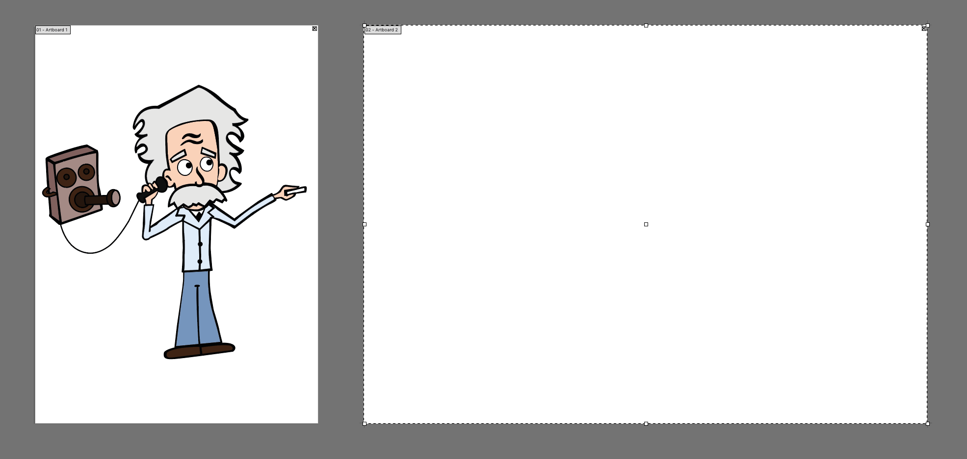
Let’s draw our laboratory on another artboard.
Click on the Artboard tool (Shift + O), and then click on “New Artboard” in the menu. You will get a copy of your first artboard with the same height and width.

Set the width to twice that of the previous table:

You should have something like this:
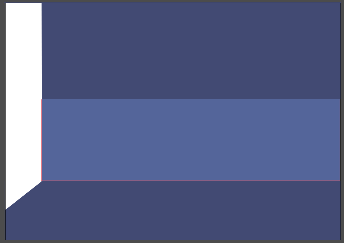
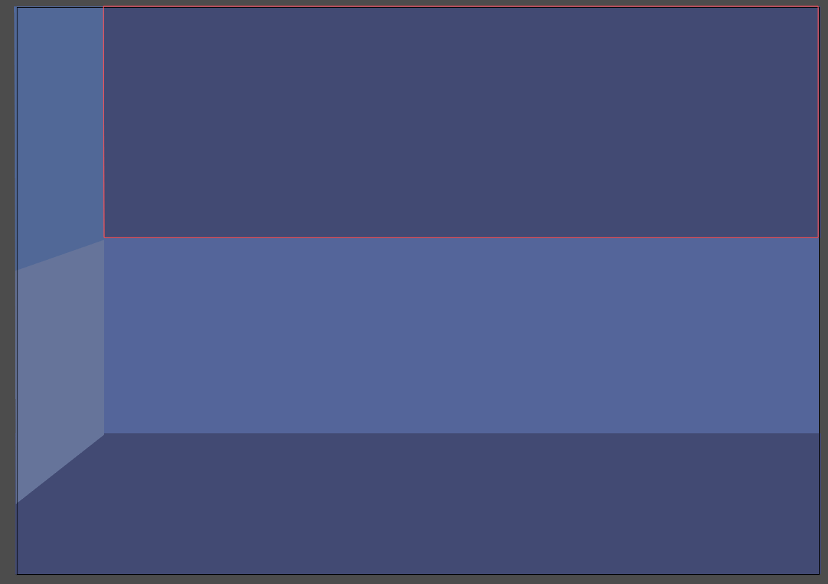
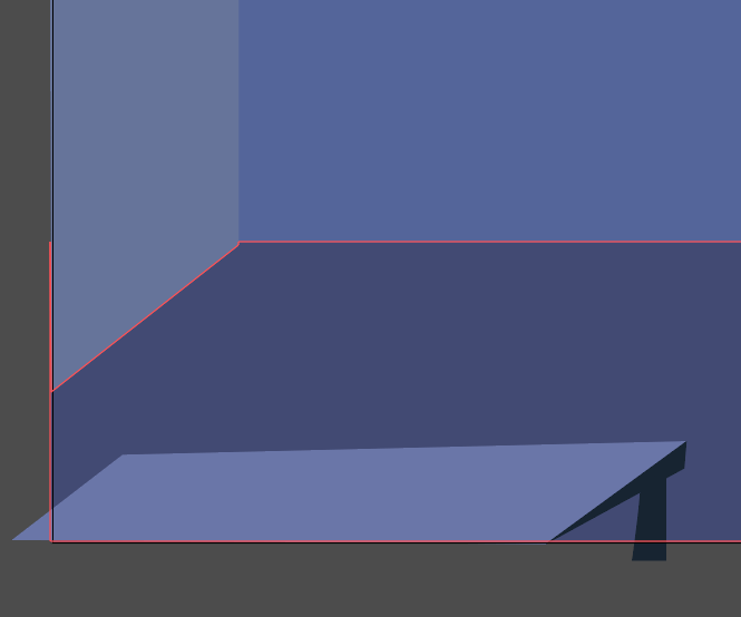
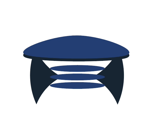
It’s time to create the room. We need a floor and two walls. The tones and colors of the room will be similar because the room is a background.
The character will stand out because of the different colors and the thick edges. The uniform tone of the background will serve not to distract from what is happening.
Create a new layer and call it “Room.” Block the other layers.
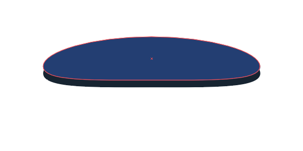
Take the Pen Tool (P) and draw a polygon like the one in my image. Set the fill color to #424974.
Draw the front wall with the Rectangle tool (M). Divide it into two colors, so that we have a more dynamic background. Use #53649C for the bottom rectangle, and #424974 for the top rectangle.

Finally, insert the side wall. You can use the Rectangle tool again. Then, put your shape under the floor by right-clicking, then “Arrange” and “Send Backward” (or ⌘ + [).
I’ve split it into two shapes. The bottom rectangle is set to #65739B, and the top one to #506799.
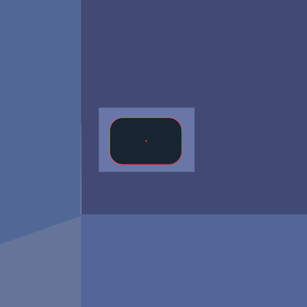
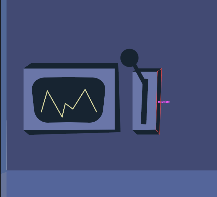
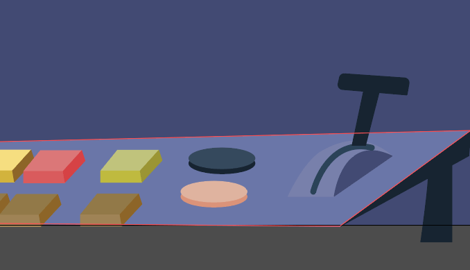
In a cartoon laboratory you will find strange machinery, buttons, screens and handles. Let’s create our first machine, a screen and a handle.
Create a rectangle with the Rectangle tool (M), sized to 587 × 323 pixels and the color set to #6A75AA.
Create another rectangle inside that with the Rounded Rectangle Tool (M), the color set to #172432.

Go to “Effect” → “Warp” → “Arc” and select “Horizontal.” Set the bend to 3%, and under “Distortion,” set “Horizontal” to =0% and “Vertical” to -4%.
With the Pen tool (P), create three rectangles to draw the screen’s sides, as shown below.


Finally, grab the Pen tool again and draw a zig-zag line, with the color set to #D8D89C and the stroke weight set to 5 points.
Draw a line as shown here:

Now, create another rectangle with dimensions of 160 × 372 pixels and the color set to #6A75AA. Put it on the side of the first one.

With the Pen tool, draw the sides of the rectangle, the same way you did for the first one.

Create another rectangle inside this one, with the color set to #172432.

Create a rectangle again, coming out of the slot, as shown here:

Draw the handle’s knob with the same color.
On the other side, create two circles with the Ellipse Tool (L), with the same dimensions as the knob and the color set to #6A75AA.

With both circles selected, go to the Pathfinder panel and click on “Minus Back” (or by selecting “Effect” → “Pathfinder” → “Minus Back”). You will get this shape:
Apply this to our knob to get a light effect.
Repeat the same steps to create our second machine. Draw some shapes, such as trapezoids and circles, with the color set to #6A75AA.

Do the same for our third machine, this time with rectangles, circles and squares. You can create every single object by repeating the previous steps.
To create the pipe sticking out of the ground, just draw two rectangles with the same dimensions, 560 × 158 pixels.

Right-click on the bottom pipe and select “Transform” → “Rotate,” with the angle set to 90°.
Make an L-shape from the two rectangles:

Select both rectangles, go to the Pathfinder panel and click “Unite.”
With the Direct Selection Tool (A), select the resulting shape. Some little circles will show up, giving you dynamic corners. Click and drag to the bottom right the ones shown here:

This is the result:
Let’s work on the table now.
Draw a simple rectangle and let it extend past the artboard, so that it appears to be in the foreground.
The colors are #787FAD for the light violet, #6A75AA for the dark violet, and #8C92AD (very light violet) for the lighting.

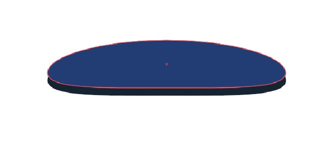
Create a button with the Ellipse tool (L), set to #F7DF79.
Draw sides of the bottom the way we did with our first machine, the colors set to #D3B42F and #8E6621.
Create all of the other buttons the same way, with the following colors:
- red button: #DD7676, #DB5A5A, #D84141
- green button: #C0C478, #BFBB32, #9B962A
- brown button: #937A44, #A08453, #8E6621
- blue button: #34495E, #172432
- pink button: #E0B39D, #DD9376
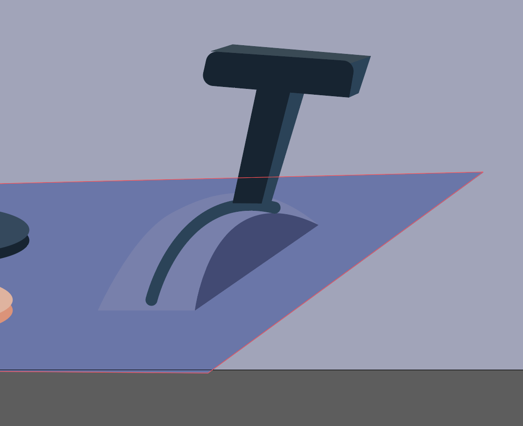
With the Pen tool (P), create a curved shape, with a darker side. This will be the base of another knob, the colors being #787FAD and #424974:
Create a curved line in the center of the shape, again using the Pen tool. Set the stroke weight to 16 points.

Now, create a handle with two simple rectangles.
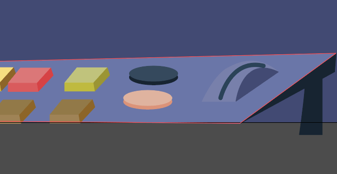
Create the handle’s sides with our trusty technique, the colors being #172432, #2a4359 and #3a4a56.
Let’s create a futuristic table.
Create an ellipse with the Ellipse Tool (L), and drag the anchor points as shown here:
Hit Control + C and Control + B to paste in the back. Move down the shape we’ve just pasted, and set its color to #172432.
Finish your futuristic table by adding the other shapes as shown below, simple ellipses and two triangles.
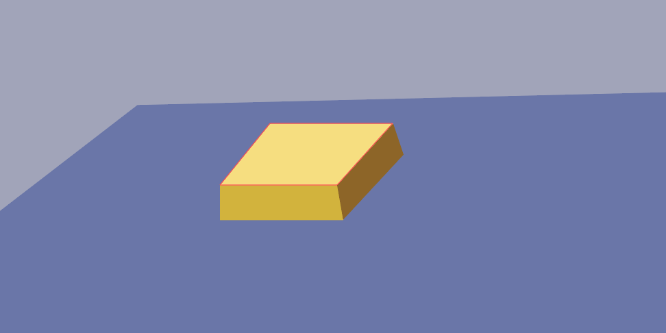
I’ve created a couple of objects on the table as well, a book and a lamp, simply by using shapes, rectangles and the Ellipses tool.
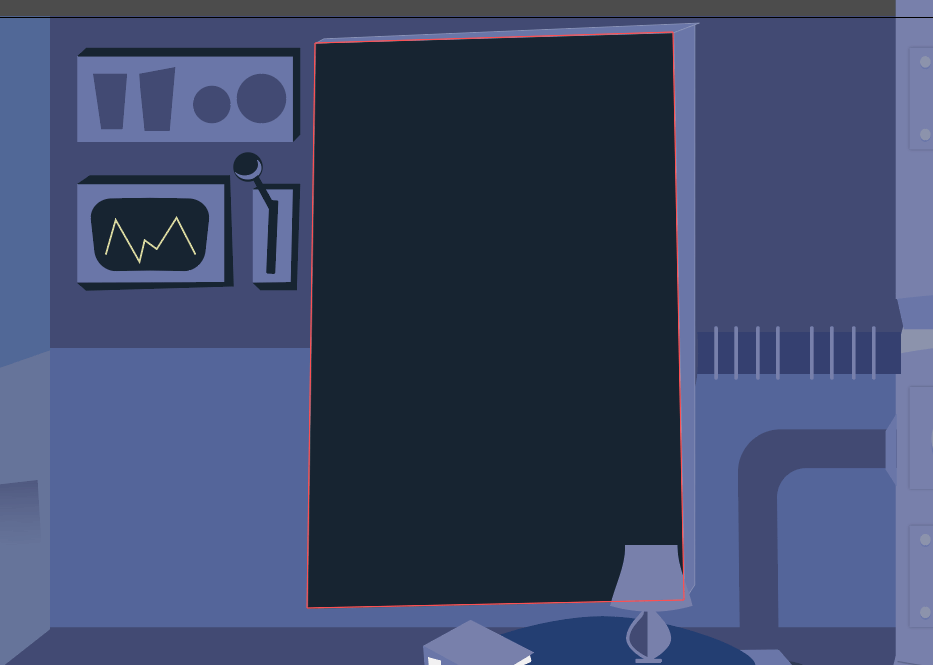
Now, draw a big blackboard for where Einstein will write his formulas.
Take the Rectangle Tool (M) and draw a rectangle, the color set to #172432.

We need to write some formulas on the blackboard, and they need to look as though they’re written in chalk.
Grab the Pencil Tool (N) and write some formulas (mine are almost all made up!). Set #e6e6e6 as the color. When you’re done, select what you’ve written, go to the Brushes panel, and click on the little arrow on the top right:
Select “Open Brush Library” → “Artistic” → “ArtisticChalkCharcoalPencil,” and select the last type of charcoal, which will give you a beautiful charcoal effect on the blackboard.
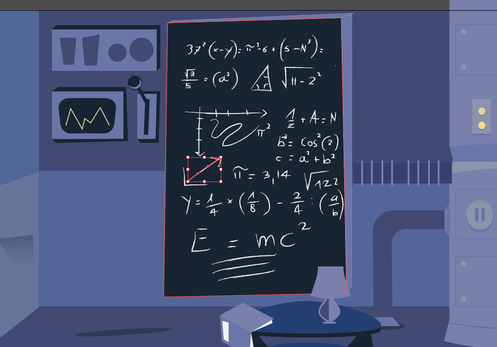
Take the Einstein vector and put it on the side of the blackboard.
4. The Period
The period in which our cartoon is set is about 1920. Einstein’s theories about gravitational waves date back to 1918. For this reason, I’ve inserted an old telephone, the kind Einstein would talk on.
5. The Scene
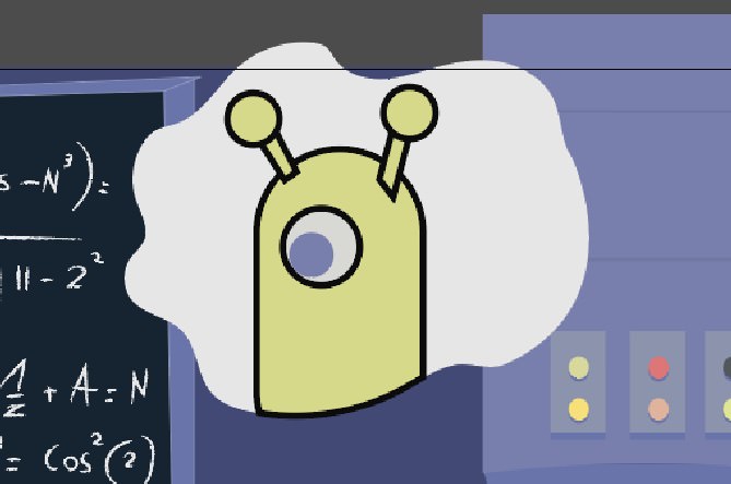
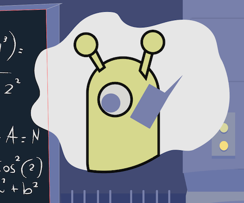
I wanted to put Einstein in a scene in which he’s talking with aliens, who are giving him this information. (It is a cartoon after all — it should be a little funny!)
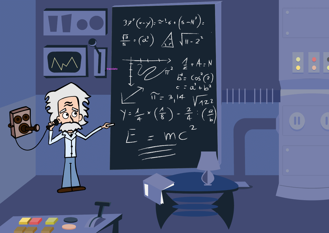
Draw a cloud in the top right with the Pencil tool (N), and then fill it with white (#ffffff).
With the Rounded Rectangle Tool (M), draw a rectangle, and round its corners until they are completely curved. Set the fill to #d6d989 and the stroke to #000000.
With the Ellipse Tool (L), draw an eye and a pupil, setting the color to #787fad.
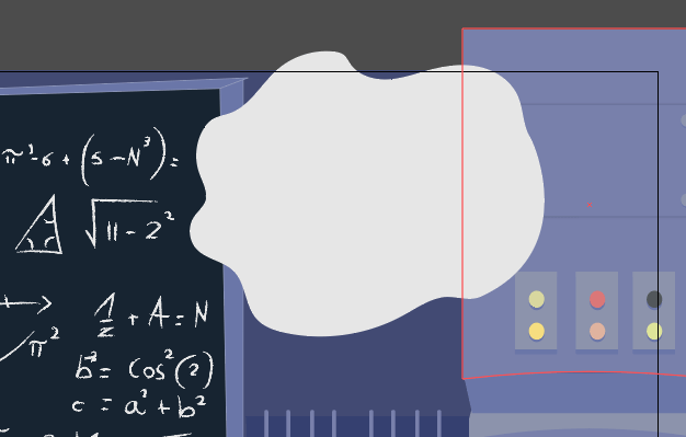
With the Pen Tool and Ellipse tool, draw two little antennas.
Draw a small rectangle, which will be its phone, and tilt it by grabbing an angle and drawing the cursor down.
With the Pencil tool, draw a hand holding the phone and some lines for the phone’s signal.

Conclusion
We’re done!

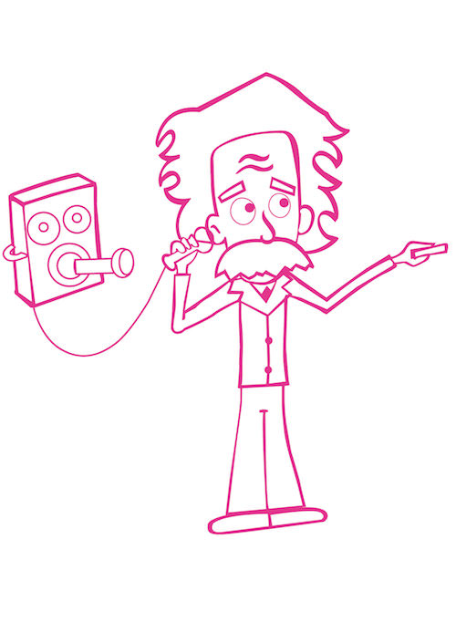
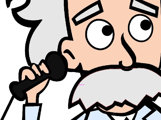
I hope you’ve liked this tutorial. Feel free to leave a comment below, and show us your cartoon! Last but not least, some of you were asking a high-res image of Einstein. So here you go:
Further Reading
- How To Create A Water Lily In Illustrator
- 40 Excellent Adobe Illustrator Tutorials
- Inspiring Illustrator Artworks By Artists Around The World
- Beautiful Photoshop Illustrations By Artists Around The World


