40 Excellent Free Fonts For Professonal Design

Email Newsletter
Weekly tips on front-end & UX.
Trusted by 182,000+ folks.

 Celebrating 10 million developers

 Custom Web Forms for Angular, React, & Vue. Your backend.
The importance of typography in design can’t be overestimated. The accuracy, precision and balance of geometric forms can give letters the elegance and sharpness they deserve. Besides, elegant fonts can help to convey the message in a more convenient way. In fact, while there are many excellent professional fonts there are literally thousands of free low-quality fonts which you would never use for professional designs.
Quality costs. The price of “bulletproof” fonts usually reflects their quality and starts at 50$ per typeface. However, before purchasing a font you will probably use only once in your designs you might want to take a glance at outstanding free alternatives first.
Over the last year we’ve been observing typo-designers and their works; we’ve regularly collected high-quality fonts available for free download and free to use for personal or/and commercial projects. In this article we’d like to present an overview of over 40 excellent free fonts you might use for your professional designs. What is your favourite?
Further Reading on SmashingMag: Link
- 33 Beautiful High-Quality Free Fonts
- Massive Collection of Nature Inspired Typography
- When Typography Speaks Louder Than Words
- 50 Helpful Typography Tools And Resources
- Industrial-Strength Types
Please notice:
- Some images are taken from Gerrit van Aaken’s Typography Essays. Thank you, Gerrit.
- We haven’t listed Arial, Georgia, Verdana, Trebuchet MS & Co. as well as Calibri, Cambria, Candara, Constantia and Corbel as they are delivered almost “automatically”.
- We’d like to thank to all typo-designers and foundries for releasing these fonts for free. We appreciate your work and your intentions.
- Before using fonts please read the license agreements carefully — they can change from time to time.
Excellent Freefonts For Professional Designs in 2008
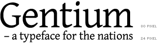
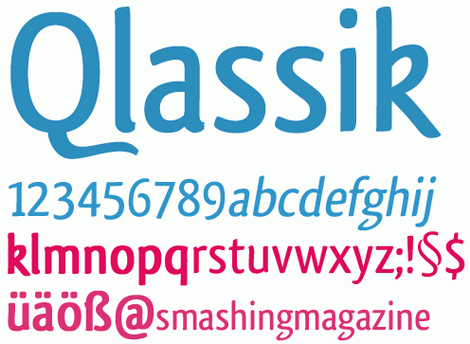
Gentium Gentium is a typeface family designed to enable the diverse ethnic groups around the world who use the Latin script to produce readable, high-quality publications. It supports a wide range of Latin-based alphabets and includes glyphs that correspond to all the Latin ranges of Unicode. Gentium examples.
District Thin A very calm, serious and impressive sans-serif free font from GarageFonts’ District family. The font is available as Mac Postscript, Mac TrueType, PC Postscript, PC Truetype and OpenType.
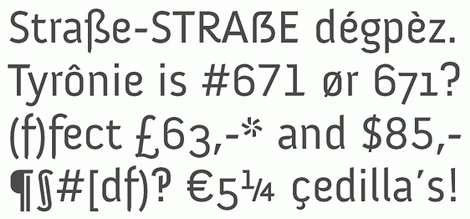
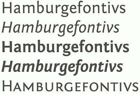
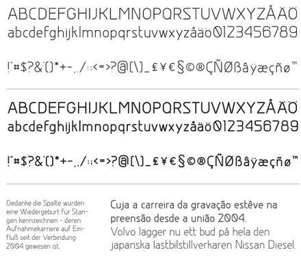
Few years ago the government of the region has decided to design a new typeface to enable its 28.000 citizens to use all four languages in a uniform manner. The result is a beautiful, rich and professional sans-serif free font. The family includes a bold, heavy, italic, light and regular weights. Examples.
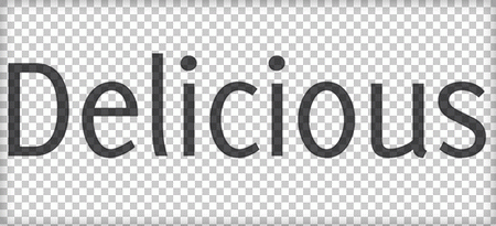
Delicious Special attention was given to character spacing to obtain a homogenous appearance. With its relatively large x-height the Delicious can be used for text in smaller point sizes. The Delicious italic is not a slanted roman, but a true italic. Serif, Mac / PC.
Anivers A robust and rigid font, forgiving, flexible, elegant and also suitable for a broad use: from a stationery to a poster headline. A smashing serif freefont by Jos Buivenga, dedicated to the One-Year-Anniversary of Smashing Magazine. Besides ligatures, contextual alternatives, fractions and oldstyle/tabular numerals Anivers also has a ‘case’ feature for case-sensitive forms. Anivers supports CE languages and Esperanto. It has more than 350 glyphs and over 1.600 kerning pairs. Examples.

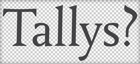
Tallys Tallys is a font that is one degree slanted and has large caps, a small x-height and long ascenders. Only roman style is available.
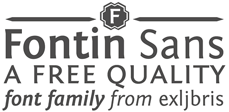
Fontin Sans Available weights: regular, italic, bold, bold italic and small caps. It is a sans companion of Fontin and can be downloaded at Mac & PC (OpenType). Fontin Sans is absolutely free for personal and commercial use. Examples.
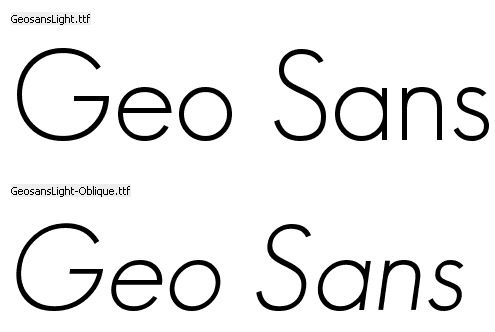
Geo Sans Light, by Manfred Klein
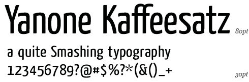
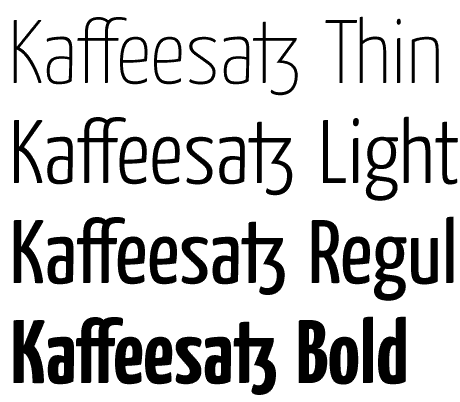
Yanone Kaffeesatz This “coffee”-font is supposed to be used in headlines and brief text passages; it shouldn’t, however, be used for body copy. The numbers and currency signs are monospaced, which means that they have the same width. This is useful if you’d like to place them on a restaurant menu beneath each other in a table. The alternative and historic symbols as well as ligatures can be activated via the OpenType-option »optional ligatures«. Released under Creative Commons license. Examples.
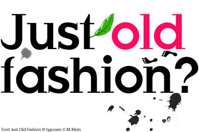
JustOldFashion A font designed by Manfred Klein.
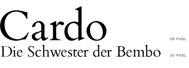
Cardo Cardo is a large Unicode font specifically designed for the needs of classicists, Biblical scholars, medievalists, and linguists. This font is free for personal, non-commercial, or non-profit use.
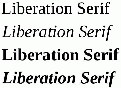
Liberation Serif Public domain / GNU GPL, Regular, Italic, Bold, Bold Italic, PC / Mac OS X
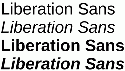
Liberation Sans Public domain / GNU GPL, Regular, Italic, Bold, Bold Italic, PC / Mac OS X
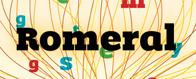
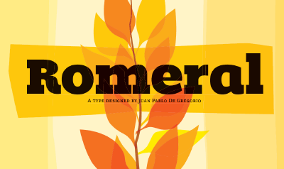
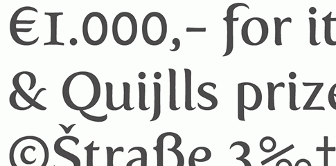
Romeral offers aside from optimal legibility an elegant style, rounded forms and sharp geometric structure of its letters. Romeral is designed to produce a noticeable visual impact that invites the audience to the reading due to its sizable thickness. Interestingly enough, the basic idea of this OpenType-font was to find a way to fill the color titles zone in order to create a comfortable atmosphere for the reading experience. It can be used for body copy and headlines. Free to use in personal and commercial projects.
You can get the font sending a personal request via e-mail or comment form. More information is available on Typies, Pablo De Gregorio’s blog.
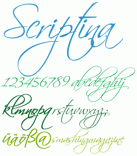
Scriptina Handwriting, PC, Mac.
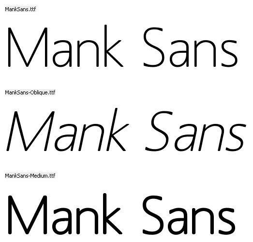
Mank Sans A freefont designed by Manfred Klein.
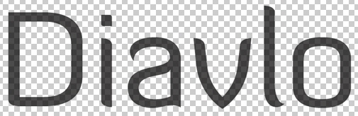
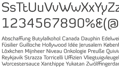
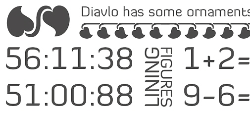
Diavlo Jos Buivenga’s freefont that is a bit square and sharp. Great attention has been given to detail, spacing and kerning. It contains more than 300 glyphs and over 1.300 kerning pairs. So Tørwald can pick up his Téléphone without worrying. Diavlo contains (some) East European characters and also Esperanto characters.
The final release contains 5 weights: Light, Book, SemiBold, Bold and Black. Diavlo contains a bunch of ligatures and contextual alternatives (OpenType feature) to prevent undesired collisions.
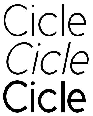
Cicle Sans-Serif, 7 weights, freeware.
Kontrapunkt Slab-serif. Kontrapunkt was awarded the Danish Design Prize for best typeface. The aim has been to develop a distinct font, with regards to both the inidividual character and the overall image as such. The typeface has so far been developed in a light, light italic and bold version.
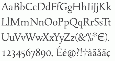
Fontin The Fontin is designed to be used at small sizes. The color is darkish, the spacing loose and the x-height tall. The numbers of the Fontin have a ‘hybrid’ design. They carry the characteristics of medieval numbers, but their size is larger than the x-height. Mac (Type 1), PC (TTF, Opentype).
 [image via typoblog.ch]
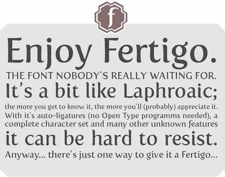
Fertigo It’s a bit like Laphroaic; the more you get to know it, the more you’ll (probably) appreciate it. With it’s auto-ligatures (no Open Type programms needed), a complete character set and many other unknown features it can be hard to resist. Regular only.
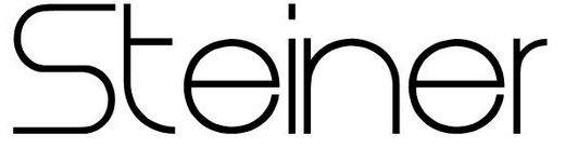
Steiner This typeface is ideal for logos and general design. It isn’t very suitable to be used with word-processors as it lacks some symbols and letters. Sans Serif, free for personal use only.
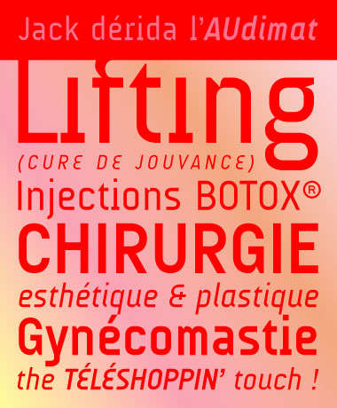
AUdimat (v2) OpenType, Mac, PC, in four weights: regular, italic, bold, bold italic. Freeware, via fontleech.
Google’s Android project, an open platform for mobile devices, includes the Droid font family, which was designed to provide optimal quality and comfort on a mobile handset when rendered in application menus, web browsers and for other screen text.
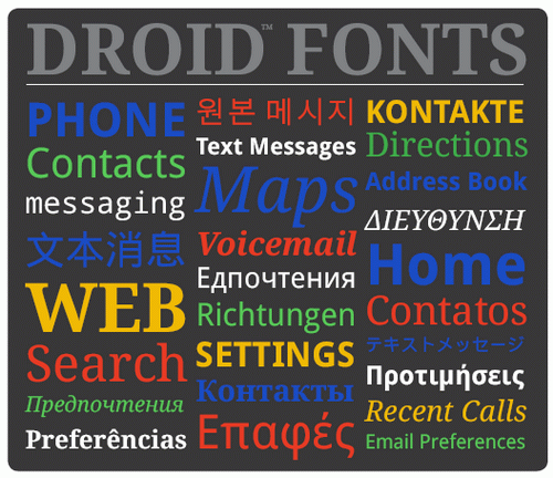
The Droid family of fonts consists of Droid Sans, Droid Sans Mono and Droid Serif. Each contains extensive character set coverage including Western Europe, Eastern/Central Europe, Baltic, Cyrillic, Greek and Turkish support. Description with a specimen. You can find concrete instruction of how you can use the fonts in this article.
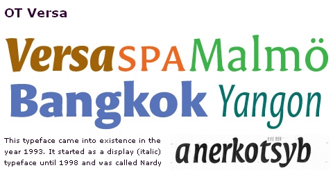
OT Versa Condensed, by Peter Verheul
Ourtype offers a bonus font of the month. To download the font, click on the “About” item in the left sidebar of this site. Once the horizontal menu has appeared, click on the “Bonus font of the mont” section link in the menu.
Greyscale Basic A freefont designed by Greyscale
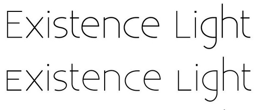
Existence Light A free sans-serif font designed by Yeah Noah. 3 weights — Light, UnicaseLight, StencilLight. OpenType, PC, Mac OS X.
Pixel fonts
Style-Force Semplice Pixelfonts Tiny pixelfonts, Flash-compatible including detailed instructions on how the fonts should be used to achieve the best readability.
![]()
![]()
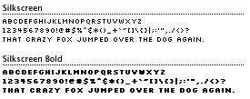
Silkscreen Silkscreen is best used in places where extremely small graphical display type is needed. The primary use is for navigational items (nav bars, menus, etc.). Silkscreen also works very well at large point sizes if you’re looking for that chunky, old school computer look so popular with the kids today. Created by Jason Kottke. Silkscreen, with both Mac and Windows versions, is free for personal and corporate use. TrueType, Windows, Mac, Linux.