30 Usability Issues To Be Aware Of

Email Newsletter
Weekly tips on front-end & UX.
Trusted by 182,000+ folks.
 Celebrating 10 million developers
 Custom Web Forms for Angular, React, & Vue. Your backend.


You don’t have to agree upon everything. As a professional web developer you are the advocate of your visitors’ interests and needs; you have to protect your understanding of good user experience and make sure the visitors will find their way through (possibly) complex site architecture. And this means that you need to be able to protect your position and communicate your ideas effectively — in discussions with your clients and colleagues. In fact, it’s your job to compromise wrong ideas and misleading concepts instead of following them blindly.
In this context nothing can support you more than the profound knowledge of fundamental issues related to your work. But even if you know most of them it’s important to know how to name these concepts and how to refer to them once they appear in the conversation. Furthermore, it’s always useful to have some precise terms ready to hand once you might need them as an argument in your discussions.
You might be interested in the following related posts:
- 9 Common Usability Mistakes In Web Design
- 10 Useful Usability Findings and Guidelines
- 10 Principles Of Effective Web Design
In this article we present 30 important usability issues, terms, rules and principles which are usually forgotten, ignored or misunderstood. What is the difference between readability and legibility? What exactly does 80⁄20 or Pareto principle mean? What is meant with minesweeping and satisficing? And what is Progressive Enhancement and Graceful Degradation? OK, it’s time to dive in.
Usability: Rules and Principles
7±2 Principle Since human brain has some limits on its capacity for processing information, it deals with complexity dividing information into chunks and units. According to George A. Miller’s studies humans’ short term memory can retain only about 5-9 things at one time. This fact is often used as an argument for limiting the number of options in navigation menus to 7; however there are heated debates about The Myth of “Seven, Plus or Minus 2”. Therefore it’s not clear how the 7±2 Principle can, could or should be applied to the Web. Miller’s studies.
2-Second-Rule A loose principle that a user shouldn’t need to wait more than 2 seconds for certain types of system response, such as application-switching and application launch time. The choice of 2 seconds is somewhat arbitrary, but a reasonable order of magnitude. Reliable principle: the less users have to wait, the better is the user experience.
3-Click-Rule According to this rule users stop using the site if they aren’t able to find the information or access the site feature within 3 mouse clicks. In other words, the rule emphasizes the importance of clear navigation, logical structure and easy-to-follow site hierarchy. In most situations the number of clicks is irrelevant; what is really important is that visitors always know where they are, where they were and where they can go next. Even 10 clicks are OK if users feel that they have a full understanding of how the system works.
80⁄20 Rule (The Pareto principle) The Pareto principle (also known as the law of the vital few and the principle of factor sparsity) states that 80% of the effects comes from 20% of the causes. This is the basic rule of thumb in business (“80% of your sales comes from 20% of your clients”), but can also be applied to design and usability. For instance, dramatic improvements can often be achieved by identifying the 20% of users, customers, activities, products or processes that account for the 80% of contribution to profit and maximizing the attention applied to them. [Wikipedia]
Eight Golden Rules of Interface Design As a result of Interface Design Studies, Ben Shneiderman proposed a collection of principles that are derived heuristically from experience and applicable in most interactive systems. These principles are common for user interface design, and as such also for web design.
- Strive for consistency.
- Enable frequent users to use shortcuts.
- Offer informative feedback.
- Design dialog to yield closure.
- Offer simple error handling.
- Permit easy reversal of actions.
- Provide the sense of control.
Support internal locus of control. - Reduce short-term memory load.
You can learn more details about Shneiderman’s Rules For Design in Shneiderman’s rules for design.
Fitts’ Law Published by Paul Fitts in 1954, Fitts’ law is a model of human movement which predicts the time required to rapidly move to a target area, as a function of the distance to the target and the size of the target. The law is usually applied to the movement of the mouse visitors have to perform to get from point A to point B. For instance, the rule can be important to place the content areas in a more usable way to maximize their accessibility and improve click rates.
Inverted Pyramid The inverted pyramid is a writing style where the summary of the article is presented in the beginning of the article. This approach makes use of the “waterfall effect” well-known in journalism where writers try to give their readers an instant idea about the topic they’re reporting. The article begins with a conclusion, followed by key points and finally the minor details such as background information. Since web users want instant gratification, the inverted pyramid style, is important for web writing and for better user experience.
Satisficing Web users don’t prefer optimal ways to find the information they’re looking for. They aren’t interested in the most reasonable and sound solution to their problem. Instead they permanently scan for quick’n’dirty-solutions which are “good enough”. Applied to Web, satisficing describes exactly this approach: users settle with a solution to a problem that is “good enough” — even if alternative solutions can better fulfill their requirements in a long run. [I-D]
Usability nightmares
Sometimes you just want to get the information you’re after, save it and move along. And you can’t. Usability nightmares — which are rather a daily routine than an exception — appear every now and again; usually, almost every time you type your search keywords in Google. In his article “Why award-winning websites are so awful” Gerry McGovern points out that “the shiny surface wins awards, real substance wins customers” and that is entirely right.
Nevermind what design you have, and nevermind which functionality you have to offer — if your visitors don’t understand how they can get from point A to point B they won’t use your site. In almost every professional design (except special design showcases such as, e.g., portfolios) you need to offer your visitors
- a clear, self-explanatory navigation,
- precise text-presentation,
- search functionality and
- visible and thought-out site structure.
And that means that you simply have to folow the basic rules of usability and common sense. You want to communicate with your visitors, don’t drive them away, right?
In this article, we take a look at some of the usability nightmares you should avoid designing functional and usable web-sites. At the end of the article you’ll also find 8 usability checkpoints you should probably be aware of.
8 Usability Check-Points You Should Be Aware Of
- You don’t use pop-ups. Pop-ups interrupt the browsing session of the visitors and require an instant feedback. Respect your visitors.
- You don’t change users’ window size. The same argument as the one against pop-ups holds. Some browsers, e.g. Internet Explorer, saves the browser dimensions and uses them for further browser sessions. As Ben Bodien commented, “it’s just plain inconsiderate to assume that you know better than the user how their software environment should be configured?”
- You don’t use too small font sizes. Long passages are harder to read and to read brief sentences readers need more time. It also holds for links, buttons, forms, search boxes and other elements. Good news — in Web 2.0 the opposite is the case.
- You don’t have unclear link text. Links have to be precise and lead to the destination they describe. Ambiguous link descriptions should be avoided.
- You don’t have dead links. There are too many of them anyway; why would you want to point your visitors to a dead end?
- You have at most one animation per page. If blinking images are wide-spread through the site, it’s extremely hard to focus on one single site element. Give your visitors an opportunity to perceive your content. Using animated ads, don’t place them right along your articles.
- You make it easy to contact you. Maybe because you just don’t want to be contacted, but If visitors do want to get in touch with you, but can’t find any contact information, you lose their interest and trust. Disastrous for online-shopping, a missed opportunity for the rest.
- Your links open in the same window. Visitors want to have control over everything what happens in their browser. If they’d like to open a link in a new window, they will. If they don’t want to, they won’t. If your links open in a new window, you make the decision which is not your decision to make.
Psychology Behind Usability
Baby-Duck-Syndrome Baby Duck Syndrome describes the tendency for visitors to stick to the first design they learn and judge other designs by their similarity to that first design. The result is that users generally prefer systems similar to those they learned on and dislike unfamiliar systems. This results in the usability problems most re-designs have: users, get used with previous designs, feel uncomfortable with new site structure they have to find their way through.
Banner-Blindness Web users tend to ignore everything that looks like advertisement and, what is interesting, they’re pretty good at it. Although advertisement is noticed, it is almost always ignored. Since users have constructed web related schemata for different tasks on the Web, when searching for specific information on a website, they focus only on the parts of the page where they would assume the relevant information could be, i.e. small text and hyperlinks. Large colourful or animated banners and other graphics are in this case ignored.
Cliffhanger-Effect (Zeigarnik-Effect) Human beings can’t stand uncertainty. We tend to find answers to unanswered questions we are interested in as soon as possible. Cliffhanger-effects are based upon this fact; movies, articles and plots with Cliffhanger-effect have an abrupt ending, often leaving with a sudden shock revelation or difficult situation. The effect is often used in advertisement: asking the visitors unanswered and provocative questions advertisers often tend to force them to read the ad, click on the banner or follow a link.
Found out by Bluma W. Zeigarnik in 1927, this effect establishes an emotional connection with readers and is extremely effective in terms of marketing. Visitors can better remember what the ad is about and even smallest details are stored more clearly and precisely. In Web writing the Cliffhanger-effect is also used to bound the visitors to a web-site (e.g. “Grab our RSS-Feed to ensure you don’t miss the second part of the article!”).
Gestalt principles of form perception These principles are the fundamental rules of human psychology in terms of human-computer-interaction-design.
- The law of proximity posits that when we perceive a collection of objects, we will see objects close to each other as forming a group.
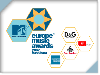
A real-world example of the law of proximity from MTV Music Awards 2002. Source. - The law of similarity captures the idea that elements will be grouped perceptually if they are similar to each other.
- The Law of Prägnanz (figure-ground) captures the idea that in perceiving a visual field, some objects take a prominent role (the figures) while others recede into the background (the ground).
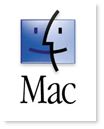
The Macintosh logo can be viewed as a regular happy face and a happy face in profile (looking at a computer screen). Source. - The law of symmetry captures the idea that when we perceive objects we tend to perceive them as symmetrical shapes that form around their centre.
- The law of closure posits that we perceptually close up, or complete, objects that are not, in fact, complete.
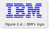
We perceive the letters ‘I’, ‘B’, and ’M’ although the shapes we see, in fact, are only lines of white space of differing length hovering above each other. Source.
The Self-Reference Effect Self-reference effect is particularly important for web writing and can dramatically improve the communication between authors and readers. Things that are connected to our personal concept are remembered better than those which aren’t directly connected to us. For instance, after reading an article users better remember the characters, stories or facts they had personal experience with. In Usability the self-reference effect is usually used in terms of web writing and content presented on a web-site.
Usability Glossary: Terms and Concepts
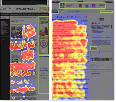
Eye-Tracking Eye tracking is the process of measuring either the point of gaze (“where we are looking”) or the motion of an eye relative to the head. eye tracking monitor records every eye movement and highlights the most active areas on the site visually. Eye-tracking studies can help to estimate how comfortable web users are with the web-site they’re browsing through and how quickly they can understand the structure and system behind it. You can find some interesting usability findings from recent eye-tracking study.
Fold The fold is defined as the lowest point where a web-site is no longer visible on the screen. The position of the fold is, of course, defined by the screen resolution of your visitor. The region above the fold (also called screenful) describes the region of a page that is visible without scrolling. Since the fold is seen directly without scrolling, it is often considered as the area which guarantees the highest possible ad click rates and revenues. However, Fold area isn’t that important. [Usability.gov]
Foveal viewport (Foveal area) The fovea, a part of human’s eye, is responsible for sharp central vision, which is necessary in humans for reading, watching television or movies, driving, and any activity where visual detail is of primary importance. Foveal area is a small wide space area where your eyes are aimed at and it is the only area where you can perceive the maximum level of detail. Foveal area is a tight area of about two degrees of visual field or two thumbnails held in front of your eyes. This is the place where you’d like to deliver the most important messages of your visitors.
Foveal viewport is important, because outside of this wide screen area how your visitors see your web-pages change dramatically. Inside this area is the only part of your vision with the maximal resolution - only here no eye scanning is necessary. [Source]
Gloss
Gloss is an automated action that provides hints and summary information on where the link refers to and where it will take the user once it’s clicked. Hints can be provided via title-attribute of links. From the usability point of view users want to have the full control over everything what is happening on a web-site; clear and precise explanations of internal and outgoing links, supported by sound anchor text, can improve the usability of a web-site.
Graceful Degradation (Fault-tolerance) Graceful Degradation is the property of a web-site to present its content and its basic features even if some of its components (partly or at all) can’t be displayed or used. In practice it means that web-sites display their content in every possible “fault” scenario and can be used in every configuration (browser, plug-ins, connection, OS etc.) the visitor might have. “Power-users” are still offered a full, enhanced version of the page. For instance, it’s typical to offer alternatives for Multimedia-content (for instance image) to ensure that the content can be perceived if images can’t be displayed. [Wikipedia]
Granularity Granularity is the degree to which a large, usually complex data set or information has been broken down into smaller units.
Hotspot
Hotspots are clickable site areas which change their form or/and outer appearance once they are clicked. This is typical for :focus-effects when a link or any other site element is clicked.
Legibility Legibility indicates how clear the text is visually.
Minesweeping Minesweeping stands for user interactions which aim to identify the links on a web-site. In most cases minesweeping is a clear alarm signal for usability problems. Usually minesweeping involves the user rapidly moving the cursor or pointer over a page, watching to see where the cursor or pointer changes to indicate the presence of a link. [Usability.gov]
Mystery-Meat Navigation (MMN) In Web mystery-meat navigation describes designs in which it is extremely difficult for users to recognize the destinations of navigational hyperlinks — or determine where the hyperlinks are.
Physical consistency This concept describes the consistent outer appearance of a web-site - e.g. the position of logos, navigation, the use of graphic elements and typography. Physical consistency is essential for better orientation and effective site navigation.
Progressive Enhancement (PE) Progressive Enhancement is a design strategy in which sites are created in a layered fashion — from the basic functionality for all browsers to the additional, enhanced features for modern browsers. The main advantage of progressive enhancement lies in its “universal usability” — i.e. the fact that it allows everyone to access the basic content and functionality of a web page, using any browser or Internet connection, while also providing those with better bandwidth or more advanced browser software an enhanced version of the page. [Wikipedia]
Readability Readability describes the degree to which the meaning of text is understandable, based on the complexity of sentences and the difficulty of vocabulary. Indexes for readability usually rank usability by the age or grade level required for someone to be able to readily understand a reading passage. Readability is not legibility.
User-centered design (UCD) User-centered design is a design philosophy in which users, their needs, interests and behavior define the foundation of web-site in terms of site structure, navigation and obtaining the information. UCD is considered as a standard approach for modern web-applications, particularly due to the rise of user generated content. In Web 2.0 visitors have to be motivated to participate and therefore need conditions optimized for their needs.
Vigilance (sustained attention) Vigilance is the ability to sustain attention during prolonged, monotonous tasks such as proofreading a text looking for spelling errors, reminding of appointments, auto-saving word processor documents etc. In modern web-applications vigilance tasks are performed in background, automatically and thus improve the usability of the service. [I-D]
Walk-Up-And-Use Design A Walk-up-and-use design is self-explanatory and intuitive, so that first-time or one-time users can use it effectively without any prior introduction or training. [I-D]
Wireframe A wireframe is a basic structure — skeleton — of a site that describes the ideas, concepts and site structure of a web-site. Wireframes can be designed as presentations which explain to the stake holders how the site is designed, which functionality it offers and how users can accomplish their tasks. Wireframes usually don’t have any visual elements or a complete page layouts; they are often first drafts and sketches designers create on paper. Example? Here you go. Wikipedia: Wireframes]