Prioritizing Devices: Testing And Responsive Web Design

Email Newsletter
Weekly tips on front-end & UX.
Trusted by 182,000+ folks.


 Custom Web Forms for Angular, React, & Vue. Your backend.
 Celebrating 10 million developers
My Android Galaxy smartphone is so sweet. It plays games, has a lovely screen and lets me check all of my favorite websites while I’m commuting to and from work. And my new iPad is even better; it’s all I use at home when I’m relaxing in the living room, cooking in the kitchen or toileting on the toilet. As a consumer of electronic gadgets, I’m happier than Angelina Jolie in an orphanage with all of the devices with which I can use to access the Internet.
As a developer, I hate it.
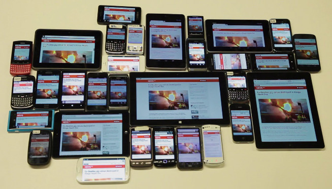
Have you seen how many browsers and devices we have to test now? I remember when Internet Explorer (IE) 8 came out and we were annoyed that we had to start testing six browsers. Now, we’re testing at least 15! Back then, when every home had broadband and before anyone had a smartphone, we were living in the Golden Age of web development. We never knew how easy our jobs were.
Because of all the things we have to support now, testing has become really, really, really difficult and also super-expensive. But imagine having to support and test all of these browser and device combinations while also responding to the news. When you work in a busy environment like the BBC News, where much of what you make is pegged to a news story or breaking event and everything is made using responsive web design, the job becomes really tricky and occasionally very stressful.

Unfortunately, we can never move the deadlines that news events present to us. We can’t contact the UK government and ask them to postpone an election by a few more days while we get the new responsive timeline carousel working in IE 8. And during the flooding in the UK earlier this year, we couldn’t contact God to ask him to pause the heavy rain long enough for my team to get the interactive flooding map working in Android 2.3.
Before responsive web design, we had to test five web browsers on a desktop computer. Now with responsive web design, we have at least 15 browsers working on a myriad of different-sized devices, with many different input types, multiple pixel resolutions and hugely varying connection speeds.
Your boss might have once dictated your testing strategy as such: “This website has to work perfectly in all of the browsers on this list.” If you tried to carry out that strategy with the vast number of browser and device combinations that now visit your website, you would quickly spend a fortune and get sucked into a testing black hole.
There must be a better way to deal with the problem that responsive design has created for testing. So, let’s step back from this testing singularity for a moment and think about the problem.
In this article, we’ll devise a testing strategy so that you don’t have to test every device every time you want to update a live website. I’ll draw on my experience as a developer working on the BBC News’ website.
Devising A New Testing Strategy
With unlimited time, money and human resources, you’d be able to test your entire website on every device, every day of the week. In the real world, even large organizations like the BBC don’t have the resources to attempt this perfect solution.
Nevertheless, as developers, we’d expect JavaScript that works in Chrome to probably work in Safari or Firefox, too. We’d also be confident that the majority of our CSS would render correctly. However, we’d be less certain that a responsive layout would work perfectly on multiple devices. And when we test the layout on an old Nokia device, we’d be more nervous than a startup founder about to meet a venture capitalist.
We can take advantage of similarities between browsers and devices. If some code works on a Samsung Galaxy S4 running Chrome, then it probably also works on an Android tablet or iPhone 5S. If IE 9 throws no JavaScript errors, then we’d be able to test IE 10 and 11 with much more confidence. But some browsers are so old and wicked and unlike anything else we have to deal with — yes, IE 8, I’m looking at you — that we should always test on them.
While you should try to support as large a proportion of your audience as possible, your analytics will show that a small group of browsers and devices make up the majority of your traffic, while the rest are a long tail of obscure browsers and devices. Take advantage of this.
By prioritizing which devices and browsers you test first, you can maximize your testing time. Don’t think of testing as a single task; break it up into groups of browsers according to how important they are to you. You could — dare I say — take shortcuts. Do 50% of your browser testing and then release, knowing that the majority of your users won’t see bugs, and then test and fix the long tail.
This new strategy could be carried out in different ways:
- Making a major new version of your website? Test all browser groups.
- Making a minor change that needs to be released very quickly? Test your primary and secondary browser groups, release, and then test the rest and release again if need be.
In the industry, running a segment of tests is called “smoke testing.” Smoke testing is a quick process that gives you confidence that you haven’t broken anything fundamental in your product. By sometimes choosing to test only your primary group of browsers, you’re effectively smoke testing for certain browser and device combinations.
Every Website Is Different
Before you present the top of this article to your boss and start testing only iPhones, consider that every website is different. Websites have different objectives and audiences and, thus, will be visited by different browser and device combinations.
With any new strategy, first consider the audience of your product:
- Age and class. Young people and less affluent people are more likely to use non-desktop devices. As a developer who’s been in the industry for 15 years, I struggle to accept that my desktop-centric mental model of the web is now in a minority.
- Global distribution. Different form factors are popular in different regions of the world. High-end smartphones are most popular in the West. “Phablets” (i.e. really big phones) are popular in the East because the larger screen size makes it easier to type text messages with Eastern character sets. Phones with long battery life are popular in rural India and Africa.
- Engagement time. In the UK, desktop browsers now make up less than 50% of a typical website’s traffic. This number drops dramatically on the weekend and rises dramatically during workday lunchtime (especially for legacy versions of IE installed in offices).
Testing All The Things
The point of grouping is to get the most out of testing as few devices as possible. So, for your first group, test as many different properties as possible. I call this a “test matrix”:
- Screen size. Designing responsively means being agnostic to device type. So, get a good idea of how your website works on a wide range of screen sizes.
- Connection speed. Treat connection speed the same way. Unfortunately, there is no correlation between screen size and connection speed. While a given device might be able to connect to Wi-Fi as well as to various mobile connection types that offer different Internet speeds, mobile devices generally limit the number of concurrent downloads to two. This means that even when an iPhone has a Wi-Fi connection, it still won’t be as fast as a MacBook. You’ll have to account for this.
- Pixel density. Pixel density refers to the number of pixels that make up a screen. The higher the pixel density, the clearer the picture on the screen will be. Differences in pixel density can cause issues that are subtle and hard to debug. The biggest issue I’ve come across is browsers that calculate subpixel values differently (which happens when widths are defined with a floating point percentage, such as 33.3%), thus breaking the layout.
- Interaction style. Make sure to cover not only mouse-and-keyboard interaction and touch interaction, but also D-pad styles of interaction, which happens with the arrow keys on a phone keyboard or the “nipple” on a BlackBerry (honestly, it’s called a “nipple” — ask your mum if you don’t believe me). However, don’t prioritize D-pad interaction unless Nokia and BlackBerry phones make up a significant share of your traffic.
- Similarity to other browsers. If browser A is very similar to browser B, and browser A passes your test, then browser B has a lower chance of causing serious problems than other browsers. So, you can lower the priority of browser B and expect to deal with only minor layout issues later on. If browser C has a smaller user base than browser B but is much older and has more differences, then you should probably test browser C earlier in the development cycle to catch issues that are harder to solve than minor layout bugs.
- Browser rendering mode. Browsers have two ways of rendering a page:
- the standard client-side rendering that we are all used to,
- proxy rendering.
A proxy browser sends the requested URL to a server, which downloads and renders the page before serving an image of the page to the user. A proxy browser renders much faster than a typical web browser and so is popular among users who are sensitive about their data plans, but they come at a cost.
Because the user is looking at a screenshot of a web page, the design might not work quite as intended. While proxy browsers might sound like a niche case and not worth prioritizing, note that Nokia’s Ovi browser, Opera Mini and the Chrome mobile browser either are proxy browsers or have proxy rendering modes.
Understand Your Testing Options
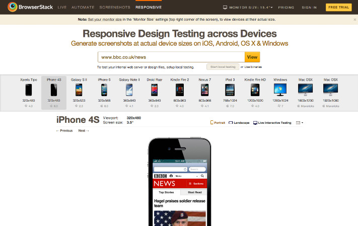
We have quite a few options for testing in the industry now: emulators, virtual machines, testing services like BrowserStack and grassroots community efforts like Open Device Lab. While testing services are great at showing what your website looks like, they will never be as good as testing your code on actual devices. Emulators and testing services are more efficient than buying and maintaining your own device lab, and they really help you to understand how your code behaves on different platforms, but they don’t tell you everything you need to know about the UX.
Are loading times fast enough? Are the hit sizes big enough? Will the user’s hand get in the way of the screen and keep them from noticing a change? Does the time between pressing the screen and the resulting change feel adequate?
Testing services are good for finding logical issues with your code — JavaScript errors, timeouts, etc. — but the coverage is only as good as the test that you run. The services suffer from a positive bias, in that they are good for asserting that stuff works. They won’t tell you whether something feels wrong or looks strange. I always suggest eyeballs for testing; unfortunately, this doesn’t scale to large products, especially if you lack dedicated testers.
You need to make a judgment call, balancing the amount of testing required with the testing resources available. Can you split up automated and manual testing, focusing the latter on new features? Are you continually testing something that never changes? If you test frequently, could you test a proportion of each part of the product or randomly choose features to test?
Group Devices By Priority
Now that we’ve gotten the theory out of the way, let’s look at an example in practice. The device groups defined below are specific to the statistics for the BBC News, so adapt the list to your website according to the advice in the section above “Every Website Is Different.”
Group 1
Group 1 is essentially the Chrome, Safari and Android browsers on different devices and the desktop (“desktop” here meaning both Mac and Windows). Group 1 generally covers just over 50% of an audience for a typical website and is the absolute minimum amount of testing I would recommend before any kind of release.
I strongly recommend that you purchase the following devices:
| Device/Virtual machine/Emulator | Browser | Screen size | Pixel density | Interaction style | Connection speed | Browser similarity | Rendering mode |
| your development machine | Chrome latest | large | standard | mouse/keyboard | broadband | other modern browsers | typical |
| Samsung Android 4.* device | Chrome latest | small | high | touch | broadband/mobile | N/A | typical |
| Apple device running iOS 7 | Safari 6 | small/medium | high | touch | broadband/mobile | N/A | typical |
| Apple device running iOS 6 | Safari 5 | small/medium | high | touch | broadband/mobile | N/A | typical |
| Samsung Android 4.* device | Android browser | small | high | touch | broadband/mobile | N/A | typical |
| any Android 2.3 device | Android browser | very small | standard | touch | broadband/mobile | N/A | typical |
This could easily cost you the best part of $2,500. I am really sorry about this, but I’m guessing that because you read Smashing Magazine, you’re a technologist, so you probably already have one of these devices in your pocket.
Android devices are much cheaper than iOS devices anyway, so spending some of your budget on two Android devices is worthwhile. These four devices plus Chrome on the desktop should be your primary testing group. Chrome is the most popular desktop browser — fortunately, too, because most developers prefer to work in it.
You’ll need to test both Chrome and Android’s default browser on a Samsung Galaxy device running Android 4.*. All top-end Android devices (made by HTC, Sony and Motorola) except for Samsung now ship by default with Chrome. Only Samsung uses a slightly modified version of the browser that ships with the Android Open Source Initiative — that browser is a flavor of WebKit.
Recommended buys:
- Buy an iPad and an iPhone. Make sure they have different versions of iOS so that you can test Safari 5 and 6 in different resolutions.
- Buy a top-end Samsung Galaxy Android 4.* device and a cheap Android 2.3 device. This will give you an idea of how your code runs on Android devices with different types of processors and memory sizes.
Cheaper alternative:
- Download Apple’s Xcode IDE and use the iPhone virtual machine. This will give you access to all versions of iOS on all devices, but then you’d have to buy a Mac, so that would still cost you the best part of $2,500 anyway.
- Download the Android IDE (Java, yuck) and use the Android virtual machine. This isn’t highly recommended, though, because you wouldn’t be able to see your website in action on low-end hardware.
Group 2
The good news about group 2 is that there are no devices to buy (if you develop on a Mac). The bad news is that it requires downloading a lot of virtual machines. Group 2 consists mostly of desktop browsers:
| Device/Virtual machine/Emulator | Browser | Screen size | Pixel density | Interaction style | Connection speed | Browser similarity | Rendering mode |
| virtual machine | IE 8 | large | standard | mouse/keyboard | broadband | N/A | typical |
| your development machine | Safari 6/7 (see note below) | large | standard | mouse/keyboard | broadband | other modern browsers | typical |
| your development machine | Firefox latest | large | standard | mouse/keyboard | broadband | other modern browsers | typical |
| virtual machine | IE 11 | large | standard | mouse/keyboard | broadband | other modern browsers | typical |
| Windows Phone 8 Emulator | IE 10 mobile | small | standard | touch | broadband | other modern browsers | typical |
Note: Depending on the version of OS X your MacBook is running, you will most likely have Safari 6 or 7. Mavericks is the latest and most popular version of OS X, so prioritizing Safari 7 is recommended.
IE 11 and 8 can be tested using virtual machines downloaded from modern.IE. Windows Phone Emulator can be downloaded from Microsoft. Notice that I’ve not mentioned IE 9 or 10. You can test those browsers with virtual machines, too, but the majority of those users would have upgraded to IE 11 by now, so their priority is lower.
IE 8 is a special case because there is no upgrade path for users stuck on Windows XP, and, being so old, it will be the browser that gives you the most problems. The BBC News’ statistics show almost no IE 8 users on weekends or on weekday mornings or evenings, but we get a sudden spike of IE 8 activity during workday lunchtimes. This indicates that people now mostly use IE 8 when they are on their lunch break at work.
Recommended buys:
- If your development machine is a Mac, then definitely include Safari 6 in this group. If not, then depending on the size of your audience, you might want to think about getting a Mac. Spending $2,500 for one device is expensive, and your budget would be better spent on other devices, so this is recommended only if you have a large budget for devices.
Cheaper alternative:
- If your development team is PC-centric, then you could look to BrowserStack to test Safari 6. BrowserStack can be used instead of all of these virtual machines, too, and might be preferable if your machine is old. Virtual machines require at least 1 GB of memory to themselves to run smoothly. I’d recommend a minimum of 8 GB to run virtual machines because you’ll want a couple of them up at the same time.
Expensive alternative:
- Buy a Nokia Windows Phone. Devices are always more preferable than emulators.
Group 3
A third group consisting of Opera Mini and Nokia’s Ovi browser is also worth considering. These are “proxy browsers” that behave differently than standard browsers (see above for a description of how they work):
| Device/Virtual machine/Emulator | Browser | Screen size | Pixel density | Interaction style | Connection speed | Browser similarity | Rendering mode |
| Apple device running iOS 7 | Opera Mini latest | small/medium | high | touch | broadband/mobile | N/A | proxy |
| any Nokia Ovi device | Ovi browser | very small | very low | D-pad/touch | broadband/mobile | N/A | proxy |
Download and test Opera Mini on your iOS 7 device. If you have an international audience, then a Nokia Ovi device is a mandatory purchase; we have a Nokia C5 in our device drawer. While Nokia budget phones are not insanely popular in the UK or US, they are more popular in markets that value low prices, battery life and robustness (dropped your iPhone recently?). If you have a global audience, then definitely allocate part of your budget to a Nokia Ovi.
A few years ago, there was a clear distinction between the new range of smartphones that were appearing on the market and traditional “feature” phones. Unfortunately today, that distinction is not clear at all. The definition of a smartphone used to be that it supports Wi-Fi, has a modern browser, has a touchscreen and supports apps. The Nokia C5 has all of these features. Every phone is a smartphone now.
The big difference between the top and bottom ranges of phones is hardware capability. Manufacturers differentiate and compete by varying the amount of processing power and RAM available in each phone. This means that, while the difference in browser (read “software”) capabilities between, say, an HTC One and a Sony Experia Typo is nil, the difference in capacity to process your website and in reaction times to user input (read “hardware”) is huge. You can’t detect a device’s processing power or memory, so understanding how your website works with limited hardware is important.
Recommended buys:
- Nokia Ovi phone
Group 4
Group 4 is the long tail of browser support. The previous three groups had distinct characteristics (popularity, desktop, proxy rendering). Group 4’s characteristic is randomness! This is where your testing gets more varied and where the value of spending time on edge-case bugs decreases.
| Device/Virtual machine/Emulator | Browser | Screen size | Pixel density | Interaction style | Connection speed | Browser similarity | Rendering mode |
| virtual machine | IE 10 | large | standard | mouse/keyboard | broadband | other modern browsers | typical |
| virtual machine | IE 9 | large | standard | mouse/keyboard | broadband | other modern browsers | typical |
| your development machine | Firefox desktop version 4 | large | standard | mouse/keyboard | broadband | N/A | typical |
| your development machine | Opera desktop latest | large | standard | mouse/keyboard | broadband | N/A | typical |
| Any Android device | Firefox Mobile latest | small/medium | high | touch | broadband/mobile | other modern browsers | typical |
| Any Android device | Opera Mobile latest | small/medium | high | touch | broadband/mobile | other modern browsers | typical |
| BlackBerry device running BB10 | default browser | small | high | touch | broadband/mobile | other modern browsers | typical |
| BlackBerry device running version 6 | default browser | small | standard | D-pad/touch | broadband/mobile | N/A | typical |
| BrowserStack | Safari desktop 6 | large | standard | mouse/keyboard | broadband | other modern browsers | typical |
| BrowserStack | Safari desktop 5 | large | standard | mouse/keyboard | broadband | other modern browsers | typical |
- Firefox desktop version 4 is the last version of Firefox that doesn’t auto-update; it’s the only old version of Firefox still trending in our statistics. It’s big enough for you to consider testing; fortunately, though, despite its age, it’s still a decent browser, so unless you are using advanced CSS3 features, you shouldn’t find many problems.
- Firefox Mobile and Opera Mobile are excellent modern web browsers. They are a low priority because they render pages so well that you can expect your website to work in them with only minor layout issues by the time you make it down to the fourth group of browsers.
- IE 9 and 10 are quickly disappearing from our statistics. We think they will be completely gone by the end of the year. Check your own statistics before deciding whether to support them.
- BlackBerry devices are still worth testing. From OS 6, BlackBerry’s default browser has actually been very modern and feature-rich. The difference between this and other devices, though, is its form. Many BlackBerry owners use the trackball (D-pad) to move a cursor around the small landscape-oriented screen. This screen makes a mockery of people who design for the “fold,” because the fold on these devices is 200 pixels tall.
- Safari 6 is the version of Safari that comes with Apple OS 10.7. While 10.7 isn’t the latest version of Apple’s operating system, it’s still relatively popular. Safari 6 is very similar to Safari 7, so it’s not worth the large investment required for an additional desktop machine.
Recommended buys:
- As always, I recommend buying the devices if your budget allows. Buy a BlackBerry 10 and a BlackBerry Bold running OS 6. BlackBerry Bold should still be available on eBay, while the BlackBerry Z10 (running BlackBerry OS 10) should be available in most stores.
Cheaper alternative:
- Test Safari 6 using BrowserStack. It’s still available to test via Mac OS X Lion.
- Test Safari 5 using BrowserStack. It’s still available to test via Mac OS X Snow Leopard.
- Unfortunately, BrowserStack doesn’t have BlackBerry devices to test; however, you can download and run simulators from BlackBerry’s website. You can run a Playbook simulator as a virtual machine on a PC or Mac, but the Playbook was never popular, so the simulator isn’t very useful. The phone emulators are much more useful; you can download exact model and OS versions, but they only work on a PC, so you will need a second machine if you are a Mac user.
- An Open Device Lab is an even cheaper alternative to BrowserStack, but the devices available to you will depend on what is available in the lab in your area. You will also need to account for the cost and convenience of getting to the device lab.
Expensive alternative:
- Buy a Mac running 10.7 to test Safari 6. This might be the best choice if your development machine is a PC.
- Buy a Mac running 10.6.8 to test Safari 5 — but only if you are seriously loaded!
Conclusion
Testing (or, to use the proper term, quality assurance) is a profession unto its own. As designers, we shouldn’t try to simplify the testing process; rather, we should understand the different testing strategies well enough to solve the challenges we now face in trying to support browsers.
Although the explosion of devices that started with the iPhone has dramatically increased the number of browsers we have to support, remember that a large proportion of your audience use only a handful of devices. The rest of your audience consumes the web via a massively diverse long tail of devices. Test your product on as many devices as possible, but also prioritize which devices to test in order to maximize your time.
Test hard, but test smart. Nobody can test everything all the time.
Other Resources
- modern.IE, Microsoft
- Windows Phone Emulator for Windows Phone 8, Windows Phone Dev Center
- Android Emulator, Android Developers
- Xcode, Apple
- BlackBerry simulators, BlackBerry
- VirtualBox
- “Browsers and Mobile Devices for Live Testing,” BrowserStack
- Open Device Lab
- “Opera Mini and JavaScript (proxy browsing), Dev.Opera
Further Reading
- Testing Mobile: Emulators, Simulators And Remote Debugging
- Where Are The World’s Best Open Device Labs?
- How To Create Your Own Front-End Website Testing Plan
- High-Impact, Minimal-Effort Cross-Browser Testing
 (al, ml, mrn)

