Splash Pages: Do We Really Need Them?

Email Newsletter
Weekly tips on front-end & UX.
Trusted by 182,000+ folks.

 Celebrating 10 million developers
 Custom Web Forms for Angular, React, & Vue. Your backend.

Yes, sometimes we do. Should we use them? No, we probably shouldn’t. Splash screen (or splash page) is a front page of a web-site that don’t provide the actual content, but offers visitors some kind of intuition or background information for what the site is about. Designers use splash pages in their portfolios to impress potential clients with eye-candy. Companies tend to make use of them to draw users’ attention to their latest products. And users literally can’t stand them, because splash pages usually take a long time to load and provide (almost) no navigation options — except of “entering the site”.
Depending on designers’ creativity, splash pages use more or less attractive visual elements. Splash pages usually have a very simple structure — mostly just an image with few text lines and links.
The design of these pages sometimes isn’t related to the overall site design. And although most sites don’t use them, splash pages are sometimes necessary and therefore remain popular. In fact, there are some situations in which we might want or might even need to use them. Even although we shouldn’t — for our visitors’ sake.
12 Common Reasons For Using Splash Pages
- Splash pages display disclaimers or warnings which are supposed to restrict access to content such as pornography, advertising, or gambling (as is required by law).
- It is necessary to draw visitors’ attention to an important message such as approaching deadline, critical update, latest release, news, slogan etc.
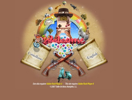
- Visitors are supposed to select the language they want to use or the country they come from — to direct users to the appropriate version of the site.
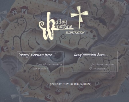
- Visitors can choose between a low-bandwidth version (HTML — Dial-Up) and high-bandwidth version (Flash — cable, DSL). Sometimes one can also choose the “accessible” version containing only text without images.
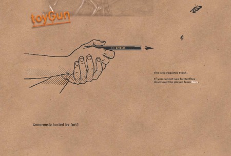
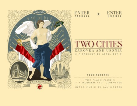
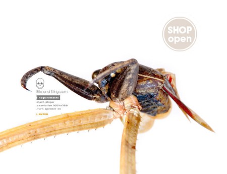
- The designer informs visitors about site requirements such as used browsers, screen resolution as well as used Flash, Java, Quicktime etc. and suggests to choose the “right” configuration and download plug-ins for “optimal” site presentation.
- Visitors can select the preferred view mode - for instance, standard mode and fullscreen mode.
- Multiples sites share the same domain. Or a large site tries to communicate its most important sections directly.
- Splash page is supposed to include hints for browsing the site and explains the main sections.
- Designers use splash page trying to awake excitement for the actual content of the site.
- Sound is announced. Visitors are asked to turn on their loudspeakers to enjoy the Flash-show or Midi-experience (yes, apparently Midis are still alive).
- Splash pages are used as an additional form of advertising.
- The decision to use a splash page is design-driven and realizes some designer’s idea.
How To Lose Your Visitors: Case #1
Users don’t like splash pages, however if designed creatively, splash pages can also really get on users’ nerves. Petr Hrubes has an informative and attractive web-site with an absolutely unusable splash page (sorry, Petr). The design of Petr’s splash page offers precise information and is visually appealing, but it has one of the most significant mistakes a splash page can contain — it’s obtrusive and just not user-friendly.
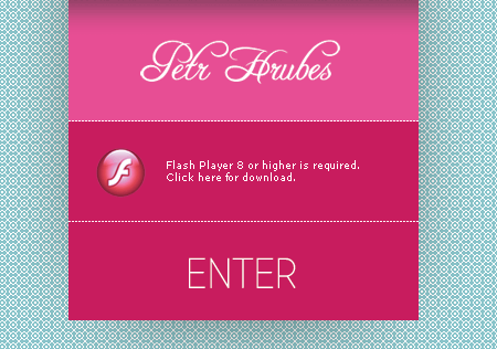
If you are using Firefox or Opera you’ll find out that the mouse click on “Enter” opens the main page in a new tab in your browser. To navigate through the site visitors may want to close the “splash page”-window first and then change to the “main page”-tab. It’s neither necessary nor helpful.
The fans of Internet Explorer (is there anybody out there?) or Safari (Windows) have even more fun. Not only doesn’t the page open in a new tab (although IE7 should be capable of it), both browsers also open a new window which is automatically displayed in the fullscreen mode. Without warning. It doesn’t have to be like this.
How To Lose Your Visitors: Case #2
It can get worse: creative designers tend to offer their visitors problems of a different kind. For instance, sometimes users have to move the mouse among the splash page to recognize what elements can actually be clicked and what should be done to finally get to the content of the page.
Not every visitor is patient, in most cases the page will be closed right away. Or the visitors land on the Adobe-page where they are asked to download the latest version of Flash plug-in. Or they are directed to some design-award web-site where they can observe dozens of beautifully designed web-sites. You can be sure that they won’t get back. Here you go - an optimal way to lose a visitor in few seconds.
A Showcase Of Splash Pages
Whether minimal, useful, beautifully illustrated, colorful or animated: the design of splash pages is a challenge designers can take to impress their visitors with creative approaches. Whatever decision you make please make sure that you really need a splash page and that it is designed with a purpose in mind.
There are literally millions of them out there. Below we’d like to present an overview of splash pages which are supposed to showcase their basic purposes and common design solutions (mostly non-Flash-based splash pages are presented). These pages make use of the 12 common reasons we’ve listed at the top of this article. Here are some ideas:
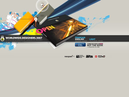
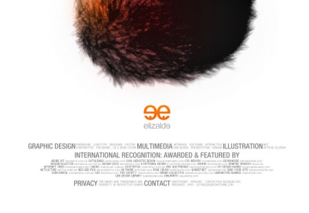
Splash Pages As Additional Advertising
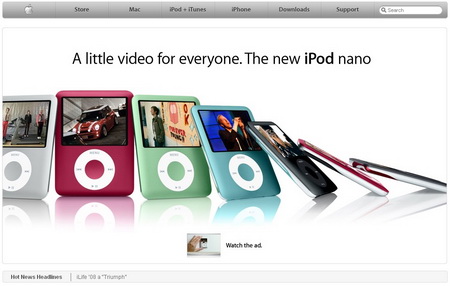
Apple use a hybrid of a splash page with basic navigation functions. What do you think, is it still a splash page? (Bonus: find the difference between both of them!).
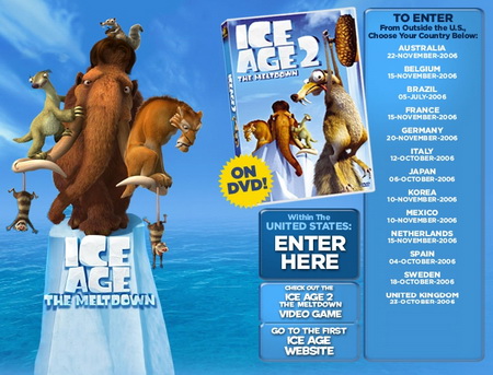
Classic: multimedia-related sites offer audio and video on the splash page; however, sometimes basic navigation is also included. Ice Age also provides “special” entry points for users from United States and outside the U.S.

Showcase For Important Messages And News

Disclaimer, Warning, Requirements
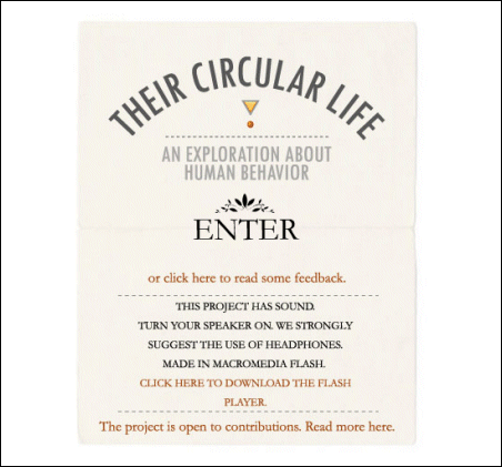

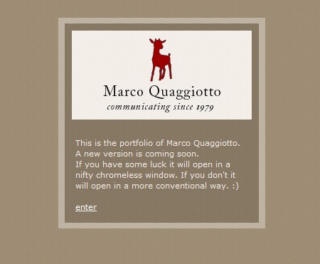
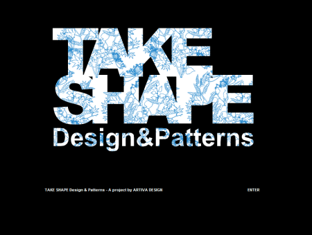
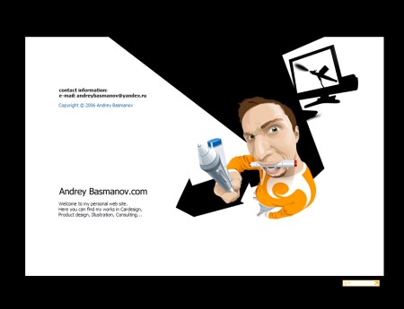
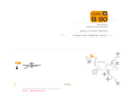
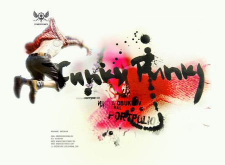
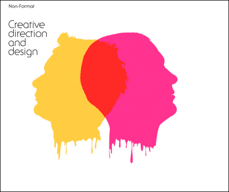
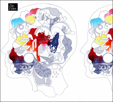
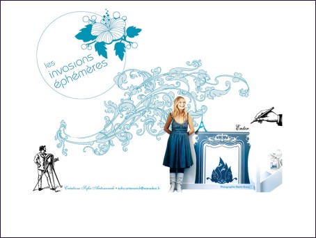
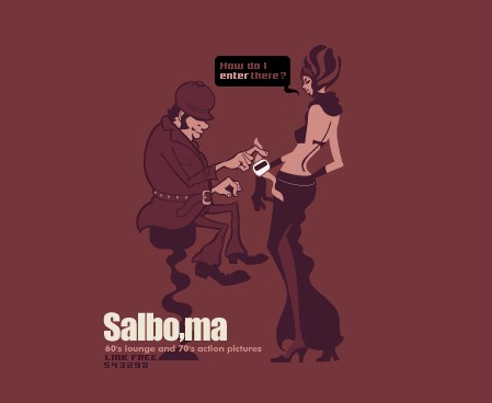
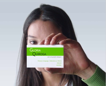
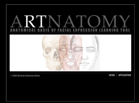
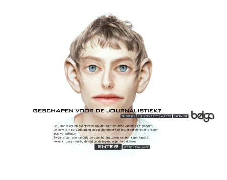
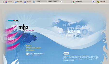
Showcasing Designer’s Creativity


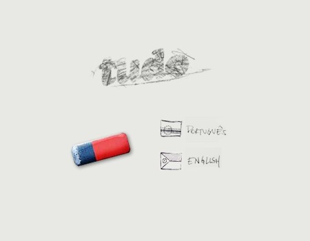
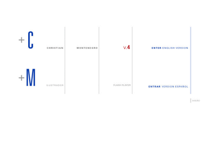
Choice Of A Language / Site Version

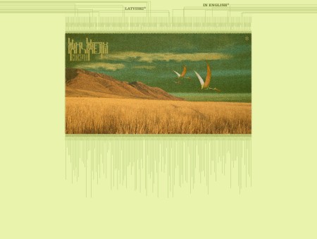
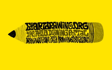
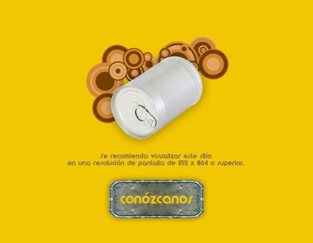
Splash Pages Explain What The SIte Is About
So much text, so many references, but none of them can be clicked.
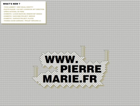
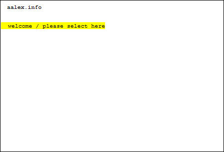
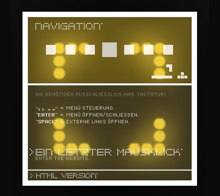
Minimalistic Solutions
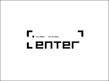
## Further Solutions Flash-based splash page. There is some kind of navigation, however it doesn't really work.
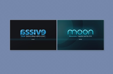
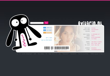
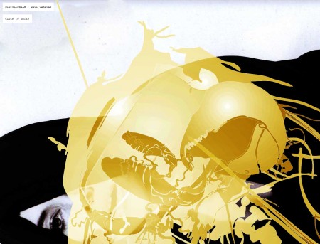
We Have No Idea Why The Splash Page Is Used