Color Contrast And Why You Should Rethink It

Email Newsletter
Weekly tips on front-end & UX.
Trusted by 182,000+ folks.
 Register for Free


 Celebrating 10 million developers
 Custom Web Forms for Angular, React, & Vue. Your backend.
When you browse your favorite website or check the latest version of your product on your device of choice, take a moment to look at it differently. Step back from the screen. Close your eyes slightly so that your vision is a bit clouded by your eyelashes.
- Can you still see and use the website?
- Are you able to read the labels, fields, buttons, navigation and small footer text?
- Can you imagine how someone who sees differently would read and use it?
In this article, I’ll share one aspect of design accessibility: making sure that the look and feel (the visual design of the content) are sufficiently inclusive of differently sighted users.

I am a design consultant on PayPal’s accessibility team. I assess how our product designs measure up to the Web Content Accessibility Guidelines (WCAG) 2.0, and I review our company’s design patterns and best practices.
I created our “Designers’ Accessibility Checklist,” and I will cover one of the most impactful guidelines on the checklist in this article: making sure that there is sufficient color contrast for all content. I’ll share the strategies, tips and tools that I use to help our teams deliver designs that most people can see and use without having to customize the experiences.
Our goal is to make sure that all visual designs meet the minimum color-contrast ratio for normal and large text on a background, as described in the WCAG 2.0, Level AA, “Contrast (Minimum): Understanding Success Criterion 1.4.3.”
Who benefits from designs that have sufficient contrast? Quoting from the WCAG’s page:
"The 4.5:1 ratio is used in this provision to account for the loss in contrast that results from moderately low visual acuity, congenital or acquired color deficiencies, or the loss of contrast sensitivity that typically accompanies aging."
As an accessibility consultant, I’m often asked how many people with disabilities use our products. Website analytics do not reveal this information. Let’s estimate how many people could benefit from designs with sufficient color contrast by reviewing the statistics:
- 15% of the world’s population have some form of disability, which includes conditions that affect seeing, hearing, motor abilities and cognitive abilities.
- About 4% of the population have low vision, whereas 0.6% are blind.
- 7 to 12% of men have some form of color-vision deficiency (color blindness), and less than 1% of women do.
- Low-vision conditions increase with age, and half of people over the age of 50 have some degree of low-vision condition.
- Worldwide, the fastest-growing population is 60 years of age and older.
- Over the age of 40, most everyone will find that they need reading glasses or bifocals to clearly see small objects or text, a condition caused by the natural aging process, called presbyopia.
Let’s estimate that 10% of the world population would benefit from designs that are easier to see. Multiply that by the number of customers or potential customers who use your website or application. For example, out of 2 million online customers, 200,000 would benefit.
Some age-related low-vision conditions include the following:
- Macular degeneration. Up to 50% of people are affected by age-related vision loss.
- Diabetic retinopathy. In people with diabetes, leaking blood vessels in the eyes can cloud vision and cause blind spots.
- Cataracts. Cataracts clouds the lens of the eye and decreases visual acuity.
- Retinitis pigmentosa. This inherited condition gradually causes a loss of vision.
All of these conditions reduce sensitivity to contrast, and in some cases reduce the ability to distinguish colors.
Color-vision deficiencies, also called color-blindness, are mostly inherited and can be caused by side effects of medication and age-related low-vision conditions.
Here are the types of color-vision deficiencies:
- Deuteranopia. This is the most common and entails a reduced sensitivity to green light.
- Protanopia. This is a reduced sensitivity to red light.
- Tritanopia. This is a reduced sensitivity to blue light, but not very common.
- Achromatopsia. People with this condition cannot see color at all, but it is not very common.
Reds and greens or colors that contain red or green can be difficult to distinguish for people with deuteranopia or protanopia.
Experience Seeing Differently
Creating a checklist and asking your designers to use it is easy, but in practice how do you make sure everyone follows the guidelines? We’ve found it important for designers not only to intellectually understand the why, but to experience for themselves what it is like to see differently. I’ve used a couple of strategies: immersing designers in interactive experiences through our Accessibility Showcase, and showing what designs look like using software simulations.
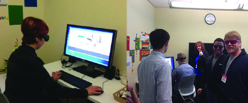
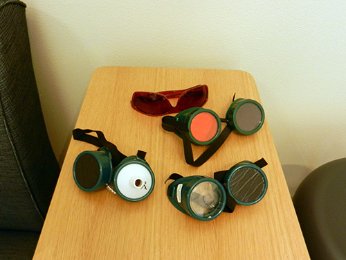
In mid-2013, we opened our PayPal Accessibility Showcase (video). Employees get a chance to experience first-hand what it is like for people with disabilities to use our products by interacting with web pages using goggles and/or assistive technology. We require that everyone who develops products participates in a tour. The user scenarios for designing with sufficient color contrast include wearing goggles that simulate conditions of low or partial vision and color deficiencies. Visitors try out these experiences on a PC, Mac or tablet. For mobile experiences, visitors wear the goggles and use their own mobile devices.
Fun fact: One wall in the showcase was painted with magnetic paint. The wall contains posters, messages and concepts that we want people to remember. At the end of the tour, I demonstrate vision simulators on our tablet. I view the message wall with the simulators to emphasize the importance of sufficient color contrast.
Software Simulators
Mobile Apps
Free mobile apps are available for iOS and Android devices:
- Chromatic Vision Simulator. Kazunori Asada’s app simulates three forms of color deficiencies: protanope (protanopia), deuteranope (deuteranopia) and tritanope (tritanopia). You can view and then save simulations using the camera feature, which takes a screenshot in the app. (Available for iOS and Android.)
- VisionSim. The Braille Institute’s app simulates a variety of low-vision conditions and provides a list of causes and symptoms for each condition. You can view and then save simulations using the camera feature, which takes a screenshot in the app. (Available for iOS and Android.)
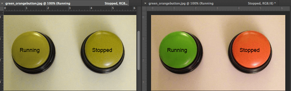
Chromatic Vision Simulator
The following photos show orange and green buttons viewed through the Chromatic Vision Simulator:
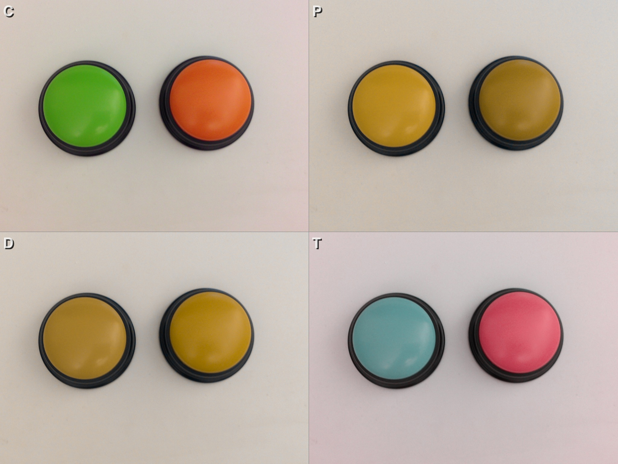
This example highlights the importance of another design accessibility guideline: Do not use color alone to convey meaning. If these buttons were online icons representing a system’s status (such as up or down), some people would have difficulty understanding it because there is no visible text and the shapes are the same. In this scenario, include visible text (i.e. text labels), as shown in the following example:
Mobile Device Simulations
Checking for sufficient color contrast becomes even more important on mobile devices. Viewing mobile applications through VisionSim or Chromatic Vision Simulator is easy if you have two mobile phones. View the mobile app that you want to test on the second phone running the simulator.
If you only have one mobile device, you can do the following:
- Take screenshots of the mobile app on the device using the built-in camera.
- Save the screenshots to a laptop or desktop.
- Open and view the screenshots on the laptop, and use the simulators on the mobile device to view and save the simulations.
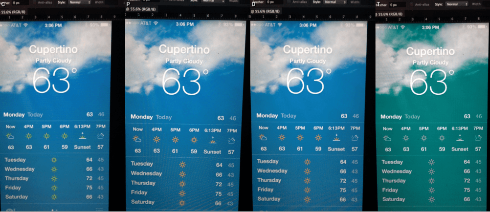
How’s The Weather In Cupertino?
The following example highlights the challenges of using a photograph as a background while making essential information easy to see. Notice that the large text and bold text are easier to see than the small text and small icons.
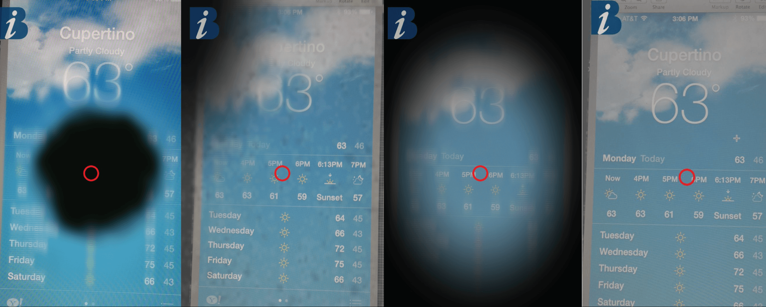
Low-Vision Simulations
Using the VisionSim app, you can simulate macular degeneration, diabetic retinopathy, retinitis pigmentosa and cataracts.
Adobe Photoshop
PayPal’s teams use Adobe Photoshop to design the look and feel of our user experiences. To date, a color-contrast ratio checker or tester is not built into Photoshop. But designers can use a couple of helpful features in Photoshop to check their designs for sufficient color contrast:
- Convert designs to grayscale by going to “Select View” → “Image” → “Adjustments” → “Grayscale.”
- Simulate color blindness conditions by going to “Select View” → “Proof Setup” → “Color Blindness” and choosing protanopia type or deuteranopia type. Adobe provides soft-proofs for color blindness.
Examples
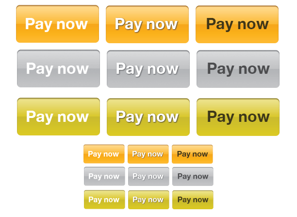
If you’re designing with gradient backgrounds, verify that the color-contrast ratio passes for the text color and background color on both the lightest and darkest part of the gradient covered by the content or text.
In the following example of buttons, the first button has white text on a background with an orange gradient, which does not meet the minimum color-contrast ratio. A couple of suggested improvements are shown:
- add a drop-shadow color that passes (center button),
- change the text to a color that passes (third button).
Checking in Photoshop with the grayscale and deuteranopia proof, the modified versions with the drop shadow and dark text are easier to read than the white text.
If you design in sizes larger than actual production sizes, make sure to check how the design will appear in the actual web page or mobile device.
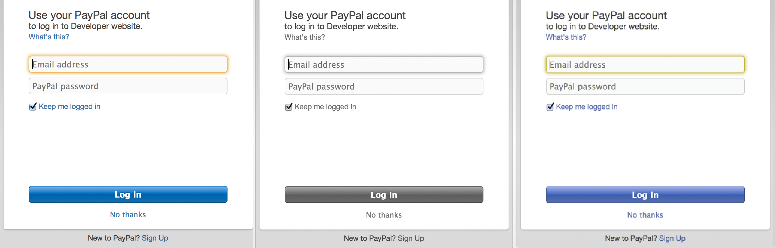
In the following example of a form, the body text and link text pass the minimum color-contrast ratio for both the white and the gray background. I advise teams to always check the color contrast of text and links against all background colors that are part of the experience.
Even though the “Sign Up” link passes, if we view the experience in grayscale or with proof deuteranopia, distinguishing that “Sign Up” is a link might be difficult. To improve the affordance of “Sign Up” as a link, underline the link or link the entire phrase, “New to PayPal? Sign Up.”
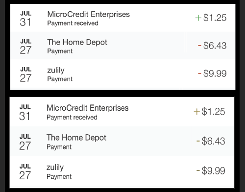
Because red and green can be more difficult to distinguish for people with conditions such as deuteranopia and protanopia, should we avoid using them? Not necessarily. In the following example, a red minus sign (“-”) indicates purchasing or making a payment. Money received or refunded is indicated by a green plus sign (“+”). Viewing the design with proof, deuteranopia, the colors are not easy to distinguish, but the shapes are legible and unique. Next to the date, the description describes the type of payment. Both shape and content provide context for the information.
Also shown in this example, the rows for purchases and refunds alternate between white and light-gray backgrounds. If the same color text is used for both backgrounds, verify that all of the text colors pass for both white and gray backgrounds.
In some applications, form fields and/or buttons may be disabled until information has been entered by the user. Our design guidance does not require disabled elements to pass, in accordance with the WCAG 2.0’s “Contrast (Minimum): Understanding Success Criterion 1.4.3:
"Incidental: Text or images of text that are part of an inactive user interface component,… have no contrast requirement."
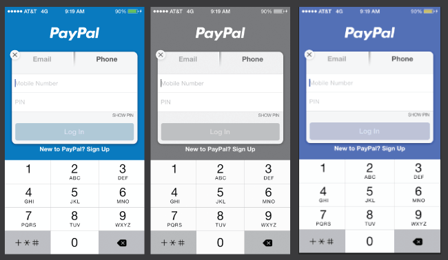
In the following example of a mobile app’s form, the button is disabled until a phone number and PIN have been entered. The text labels for the fields are a very light gray over a white background, which does not pass the minimum color-contrast ratio.
If the customer interprets that form elements with low contrast are disabled, would they assume that the entire form is disabled?
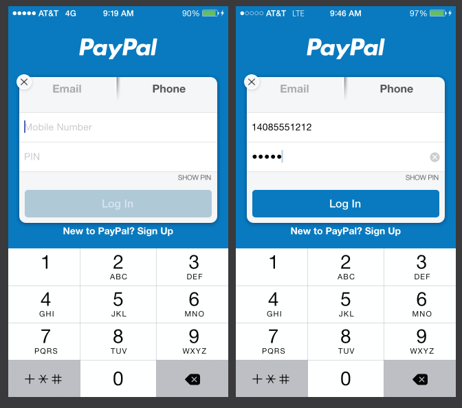
The same mobile app form is shown in a size closer to what I see on my phone in the following example. At a minimum, the text color needs to be changed or darkened to pass the minimum color-contrast ratio for normal body text and to improve readability.
To help distinguish between labels in fields and user-entered information, try to explore alternative visual treatments of form fields. Consider reversing foreground and background colors or using different font styles for labels and for user-entered information.
NoCoffee Vision Simulator For Chrome
NoCoffee Vision Simulator can be used to simulate color-vision deficiencies and low-vision conditions on any pages that are viewable in the Chrome browser. Using the “Color Deficiency” setting “achromatopsia,” you can view web pages in grayscale.
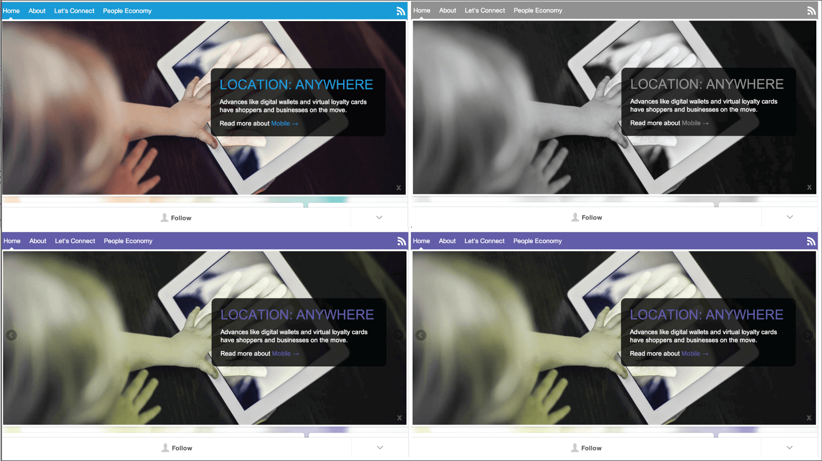
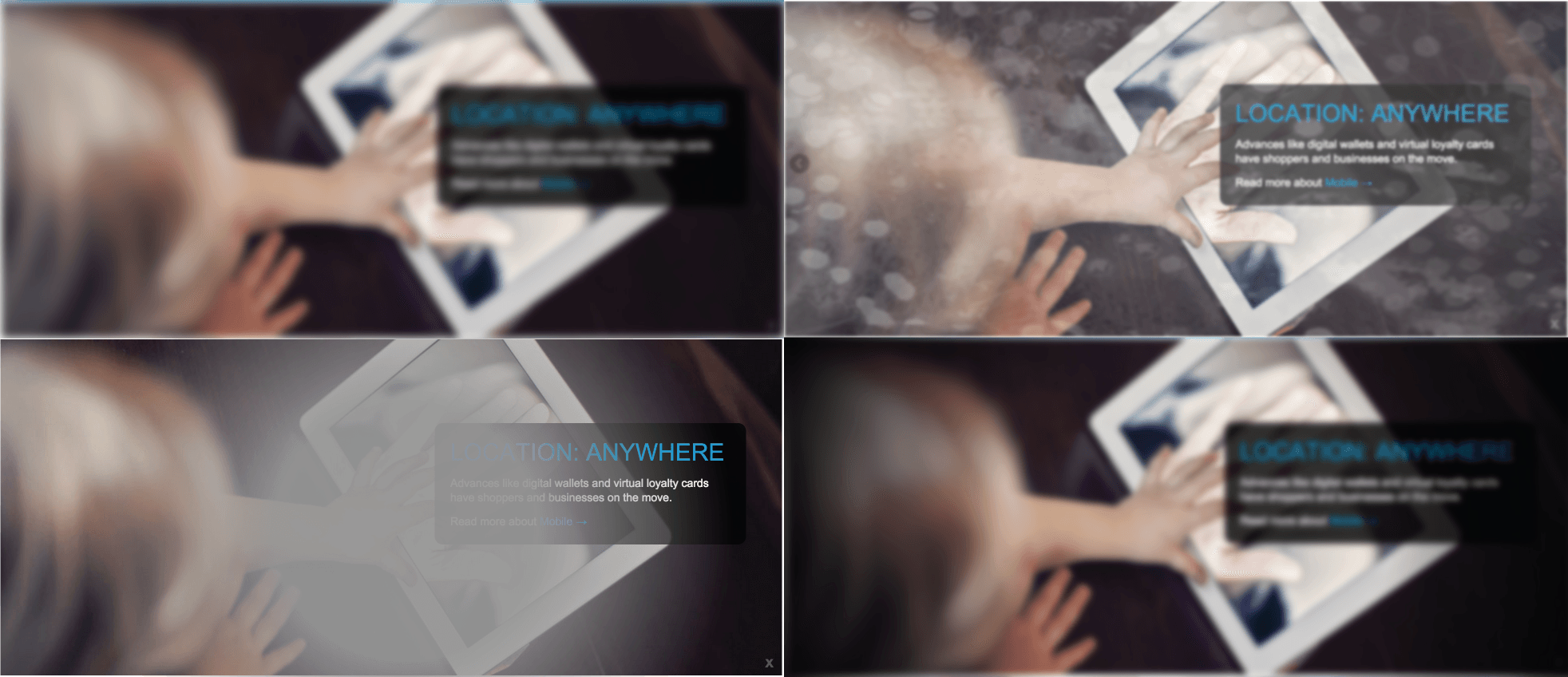
The following example shows the same photograph (featuring a call to action) viewed with some of the simulations available in NoCoffee. The message and call to action are separated from the background image by a practically opaque black container. This improves readability of the message and call to action. Testing the color contrast of the blue color in the headline against solid black passes for large text. Note that the link “Mobile” is not as easy to see because the blue does not pass the color-contrast standard for small body text. Possible improvements could be to change the link color to white and underline it, and/or make the entire phrase “Read more about Mobile” a link.
Using Simulators
Simulators are useful tools to visualize how a design might be viewed by people who are aging, have low-vision conditions or have color-vision deficiencies.
For design reviews, I use the simulators to mock up a design in grayscale, and I might use color-blindness filters to show designers possible problems with color contrast. Some of the questions I ask are:
- Is anything difficult to read?
- Is the call to action easy to find and read?
- Are links distinguishable from other content?
After learning how to use simulators to build empathy and to see their designs differently, I ask designers to use tools to check color contrast to verify that all of their designs meet the minimum color-contrast ratio of the WCAG 2.0 AA. The checklist includes a couple of tools they can use to test their designs.
Color-Contrast Ratio Checkers
The tools we cite in the designers’ checklist are these:
- WebAIM Color Contrast Checker, a browser-based tool, tests color codes specified in hexadecimal values.
- The Paciello Group’s Colour Contrast Checker, an application available for Macs or PCs, tests color codes specified in RGB values.
There are many tools to check color contrast, including ones that check live products. I’ve kept the list short to make it easy for designers to know what to use and to allow for consistent test results.
Our goal is to meet the WCAG 2.0 AA color-contrast ratio, which is 4.5 to 1 for normal text and 3 to 1 for large text.
What are the minimum sizes for normal text and large text? The guidance provides recommendations on size ratios in the WCAG’s Contrast (Minimum): Understanding Success Criterion 1.4.3 but not a rule for a minimum size for body text. As noted in the WCAG’s guidance, thin decorative fonts might need to be larger and/or bold.
Testing Color-Contrast Ratio
You should test:
- early in the design process;
- when creating a visual design specification for any product or service (this documents all of the color codes and the look and feel of the user experience);
- all new designs that are not part of an existing visual design guideline.
Test Hexadecimal Color Codes For Web Designs
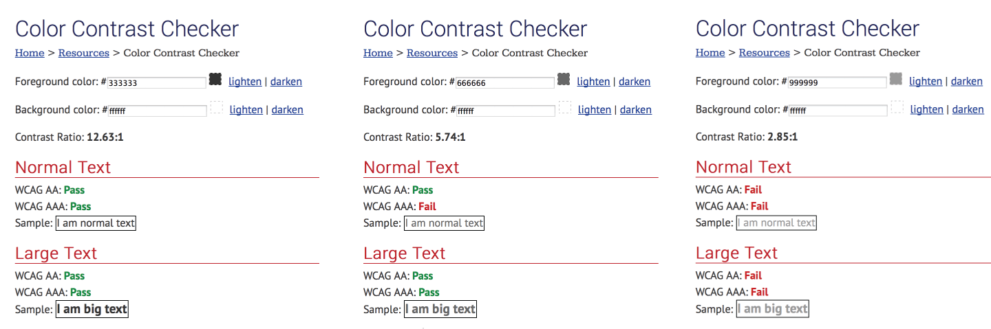
Let’s use the WebAIM Color Contrast Checker to test sample body-text colors on a white background (#FFFFFF):
- dark-gray text (#333333).
- medium-gray text (#666666).
- light-gray text (#999999).
We want to make sure that body and normal text passes the WCAG 2.0 AA. Note that light gray (#999999) does not pass on a white background (#FFFFFF).
In the tool, you can modify the light gray (#999999) to find a color that does pass the AA. Select the “Darken” option to slightly change the color until it passes. By clicking the color field, you will have more options, and you can change color and luminosity, as shown in the second part of this example.

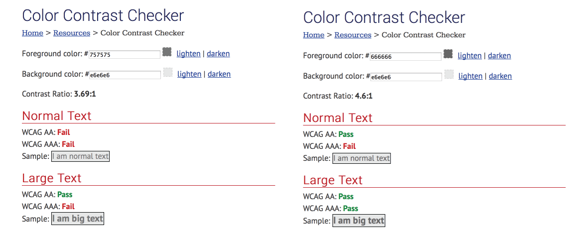
Tabular information may be designed with alternating white and gray backgrounds to improve readability. Let’s test medium-gray text (#666666) and light-gray text (#757575) on a gray background (#E6E6E6).
Note that with the same background, the medium text passes, but the lighter gray passes only for large text. In this case, use medium gray for body text instead of white or gray backgrounds. Use the lighter gray only for large text, such as headings on white and gray backgrounds.
Test RGB Color Codes
For mobile applications, designers might use RGB color codes to specify visual designs for engineering. You can use the TPG Colour Contrast Checker. you will need to install either the PC or Mac version and run it side by side with Photoshop.
Let’s use the Colour Contrast Checker to test medium-gray text (102 102 102 in RGB and #666666 in hexadecimal) and light-gray text (#757575 in hexadecimal) on a gray background (230 230 230 in RGB and #E6E6E6 in hexadecimal).
- Open the Colour Contrast Checker application.
- Select “Options” → “Displayed Color Values” → “RGB.”
- Under “Algorithm,” select “Luminosity.”
- Enter the foreground and background colors in RGB:
102 102 102for foreground and230 230 230for background. Mouse click or tab past the fields to view the results. Note that this combination passes for both text and large text (AA). - Select “Show details” to view the hexadecimal color values and information about both AA and AAA requirements.
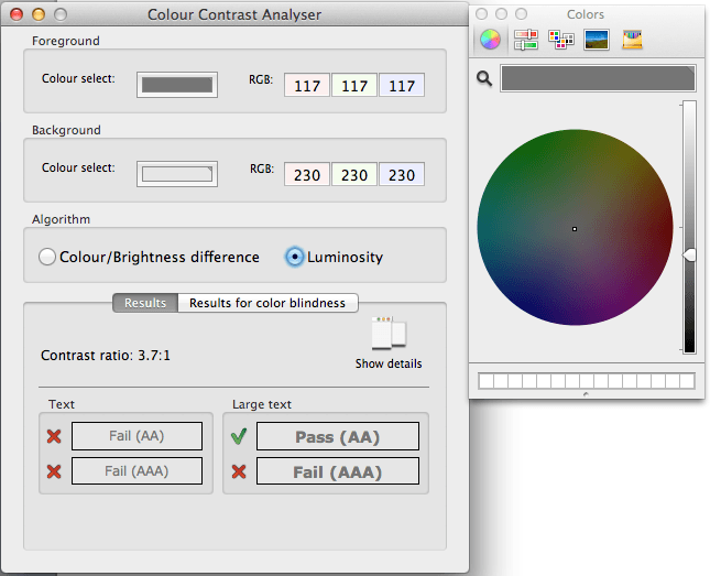
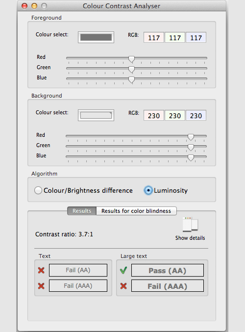
In our example, light-gray text (117 117 117 in RGB) on a gray background (230 230 230 in RGB) does not meet the minimum AA contrast ratio for body text. To modify the colors, view the color wheels by clicking in the “Color” select box to modify the foreground or background. Or you can select “Options” → “Show Color Sliders,” as shown in the example.
In most cases, minor adjustments to colors will meet the minimum contrast ratio, and comparisons before and after will show how better contrast enables most people to see and read more easily.
Best Practices
Test for color-contrast ratio, and document the styles and color codes used for all design elements. Create a visual design specification that includes the following:
- typography for all textual elements, including headings, text links, body text and formatted text;
- icons and glyphs and text equivalents;
- form elements, buttons, validation and system error messaging;
- background color and container styles (making sure text on these backgrounds all pass);
- the visual treatments for disabled links, form elements and buttons (which do not need to pass a minimum color-contrast ratio).
Documenting visual guidelines for developers brings several benefits:
- Developers don’t have to guess what the designers want.
- Designs can be verified against the visual design specification during quality testing cycles, by engineers and designers.
- A reference point that meets design accessibility guidelines for color contrast can be shared and leveraged by other teams.
Summary
If you are a designer, try out the simulators and tools on your next design project. Take time to see differently. One of the stellar designers who reviewed my checklist told me a story about using Photoshop’s color-blindness proofs. On his own, he used the proofs to refine the colors used in a design for his company’s product. When the redesigned product was released, his CEO thanked him because it was the first time he was able to see the design. The CEO shared that he was color-blind. In many cases, you may be unaware that your colleague, leader or customers have moderate low-vision or color-vision deficiencies. If meeting the minimum color-contrast ratio for a particular design element is difficult, take the challenge of thinking beyond color. Can you innovate so that most people can pick up and use your application without having to customize it?
If you are responsible for encouraging teams to build more accessible web or mobile experiences, be prepared to use multiple strategies:
- Use immersive experiences to engage design teams and gain empathy for people who see differently.
- Show designers how their designs might look using simulators.
- Test designs that have low contrast, and show how slight modifications to colors can make a difference.
- Encourage designers to test, and document visual specifications early and often.
- Incorporate accessible design practices into reusable patterns and templates both in the code and the design.
Priorities and deadlines make it challenging for teams to deliver on all requests from multiple stakeholders. Be patient and persistent, and continue to engage with teams to find strategies to deliver user experiences that are easier to see and use by more people out of the box.
References
- “Contrast (Minimum): Understanding Success Criterion 1.4.3” and the note, Web Content Accessibility Guidelines 2.0, Level AA
- “Get a Sneak Peek Into PayPal Accessibility Showcase,” Victor Tsaran and Cathy O’Connor, PayPal Engineering
- “Adobe Photoshop” Accessibility,” Adobe
- “Soft-Proof for Color Blindness (Photoshop and Illustrator),” Adobe
- Web Accessibility in Mind (WebAIM)
- TPG Colour Contrast Analyser (for Mac and PC), The Paciello Group
- Color Vision Simulator for iOS and Android, Kazunori Asada
- VisionSim for iOS and Android, The Braille Institute
- “NoCoffee Vision Simulator, Aaron Leventhal (see Levanthal’s blog post about it)
- “Age-Related Eye Diseases,” National Eye Institute
- “Disability and Health,” World Health Organization
- “Presbyopia,” Mayo Clinic
- “World Population Ageing: 1950–2050,” UN Department of Economic and Social Affairs
Low-Vision Goggles And Resources
- Zimmerman Low Vision Simulation Kit
- Low Vision Simulators, Fork In the Road
Further Reading
- The Underestimated Power Of Color In Mobile App Design
- Color Theory for Designers, Part 1: The Meaning of Color
- The Code Side Of Color
- The WAI Forward
- The Beauty Of Watercolor Painting In 43 Examples
 (hp, al, il, ml, mrn)

