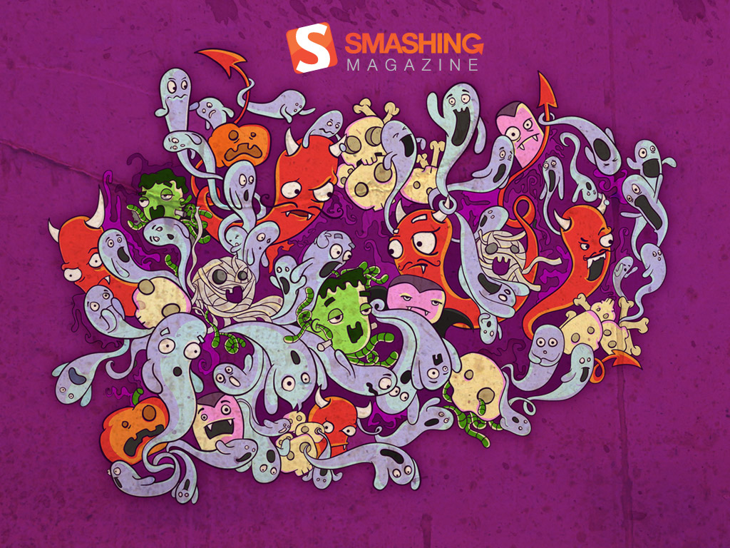
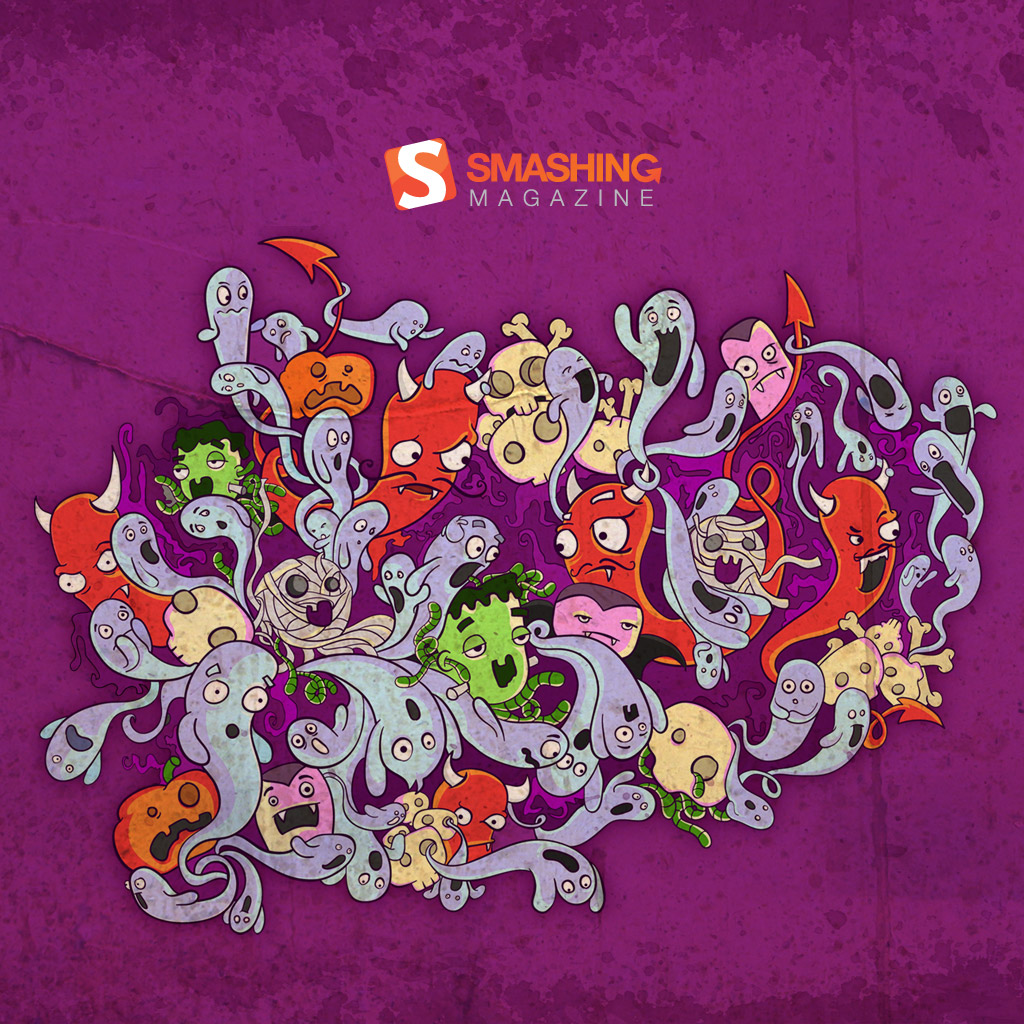
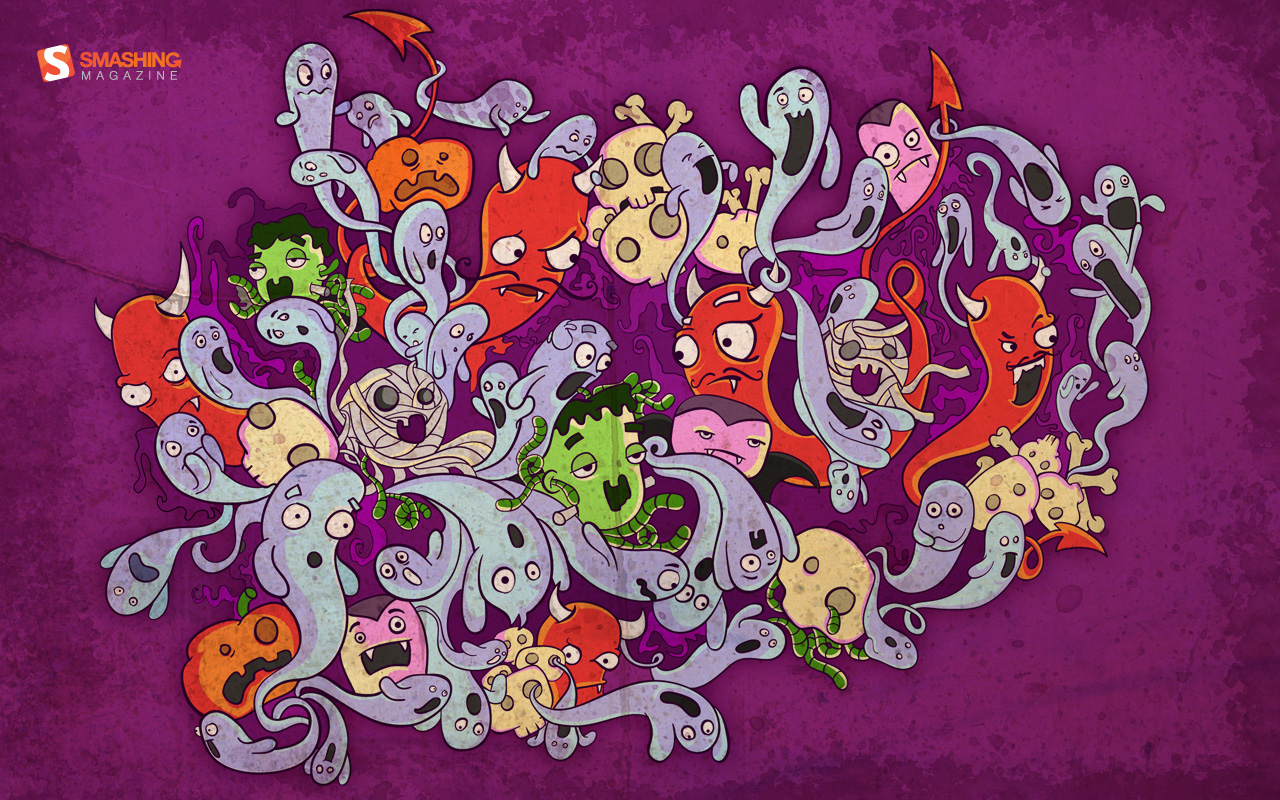
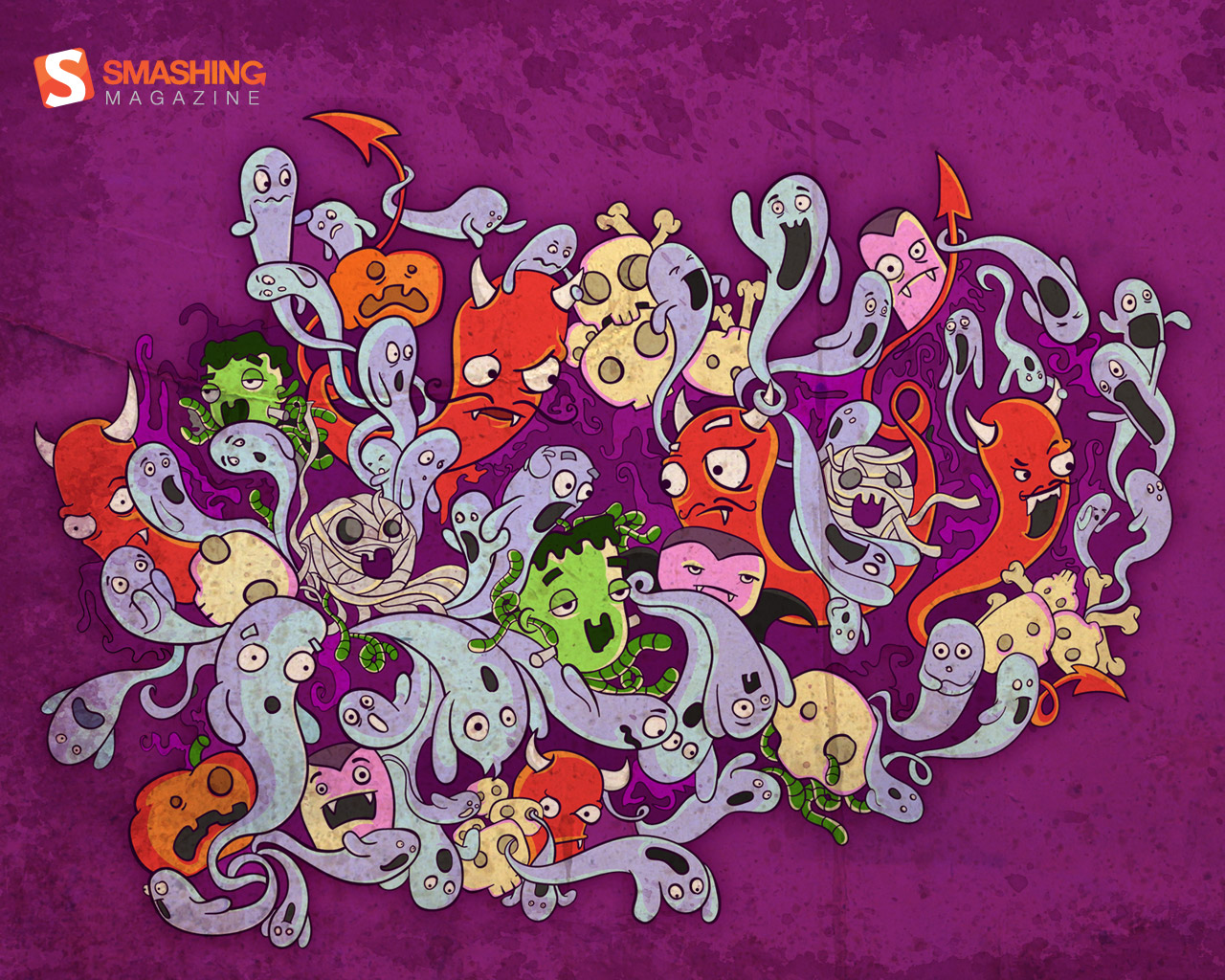
75 Halloween Wallpapers ? Scary Monsters, Pumpkins And Zombies

Email Newsletter
Weekly tips on front-end & UX.
Trusted by 182,000+ folks.
 Claim Your Free Spot!

 Register Free Now
 SurveyJS: White-Label Survey Solution for Your JS App
 Celebrating 10 million developers
Halloween is around the corner and the atmosphere is filled with pumpkins, skeletons, bonfires, horror movies and other scary things spread across the houses, stores and, of course, web sites. Just the right time to spice up your desktop with an appropriate Halloween spirit. And for this purpose you may change your desktop wallpaper and prepare some traditional pumpkin carvings. Last updated Oct/11/2016.
In this post we present some beautiful hight quality Halloween wallpapers for your scary Halloween party. All these screenshots are linked to their source here on our servers or elsewhere.
Halloween is around the corner and the atmosphere is filled with pumpkins, skeletons, bonfires, horror movies and other scary things spread across the houses, stores and, of course, web sites. Just the right time to spice up your desktop with an appropriate Halloween spirit. And for this purpose you may change your desktop wallpaper and prepare some traditional pumpkin carvings.
In this post we present some beautiful hight quality wallpapers for your scary Halloween party. These images do not contain any calendars. All images can be clicked and lead to a preview. [Links checked January/12/2017]
You may also want to take a look at the following related posts:
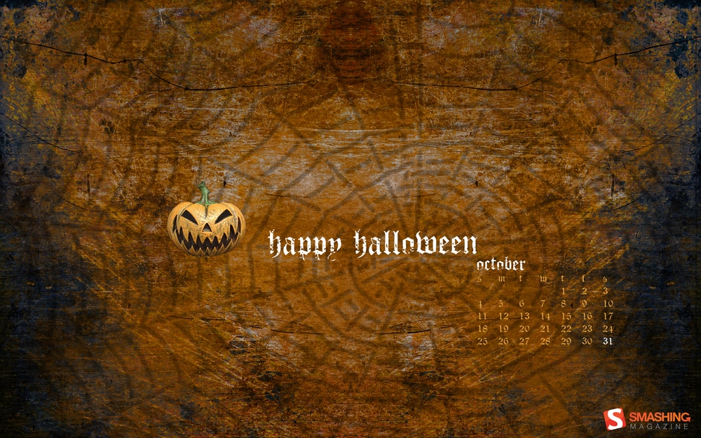
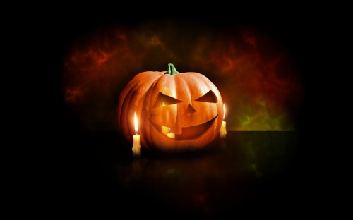
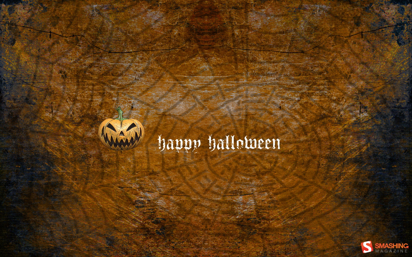
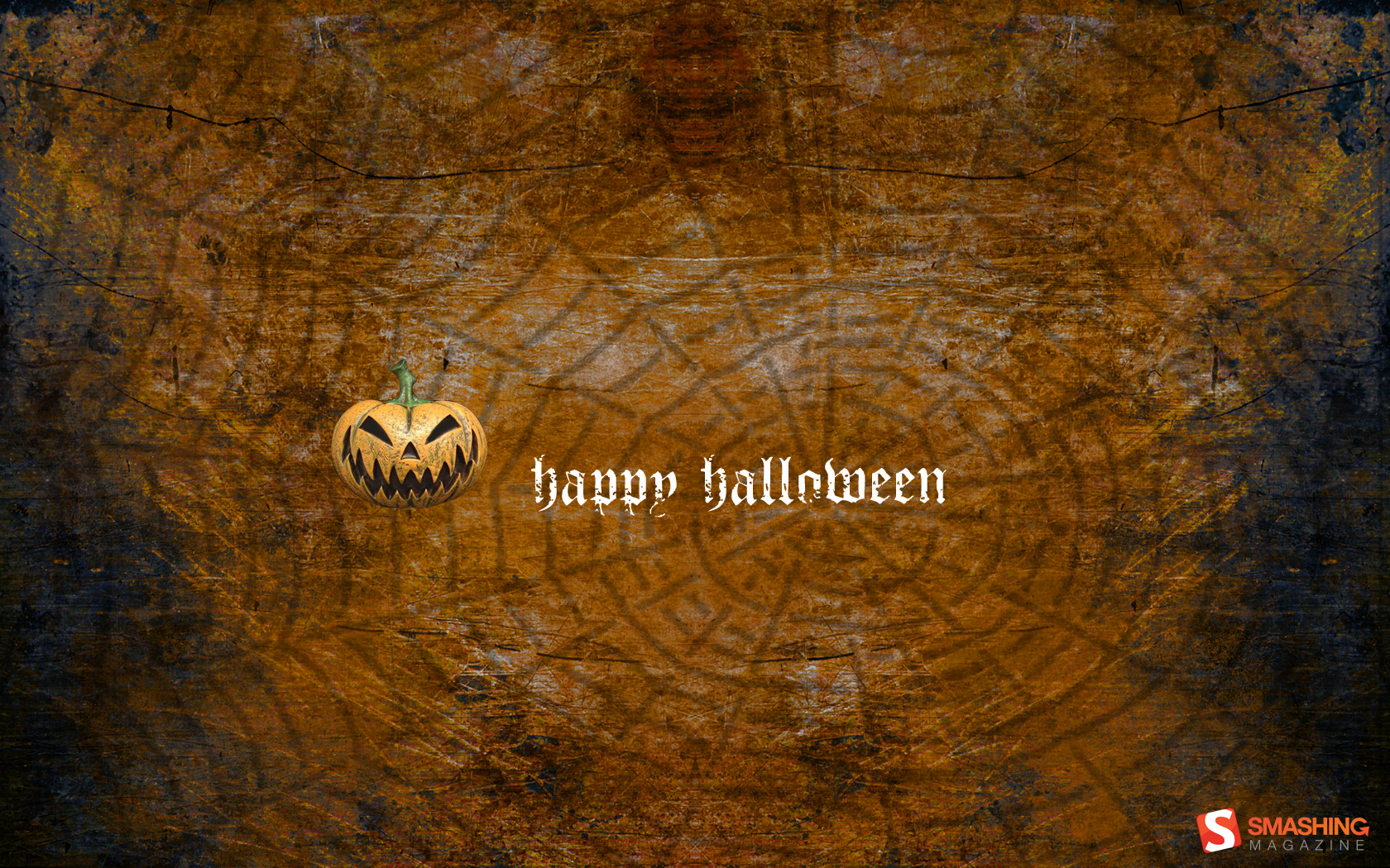
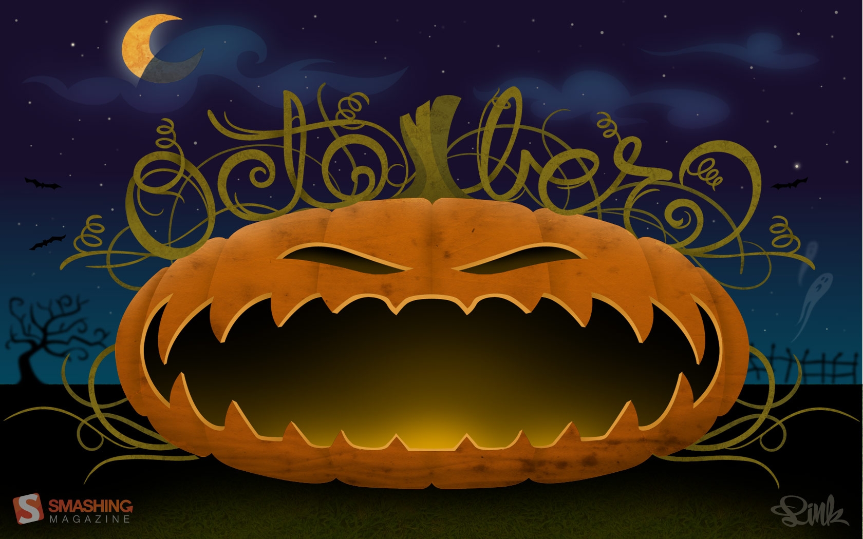
Halloween Pumpkin ? Wallpaper
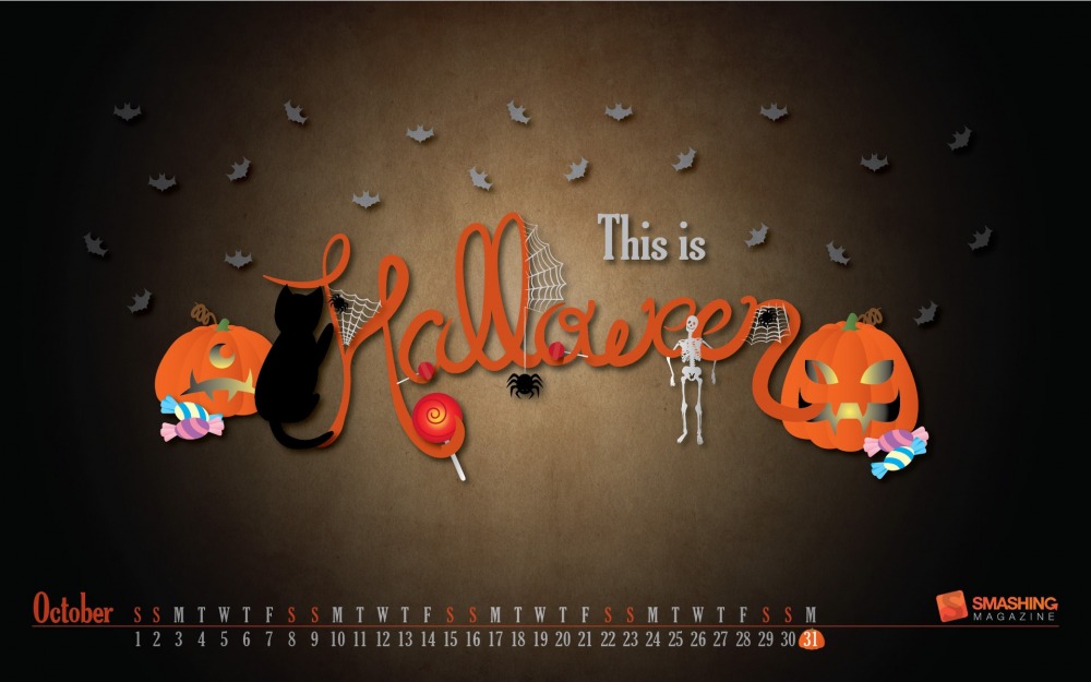
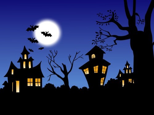
Scary bats and spiders, frightening skeletons, delicious candies and lollies and ominous black cats and carved pumpkins… All bundled up together and you have a perfect Halloween. Trick or treat! Designed by Soraia Mendes from Portugal.
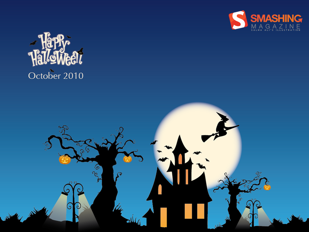
Happy Halloween Wallpapers
Designed by Zanetine Web Design from India.

- 320x480, 640x480, 800x480, 800x600, 1024x768, 1152x864, 1280x720, 1280x800, 1280x960, 1440x900, 1600x1200, 1680x1050, 1920x1080, 1920x1200, 2560x1440, 2880x1080, 1366x768
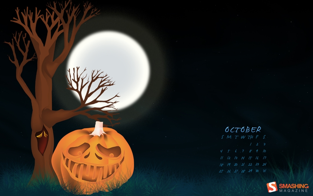
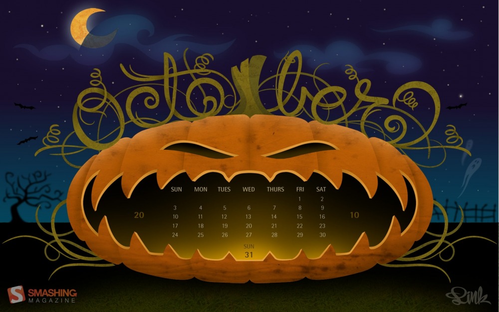
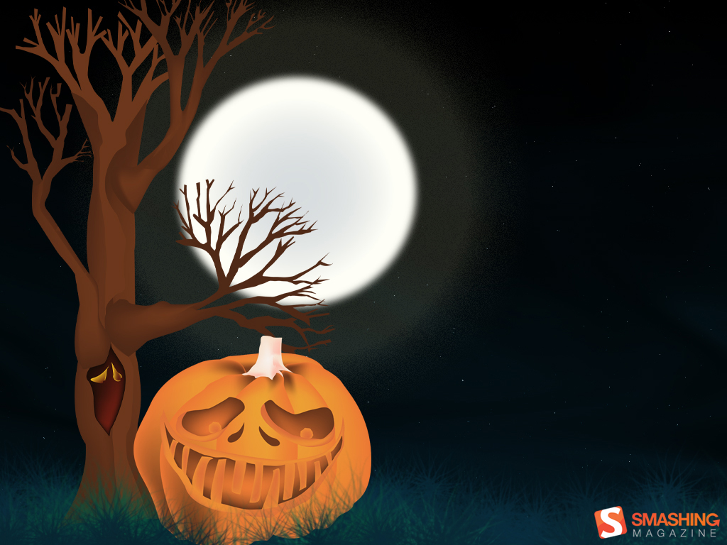
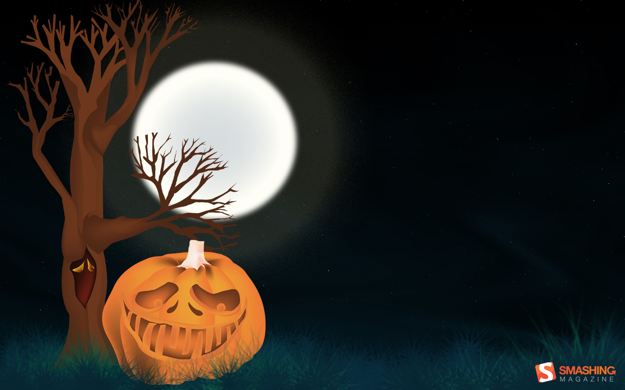
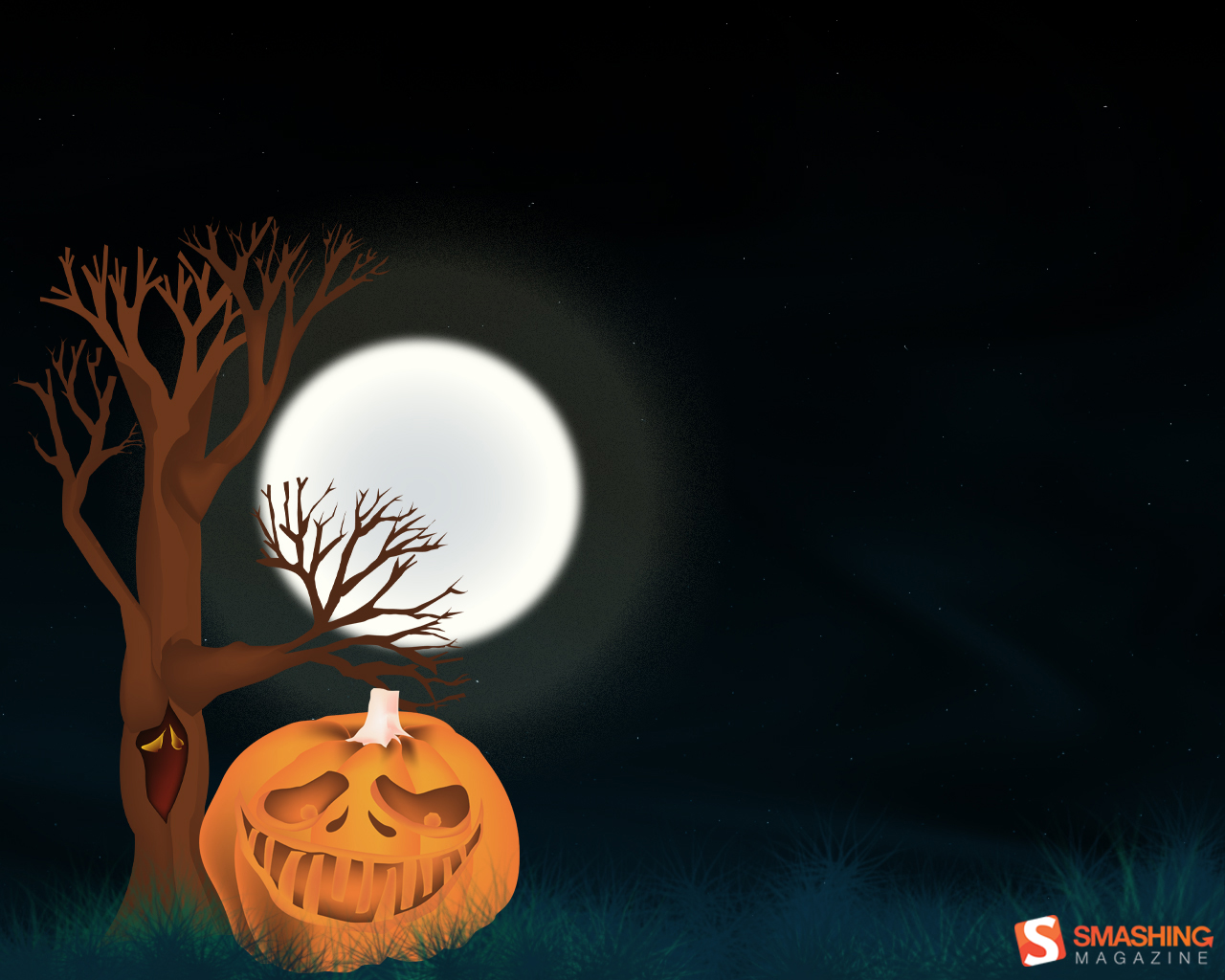
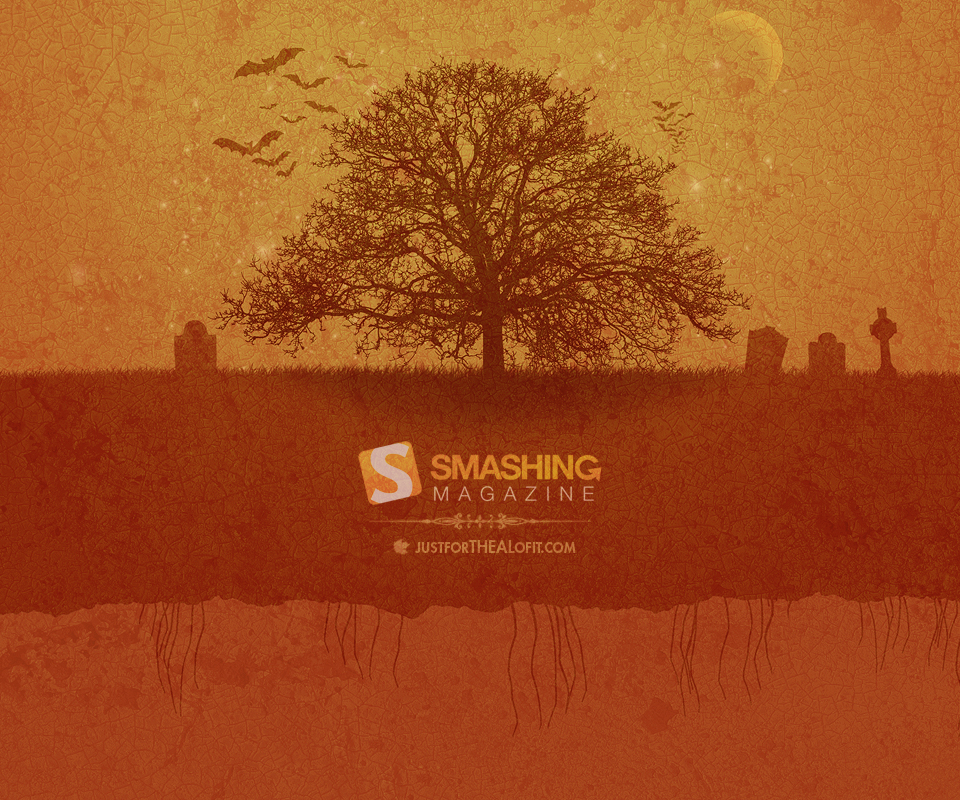
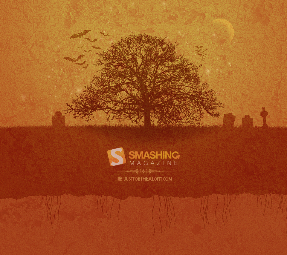
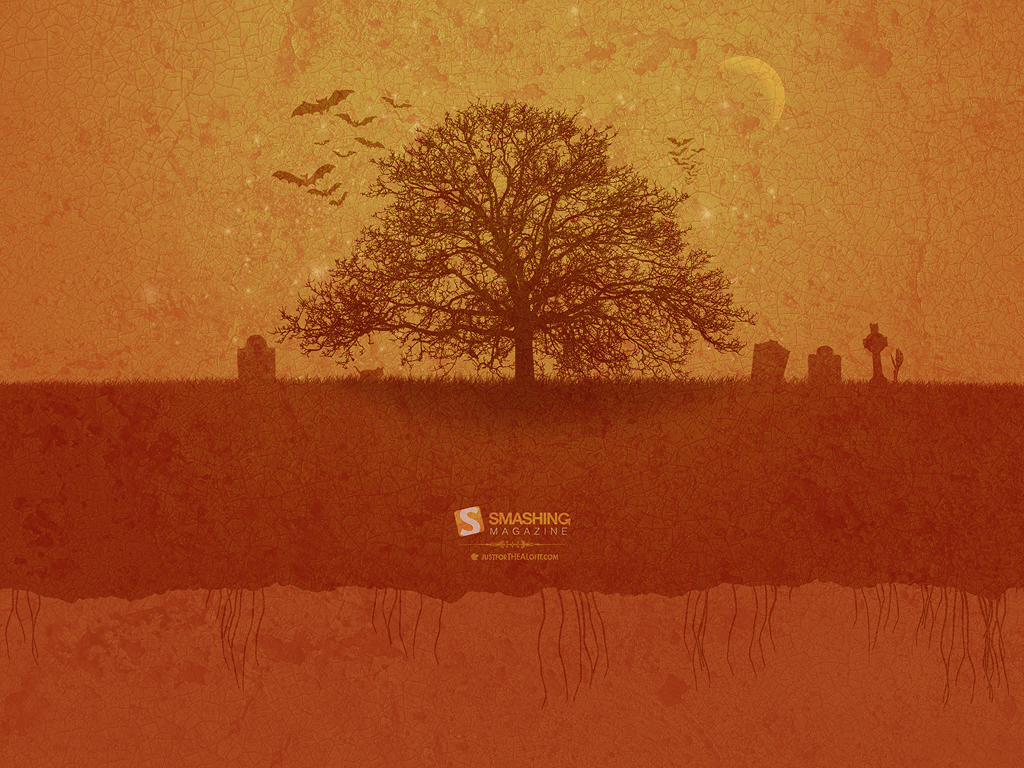
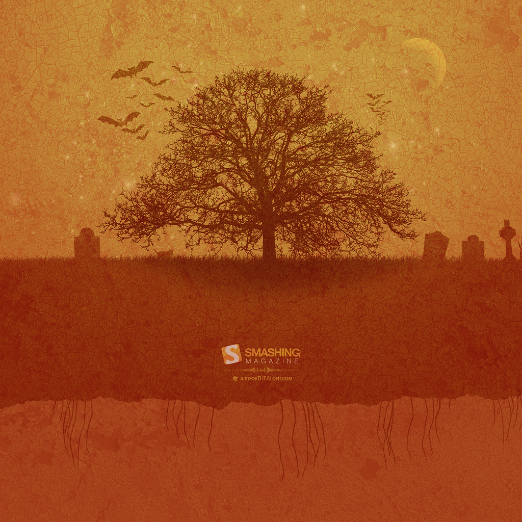
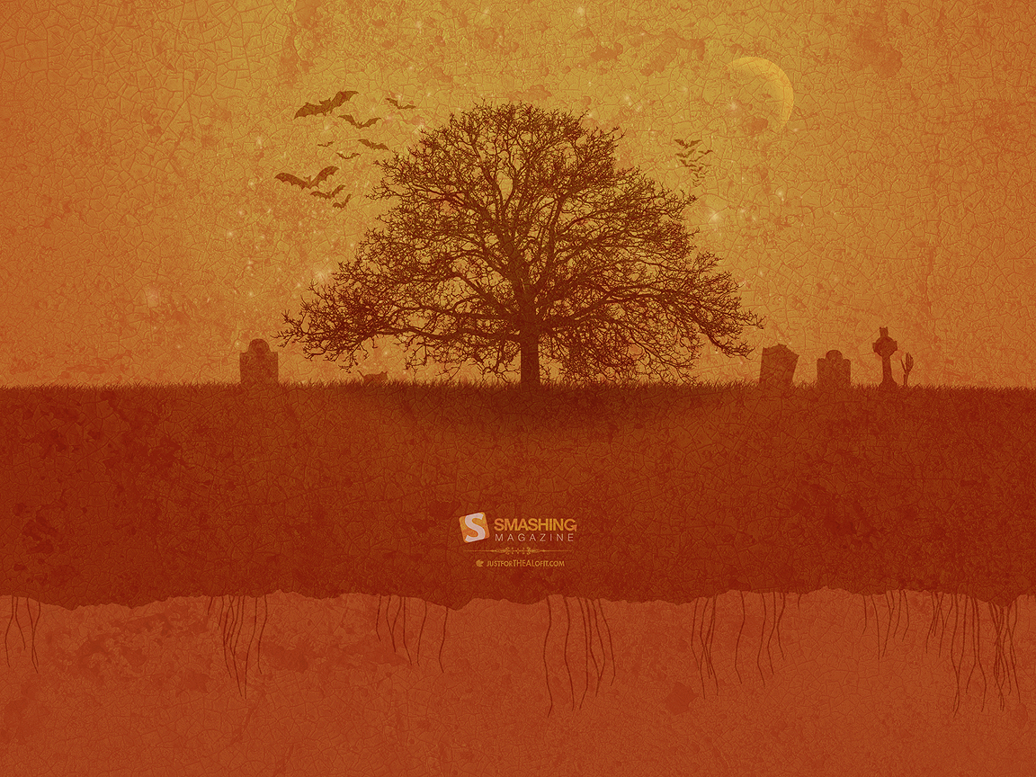
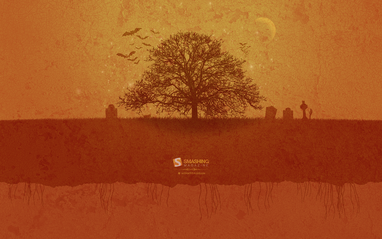
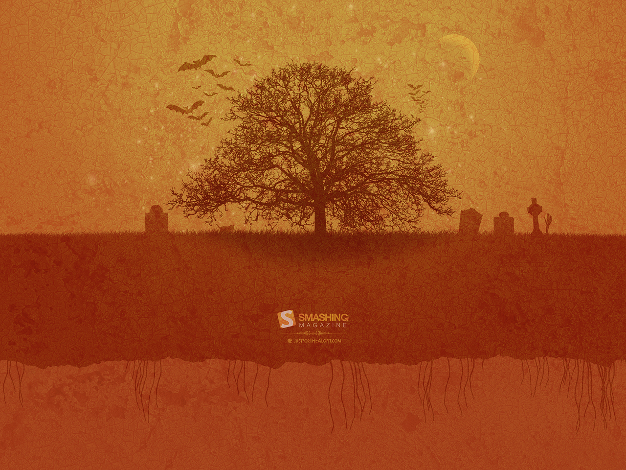
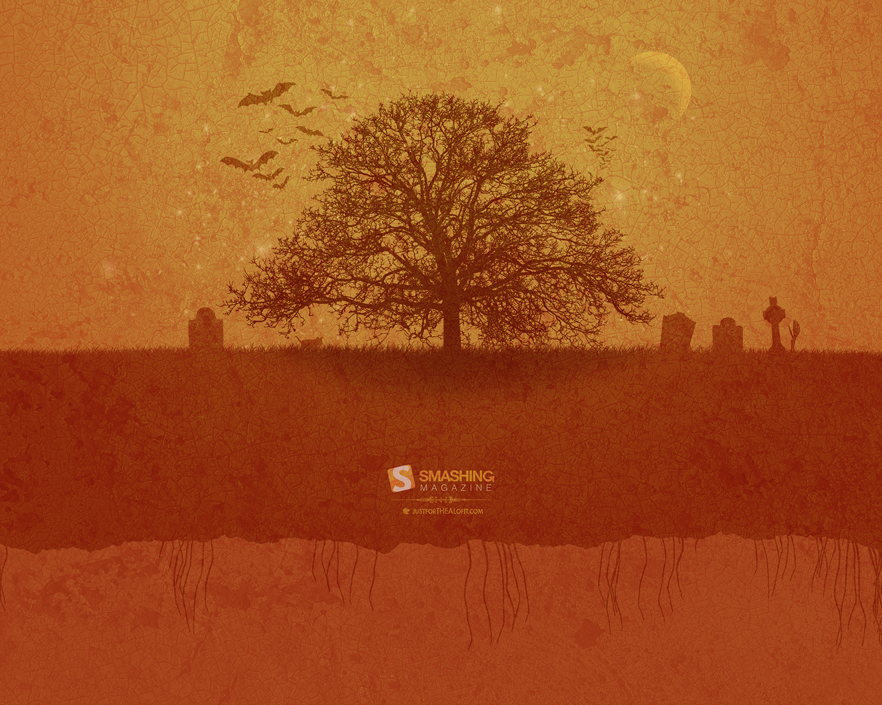
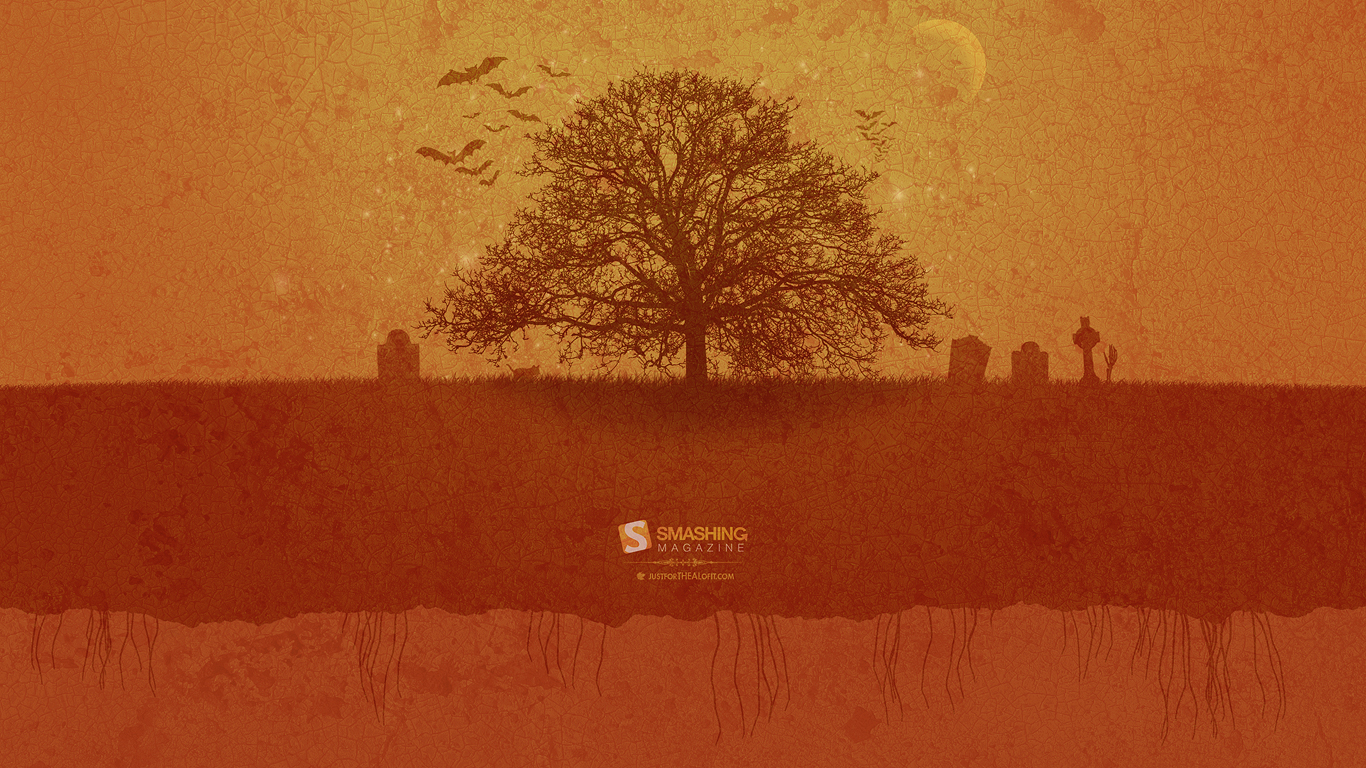
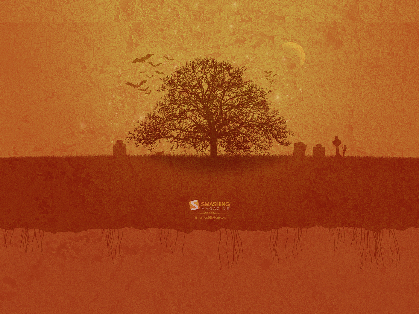
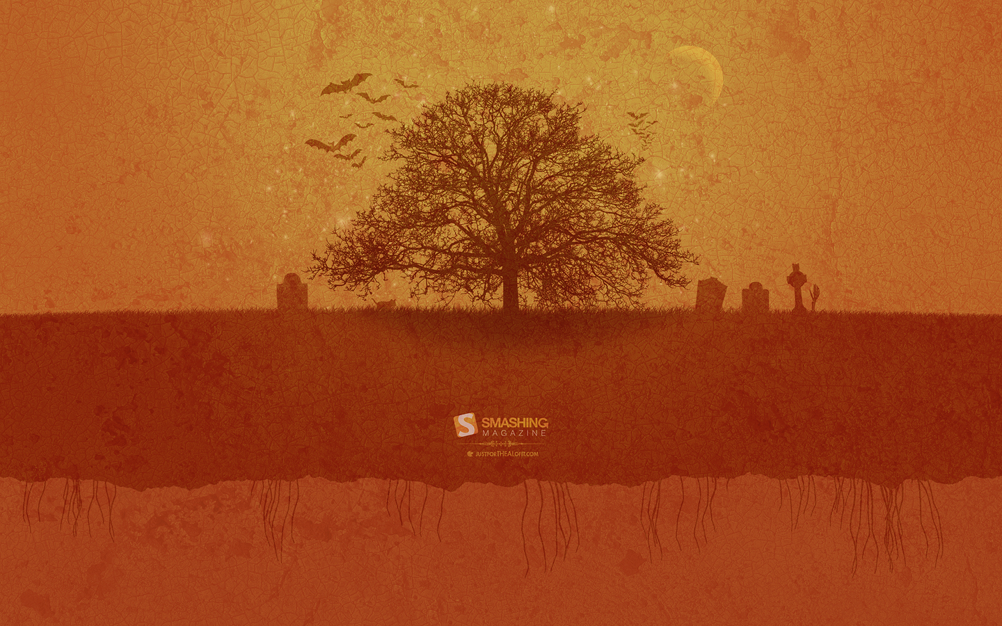
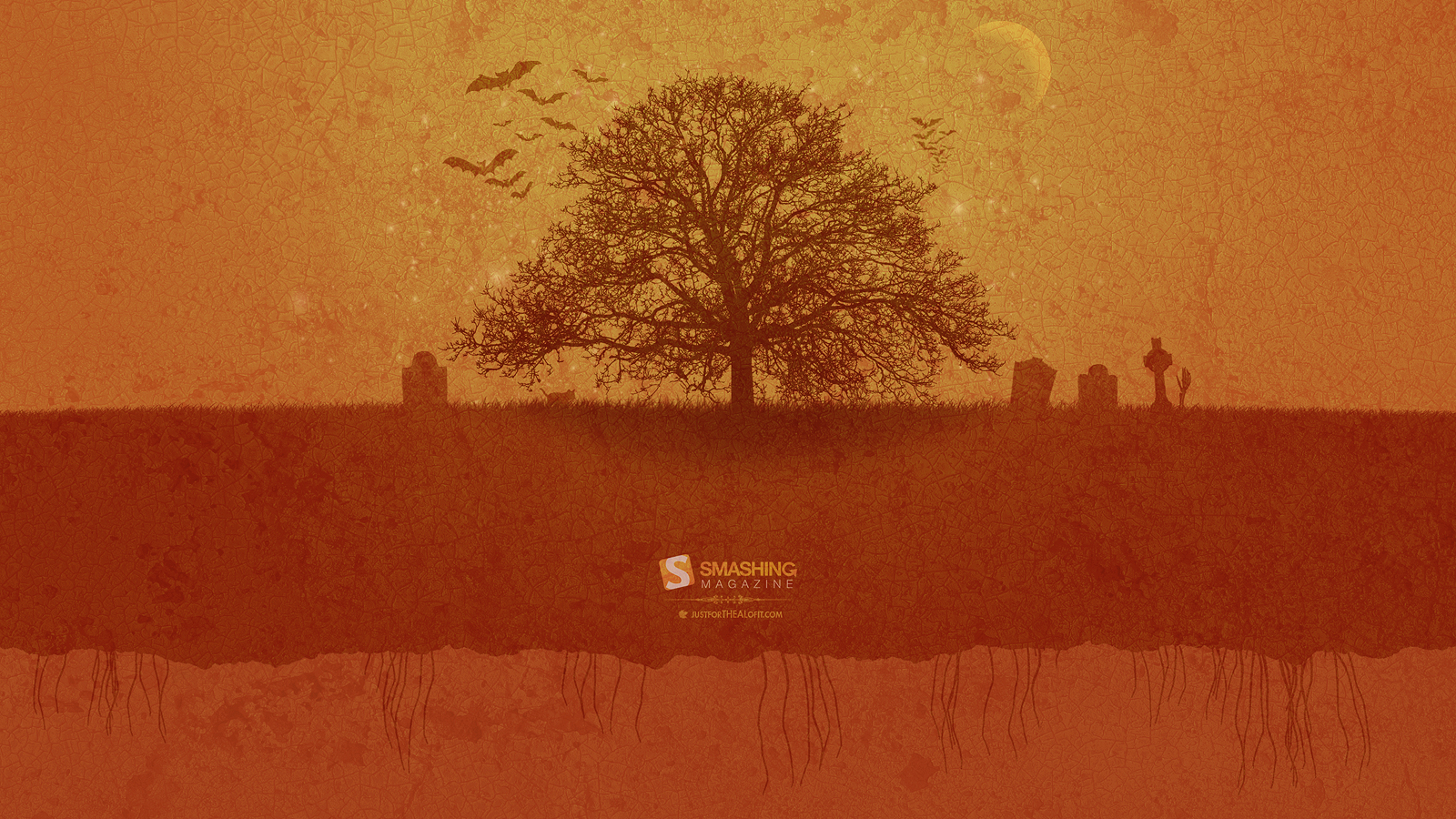
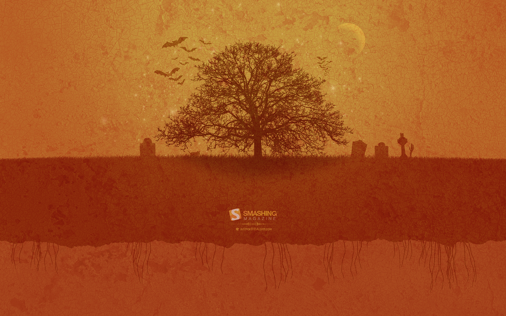
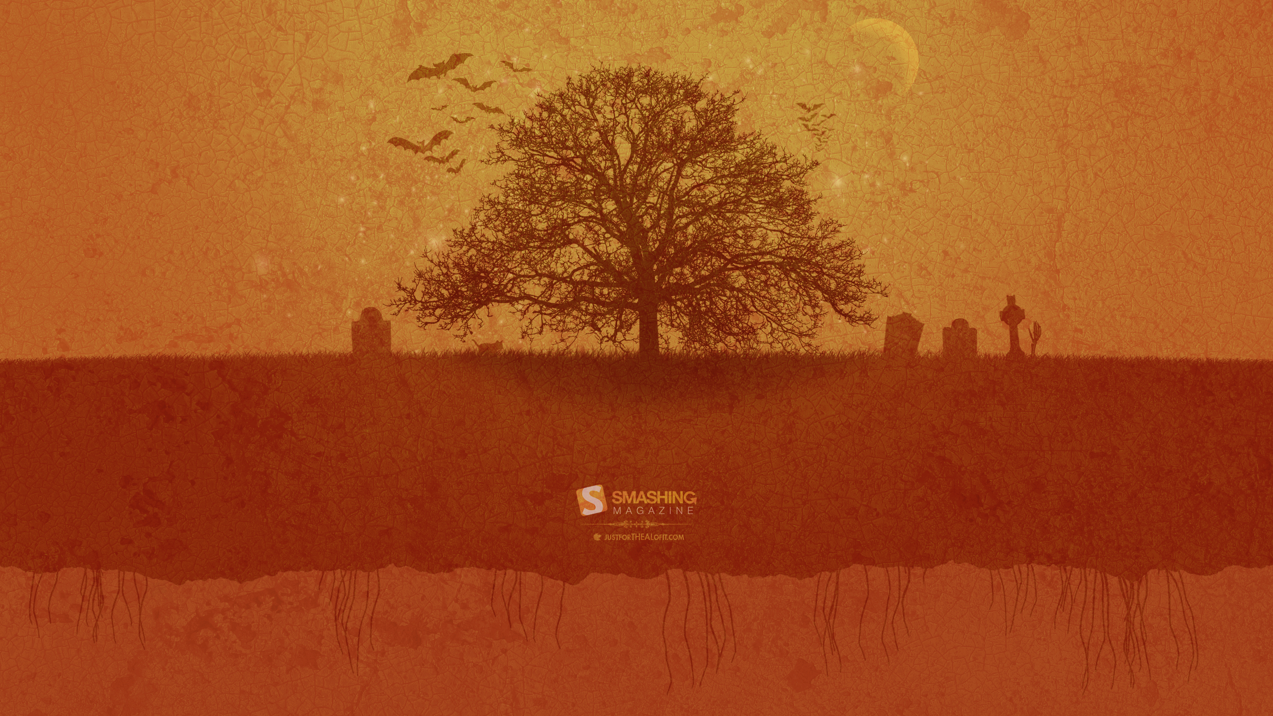
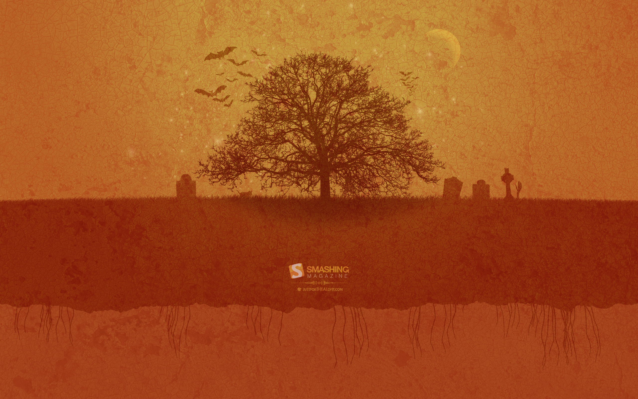
The Moons Glow
“It is a full moon tonight. The fall wind blows the clouds. The leaves have fallen from the trees and a happy pumpkin sits beneath a spooky tree. The tree and the pumpkin both welcome in the month of October.” Designed by Allison S. Hoge from USA.
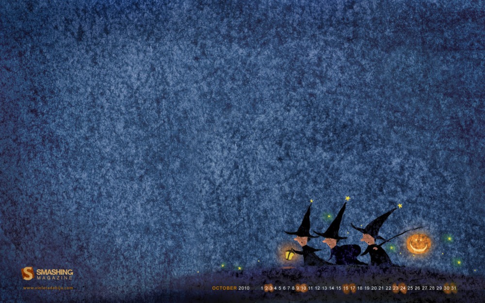
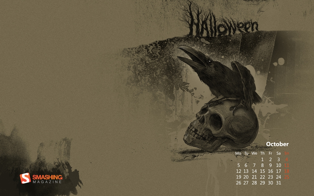
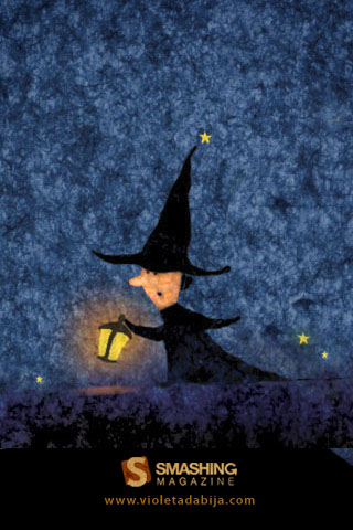
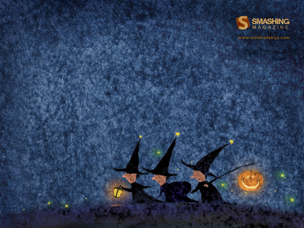
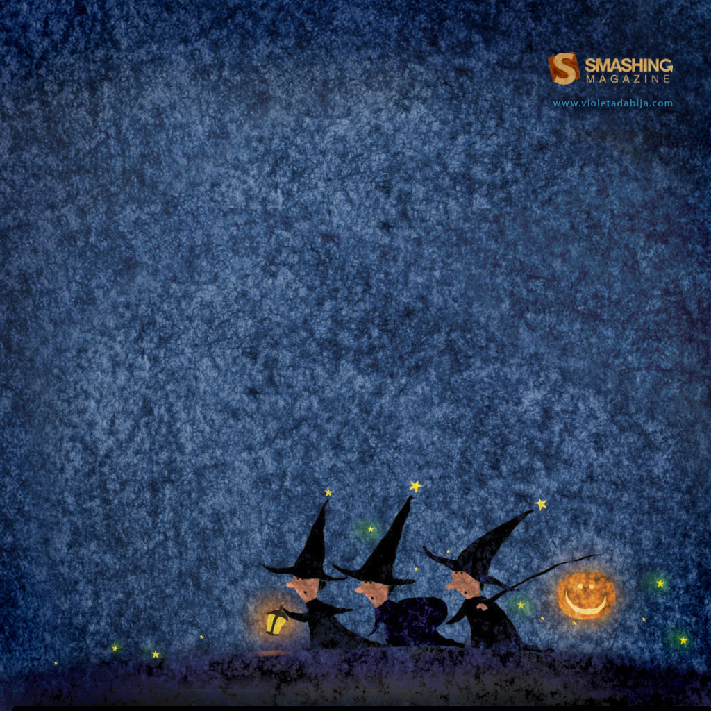
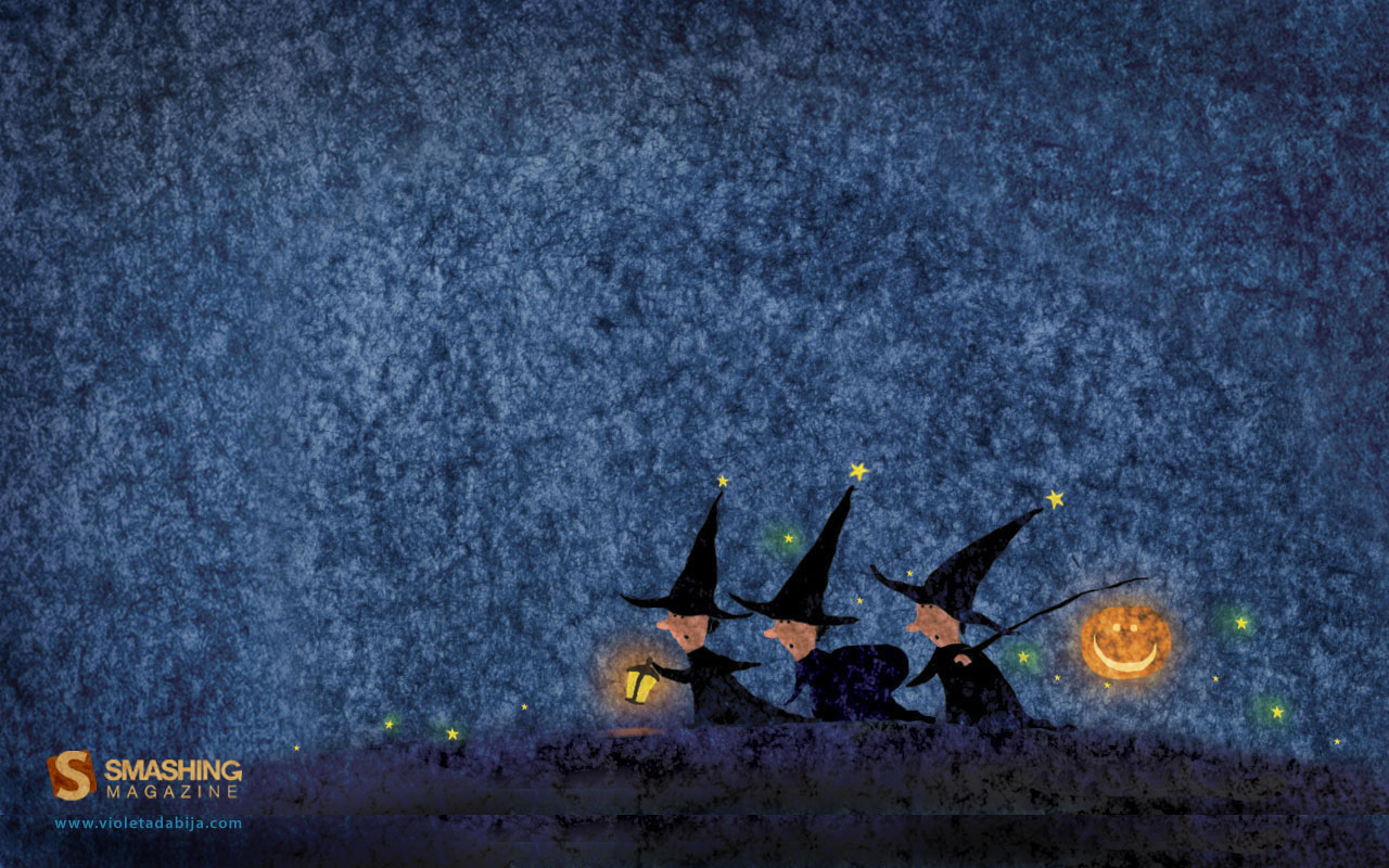
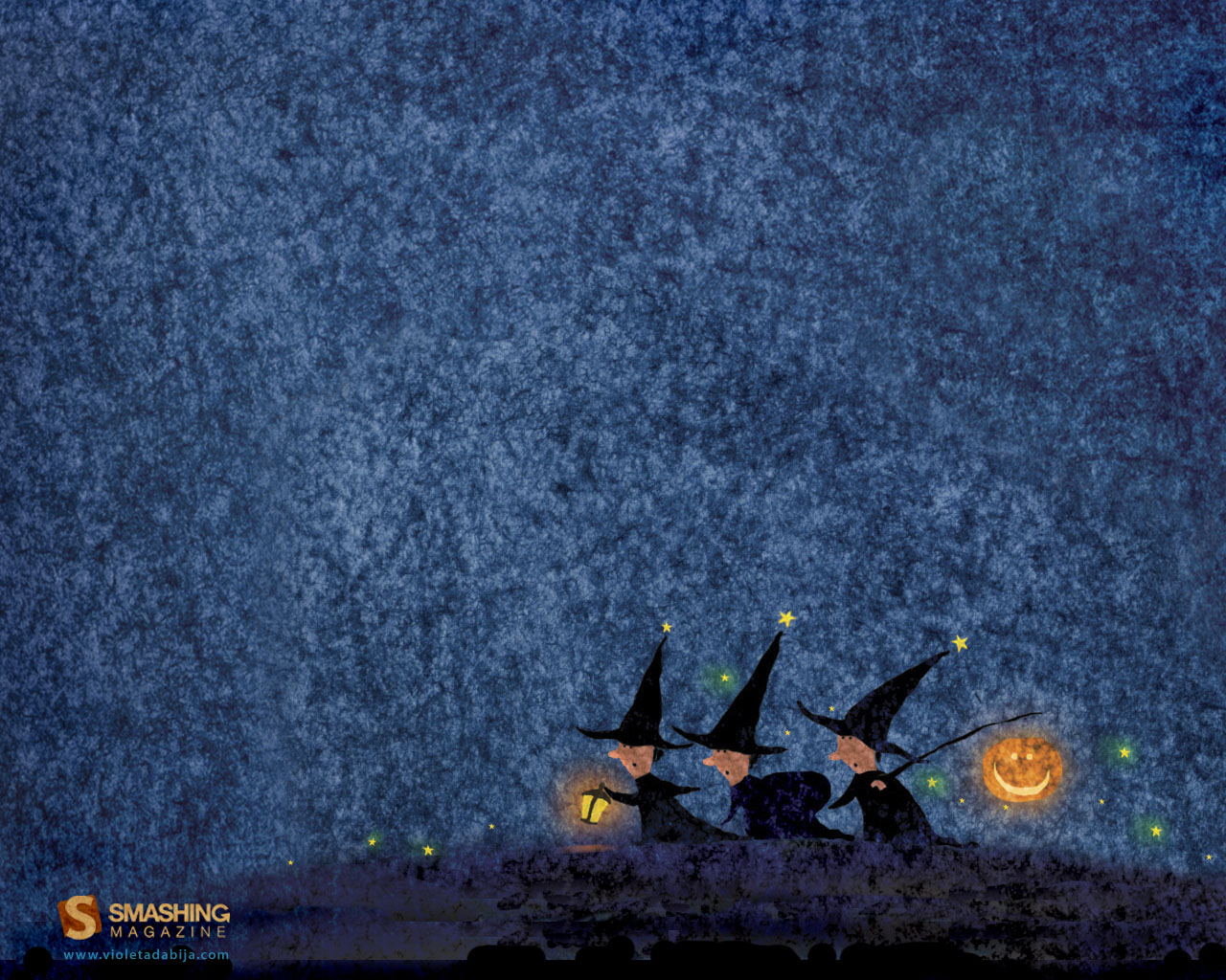
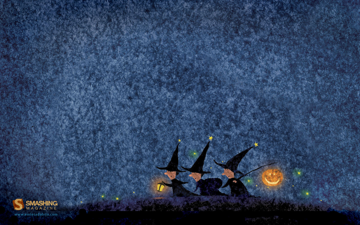
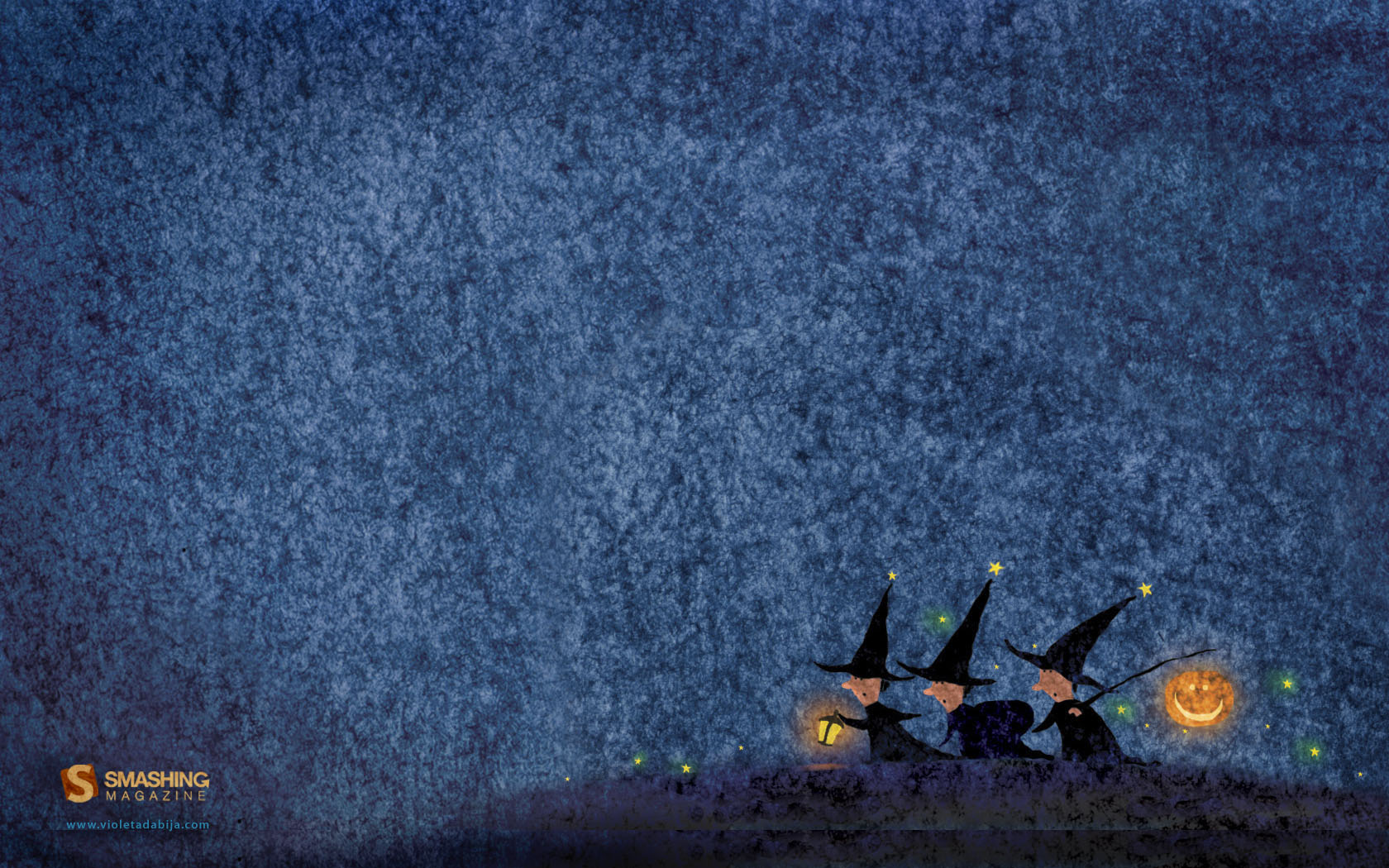
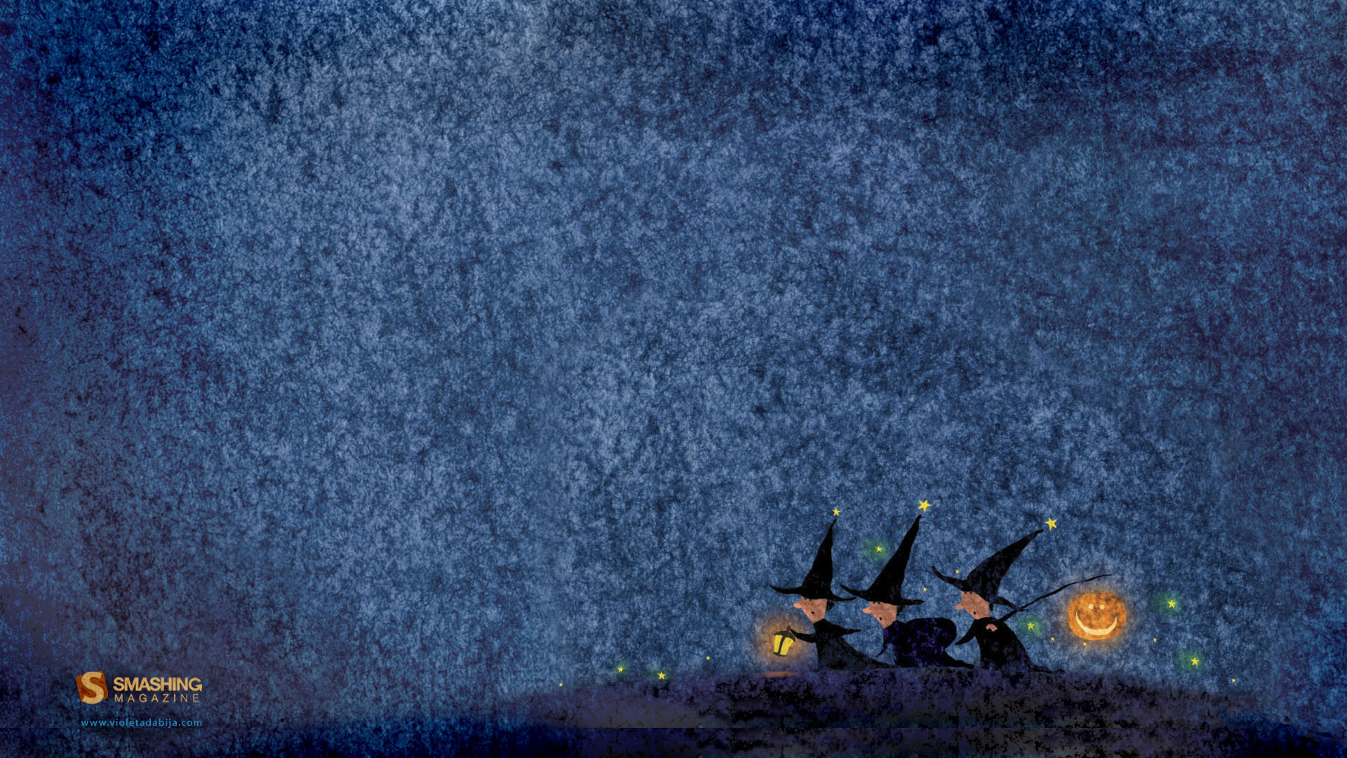
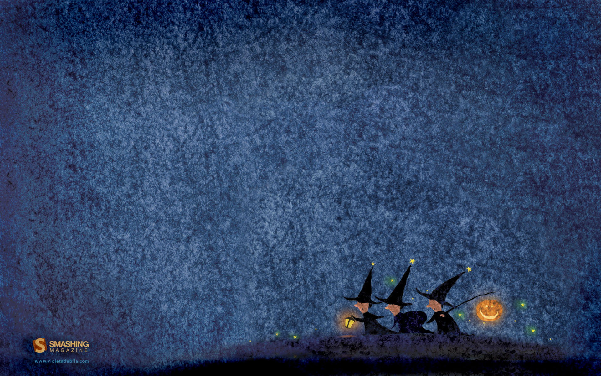
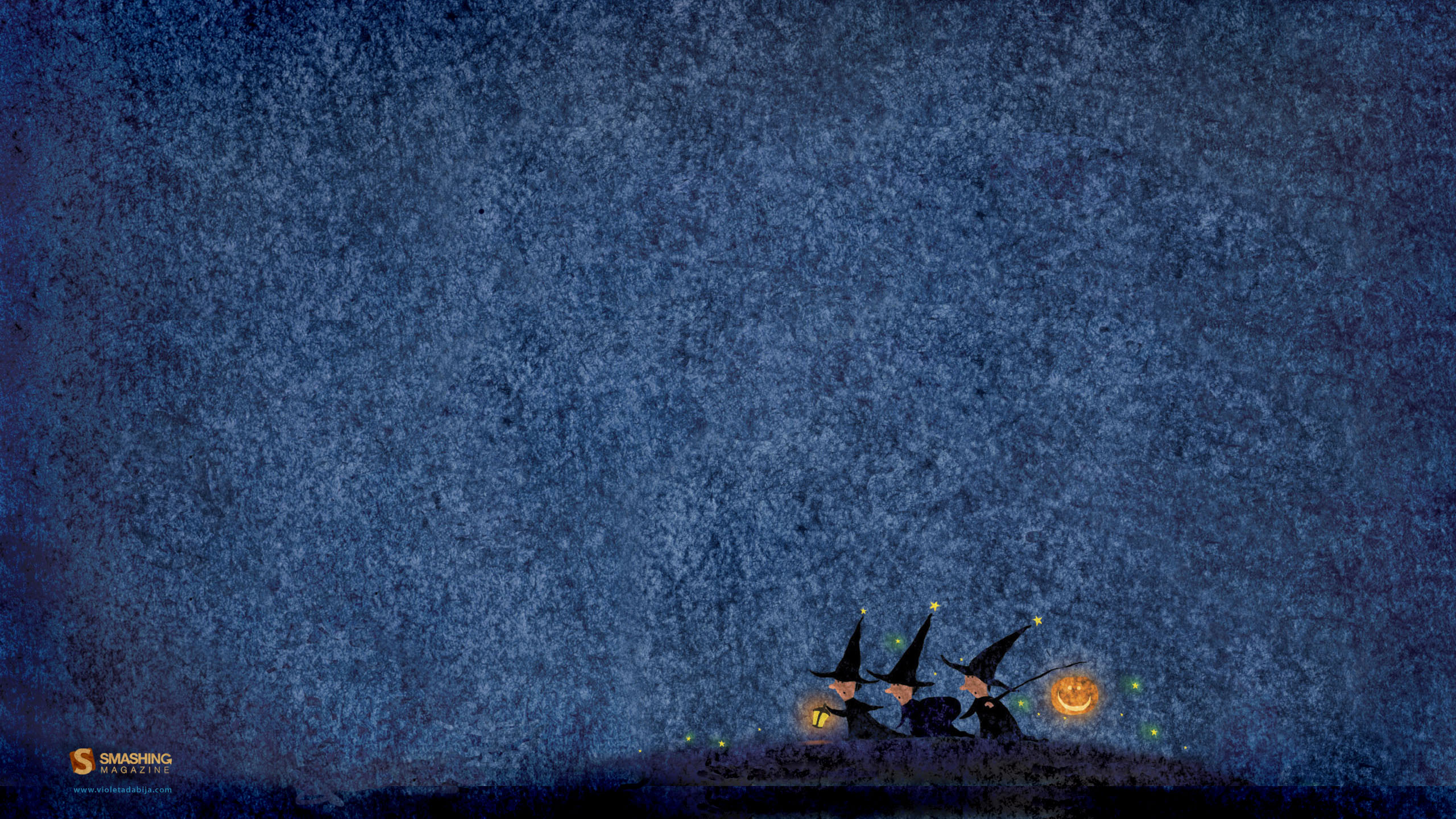
Halloween
Designed by Violeta Dabija from Moldova.
- 320×480, 1024×768, 1024×1024, 1280×800, 1280×1024, 1440×900, 1680×1050, 1920×1080, 1920×1200, 2560×1440
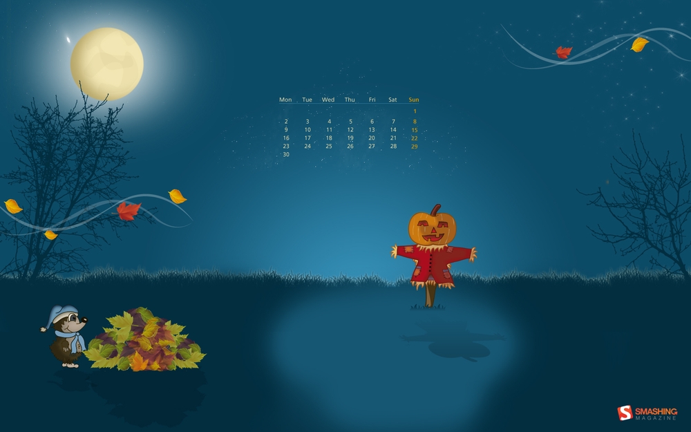
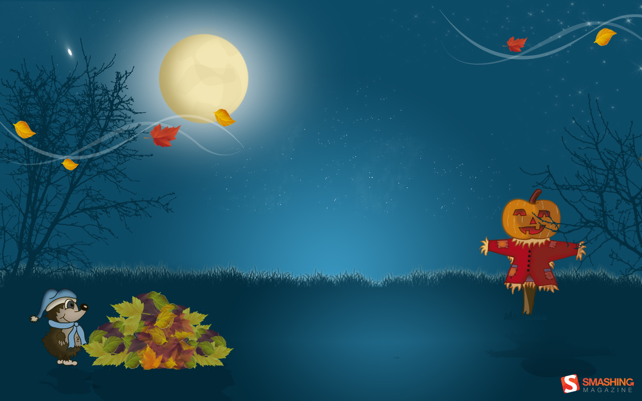
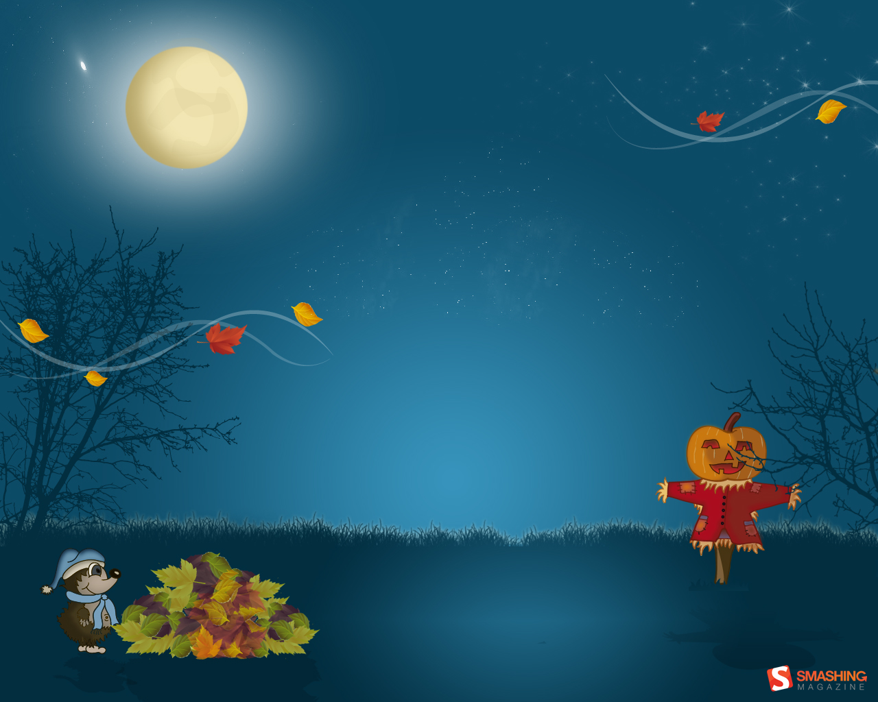
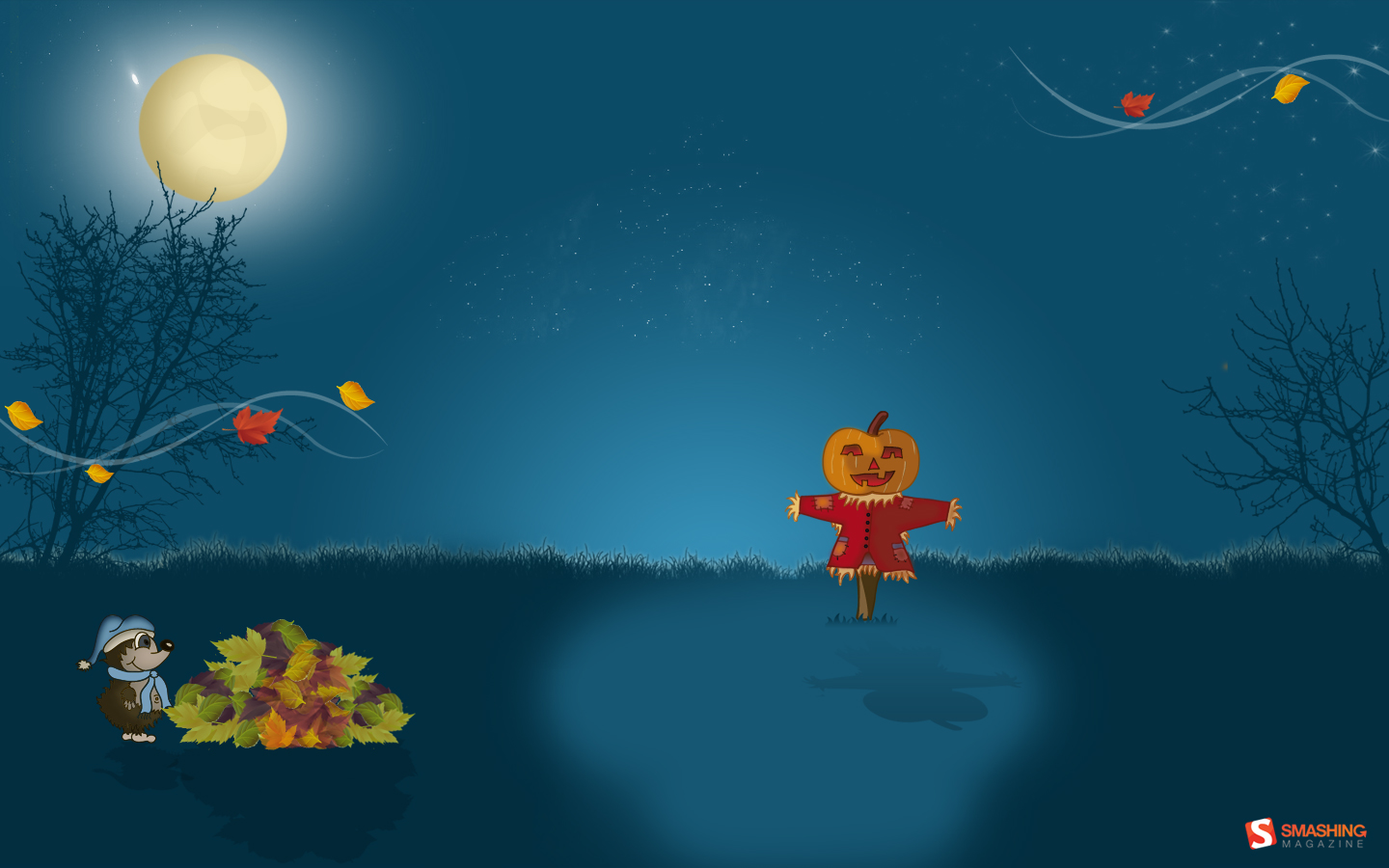
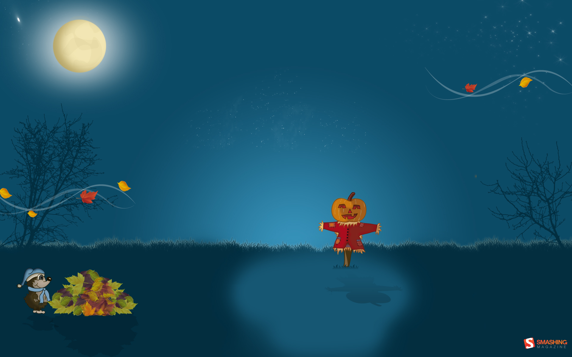
Punpkin Scarecrow
Designed by Barbara Haider from Austria.
Scary Pumpkin
My is my favorite holiday. This calendar shows my desire to make Halloween a darker holiday than it has been in the past for me. Designed by Rachel Cobb from USA.
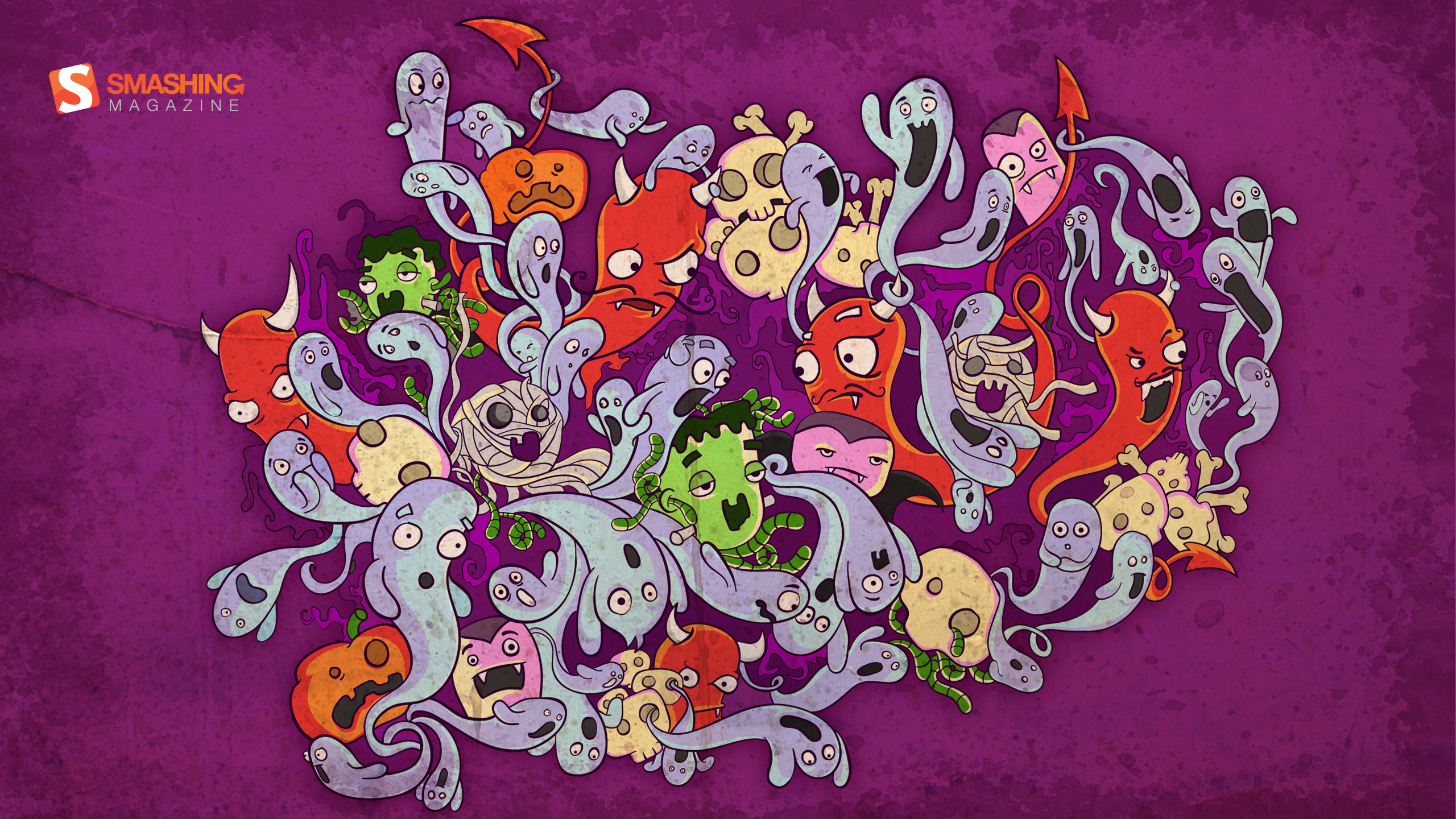
The Month Of Monsters
To me October is a really fun month, since this is the time of the year where all kind of monsters can hang out together, without caring what universe they come from. — Designed by Maria Keller from Mexico.

- 320x480, 640x480, 800x480, 800x600, 1024x768, 1024x1024, 1152x864, 1280x720, 1280x800, 1280x960, 1280x1024, 1400x1050, 1440x900, 1600x1200, 1680x1050, 1680x1200, 1920x1080, 1920x1200, 1920x1440, 2560x1440, 2880x1800, 1366x768
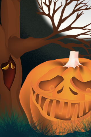
Creepy Pumpkin
Designed by Christopher Krahlisch from Germany.

- 640x480, 800x600, 1024x768, 1152x864, 1280x720, 1280x800, 1280x960, 1366x768, 1400x1050, 1440x900, 1600x1200, 1680x1050, 1920x1080, 1920x1200, 1920x1440, 2560x1440
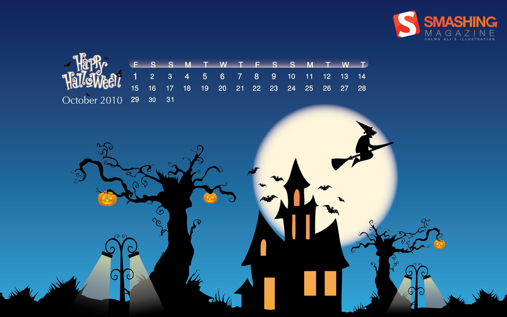
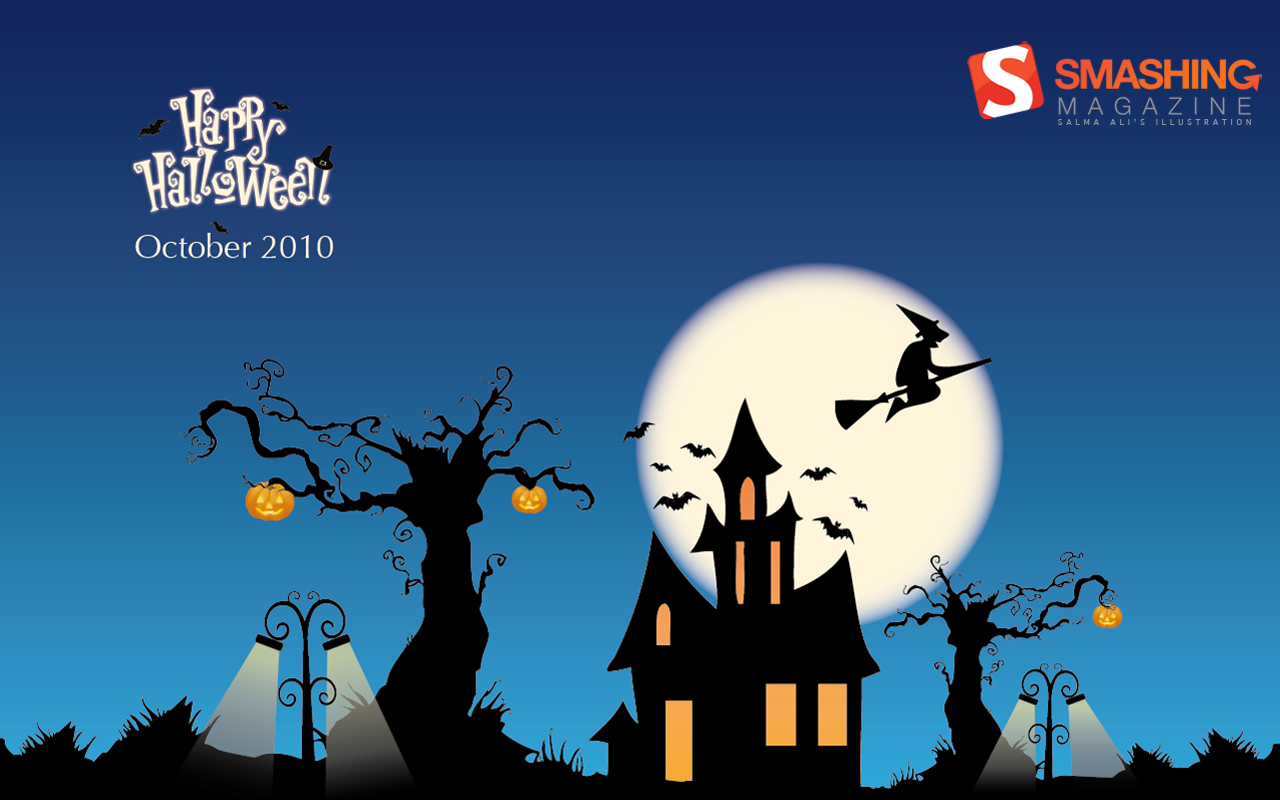
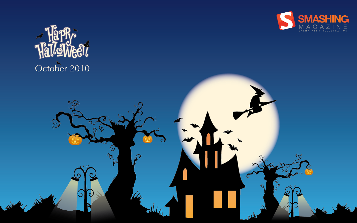
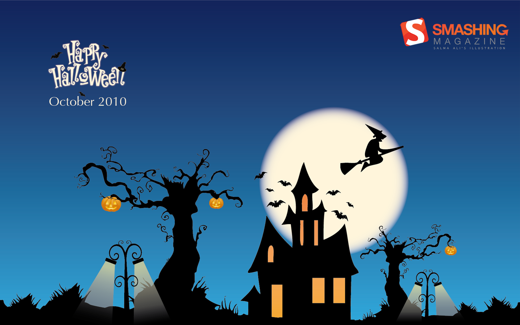
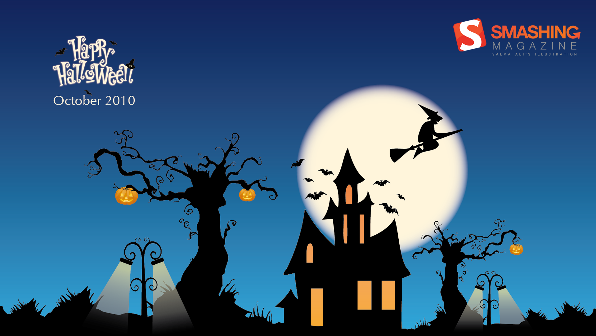
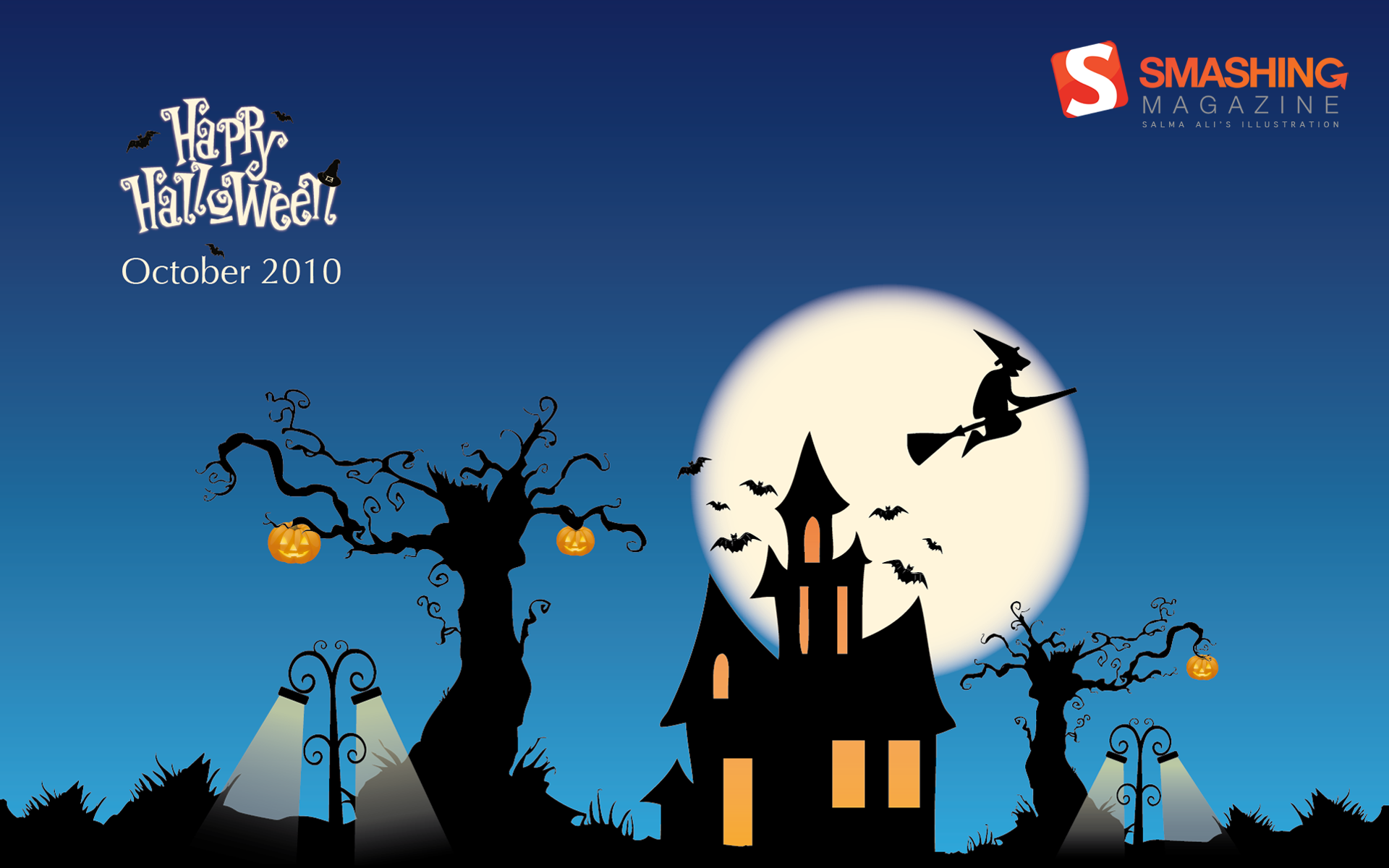
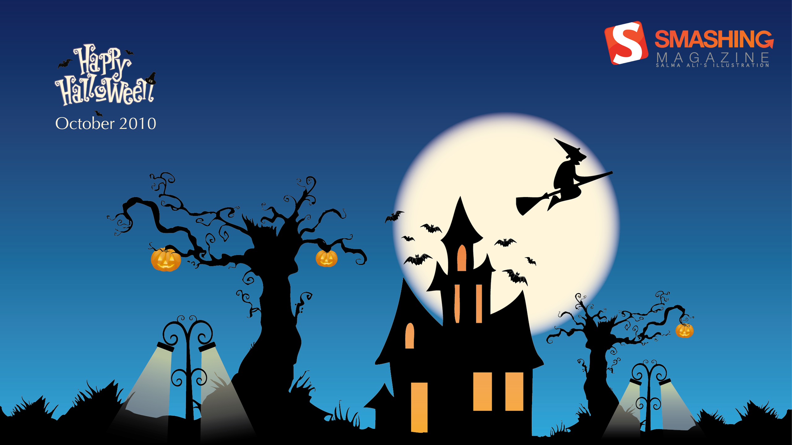
Happy H.
Designed by Salma Ali from United Arab Emirates..
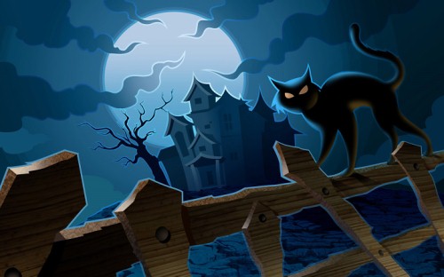
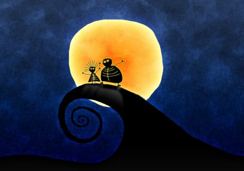
Night Of The Black Cat
Halloween is nearly upon us once again! I love black cats, so I decided to feature one surrounded by a moon-lit sky. — Designed by Eddie Wong from Ireland.

- 320x480, 800x480, 800x600, 1024x768, 1024x1024, 1152x864, 1280x720, 1280x800, 1280x960, 1280x1024, 1400x1050, 1440x900, 1600x1200, 1680x1050, 1680x1200, 1920x1080, 1920x1200, 1920x1440, 2560x1440
Halloween Cat
Designed by Mohamad Khatib from Lebanon.

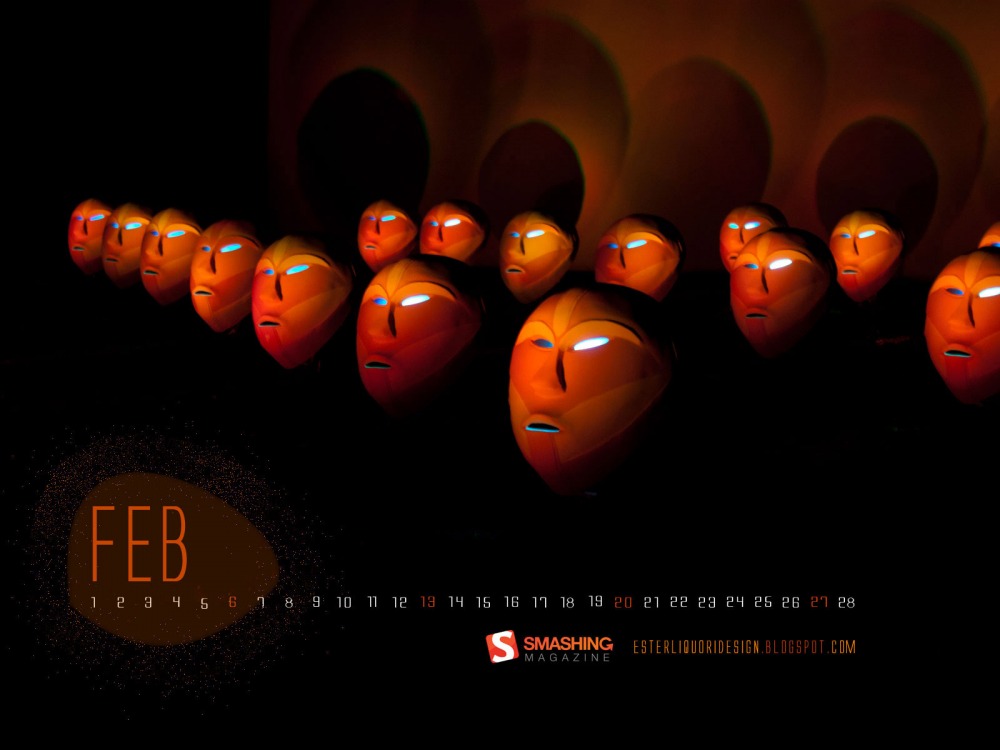
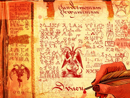
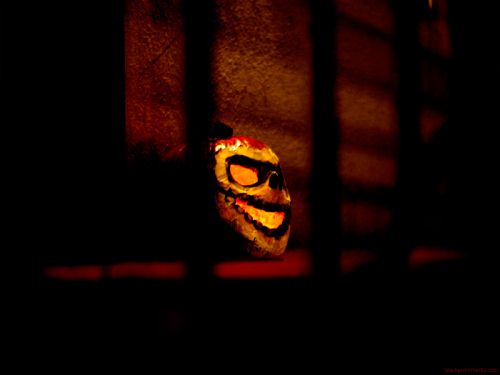
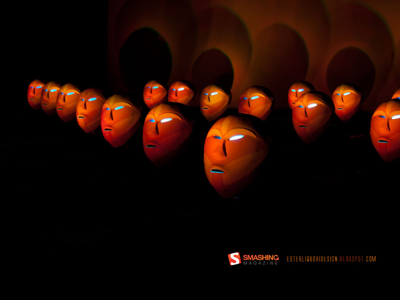
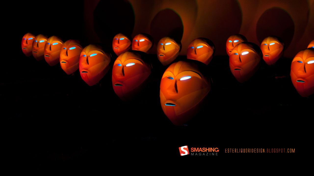
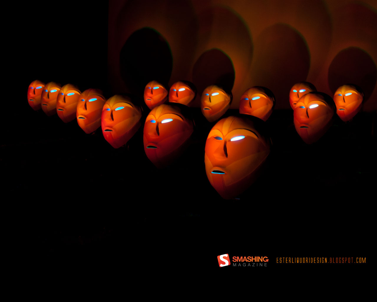
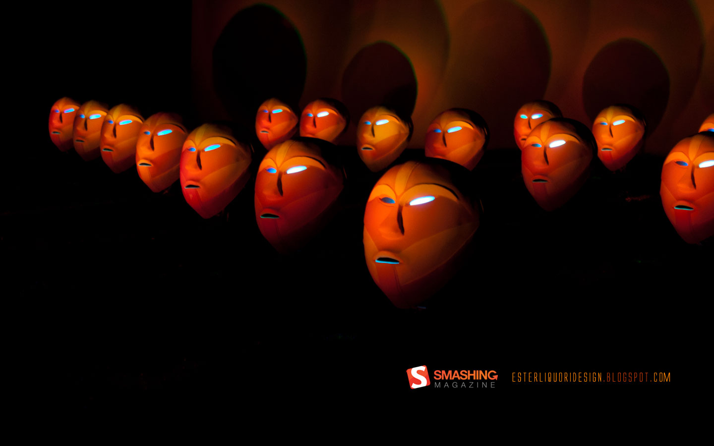
Masks
Mistic Tribal Masks temporary exposition in Turin. They really remind to an alien atmosphere. Designed by Ester Liquori from Italy.
Will Miss You On This Halloween
Jack-o-lanterns and spooky ghosts are coming to fight the haunted house, witches all alive again! But this time don’t miss your friends. It’s time to scare the family, pals and mates with ghosts! Wish you a happy Halloween night again and again. Designed by Debobrata Debnath from India.

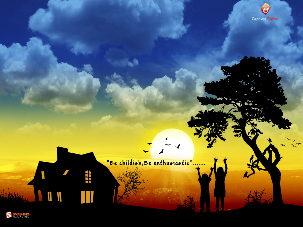
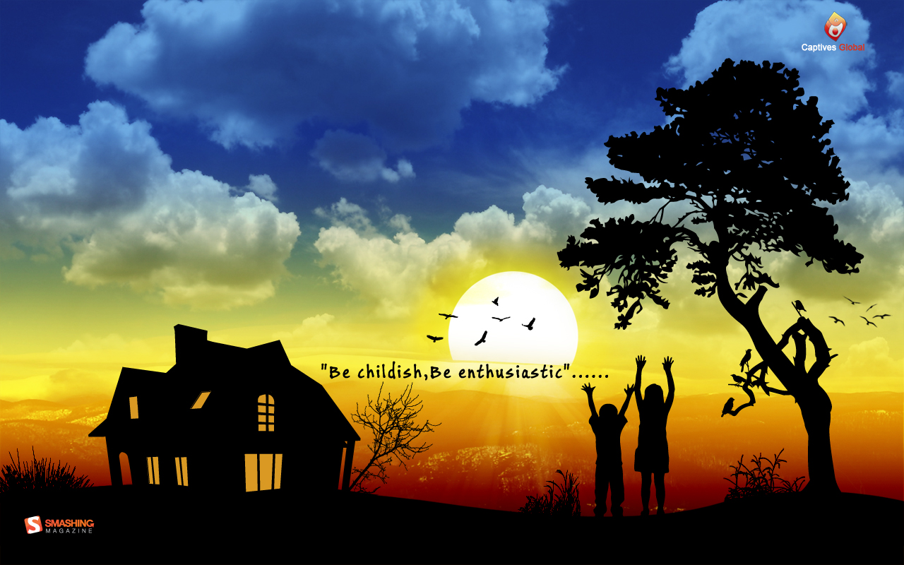
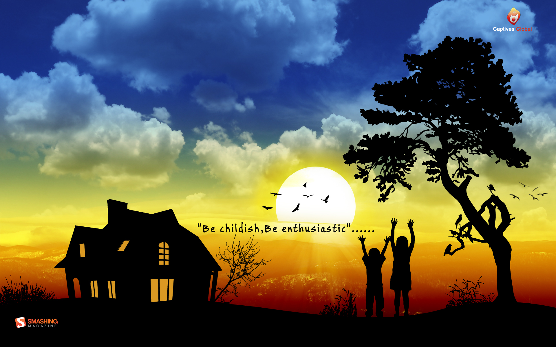
Childish
Children day is celebrated in October…in many countries around the world ..They are the future.. The hope for a brighter tomorrow… Designed by Nishith from India.
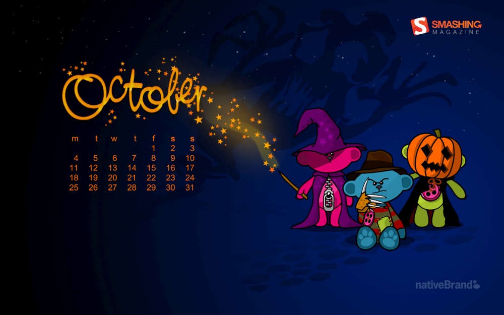
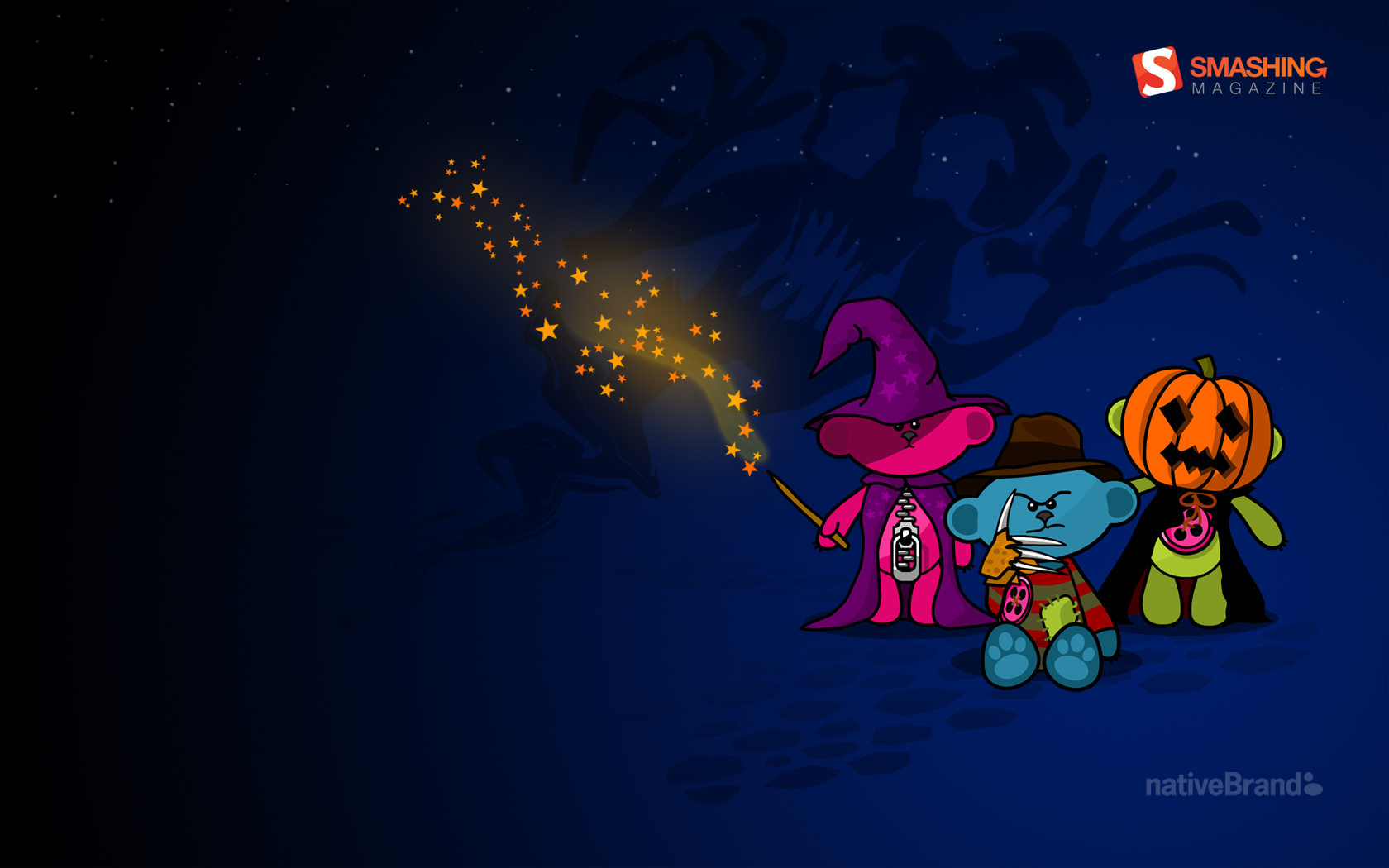
Trick Or Treat
“As night falls there’s magic and mischief in the air.” Designed by Jason Knight (nativeBrand) from UK.
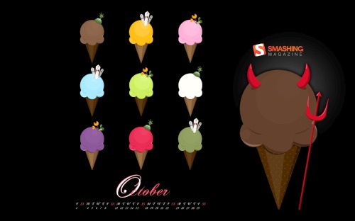
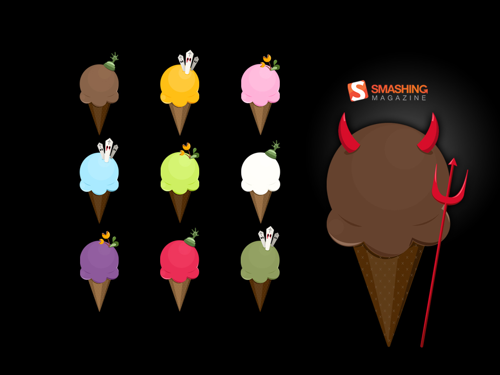
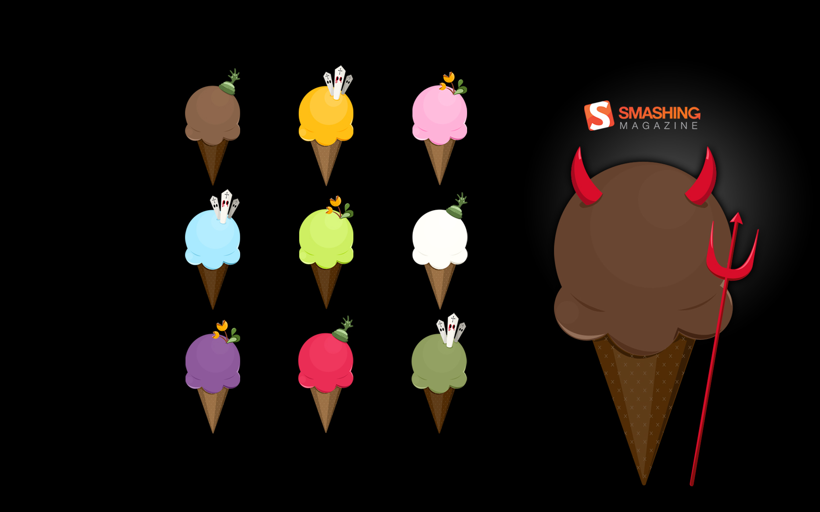
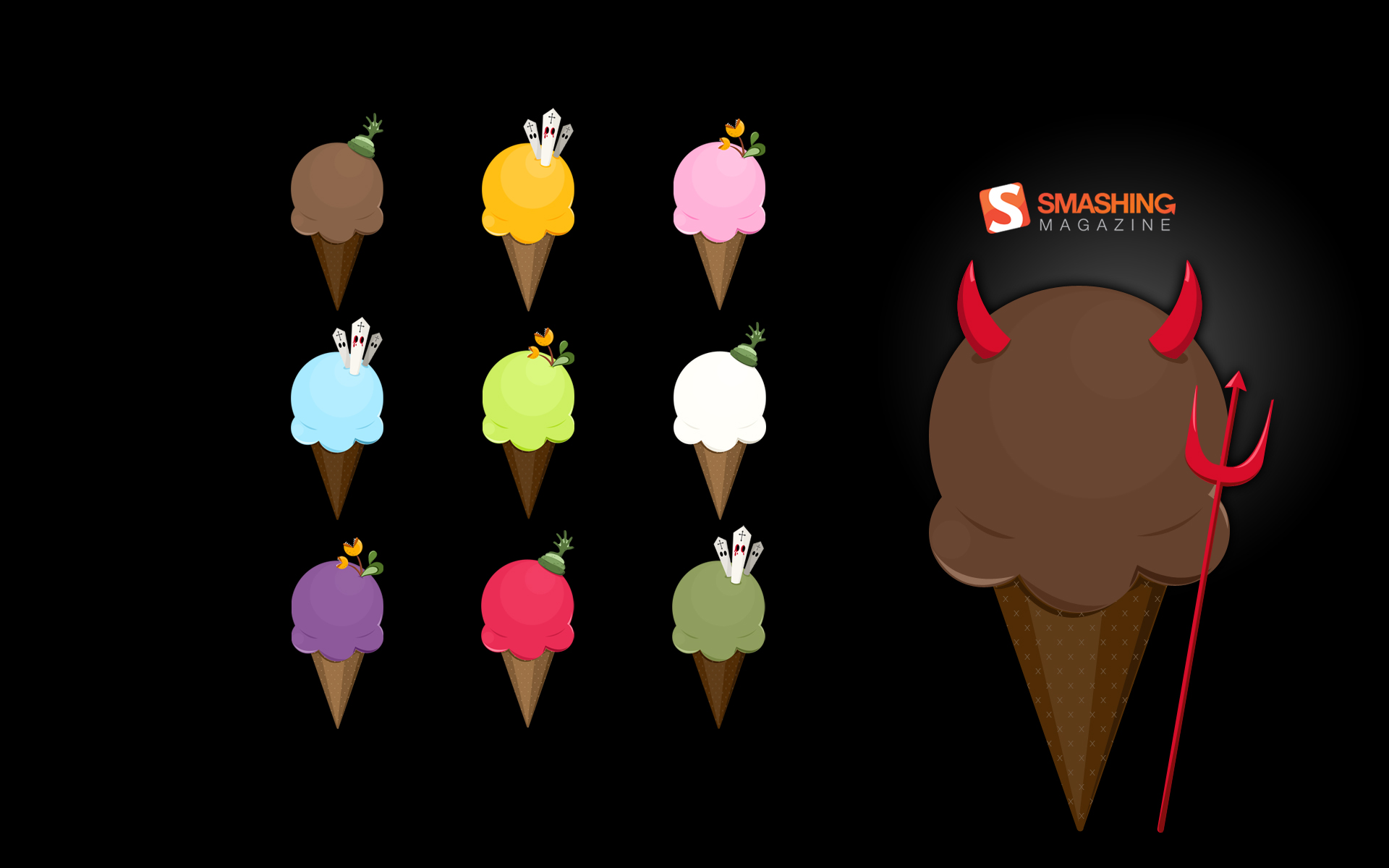
Creepy Ice-cream
To all ice-cream lovers, let’s get creepy this October! Designed by Carmen Ng from Singapore.
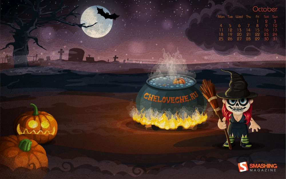
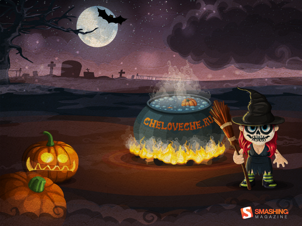
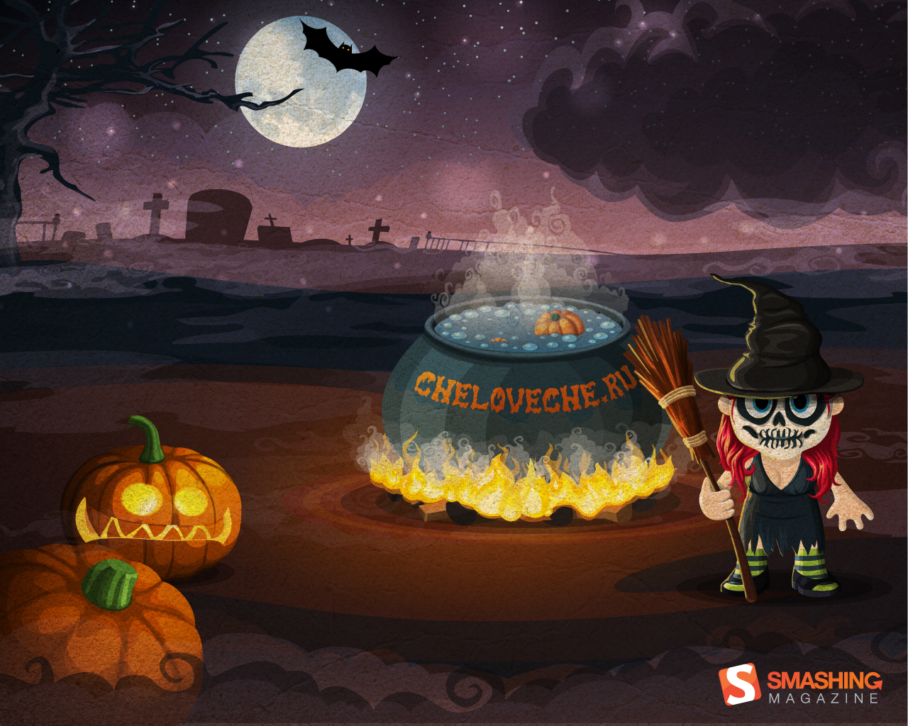
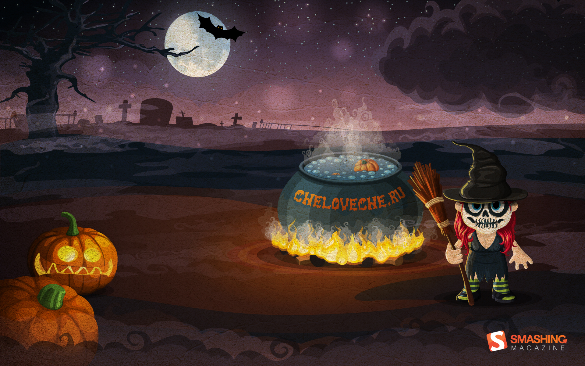
Halloween
The time of candies, ghosts, witches and fun. Designed by cheloveche.ru from Russia.
Feeling Sorry For All The Pumpkins
Designed by Ricardo Gimenes from Brazil.

- 320x480, 1024x768, 1024x1024, 1280x800, 1280x960, 1280x1024, 1400x1050, 1440x900, 1600x1200, 1680x1050, 1680x1200, 1920x1080, 1920x1200, 1920x1440, 2560x1440, 640x960, 1366x768, 1600x1050, 2880x1800
Zombie’s Grafitti
A mystical month like October diserve an trash art contribution so the dead can go back to life and haunt the living people. This wallpaper was made for terror e thriller lovers. Download and enjoy it! Designed by Vinicius Ervilha from Brazil.

Ghost
Designed by Tiago Santos from Portugal.
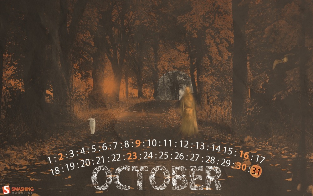
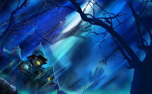
Misty Woods
October reminds me of cold nights. Halloween is a time when going up to creepy houses through misty haunted woods is acceptable, which also inspired me to design a moonlight misty composition. — Designed by Samantha Magaard from the United States.

A Very Bright Halloween
We want to remind everyone to stay safe this Halloween when trick-or-treating, maybe carry a portable lantern or flashlight. We also wanted to share some ideas we had for adding a special bright touch to your costumes this year - battery operated Halloween string lights! — Designed by Carla Genovesio (from Lights.com from the United States.

- 320x480, 640x480, 800x480, 800x600, 1024x768, 1024x1024, 1152x864, 1280x720, 1280x800, 1280x960, 1280x1024, 1400x1050, 1440x900, 1600x1200, 1680x1050, 1680x1200, 1920x1080, 1920x1200, 1920x1440, 2560x1440
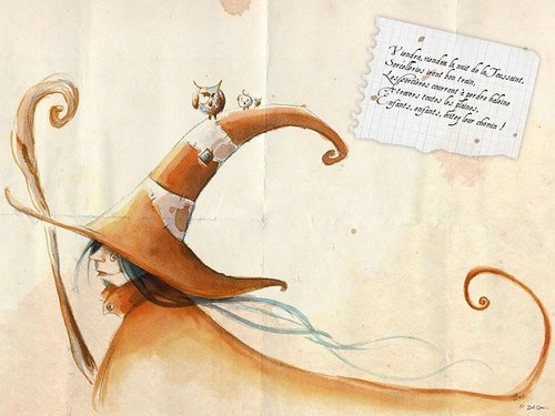
Moon Owl
Designed by Katerina Bobkova from Ukraine.

Scary Moon
Designed by Andy Murphy from Northern Ireland.

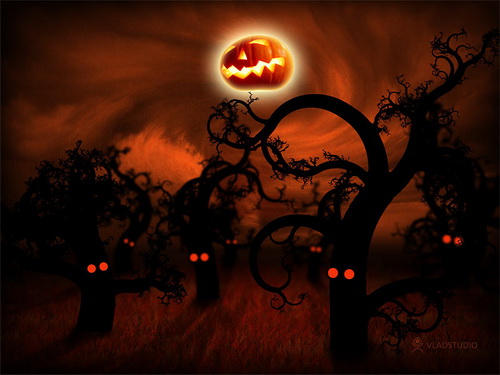
It’s The Most Terrifying Time Of The Year
The best time of the whole year. The weather get cooler and crisper, the leaves start to change, and all of the things that go bump in the night come out to play. — Designed by Casey Booth from the United States.

- 1280x800, 1440x900, 1680x1050, 1920x1080, 2560x1440, 640x960, 640x1136, 1080x1920, 960x1704, 1366x768, 768x1024
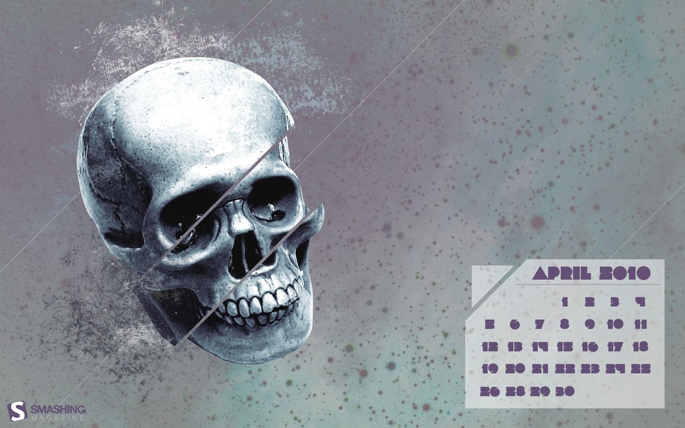
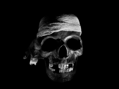
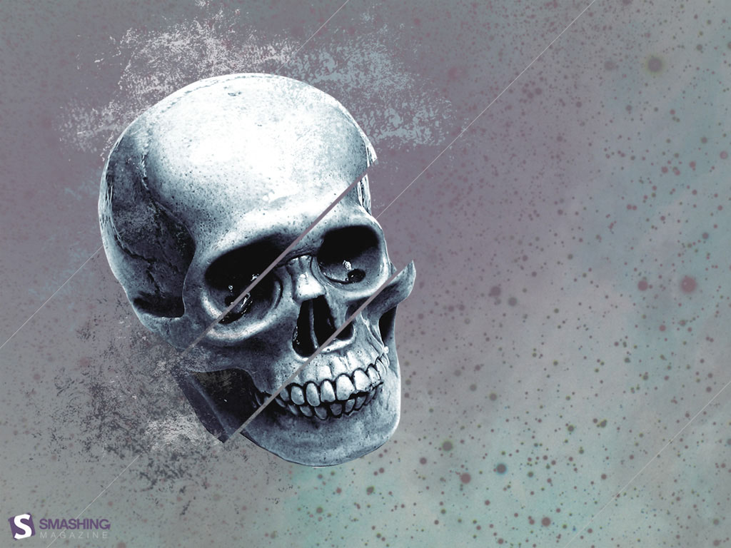
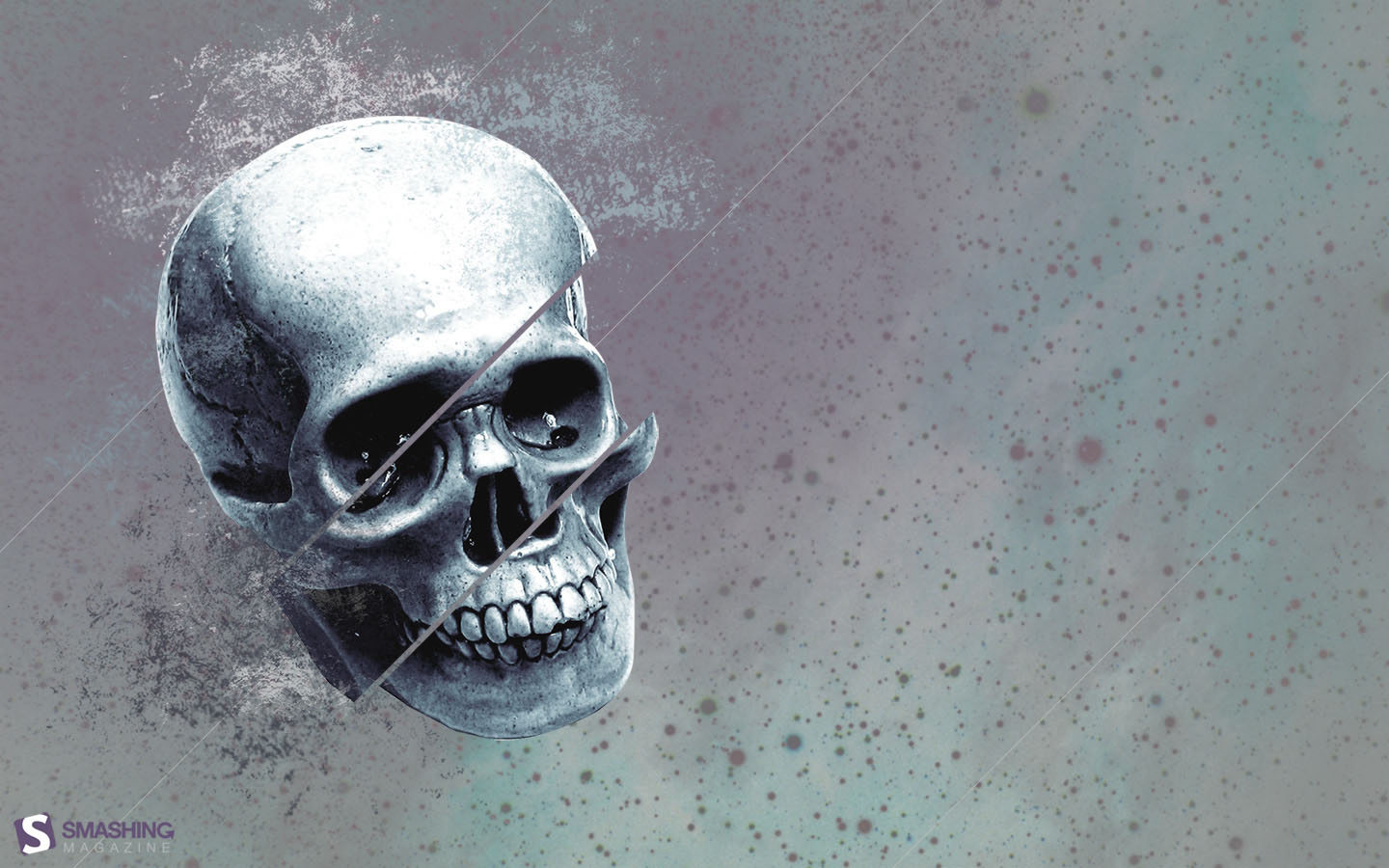
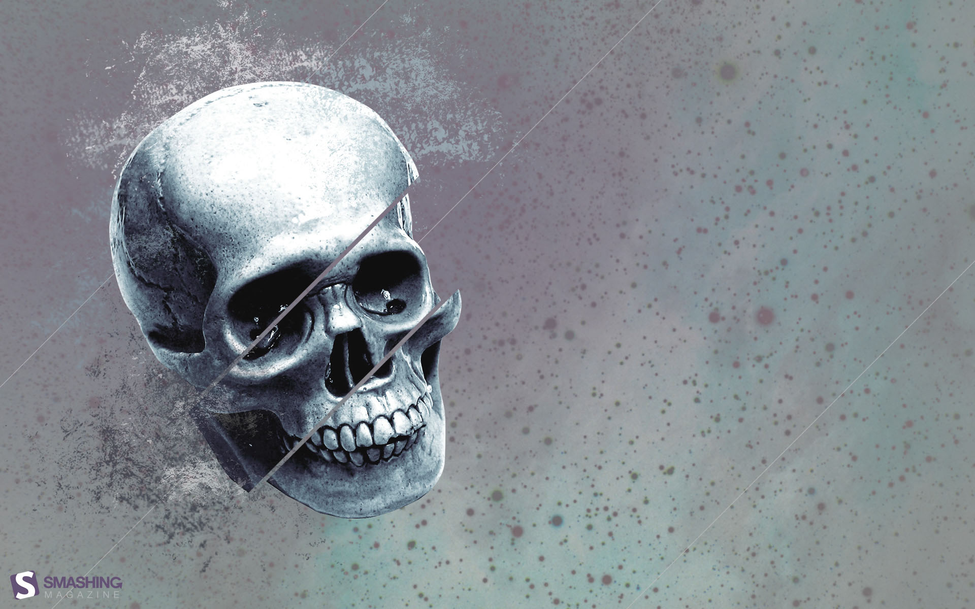
Skull Wallpaper
Designed by Rumake Web Agency from Russia.
Skeleton Theme
Designed by Shilpa Sharma from India.

Sweet Halloween
Designed by Cortando Pixeles from Argentina.

Ghostober
“I made this wallpaper a year ago, but i didntcame on time to send it to Smashing magazine.Serching other files i found it, and decide to finish it and post it, halloween is coming, hope you like this ghostsperms hehe!” Designed by Ricardo Delgado from México City.
Weird Season
Designed by Ryan Thompson from USА.

- 320×480, 640×480, 800×480, 800×600, 1024×768, 1024×1024, 1152×864, 1280×720, 1280×800, 1280×960, 1280×1024, 1400×1050, 1440×900, 1600×1200, 1680×1050, 1680×1200, 1920×1080, 1920×1200, 1920×1440, 2560×1440
Happy H.
Designed by JD from the United States.

- 320x480, 640x480, 800x480, 800x600, 1024x768, 1024x1024, 1152x864, 1280x720, 1280x800, 1280x960, 1280x1024, 1400x1050, 1440x900, 1600x1200, 1680x1050, 1680x1200, 1920x1080, 1920x1200, 1920x1440, 2560x1440
Weeny Scary
Designed by Cheloveche.ru from Russia.

It Is Coming
Fall always reminds me of a cozy atmosphere during evenings spent with candles, covered under my fluffy blanket. Everything is shining in warm orange light. Halloween FTW! — Designed by Izabela Grzegorczyk from Vienna, Austria.

Howl For October
No Halloween scary tales, witches and goblins fright us! We have our friend Wolfey whose howling scares away the dark, and we can wait for All Hallows Eve in the peace and comfort of our home. Designed by PopArt Studio from Serbia.

- 320x480, 640x480, 800x480, 800x600, 1024x768, 1024x1024, 1152x864, 1280x720, 1280x800, 1280x960, 1280x1024, 1366x768, 1400x1050, 1440x900, 1600x1200, 1680x1050, 1680x1200, 1920x1080, 1920x1200, 1920x1440, 2560x1440
Festival Of The Dead
Shadows of a thousand years rise again unseen, Voices whisper in the trees, ‘Tonight is Halloween! Dexter Kozen.” — Designed by Suman Sil from India.

- 1280x720, 1280x800, 1280x960, 1280x1024, 1366x768, 1400x1050, 1440x900, 1600x1200, 1680x1050, 1680x1200, 1920x1080, 1920x1200, 1920x1440, 2560x1440
Spooky Town
Designed by Xenia Latii from Germany.

- 320x480, 640x480, 800x480, 800x600, 1024x768, 1152x864, 1280x720, 1280x800, 1280x960, 1280x1024, 1366x768, 1400x1050, 1440x900, 1600x1200, 1680x1050, 1680x1200, 1920x1080, 1920x1200, 1920x1440, 2560x1440
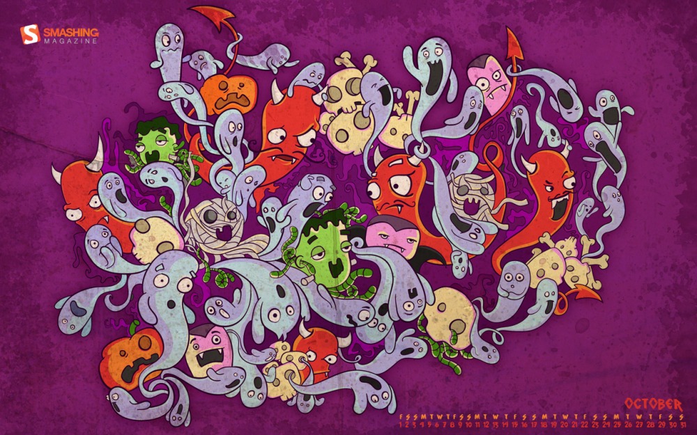
Cute Halloween
Halloween is one of my favorite holidays, so I decided to create four of my favorite monsters. Designed by Maria Keller from Mexico.

- 320x480, 640x480, 640x1136, 750x1334, 800x480, 800x600, 1024x768, 1024x1024, 1152x864, 1242x2208, 1280x720, 1280x800, 1280x960, 1280x1024, 1366x768, 1400x1050, 1440x900, 1600x1200, 1680x1050, 1680x1200, 1920x1080, 1920x1200, 1920x1440, 2560x1440, 2880x1800
Scary Monsters
Designed by Servanne from France.

- 320x480, 640x480, 800x480, 800x600, 1024x768, 1024x1024, 1152x864, 1280x720, 1280x800, 1280x960, 1280x1024, 1400x1050, 1440x900, 1600x1200, 1680x1050, 1680x1200, 1920x1080, 1920x1200, 1920x1440, 2560x1440
Trick Or Treat!
It’s Halloween on the 31st (of course), and I think this poor kid might have picked the wrong house to go Trick or Treat-ing! — Designed by James Mitchell from the United Kingdom.

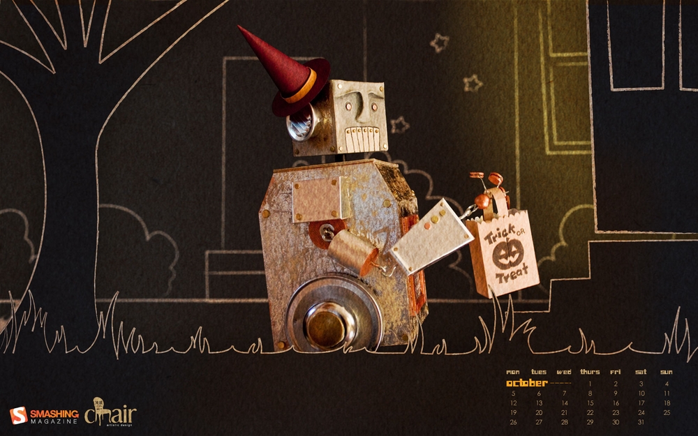
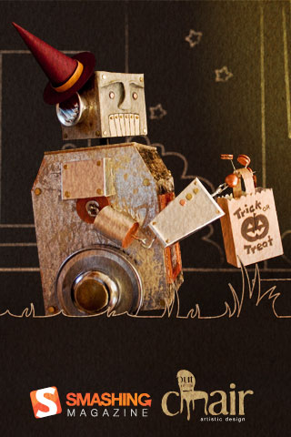
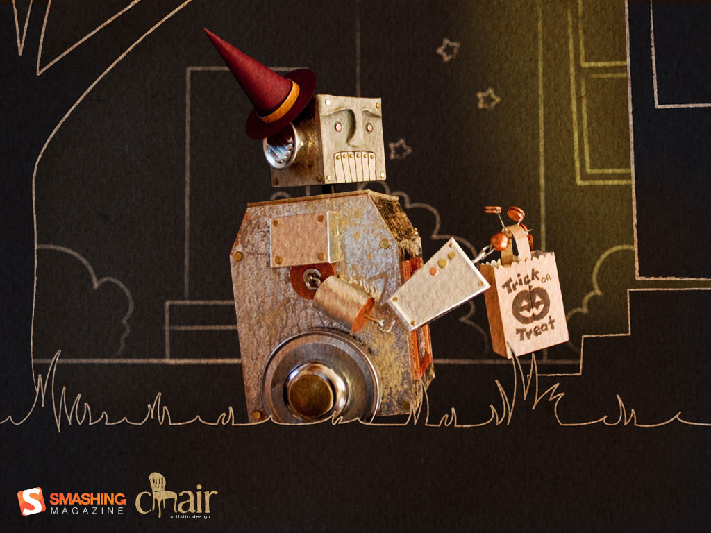
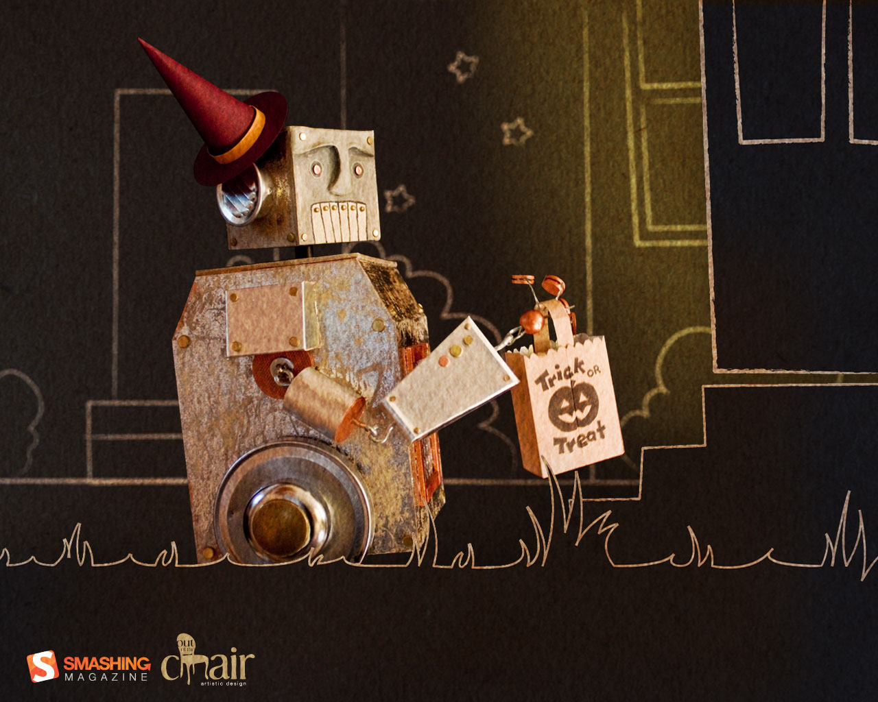
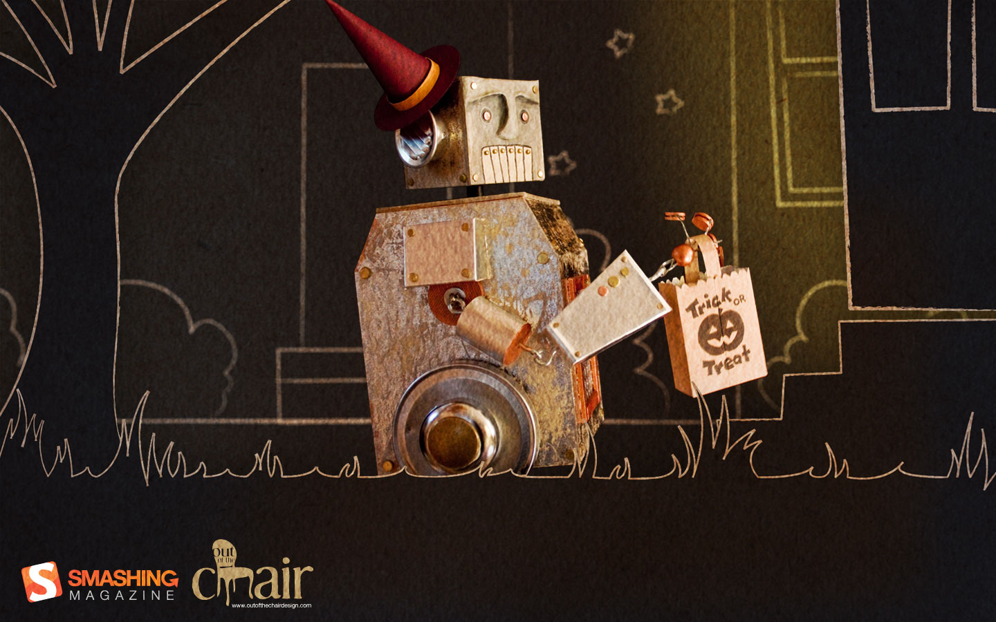
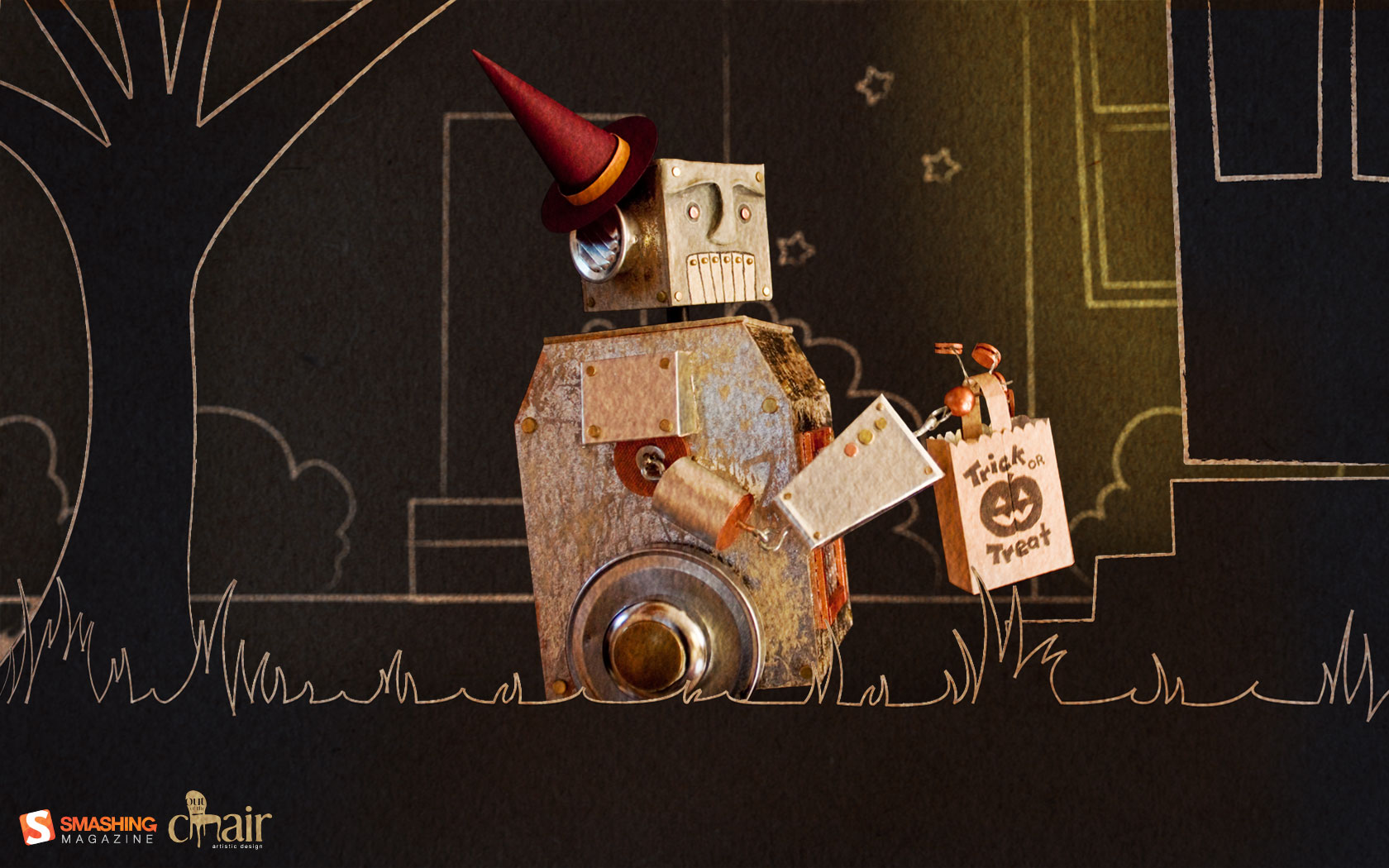
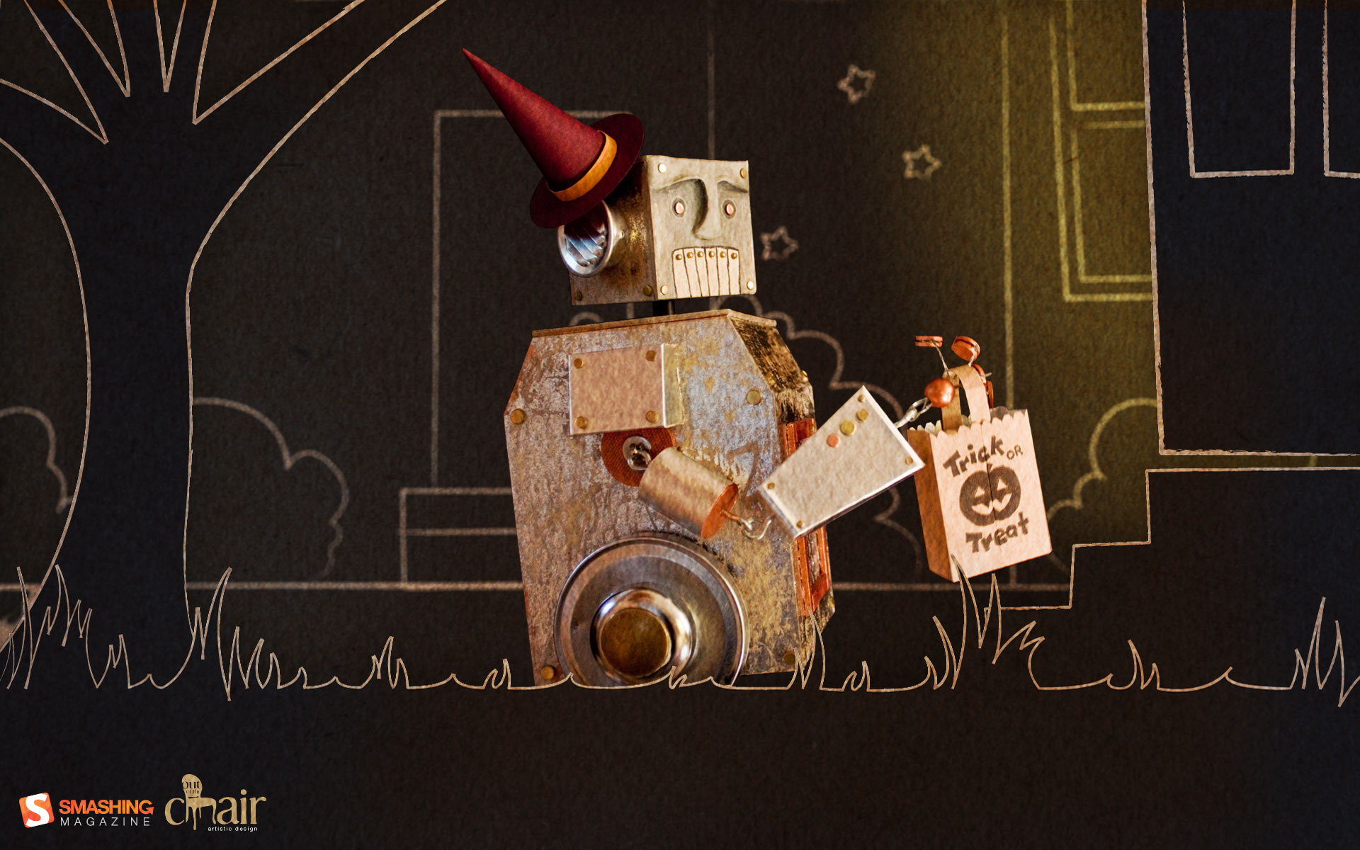
Trick Or Treat 2000
It is the year 2000, and robots rule the world. This is a photo of a recently completed fully-functional rod puppet, approx. 10” tall, set within a digital halloween scene via Photoshop. 0000101011001! (robot translation: Trick or treat!) Designed by Out of the Chair Design from Canada.
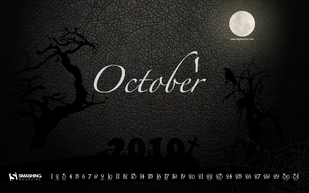
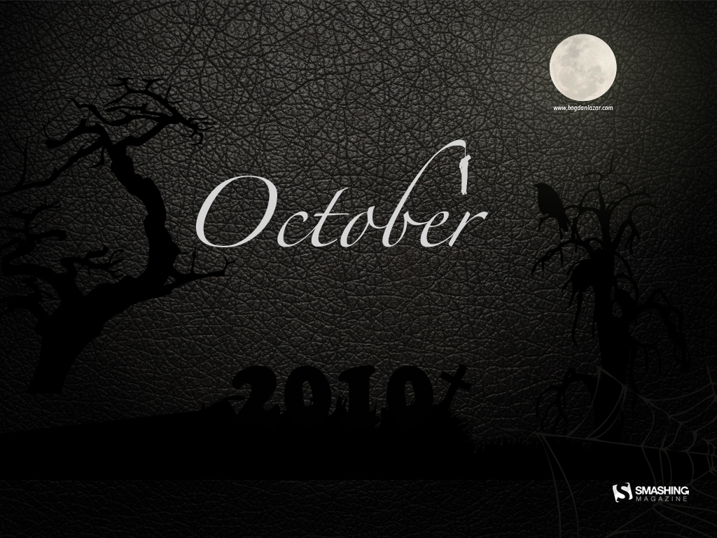
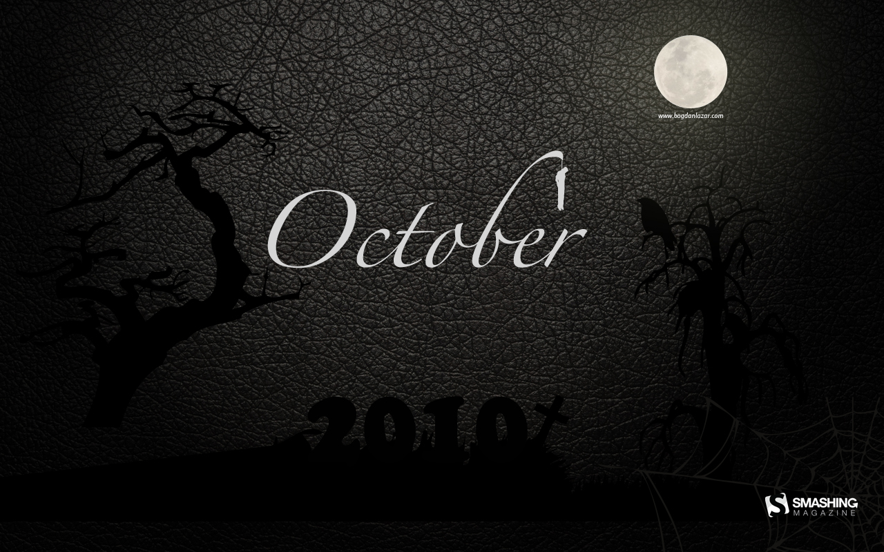
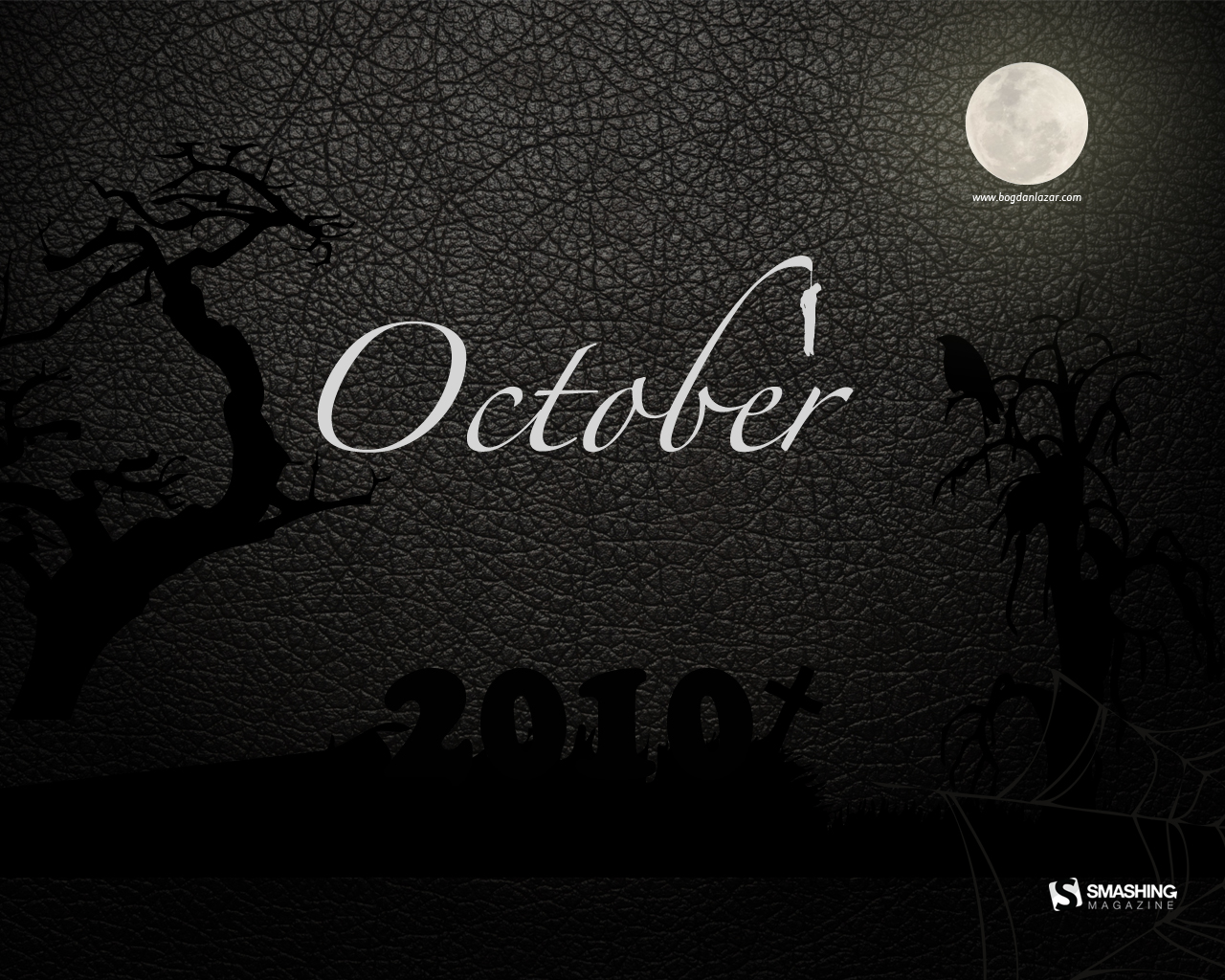
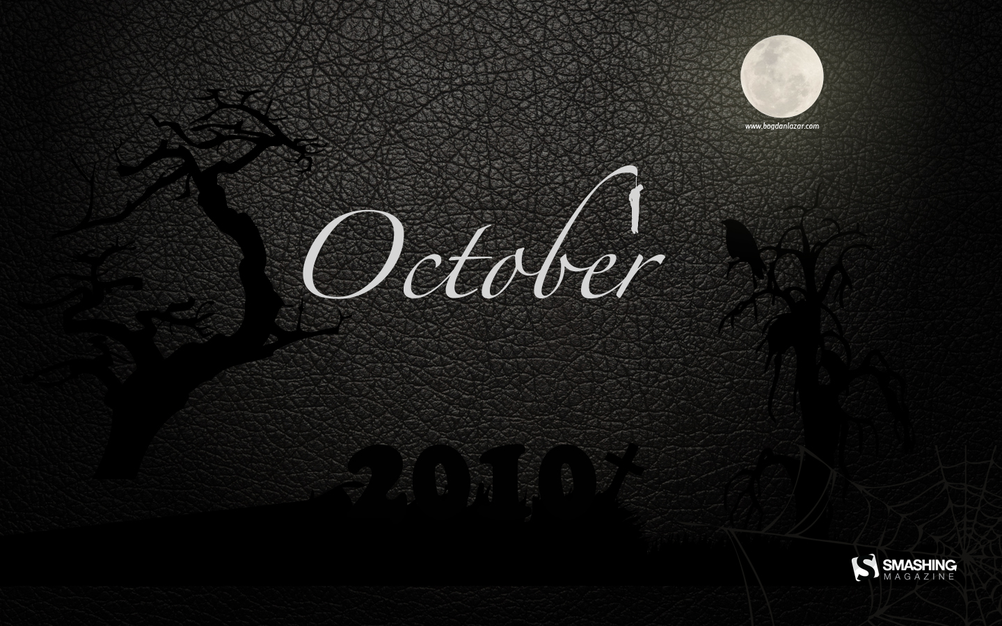
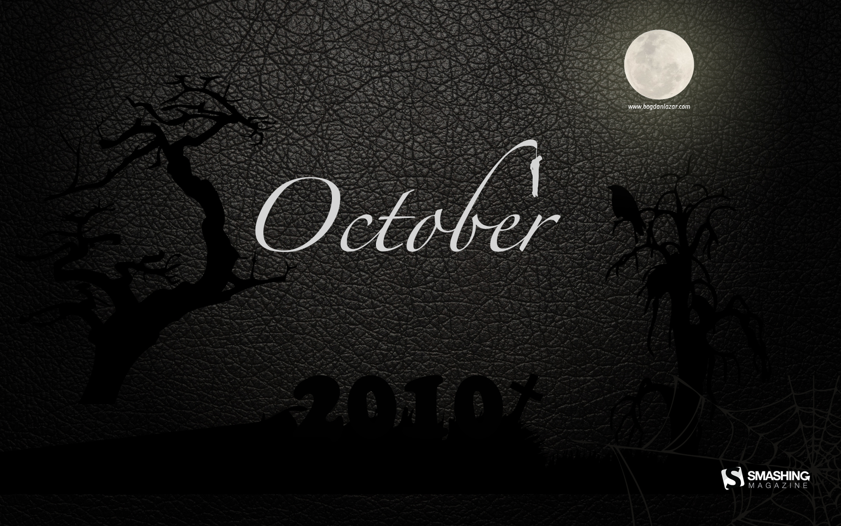
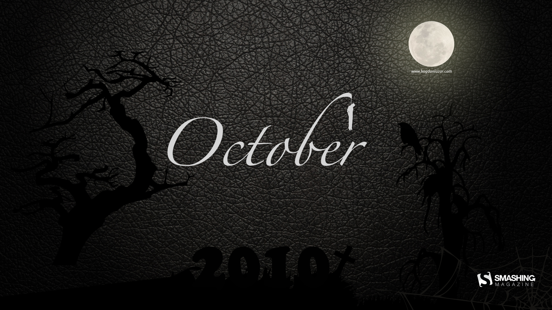
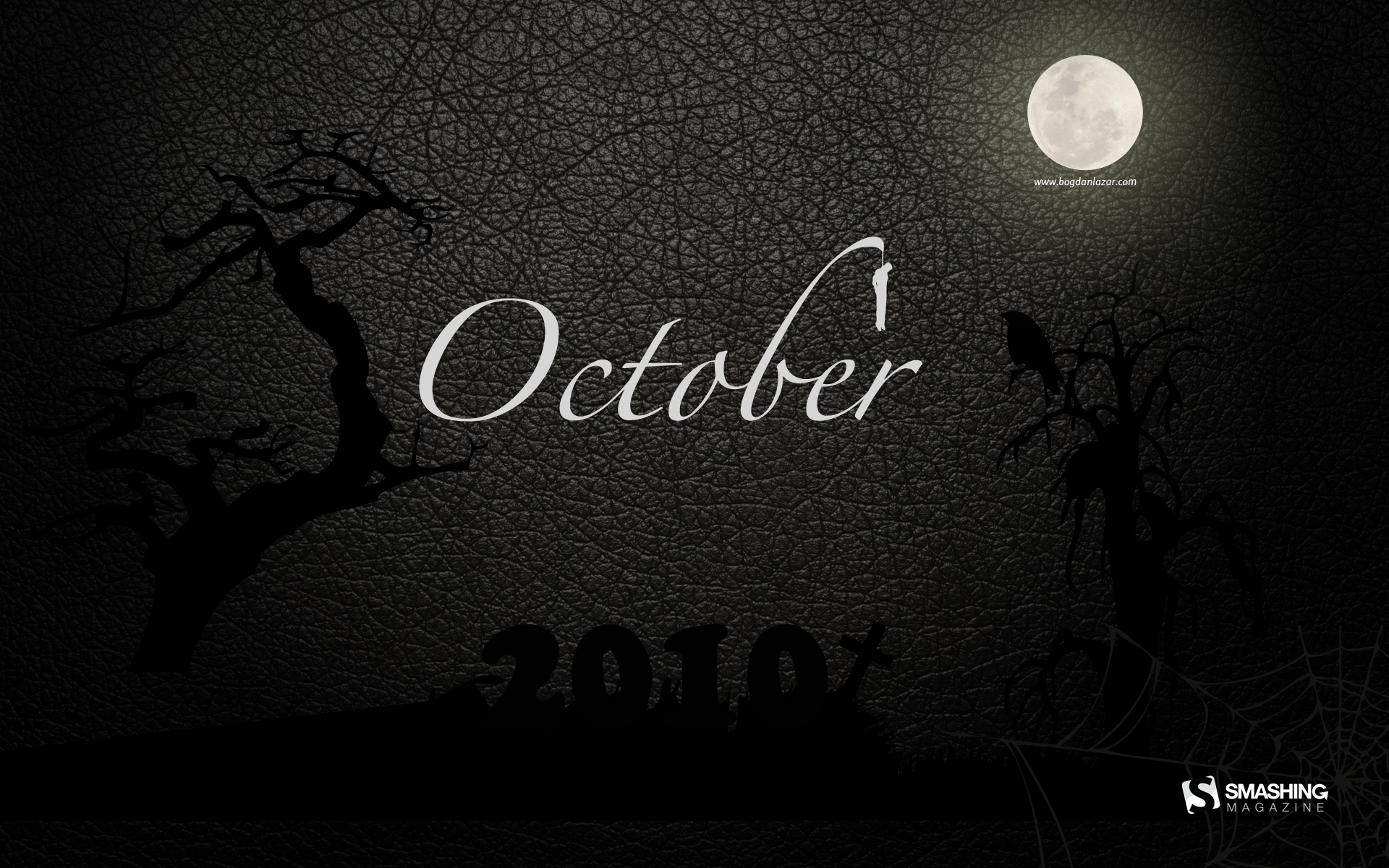
Dead Night
The month the dead walk (apparently). For everyone who celebrates Halloween, with costumes, trick or treats or just a simple desktop wallpaper. Designed by Bogdan Lazar from Romania.
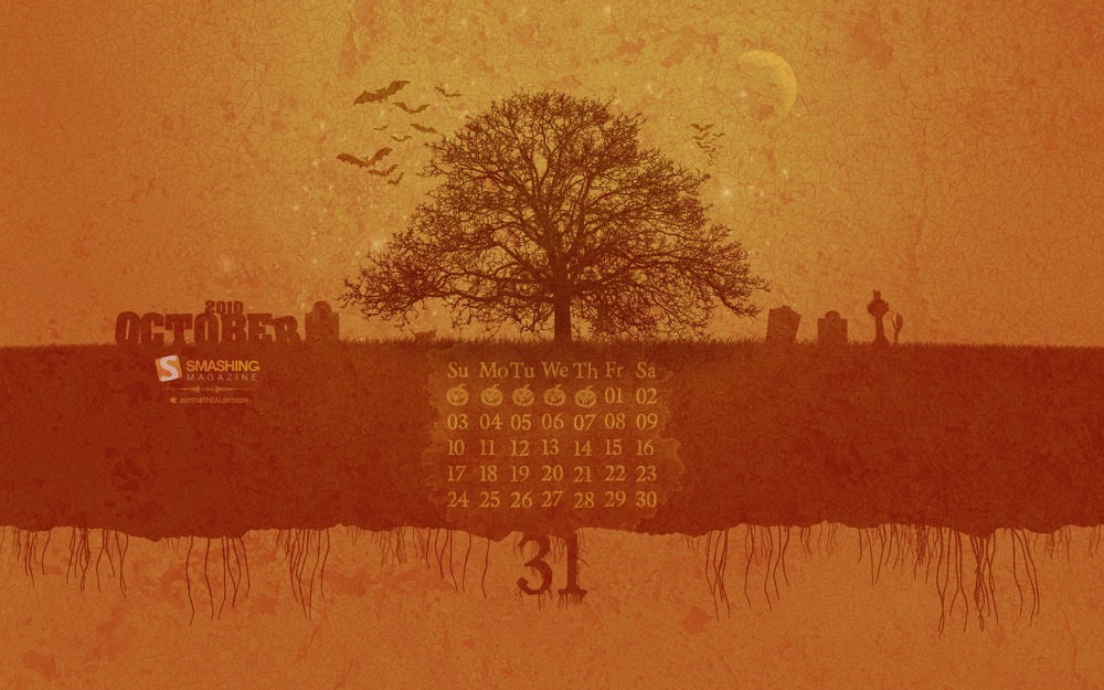
Jack O Cal
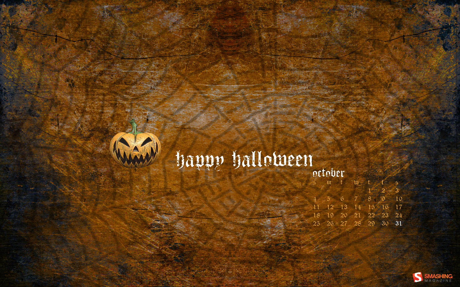
“Jack O Lantern with 2010 October Calender in mouth. spooky halloween surrounding background” Designed by Lindsey Kellis from USA.
Skull Break
Designed by jadekone from Venezuela.
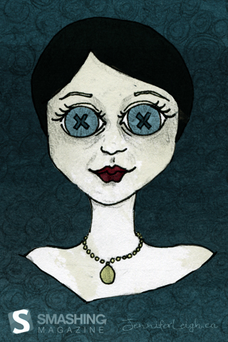
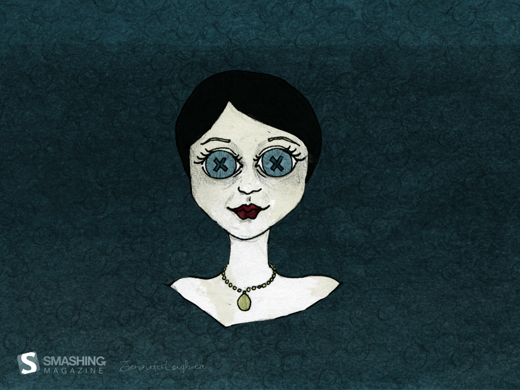
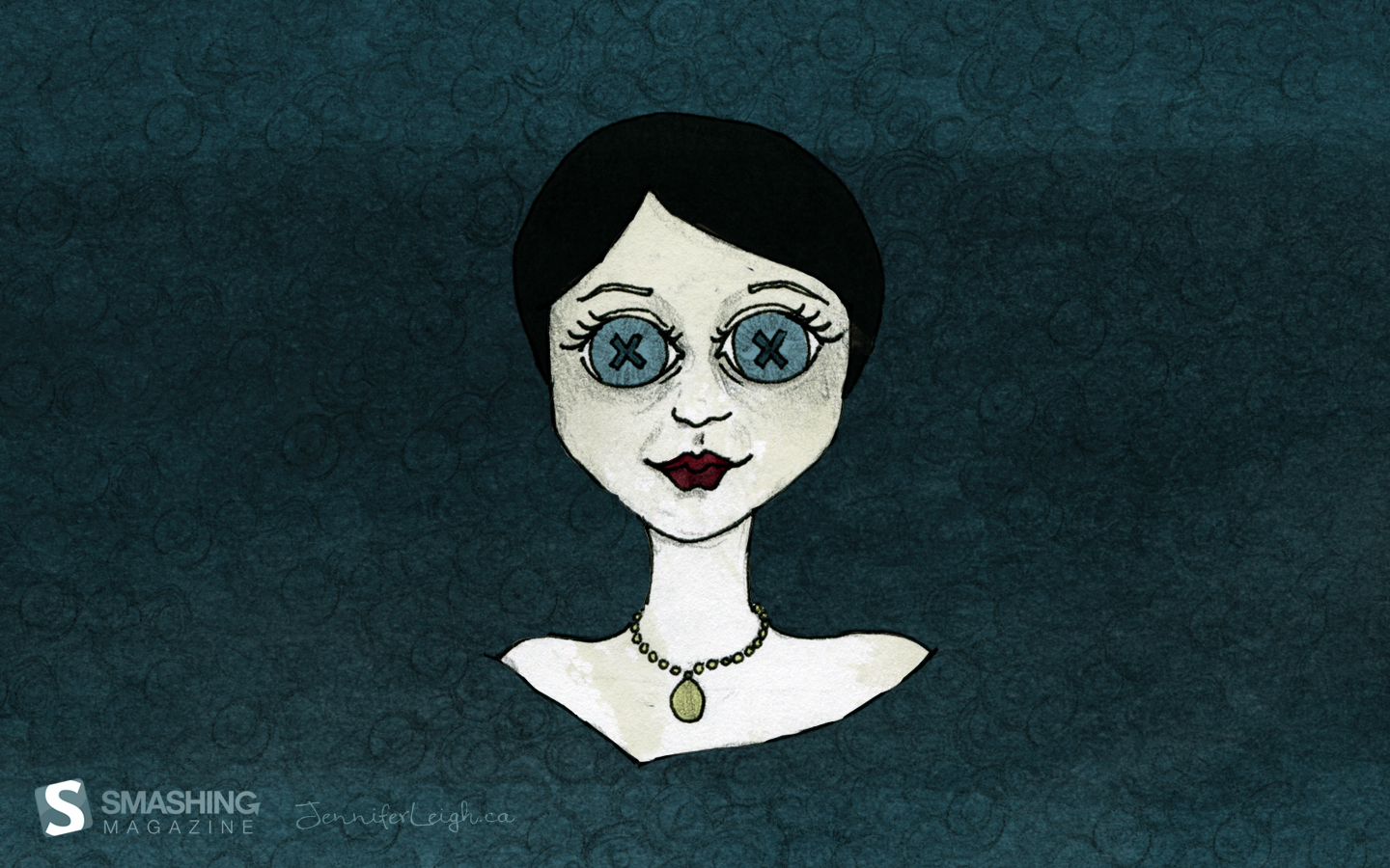
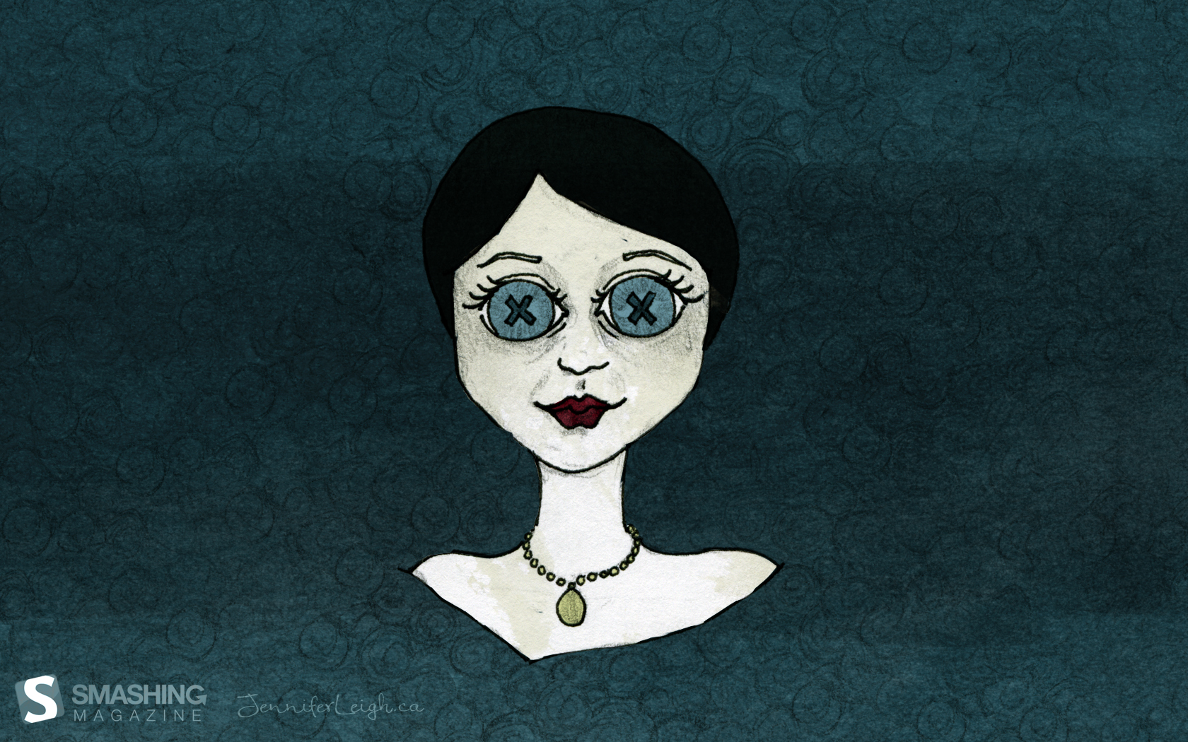
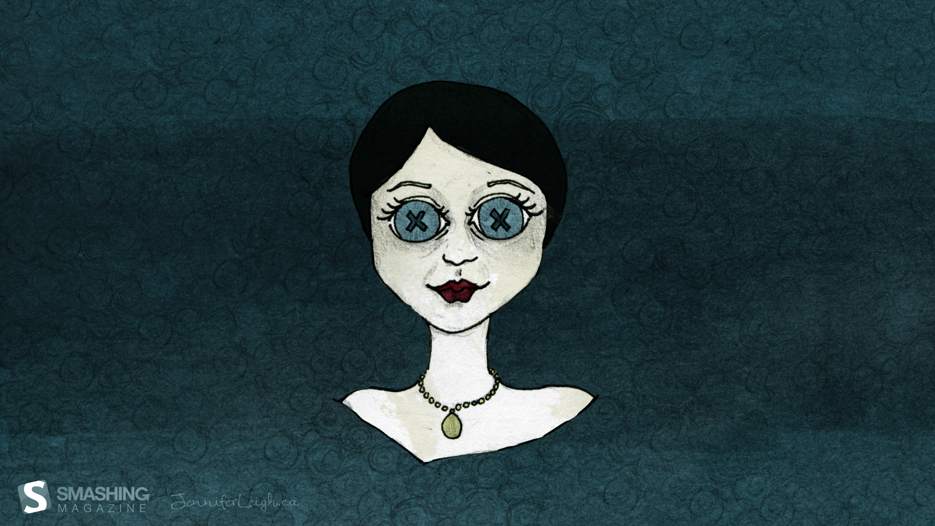
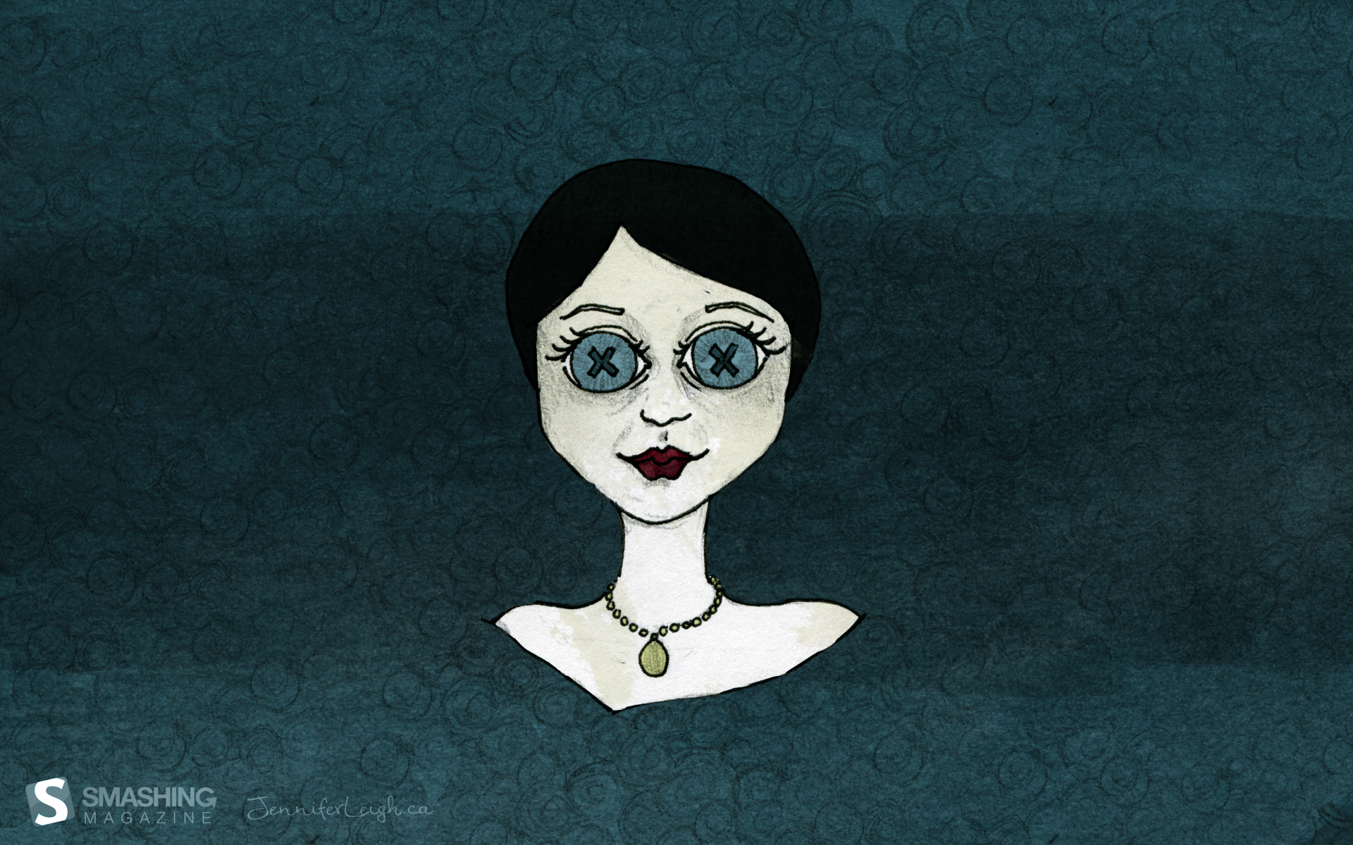
Eerie October
Designed by Jennifer Leigh Holt from Canada.

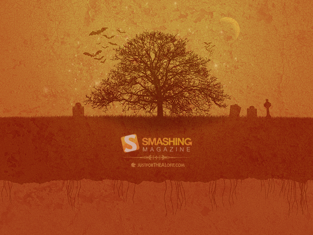
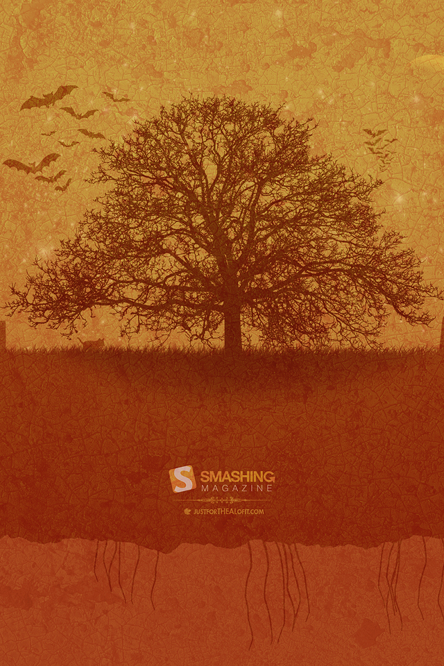
Pumpkin Spice Spookster
“A spooky, fun, orange-tastic wall for Halloween lovers of all ages.” Designed by Allen from USA.
- 320×480, 480×272, 640×480, 640×960, 960×800, 960×854, 1024×768, 1024×1024, 1152×864, 1280×800, 1280×960, 1280×1024, 1366×768, 1400×1050, 1440×900, 1600×900, 1600×1200, 1680×1050, 1920×1200, 2560×1440, 2560×1600
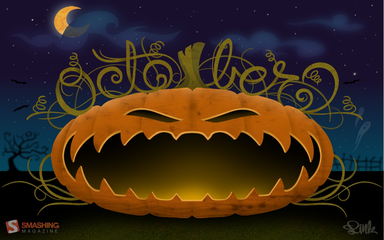
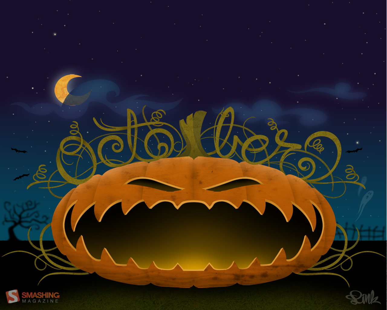
Creepy October
Designed by Roland Szabó from Hungary.
Creepy October
Designed by Christina Mokry from Germany.

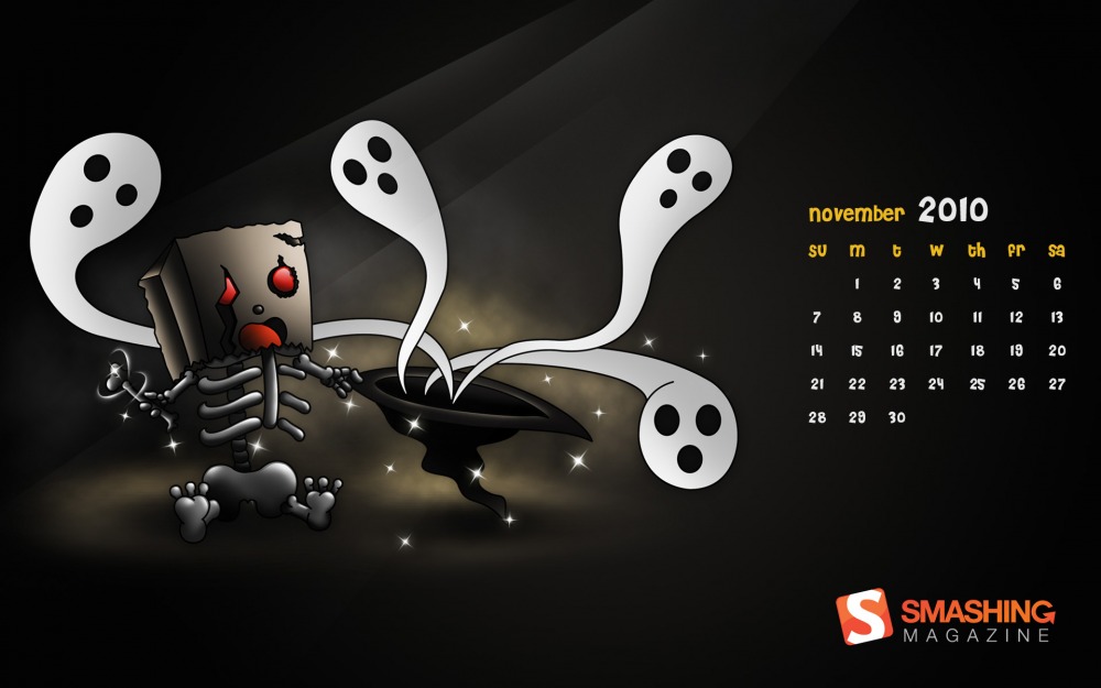
Ghost Friends
“Boney wanted to have friends but they are all ghosts.” Designed by Constantino Co from Singapore.
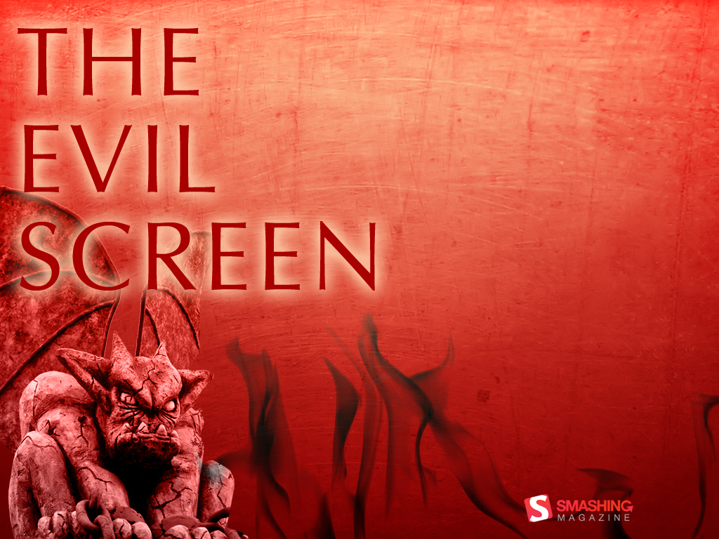
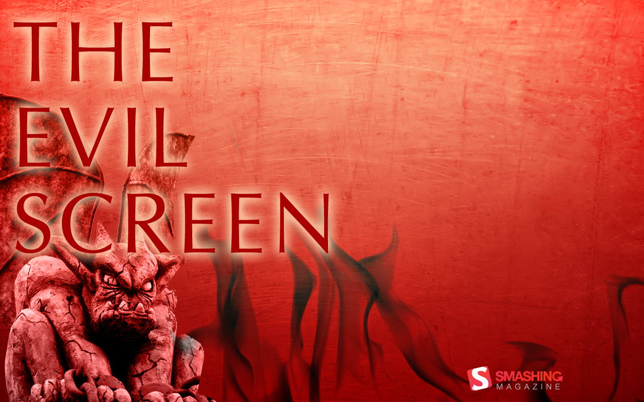
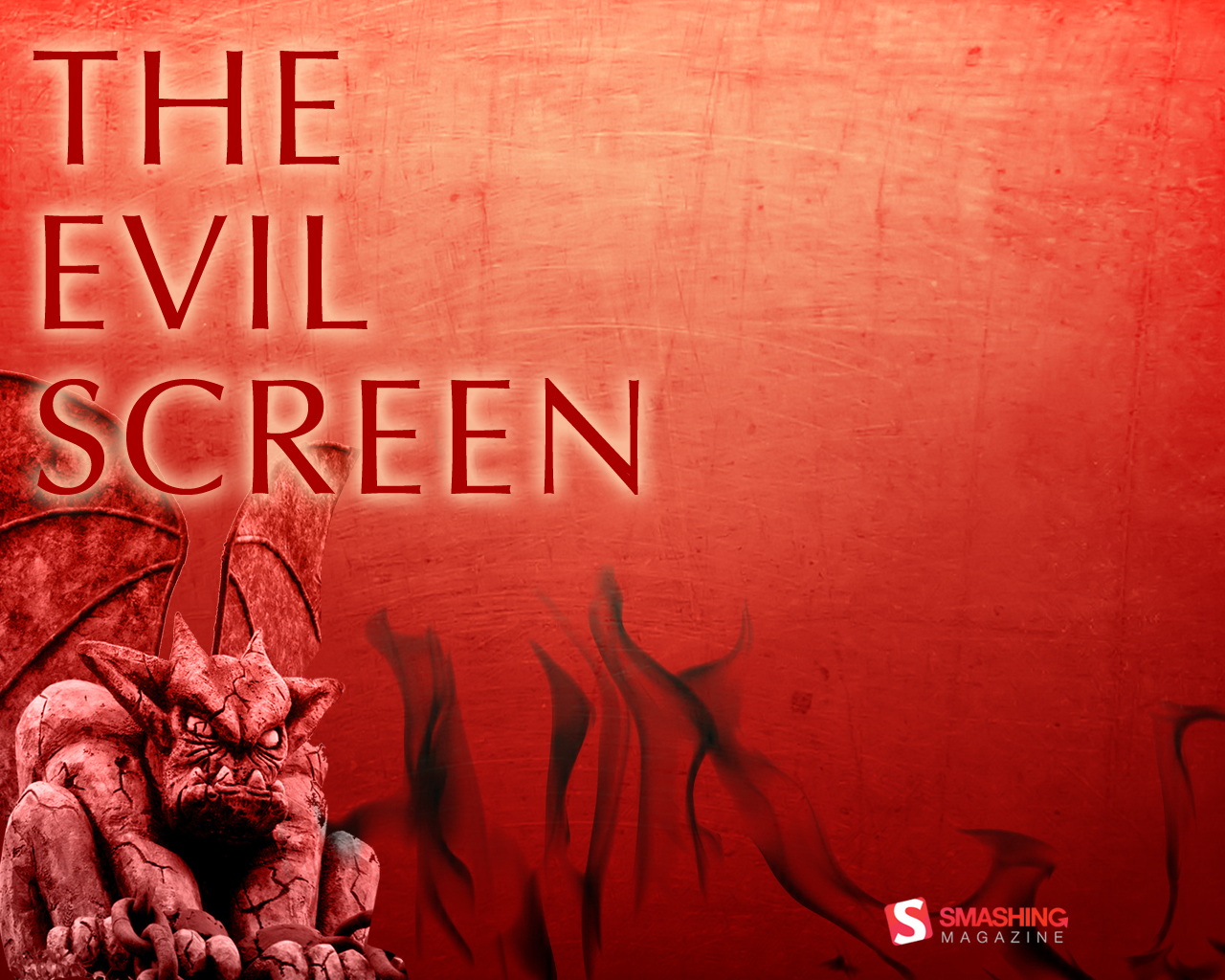
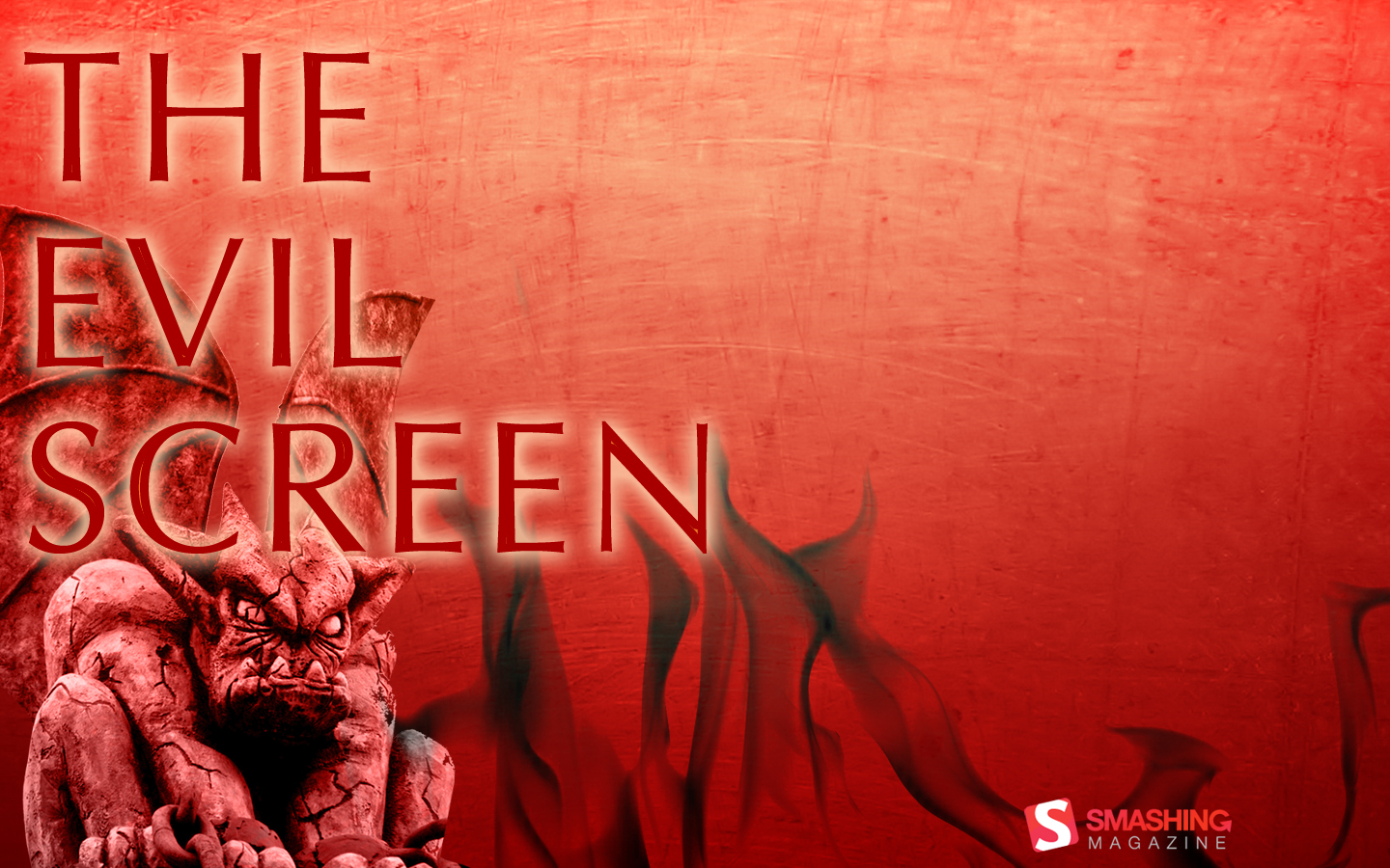
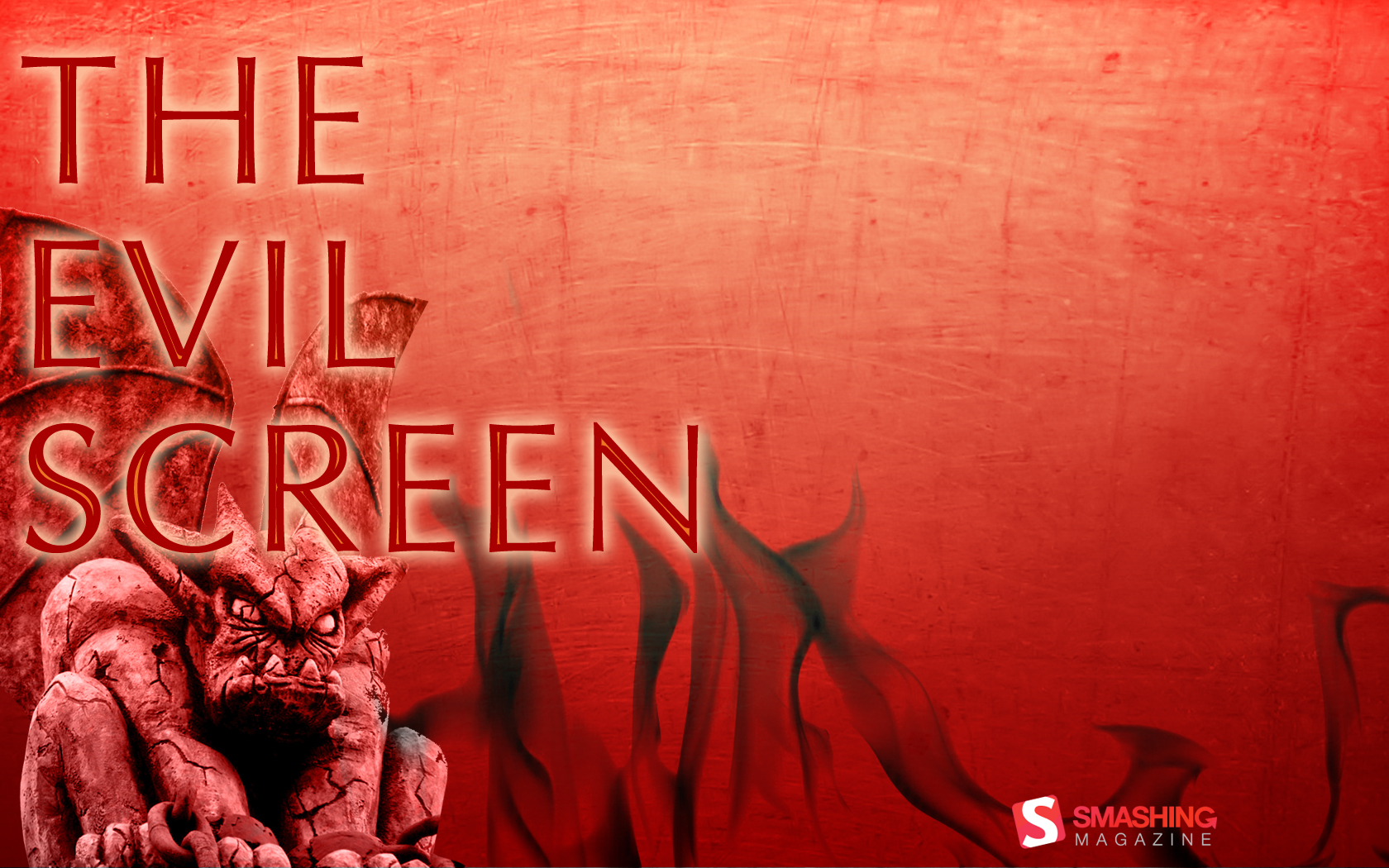
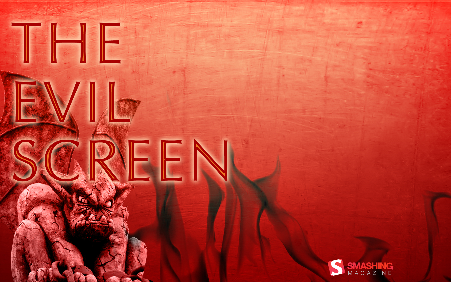
The Evil Screen
Designed by Misti Kenison.

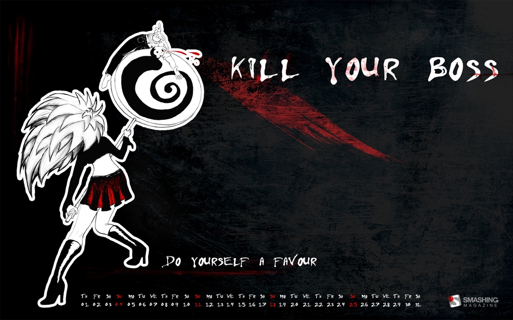
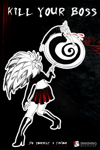
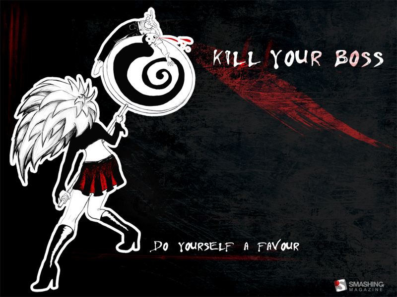
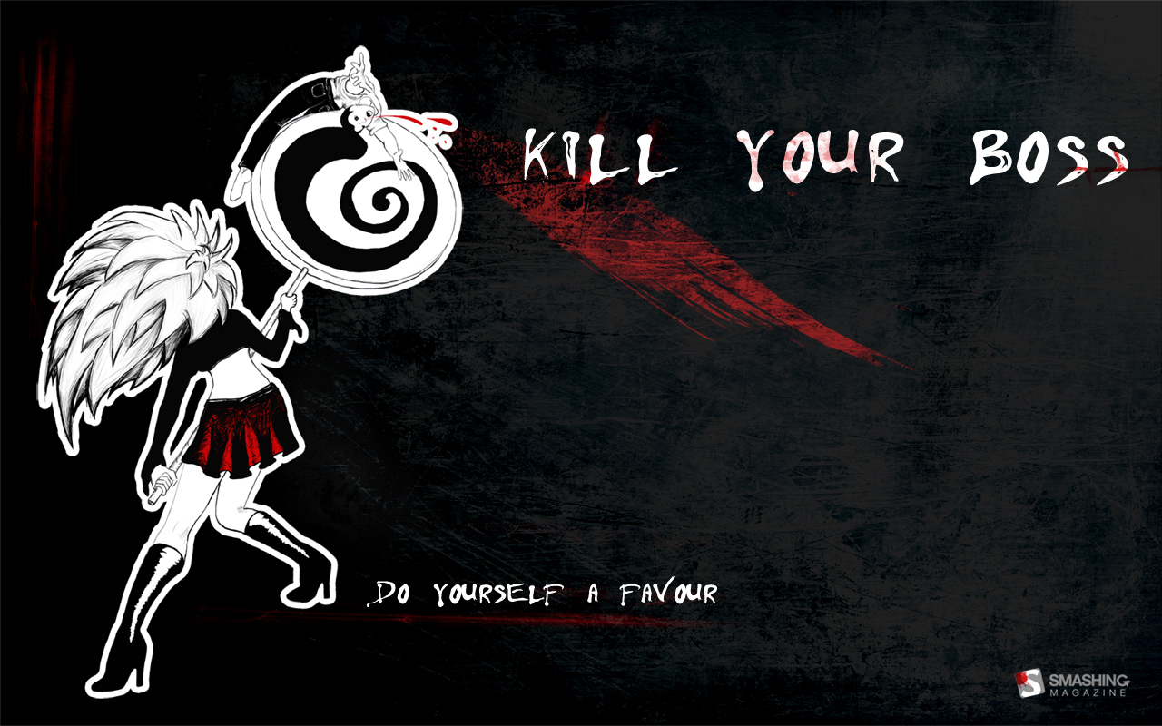
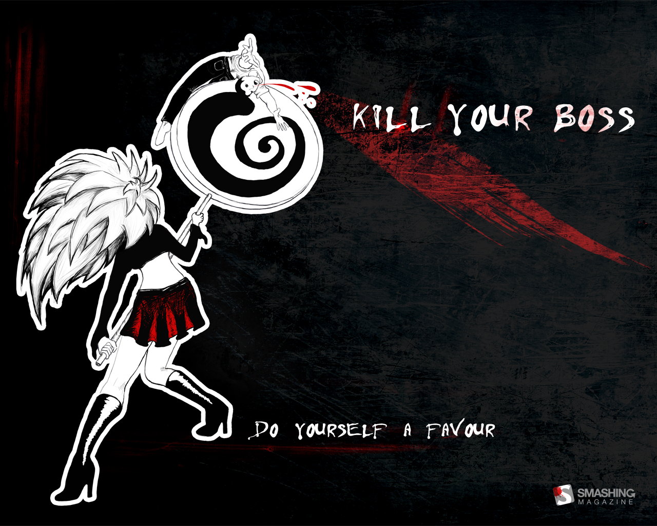
Kill your boss (Do not take it seriously)
(Editorial Team) Yes, this is a controversial wallpaper. Please do not take it seriously and consider it to be a funny and scary Halloween wallpaper. Some bosses can be quite harsh sometimes, but that’s definitely no the reason to kill anybody. So we do not take any legal responsibilities for the side effects of you having this wallpaper on your desktop. Happy Halloween!
“When your boss yells that you are too immature to be a designer you are morally obliged to stop whatever youare doing, go to him and have an encounter.” Designed by Milana Adamov from Serbia.
Halloween Wallpapers Elsewhere
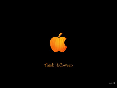
Think Halloween Only 1280× 960px. Designed by Zefhar.
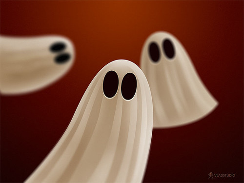
Ghosts 800x600, 1024x768, 1280x1024, 1600x1200.
Halloween Night Wallpaper 1024x768, 1152x864, 1280x960 and 1600x1200.
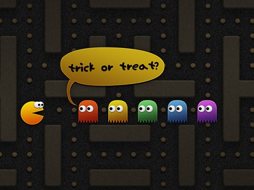
Pacman Halloween 800x600, 1024x768, 1280x1024, 1600x1200.
Horror, Scary Wallpapers
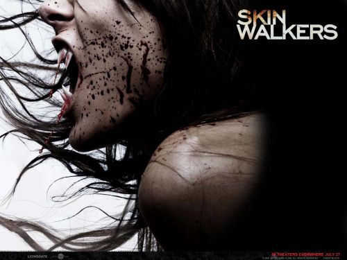
Skin Walkers 1024x768, 1152x864, 1280x1024 and 1600x1200.
Halloween Pumpkin Wallpaper 1440x900.
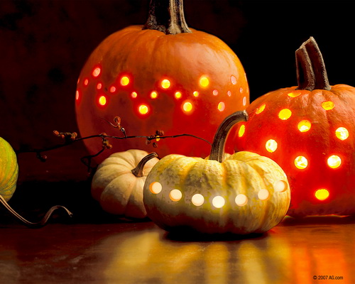
Halloween Lights Pumpkin and gourd lanterns represent a more artistic side of All Hallow’s Eve. 640x480, 800x600, 1024x768, 1280x1024, 1600x1200.
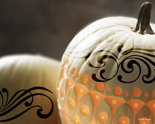
White Chocolate Pumpkin This white pumpkin decorated with brown and orange graphics looks good enough to eat. 640x480, 800x600, 1024x768, 1280x1024, 1600x1200.
Wallcoo Halloween Haunts Over 50 beautiful Halloween wallpapers in various resolutions, at most 1920x1200.
Spooky Halloween 1024x768.
Paci Tubes Halloween Wallpapers 7 Halloween wallpapers in the resolution 1280x1024.
Pumpkins 1280x1024.
Pendemonium Only 1024x768.
Dangerous Mask 1600x1200.
Halloween In The Midnight Forest 800x600, 1024x768, 1280x1024, 1600x1200.
Halloween Art Design Only 1024x768.
The Two And The Nightmare 800x600, 1024x768, 1280x1024, 1600x1200.

This is the END (sl)


