60 Lovely Workspace Illustrations [Freebie]

Email Newsletter
Weekly tips on front-end & UX.
Trusted by 182,000+ folks.


 Custom Web Forms for Angular, React, & Vue. Your backend.
 Celebrating 10 million developers

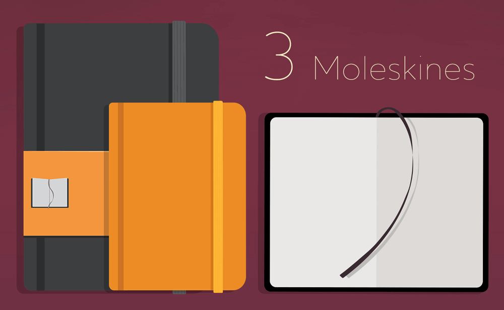
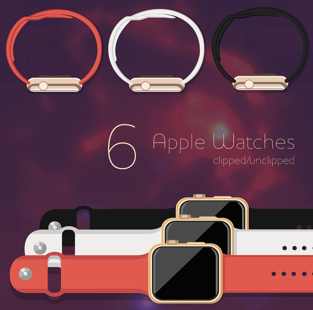
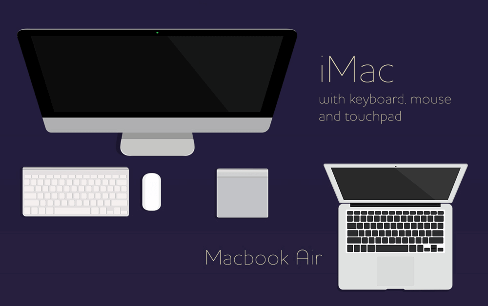
Today we’re happy to release yet another freebie: a set of 60 lovely workspace illustrations of items that many web and graphic designers use every day: tablet and desktop computers, Apple Watches, cameras, Moleskine notebooks, headphones, pens, pencils, pairs of glasses — even coffee cups and cookies!
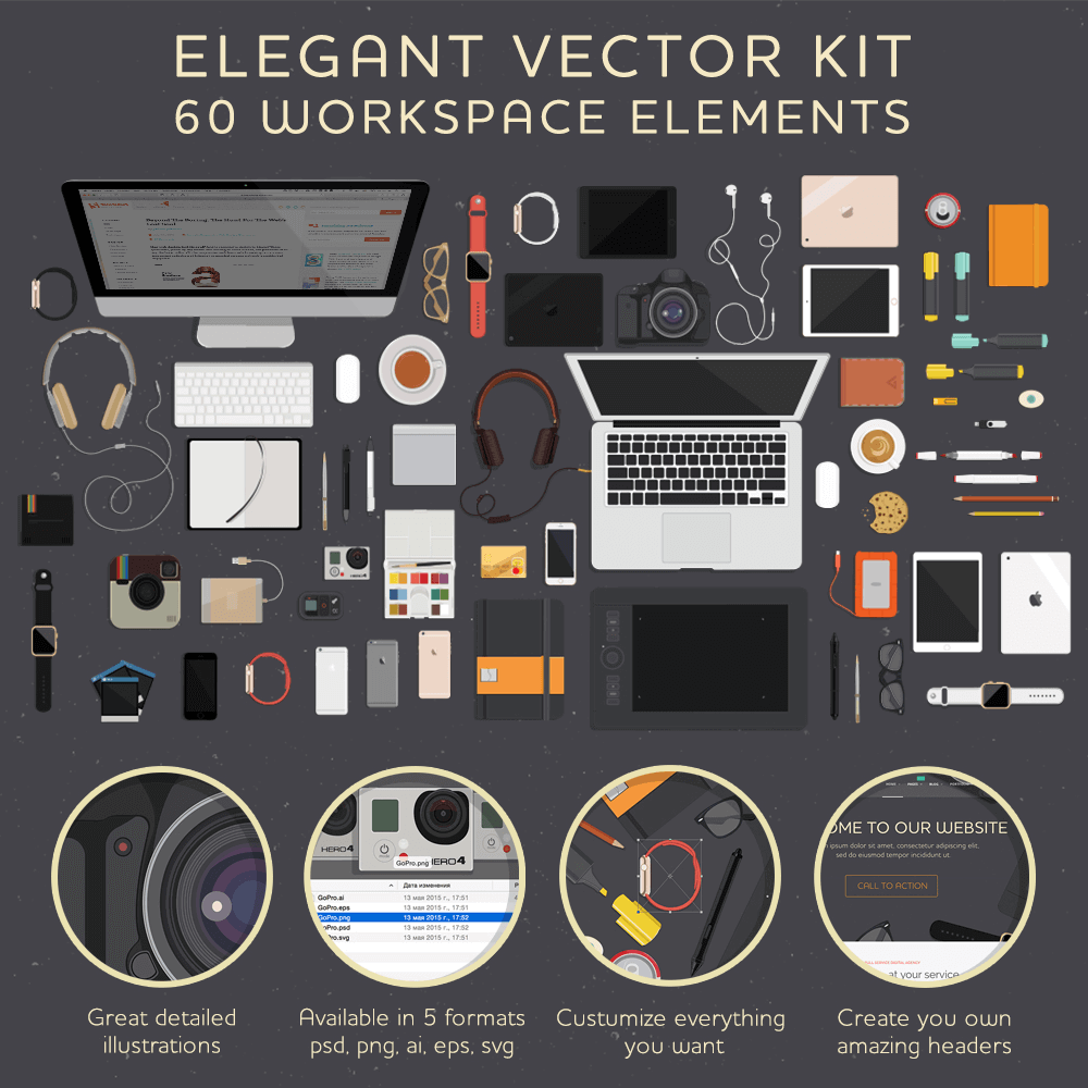
The set has been designed by Anastasia Kolisnichenko, from Minsk, Belarus, and released free for Smashing Magazine’s readers. Feel free to use all these elements and others for your projects. Grab what you need for a poster or website. You can customize everything you want: stroke width, size, color, shape — everything.
Each illustration is provided in five different formats (AI, PNG, PSD, EPS and SVG). So even if you don’t work with vector graphics, you can still easily use the illustrations to create great designs in any graphics software.
The kit is licensed under a Creative Commons Attribution-ShareAlike 4.0 International license. As long as you don’t resell bundles of the illustrations, you can use the illustrations for anything you need.
Download The Elegant Vector Kit For Free!
- Download Elegant Vector Kit (.zip, 234.1MB)
Insights From The Illustrator:
"I really love beautiful headers with workspace elements. I think it will be very useful for every web designer — who like my style, of course ;) Working on illustrations of Apple Watches, iMacs, iPhones and so on was really pleasant for me. I like to help people express their ideas. I hope my work will help web designers in their work."
Sincere thanks to NastiFunny (Anastasia Kolisnichenko) for releasing the illustrations — we’re very grateful for your talent and generosity!
Further Reading
- Up On The Wall: How Working Walls Unlock Creative Insight
- Dealing With Workaholism On Web Teams
- Andres Glusman On The Power Of UX And Lean Startup Methods
- Getting The Most Out Of Your Web Conference Experience


