What Is User Experience Design? Overview, Tools And Resources

Email Newsletter
Weekly tips on front-end & UX.
Trusted by 182,000+ folks.


 Celebrating 10 million developers
 Custom Web Forms for Angular, React, & Vue. Your backend.
Websites and Web applications have become progressively more complex as our industry’s technologies and methodologies advance. What used to be a one-way static medium has evolved into a very rich and interactive experience.
But regardless of how much has changed in the production process, a website’s success still hinges on just one thing: how users perceive it. “Does this website give me value? Is it easy to use? Is it pleasant to use?” These are the questions that run through the minds of visitors as they interact with our products, and they form the basis of their decisions on whether to become regular users.
What Is User Experience?
User experience (abbreviated as UX) is how a person feels when interfacing with a system. The system could be a website, a web application or desktop software and, in modern contexts, is generally denoted by some form of human-computer interaction (HCI).
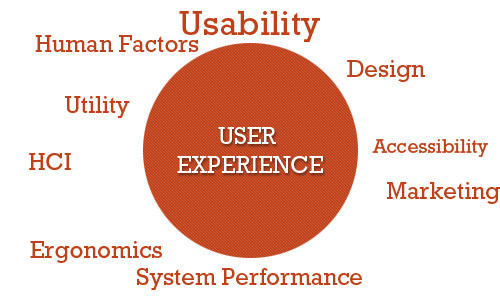
Those who work on UX (called UX designers) study and evaluate how users feel about a system, looking at such things as ease of use, perception of the value of the system, utility, efficiency in performing tasks and so forth.
Further Reading on SmashingMag:
- Why User Experience Cannot Be Designed
- Effectively Planning UX Design Projects
- 25 User Experience Videos That Are Worth Your Time
- Better User Experience With Storytelling
- 10 Principles Of Effective Web Design
User experience design is all about striving to make them answer “Yes” to all of those questions. This guide aims to familiarize you with the professional discipline of UX design in the context of Web-based systems such as websites and applications.
UX designers also look at sub-systems and processes within a system. For example, they might study the checkout process of an e-commerce website to see whether users find the process of buying products from the website easy and pleasant. They could delve deeper by studying components of the sub-system, such as seeing how efficient and pleasant is the experience of users filling out input fields in a Web form.
Compared to many other disciplines, particularly Web-based systems, UX is relatively new. The term “user experience” was coined by Dr. Donald Norman, a cognitive science researcher who was also the first to describe the importance of user-centered design (the notion that design decisions should be based on the needs and wants of users).

Why Is UX Important?
Nowadays, with so much emphasis on user-centered design, describing and justifying the importance of designing and enhancing the user experience seems almost unnecessary. We could simply say, “It’s important because it deals with our users’ needs — enough said,” and everyone would probably be satisfied with that.
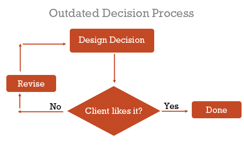
However, those of us who worked in the Web design industry prior to the codification of user-centered design, usability and Web accessibility would know that we used to make websites differently. Before our clients (and we) understood the value of user-centered design, we made design decisions based on just two things: what we thought was awesome and what the client wanted to see.
We built interaction based on what we thought worked — we designed for ourselves. The focus was on aesthetics and the brand, with little to no thought of how the people who would use the website would feel about it.
There was no science behind what we did. We did it because the results looked good, because they were creative (so we thought) and because that was what our clients wanted.
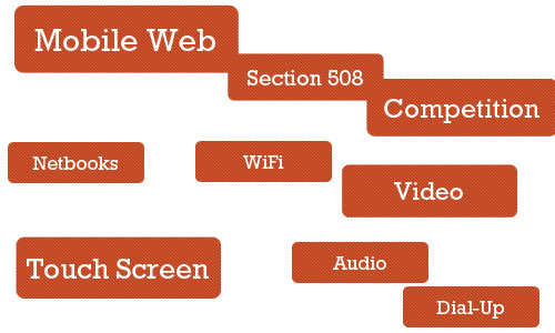
But this decade has witnessed a transformation of the Web. Not only has it become more ubiquitous — the Web had at least 1.5 billion users globally in 2008 — but websites have become so complex and feature-rich that, to be effective, they must have great user experience designs.
Additionally, users have been accessing websites in an increasing number of ways: mobile devices, a vast landscape of browsers, different types of Internet connections.
We’ve also become aware of the importance of accessibility — i.e. universal access to our Web-based products — not only for those who with special requirements, such as for screen readers and non-traditional input devices, but for those who don’t have broadband connections or who have older mobile devices and so forth.
With all of these sweeping changes, the websites that have consistently stood out were the ones that were pleasant to use. The driving factor of how we build websites today has become the experience we want to give the people who will use the websites.
What Situations Would Benefit From UX Design?
Saying that all Web systems would benefit from a solid evaluation and design of the user experience is easy; arguing against it is hard if you care about user-centered design at all. But we don’t live in a perfect world, and we don’t have unlimited resources. Thus, we must prioritize and identify the areas that stand to gain the most from UX design and UX designers.
Complex Systems
The more complex the system, the more involved will the planning and architecture have to be for it. While investing in a full-blown multi-member UX study for a simple static website seems excessive, multi-faceted websites, interaction-rich Web applications and e-commerce websites stand to benefit a lot from UX design.
Systems that involve a myriad of user tasks must be perceived as being valuable, pleasant and efficient. Designers risk big losses in revenue by neglecting the user experience.
Start-Ups
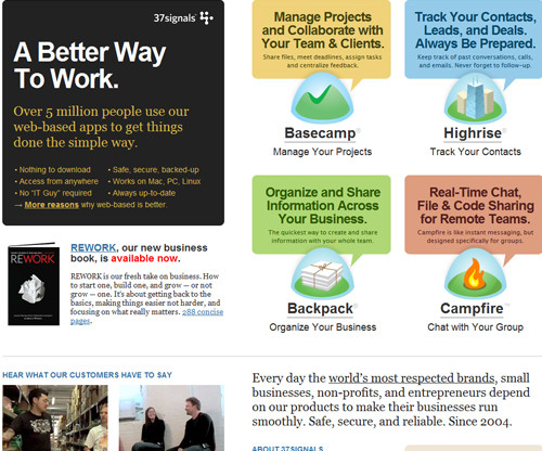
Start-ups and smaller companies generally do not have the resources to hire dedicated employees for this. For example, 37Signals (now Basecamp), a lean start-up company that builds highly successful and robust Web applications, including Basecamp and Highrise, relies on well-rounded individuals, people who can “wear different hats.”
In this situation, training existing employees (specifically, the Web designer) in the principles and processes of UX, or contracting out the UX work as needed, might be more suitable than hiring a full-time employee. However, creating a solid user experience for users in the very first versions of a product or service can certainly make it stand out and attract users’ attention. But as the owner of a start-up, sometimes you may just not have enough resources for hiring a skilled UX designer.
Projects With “OK” Budgets
Smaller agencies that work for small and medium-sized businesses need to keep costs low for the customer base and prioritize deliverables in order to stay on the budget. The focus in these situations is more on the build process and less on planning, research and analysis. Projects with small budgets will be driven more by the launch of the final product. That doesn’t mean that these projects wouldn’t benefit from the good UX — of course they would — but in practice, small or medium-sized companies often do not feel compelled to invest resources into something that is not necessary for the launch of the site.
Projects With Longer Timeframes
By simple logic, adding a cog to the traditional website production process will extend the timeline. Time must be allotted for user experience design. UX designers could, in theory, shorten timelines by taking on some of the tasks traditionally assigned to Web designers and developers, thus potentially saving time and costs in revision phases by having addressed user issues.
Things To Know About UX Design
UX design is an amazing discipline, but it cannot, or will not, accomplish certain things.
UX Design Is Not One Size Fits All
User experience design won’t work in every situation for every user because, as human beings, we are all different. What works for one person might have the opposite effect on another. The best we can do is design for specific experiences and promote certain behaviors, but we can’t manufacture, impose or predict the actual experience itself.
And just as we can’t design a user experience, we can’t replicate the user experience for one website exactly on another website. User experiences will be different between websites. a design must be tailored to the goals, values, production process and products of its website.
Can’t Be Directly Assessed With Traditional Metrics
You can’t determine the effectiveness of a user experience design based solely on statistics such as page views, bounce rates and conversion rates. We can make assumptions, and we can ask users for anecdotal evidence, but we can’t install an app (at least not yet) that automatically records user experience statistics directly.
Not the Same Thing as Usability
User experience and usability have become synonymous, but these two fields are clearly distinct. UX addresses how a user feels when using a system, while usability is about the user-friendliness and efficiency of the interface.
Usability is big part of the user experience and plays a major role in experiences that are effective and pleasant, but then human factors science, psychology, information architecture and user-centered design principles also play major roles.
Criticisms Of UX As A Profession
Not everyone sees the value of having a UX designer on the team. Arguments against hiring UX specialists revolve around the perceived associated costs, redundancy in skill set and fear of change.
Yet Another Thing to Worry About
The traditional website production process, especially at small agencies and start-ups, whose resources aren’t as deep as they’d like, consists of one Web designer and one Web developer. The Web designer might be the one who develops the user experience, along with other tasks such as designing a wireframe and functional prototype, while the developer builds the production website as specified by the designer. A UX specialist only complicates this process.
Too Far Removed From the Process
A few people in the business of building websites believe that UX designers are too far removed from the actual process. Ryan Carson, founder of Carsonified and a leading voice in the Web design industry, for example, has criticized UX professionals who aren’t “involved in the day-to-day process of designing, building, testing, marketing and updating a Web project.”
This view of the profession basically says that UX professionals with no background in the actual process of building websites can’t devise solutions as expertly as people who create the actual products.
However, many UX professionals do have a background in the build process; many were Web designers or developers who chose to specialize in this particular area of the production process.
Adds Expense
Simple logic dictates that hiring a UX person costs money (unless they’re willing to work for free, and none are).
A counter-argument is that we should look at UX design as an investment. Although the benefits of UX are not as readily apparent as those of other parts of the website or application, it can lead to higher returns later on. For example, a simple improvement in the user experience design of a checkout process could increase revenue by millions of dollars.
Results Are Not Directly Measurable
Evaluating the effectiveness and return on investment of a UX design using quantitative measures is difficult. This is because the field is subjective. UX deals with users’ emotions, and you can’t put a number on it the way you can with page views, loading speed or conversion.
Instead, we have to tease out the results indirectly by analyzing revenue levels, page views, before-and-after surveys of users and the like. However, saying that any positive effects are the result of a better user experience or aesthetics or some other factor, such as improved marketing or front-end performance optimization, would be inconclusive.
The difficulty is in trying to quantify effects that are subjective in nature. We have to rely on qualitative evidence.
Tasks And Techniques Of UX Designers
UX designers perform various tasks at various points in the process. Here are a few things that they deliver.
Evaluation of Current System
If a system already exists, a UX professional will holistically evaluate its current state. They will report issues and suggest fixes based on their analysis of research data.
A/B Testing
A UX specialist might devise a study to compare the effectiveness and quality of experience of different user interfaces.
This is done by stating a hypothesis (e.g. “A green button is more attractive than a red button.”), proposing or creating multiple versions of a design, defining what a “better experience” means (e.g. “The green button is better because users clicked it more.”) and then conducting the test.
User Surveys
A UX designer could interview existing and potential users of the system to gain insight into what would be the most effective design. Because the user’s experience is subjective, the best way to directly obtain information is by studying and interacting with users.
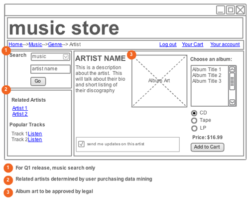
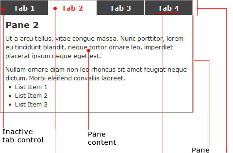
Wireframes and Prototypes
Based on their findings, UX specialists might develop wireframes of different layouts and perhaps also higher-fidelity prototypes.
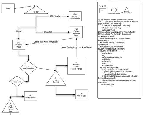
User Flows
Designing how users should move through a system is another popular deliverable.
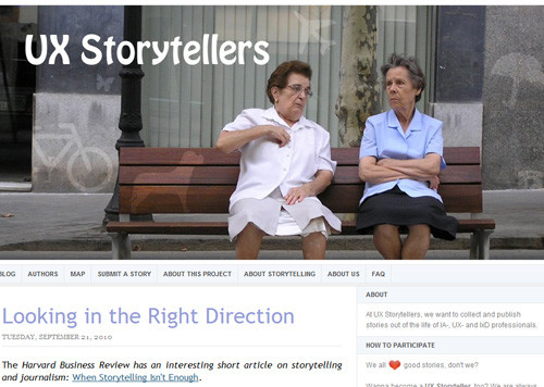
Storytelling
By engaging the emotions of users and drawing on familiar elements, UX designers tell stories and teach information. Learn more about the value of storytelling in the context of UX in the two-part post “Better User Experience With Storytelling.”
Design Patterns
Patterns provide consistency and a way of finding the most effective “tool” for the job. With user interface design patterns, for example, picking the right UI elements (e.g. module tabs, breadcrumbs, slideshows) for certain tasks based on their effectiveness leads to better and more familiar experiences. UX designers not only propose design patterns that are used on other websites, but develop custom patterns specifically for the current project.
User Profiles and Personas
Knowing your audience is the first step in UX design and enables you to develop experiences that reflect the voice and emotions of your users. Personas can be developed using website data.
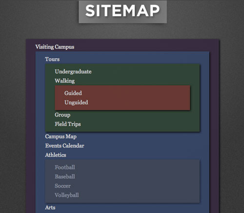
Content Inventory
In the simplest of terms, content inventory is an organized list of pages on a website. Doing a content inventory is a step towards proposing changes in information architecture to enhance the user experience (e.g. user flow, findability and efficiency).
Content Style Guides
Consistency is critical to crafting a memorable user experience through your brand. Content style guides give writers and designers a framework in which to work when creating content and developing a design, and they also ensure that the brand and design elements align with the owner’s goals.
There are plenty of other UX design deliverables; check out this more complete listing.
Tools Of The Trade
Here are a few popular and easily accessible tools for UX professionals. The tools aren’t exclusive to UX professionals; developers, designers and interaction designers, among others, use them as well.
Wireframing and Prototyping Applications
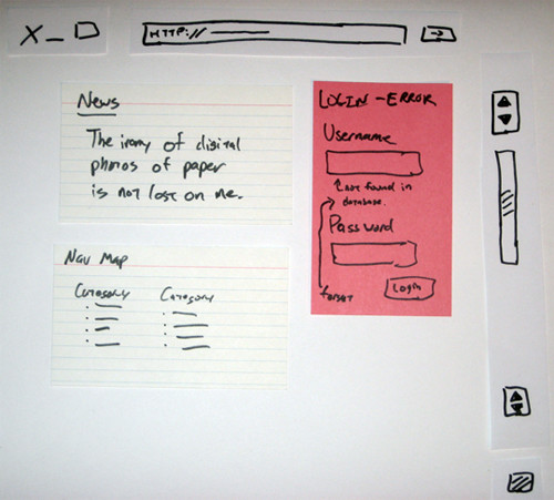
Wireframing and prototyping can be done simply with pen and paper. Paper prototyping, in particular, has many benefits, such as being inexpensive, conducive to group prototyping and quick and easy to produce.
Some software-based wireframing and prototyping tools are:
A/B Testing Software
A/B testing (also known as split testing or multivariate testing) compares different versions of a page, and it can be conducted with any of several programs.
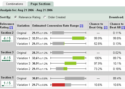
Basically, A/B testing software splits a website’s traffic into two equal segments. One group sees version A, and the other group sees version B. Statistics such as conversion rate and bounce rate are tracked for each version. Split testing determines which version is better based on these statistics. One of the most popular applications for A/B testing is Google’s Website Optimizer.
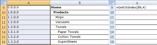
Content Inventory Software
There are plenty of methods of conducting a content inventory. Using an on-site server application (for which you’ll require access to the Web server) is best for production websites; being closer to the source than third-party software, these applications will naturally be more accurate and efficient. You can use as simple a tool as Excel to create and manage a content inventory (check out the GetUXIndex() template).
Websites built with content management systems such as WordPress and Drupal typically have built-in tools that show a map of the existing website.
User Testing and Feedback Software
Interviewing users is another popular UX design task. The most effective and cost-saving way to do this is with a surveying or feedback app and remote user testing.
User feedback tools are abundant. General survey tools such as PollDaddy are flexible solutions that can be used for other tasks, too. There are usability-specific feedback tools, such as Usabilla, and remote user-testing services, such as Usability Hub, which administer usability tests on reviewers.
Analytics Software
UX designers can analyze traffic statistics to hypothesize what types of experiences would be most effective for the audience of the website.
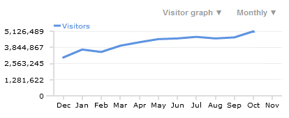
Let’s say the data indicates that the most popular browser for a website is Google Chrome. Google Chrome is regarded as a power user’s browser (as opposed to Internet Explorer, which is more mainstream). From that assumption, a UX designer can craft user experiences that appeal to power users and tech-savvy people.
A feature-packed and free analytics tool is Google Analytics.
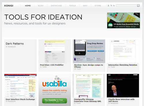
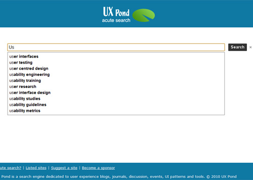
Websites About UX
Plenty of websites cover the topic of UX. Here are a few of them.
UX Magazine UX Magazine is a high-quality resource that publishes discussions on ways to enhance the user experience.
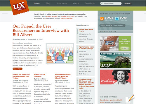
UX Booth UX Booth is a multi-author blog catering to the user experience community. It also covers usability and interaction design.
Further Reading on UX Design (and Related Fields)
- Can Experience be Designed?
- Userfocus Articles and Resources
- UX Myths
- User Experience Publications (curated by Nick Finck)
- 10 Most Common Misconceptions About User Experience Design
- 8 Must-See UX Diagrams


