Pagination Gallery: Examples And Good Practices

Advertisement

Structure and hierarchy reduce complexity and improve readability. The more organized your articles or web-sites are, the easier it is for users to follow your arguments and get the message you are trying to deliver. On the Web this can be done in a variety of ways.

In body copy headlines and enumerations are usually used to present the information as logically separated data chunks. An alternative solution is pagination, a mechanism which provides users with additional navigation options for browsing through single parts of the given article. Parts of the article are usually referred to by numbers, hints, arrows as well as “previous” and “next”-buttons.

Search engines almost always use pagination; newspapers tend to make use of it for navigation through the parts of rather large articles. And there are situations when pagination is also necessary for weblogs. Additional navigation can simplify the access to some site pages — e.g. make it easier for users to browse through the archives of the site.

In most cases pagination is better than traditional “previous – next” navigation as it offers visitors a more quick and convenient navigation through the site. It’s not a must, but a useful nice-to-have-feature.

Let’s take a look at the good practices of pagination design as well as some examples of when and how the pagination is usually implemented.

Good Practices Of Pagination Design
(7 Aspects according to Faruk Ates)

  1. Provide large clickable areas
  2. Don’t use underlines
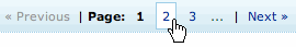
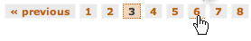
  3. Identify the current page
  4. Space out page links
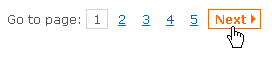
  5. Provide Previous and Next links
  6. Use First and Last links (where applicable)
  7. Put First and Last links on the outside

Related References

  • An ultimate article about pagination, Pagination 101, has already been written by Faruk Ates.
  • Style sheets freely available for free download: Some Styles For Your Pagination.
  • If your weblog runs upon WordPress you can use WP-PageNavi plug-in to generate pagination “on the fly”. It’s easy to install, however, requires some changes in the source code of your WordPress theme.

Mistake #1: Navigation Options Are Invisible

Since pagination’s primary purpose is to serve as an improved navigation, it is supposed to make it clear for the visitors where they are, where they’ve already been and where they can go next. These three facts give users a complete understanding of how the system works and how the navigation should be used.

But most importantly, the navigation options should be visible. Hugg.com doesn’t follow this guideline. The color of the links has a very low contrast with the white background. The hover-effect isn’t provided.

Screenshot Pagination
The color of the links on Hugg.com has a very low contrast with the white background. The hover-effect isn’t provided.

Mistake #2: Pagination Isn’t Intuitive

If you have to decide between a quite complex (but beautiful) pagination and a simple one with necessary functionality always prefer the simple solution. If users don’t understand the mechanism behind navigation they won’t be able to use it and therefore won’t use your web-site.

Helium.com is a perfect example for this mistake. Take a look at the screenshot below: what do the arrows stand for? For the page you’ve already visited or for the page you are currently on? And why does the link to the second page have a white background color? Why do the arrows have different colors? This is unintuitive.

Screenshot Pagination
Unintuitive pagination design on Helium.com

Unintuitive designs result from the lack of structure, hierarchy and well thought-out design decisions. “Blank” pagination is as unintuitive as overcrowded design solution.

Screenshot Pagination
Our favourite example: Helium.com

Screenshot Pagination
Not spaced out page links are harder to scan and to navigate through. Make-Believe.org as an example. The design is unintuitive.

Creative Solutions Can Be User-Friendly

The more frequently a design element is used, the harder it is for designers to introduce some creative approaches without risking to make the design less intuitive. Consequently, pagination designs have rather a variety of different patterns — revolutionary approaches are used very rarely.

However, creative approaches can be user-friendly. E.g. Dirty.ru uses a slider-based pagination menu; users can drag it to get more available options, that means links to the older pages of the site.

Screenshot Pagination
A slider on Dirty.ru

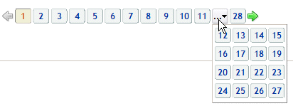
Erweiterungen.de, the German version of the official Firefox extensions web-site, provides more navigation options once the visitor clicks on the “…”-button.

Screenshot Pagination
Further navigation options are displayed once the “…”-button is clicked. Erweiterungen.de.

Gallery

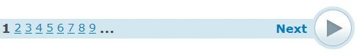
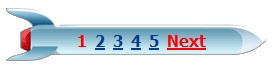
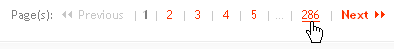
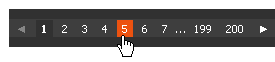
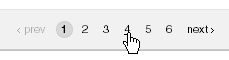
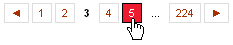
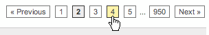
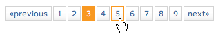
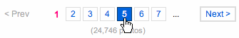
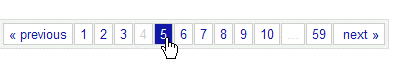
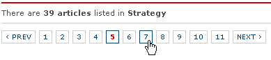
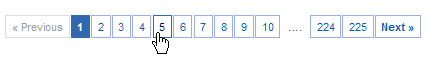
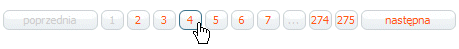
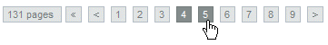
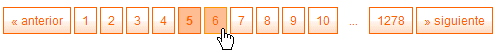
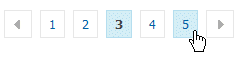
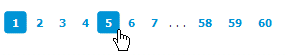
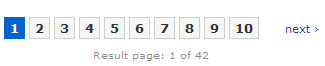
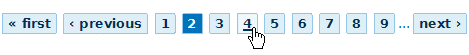
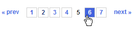
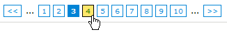
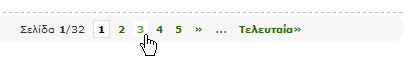
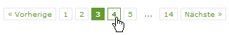
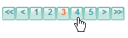
Although “standard” pagination — linked blue numbers following each other — is very common for most web interfaces, designers tend to experiment with colors, forms, backgrounds and shapes.

The pagination doesn’t need to look nice aiming to captivate users’ attention; as a part of site navigation it offers users an important functionality and as such has to be used effectively. Still, visual clues can be helpful. In most designs blue and grey colors dominate — colors traditionally used by services.
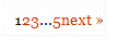
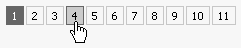
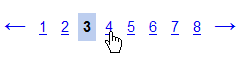
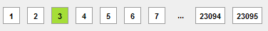
Simple Enumeration

Facebook

Screenshot Pagination

Businessweek

Slanted

Cpluv

Stylegala

Screenshot Pagination

Overture

Misal

Colors and Shapes In Use

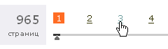
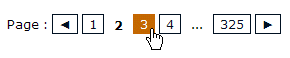
Often designers use colors to highlight the current page and separate it from the other pages. The numbers of the pages are also given a shape: a rectangle, a circle or a button. The current page is usually not linked.

StylishLabs

Apple Store

Bildblog

Screenshot Pagination

Sitepoint

Amazon

Maple

Screenshot Pagination

Screenshot Pagination

Screenshot Pagination

Flickr

Screenshot Pagination

Screenshot Pagination

Screenshot Pagination

UXMag

Screenshot Pagination

Screenshot Pagination

Screenshot Pagination

Screenshot Pagination

Screenshot Pagination

Screenshot Pagination

Screenshot Pagination

Screenshot Pagination

Screenshot Pagination

Screenshot Pagination

Screenshot Pagination

Screenshot Pagination

Screenshot Pagination

Screenshot Pagination

Screenshot Pagination

Screenshot Pagination

Screenshot Pagination

Designshack

Screenshot Pagination

Screenshot Pagination

Screenshot Pagination

Screenshot Pagination

Screenshot Pagination

Screenshot Pagination

Screenshot Pagination

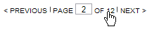
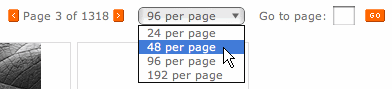
Pagination With Manual Page Input

In some cases users can provide the number of the page they’d like to see manually, via the input-element. This is common for paginations with the limited number of options — e.g. in these designs you can’t jump to the last page if you’d like to.

Screenshot Pagination

Veer

Screenshot Pagination

Unusual Solutions

Screenshot Pagination

Screenshot Pagination

Vitaly Friedman loves beautiful content and doesn’t like to give in easily. Vitaly is writer, speaker, author and editor-in-chief of Smashing Magazine, an online magazine dedicated to designers and developers.

  1. 1

    Jeff Adans

    November 16th, 2007 1:48 am

    This article is great! I’m doing a step-by-step system for my own site so it really came in handy, I was using a basic links 1,2,3 etc but now I might add some CSS to them and make them more user friendly!

    great article!

    +1
    • 2

      xi

      October 9th, 2010 3:21 pm

      agree

      0
  2. 3

    Aaron Stroud

    November 16th, 2007 2:07 am

    Great timing. I’m in the middle of a final redesign before launching and adding pagination was one of my final tasks. Does anyone know how to code pagination into a wordpress template? So far, I’ve only come across this wordpress plugin.

    0
  3. 4

    Voltarex

    November 16th, 2007 2:24 am

    Guys, you’re outstanding! The magazine is a weekly blast of superlative, effective and useful articles. This one is perfect. And kudos to you right because is about a so important but too often underrated argument. Pagination is the core of this so overloaded world of informations and documents and answers that is the web today.

    0
  4. 5

    kidsinhalf

    November 16th, 2007 2:44 am

    The simplest is always the best. bold better than bord..er !

    Nice exhaustive gallery

    -1
  5. 6

    Josh Minnich

    November 16th, 2007 2:46 am

    I think facebook has some of the best pagination styles. Super easy to read and understand how to use it.

    0
  6. 7

    Ant

    November 16th, 2007 3:55 am

    I was just putting together a pattern library entry on pagination tools, this will be a great help. Thanks!

    0
  7. 8

    Jason

    November 16th, 2007 5:27 am

    I love the PHP pagination class at catchmyfame, http://www.catchmyfame.com/2007/07/28/finally-the-simple-pagination-class/

    -2
  8. 9

    Stephen

    November 16th, 2007 6:36 am

    1..2..3..4..5 pagination is just not intuitive to begin with. Navigation is about context, and there’s no way to know what “3″ is, at-a-glance.

    Keep the prev/next/first/last if you have to, but paginate, predominantly, based on something less-arbitrary than page number, like letter…

    +2
  9. 10

    Aaron Pepper

    November 16th, 2007 7:47 am

    Great post! You guys have inspired me to take another look at Paging possibilities.

    Another method of paging that I like is the simple dropdown. Tom’s Hardware, Anandtech and most other tech sites use this effectively.

    +1
  10. 11

    Ahmad Alfy

    November 16th, 2007 8:23 am

    It never crossed my mind how important is the pagination thing!
    Thanks for the great article

    +1
  11. 12

    Justin Young

    November 16th, 2007 9:05 am

    YES! The UE is most important.

    0
  12. 13

    Yogi

    November 16th, 2007 10:00 am

    Wow..excellent pagination

    0
  13. 14

    bea

    November 16th, 2007 10:39 am

    That’s great! I must add it on my site SingleParentLoving.com

    0
  14. 15

    Ryan Feeley

    November 16th, 2007 10:53 am

    Sure I’m biased, but I really like my pagintation design for Masterfile.com. I’ve never seen anything like it on the web, and I even blogged about it a few months ago. Compact and versatile it is. Funny how you have Veer listed.

    0
    • 16

      Jackie

      February 25th, 2010 9:58 am

      @Ryan. you’re right. That’s a pretty nice option. I definitely think ten or more links just to go from page to page is way too cumbersome. Your design balances the real-estate efficiencies found in some of the jump to entry field designs with the simplicity of clicking on a number. I’m sure others will feel that a single click to page 2 is better than the two required in your design. Also there is the added movement of scrolling the drop down. …At any rate, kudos! I like it.

      If anyone knows of an actual user study comparing, please post a link to results.
      -jackie

      -1
  15. 17

    Ben

    November 16th, 2007 10:56 am

    Great article, simple and easy to use is the best option for Paginations. But that doesn’t mean they have to be ugly.

    +1
  16. 18

    Mike

    November 16th, 2007 11:42 am

    Thanx a lot for that wonderful list!

    0
  17. 19

    v1

    November 16th, 2007 4:13 pm

    80% of the pagination examples are the same… =/

    0
  18. 20

    Christian

    November 16th, 2007 4:31 pm

    Thank you for this good source of ideas. It’s always a lot of detail work but the navigation is so important for any website!

    0
  19. 21

    Polo

    November 16th, 2007 4:32 pm

    Thanks a lot for this great article.

    0
  20. 22

    Gerd Wippich

    November 16th, 2007 4:45 pm

    I appreciate the range of themes that are shown and discussed on this blog. Pagination is so important and really worth to be thought about.

    0
  21. 23

    gterez

    November 16th, 2007 5:58 pm

    Something that is not covered in this post is the possibility of having different levels of “granularity” in the display of page numbers, to give a better overview of the number of results and some means to browse more effectively by moving forwards and backwards in chunks of different sizes.
    This is useful especially in cases where the number of resulting pages is really big.
    E.g. for a query that returns 3500 pages:

    1 2 3 4...10...100...1000...2000...3000...3500 next >>

    or when we’re in the middle of the results:


    1...100...1000 ... 2000 ... 2234 2235 2236 2237... 2300...3000...3500 next >>

    Another point: I think it is far better to get rid of the links to first & last page, but always provide a means to go to the first & last page by clicking their numbers. It is VERY frustrating to click “last” instead of “next” and they’re often placed right next to each other.

    Of course, I do agree with Stephen that it is MUCH better to display something more relevant to the actual data than page numbers…

    0
  22. 24

    Justin Scheetz

    November 16th, 2007 7:35 pm

    Wow, thanks for using our pagination (designsnack.com) in one of your “good” examples. Love this site, too!

    0
  23. 25

    Chris Pemberton

    November 16th, 2007 7:45 pm

    Great article as always. One point for all to remember. The pagination design is important but design is nothing without function. Keep it simple keep it quick. So often I see people who grab all the data from the DB and then paginate the data object on the page, SLOW!! which then lets down the design.

    I like that all the examples highlight a key to pagination design, correct spacing between the page numbers. I have seen sites which bunch them together making quick clicking harder for novice computer users…Yes there are some still out there :)

    0
  24. 26

    Jerald Rajan

    November 16th, 2007 8:55 pm

    Another Fine article from smashingmagazine.
    Keep it UP friends.

    0
  25. 27

    Michael

    November 16th, 2007 11:19 pm

    When I grow up, I want to marry smashingmagazine.com.

    0
  26. 28

    helaene

    November 16th, 2007 11:34 pm

    these are great – thank you!

    what really drives me crazy is when default positions and hover positions don’t match…. I just love clicking the wrong link because it moved under my mouse…don’t you?

    0
  27. 29

    David J.

    November 17th, 2007 2:19 am

    I’m fairly impressed with the list. Stylish Labs & apple’s store — both look great but with usability in mind
    Ours at HostJury are good as well though, albeit we’re only using them on the blog: HostJury blog

    0
  28. 30

    pault

    November 17th, 2007 7:09 pm

    lets start a pagination hall of shame
    my first nomination is
    http://www.eurekalert.org/pubnews.php
    no next page widget and its hard to tell which page you
    are currently on

    0
  29. 31

    baldo

    November 17th, 2007 7:27 pm

    I did something similar for the search forms:

    Search forms examples

    0
  30. 32

    Mocker

    November 19th, 2007 2:17 pm

    Hey, that’s pretty cool – I checkout out the wordpress plugin.

    I’m going to install it tomorrow, thanks for turning me on to it.

    0
  31. 33

    OverZero.it

    November 19th, 2007 4:20 pm

    Great inspiration for a very specific issue.
    Thank you!

    0
  32. 34

    karaboz

    November 20th, 2007 1:16 am

    I was very proud discovering my paginator 3000 (paginator with slider created for dirty.ru) among creative examples (= After this I desided to publish it’s source files in my blog karaboz.ru. Maybe it could be useful for somebody else (=

    0
  33. 35

    Spencer Lavery

    November 20th, 2007 8:41 pm

    Google’s search results pagination should be in the article listed under “Unusual Solutions”. It’s probably the most used pagination in the world, too.

    0
  34. 36

    cos

    November 21st, 2007 1:53 am

    LAME :)

    All are the same.
    how about NOT conformist pagination:

    inkdot.ro,

    still in early alpha but layout looks cool.

    0
  35. 37

    Marie ALHOMME

    November 23rd, 2007 6:30 pm

    Hello, I’ve liked this article a lot and would like to translate it to French and publish it to my website alongside other translations, with all the due backlinks and credits to you of course…

    Do I have your authorization ?

    Thanks in advance,
    Marie ALHOMME (webdesigner/front-end developer)

    0
  36. 38

    Steve

    November 24th, 2007 3:37 am

    Really fantastic analysis, could have used this about a month ago when we were designing our new pagination method. Although we’re using Flash and our content is all media, we think we figured out something new. We call it ‘Pagiscrolling’ ;) and I’d love to get opinions on it. Here’s a link to it’s use, http://voicethread.com/#q and a place to critique it, http://voicethread.com/#home.b12965

    0
  37. 39

    zeus

    November 26th, 2007 10:39 am

    Thank you for using our website’s pagination method, as an example, in this article! :)

    0
  38. 40

    kl3tte

    November 29th, 2007 9:46 pm

    Real good summary of this topic. Pagination is a very difficult thing in modern web technologies. thank you for this awesome article.

    0
  39. 41

    extreme webmaster

    December 6th, 2007 9:03 am

    Basically, the best ones are those with numbers inside a square. They are far more usable, because the user has a bigger area to click on (rather than going for a digit between two other ones). Also, the selection is far more visible when the square changes the background color. And they look elegant too, and can be integrated in different kinds of designs and layouts.

    0
  40. 42

    Chris

    December 7th, 2007 10:11 pm

    I am just now devising a paging system for a site – You couldn’t have timed this better!

    Welcome back!!!

    0
  41. 43

    Diego

    December 11th, 2007 9:55 am

    The article forgot to mention the site with the best pagination: Google Reader.

    Google Reader loads the older news while you are moving the scroll bar, no pagination links at all.

    0
  42. 44

    frosty_yul

    December 22nd, 2007 5:53 am

    Here’s my use of navigation buttons and a dropdown list to create a simple but effective paging system. Probably would not recommend it for pages over several hundred though.

    http://img265.imageshack.us/my.php?image=pagingwt0.jpg

    imageshack is a disgusting service. (SM editor)

    0
  43. 45

    Rodrigo

    January 4th, 2008 11:01 pm

    Incredible analysis!

    You Help-me!

    Thank you very much! :)

    0
  44. 46

    Foxinni - Wordpress Designer

    January 20th, 2008 1:06 pm

    Ah. I’ve been looking for a article like this for ages. Great job once again SM!

    0
  45. 47

    bulklodd - developer

    February 18th, 2008 4:32 am

    imho, pagination isn’t a good thing for a user, i’d prefer not to have it at all but i’m aware of the impossibility to avoid it. it’d be much better just get all you need on the first page and let users set how many results they want on one page. as matter of fact it’s not the implementation of pagination which drives me mad but the impossibility to set a number of results for a page!

    0
  46. 48

    Subcide

    February 27th, 2008 7:07 pm

    bulklodd: no offence but thank god you dont develop for Digg. Some sites definately require pagination to be usable.

    0
  47. 49

    Igor Kryltsov

    April 15th, 2008 6:11 am

    Agree. Even though my pagination allows to go First/Last/Previous/Next and go to surrounding pages (like three ahead and three behind to current page) as well as enter arbitrary page number – I think (after 6 years of doing it) this is more programmer’s approach on showing all you can rather than asking why user ended up on that page. If user was looking for something why the hell he will go to page 25 even if he can do it? Than why to offer him this option?

    0
  48. 50

    Igor Kryltsov

    April 15th, 2008 6:41 am

    If youb think of it this is what Google does: Results 1 – 10 of about 5,350,000 for ‘pagination’
    Have you ever clicked all 1-11?

    What CNET downloads search results does:
    Showing: 11-20 of 303 | Previous 10 | Next 10 … AND smart filters on top of table.

    Do you really need more than first couple of pages and smart filters to search within search results and or smart pagination which is based not on page number which is (total/items_per_page) but say each pagination node is month/year or week or day – so you can jump to ‘Jan 2008′ without guessing that it could be 10 pages back?
    This is what I call a creativity in ‘pagination’ :)

    0
  49. 51

    Pritam Shetty

    June 4th, 2008 10:27 pm

    This is completely useless. What is the difference between either of these pagination systems? You are only changing background color and font colors?
    I would extract information from the documents and classify them and put a number next to that. Only then will a 1 2 3 pagination be of any use.

    Ex: If you have 400 documents say about properties. Then classify them as below:
    single family units: 200 | Multi family units:100 | Commercial:100
    Make these 3 hyperlinks.

    Then if someone clicks on href=”single family units: 200″ show these 1 2 3 pagination.

    A user will be able to know that the documents he is clicking on one after the other are of similar type.

    Cheers,
    Pritam the great

    +2
  50. 52

    adda4u

    June 8th, 2008 4:37 am

    Another Fine article from smashing magazine.
    Keep it UP friends.

    I wish u gr8 success in future …Plz provide a bit more articles

    0
  51. 53

    lefiath

    June 18th, 2008 3:05 am

    Thank you for publishing it, but there is a problem when i dont speak russian :(

    0
  52. 54

    roxana

    July 8th, 2008 7:06 am

    It’s a very useful article indeed. I am not sure I can agree though with the no no to underlines. Since underlined text has become so powerful in pointing out links, why not use it in pagination? I mean if it’s consistent with the rest of design elements on the website, why not use it?

    0
  53. 55

    Seyferf Hallendent

    August 7th, 2008 9:06 am

    oh.. talking like you know everything…

    have you made programs before?

    its better to have reference so quit blabbin your hurtful words..

    these paginations were made to see if it fits for a website …

    0
  54. 56

    sid

    August 26th, 2008 3:30 am

    super collection

    0
  55. 57

    Martin

    September 15th, 2008 2:22 am

    thx!

    please make a 2008 update!

    +1
  56. 58

    blaszta

    September 16th, 2008 6:03 pm

    Agree! I can’t find the original article by Faruk Ates (Pagination 101). Anybody has a link for it?

    Great article/reference anyway!

    0
  57. 59

    Dibakar Jana

    November 17th, 2008 3:34 am

    Really nice article

    Pagination is the very important feature for those websites mainly who contains huge amount of information/library/gallery. The pagination part must be highlighted properly.

    0
  58. 60

    nihal

    November 26th, 2008 3:35 am

    nice article !

    0
  59. 61

    Constantine Lovelorn

    December 17th, 2008 3:33 pm

    This is my pagintion script on mootools framework.
    http://clproject.info/archives/634
    Can be used as you wish.

    0
  60. 62

    dzhus

    December 17th, 2008 9:28 pm

    The pagination technique used by dirty.ru is now available for WordPress blogs and can be found here here

    +1
  61. 63

    Steve

    March 17th, 2009 11:55 am

    Smashing Magazine the bests!!

    +1
  62. 64

    Bejoys Vijayan

    March 26th, 2009 1:53 am

    cool article!!

    +1
  63. 65

    kaspar

    May 20th, 2009 8:28 am

    I like the Ajax next/previous scrolling here where next and previous are not loaded in new page but just instantly scroll in.

    +1
  64. 66

    chris

    May 23rd, 2009 9:07 am

    It looks good. Like the one on this flash humour site http://www.plentyoftorrents.com/flsh/loops/

    0
  65. 67

    Ryan

    July 30th, 2009 2:09 am

    Great Article about pageination. And I found there are some simmilar ones on this site.
    Thanks for sharing…

    0
  66. 68

    Kevin Brown

    July 30th, 2009 6:32 am

    Nice job with overview of pagination design patterns.

    New to Flex and it seems to have no pagination controls for a datagrid/table. On to writing a custom control.

    Thanks a bunch

    0
  67. 69

    RAHUL

    September 6th, 2009 11:24 pm

    DIRTY.RU PAGINATION rocksssss……

    0
  68. 70

    Jayaprakash

    October 22nd, 2009 8:13 pm

    nice paginations

    0
  69. 71

    Ant

    November 30th, 2009 3:24 am

    I don’t like when numbers and arrows are in reversed direction, some designers think it’s better.

    +1
  70. 72

    Jing

    March 8th, 2010 1:12 am

    Excellent! Great to see people putting some thought into UI design, even if it’s something minute like pagination.

    0
  71. 73

    vijay

    March 8th, 2010 3:32 am

    awesome collections.

    0
  72. 74

    Maciek Saganowski

    March 10th, 2010 8:21 am

    Thanks for this article. It inspired me to write a post on brower aids in navigating search results. http://www.uxandall.com/browser-support-in-navigating-search-results

    0
  73. 75

    amam

    March 18th, 2010 5:38 am

    This article is just amazing…

    0
  74. 76

    Oscar Buse

    March 21st, 2010 4:03 pm

    Nice article! wish I saw it earlier…
    I wrote an article about pagination but focused more on the “getting the data” side then on the presentation. The idea is I didn’t want to make a database query for every page and decided to query more pages (one block) at once and use javascript to make one page visible and the rest hidden. This makes the navigation pretty fast I think.
    Link: http://www.kwalinux.nl/pagination/849/
    (sorry most of other stuff are in Dutch…)
    Hope this helps getting the data to present using your very nice examples!

    0
  75. 77

    kelly

    March 24th, 2010 9:56 pm

    really good stuff,!!!
    I love it~~

    0
  76. 78

    Sathyanarayana sastry

    April 19th, 2010 12:23 am

    Excellent. Really useful.

    0
  77. 79

    fortrabbit-frank

    April 28th, 2010 1:31 am

    Nice article, where is the 2010 review?

    Wrote down some thoughts (in german) on page navigation as well:
    http://fortrabbit.de/blog/2010/04/paginate-my-page/

    0
  78. 80

    Mamta Tandel

    June 11th, 2010 2:35 am

    Kool pointers! Just wanted to add on to the good practices for developers, ensure that the current page number is not a link! Present it as plain text and not as a clickable link.

    +1
  79. 81

    Антон

    July 28th, 2010 3:55 pm

    I wrote an article about pagination but focused more on the “getting the data” side then on the presentation. The idea is I didn’t want to make a database query for every page and decided to query more pages (one block) at once and use javascript to make one page visible and the rest hidden. This makes the navigation pretty fast I think.

    0
  80. 82

    JDao

    October 15th, 2010 11:40 pm

    thanks a lot for this article :) excellent!

    0
  81. 83

    rali madhu

    November 1st, 2010 10:11 pm

    Pagination is very important as a part of site navigation.
    Thanks for Great Articles. Excellent really useful.

    -1
  82. 84

    Arish Rahiman

    November 4th, 2010 12:05 am

    Good Article …..

    0
  83. 85

    ricalien

    November 28th, 2010 1:56 am

    Nicely done. Really lays it out in ways I would have been hard pressed to accomplish. Thank you.

    0
  84. 86

    anthony

    December 1st, 2010 3:05 pm

    A new form of pagination that’s even more visible, intuitive and user-friendly is an accordion pagination. It works great for multiple page forms, articles and tours. It can be easily implemented with jQuery. Check it out: http://uxmovement.com/design-articles/accordion-pagination-a-faster-smoother-way-to-paginate

    0
  85. 87

    AlterA

    February 9th, 2011 2:51 am
    -1
  86. 88

    Hendrik P de Ruijter

    February 28th, 2011 11:04 am

    What I usually find difficult with pagination on a sorted list is that you don’t know where you are. Suppose you wanted an article that starts with K, and you start browsing at page 1 of 160 (all items probably start with A). You will have to browse through about 10 pages before you arrive at K, as you are not sure where it starts exactly.

    I recently came across a solution: when you hover over the page numbers, a hint shows you the first and last item on the page. It even works when you sort on price. You can see it in action here: http://datnarrenschip.com/?prodcat=13. (I am not spamming, this is not my site (I wish!), but it is a great improvement over traditional pagination.)

    0
  87. 89

    Santosh

    March 2nd, 2011 3:44 am

    Why majority of pagination controls on different apps and websites does not consist “Go To Page” feature? is there any rationale behind? I feel its a serious usability flaw. Any comments?

    0
  88. 90

    gary

    March 3rd, 2011 1:24 pm

    Pagination without a “jump to page 32″ search can be annoying especially if you are limited to navigating four pages at a time. I was considering pagination on a themed wordpress blog, but i’m not sure if it just distracts on this occasion. Would a site like magoo-design.co.uk need it?

    +1
  89. 91

    Anirban Adhikari

    March 17th, 2011 6:42 am

    Excellent ….Really good article.Thanks.

    +1
  90. 92

    Ramesh Vishwakarma

    May 5th, 2011 4:42 am

    We can say in Hindi… “Bole to jhakkassss hai bidu…” Really love the collection of pagination.

    +1
  91. 93

    wicker patio sets

    June 19th, 2011 10:09 am

    more great information..Thanks! Love the website

    0
  92. 94

    Filip

    August 9th, 2011 9:57 am

    The one thing all of these designs have in common? They are all using TINY NUMBERS in TINY BOXES! C’mon people. Pfffft!

    0
  93. 95

    Seeks

    October 25th, 2011 5:28 am

    The Pagination 101 link at the beginning of the article is dead. Other than that, a great article! Thanks!

    +1
  94. 96

    Jason Burnett

    November 7th, 2011 10:17 am

    This article is missing a lot of things. First of all, when is it appropriate to handle pagination? Is it better to paginate long continuous copy, or is it better to scroll copy?
    What about the use of nested pagination? For example, I have a section labeled ‘Profiles’ and in it, I have 20 profiles that I want to paginate. How do I paginate the main content and the subcontent effectively; or is it possible to do nested pagination?

    For the design pure, you forgot to mention some of the best pagination techniques like thumbnail previews on rollover, continuous scrolling pagination with discrete points of interest, the entire spectrum of icon-based pagination, the entire grid-based pagination method, and the trending pagination styles. You also mention that the current page should not be linked, but you neglected to mention that it should not look like the other pages…especially the mouse-hover link. If possible there should be a continuum between the “normal”, “hover”, and “active” states of the page links. Your examples show several places where it is unclear at first glance if there are two current pages or if the mouse is just making it look that way.

    So, these are all basic nitpicky complaints, I’ll concede. But the fact that none of the links provided actually work…that’s rough.

    I love Smashing and find lots of great info and inspiration here. Unfortunately, this article just doesn’t cut it. Please reconsider or revisit this topic. Heck, contact me and I’ll revisit it for you. Thanks for your hard work, regardless.

    0
  1. 1

    Stephen

    November 16th, 2007 6:36 am

    1..2..3..4..5 pagination is just not intuitive to begin with. Navigation is about context, and there’s no way to know what “3″ is, at-a-glance.

    Keep the prev/next/first/last if you have to, but paginate, predominantly, based on something less-arbitrary than page number, like letter…

    +2
  2. 2

    Pritam Shetty

    June 4th, 2008 10:27 pm

    This is completely useless. What is the difference between either of these pagination systems? You are only changing background color and font colors?
    I would extract information from the documents and classify them and put a number next to that. Only then will a 1 2 3 pagination be of any use.

    Ex: If you have 400 documents say about properties. Then classify them as below:
    single family units: 200 | Multi family units:100 | Commercial:100
    Make these 3 hyperlinks.

    Then if someone clicks on href=”single family units: 200″ show these 1 2 3 pagination.

    A user will be able to know that the documents he is clicking on one after the other are of similar type.

    Cheers,
    Pritam the great

    +2
  3. 3

    Jeff Adans

    November 16th, 2007 1:48 am

    This article is great! I’m doing a step-by-step system for my own site so it really came in handy, I was using a basic links 1,2,3 etc but now I might add some CSS to them and make them more user friendly!

    great article!

    +1
  4. 4

    Aaron Pepper

    November 16th, 2007 7:47 am

    Great post! You guys have inspired me to take another look at Paging possibilities.

    Another method of paging that I like is the simple dropdown. Tom’s Hardware, Anandtech and most other tech sites use this effectively.

    +1
  5. 5

    Ahmad Alfy

    November 16th, 2007 8:23 am

    It never crossed my mind how important is the pagination thing!
    Thanks for the great article

    +1
  6. 6

    Ben

    November 16th, 2007 10:56 am

    Great article, simple and easy to use is the best option for Paginations. But that doesn’t mean they have to be ugly.

    +1
  7. 7

    Martin

    September 15th, 2008 2:22 am

    thx!

    please make a 2008 update!

    +1
  8. 8

    dzhus

    December 17th, 2008 9:28 pm

    The pagination technique used by dirty.ru is now available for WordPress blogs and can be found here here

    +1
  9. 9

    Steve

    March 17th, 2009 11:55 am

    Smashing Magazine the bests!!

    +1
  10. 10

    Bejoys Vijayan

    March 26th, 2009 1:53 am

    cool article!!

    +1
  11. 11

    kaspar

    May 20th, 2009 8:28 am

    I like the Ajax next/previous scrolling here where next and previous are not loaded in new page but just instantly scroll in.

    +1
  12. 12

    Ant

    November 30th, 2009 3:24 am

    I don’t like when numbers and arrows are in reversed direction, some designers think it’s better.

    +1
  13. 13

    Mamta Tandel

    June 11th, 2010 2:35 am

    Kool pointers! Just wanted to add on to the good practices for developers, ensure that the current page number is not a link! Present it as plain text and not as a clickable link.

    +1
  14. 14

    Anirban Adhikari

    March 17th, 2011 6:42 am

    Excellent ….Really good article.Thanks.

    +1
  15. 15

    Ramesh Vishwakarma

    May 5th, 2011 4:42 am

    We can say in Hindi… “Bole to jhakkassss hai bidu…” Really love the collection of pagination.

    +1
  16. 16

    gary

    March 3rd, 2011 1:24 pm

    Pagination without a “jump to page 32″ search can be annoying especially if you are limited to navigating four pages at a time. I was considering pagination on a themed wordpress blog, but i’m not sure if it just distracts on this occasion. Would a site like magoo-design.co.uk need it?

    +1
  17. 17

    Seeks

    October 25th, 2011 5:28 am

    The Pagination 101 link at the beginning of the article is dead. Other than that, a great article! Thanks!

    +1

Leave a Comment

Yay! You've decided to leave a comment. That's fantastic! Please keep in mind that comments are moderated and rel="nofollow" is in use. So, please do not use a spammy keyword or a domain as your name, or it will be deleted. Let's have a personal and meaningful conversation instead. Thanks for dropping by!

↑ Back to top