Smashing Magazine ~ we smash you with the information that will make your life easier. really.
Smashing Magazine we smash you with the information that will make your life easier. really.

Paper Strips Menus

Advertisement

The beauty of an excellent design lies in designer’s attention to smallest details. Conventions are our friends; however, to stand out, a design needs a creative spin, an elegant play of colors, some unique flavour — a small detail that would make a big difference.

Where the boundaries between traditional solutions and unusual approaches become fuzzy, designers tend to get creative. However, to come up with unusual ideas isn’t that easy, particularly if you are dealing with some daily routine-tasks.

Still, nothing is impossible. Even if you’re designing a navigation menu there are a number of possibilites you can explore. For instance, have you ever thought of… navigation in form of paper strips?

Paper Strips Menu
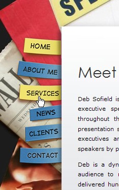
Deb Sofield sticks posts on a paper pile.

Paper Strips Menu
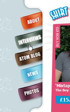
A menu in the shape of coloured loops.

Paper Strips Menu
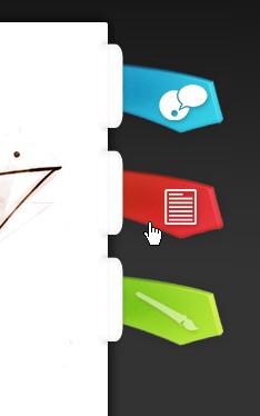
These ties will never hang on the neck of a web-developer.

Paper Strips Menu
The navigation menu is simple, nice and fits perfectly to the overall design; navigation options appear to stick out of the content area.

Stumbleupon Delicious button

Advertisement
  1. 1.

    Andrew E (December 17th, 2007, 6:02 pm)

    very nice!

  2. 2.

    Andrew E (December 17th, 2007, 10:15 pm)

    Very Boring!

  3. 3.

    Aakadasch (December 17th, 2007, 11:07 pm)

    A bit short, hmm?

  4. 4.

    Anthony (December 17th, 2007, 11:33 pm)

    hmm.. holidays got smashing down? posts have been thin lately… thanks for the monday post

  5. 5.

    Nick (December 17th, 2007, 11:51 pm)

    Interesting, but not very inspiring. :-)

  6. 6.

    Tim (December 18th, 2007, 12:04 am)

    One post per week and this short?

    I still love this site though ;-)

  7. 7.

    Ufucuk (December 18th, 2007, 12:28 am)

    I think subjects have finished for your blog.

  8. 8.

    dagobert renouf (December 18th, 2007, 1:38 am)

    i love you guys but this post is just not what i can expect from this wonderful magazine.

    1 post a week and still that short ? we got a problem here ..

  9. 9.

    matt (December 18th, 2007, 2:12 am)

    uhh…smashing rules, think maybe they have lives? or family? calm down guys!

  10. 10.

    Jestep (December 18th, 2007, 2:32 am)

    I would suggest staying away from the mystery nav like example 3. Most people will have no idea what those are supposed to mean.

  11. 11.

    imaginepaolo (December 18th, 2007, 2:34 am)

    Nice gallery and idea. Smashing magazine is the best webDesign Gallery.

  12. 12.

    tom2strobl (December 18th, 2007, 2:34 am)

    somehow i hope SM will find better topics, but i’m yet thankful for those great resources of the past.

  13. 13.

    Jeff (December 18th, 2007, 3:09 am)

    And you guys are paying … how much? … for this content?

    Zero.

    Thanks for the creative finds, SM. The world does NOT need another stupid web resource with unimaginative posts every day. Take your time to find neat stuff like this!

  14. 14.

    Miks (December 18th, 2007, 3:31 am)

    Interesting, thanks!

  15. 15.

    Cutting_Crew (December 18th, 2007, 3:46 am)

    Next week on smashing magazine : How to build a 3 column, 2 row table using only .html

  16. 16.

    Ash (December 18th, 2007, 3:54 am)

    looks really effective, love the tie idea.

    Good stuff!!

  17. 17.

    Rob Hawkes (December 18th, 2007, 4:03 am)

    Please tell me the spelling of “Tonight” on the first website is a deliberate mistake! If not, that voice coach needs to change jobs.

  18. 18.

    Carlos Eduardo (December 18th, 2007, 4:07 am)

    I dont like the third example… These icons doesn’t show clearly what they mean…. =/

  19. 19.

    juanclaudio (December 18th, 2007, 4:33 am)

    not inspiring, sory

  20. 20.

    Jummy (December 18th, 2007, 4:48 am)

    From the “About us” section of this site (emphasis is my own):

    We don’t try to convince you with the quantity, but with the quality of the information we present. That’s what makes us different. In fact, we smash you with the information which will make your life easier. Really.

  21. 21.

    Katie (December 18th, 2007, 4:55 am)

    Hey look this Link [www.valentinaolini.com]

  22. 22.

    Katie (December 18th, 2007, 4:58 am)

    hello!!! look this!!! the menu is very similar!!! Link [www.valentinaolini.com]

  23. 23.

    Roweena (December 18th, 2007, 5:00 am)

    I’m at college having to design a cool site with cool navigation (and over the xmas holidays) so this is a GREAT help, thanks!

  24. 24.

    Mrs. Micah (December 18th, 2007, 5:19 am)

    Beautiful. If only I could do cool site design…I’m learning, at least. :)

  25. 25.

    Andy Gongea (December 18th, 2007, 5:21 am)

    Nice but useless

  26. 26.

    A3brasil (December 18th, 2007, 5:38 am)

    Thx! Very intresting links!

  27. 27.

    Grant (December 18th, 2007, 5:52 am)

    Something we didn’t all know would have been nice!

  28. 28.

    Prasanth (December 18th, 2007, 6:13 am)

    These menus are nice to look at. Difficult to use.

  29. 29.

    Kiki (December 18th, 2007, 10:12 am)

    Been there… done that. Shall wait for next Monday’s Inspiration.

  30. 30.

    PixlNinja (December 18th, 2007, 10:25 am)

    quite different menus, I like it !

  31. 31.

    Sean Hodge (December 18th, 2007, 10:37 am)

    I was wondering if you had some samples not requiring the use of flash or javascript, but just straight html/css. Thx for the post.

  32. 32.

    IT Certification Training Videos (December 18th, 2007, 12:07 pm)

    Great magazine, a little light in the post yes…. but great overall. I think the amount of great information you guys have been posting up until now more than cover a few light posts.

    I’d really like a good article on html/css menus without flash/javascript, etc. Perhaps showing some great horizontal and vertical menus, and it’s effectiveness for SEO. Seems everything I’ve read about java menus, etc., have had some type of negative impact on overall SEO effectiveness.

    Anyone else care to comment, I’d love to hear it.

  33. 33.

    c.crack (December 18th, 2007, 12:45 pm)

    .ah,
    this was ok.
    i dont know anything about design, or poofs for that matter.
    no.
    anyway,
    I subscribed to your feed, but its doesnt come through enough.
    I usually like it when it does.
    keep on trying!

  34. 34.

    Yalcin (December 18th, 2007, 2:38 pm)

    cmon guys.. it’s almost end of year… I don’t mind a short post. got a bit on anyway.

  35. 35.

    outwindow (December 18th, 2007, 3:10 pm)

    good jobs !
    but they are difficult to use in commercial websites

  36. 36.

    Rhonda (December 18th, 2007, 5:32 pm)

    Or you could use fridge stickers for your navigation as a friend of mine has done - see: Link [impress-cc.com.au]

  37. 37.

    tux86 (December 18th, 2007, 6:53 pm)

    I thought about designing a paperstrip navigation months before, but this does not help me to create something brand new. It’s not as inspiring as the last weeks post was.
    Merry Christmas (i guess this is the reason for the few posts in the last time)

  38. 38.

    Michael Skirde (December 18th, 2007, 7:00 pm)

    Great idea! This will make the web more beautiful.

  39. 39.

    Barry McGee (December 18th, 2007, 7:37 pm)

    Smashing Magazine is awesome, keep up the good work…

    Those who criticize, you would almost think you were paying for the service!

  40. 40.

    tom (December 18th, 2007, 7:43 pm)

    Similar navigation at Link [www.abedi.de]

  41. 41.

    deathhead (December 18th, 2007, 8:11 pm)

    i don’t think these is greatest article you do. the paper strips is ugly. but smashing magazine is the best. i love you. will you marry me?

  42. 42.

    Evangelist (December 18th, 2007, 8:37 pm)

    A good introduction to this style and some nice examples. It’s about time we had a short post ;) - it is Christmas after all and, a very Merry time to one and all..

  43. 43.

    3G (December 18th, 2007, 11:21 pm)

    decent post, not sure why everyone feels the need to be 133t, but what i cant get over is when a site is very nice looking and its get butchered by a developer. Im a developer myself and i would never goof up like the first navigation did. Text is running into an image….eh whatever now i sound l33t, haha.

  44. 44.

    Yogi (December 18th, 2007, 11:47 pm)

    Very very nice indeed.
    Great post dude.

  45. 45.

    Nytryk (December 19th, 2007, 12:48 am)

    WoW :-O

  46. 46.

    Robert (December 19th, 2007, 6:38 am)

    They look nice but for my taste too playful to use on a serious website.

  47. 47.

    Hope (December 19th, 2007, 9:31 am)

    There’s a similar paper strip or bookmark look here: Link [www.rosefu.net]

  48. 48.

    hurben (December 19th, 2007, 2:27 pm)

    err.. outline:none;

  49. 49.

    Chris (December 19th, 2007, 7:33 pm)

    Happy Christmas Smashing Magazine + F**k the begrudgers and moaners!

  50. 50.

    Steve Ranford (December 21st, 2007, 6:30 pm)

    Hmmm… not sure about that. Interesting, but not very inspiring to be honest… still worth bringing to our attention though.

    Keep up the good work.

    Merry Christmas everyone!

  51. 51.

    arman (December 26th, 2007, 12:57 am)

    wow!!

    that is very nice

    (a lot of a lot)
    thanks

  52. 52.

    Robert Marbun (December 27th, 2007, 12:33 pm)

    very nice!

  53. 53.

    kamal (January 1st, 2008, 3:36 am)

    Great Resource

  54. 54.

    Jylan Wynne (January 3rd, 2008, 2:36 am)

    I agree with the people saying that menu #3 is no good. It isn’t. There is no way that anybody could easily tell where the links go to.

  55. 55.

    sri (January 8th, 2008, 7:02 am)

    Keep up the good work.

  56. 56.

    Ivan (January 23rd, 2008, 1:13 pm)

    To the critics with menu#3: Are you going blind? Didn’t you see the hover effect on those big-big-reallyBIG letters on the top of the frame?
    OMG…

  57. 57.

    ivan (April 23rd, 2008, 9:10 am)

    no inspiring

Leave a Reply

Allowed Tags: <a href="" title=""> <abbr title=""> <acronym title=""> <b> <blockquote cite=""> <code> <em> <i> <strike> <strong>
 

All Posts

Sideblog

Mozilla has put out a call for everybody to share the vision of how we would like to see the Firefox browser and the Web in the future.

10 Free Handwriting Fonts features Sketch Rockwell, Gregs Other Hand and Imitation.

10 Handwriting Fonts You Can't Miss

Coquette icons is a free set with curvy and colorful icons designed to get the affection of your visitors. .ico, .png, .icns, 128×128px. Backlink is necessary to use the set.

Free Icon Set

Logo Design Trends 2008 presents 15 current trends in logo design. Among them are Supernova, loops, stitch, amoeba and doodles.

Logo Design Trends 2008

You can follow Smashing Magazine on Twitter now. Ideas, suggestions, remarks? Feel free to share, discuss and spread the word.

Smashing Magazine on Twitter

Take the survey and help to sketch a true picture of the way web design and web development is practiced worldwide.

A List Apart Survey 2008

Donuts Icons Set is free and comes in 25 flavors: chocolate, glazed, powdered etc. Leopard ready, 512×512px. Formats: PNGs, Icns, Folder Icons, Ico and iContainer. Tasty!

Donuts Icons

Got It Icons Set is a free set of 115 icons based upon the well-known Tango icon set. SVGs-sources are available as well. Clean and useful.

Free Icon Set For Web Applications

Jeff Finley shares 15 Common Designers' Mistakes in the Music Industry. Among them are not charging enough, ignoring typography, unprofessional behavior and over promising.

Henry Jones presents 400 High Quality Patterns — a collection of patterns of all shapes, sizes, and color. Some are images, and some are pattern files for Photoshop and Illustrator.

Patterns for free download

  • Grab the High-Quality OpenType Free Font Anivers!
  • Grab the Free Royal Icon Set!
  • Grab the Dilectio WordPress Theme!
  • Grab the Smashing WordPress Theme!