Free Fonts of the Week - Best of

Email Newsletter
Weekly tips on front-end & UX.
Trusted by 182,000+ folks.


 Custom Web Forms for Angular, React, & Vue. Your backend.

 Celebrating 10 million developers
We continue to collect most beautiful high quality freefonts, which can be used for both private and professional projects without any restrictions whatsoever. They are hard to find, but the search is definitely worth it.
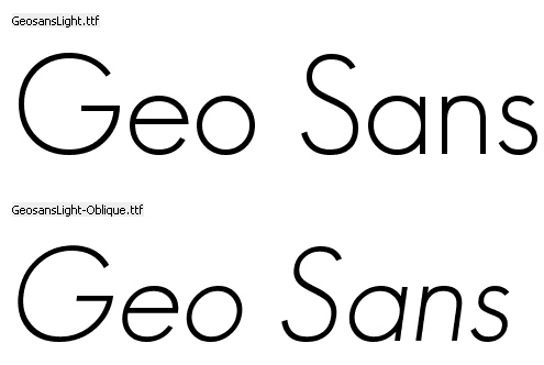
Over the last month we’ve managed to find few oldies such as famous Geo Sans and Mank Sans by Manfred Klein, but also some newbies such as Jos Buivenga’s Diavlo. Before using the font, don’t forget to read the legal agreement carefully. They change from time to time.
Further Reading on SmashingMag:
- 15 Beautiful High-Quality Free Fonts
- Beautiful High-Quality Free Fonts For Your Designs
- The Best Free Fonts for Designers
- Free Fonts With Personality
Free high-quality fonts are extremely hard to find, but sometimes the time you’ve invested in the search is definitely worth the result you’ve got.
It’s not quite clear if one is legally allowed to use MyriadPro (Bold, Semibold), Helvetica (Bold) and Humanist Gill 521 (Bold), which are also presented below. Please read the license agreement carefully - it can change from time to time.
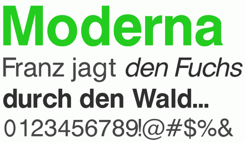
- MG Open Moderna
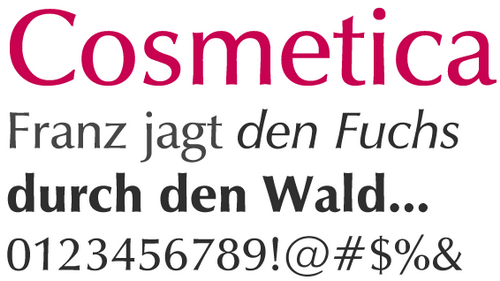
- MG Open Cosmetica
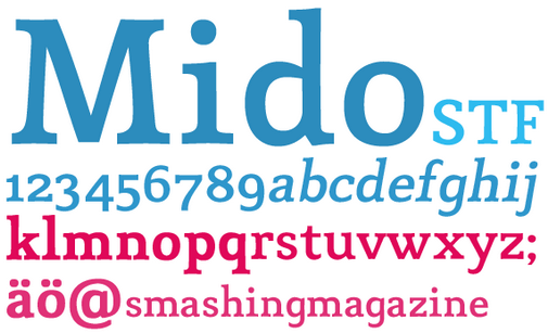
- Mido
A limited test version. The full version will be released in 2008.
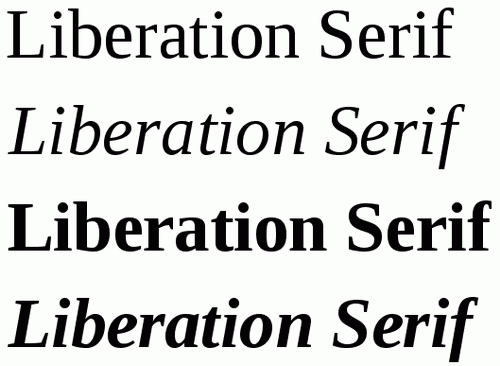
- Liberation Serif
Public domain / GNU GPL, Regular, Italic, Bold, Bold Italic, PC / Mac OS X
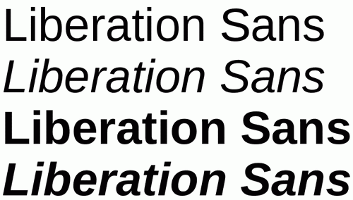
- Liberation Sans
Public domain / GNU GPL, Regular, Italic, Bold, Bold Italic, PC / Mac OS X
Bonus
Jumpstart Package (thanks, Chris Apalodimas)
Available fonts:
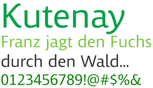
Kootenay™ regular (a sans serif design)
Lindsey™ regular (a handwriting style design)
Miramonte™ regular and bold (a sans serif design)
Pescadero™ regular and bold (a serif design for text)
Pericles™ light and regular (a sans serif inscriptional style design)
The Microsoft HD DVD Interactivity Jumpstart Package contains software and utilities to simulate, test and debug HD DVD applications. Ascender has licensed a set of OpenType (.TTF) fonts to Microsoft which are included in this package for developers to use and distribute on HD DVD discs.
The eight fonts were all designed by Ascender’s Type Director, Steve Matteson, for on-screen viewing and to showcase the advanced typographic features of OpenType.
This download is available to customers running genuine Microsoft Windows.
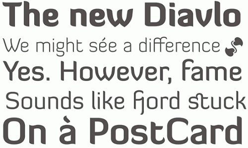
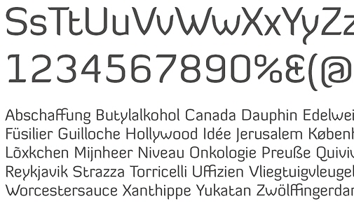
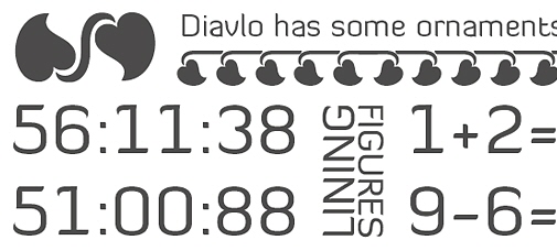
Diavlo (new release) Jos Buivenga has released an improved version of his font Diavlo. The new release contains 5 weights: Light, Book, Medium, Bold and Black. Among new features are the extended language support (Latin, Central European, Croatia, Romanian, Icelandic, Turkish and Esperanto are now supported), improved glyph shapes (such as S, s, W, w, f, t, diactitics, fractions etc.) and extended kerning (over 3.200 kerning pairs).
Inconsolata Inconsolata is a monospace, humanist sans design. Some details will be most apparent in print, such as the subtle curves in lowercase “t”, “v”, “w”, and “y”. Inconsolata also borrows “micro-serifs” from some Japanese Gothic fonts, which enhance the appearance of crispness and legibility. Available in the OpenType-format.
Relato Sans is the best of a fresh new breed of humanist sans serifs. Witness Eduardo Manso’s technical and artistic skill for yourself with this complimentary sampling of the complete OpenType family. Registration is required to download the file.
Bonus
John Gruber has recently published a list of the fonts which are being used in Apple’s iPhone. Apparently, American Typewriter, American Typewriter Condensed, Arial, Arial Rounded MT Bold, Courier New, Georgia, Helvetica, Marker Felt, Times New Roman, Trebuchet MS, Verdana and Zapfino are included.
You can also download a .pdf-version of the table which shows how each of 11 font families should render.
Tallys
Jos Buivenga, the designer of beautiful typofaces Fontin and Delicious, has released a new freefont, which is called Tallys and can be used for personal and private projects without any restrictions.
Images: josbuivenga.demon.nl.
Tallys is a font that is one degree slanted and has large caps, a small x-height and long ascenders. It comes with hybrid numbers and a complete character set. The Tallys has one weight and comes only in Roman Style, however, Jos might be thinking about adding other weights and an italic later.
The font is available in Mac & PC (Opentype) formats and can be downloaded here for free.
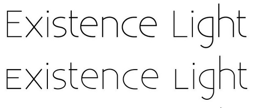
District Thin
District Thin, the thinnest weight from GarageFonts’ District family, by Kienan and Dylan Smith, can be downloaded and used for free. No words are needed - it is enough to just look at the font itself.
District Thin can be downloaded here, for free.
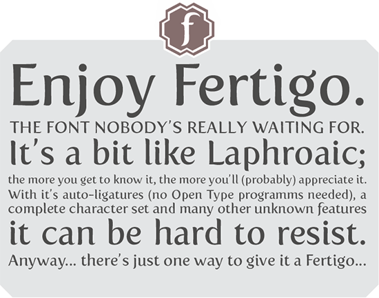
Fertigo: Description and Download
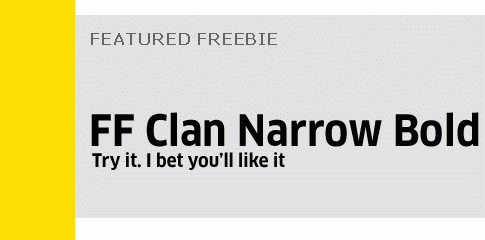
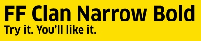
FF Clan Narrow Bold: Description and Download
Kontrapunkt: Description and Download
Com4T Fine Regular: Description and Download
Geo Sans Light, by Manfred Klein
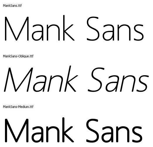
Mank Sans, by Manfred Klein
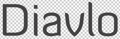
Diavlo by Jos Buivenga.
Diavlo is a free font that is a bit square and sharp. Great attention has been given to detail, spacing and kerning. It contains more than 300 glyphs and over 1.300 kerning pairs. Other weights may follow, but for now it’s only regular.
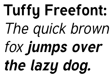
Tuffy, by Thatcher Ulrich
Greyscale Basic, by Greyscale [via Computerlove]
- Faceplate™ A Gauge (Fontshop, registration is required)

- Sling (Serif, 3 fonts, freeware)


 The design of Segoe UI improves the reading and scanning of text while leveraging ClearType. The overall approach to font size increase and font usage creates consistency across Windows and applications for a better experience in all languages.
"Microsoft grants you a personal, nonexclusive, non-transferable, royalty-free license to install and use the Software solely for the purpose of creating materials requested by Microsoft and in accordance with the specification(s) provide to you by Microsoft." (Source)
Sometimes web design is just about beautiful typography. Used with a profound understanding of white space, basic typographic principles and usability heuristics, it can sufficiently highlight the main sections of the site and its key elements. Font size of headers, body copy and navigation is important. Leading is important. Line length is important. And the visibility of links is important. Basically, that's it - really, you don't need more.
There are literally thousands of professional typefaces you can use, you might use dozens of them; however there is also a plenty of high-quality freefonts which can serve as reasonable and feasible alternatives and fulfill your requirements just as well. We collect all of them regularly, so you don't have to.
Over the last month we've found six high-quality free fonts you can use for both private and commercial projects. Please check out the license agreements before using these typefaces - disclaimers can change from time to time.
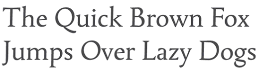
1. Revalo Classic Regular (Registration is required)
The design of Segoe UI improves the reading and scanning of text while leveraging ClearType. The overall approach to font size increase and font usage creates consistency across Windows and applications for a better experience in all languages.
"Microsoft grants you a personal, nonexclusive, non-transferable, royalty-free license to install and use the Software solely for the purpose of creating materials requested by Microsoft and in accordance with the specification(s) provide to you by Microsoft." (Source)
Sometimes web design is just about beautiful typography. Used with a profound understanding of white space, basic typographic principles and usability heuristics, it can sufficiently highlight the main sections of the site and its key elements. Font size of headers, body copy and navigation is important. Leading is important. Line length is important. And the visibility of links is important. Basically, that's it - really, you don't need more.
There are literally thousands of professional typefaces you can use, you might use dozens of them; however there is also a plenty of high-quality freefonts which can serve as reasonable and feasible alternatives and fulfill your requirements just as well. We collect all of them regularly, so you don't have to.
Over the last month we've found six high-quality free fonts you can use for both private and commercial projects. Please check out the license agreements before using these typefaces - disclaimers can change from time to time.
1. Revalo Classic Regular (Registration is required)