Grunge Style In Web Design

Email Newsletter
Weekly tips on front-end & UX.
Trusted by 182,000+ folks.
 Register for Free
 Celebrating 10 million developers
 Custom Web Forms for Angular, React, & Vue. Your backend.


Most design trends come unexpectedly, evolve over time, become pointless and finally disappear from the design landscape. This holds particularly for web design, which is — just as every other creative field — prone for over-hyping and over-usage of trends. Being used excessively (sometimes properly, but mostly without any reasonable purpose), trends lose their ability to communicate information, express something unique or innovative and consequently lose their visual appeal.
Web 2.0 style is an excellent example for this evolution in design. In 2007 we’ve observed a clear example of design abuse, as glossy buttons, colorful reflections, 3D-effects, rounded corners and xx-large font sizes could be found almost everywhere (and we’ve presented some examples a year ago). However, currently we’ve been observing a new step in this evolution. Web 2.0 elements start to disappear; they become more subtle, more user-centric, more content-oriented and less loud.
What is the Grunge style?
As Web 2.0 style passes way, it’s time for something new. Few weeks ago we’ve written about the hand-drawing style in modern web-design. And as Web 2.0 style is all about glossy and shiny look, another option would be something rather crude, radical and provoking. Such as the grunge style — dirty look with irregular, nasty, sometimes even ugly and crooked visual elements. Will it establish itself as a trend? Probably not. However, it may be used once some creative and unconventional design approach is needed.
You may want to take a look at the following related posts:
Below we’ve collected everything you would ever need for a perfect design in a grunge style — design examples, free fonts, icons, textures, brushes and even few tutorials.
Examples of Grunge Style
Grunge doesn’t necessarily stand for dirty. Grunge designs may have subtle dirty elements, providing the content with the dominant position it deserves. Let’s take a look at some examples how it might look like. All screenshots are linked and lead to the sites from which they have been taken.
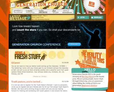
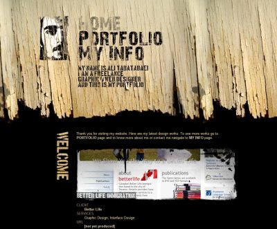
Web 2.0 meets Grunge.
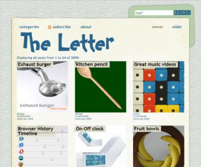
Notice the clear, rigid structure of the site blocks, supported by the grunge style.
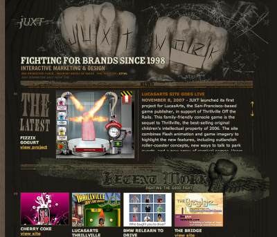
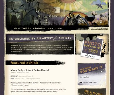
Visually appealing design with grunge elements.
Not that visually appealing, however unique and unusual. Wood in use.
Grunge can be used not only in personal web-sites, but also in galleries and blogs.
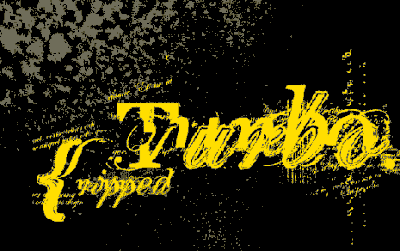
Grungy Free Fonts
5 Excellent Free Grunge Fonts A selection of free “grunge” or “eroded” typefaces.
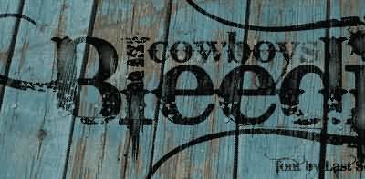
Bleeding Cowboys Font Free for personal use. PC / Mac OS X.
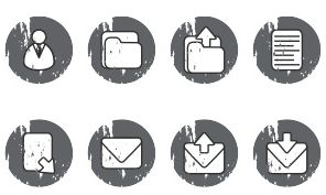
Grungy Icons
Stretched, torn and dirty: grunge icons at its best. They don’t necessarily fit to all designs, however it’s nice to have them ready to hand once you might need them.
Grungy Olive Icons This set by designed by Dryicons fits not only to grungy cloth and weapons. 28 icons in the .png-format. 16 x 16, 24 x 24, 32 x 32, 48 x 48 and 128 x 128 px. Released under the Creative Commons Attribution 3.0 license. You can do with them almost everything you might ever need to.
![]()
Grungy Asphalt Icons Another set, in a different color.
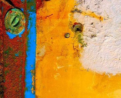
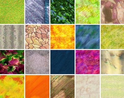
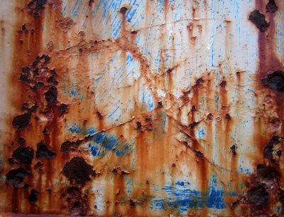
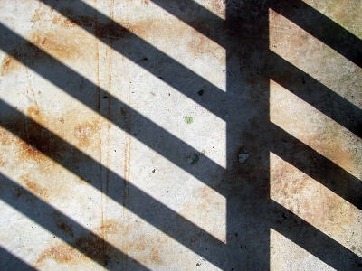
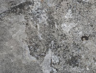
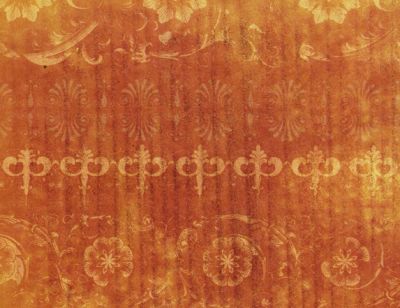
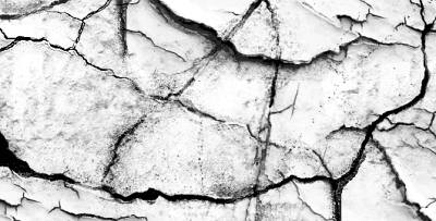
Grungy Textures
The Best Textures Flickr Group offers excellent textures, among them also pretty colorful grunge textures. More than 900 images offered in a variety of sizes.
Torley Textures presents 11 sets with quite impressive images in the size 512x512 — available in the .png-format.
DeviantArt: Textures is probably one of the largest sources for textures. For instance you can find excellent textures by searching for rust, grunge or wood. The choice is enormous, so you better take a portion of patience with you: advertisements are annoying, but the search is worth it.
Example: Flaky Old Gold
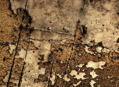
Urbandirty collects the dirty of cities. Virtually, of course, in form of textures. No, this is not beautiful, but real. The collection includes 291 photos in three sizes. Released under the Creative Commons License.
Free Grunge textures from TextureKing A growing collection of grungy textures, available for free download. 319 textures.
10 Grunge, Rusty and Dirty Tileable Textures This is a collection of ten 1000×1000 pixels seamless textures. These textures were created using Filter Forge plugin. And they are free.
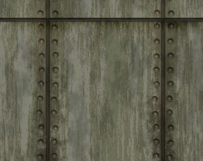
Grunge Textures Craig Jewells texture set contains 211 photos on Flickr. Different themes: rock, wood, rust, floors and more.
24 Free High-Res Textures By Bittbox. There is also a set of Photoshop brushes made from these grungy textures. There are 12 brushes in the set, and they are all 2500px. Available for CS3, CS1, and in PNG formats.
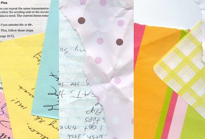
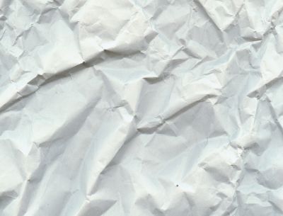
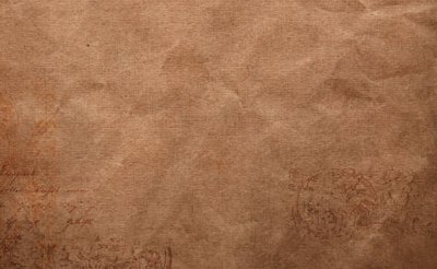
Grungy Paper Textures
Scanned Scrapbook Papers Set 1 with 14 themes, Set 2 with 12 themes.
Set 2
Lovelamp presents 7 textures which look like wallpapers (real wallpapers, not desktop wallpapers).
PapierScans offers more paper scans; 12 images in high resolution.
4 Free High-Resolution Grungy Paper Textures The full-size images are in the 2005x3000px resolution.
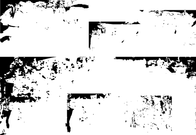
Grungy Brushes, Corners etc.
Grunge Brushes Photoshop set.
50 Free Vector Grunge Corners Formats: AI, EPS, SVG, PNG, Ill8. Source grunge is also included to let you play around with.
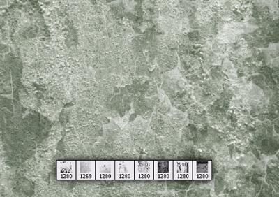
RisingSun Brushes This set contains brushes of the size 1280x1024px.

Grunge Brushes Photoshop set.
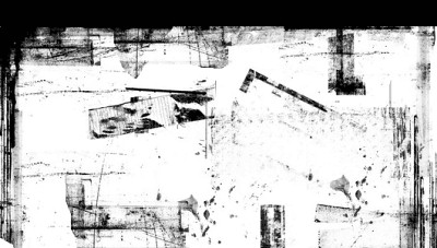
Dumpster Brushes 8 Photoshop brushes created from photos of old dumpsters. All brushes are over 800px.
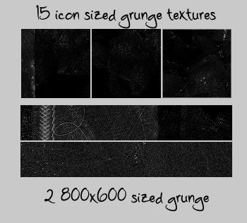
XiconTexturesX 15 icon with two large scratchy / grungy textures in .pat (Photoshop Patterns Format).