A Little Journey Through (Small And Big) E-Commerce Websites

Email Newsletter
Weekly tips on front-end & UX.
Trusted by 182,000+ folks.
 Register for Free

 Custom Web Forms for Angular, React, & Vue. Your backend.

 Celebrating 10 million developers
People don’t spend their money online easily. Think about it: If you had to answer a long list of questions or struggle to navigate a website, how much money would you be willing to part with? Online shopping is about convenience and comfort, and those of us who have at least once ventured into the realm of online shopping know how time-consuming and unpleasant it can be.
The online stores that stand out from the rest are those that go the extra mile for their users. We’ll look here at some small and big e-commerce websites that create pleasant online shopping experiences. We’ll consider the experience from the very start to the very end, right through to the checkout process.
Interesting E-Commerce Websites
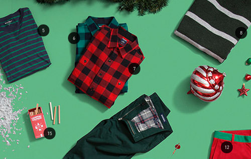
Bonobos Bonobos’ shopping experience is smooth. Good typography and subtle colors help focus on the products and features, with all distractions fading away as you interact with the site. When a new item is added to the cart, it appears in a sliding sidebar on the right, prompting customers to either keep shopping or check out. The design of the checkout form is elegant and clean. The amount of data required is never overwhelming since it’s clearly separated in manageable chunks. And the most important bit: the favicon is a bananas icon! Now that is pretty cool.
Martina Sperl Martina Sperl’s website is a lovely website. The shop features polished photography of her products, with a simple navigation panel fixed on the right side of the page. The hover effect is simple yet bold, showing the item number and price boldly in a large sans-serif typeface. You can, of course, click an image to view details about the product and get a 3-D view of the furniture (just a series of images). Buying a piece of furniture requires you to order by email. Again, bold full-width product images are used on product pages, and you can click on the “heart” icon to express your love for a product. Powered by WordPress.

Evyi Putting the shopping cart on the left, with the navigation, is a great idea. Because the eye starts from the top left of the page, the shopping cart takes precedence, making it more natural for users to keep track of the items in their cart and the running total.

Banana Cafe Banana Cafe is crazy. The 3-D hover effects of the site are consistent across the entire shopping experience. The blocks rotate in different directions, creating interesting movement throughout the website. It isn’t your ordinary online shop, but rather a collection of suggestions for your closet. The hover effects reveal a reference number that you would use in the contact form at the bottom of the page. Well, the audio and video in the background aren’t really necessary, but they do complement the unique experience on the site quite well.

MadeForFun Well, this online shop could be made for fun, but fun was probably not the only reason to set it up. The experience on the site is, however, quite snappy indeed. You can quickly customize each product with features displayed using an accordion pattern. The shopping cart preview is visual, almost infographic-alike, rather than filled with quick-paced text. In fact, the shop even has rainbow-alike horizontal lines which still fit quite well into the design.
Indigo Indigo’s shopping experience isn’t particularly extraordinary, but it’s a great example of how shops with a relatively large inventory can have a quite nice user experience. The number of navigation options on Indigo is quite overwhelming, especially the navigation in the sidebar looks a bit too complex, yet what’s interesting is the bar at the bottom of each product page. As you add an item to cart, the item is visually added to the shopping cart in the bar. Quite interesting is the fact that Indigo provides a discount for customers who are willing to invest some time into creating an account on the page. Clever.
Walmart Walmart’s recent responsive redesign must have been quite an undertaking. The main navigation has been hidden behind the “Shop All Departments” button that triggers the off-canvas navigation on the side. The items are well-organized, the interface elements and the typography provide a clutter-free overview. The reviews of each item can be rated as being helpful or not quite helpful. As an item is added to the cart, a lightbox appears prompting customers to proceed to the check out or continue shopping. The checkout is well-designed across resolutions, and you see only what is actually helpful for finishing the checkout. Good information architecture, good layout, good redesign.
Appliances Online Although the overview of items per category is quite overwhelming on ao.com, the shopping and checkout experience is very pleasant indeed. On product pages, customers can compare the feature of recently viewed items next to each other in a table while many products have an embedded video review. The checkout provides a variety of options but it’s easy to follow the steps to end up with just what you need when you need it.
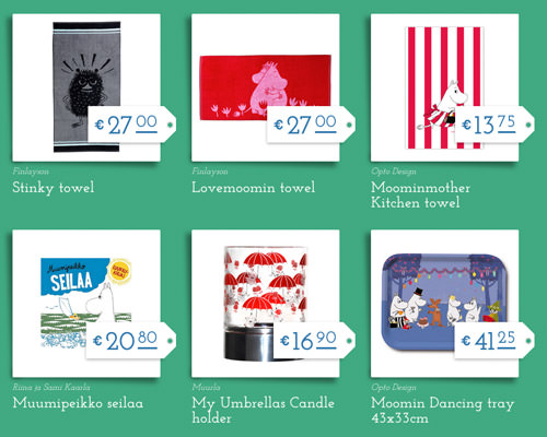
Moomin Sometimes you really don’t need to reinvent the shopping experience: it’s perfectly enough to provide a consistent visual style that guides the customers through the checkout. The typography, the shopping back icon, the way price tags are presented and the checkout itself fit well within the branding of the Moomin brand. Since there aren’t many products in the shop, each items is prominently highlighted; the breadcrumbs help the customer see where they are on the page at any given moment. Nice personal design that conveys an intimate atmosphere.
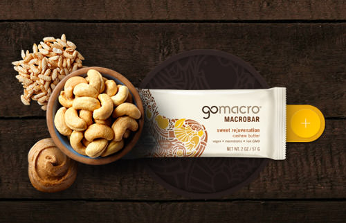
GoMacro If you are looking for a… different online shopping experience, GoMacro is an option worth checking out. Instead of having a simple grid overview of items, all items are grouped into colored item circles. The experience of adding items to the cart is very unique as you literally place bars into a cart. The checkout is also well-designed and quite simple to follow through although main navigation (“Back” and “Next Step”) are somehow hidden beyond the actual checkout lightbox. A unique design can work well as well, and GoMacro shows how it can be done.
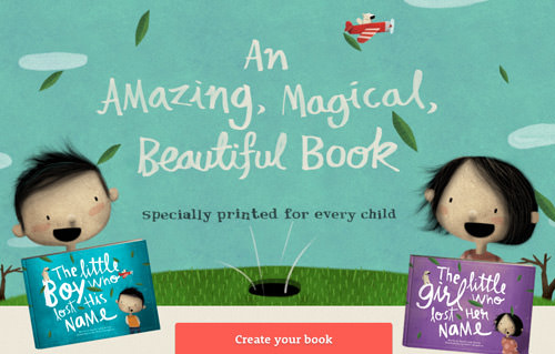
Lost My Name Alright, this isn’t really an online shop, but the checkout design is quite lovely. The design applies a soft touch of the visual design of the brand to the Web forms creating a pleasant overall experience. Probably the best adjective to describe the design is “friendly”. So is the experience of the checkout.
Indochino Indochino’s shopping experience is the king of customization. Basically you can customize everything. However, this requires quite some interaction from customers’ side. Product images are prominently highlighted as background images. In suits, everything from jacket lapels to vents, buttons, pockets, lining and pleats can be customized. Before you check out, you are asked to provide detailed measurement data which takes just 18 steps. Well, if you’d like to provide many customized options in your shop, Indochino is a great example to learn from. The responsive design doesn’t quite work in some scenarios though, especially when it comes to pages with lots of available options.


Cocones This shop has a quite remarkable user interaction. The snazzy hover effect swivels the iPad sleeve around for you to see what it looks like from the back. The large full-width photographs on product pages are a pretty nice idea to show the products “in action”. Another welcome feature is the little button in the header that tells you if an item has been added to your cart. The Web form for the billing details is short and simple, completing the pleasant shopping experience. The only drawback is the country selector that could be replaced with something a bit more elegant.

Benj & Soto Ben & Soto is a strictly functional website with a clean design. It has a quite unique interaction; you can decorate your own cube and then view all six sides by, well, actually rotating it. I really like the annotated elements, which add a kind of work-in-progress feel to it. Understandably, you have to create an account or sign in with Twitter or Facebook to create and save a design. A nice way of visualizing a product.


Canopy is all the best stuff on Amazon, curated by those who know you best. You can see products recommended by your friends or make your own recommendations. Each link takes you straight to the Amazon store, where you can follow the familiar process. I like the minimalistic design of the website, and the layout has an open feel to it. The prices are clearly visible on each product, helping you to browse the website with ease. A very uncommon shopping interface that is used reasonably and properly on the site.

Orlando’s page has quite interesting transitions. As you click through the different categories, the preceding image fades away leaving enough space for the new image and the product details. However, you can’t actually purchase goods from the website itself; rather, you have to order by email which is quite surprising. The navigation is provided on the left side as an overlay. Also quite unusual for an online shop.

Minimals has a beautifully soft, minimal aesthetic. The website, which sells invitations for baby showers, is cute and friendly. It’s amazing how simple rounded corners within blocks can put you at ease. The hover effect is a bit inconvenient — the name and price fade away when you take the mouse away. In the cart, customers can select the country to which the item should be shipped and update the total price right away. A shop without bells and whistles, but with a unique, personal design. Powered by Bigcartel.

Noodoll Now that’s something a little different! Noodoll has a fun scrapbook feeling; cute page-loading animation are lovely as they create a bit of intrigue with the cut-out characters in the top-right corner. In fact, little animations are sprinkled all around the website, creating a playful and engaging experience. As you add more items to the cart, they appear in the left sidebar rather than in the upper right corner which is a bit unusual. Powered by Shopify.

Le Col De Claudine’s website has an elegant design that showcases the fashion brand. Visitors are greeted with beautiful, soft photographs that act as a large header. The checkout is a five-step process, with no guest checkout option. There are not tricks or effects to detract from the subject matter. And the hover effect over the fashion pieces is bold without being too loud, although it doesn’t work on mobile phones of course. Interesting to see prices not being displayed by default, but only on hover.

Mujjo The focus of the website is, well, the gloves. The ultra-minimal design is the perfect backdrop for them, and since the target market is smartphone users, all product images have an image of the touchscreen gloves with an actual device rather than the gloves alone. The search tool is hidden in the top-right corner which is not necessarily very convenient. On product pages, the product image can be zoomed in, but displayed on the right, next to the main image which is a bit unusual. The footer has quite some text which is not necessary and could be reduced, but the overall aesthetics is very pleasant.

Greats The responsive Greats’ online store is very well designed, with a lot of polish and attention to products. The online-only men’s footwear brand uses consistent typography and photography to present their products well. All items appear to be floating in the air, being shot from the same angle. The features of each shoe are thoroughly described and presented. Once items are added to the cart, you can preview the cart in a nice overlay. The checkout design is perhaps a bit too oversimplified, but it works well within the branding of the site. An online shop with products well-presented and the layout well-designed.

Big Cartel. The photography on Big Cartel is strong and bold, with rich, earthy colors that grab the user’s attention. There are also no lengthy descriptions, but rather concise bits of explanation. This website has no guest checkout option (which is quite uncommon), but the entire purchasing process is only four steps long and all on one page, which keeps the process from feeling tedious and relieves the user from having to constantly click to the next step. The Web forms are also easy to use and beautifully designed. A nice example of a shopping experience that focuses on one major product item per page, and nothing else.

Obey Clothing Obey provides a smooth shopping experience, using consistent typography. Product pages provide fit and styling guides as well as a number of view for every item. The checkout link reveals a quick preview — an overlay with item,s, prices and the ability to remove or edit items from the shopping bag which is quite comfortable. The checkout is quite ordinary, yet what is missing is a progress bar that communicate in which part of the checkout process the user currently is. A nice touch is the red plus sign that means “add to shopping cart,” which is accompanied by the “Added one item to your basket” header that appears. In this case, the straightforward, no-nonsense design reinforces the brand’s image well.

Früute Früute’s website has a design that is consistent all the way through to the Web forms. The contrast could be improved a bit, but the flat aesthetic creates a soft yet down-to-earth feel that matches the brand. It’s interesting to see a mix of a common grid and large, prominent product images throughout the site. There is no guest checkout option, but you can log in using your Facebook account. It’s also quite unusual to see the “philosophy” section in an online shop which explain the passion of the company and the rationale behind its products. As an item is added to the cart, it appears as the lightbox in the right upper corner.

Sew Sew The simple grid layout and smooth transitions, along with the prices clearly displayed under each item, make for a user-friendly website. The shop is run by Claire Walls who designs everything on her own, and her personality shines through the website quite vividly. From the subtle color scheme to product photos to product descriptions, everything speaks one consistent voice. For independent online shops that’s probably the most significant quality to look after.

Fiorly. The whimsical look of Fiorly is established by all of the different elements on the page: the typeface, the filter on the photographs, the color scheme and the expansive use of space. What makes this shop unique is that each product item has a dedicated story attached to it. On the product pages, you’ll find quick essays and videos about real people sharing their stories connected to the items (in that case, jewellery). A nice example of how storytelling can be embedded into the online shopping experience.

Conclusion
There you have it, some of the interesting online stores out there. Spending hard-earned cash is tough, so of course as a designer of an online shop, you want your users to feel as comfortable as possible. Whether you’re selling your own design services or a pair of designer jeans, it’s about a nice overall shopping experience and a quick checkout. Now if that’s not a reason to remove a couple of unnecessary checkboxes, add better typography and remove the unnecessary in the checkout, what is?
What interesting design/UX techniques for better shopping experience have you found recently? Or how have you optimized the checkout process of an online shop recently? Let us know in the comments!
We kindly thank everybody who submitted their links via Twitter and Facebook over the last couple of days. You are smashing, you know that, right?
Further Reading
- 35 Beautiful E-Commerce Websites
- Web Design Showcases From Various Industries
- 15 Common Mistakes in E-Commerce Design
- Shop and Store Signs Part 1


