Award-Winning Newspaper Designs

Email Newsletter
Weekly tips on front-end & UX.
Trusted by 182,000+ folks.
 Celebrating 10 million developers
 Custom Web Forms for Angular, React, & Vue. Your backend.


Print and Web are different. Traditional layout techniques from print, particularly an advanced formatting, aren’t applicable to the Web as CSS doesn’t offer sophisticated instruments to design such layouts (e.g. text floating around an embedded image; some “floating” techniques provide such results. However they produce bloated source code just as well).
At the same time, the flexibility of the Web is hardly applicable to print as there is no way to customize a traditional periodical for reader’s convenience. Apart from that, online reading is very different from offline-reading: in the latter both leading and the line length are usually much shorter.
However, there are some fundamental principles which are often being used in both media. Over the last years newspapers and websites started to apply similar principles of data presentation, such as the heavy use of white space and grid-based design. The results can sometimes be very similar, but often they have almost nothing at common.
This issue of Monday inspiration series is supposed to provide you with some examples of outstanding newspaper designs which have been rewarded with prestigious awards (see references at the bottom of this post) and demonstrate unusual approaches of newspaper layout.
You might be interested in the following related posts:
- Newspaper Website Design: Trends And Examples
- 10 Pre-Press Tips For Perfect Print Publishing
- Switch From Print To Web: Where To Start?
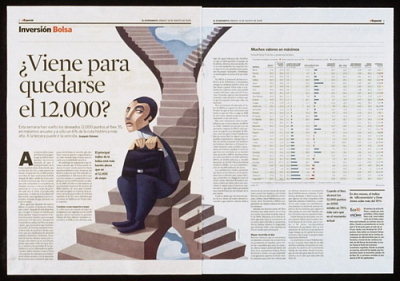
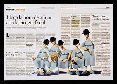
El Economista (Madrid, Spain)
El Economista uses a very traditional, subtle and unique newspaper layout. Notice how well the typography reflects the weight of single articles. Infographics support the content and headlines are surrounded by huge amount of whitespace.
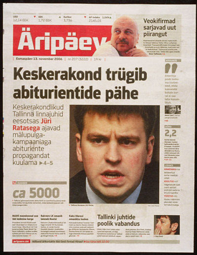
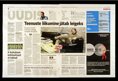
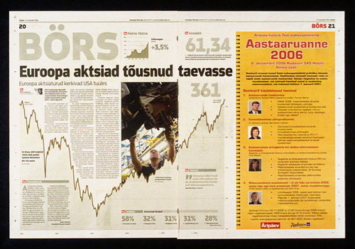
Äripäev (Tallinn, Estonia)
Äripäev’s signature is the heavy use of typography. The layout may sometimes seem overcrowded, however the packaging is always clean, simple to digest and easy to read. Note the difference in weights of colors: color, grey and red are applied carefully and sparingly.
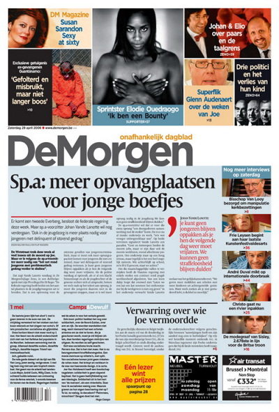
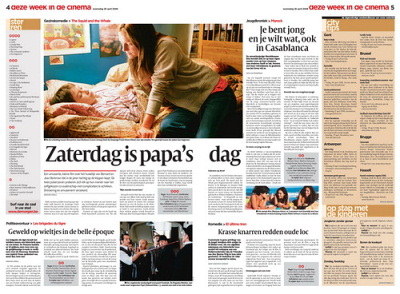
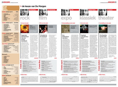
De Morgen (Belgium)
De Morgen focuses on attractive packaging and a visually appealing layout. Vivid colors offer readers more eye-candy; however, they also have a function as they e.g. clearly separate quotations from the overall article. Headlines are centered, background-colors differ from page to page.
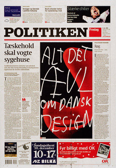
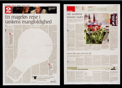
Politiken (Copenhagen, Denmark)
Politiken has a very eye-pleasing, legible layout with soft, neutral colors. Notice the clean horizontal packaging on the right-hand side image below. The sharpness of typography is breathtaking.
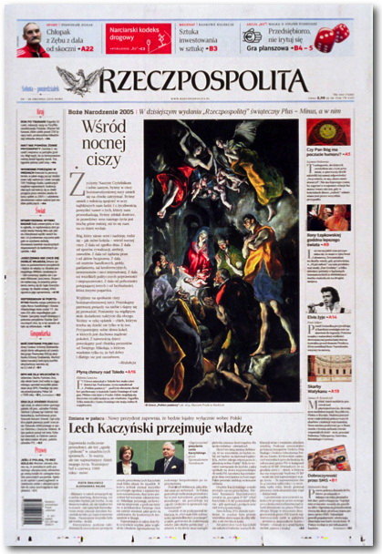
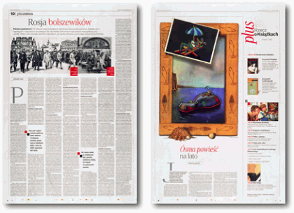
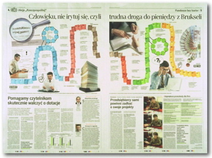
The Rzeczpospolita (Warsaw, Poland)
The Rzeczpospolita displays its conservatism in a traditional, conservative layout. No fancy images, no vivid background colors in use. The content dominates and helps the layout to gain a rather traditional look.
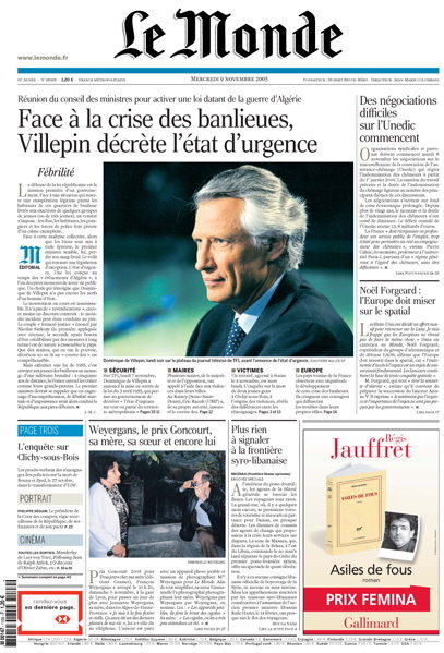
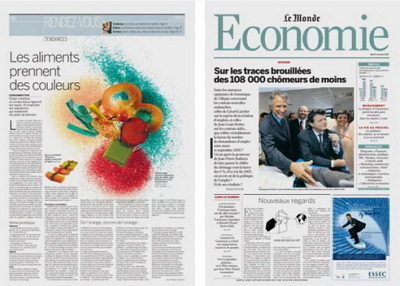
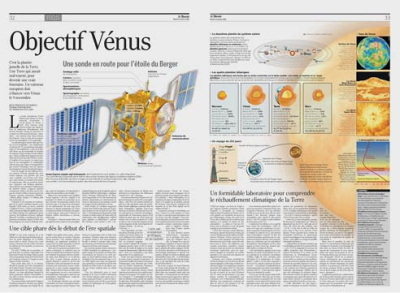
Le Monde (Paris, France)
Le Monde presents a mix of colorful infographics, solid typography and professional content…
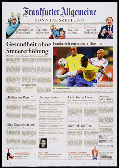
Frankfurter Allgemeine Zeitung (Frankfurt, Germany)
…so does the “>Frankfurter Allgemeine Sonntagszietung: the excerpts are distributed uniformly which gives the page a clear and easy-to-read and easy-to-scan structure. It’s not always possible, though.
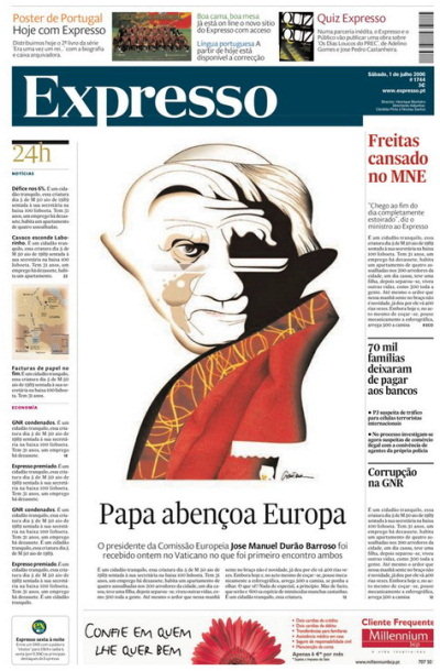
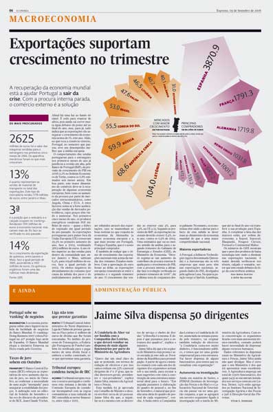
Expresso (Portugal)
Expresso: with rich colors, clean grid-based layout and concise typography. Notice how the colors are applied and how the content is separated (see second screenshot).
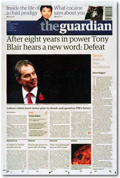
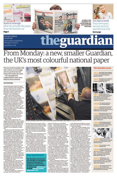
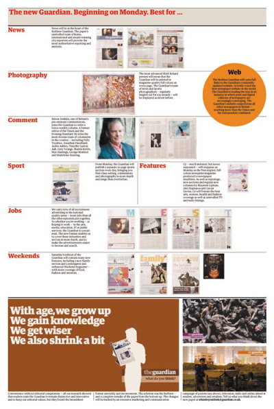
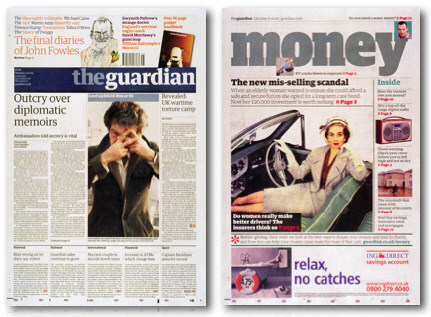
The Guardian (London, UK)
The Guardian has recently finished its redesign. Result: more vivid colors and more vivid blocks. However, the legibility and the sharpness of presentation don’t suffer. A nice example of how multiple colors can be used not destroying the balance between visual appeal and legibility.
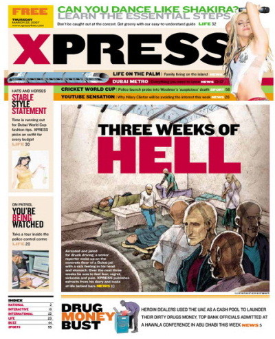
Dubai Express (Dubai, United Arab Emirates)
Dubai Express is another example of colorful yet legible layout design. The layout has 10 colors on one single page, used in different contexts in different colors. Note the sharpness of typography and use of capital letters on the front page. In this case color is definitely appropriate as the newspaper’s main topic is entertainment.
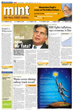
Mint (India)
Mint, financial daily in India, uses large indentation for typography and elegant visual highlights to separate the content. That works well: both attractive, scannable and easy-to-read.
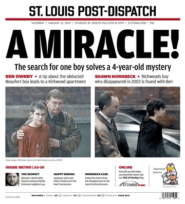
St. Louis Post-Dispatch (US)
St. Louis Post-Dispatch (US) isn’t a boulevard-newspaper, but a local regional magazine. The layout has a clear content hierarchy and a very simple structure. Huge amount of whitespace: waste of space or a clever technique to focus readers’ attention on the main topics?
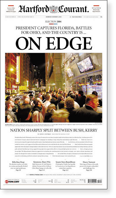
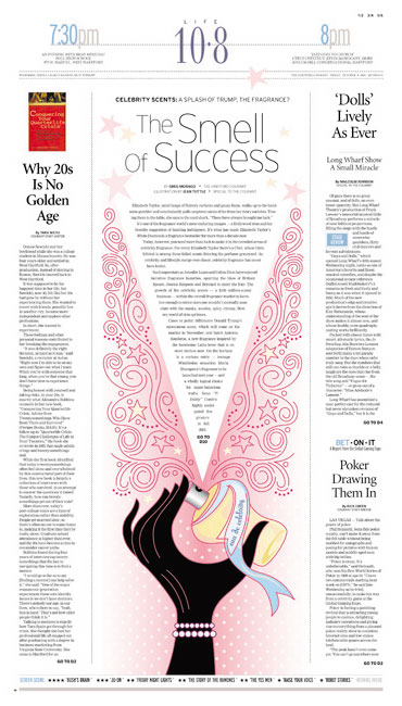
Hartford Courant (US)
The Hartford Courant is a standout in the American newspaper market. The newspaper distinguishes itself with an enduring elegance in design and typography. Though conservative in their approach, designers engage readers with the bold use of visuals. The contrast between their quiet, understated style and the gutsy photography and illustrations create a tension that captures the attention of readers.
Resources and Further References
- Society of News”” Design Every year The Society for News Design selects “World’s Best-Designed Newspapers”.
- Newseum.org The Newseum displays these daily newspaper front pages in their original, unedited form. Some front pages may contain material that is objectionable to some visitors. Viewer discretion is advised.
- The News Design Flickr Pool
- Newspaperaward.org The European Newspaper Design Award.


