Drunken Monkey Photoshop Tutorial

Email Newsletter
Weekly tips on front-end & UX.
Trusted by 182,000+ folks.
 Celebrating 10 million developers
 Custom Web Forms for Angular, React, & Vue. Your backend.


This Adobe Photoshop tutorial is a guest article written by Sergio Ordóñez, 29 years old Spanish designer and illustrator who is working as a freelancer in SOSFactory since 2004. The article focuses on creating a visually appealing mascot and a logo and provides insights in the designer’s workflow and the design process itself.
You might want to take a look at:
- Beautiful Photoshop Illustrations By Artists Around The World
- 50 Stunning Photoshop Text Effect Tutorials
- 70 Beauty-Retouching Photoshop Tutorials
In this article I will explain step-by-step how I’ve designed an attractive character in one of our recent projects, namely for the company “Drunken Monkey Collectibles”. I will review the entire design process, from the first sketches and drafts to the final touches with Adobe Photoshop. In the post you’ll find further references to different articles published in my blog SOSArmy; you might want to check them out as they cover more details of each phase of the process.
To provide you with a profound understanding of the process from scratch, let me provide you with a brief outline of the article first.
Outline
- Briefing Covers the inception phase, the phase of gathering requirements and analyzing the profile of the work.
- Looking for references The phase where we’re getting more familiar with the design requirements.
- Drawing the character We take a look at some basic principles in the corporate design of mascots and draw first sketches of the character.
- Coloring the character We make the character more vivid and pretty colorful using plain colors, shadows, lighting medium values, lights, reflection and lines coloring.
- Designing the logo The stage when we design a rather amusing logo which fits to the character.
- Final presentation We introduce final changes and finish the design combining everything we’ve created so far.
1. Briefing
Is a common instrument which is used in the beginning of the design process to obtain information about the results the company is expecting from us. It is similar to the Q&A-sessions where you are defining the objectives and the plan for the design process.
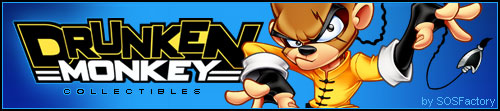
- Name: Drunken Monkey Collectibles
- Sector: Toys and collectibles
- Audience: 5 — 25 years old
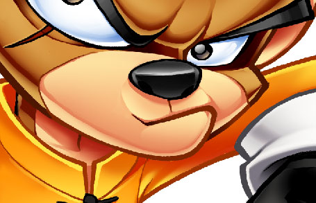
- Message to communicate: the company wanted a character with an attitude, aggressive but also friendly, very energetic, and some kind of a hero with an oriental touch.
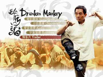
- References: Drunken Master, a movie with Jackie Chan made in 1978. The main character uses a funny Kung Fu technique, especially for the position of hands. The company specified that the character shouldn’t look drunk.
- Technical aspects: the design should be used for both Web and print. It must work together with the logo, but should also remain usable if the logo isn’t used.
2. Looking for references
So far we have all the information we need, so now it’s time to look for references to use as a base. Lucky me, as a child I really liked Karate movies; I remember that after watching this movie I spent several days beating my brother using exactly the same technique. The first image that comes to my mind is Jackie Chan (a stranger in that time, at least for me) in that characteristic pose.
After watching that video I think we’re in conditions to start. ;-)
This 10-minutes video is a pretty good manual of amazing poses; however it’s important to mention that the key was finding a pose not too comical that transmitted aggressivity as the client wanted, so I searched in Google and found one with the perfect balance between the comic and the heroic part:
We had a freedom to decide which clothes should be used, so we decided to make it wear a kimono, something simple not to overload the design. We suggested it would be better to add further accessories once the the character is finished.
3. Drawing the character
Before starting to draw it’s a good idea to review the principles in the corporate design of mascots. In fact, you need to have few things in mind:
- the character must transmit the desired attitude only in one single drawing,
- the character must be attractive and original,
- the pose must be clear and recognizable, it has to work in small sizes,
- you shouldn’t overload the drawing. The lines should suggest the volumes to the colorist, as less lines the drawing has, the design will be cleaner and we will get a better sense of volume with the color.
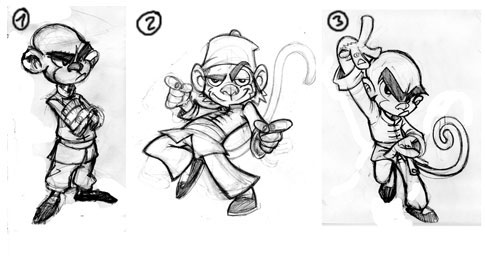 We’ve tried a number of different poses for our character, we’ve chosen the third one.
Over years it turned out to be extremely useful to start the design with sketches on paper. After that I usually pass it to Adobe Photoshop since I’m not very skilled with traditional drawing and I draw with the digitalizing PC tablet (Wacom Intuos3 A6). I draw everything in high resolution (about 6000x6000px); it’s easier because the errors will not heavily impact the design. Besides, we can also print the sketch in a large resolution if needed.
Below you can see the evolution of the drawing step by step:
Character evolution, from the sketch to the final touches, took about 6 hours of work.
Now let me explain the creation process in a little more detail:
- Lines We plan the pose starting with the typical dummy. In this step, the most important thing is to find the correct corporal expression, adjust the character proportions and try to get a clear pose.
- Shapes We give shapes to the lines and start defining the character.
- Refining shapes We connect and soften the volumes.
- Adding details We keep refining the volumes and add details to the character.
- Final sketch In this phase the character is complete. We only have left to clean it and ink it.
- Inking
- Option 1: digital inking with Photoshop, using the vector drawing tools and with some help from the digitalizing tablet. It’s the easiest option if like me, you’re not that good at drawing.
- Option 2: mixed inking. We make the final drawing in pencil, scan it and after that using Photoshop we convert the pencil into ink. If you’re very good at drawing, it’s the best option and definitely the first option to consider.
- Option 3: traditional inking. This option is only for very experienced designers.
- Final touches Once we finish the sketch and make sure everything is perfect. Usually it’s necessary to reassign line weights, clean stains or lines, simplify volumes, correct errors… Sometimes you might need to even re-create parts of the drawing.
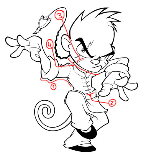
We have 3 types of lines:
- Contours: the thicker lines of the drawing. They give a unity appearance to it.
- Area delimiters: to distinguish elements in the design, we use a medium thickness.
- Intern lines: the lines that mark the cheek, those are the thinner lines.
- Transition lines: they start as a contour and get inside the design. We make it thick and start to make it thinner when it goes inside.
What we should never do:
- Make shadows with the lines: we’ll only make the design dirty.
- Create extremely thick lines without any thickness variations.
- Long intern lines: these lines are used to mark volumes, you have to make them appear in a very subtle way, it’s just a guide to help you color afterwards.
- Straight lines: if you take a look at the image, you’ll notice that all lines are slightly curved.
- Small areas: try to make your volumes as big as possible, otherwise in the coloring phase you won’t have any space and the image will look flat.
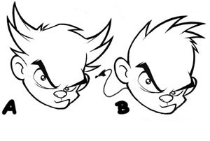
8. Corrections: I usually ask for the clients’ approval in each step (concept, sketch, inking, color), so I don’t have to do many corrections in the later phase of the design process. For instance, in this case I designed few different hairstyles:
4. Coloring the character
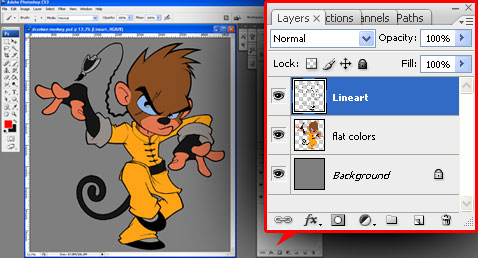
For coloring I usually use Adobe Photoshop or Illustrator, however the process is basically the same. I do it in various steps:
Many illustrators color everything in one layer, i prefer to to it in separate ones, so i can make color modifications in any of the design tones, lights or shadows. Let me briefly explain each step, if you want to get into details I highly recommend you to watch the Photoshop coloring videotutorial.
4.1. Plain colors
It’s ideal to have a set of the lines on a transparent background. If you inked it in the traditional way we’ll have the lines with a white background, so we need to extract the lines from the drawing. The advantage of this method is that we can color the lines easily although there are other methods like changing the blending mode of the drawing and multiply on top of all the color layers.
We create a layer under the drawing’s layer and fill it with plain colors of medium values (not too dark and not too light). Doing that we need to consider two objectives:
- Start choosing the color scheme.
- It’s useful to make quick selections of the different area of the drawing, using the magic wand.
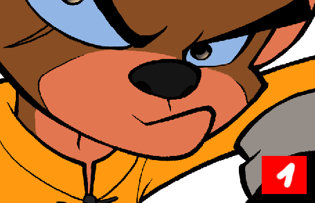
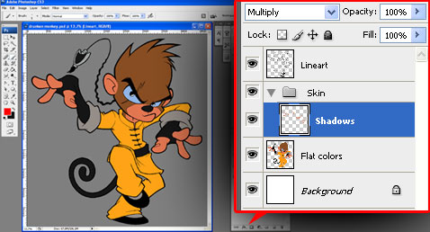
4.2. Shadows
We’ll create a new layer set and name it “Skin”; after that we make a new layer and name it “Shadows” — obviously, here we’ll color the shadows. We have to change the layer’s blending mode to “Multiply”.
Before coloring like a madman study the volumes, try to visualize them in 3 dimensions, understand each volume separately, and then imagine how they look like if they’re connected. Here you have a little study:
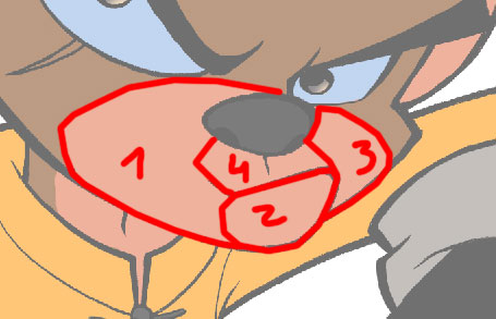
Face volume study
Now we’ll start to color the shadows. I used the same base color of the skin (but as we have the layer in “Multiply” mode we can see the difference) having in mind several things:
- Leave a shadow margin near the edges, thicker in the inferior edge since the light comes from the top, later we’ll add reflections to mark the contours.
- We have to obtain the perfect balance between soft and hard shadows. Usually the ample and curved surfaces are soft (Volume 1), and the angled ones are hard (Volume 4).
- We need to leave some space for the lights, it’s not useful to overload the drawing with shadows.

This is the process I follow to color the shadows:
- Having the original image, I used the magic wand in the plain colors to select the face (you can hide the dotted lines with
CTRL+H) - Fill the area with the same background color (but with the layer in multiply mode)
- I erased until it’s degraded (you can also use the gradient tool)
- I added a hard border to the gradient
- Let’s go with the second volume, repeat step 2
- Repeat step 3
- Repeat step 4
- I added a gradient in the upper part
4.3. Medium lighting values
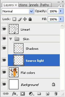
To define the light source we use the gradients; so we create a new layer, “Source Light” and put it below the shadows.
These are the steps i followed:
- 8. This is step where we were before
- 9. Let’s change the “Shadows” layer back to normal mode. We put it in Multiply before because we were using the same color as the background, just for comfort. Now it’ll look like nothing happened, but don’t worry about that for a moment.
- 10. Let’s go to the “Source Light” layer and make a gradient with a lighter color… and magic! I chose a light source from the upper left corner.
4.4. Lights
Let’s create again a layer called “Lights”, and put it on the top.
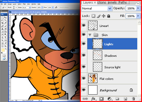
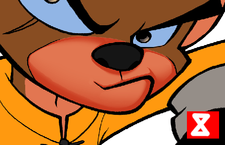
Having in mind our light source (upper left corner) we’ll color the lights for the different volumes. The lights should be in the upper part. Let’s take a look at the image to understand how I’ve done it:
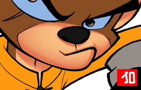
We color the lights with Photoshop
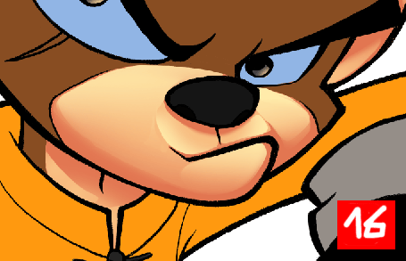
4.5. Reflections
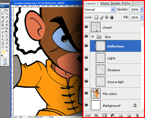
In this stage we simply add a few lines for brightness in the contours; this way we reinforce them and everything looks clearer. I just make the line and after that I blur it a little bit:
4.6. Lines color
This stage is optional, I usually like to join the lines with the color to obtain a softer result, so what I do is coloring them. As we already extracted the lines of the drawing, now we only have to select them (CTRL+click in the “Lineart” layer thumbnail) and color them.
the best thing to do here is to choose a color a little bit darker than the skin tone , so it can still be distinguished. I like to have the colored lines in a layer different from the drawing layer, just in case I need to make any modifications.
This is the final result
I color the other parts of the character with the same technique, one by one; as you can imagine the process is pretty long, so I usually spend about 4-6 hours only coloring… but it’s worth it, don’t you think?
5. Designing the logo
![]()
The company which hired us ordered both the character and the logo design. My intention was to obtain a clean and simple logo, legible and typography-based, so the design wasn’t overloaded, worked with the mascot but also remained usable used without the mascot.
The logo should be funny and should convey strength and stability; however it should also remain flexible and transmit a lot of energy. Here you have the reasoning for my choices:
Plain O Matic (by Utopiafonts)
Typography: it’s a thick font, heavy but flexible due to the rounded parts of some characters. I only modified the width of the characters which are too thick for my taste.
Format: I chose a 3-lines-format, using two different fonts. This way we can distinguish the name of the trademark (it’s more important, that’s why it’s bigger) and their activity.
Base line: the base line of the word “Drunken” is irregular, a care-free touch. The word “Monkey” is regular, which suggest stability and gives unity to the design.
Borders: irregulars on top, to emphasize that care-free touch; a little bit more regular going down to suggest stability; regulars on the sides, to give this appearance of unity to both words of the design.
Shape: wide on top and narrow on the bottom, suggests activity, energy, power. I used some horizontal lines to give more stability to the logo and unity to the design.
Capital letters: very simple, more energy for the logo.
Click on the image to see different versions I usually create for Web or prints if the budget isn’t too constraining.
Rendering: when I design for web, I usually add bevel and effects, but this time I chose a more practical approach and used plain colors, ideal to print at low cost. When the budget allows it, it is reasonable to make different versions of the logo as well.
Colors: yellow and black (suggests danger, action, excitement). I used white to obtain the maximum contrast over the black background.
6. Final presentation
As a good designer as I am, I like to present my designs in an eye-catching and professional way. So here’s the final version:
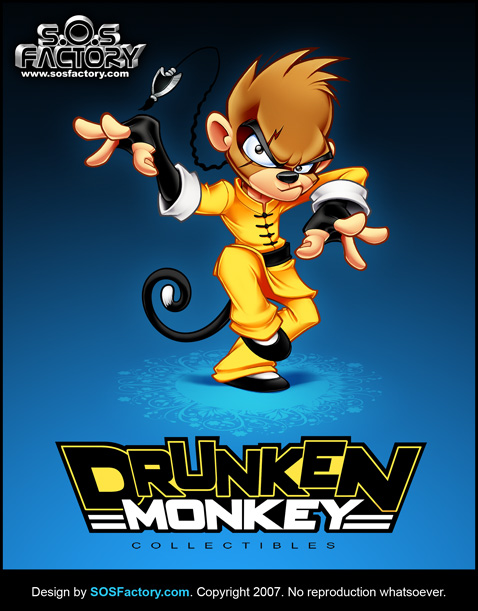
Hopefully you’ll find it useful.


