Navigation Menus: Trends and Examples

Advertisement

Navigation is the most significant element in web design. Since web-layouts don’t have any physical representation a user can stick to, consistent navigation menu is one of the few design elements which provide users with some sense of orientation and guide them through the site. Users should be able to rely on it which is why designers shouldn’t mess around with it.

That’s why in most cases it’s where simple, intuitive and conventional solutions are usually the best option. However, it doesn’t mean that they need to be boring. One year ago we’ve presented modern approaches of navigation design. Let’s take a look at what’s different now, which trends one can observe and what ideas you can develop further in your projects.

This article presents recent trends, examples and innovative solutions for design of modern navigation menus. All images are clickable and lead to the sites from which they’ve been taken. We’ve missed something? Definitely! Let us know in the comments!

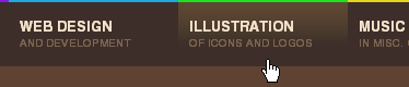
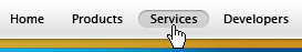
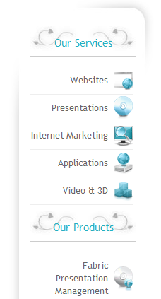
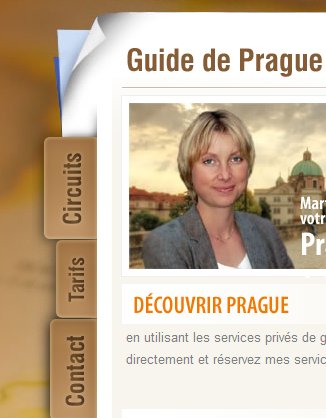
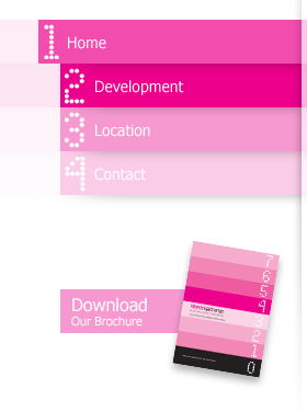
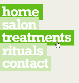
1. Trend toward “speaking” block navigation

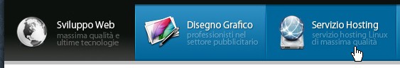
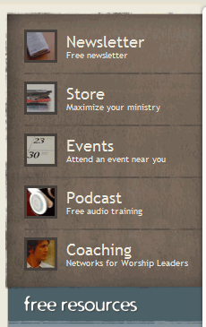
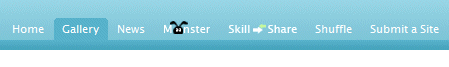
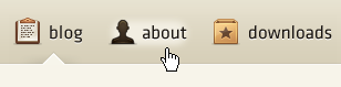
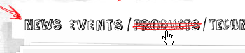
The most significant task a navigation menu has to fulfill is to unambiguously guide the visitors through the different sections of the site. However, often it’s quite hard to communicate the content of a site section within one or two single keywords, particularly if horizontal navigation is in use. That’s why often navigation options aren’t simply listed one after each other using some appropriate keyword (“silent” navigation); instead, designers attempt to concretely explain which options are available and what the visitor should expect from site sections once clicking on corresponding links.

In fact, over the last months we’ve observed a strong trend toward exactly this navigation scheme; and since designers try to initiate a more effective dialogue with visitors we prefer to call it “speaking” navigation — contrary to “silent” navigation based upon the listing of keywords.

Screenshot

Screenshot

Screenshot

Screenshot

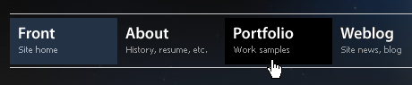
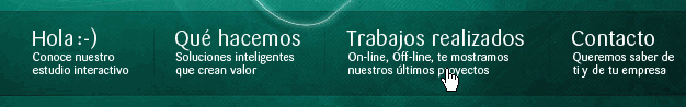
To make the perception of information easier, the navigation is often structured by using blocks of the same height and width; large icons are used quite often, but in most cases the decision whether they are appropriate or not depends on the content of the site and the overall layout. “Soft” hover-effects often support the navigation design by making the browsing more pleasant.

Screenshot

Screenshot

Screenshot

Screenshot

Screenshot

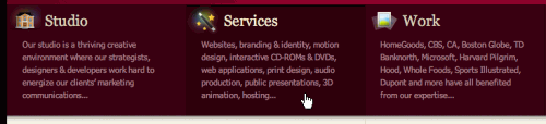
This navigation scheme can be used not only for the horizontal navigation; it can can be applied to vertical navigation as well.

Screenshot

Screenshot

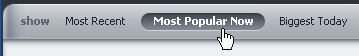
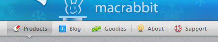
2. Mac-style still popular?

One can discuss if the Mac-style is the survivor of the Web 2.0 design attack or it becomes a standalone design element used independently from glossy colorful buttons with 3D-effects. Or maybe it’s just a temporary trends toward grunge style — nobody knows, really.

In any case over the last months a number of web-sites integrated Mac-styled-navigation in their web-sites. What’s interesting is that the style is used not only on Apple-related sites, but also on web-sites which aren’t directly related to Mac. Particularly when it comes to design of software products traditional Mac-style is often imitated. Reason: it is visually appealing and looks cool.

Screenshot

Screenshot

Screenshot

Screenshot

Screenshot

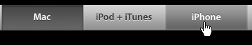
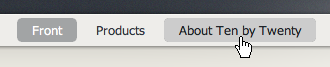
A navigation bar doesn’t need to look exactly like a typical Mac-style-navigation. Variations are also possible.
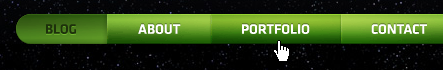
Screenshot
“Green” version of the traditional Mac-style menu

Screenshot

Since navigation bars can’t exist alone and need to be supported by the overall design, colorful one-page-sites with happy talk and overused stock photos designers are being replaced with more decent, serious and calm layouts. And that’s a good thing. However, when using the Mac-style please keep in mind that it shouldn’t be used for the sake of it but has to fit to the overall design.

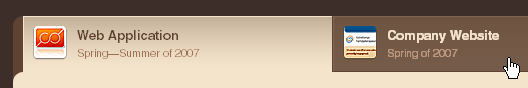
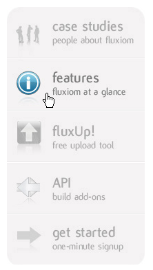
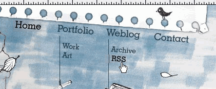
3. Visually appealing icons are used more often

To communicate navigation options in a more effective way, designers often make use of appealing icons. In such cases it’s important to make sure that the icon is easily recognizable, clearly conveys the message, corresponds to the link it stands for and isn’t too small. Attractive icons are, of course, always preferred to the boring ones.

Screenshot

Screenshot
Icons can also be hidden into the links; this effect should be used sparingly.

Screenshot

Screenshot

Screenshot

Screenshot

Screenshot

Screenshot

Screenshot

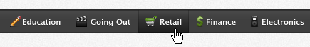
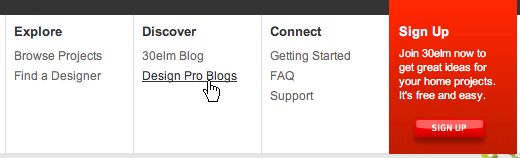
Icons can be placed on the left-hand side…

Screenshot

…and on the right-hand side in the sidebar.
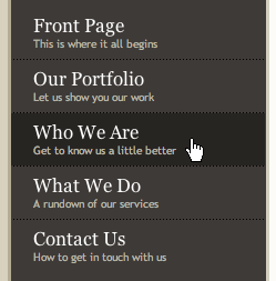
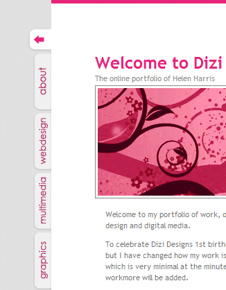
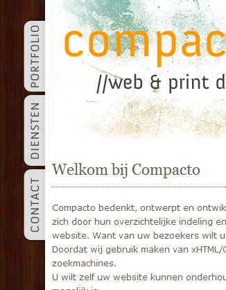
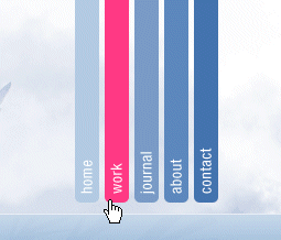
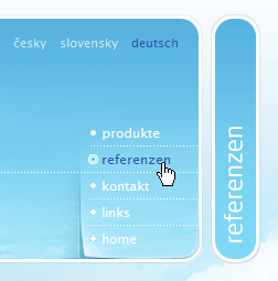
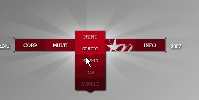
Screenshot

4. Vertical tabs

Although traditional desktop-applications almost never make use of vertical tabs, in the office vertical tabs are used at least as often as horizontal ones. In fact, designers often try it out; and the results can be quite interesting.

Before using vertical tabs you should make sure that it is possible within your layout and you actually have enough area to cover all navigation options on every single page. And, of course, the text is harder to read.

Screenshot

Screenshot

Screenshot

Screenshot

Screenshot

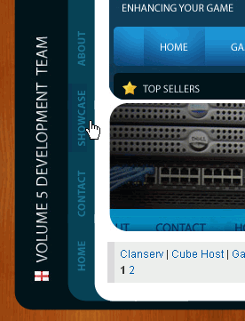
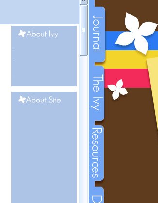
Tabs on the right-hand side.

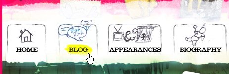
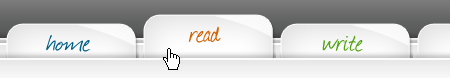
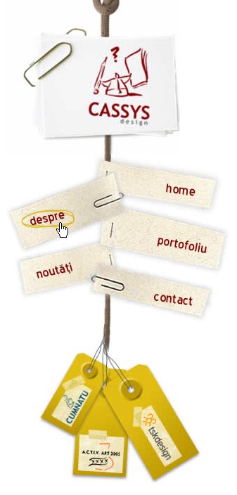
5. Handwriting in use.

Recently we already discussed the hand-drawing style in modern web-design. And what holds for design layouts also holds for its specific elements — for instance, for navigation.

Screenshot

Screenshot

Screenshot

Screenshot

Screenshot

Screenshot

Screenshot

Screenshot

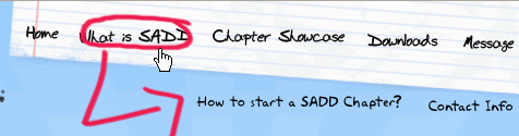
6. Experimental solutions

Although it’s usually not the best idea to come up with some strange and/or unique site navigation, designers tend to risk crazy and uncommon experiments. When trying out something new, make sure that you don’t put the usability of your site in danger by creating unnecessary barriers for your visitors. Any navigation menu fails if users can’t make sense out of it.

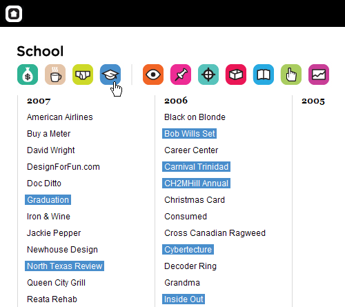
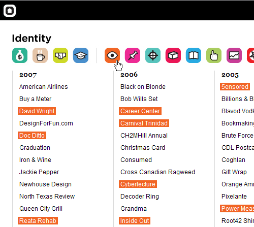
DesignForFun uses icons to help visitors to filter the content they’re looking for. Depending on the clicked icon the background of corresponding links changes. However, the selection of icons may be not the best one as it’s unclear hat icons stand for. Fortunately, title attribute is in use.

Screenshot

Screenshot

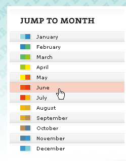
Interesting concept: the hover-effect on jBunti depends on the selected month of the year. Warm months are associated with reddish colors, cold months with blueish colors. 12 hover-colors in use.

Screenshot

Playground Blues tries out something completely different; each of 12 site sections has its color in the left sidebar. Once the visitor hovers the mouse arrow over the left-hand sidebar the icons pop up providing visitors with navigation options. Title-attribute is used as well. And to make sure visitors actually can find the navigation the icons pop out like harmonica first time the page is loaded.

Screenshot

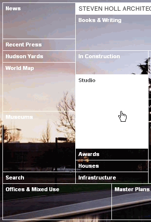
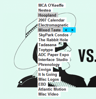
Steven Holl is an architect. Which is why his navigation menu looks like an architectural sketch. Each navigation option is given some weight in the map — apparently according to its weight on the site.

Screenshot

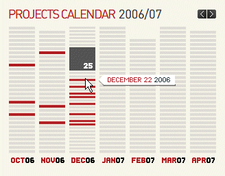
Polkdesign uses a calender as the central navigation element. Flash.

Screenshot

Hopkingdesign offers not a tabbed-navigation; it’s a vertical navigation placed at the top of the page. Looks at least unusual.

Screenshot

No, Adipintilie.eu has navigation options also placed at the top; however, these are only external links.

Screenshot

Flash-based 3D-effect used on Gol.com.pl. The menu can also be expanded.

Screenshot

The navigation on Wards-Exchange.co.uk fits to the brochure design. Or the other way around.

Screenshot

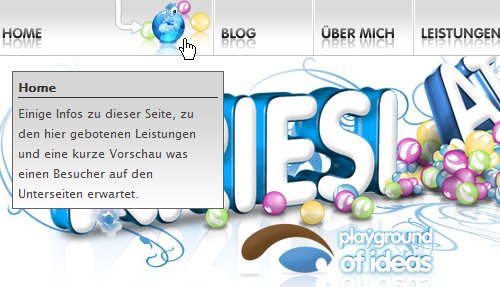
On Kriesi.at the hovered navigation option is dynamically expanded and shows the icons which illustrate what to expect in the section of the site. The effect is in this case not necessary.

Screenshot

Not really new, but still beautiful. Folietto.at uses the free area effectively and sparingly. You may notice an interesting visual effect when hovering the links.

Screenshot

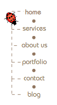
inBloom has a menu with animation. The beetle doesn’t care what option you choose, it crawls its long path through the navigation tree anyway. This is an example of how animation can be unobtrusive.

Screenshot

Cobahair.co.uk uses only BIG typography…

Screenshot

…and HelloColor.com uses small typography with rainbow colors.

Screenshot

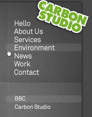
Carbonstudio.co.uk delivers a Flash-based navigation menu with sound-effects. It may sound annoying, but it isn’t: every navigation option has its own sound. If you train yourself a little bit you can even play your own melody while listening to birds in the background.

Screenshot

Maxandlous.com provides hover-effects with visual hints. It looks nice and unusual.

Screenshot

Scrollomania in all possible directions on Letters-Numbers.com.

Screenshot

OK, how can you come up with this one? Nickad‘s Flash-based construct becomes visible only if the mouse is clicked and remains being clicked.

Screenshot

Nike offers a kind of remote control. To navigate you need to click and drag. While dragging, move the mouse up to move forward, down to move backward, and left/right to turn.

Vitaly Friedman loves beautiful content and doesn’t like to give in easily. Vitaly is writer, speaker, author and editor-in-chief of Smashing Magazine, an online magazine dedicated to designers and developers.

  1. 101

    I never seen this kind of navigation menu!
    very very nice…
    thanks for it.

    0
  2. 102

    buttons is very nice :D

    +3
  3. 103

    Many thanks for sharing. i really needed some inspiration for navigation design so thanks!

    0
  4. 104

    This is such a wonderful article, thanks for all the examples you’ve provided. Some of them are really beautiful :)

    OVO Creatives

    -2
  5. 105

    Doe anyone know of a way in WordPress to dynamically create a page list like what is shown in the first trend? I know I could use a custom field to create the subtitle, the problem is then listing it and the page title with a custom query.

    -3
  6. 106

    excellent compilation of thanks

    -3
  7. 107

    That’s a really nice list, thank you :) It’s just a shame that the gotocss3.com site is no more – I really love that menu design and wanted to see more :(

    -1
  8. 108

    it is realy great designs on this site…… this is very helpfull site for web designers…iam a web designer so i am very happy now ! thank you “SMASHINMAGAZINE”….

    -2
  9. 109

    Your screenshots are not showing.

    -2
  10. 110

    Very interesting subject

    -1
  11. 111

    >while it’s cool, NickAd’s site navigation raises my anxiety levels.

    My experience exactly. Frightening really. And the bass throb made me too anxious to actually keep navigating further!

    As to this page as a whole with examples: a nice collection of work and helped with a little (well somewhat large) problem I had on a present project. Thanks for the effort in compiling all of these – must’ve taken quite some time! :)

    -1
  12. 112

    Cool collections, thanks.

    -1
  13. 113
  14. 114

    This article is really amazing! Well structured and a true source of inspiration for every web design! I use it for my day to day design. Thanks!

    -1
  15. 115

    omar no sleep till brooklyn

    January 21st, 2009 9:43 pm

    This is truly exceptional inspiration and all around great work! Thank you so much for the work you put into this Smashing Magazine!

    0
  16. 116

    Thanks for presenting this intriguing collection!

    0
  17. 117

    i am so impressed with your site and all the collections your bring to this site. Thank you so much for inspiring me with your hard work.

    -2
  18. 118

    another sample for the ‘creative / icon’ navigation. I think it works really well. intuitive.
    boxmodel.ca
    take a look.

    0
  19. 119

    nice thanks!

    -1
  20. 120

    Cool Ideas. Great for inspiration. I visit this page everytime I design a navigation menu.

    -2
  21. 121

    Hi there, does anyone know a good tutorial for speaking buttons navigation? I have tried it with only text and css but when going mouseover it won’t highlight the full button, only for example “home” and not the subtext.

    I have seen quite cool navigation menu’s but I good tutorial for such speaking navigation menu’s is hard to find…

    0
  22. 122

    This certainly is timely for. For a little while now, I had been on the look out for navigation inspiration – Viola, this turns up!

    0
  23. 123

    Really nice collection! Thanks.

    -1
  24. 124

    This is excellent work..
    Thanks

    0
  25. 125

    Great list. Small typo in Polkdesign entry: calendear

    -1
  26. 126

    Really inspiring!

    0
  27. 127

    i found a cool navigation on the webdesign portfolio from the berlin webdesigner michael seiler-gerstmann. amazing^^

    +1
  28. 128

    Check out this cool navigation from INVIVIA
    http://www.microsoft.com/services

    Its a hybrid tab-breadcrumb navigation.

    -1
  29. 129

    This is a very interesting and useful article! I’ll bring to my next web design class!

    -1
  30. 130
  31. 131

    Really very nice collection

    -1
  32. 132
  33. 133

    Creative and Innovative collection of navigation menus…………really inspiring and impressive……………i like ur collection always………..

    thanks for giving great ideas and designs………………..

    -1
  34. 134

    Sorry, some of this stuff is akin to installing a door in the ceiling and forcing people to climb hoops and ladders just to get through it. (“Nickad” should be banned from the internet.)

    Thinking outside the box means more than just replacing tried and true navigation with pointlessly convoluted scripts and jumbled Flash abortions. Apple thinks outside the box all the time, but they tend to make sure their creations are something people can actually use at the end of the day.

    I expected more from a site focused on solid, progressive web design!

    0
  35. 135

    Just wanted to thank you for this. We’ve used some of the menu info on here for both

    0
  36. 136

    It’s awesome collection…..I like most of the design……thanks…..

    -1
  37. 137

    jefferis peterson

    January 30th, 2010 12:17 pm

    Normally I’m not a fan of Flash but I must say that the nickad.com site blew me away. Awesome.

    -2
  38. 138

    Wow!!! great suggestions!!!

    0
  39. 139

    Thanks for this! Lot of materials.

    0
  40. 140

    Some great examples to inspire my creativity!
    Many Thanks!

    -1
  41. 141

    LOUNG KHAN SHAR

    April 29th, 2010 3:31 am

    Rais Loung khan shar is senior vice president PPP Cultural wing Disst: Sanghar

    -1
  42. 142

    What considerations need to be made for navigation on the various touch screen technology? Apple cites Flash as being reliant on the mouse (with mouse-over events etc…) so does this argument extend to dropdown menus et al that rely on the user hovering their mouse over a menu item before the dropdown appears?

    -1
  43. 143

    These are all great but I don’t know why all the showcases are full of portfolio sites. Even if you see any of the CSS gallery found on net you will find that many of the site are portfolios of some web design company. These examples looks great but there is not much practice examples of them on professional sites. How am I going to use these full of icons navigation on a professional business site. There should be a showcase of niche sties so that we can truly find some inspiration form them.

    -1
  44. 144

    Navigation of links on your site plays a big role in determining the stickiness of your site (how long your visitor stays and explores your site). and you also got more information.

    -1
  45. 145

    Thanks for all this reseach. I never have time to do this kind of research and thinking.

    -1
  46. 146

    Very nice collection,
    Appealing And Attractive

    0
  47. 147

    Great collections…

    thanks a lot.

    -1
  48. 148

    Thanks alot , that is a great collection and here is a IT Consulting Company for assistance

    -1
  49. 149

    Sudhansu Ranjan Mangaraj

    February 10th, 2011 8:01 pm

    Have best and good collection about the menu styles. I refer this to all designers… get some good Idea …

    -1
  50. 150

    amarnath jaganathan

    February 21st, 2011 11:01 pm

    Good list though! Would like to add Kwicks in mac style list.
    http://www.kriesi.at/wp-content/extra_data/kwicks_tutorial/kwicks_final.html

    I used it in my website as well.
    http://www.colorchalk.com

    -1
  51. 151

    I like the collection and it opens a way of designing….

    -1
  52. 152

    Emily Johnston

    April 6th, 2011 11:46 am

    This is a great collection. Thanks for posting. I also liked the right column prompts I came across at this design studio’s site: Splendor Design Group.

    -1
  53. 153

    umesh shejole

    August 8th, 2011 3:28 am

    Thanks ,
    Really awesome menus shared in this article i where inspired with this menus and anytime in any my new website project i like to use this menus thanks ………

    -1
  54. 154

    Would you say that “speaking to navigation” is a good solution for a global health care company targeting health care professionals? It has been proposed by an agency, but I am looking for a second opinion…

    -1

  1. 1

    letters-numbers.com is maybe one of the worst websites I have ever seen. The designer has lost sight of what usability is all about and is trying too hard to impress other designers…

    his menu on the right hand side looks like a google ad, which makes the initial impression of the website make it seem like it isn’t a legit site, and makes me think ‘avoid this site, I’m going to get ad-ware if I stay here…’

    +6
  2. 2

    paparao vanapalli

    June 10th, 2010 2:22 am

    Nice Collection! Thank u

    +5
  3. 3

    buttons is very nice :D

    +3
  4. 4

    I good variance in navigation types. This should be a good reference to come back to whenever a navigation creative block comes about.

    Personally, I think navigation design is what makes websites in today’s world so popular. Intuitive, and more importantly user centered navigation is what makes some sites so popular. Content is easy to reach without a lot of time searching mindlessly. The experimental navigation systems are nice, but I would always suggest only using them on “personal playground” sites, where a committed community is already willing to spend a few extra seconds to navigate to the content they desire, because they know the overall outcome is going to be beneficial.

    My suggestion for personal portfolio sites and more organized company showcases is to keep it simple. Sure, the client sees first hand exactly what kind of cool stuff you can do with Javascript or Flash, but if they have a hard time navigating to the section of your site that they want to see, it is going to say a lot about their own user centered design concerns.

    I feel like I am rambling…great list!

    +2
  5. 5

    Fantastic! Thank you for this!

    +1
  6. 6

    Debabrata Ghosh

    April 29th, 2008 9:29 pm

    Very nice collections and also very helpful for designers……..

    +1
  7. 7

    hi,
    how can we use these theme?
    I would like a theme like the site “guide de prague”.

    +1
  8. 8

    Very nice experimental navigation is used on website http://www.arin.cz

    +1
  9. 9

    very cool collections…
    My wishes to al those who ahve worked on this appealing set of navigation

    +1
  10. 10

    to the author of the article:

    what metrics do you have (other than the Apple example) that convince you that these are all sound UIs?

    +1
  11. 11

    Perfect flash menu
    It’s online builder. You can create drop down or accordion menus or download component.

    +1
  12. 12

    FAO: im suden

    It’s all very well quoting or linking to Jakob Neilsons site, but useable or not his site is incredibly ugly. In fact the content is so lacking in structure as to actually hinder useability – which content is important? Where do I look first? Why do I have to scroll to see some of the top level navigation?

    Laughable really.

    If you don’t believe there is any room for aesthetics in websites then why on earth come to a site that celebrates design?

    +1
  13. 13

    I love you more than i can do

    +1
  14. 14

    i found a cool navigation on the webdesign portfolio from the berlin webdesigner michael seiler-gerstmann. amazing^^

    +1

Leave a Comment

Yay! You've decided to leave a comment. That's fantastic! Please keep in mind that comments are moderated and rel="nofollow" is in use. So, please do not use a spammy keyword or a domain as your name, or it will be deleted. Let's have a personal and meaningful conversation instead. Thanks for dropping by!

↑ Back to top