The Secrets Of Grunge Design

Email Newsletter
Weekly tips on front-end & UX.
Trusted by 182,000+ folks.


 Custom Web Forms for Angular, React, & Vue. Your backend.
 Celebrating 10 million developers
Shiny and glossy design elements are now officially outdated. Just like retro is becoming trendy again, grungy look appears to rapidly gain on popularity. And there is a damn good reason behind it. In our everyday environment we’re unlikely to find ideal geometric forms or pretty shadow effects as they are manifested by glorious Web 2.0-designs. The reality is different, and Web is definitely not an exception here.
Therefore designers often tend to explore the less ideal and more realistic design solutions which reflect the world we’re living in more accurately and precisely. Result: such elements give the design a more realistic, genuine look, a look one would actually expect in real life.
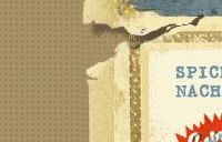
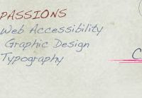
In such grunge designs dirty stains, torn images, “broken” icons and creased pieces of paper are as popular as hand-drawn elements and dirty textures. The main purpose of hand-drawn elements lies in their ability to convey a personality and an individual note. And dirty textures are often used as background images for navigation menus, photos and overall layouts. Usually these elements are regular objects from our daily life, replicated in their real form without any glossy effects.
You might be interested in the following related posts:
Grunge Style ≠ Dirty Look
Few weeks ago we’ve already provided you with grungy fonts, textures, icons and brushes. Since most designers were confused about the purpose of these “dirty”, “graffiti-like”, “urban” elements, it’s important to understand that grunge designs don’t necessarily have a dirty look.
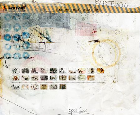
In fact, grungy layouts don’t necessarily consist only of grungy design elements. The latter can as well support the design, giving it a more realistic look without making it look overcrowded or dirty. Take a look at Bart-Jan Verhoef’s late blog presented below. Although the design has a number of irregular elements such hand-drawn doodles and dirty background image, it doesn’t feel dirty at all — in fact, the design is rather subtle, clean, elegant and in any case unique.
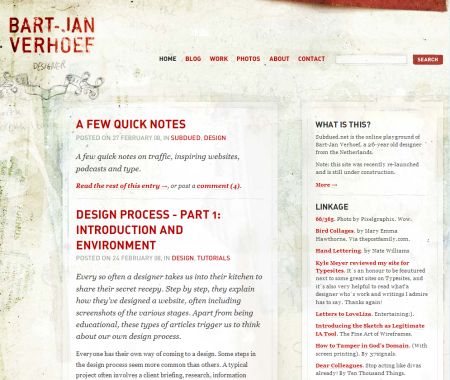
Although the design has a number of irregular elements such hand-drawn doodles and dirty background image, it doesn’t feel dirty.
Sometimes it’s enough to add just few irregular (or dirty) elements to achieve a more realistic look. In online-shops and corporate projects it simply doesn’t work otherwise. In such cases small details influence the mood and define the perception of the users. Sometimes it’s enough to simply replace the background image of the layout with a dirty texture. This is exactly what Jeremy Zevin has done. Without a dirty texture his weblog would have a typical Web 2.0-design.
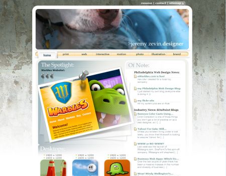
Without a dirty texture used as a background image this weblog would have a typical Web 2.0-design.
Grunge Color Palette
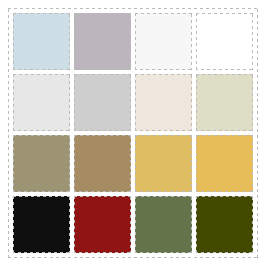
In most cases grunge designs use subdued, dirty and dull colors. Brown, beige, grey and black are dominating colors. Vibrant shades of vivid colors are being replaced with more natural and subtle colors. The color palette below presents colors which are often used when it comes to grunge designs. The colors have been extracted from the screenshots listed below.
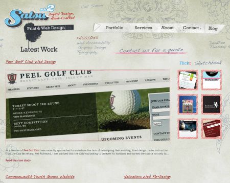
For instance, Satsu uses rather subtle colors; the design, however, doesn’t look boring. Hand-drawn elements support the overall design and give it an artistic touch.
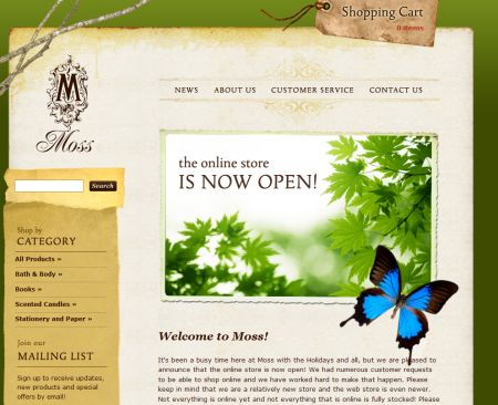
However, grunge designs can as well contain more vivid colors; however, in order to fit to the design, they are less striking and more realistic. Dark shades of green, blue and read are usual. Shop Moss and David Hellmann’s blog are examples of a vivid grunge design.
Trends In Grunge Design
Dirty textures and background images are almost essential in every grunge design.
irregular lines and frames
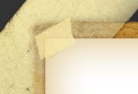
yellowed scotch tape
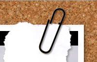
paper- and photo clips, needles and various pins
coffee rings, spilled out liquids and dirty stains
torn paper and dirty edges
dog-ears
hand-written elements
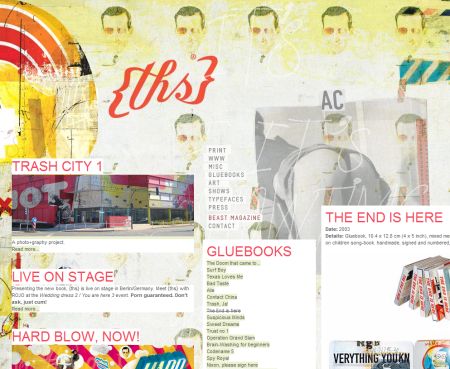
…and EXP.TYPO is rather a collage than web design.
The Grunge Gallery
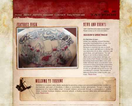
red9ine
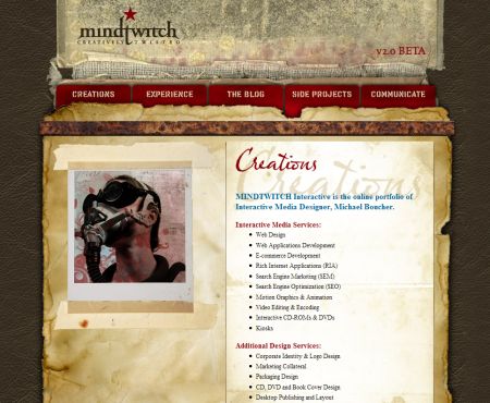
Mindtwitch
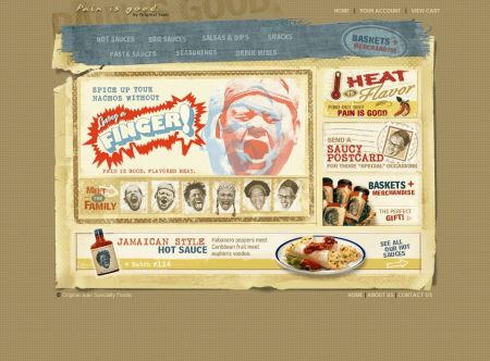
Pain is Good - don’t take it seriously, please.
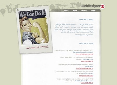
Webdesigner Ro
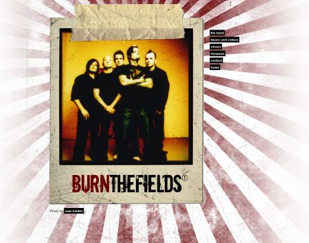
Burn the Fields - for music-related web-sites grunge look fits almost perfectly.
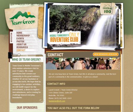
Team Green
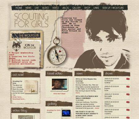
Scouting for Girls
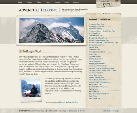
Adventure Trekking
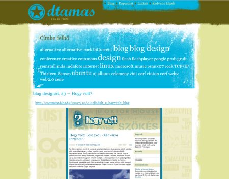
dtamas
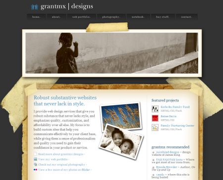
grantmx/designs
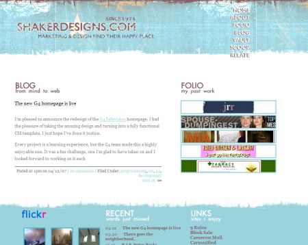
Shaker Designs
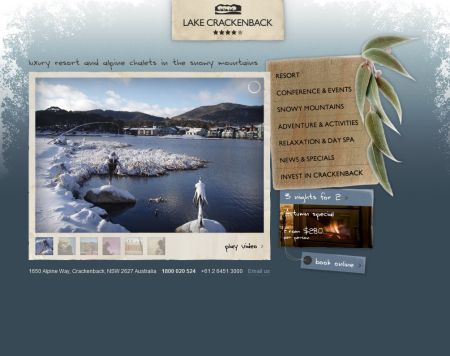
Lake Crackenback
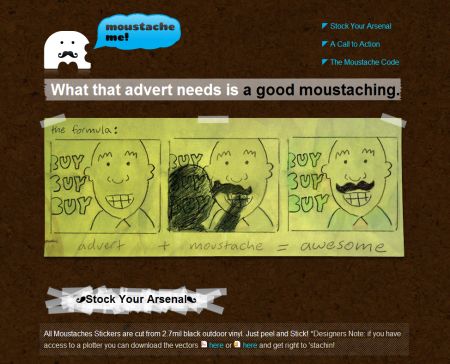
Moustache Me
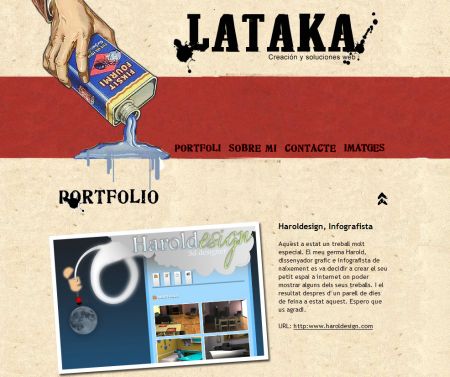
Lataka
Design Sponge
Extreme-Designer Thomas Schostok from Germany
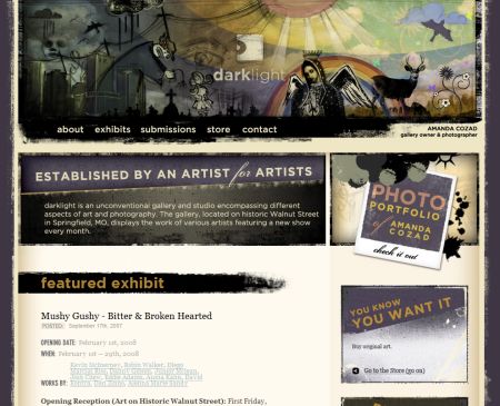
Darklight
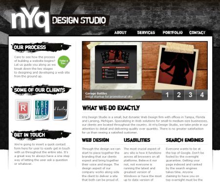
nYq
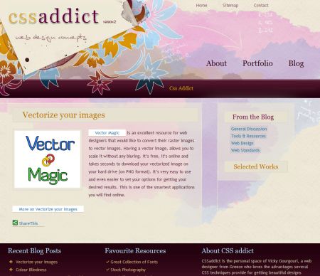
CSS Addict
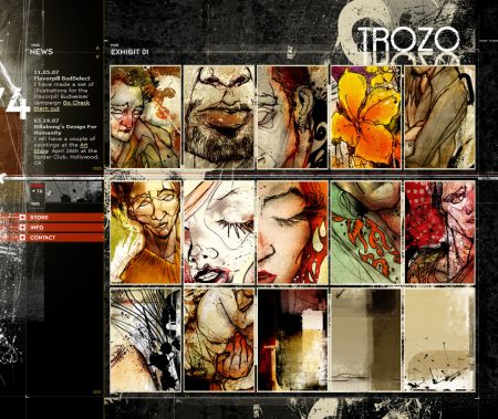
Trozo Gallery
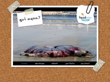
Liquidesign
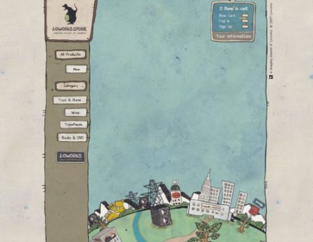
loworks. Flash in use.
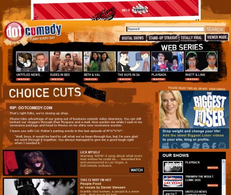
Dot Comedy
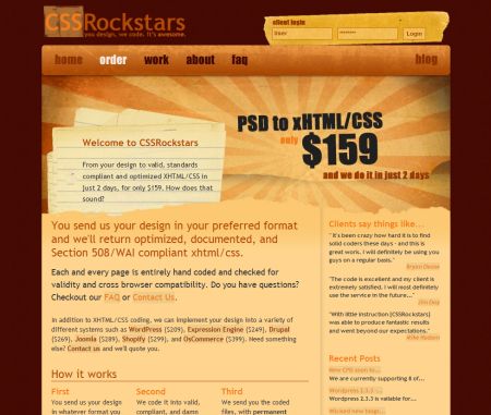
CSS Rockstars
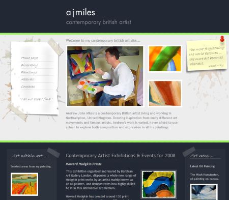
a j miles