60 Brilliant Corporate Fonts

Email Newsletter
Weekly tips on front-end & UX.
Trusted by 182,000+ folks.


 Register Free Now
 Celebrating 10 million developers
 Try ProtoPie AI free →
Typography is more than being legible and looking good. Among other things, effective typography manages to achieve two important objectives: a) to create an appropriate atmosphere and enable users to develop trust toward the site and b) to make sure visitors get the main message of the site and (if possible) become interested in the services offered on the site. Since written text is the most efficient instrument to communicate with visitors precisely and directly, the power of typography shouldn’t be underestimated. [Updated Nov/15/2016]
To communicate effectively, typography requires appropriate typefaces. Last year we’ve presented 80 Beautiful Professional Fonts, a selection of excellent typefaces one should be aware of when developing web-sites. Now it’s time to update our selection with typefaces we’ve missed then and new typefaces which have been developed over the last year.
Below you’ll find over 60 first-class corporate fonts. Please notice that they are not free; however, we’ve focused on typefaces which are definitely worth spending money on. So which typefaces are “bulletproof”? What fonts can be used effectively in almost every Corporate Design? And what are the options for unique, but still incredibly beautiful typefaces? Let’s find out.
Further Reading on SmashingMag:
- 40 Free Fonts For Professional Design
- The Best Free Fonts for Designers
- Free Fonts With Personality And Style
60 Excellent Corporate Fonts
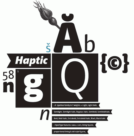
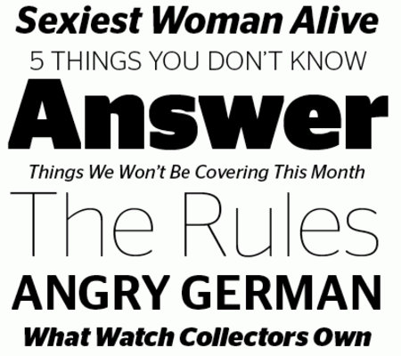
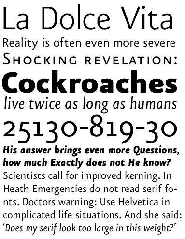
Haptic The Haptic family is a sans serif typeface which was optimized for use in small sized text. It serves well in attention seeking headlines. Comes in Roman and Italic with seven weights each. Type & Graphics by Henning Skibbe.
FF Meta Serif A collaborative work by Erik Spiekermann, Christian Schwarty and Kris Sowersby. The designers created a typeface with metrics that are not identical to FF Meta, but optically the same. Now what you see is what you get, a harmonious serif/sans type system. FF Meta Serif is available in four weights: Book, Medium, Bold, and Black, each with Italics. All styles include Small Caps, lining and oldstyle figures in proportional and tabular widths, and a range of arrows and other symbols.
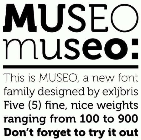
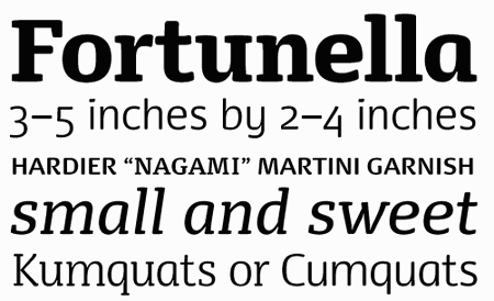
Museo A contemporary semi-slab serif font. This OpenType font family comes in five weights and offers supports CE languages and even esperanto. Beside ligatures, contextual alternatives, stylistic alternates, fractions and proportional/tabular figures Museo also has a ‘case’ feature for case-sensitive forms. This typeface comes in 5 weights; three of them are free.
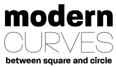
Beorcana Beorcana is a calligraphic sans, or serifless roman. Beorcana is unusual for a sans serif type; it is designed for extended reading. Beorcana fills a niche in book typography and also serves a wide range of purposes from fine print, cartography, and information design to signage, editorial design and invitations. Designed by Carl Crossgrove. “Beorcana has what it takes to become a classic.”
Agile Typeface This typeface was born as Endexamen of the postgraduate study TypeMedia in The Hague. Not released yet, but worth to be kept in mind.
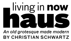
Graphik “I ended up drawing inspiration from all parts of the 20th century. The heavy end of the family is based in part on Paul Renner’s Plak, a relatively obscure display typeface cut only in large sizes of woodtype, that is related to his heavier weights of Futura but has rounder, friendlier, fatter proportions”. By Christian Schwartz.
Rondana Rondana is a tribute to the purity of line and futuristic aesthetics of the 60s and 70s. Geometry in service of Typography, rather than opposite.
Stag Sans “The normal/quirky balance is a bit different in the heavy weights, which are more likely to be used for enormous headlines. The final result is a perfect match for Stag, and also works as a muscular counterpoint to just about any elegant serif face.”
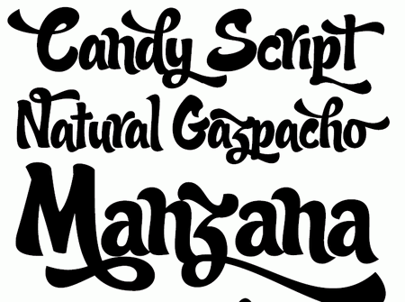
Candy Script Inspired by Argentina and its culture, Alejandro Paul’s Candy Script captures the country’s spirit. It comes from the tradition of window sign painting, but its thick hand-brushed characters — with alternates for almost every upper and lowercase letter - have a personality all their own. Tons of OpenType alternates included, over 600 characters in all.
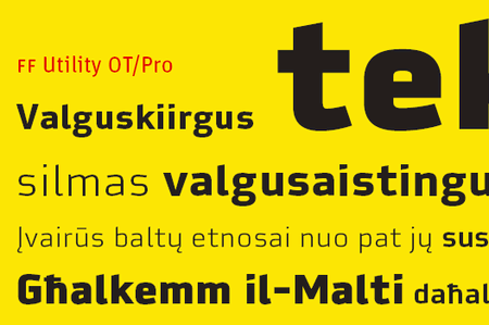
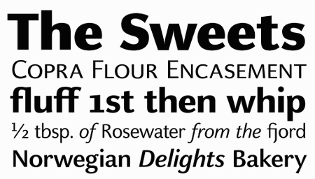
FF Utility Designed by Lukas Schneider. Comes in give weights — light, regular, medium, bold and black.
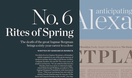
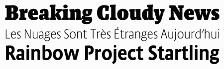
Publico The openness of the headline face made designing a matching text face very straightforward. Elegance gives way to sturdiness in the serifs, and the ball terminals are less pronounced, resulting in an even texture. Like Guardian Egyptian, Publico Text is drawn to work under the specific layout and printing conditions of newspapers but doesn’t take its design cues from traditional newspaper typefaces, resulting in a fresh and contemporary look.
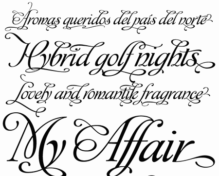
Affair Affair is an new calligraphic typeface by Alejandro Paul with a party full of swash characters, ligatures, and ornaments. By default, it’s simply an elegant yet readable display face. Dress it up with alternates, and it becomes irresistibly attractive, in styles from glamourous to over-the-top.
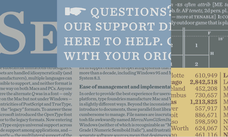
Prelo A large sans-serif family with 18 weights with ligatures, alternates, fractions, scientific inferiors, superscript, swashes, oldstyle figures, lining figures, tabular figures, numerators, denominators, ordinals and smallcaps.
DST Glosa A traditional, roman serif-family which comes in 8 weights (roman, roman italic, medium, medium italic, bold, bold italic, black, black italic) and has a number of additional features. OpenType.
Olicana Beautiful hand-drawing in action. Comes in two weights — rough and smooth. Designed by Nick Cooke.
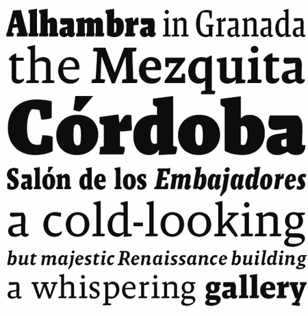
Malaga “At first glance Malaga has all the earmarks of a sturdy old style serif that would hold up well to any amount of reading. Healthy spacing, large x-height, short ascenders and descenders. It is the second glance that has you realizing that it is perfect as well for larger headlines and bolder statements.” A modern classic by Xavier Dupré.
FF Unit Rounded Designed by Erik Spiekermann.
Arno Pro “A multi-weight, multi-style, multi-optical sized, multi-lingual family of fonts in the classic Venetian tradition. It comes bundled with Adobe Creative Suite 3, and it’s almost worth upgrading just to get Arno.” Designed by Robert Slimbach.
Kinescope Kinescope is a dashing 1940s-style brush script. It was inspired by hand-lettered titles in Fleischer Brothers’ Superman cartoon series. This font features OpenType to automatically choose the most aesthetically pleasing letter shapes as you type as well as extended language support. By Mark Simonson.
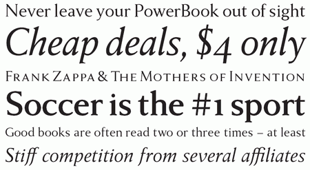
Anziano A typeface for books. When creating a traditional typeface, Stefan Hattenbach was influenced by earlier designs. Anziano shows touches of Weiss (Emil Rudolf Weiss, 1926) - another classic book typeface. Stefan had appreciated the design of Weiss for a long time.
Celeste Sans OT This OpenType serif family comes in 10 weights.
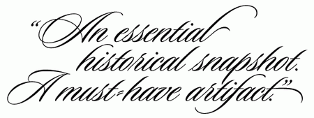
Sloop Hand-writing: sexy, elegant, feminine and inviting.
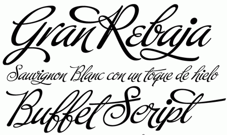
Buffet Script Buffet Script is based on calligraphy by Alf Becker, arguably the greatest American sign lettering artist of all time. Buffet Script’s OpenType programming contains discretionary ligatures, stylistic and contextual alternates, all interacting with each other to allow the composition of just the typographic look and feel. This font is best used where lush elegance is a design requirement.
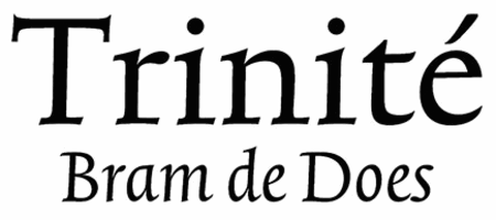
Trinité Classic, created by Bram de Does in 1982.
Dancer By Morten Olsen.
Quiosco
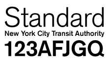
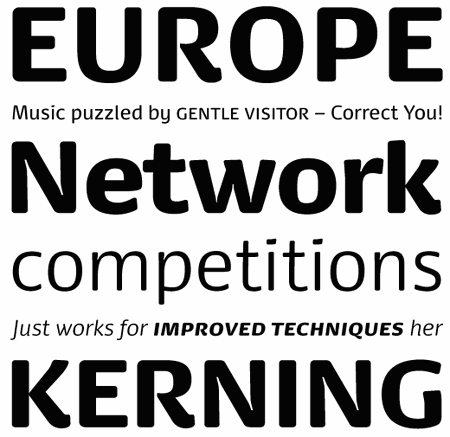
National
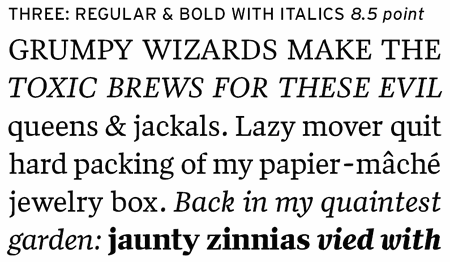
Thesis An ultimate corporate typeface, designed by Lucas de Groot. Including 144 fonts, both serif and sans-serif fonts.
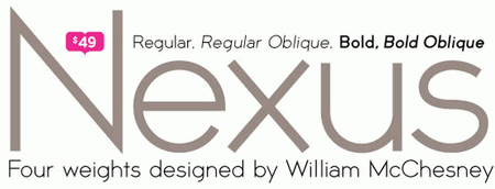
Nexus Designed by William McChesney. Comes in bold, bold oblique, oblique and regular. Price: $49 for all 4 weights.
Vesper Currently in development.
Sources and Resources
- Typographica’s Favorite Typefaces of 2007 Typographica’s fourth annual review showcases the best in new typeface design.
- Typefacedesign.org Work from the MA Typeface Design class of 2007 at the University of Reading.
- 100 Best Typefaces Of All Time An outstanding selection by Fontshop.
- Type foundries: Fontshop.com, Emigre, Hoefler & Frere-Jones, Linotype and many-many more.


