Grid-Based Design: Six Creative Column Techniques

Email Newsletter
Weekly tips on front-end & UX.
Trusted by 182,000+ folks.


 Celebrating 10 million developers

 Custom Web Forms for Angular, React, & Vue. Your backend.
Grid systems bring visual structure and balance to site design. As a tool grids are useful for organizing and presenting information. Used properly, they can enhance the user experience by creating predictable patterns for users to follow. From designer’s point of view they allow for an organized methodology for planning systematic layouts.
After creating a well-structured and usable grid, consider allowing it to breath. A page without a grid is a usability nightmare. On the other hand, a grid that has creatively overlapping, escaping, or energizing columns leads to a more enjoyable user experience. Discovering or planning areas of the design that will have some freedom will lead to more interesting and appealing design solutions. Read also: Designing With Grid-Based Approach
What is Grid-Based Design?
Grids are structure imposed on chaos. They are a harmonious and reliable system for presenting information. Grids offer an effective design approach for site layouts and assist in communicating site’s main messages clearly to the end user. They created ordered hierarchies, proportional relationships, and clear visual paths for the eye to travel.
Its important to know your tools before trying to get creative with them. This means you should study the grid and understand how to successfully use it to create your site layouts. Learn to achieve balance, symmetry, and place emphasis on important content all through the use of the grid. Grids are useful for communicating information clearly and effectively. Khoi Vinh’s redesign of a complex news-site proves it.
Six Creative Column Techniques
Like skyscrapers in city centers, overwhelmingly, columns dominate Web design grids. Once you’ve mastered the grid as a tool then it’s time to get creative with it. Work on establishing a visual rhythm in your design. Then you can step in and break the visual flow for effect. The techniques discussed in the next section present effective ways of getting creative with your columns in grid-based Web design.
1. Embracing Disharmony
Disharmony is, of course, the opposite of harmony. A grid is a harmonious instrument. Its goal is to achieve balance, symmetry, and order. So why would you want to bring imbalance to this order? Why break up this carefully constructed data structure? The answer is to add interest.
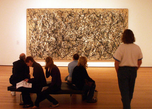
Chaos is more interesting than order. A good murder mystery is infinitely more enjoyable than a story about taking a walk in the park. Jackson Pollock’s splattered paint canvas is more stimulating than a wall without it. A partly broken grid is more interesting than a perfectly ordered grid. Besides who doesn’t want to break the rules? Embrace some randomness, chaos, or discord and create a space for them to thrive within your designs.
2. Joining for Variety
Layouts that have strong horizontal areas are being seen more often, especially on home pages. Horizontal Web design areas feel more creative because vertical designs are so common on the Web. Try using more rows in your designs. Or join areas of a column together to create a display space in your design.
Rows can be used to break up the visual flow of a page. Each row you create gives a new opportunity for establishing new column areas with different sizes, numbers, and variety. Its possible to create pages on your site, or areas of your pages, that are heavily horizontal. Or join columns to form rows that add interesting areas to your layouts. Consider varying the number of columns in the rows you create.
The gray horizontal row below is heavily emphasized. The use of repeating horizontal backgrounds helps to make predominately vertical layouts feel wide. Adding these spaces to your layouts will allow them to stand out. Horizontal areas in sites will slow the user’s progression through the page and create emphasis.
3. Utilizing Angles
It’s possible to set an entire grid on an angle. In the article Rule Four: Spacing Is Your Friend an angled grid design is reviewed. The example used in this article is for print design though. The use of an angled grid is unusual on the Web. That’s because the layout of text on the Web is horizontal, not slanted.
You would likely use images to accomplish an angled piece of text. Flash would be another option. In both cases you’re loosing the semantic goodness and ease of use of Cascading Style Sheets. The use of angles to occasionally break your grid will add visual interest. If you restrict the use of angles to images you won’t lose any semantic or SEO benefits of the default horizontal text used in the Web.
4. Escaping Boundaries
One of the techniques in line with embracing some disorder is to break out of the boundaries you’ve established in your grid. Once you’ve established your order find ways for elements to move outside of it. Cross over the lines you’ve set up and break out of the visual flow of the page.
In the article Thinking Outside the Grid Molly E. Holzschlag discusses concepts of creating compelling visual design that breaks the mold of the grid. Some of her examples show boundaries being escaped. This is an inspiring conceptual article that also discusses the complexities involved in coding designs that are less rigid.
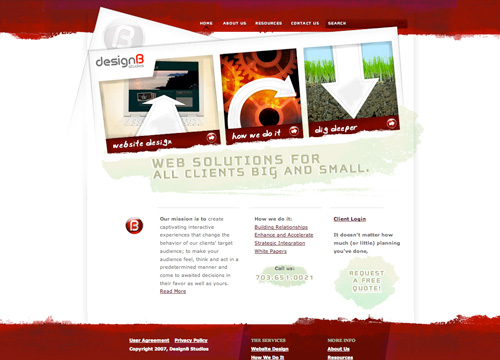
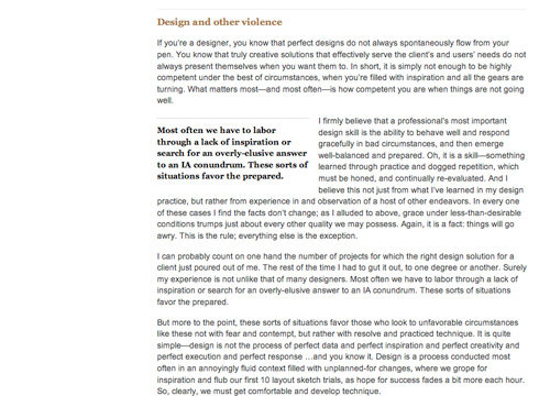
Pull-quotes are an example of a design element that presents an opportunity to break out of your established visual flow. The older version of Andy Rutledge’s Design View used interesting pull-quotes that broke the visual flow of the column. Doing this places greater emphasis on the pull-quotes than if they were kept within the content of the column.
Compare the old version to the newer site design below. The new design places pull-quotes within the boundaries of the content column. This is a less creative and more conservative solution. Though in either case the pull-quote creates a noticeable change in the visual flow of the column.
An abrupt change in the flow of the page will cause users to pause and notice the change in rhythm. This is true whether the pull-quote is kept within the column or moved outside the boundaries of its borders. Consider this the next time you use pull-quotes or if you’re embedding an image within your column. As an image presents the same design opportunity.
5. Illustrating Areas
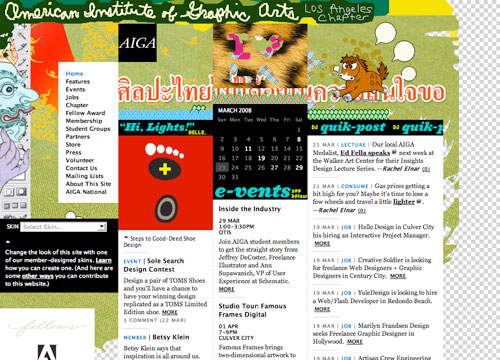
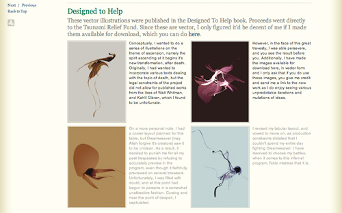
Illustrations and the use of design elements allow for overlapping and breaking out of the structure you’ve created in your grid. They can be used to add some areas of creative disorder to counterbalance the rigidity of the grid.
In the example below the illustration at the top of the page breaks the grid by overlapping the gridlines and flowing into different content areas. The movement of the design elements within the illustration creates a different visual rhythm that acts in opposition to the order of the grid. There is balance in the design of these opposing forces. The illustrations in this design add stimulating areas of interest to an otherwise boxy layout.
6. Energizing Spaces
There are some basic design principles to consider when looking to energize space within your grid. Concepts such as asymmetrical balance, proximity, and repetition are discussed in the article The Principles of Beautiful Web Design by Jason Beaird.
These principles are at work in the portfolio design of Issara Willenskomer, shown below. Jason Beaird has this to say about asymmetrical balance,“Rather than having mirror images on either side of the layout, asymmetrical balance involves objects of differing size, shape, tone, or placement. These objects are arranged so that, despite their differences, they equalize the weight of the page.”
In the image shown below no two paragraphs or images are the same size. Columns are broken and overlap horizontally. Mathematical precision is abandoned and a grid based on an artist’s intuition and eye for design is used to fill this creative space. The balance achieved here is not based on rigid structure alone, but rather is achieved through the equalizing weight of asymmetrical balance.
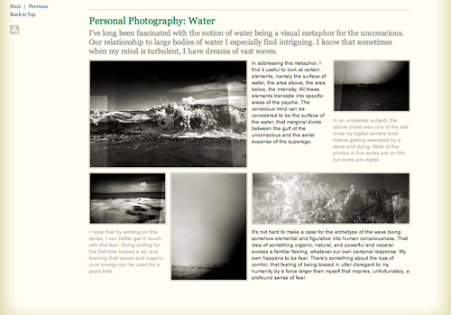
Each portfolio piece repeats a structure of similar size and weight of presentation on the page. The elements within each space through their proximity function as single design units. Though each portfolio piece is presented with a unique rhythm within the confines of this space, thereby adding interest to the design.
There is great variety in each one of these portfolio spaces. This allows for a creative presentation that the designer will enjoy making and a viewer will find stimulating.
Case Studies
Three sites that creatively use columns and break out of the rigid confined of well structured grids.
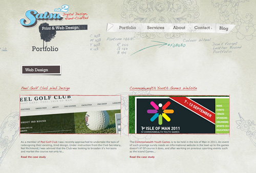
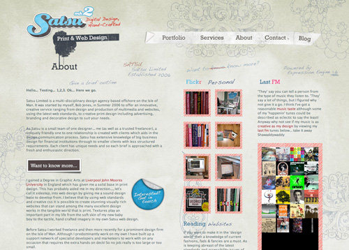
Study #1: Satsu Design
The design of Satsu.co.uk uses sketch style illustrations to overlap the grid lines established for the site. These illustrations effectively communicate the concept of rough draft brainstorming creativity. Conceptually the illustrations don’t belong inside the confines of an ordered grid. They serve to bring interest, asymmetrical balance, and conceptual creativity to the design.
The use of illustrations, the spacing between elements, and the variety in weight of elements within each grid make this a visual stimulating design.
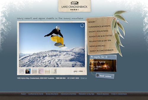
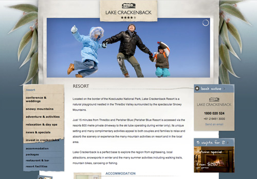
Study #2: Lake Crackenback
Lake Crackenback utilizes illustrative design elements to great effect. The interior page, second image below, has a strong three column grid. Though the presentation through the design gives the illusion that it is one column with side elements that overlap that column. The side columns successfully overlap and break the rigid layout of the grid. Order is maintained while visual interest is added.
Also, notice the difference in presentation between the home page and the interior page. Varying your grid on different pages can be a useful technique for adding interest as well.
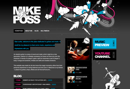
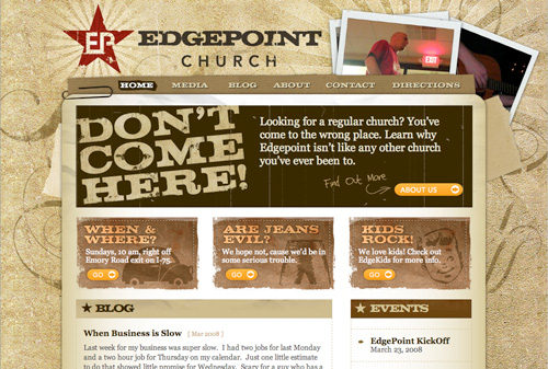
Study #3: Edgepoint Church
Edgepoint Church has a strong grid and a two column layout. The home page stands out as unique. It has multiple rows that turn the two columns into three, or unite a column to form one space. The home page especially has a grid filled with variety. The grid is escaped with the use of angles and placement of the illustrations and photography that surround the layout. The header has a free flow design that opens up the top as a creative space.

Conclusion
There are multiple techniques to add interest to your grid. Certainly you should first understand how to use the grid effectively. Then work on escaping some of this rigid structure and create some free flowing spaces within your design. Or break the established flow and focus attention on a particular element. Utilize concepts such as disharmony, asymmetrical balance, and ordered chaos to bring areas of your site’s grid designs to life.


