Beautiful Handwriting Styles, Lettering and Calligraphy

Email Newsletter
Weekly tips on front-end & UX.
Trusted by 182,000+ folks.
 Register for Free
 Custom Web Forms for Angular, React, & Vue. Your backend.


 Celebrating 10 million developers
Handwriting styles seems to have lost some of its attraction over the last years. Nobody writes beautiful handwritten letters, and uses digital means of communication with smileys, abbreviations and standard lettering instead. And that’s a pity. Since handwriting is unique, it has a tremendous expressive power a standard lettering isn’t able to achieve.
More than that, handwritten text can be incredibly gorgeous. In fact, there is nothing more valuable than a beautiful handwritten letter sent to your beloved ones. And this post attempts to prove just that.
In the overview below you’ll find excellent examples of beautiful handwriting, creative lettering and professional calligraphy. It’s really amazing to see what one can create out of simple letters drawn with a pencil on a small piece of paper.
Further Reading on SmashingMag:
- Breathtaking Typographic Posters
- The Art Of Hand Lettering
- Brush Lettering: It Only Gets Better After Practice
- Hand-Drawing Style in Web Design
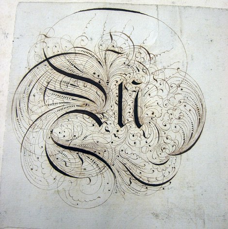
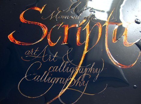
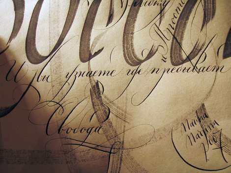
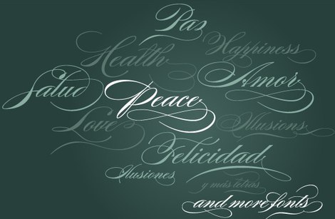
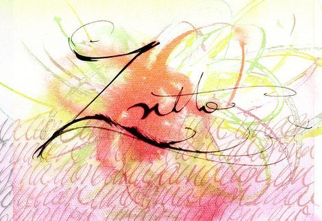
Calligraphy
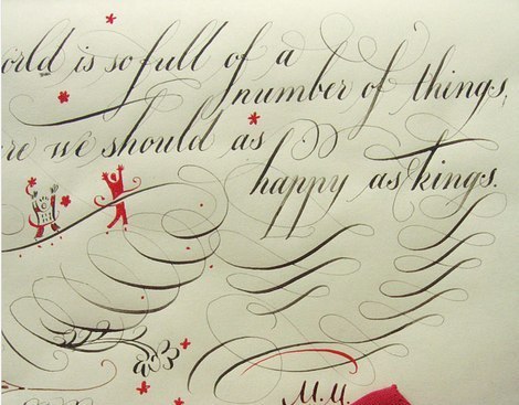
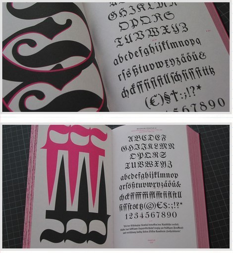
1800s Lettering Sketchbook Journal Beautiful calligraphy from 1800s.
Experiment with photographic paper Written by Marina Marjina, a type designer and letterer from Russia.
Claredon Press, Flower A book cover from 1987. Published by Claredon Press. Created by Sheila Waters.
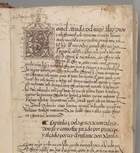
Cronica de los reyes catolicos, XVI century. A Spanish manuscript from Berkeley, University of California, The Bancroft Library.
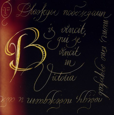
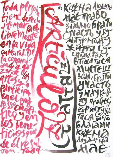
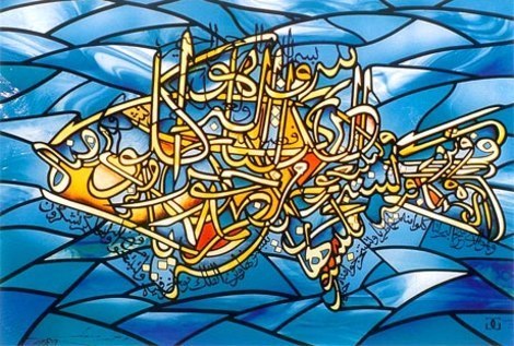
Extra: Natasha Mileshina Natasha Mileshina’s work. Moscow, Russia.
Daily Type Calligraphy by Vera Evstafieva.
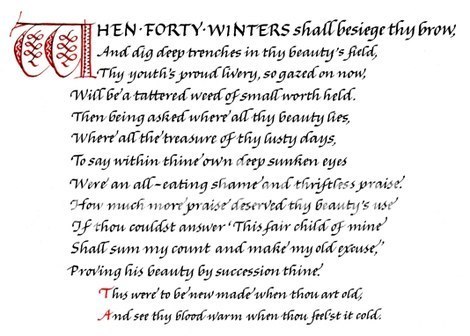
Tom Gourdie’s gallery Shakespeare’s Sonnets by Tom Gourdie. Handwriting master’s pieces from 1980s.
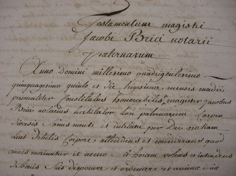
French Notarial Handwriting From Michael Twyman’s 26 November 2007 presentation.
Scripture and Calligraphy By Denis Brown.
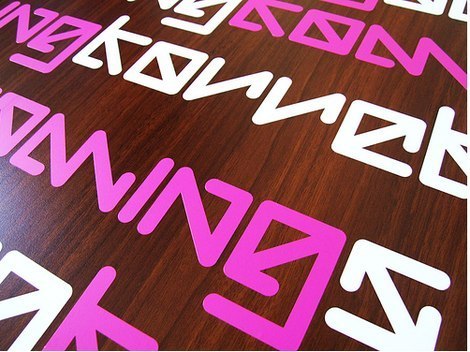
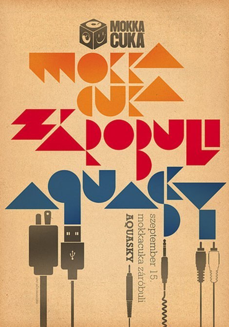
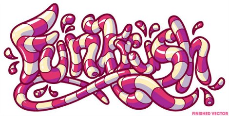
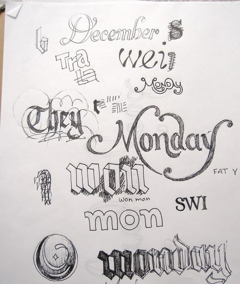
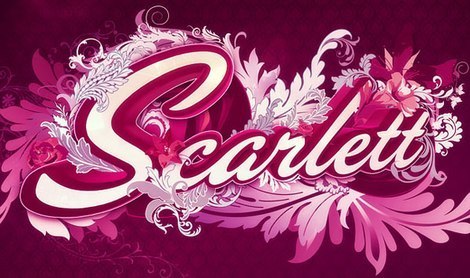
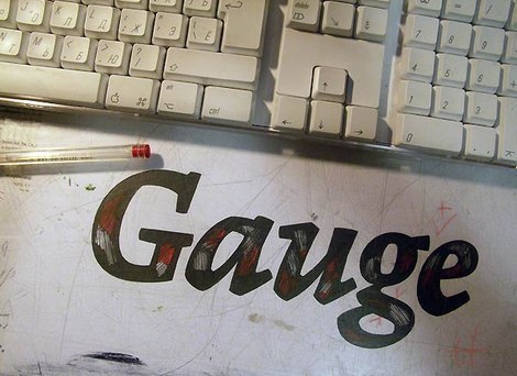
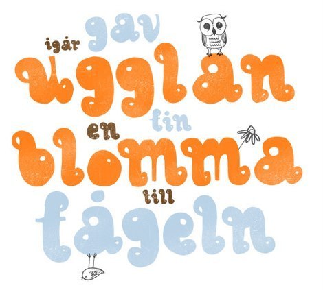
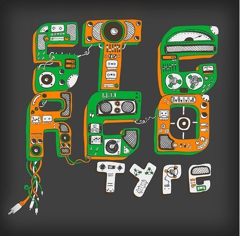
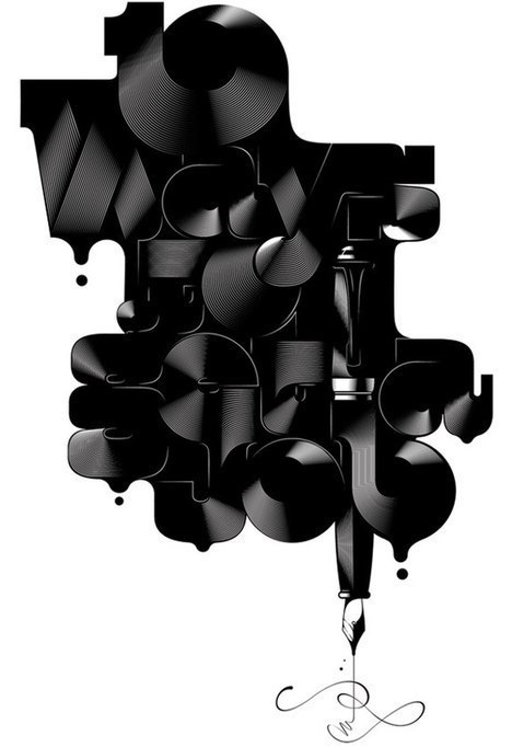
Handwriting Styles, Doodling and Lettering
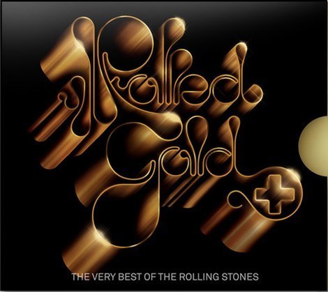
British Ariways B/W Font Alex Trochut’s work for British Airways. Sexy, sweet and beautiful lettering!
Panasonic Advertisement The design by the agency Lowerporta from Chile. An advertisement for Panasonic digital devices.
Art and Life Joei Lau’s project. Beautiful curves.
all the best Wishes from Ale Paul.

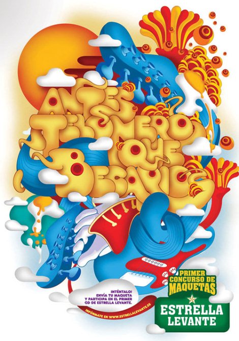
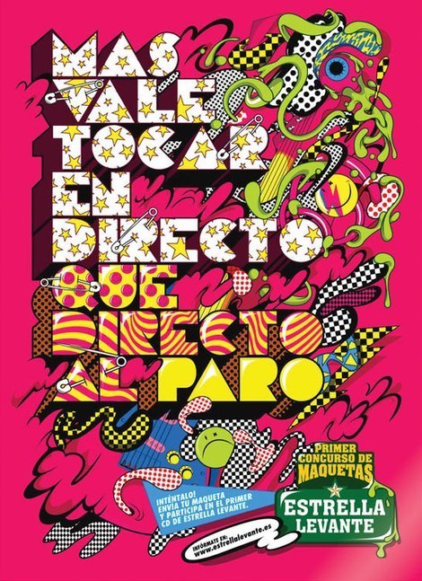
Estrella Levante Posters Tasty typography!
Extraverage x The KDU Karoly Kiralyfalvi, graphic designer from Budapest, Hungary.
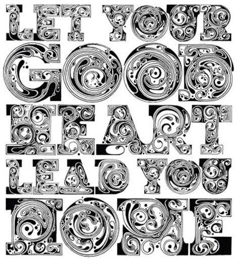
Typography Jeff Finley’s work.
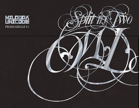
Split in Two Created by Pawel Janczarek.
Doodles! Beautiful doodles from Austin, TX.
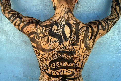
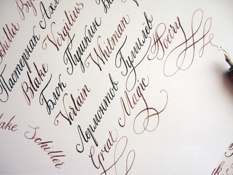
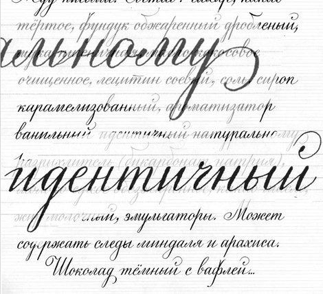
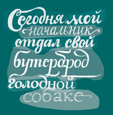
Handwriting By Yury Ostromentsky.
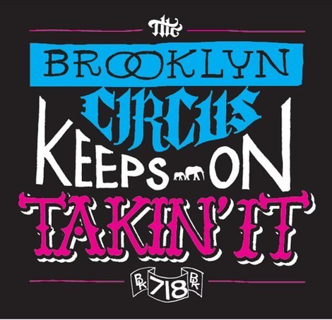
takin’ it Lettering design by Jon Contino.
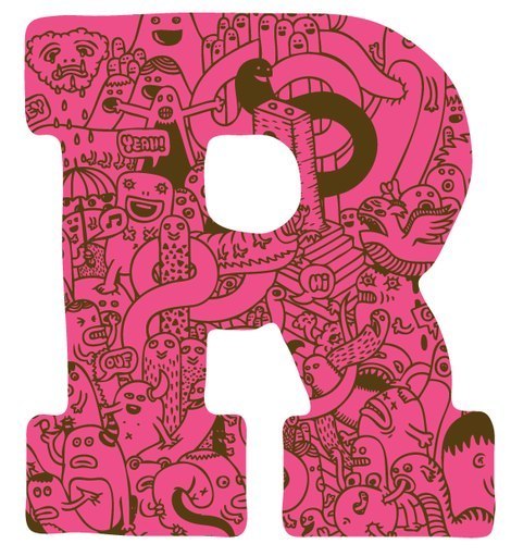
“R” By Zeptonn, an illustrator from the Netherlands.
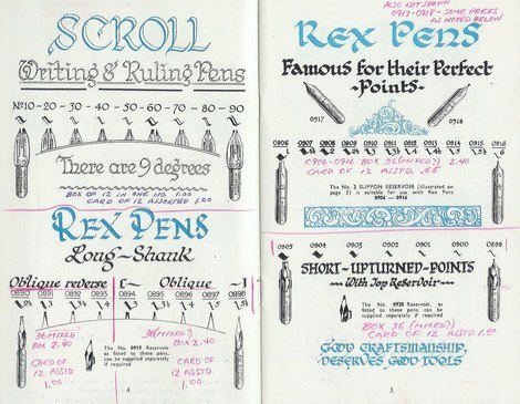
1961 William Mitchell Pen Catalog
inspiredology.com | inspiredology.com
Zapf Games 2005 By Alexander Utkin.
Daily Type
Sostav.ru
Unit.nl
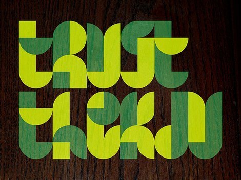
Typography
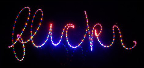
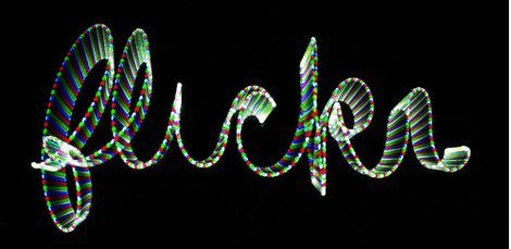
on Flickr - Photo Sharing!

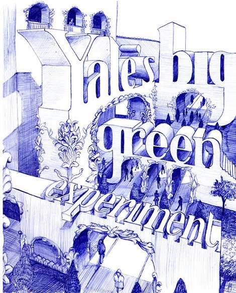
Marian Bantjes: Yale Alumni Magazine
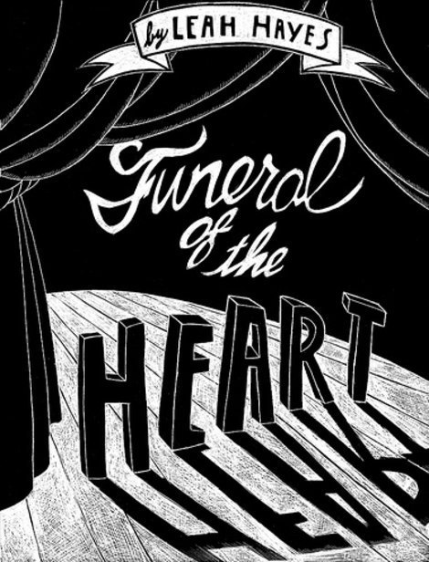
Funeral of the Heart by Leah Hayes - front cover
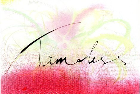
Experiments with type
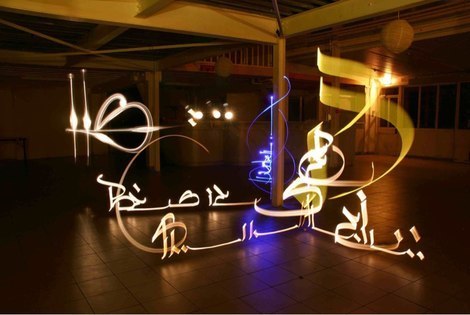
Typolight Type with light.
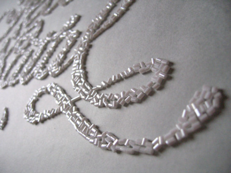
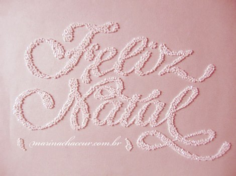
Feliz Natal | Merry Christmas By Marina Chaccur. “The 2006 online christmas card started being very real. In the beginning the letters were drawn by hand, then after the final layout was chosen, the white beads were arranged onto a paper with a very pale outline of the lettering. In the end, the paper was photographed, the image was altered in Photoshop, and the beads went back to the package.”