Footers In Web Design: Creative Examples and Ideas
According to classic principles of web design, everything at the bottom of the page isn’t that important. Most users think like that. And most designers are convinced that this is true. Site elements at the bottom of the page aren’t really able to catch visitors’ attention which is why footers are often forgotten or ignored and not given the attention they deserve.
In fact, most footers are rather boring and uninspiring. Designers often use the bottom area to mention everything they haven’t found place for at the top of the site. E.g. disclaimers, W3C-buttons, copyright, “back to the top”-link and contact details. But if most designers forget it, why don’t make use of it? Why don’t use footers to impress visitors with something they actually don’t expect at all?
What are footers good for?
Basically, footers need to provide users with the information they are looking for. This is why contact details and a brief information about site or / and site owners needs to be placed in the footer. Corporate designs may need to provide driving directions, telephone number, a web form or at least an e-mail.
However, you can also use the footer to express something artistic and very personal. For instance, if you are a Seinfeld fan, why don’t place a small Kramer somewhere next to the contact details in your footer? Thus, with one small detail you can make your site more distinctive and focus visitors’ attention to yourself.
Blog designs usually have a bunch of different data hidden or displayed in their footers. For instance, the latest posts, comments, last job opening, last forum discussion or link to a random post.
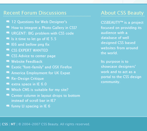
CSS Beauty presents its recent forum discussions and job openings at the bottom of the page. It’s unclear whether they belong to the footer, though.
Some designers go even further and place the whole navigation at the bottom of the page. In such cases the site is split in two parts; the upper part takes care of the content while the bottom section takes care of everything else. In such cases it’s not really reasonable to speak about footers.
A typical example is DesignShack with the whole navigation menu placed at the bottom of the site.
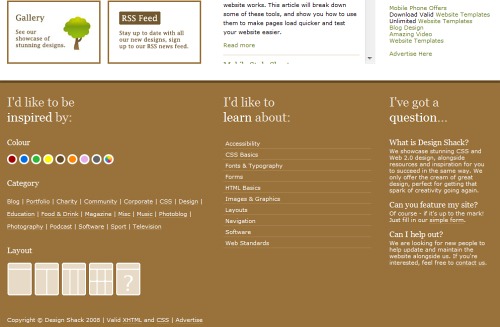
Designshack has the complete navigation, layout selection, colour selection and further information in the footer.
There is a number of possibilities: footers can contain personal illustrations, links to related sites, photos, web forms, icons, a lot of creativity. We’ve found out that quite often footers unfortunately also have SEO-spam and advertisement which don’t belong there in the first place.
1. Imitate proximity to the ground
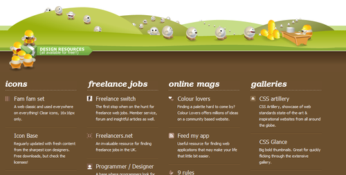
Well, that’s quite strange. But we’ve observed this trend too often to dismiss it. Many designers tend to imitate the proximity to the ground. This means that they attempt to complete layouts with illustrations of the ground — in such cases trees, birds, buildings and the horizontal perspective are usual. Funny characters, mascots, illustrations and hand-drawing are also typical for such footers.
YoDiv sends little bubbles in race.
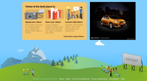
Vimeo takes a look at little humans from user’s perspective.
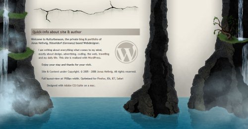
Kulturbanause.de with a waterfall and water ground. Beautiful and (really) unusual WordPress blog design.
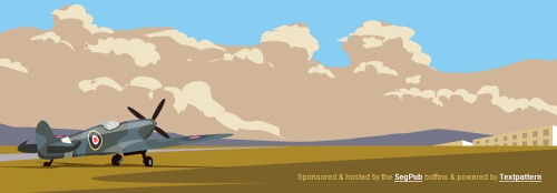
The Rissington Podcast has a helicopter plane ready to fly. Comic in use.
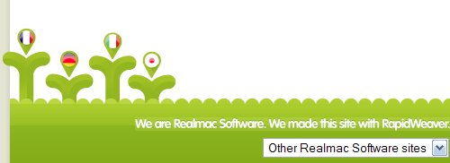
Rapidweaver has taken care of the smallest details. This sweet language selection fits perfectly to the site design.
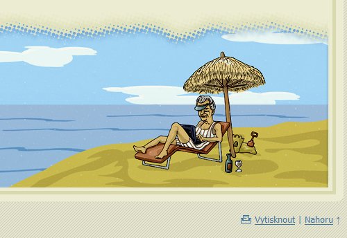
MB Dragan loves hand-drawing. We too. Simple and beautiful.

Miloslav Lešetický is an illustrator which is why one of his illustrations is placed in the footer.
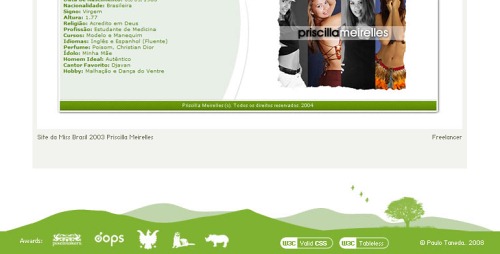
Paul Otaneda with a light green theme in the footer. Icons, a tree and three birds inclusive.
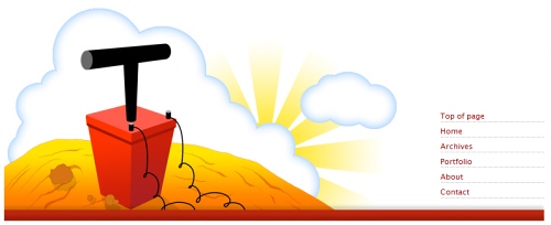
TNTPixel — oh-oh, you better be careful with this one.
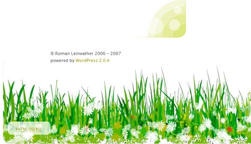
Roman Leinwather has some green flowers for us…
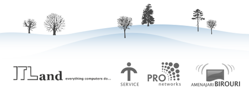
…and on Web4Biz.ro it seems to be quite cold at this period of time.
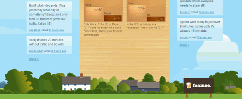
A little city on StrawPollNow.com.
2. Colors clearly separate content and footer
Since the main function of the footer is to complete the layout, often it is given a color which has a high contrast to colors dominating in the overall site design. Vivid colors can be observed as often as dark ones.
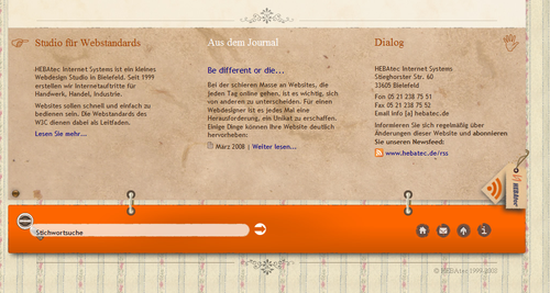
HEBAtec has a number of different features in the footer. Among them RSS feed and a search box.
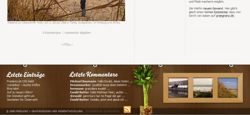
Freelenz.at knows how to arrange blog postings, comments, RSS feed icon and Flickr thumbnails. And, oh, a beautiful plant too!
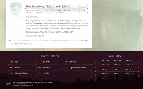
Viget.com provides navigation in categories and archives.
Blogsolid offers an icon parade in the footer.

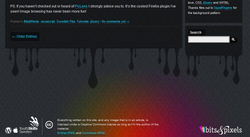
Bits and Pixels has a quite colorful footer with some icons. The design fits perfectly to the overall site design which is pretty colorful too.
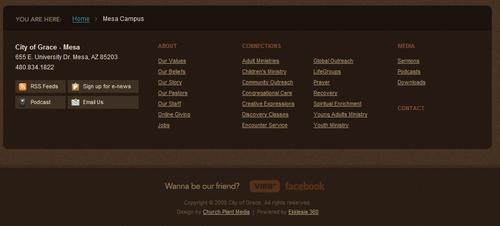
Still, often overall layout colors and the footer design are very similar. Example: City of Grace Mesa
3. Illustrations in use
Often illustrations are used to give the footer some particular meaning it needs to convey. Possibilities are endless. In most cases designers use vivid images and cartoons.
Legendary Aircraft has a toolbox in its footer.

Pil.hu with a pen, an envelope and a desk.

?ukasz Tyra?a shows some hand-drawn sketches.
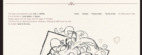
So does Bart-Jan Verhoef.

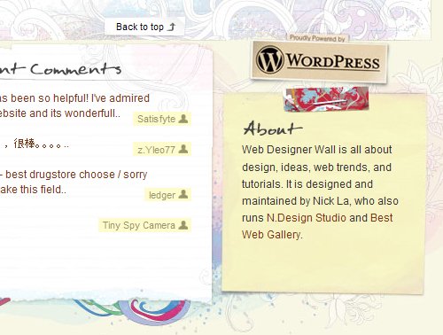
We feature Nick La’s Webdesignerwall quite often, but it definitely deserves it. The attention to details is amazing.
Us Trendy — all in one place, including RSS-feed-icon, swivels and a butterfly. Isn’t it too much?

Dandelionpath with swirls, curves and flowers.

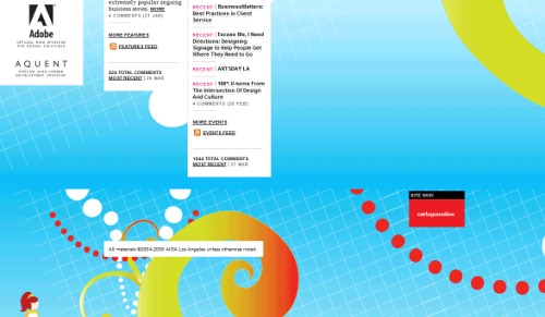
Colorful curves at the bottom of AIGA Los Angeles.
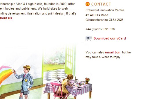
Hicksdesign with a retro-theme and brief contact details.
Codex Transportica — simple and distinctive.

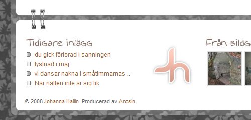
Johanna Hallin clips the footer to the site layout.
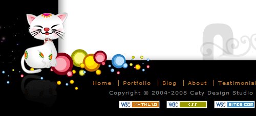
Catydesign’s cat is sweet…
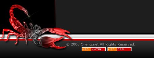
…and Olieng’s lobster scorpion is even animated!
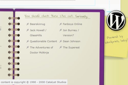
Link suggestions in Catalyst Studios sketchbook.
4. Footers with advanced functions
Apart from visual appeal, footers can be used effectively to convey some important information quickly and shortly. Contact information, address, sitemap, main sections can therefore often be found in the footer. However, also further functionalities, such as RSS-feed, email subscription and tag clouds can be placed there too.
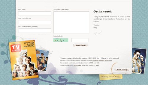
The Greg Brady Project combines a contact form and the footer.
We feature Nick La’s Webdesignerwall quite often, but it definitely deserves it. The attention to details is amazing.

Us Trendy — all in one place, including RSS-feed-icon, swivels and a butterfly. Isn’t it too much?

Dandelionpath with swirls, curves and flowers.

Colorful curves at the bottom of AIGA Los Angeles.

Hicksdesign with a retro-theme and brief contact details.

Codex Transportica — simple and distinctive.

Johanna Hallin clips the footer to the site layout.

Catydesign’s cat is sweet…

…and Olieng’s lobster scorpion is even animated!

Link suggestions in Catalyst Studios sketchbook.

4. Footers with advanced functions
Apart from visual appeal, footers can be used effectively to convey some important information quickly and shortly. Contact information, address, sitemap, main sections can therefore often be found in the footer. However, also further functionalities, such as RSS-feed, email subscription and tag clouds can be placed there too.
The Greg Brady Project combines a contact form and the footer.

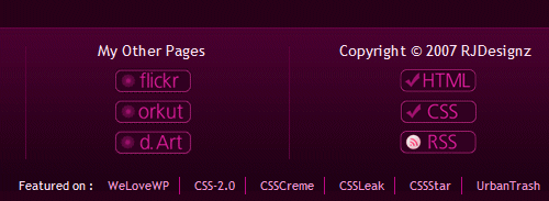
Rahul Joshi has 4 columns: one for Flickr images, one for further pages, one for copyright and one for contact details.
Lucy Blackmore has a stick-it-note which leads to the home page of the site.

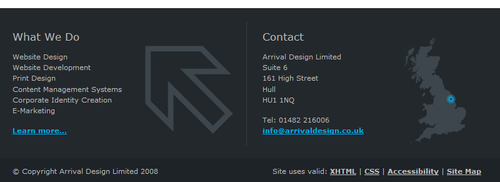
Arrival Design gets right to the point. Here is what they do. And here is how you contact them.
Media Ambassador offers e-mail newsletters…

… and so does Hopkingdesign. Not a good idea as you won’t attract many subscribers.

The same holds for the search box. Footer has a lot of place, but it’s not really helpful to place a search box only in the footer.

5. Experimental solutions
Utensils in the Surfgarden.

1ncu8u5 has a quite grungy footer.
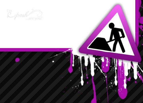
Farbspider — design agency presents people working there.

Further Reading on SmashingMag:
You may also want to take a look at the posts:
- Navigation Menus: Trends and Examples with recent trends, examples and innovative solutions for design of modern navigation menus.
- Pagination Gallery: Examples And Good Practices with good practices of pagination design as well as some examples of when and how the pagination is usually implemented.
- Tag Clouds Gallery: Examples And Good Practices presents creative examples and ideas for design of tag clouds.


 See the full picture →

 Celebrating 10 million developers

 SurveyJS: White-Label Survey Solution for Your JS App

