The Good, The Bad And The Great Examples Of Web Typography

Email Newsletter
Weekly tips on front-end & UX.
Trusted by 182,000+ folks.
 Register for Free


 Custom Web Forms for Angular, React, & Vue. Your backend.
 Celebrating 10 million developers
Choosing typefaces is an integral part of every web design project. With thousands of typefaces available from hosting services such as Typekit, as well an ever-improving collection of free fonts available, there has never been a better time to be a typography-obsessed web designer.
One could easily argue that nothing affects a design more than typography. And good typography starts with choosing an appropriate typeface. But can having too much choice be a bad thing? With more choices, we have more opportunities to make bad decisions.
In this article, we’ll review a collection of beautiful websites and analyze the impact that their designers’ typeface choices have had on the overall designs. We’ll critique both the good and the bad. Of course, type is subjective, so take any critiques with a grain of salt. Let’s dig in!
Vesper Hotel
Domaine Display, a curvy and ornate display typeface from New Zealand-based type designer Kris Sowersby, makes for a beautiful combination with Proxima Nova on Vesper Hotel’s website. Although Proxima Nova may be one of the most overused web fonts of the last few years, pairing it with something less used, such as Domaine Display, can make a design feel distinctive and fresh.
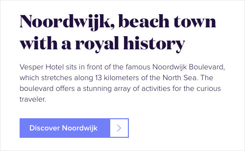
I also love when a brand is able to use a web font for its logo. It makes the developer side of my brain happy knowing that a logo can be styled with CSS, read by a screen reader and scaled up and down — all without needing an image to be loaded.
Dragone
Seeing type set against gorgeous textures like this makes me regret that “flat design” is such a prevailing trend. Dragone’s website feels like a painting, and the elegant Playfair Display is the perfect typeface for this look. The italics of Playfair Display are especially beautiful, and this website features them prominently. The classic geometric sans Futura is used as well, providing a sturdy foundation next to the flamboyant Playfair Display.
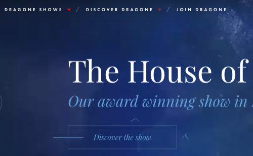
Sometimes when text is set on top of images like this, legibility suffers. However, the designers of this website have taken great care to ensure adequate contrast by darkening the photos enough to make the type stand out.
My only nitpick is the use of Playfair Display for the body copy — a high-contrast display face really isn’t meant for long passages of text. That being said, the amount of copy on this website is fairly minimal, so it doesn’t pose much of a reading hazard. Georgia is a traditional face with similar characteristics, so it could have served as a more readable body font companion to Playfair Display.
Romain Balcerak
Tiempos Text is another typeface from the prolific Kris Sowersby. It’s paired here with Sentinel, a slab serif from Hoefler & Co. Apercu, a quirky grotesque from Colophon Foundry, is thrown in the mix as well.
Using three typefaces can sometimes be a bit much, but Romain Balcerak sticks to a consistent system, which holds the design together. Tiempos Text is set in bold for headings; Sentinel is always set in italic for subheadings; and Apercu is used for body copy throughout.
Rails Assets
Adelle Sans and Whitney are two sans-serifs with somewhat similar characteristics — both are grotesques with a humanist slant. Combining two similar typefaces is definitely unorthodox. It almost feels like the designer couldn’t choose between the two and so decided to use both.
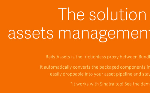
As far as typographic crimes, I would consider this one to be minor. Their use is consistent — Adelle Sans for headings and Whitney for everything else. And with typefaces as well designed as these, it’s hard for a design to look bad.
Dollar A Day
I’m going to make a not-too-controversial proclamation: Apercu is the trendiest font on the web right now. My side project Typewolf features many websites that use Apercu; in fact, it’s the third most popular font on the website, and I still come across so many websites using Apercu that don’t get featured on Typewolf. It seems like a handful of websites with this typeface pop up every day.
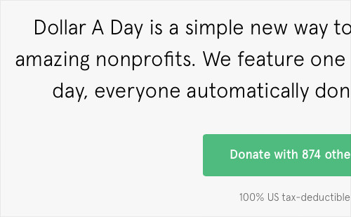
My guess is that Apercu and other similar “quirky grotesques” appeal to designers because, after years of Helvetica being used on the web, this style of typeface proudly declares “I’m not Helvetica.”
So, Dollar A Day’s website, whose design might have felt cold and sterile if set in Helvetica, instantly feels fun, lively and unique in Apercu. Of course, when every website uses the same typeface, then the freshness is lost. But right now Apercu still feels exciting.
New Venture Scouting
New Venture Scouting is a website that has so many good things going for it in the type department, but it feels like things somehow didn’t quite come together between the design and development stages.
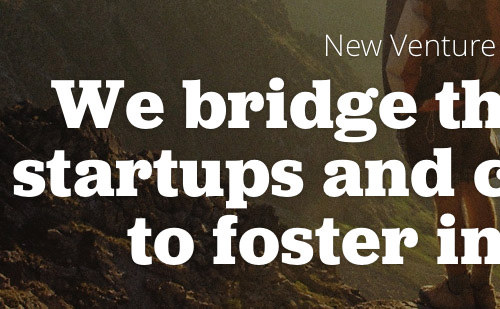
On first impression, the slab serif Jubilat looks wonderful paired with Open Sans in the prominent hero graphic. A warm and curvy slab face combined with a no-nonsense humanist face makes for some solid branding. However, on closer examination, you’ll notice that another sans-serif, Proxima Nova, is used for the navigation. And then below, Arial is used for the body copy.
If you are already importing Open Sans, then why not use it for the body copy as well? And it has a huge range of weights. Why is a separate sans-serif typeface family needed for the navigation?
The rest of the website seems to be a haphazard mix of Jubilat, Proxima Nova, Open Sans and Arial, with no clear use established for each. This kind of inconsistency usually happens when multiple designers are working on a website but aren’t on the same page. Creating a style guide early on in a project will usually prevent issues like this from occurring.
Talented designers were clearly working on this project, and the website still has a lot to be admired. But without consistency, mixing four typeface families is difficult to pull off.
United Strands
United Strands uses a single typeface, Montserrat, whose open-source font is available for free on Google Fonts. A lot of its popularity owes to its resemblance to two of the most popular commercial typefaces of the last decade, Gotham and Proxima Nova. Although it definitely has some resemblance to those two typefaces, I think it stands as its own unique design, with a distinctive character all its own.
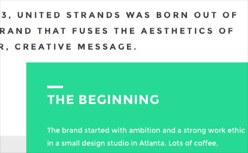
The one downside to Montserrat is that it doesn’t have an italic styles. And if you set body copy in a font without italics, you will end up with faux italics. The copy on this website is fairly minimal, though, and I noticed only a few cases where this occurs. So, while it’s not “proper” typography, it’s not very noticeable in this case. Sans-serifs usually handle faux italics better than serifs anyway.
That being said, the designers did an excellent job overall of getting the most out of a single typeface with limited styles. The text elements set in uppercase have slightly wider letter spacing than normal, which is always a nice touch; the generous white space gives the type room to breath, and the bold color creates strong contrast.
Norwegian Rain
Norwegian Rain’s website combines the classic geometric sans-serif Avenir with Freight Text. Avenir was selected as the favorite font among leading designers in a survey from earlier this year. The word “avenir” means “future” in French — type design legend Adrian Frutiger took the geometric principles behind Futura and added a warm, organic touch to create Avenir. It’s no wonder this is a favorite among those who truly appreciate typography.
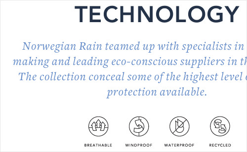
Freight Text has a distinctive italic cut that pairs very nicely with the clean lines of Avenir. In fact, only the italic style of the Freight Text family is used on this website. This not only keeps the type system consistent, but keeps page-loading times down as well.
The line height of the text in the footer feels a little tight. Other than that, this is a great website, with a lot of fine typography to appreciate.
Pelican Books
Pelican Books’ website features another extremely popular typeface among designers, Brandon Grotesque. This is actually the special text version of Brandon Grotesque, called Brandon Text. The regular version of Brandon Grotesque was designed to be more of a display face, meaning that it’s not really suited to long passages of text. Brandon Text has a higher x-height and is optimized for body copy.
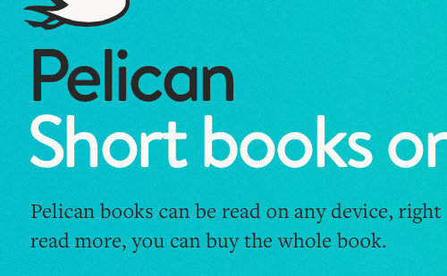
Interestingly, this website still uses Brandon Text more as a display face than for body copy, which is set in Freight Text. Brandon Text still looks great at large sizes but is not quite as charming as the original Brandon Grotesque because it’s more toned down and conservative. Freight Text is one of the most legible serifs around, so it’s an excellent choice for the long passages of text in the “Read Online” section. Combined with the subtle paper texture, the typography really makes it feel like you are reading a book.
Simply Gum
Thanks to web fonts, matching the typography on a product’s physical packaging to the typography on the manufacturer’s website is becoming increasingly common. Simply Gum chose Gotham as its brand typeface, keeping its identity consistent across online and offline channels.
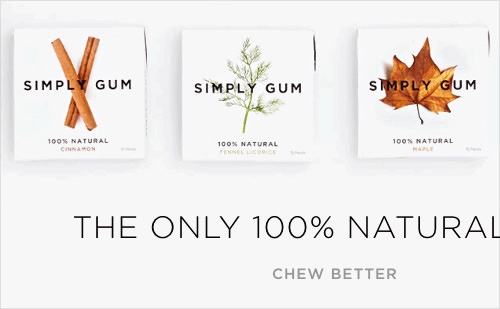
This website is also a great example of how a single typeface is all that is needed sometimes. By using the various weights of Gotham and setting headers in uppercase, Simply Gum has created a clear hierarchy with just one typeface.
The logo in the header and footer are both PNGs, so they lose the crispness and scalability of web type. Using a web font for a logo is not always feasible, especially if you need a lot of control over kerning; however, an SVG image is usually better than a PNG in this case because it can scale while retaining its crispness.
Wrapping Up
Hopefully, the examples above demonstrate just how big of an impact typeface choices can have on a design. Here are a few key takeaways:
- If you are going to use multiple typefaces, then develop a consistent type system and stick with it.
- When setting body copy, choose a typeface that comes with regular, italic, bold and bold italic styles.
- If you are going to go with a popular typeface, try pairing it with a less used typeface to make the design feel distinctive.
- Create a style guide early on in a project to ensure consistent use of type among members of your team.
- Use contrasting typefaces, rather than similar ones.
- Avoid display faces for body copy. Go with a typeface designed for the purpose.
- Don’t be afraid to use just a single typeface family. You can establish hierarchy with different weights and styles from the same family.
- If your logo allows for it, go for web type or an SVG image to ensure crispness and scalability.
Keep Up With The Latest In Web Typography
If you are as obsessed with type as I am, then head over to my side project Typewolf for even more examples of beautiful typography.
Technical note: These screenshots were taken in Safari on a Mac. Font rendering varies from browser to browser, so your results may differ.
Further Reading
- Vintage and Retro Typography Showcase
- Breathtaking Typographic Posters
- Taking A Second Look At Free Fonts
- Lessons From Swiss Style Graphic Design


