5 Principles And Ideas Of Setting Type On The Web

Email Newsletter
Weekly tips on front-end & UX.
Trusted by 182,000+ folks.
 Register for Free


 Celebrating 10 million developers
 Custom Web Forms for Angular, React, & Vue. Your backend.
There are many ways to approach Web typography in order to create effective and expressive results. Let’s take a closer look at some principles, rules and ideas for approaching Web typography decisions — you can use them as a starting point for learning how to achieve effective type setting on the Web.
1. Approach Web Typography Decisions Systematically
In web design every typographic decision needs to simultaneously accomplish a variety of results. Each headline you create should be set in text that is legible and search engine friendly, while the typeface should fit within the guidelines of the company’s brand. Furthermore, typography should fit to the graphic style of the site and meet user expectations of being able to copy and paste text. As you can see, that’s a wide array of needs for a headline to accomplish.
In some cases, this poses a problem. For instance, styling and branding guidelines may require from the designer to use specific typefaces which can’t be used online directly. So a decision needs to be made:
- deviate from the brand guidelines to maintain optimal search engine friendliness or
- use an image replacement solution which embeds the required font in an image (statically or dynamically) or
- consider using sIFR, a rich Flash-based dynamic font embedding technique which allows not only for embedding fonts into content presentation but also interacting with them (almost) as you would do with plain text.
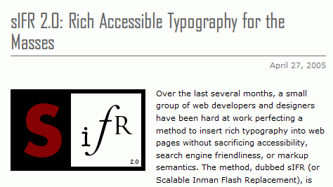
An introducing article about sIFR: sIFR 2.0: Rich Accessible Typography for the Masses
In many cases, the myriad of goals Web typography needs to serve will be conflicting with each other. With each client and for each project you need to prioritize and define which goals are more important than the others. Some clients will be more concerned with maintaining brand identity, and others will put search engine friendliness higher.
All typographic decisions function within the scope of the problem at hand. Different sites will have various needs. There isn’t always one answer for each problem. It requires careful consideration of the strengths and weaknesses that each solution poses to the various areas that web typography effects.
As part of your research and studies look at how other sites handle the same issues that come up in your work. Typography For Headlines is a collection of links and screenshots of over 100 headlines around the Web, each approaching this issue in a unique and creative way.
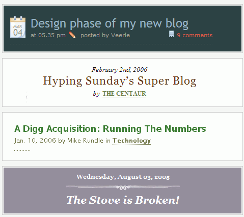
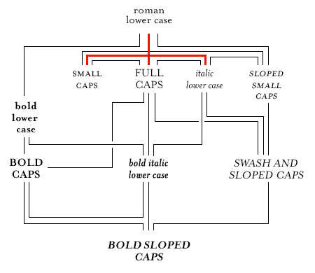
A screenshot from Christian Watson's gallery Typographfigure For Headlines.While typeface selection for headlines is a common issue that comes up in web design, using type on the Web involves more than font selection. A systematic approach can be brought to many other facets as well. We'll move on to look at this in regards to information hierarchy next.## 2\. Utilize Information Hierarchy There is more than one way to **define precedence** through the use of typography. First of all, the type size, color, weight, case, and whether the type is set normal or in italics will give the font greater or smaller importance. We also can't ignore where the type is placed within our website layout. Mark Boulton has a great 5 part series on Typography called Five Simple Steps To Better Typography. In the 5th part of this series, he discusses weight. He gives a historical perspective on how weight works with typeface in creating a hierarchical order. The article explains what text types users expect for different parts of a page. Below is a diagram of how one would hierarchically select type style based on historical perspective. Click on the image below to read Mark's description of it.
Users will react to type differently depending on where it is placed on the page. Type placed in the main body copy will have greater importance than type placed in a sidebar, with all other factors being equal. Large type in the sidebar will still call attention to itself and could move itself up in the pecking order. One needs to carefully balance type in the main body and sidebar area based on how you want the user to digest the information you present.
Consider the following screenshot from the article A Guide to Web Typography below. The image shows how type characteristics effect hierarchy. Also, notice how strongly the sidebar stands out. Although it’s clearly separate from the main content, and therefore appears to be less important, it’s hard not to be drawn to all the fonts which are presented on the black background. This design decision is effective as it makes you want to acutally click on the fonts.
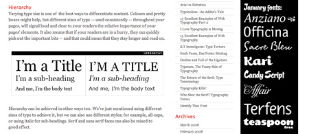
Even though those fonts are much bigger than the type set in the main body we are not confused about their function. They function as advertisements. We try to block them out as we read the article. Since the sidebar is eye-catching but passive, we experience no problems reading the article although we are subconsciously aware of the presence of the sidebar.
Placement has a large effect on how we react to the type on the Web. Emerged conventions, such as a less importance given to sidebar, helps us to focus on the main content and guide us through the visual hierarchy of the site. Conventions also help us to treat content within various page areas differently.
3. Design for Optimal Flow
Hierarchy is important in page flow as well. It helps users to recognize the most important elements of the page as they scroll down through it. There are other typographic issues to look at regarding the flow. Spacing is a big part of the flow. White space, tracking, leading, indentation, as well as the padding and margins on elements — all these elements form the flow of the page.
Nick La has written an article on Typographic Contrast and Flow. It uses the Web Designer Wall site as an example of good flow. The explanation given of flow is concise, “Space plays the most important part in maintaining flow of your design. Good use of space will tell the reader where to start, when to pause, where it ends, and what to do next.”
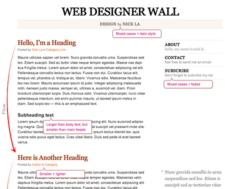
Ultimately, it’s up to the designer to create good flow. Concentrate on each element of spacing and hierarchy. Then review how they work together as a whole. Take a closer look at the image above to get an idea of how elements work together to create a good flow.
4. Maintain Legibility Within the Presence of Branding
In order for a website to stand out the visual design of the site needs to be of high quality. In some cases, this takes the form of an elaborate design. With the growing popularity of illustrative and heavily textured sites, the need to make sure that typography is optimally chosen remains particularly important. Let’s review a few sites that use grunge design and texture elements. We’ve looked at these sites before in the article The Secrets Of Grunge Design, but not in this way.
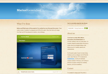
In the website Pain is Good, the company’s brand is dominating the page (see example below). Most of the text on the page has been replaced with images. This allows the designer to take advantage of brand identity fully.
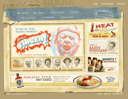
When embedded in images, fonts can be used in a variety of creative ways. The designer has strongly emphasized the brand compromising use of plain text which may hinder search engine success. Also, the top navigation is unusual. There is a low contrast in the navigation elements. It works, but could be improved.
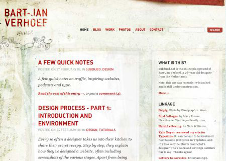
Bart-Jan Verhoef’s portfolio focuses on text rather than on visual elements. There are a few carefully selected brand and design elements converted to images, but a large percentage of the text is kept as web text. The mood of the design is created with background images, while the text remains functional. This is a way to create a grunge design while meeting user needs well. Look back at this design after reviewing the Treat Text as a User Interface section coming up, as it does an excellent job of that.
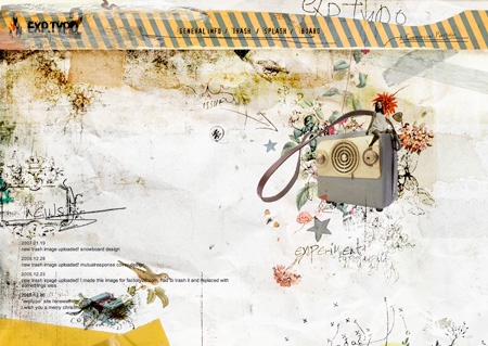
Of course, designers and artists will continue to experiment with the boundaries of legibility. The best place for extreme experiments is in personal art projects, like the site EXP Typo below. Notice how the text in the bottom left hand corner is illegible as it crosses over the old typewriter illustration.
5. Treat Text as a User Interface
Text within interfaces is extremely important. In the book Getting Real from 37 Signals (available for free), the author states how “every letter matters.” Word choice within user interfaces can make or break the functionality of the site. How those words are presented is equally important. Unstyled letterforms give no indication as to what users should interact with.
Cameron Moll mentions the concept of treating text as a user interface in his article Nine skills that separate good and great designers. There is an accompanying presentation called Essential Web Skills that was done at Webmaster Jam in Dallas Texas. In this presentation, he describes how text is a fundamental part of the user interface. He also mentions that text makes an interface more “accessible and digestible.”
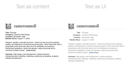
The image above is an example he uses of text being used as a user interface. On the left you’ll find an unformatted text. On the right you’ll find the text which was given a function in the user interface. Notice how the color and weight of the text differ. There is an ample spacing between paragraphs and within lines. Links are made to stand out and are easy to identify. To view the original of this before and after image you’ll need to download the presentation from Cameron’s site.
Further Web Typography Resources
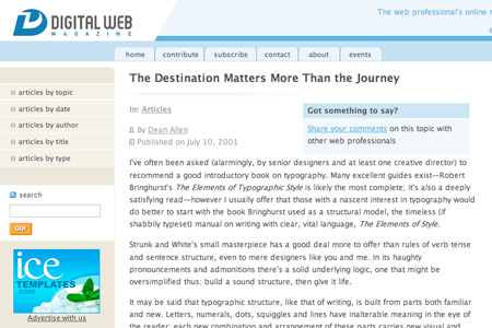
- The Destination Matters More Than the Journey
This is a classic article on web typography over on Digital Web. It reminds us of the need to help users navigate through websites by using well chosen typography, that is both fitting for the medium, and grounded in a historical understanding of how to use type. It provides plenty of practical typographic advice, while lamenting "hack designers" and University design departments that lack "classic" typographic curriculum.
- Setting Type on the Web to a Baseline Grid
This article reviews issues with aligning elements to a baseline grid with CSS and provides a solution. The solution is an attempt to take a common print based grid technique and apply it to the web. "We cfiguren apply the same principles of proportion and balance to the type within those columns by borrowing another technique from our print brethren: the baseline grid." This solution helps to control the flow of the page.
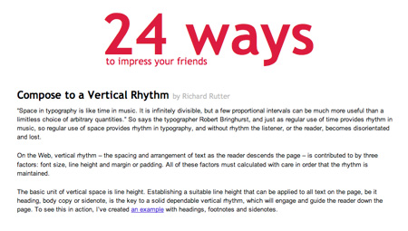
- Compose to a Vertical Rhythm
This article reviews a solution to achieving a vertical rhythm on website designs. "On the Web, vertical rhythm - the spacing and arrangement of text as the reader descends the page - is contributed to by three factors: font size, line height and margin or padding. All of these factors must calculated with care in order that the rhythm is maintained."
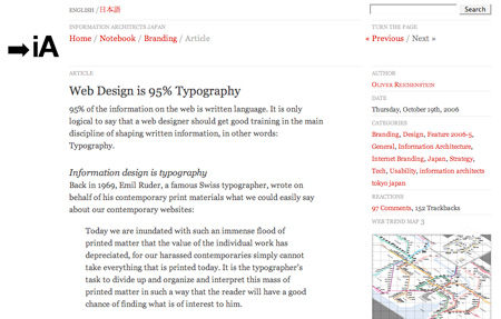
- Web Design is 95% Typography
This is a passionate article on web typography. It makes some bold statements about how important web typography is and created a heated debate. The follow up article to this post is 95% Typography? Reactions, in which the author reviews the issues brought up in the debate.
- 9 Essential Principles for Good Web Design
Web design can be deceptively difficult. How to combine usability with visual coherence, effective design and excellent technical performance? Collis Ta’eed explores 9 essential principles for good web design. Among the principles precedence, spacing, navigation, usability, alignment, clarity and consistency are discussed.
- Typetester
This website allows you to compare commonly available website fonts.
Conclusion
Both brand elements and creative design elements should enhance the user experience, and not prevent it. Good web typography improves user experience. It improves communication, flow, and interactivity. Consider how your brand, typography, and design elements combine to form an interface for your users to move through.


