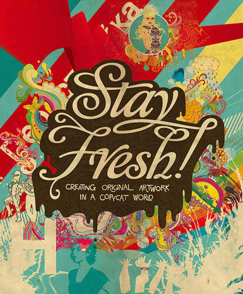
Sexy, Bold And Experimental Typography

Email Newsletter
Weekly tips on front-end & UX.
Trusted by 182,000+ folks.
 Register for Free
 Celebrating 10 million developers


 Custom Web Forms for Angular, React, & Vue. Your backend.
Sometimes typography is all you need to communicate your ideas effectively. Graphics can support the type or type can support the graphics, but to deliver the message precisely, you need to make sure your type is strong enough, your design is distinctive enough and the composition is strong enough. The results are sometimes crazy, sometimes artsy, sometimes beautiful, but often just different from things we’re used to. Thus, designers explore new horizons, and we explore new viewing perspectives which are what inspiration is all about.
This post showcases over 70 examples of sexy, bold and experimental typography. Some examples are typographic posters, some are typographic illustrations, and some are just sketches with type. In any case, you will hopefully find some inspiration for your future works.
Feel free to check out our previous typography-related posts:
- The Good, The Bad And The Great Examples Of Web Typography
- Breathtaking Typographic Posters
- The Showcase of BIG Typography
So what can be achieved out of simple letters and symbols? Please be patient, some screenshots are huge.
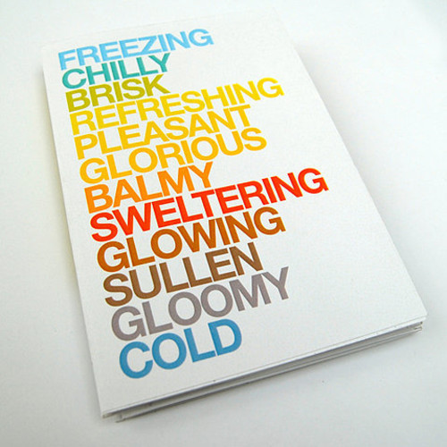
Sweet and Cute Type
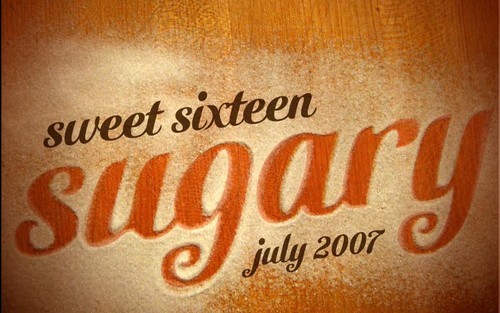
Sweet Sixteen
Typography with a sweet taste of sugar. A nice composition, an excellent execution. Sometimes not that much is needed to make the type look tasty. The typeface used below is Cutiful.
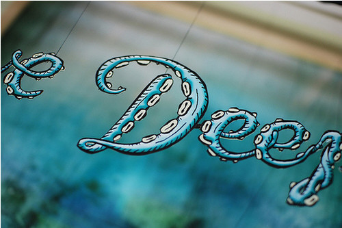
Dive Deep
Hand lettering by Ray Fenwick, cutting out by Dan Mogford.
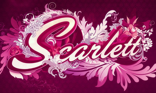
Scarlett
An illustration created by Nik Ainley. Notice how well every single letter (e.g. “l” and “s”) fits in the composition.
Newstand Cover for Computer Arts issue 139
Alejandro Paul’s Affair typography from Argentina: typography dominates in the composition, the swirly headline is just breathtaking.
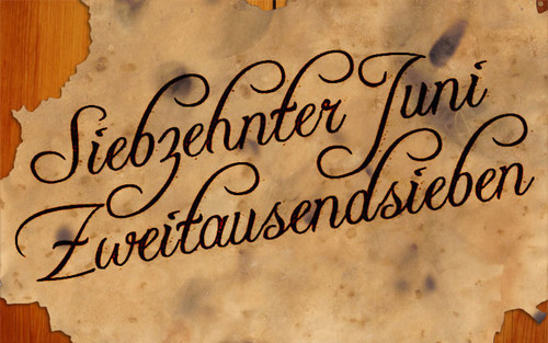
17.06.2007
Created by Michael van Laar using Freebooter Script.
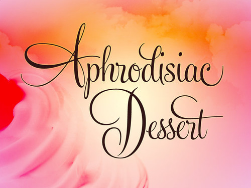
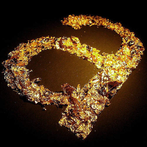
Aphrodisiac Dessert
Dessert type for a dessert announcement.
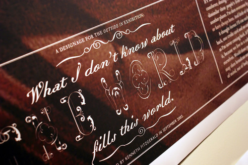
FitzGerald Album (Extended Play)
Nothing can beat old-style-typography. Nothing.
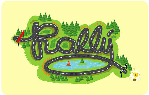
Rally
Apparently, typography can be used for a number of purposes. Typographical Motorsports: simple yet interesting.
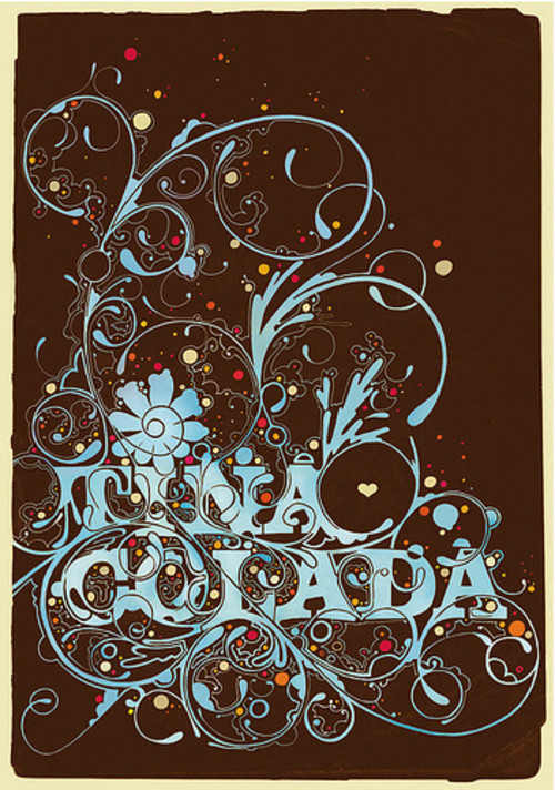
Tina Colada
It is worth a discussion if “overlettering” actually helps to deliver a message, but the type looks nicely. And the choice of colors is impressive.
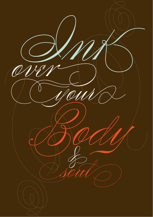
More ink is coming
Impressive lettering by Ale Paul.
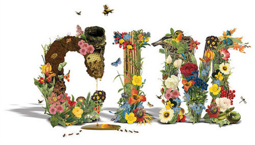
cim_organic
Sunny, flourish motif for a fresh typographic composition. Designed by Ryan Katrina.
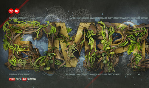
Empire
The attention to detail is remarkable. Designed by Theo Aartsma.
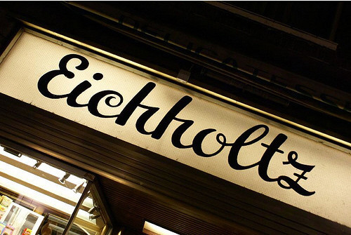
Eichholtz
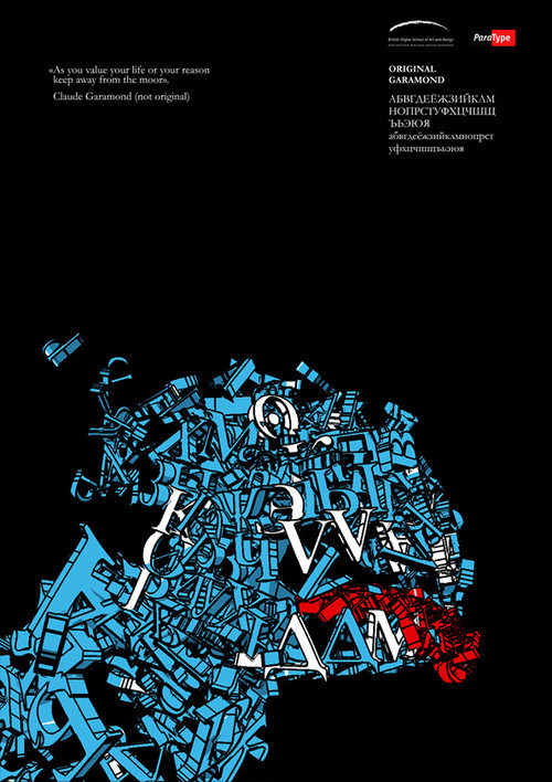
Arabic Typography

Elegant and Sexy Type
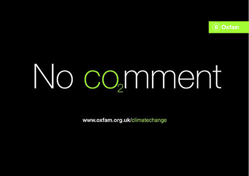
Climate Change ‘Co2’ ideas
Simple idea which uses only the power of typography. Impressive posters do not need to be colorful.
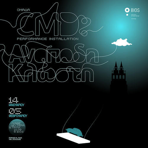
Αnapodi Klosti Poster
Poster for a experimental performance installation. The main lettering is based on PF Beau Sans. Unusual: thin font transform into a thin thread.
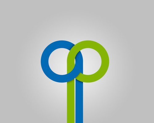
qp logo
In this logo “q” and “p” belong together. Nice concept, nice colors.
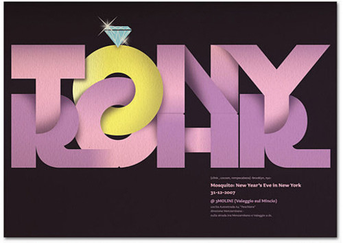
Tony Rohr
Similar idea as in the previous one, but a different execution.
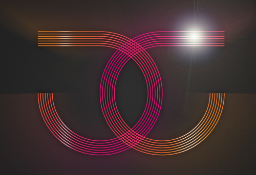
JG3!
Slick and sexy, colorful and strong. Notice how beautifully both letters intersect in the middle of the image.
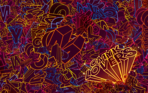
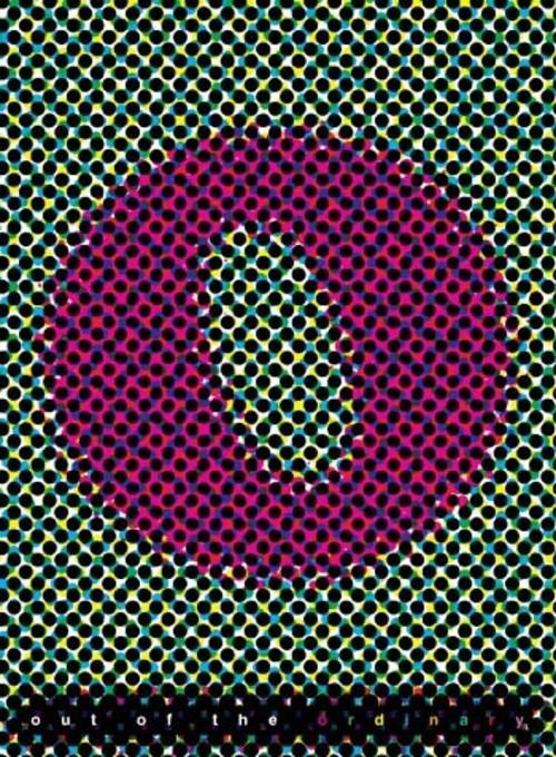
CMYK Lovers
Well, that’s A LOT of letters. Vibrant colors meet 3D-typography. Available as a desktop wallpaper. Designed by Guilherme Marconi.
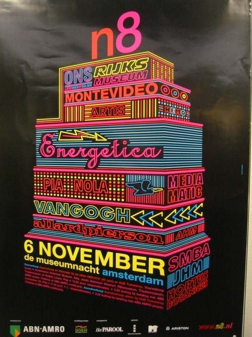
Poster in the city of Amsterdam
Dutch graphic design at its best. Interesting typographic construction which captures attention by its structure and attracts by its vibrant colors.
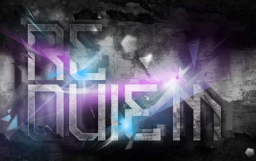
Requiem
Strong, dirty and grungy typography is also possible. Craig Shields manages to get impressive results combining grunge and type.
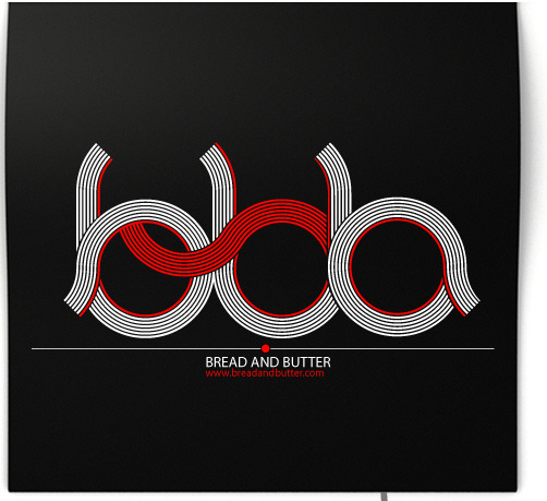
BBB
Designed by Stefan Lucut. The loog looks very modern and powerful, however, at the first glance it is not clear what the red thread stands for. Nevertheless, very original composition.
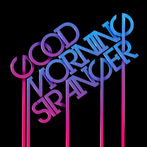
Strong and Bold Type
Typography
Nicolas Alexander combines typography and retro. Notice how elegant the line starting in the letter “G” goes through “R”.
2008 Calendar
Expressing feelings via colors and type. A very clean and beautiful design by Jonathan Davies.
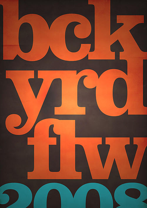
Bckyrdflw Promo
Well, this one is hard to overlook. Andrew Dyjak’s poster can be read without vocals vowels. Lovely colors, cropping and, of course, type.
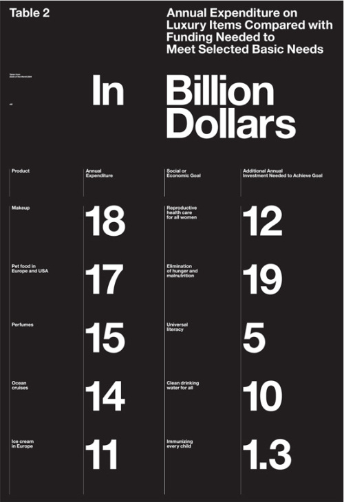
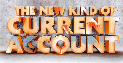
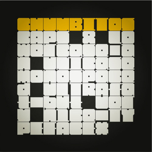
Statistics Table
Strong, bold and extremely expressive. And it is just a table!
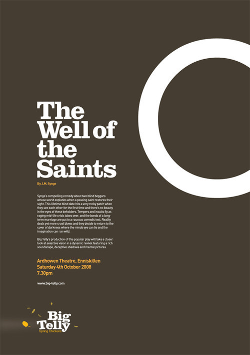
The Well of the Saints A1 poster
A1 Graphic poster produced by John McDermott. Simple, strong and sexy. Sometimes two colors and a bold typeface are enough.
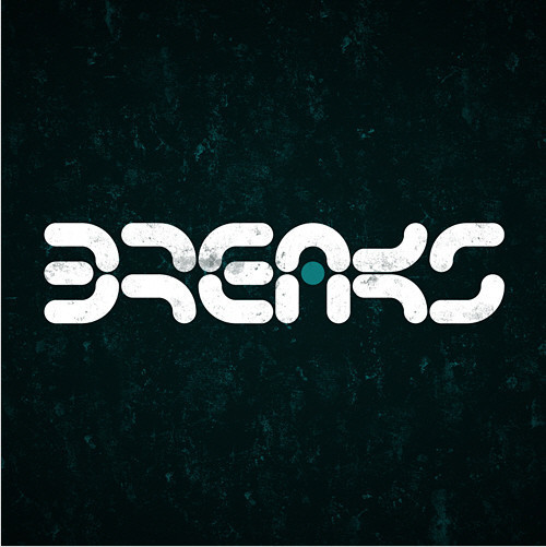
Breaks logo
A distinctive treatmeant of letters which perfectly fits to the message a poster wants to convey. Designed by Zoltan Szalay.
Nik Ainley
Nik Ainley strikes again. Lovely typographic work where letters don’t just convey the message, but are also functional: their form suggests the second message which is transported with the artwork.
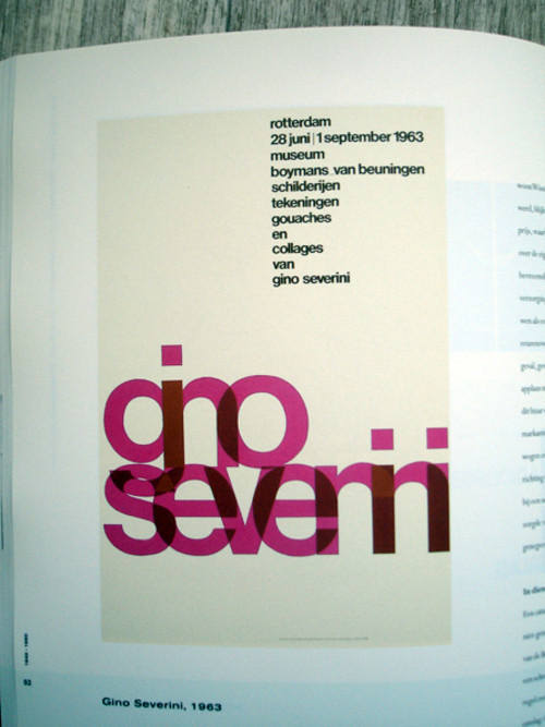
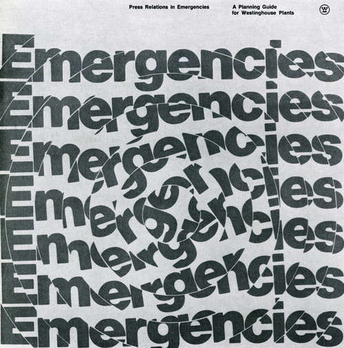
Benno Wissing
Dutch Typography by Benno Wissing. It looks very modern, but it was created in 1963.
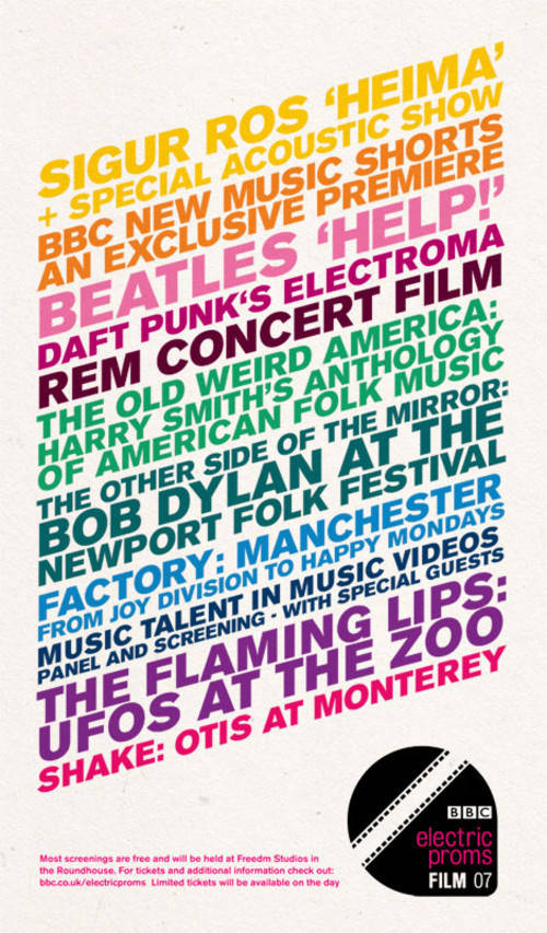
Film Poster
Colorful and distinctive. Each color stands for a different movie which participated in the festival.
Experiments with type
A2
Crumpler - ABC
American Graphic Design
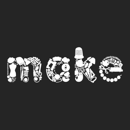
The Make Lounge
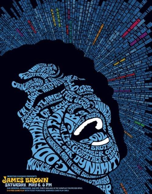
Moctezuma: James Brown
Dog Type
Sometimes typography is used to deliver a message in a quite, well, unusual way.
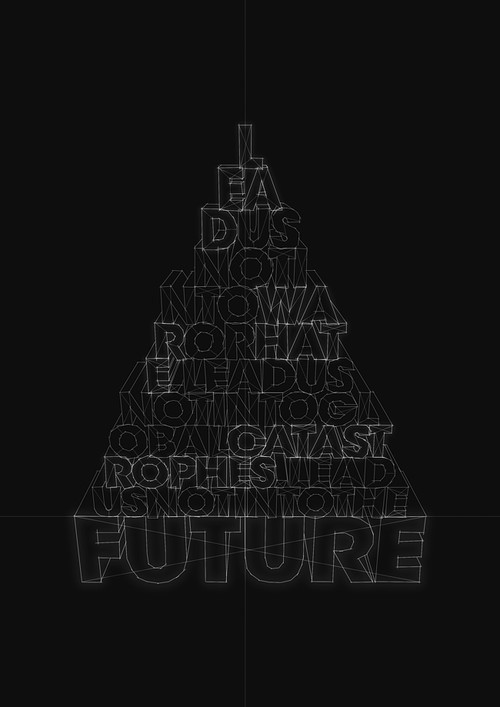
Lead Us Not Into The Future
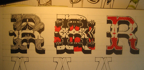
»R« letter sketches
Blik x Drez
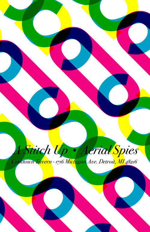
A Stitch Up - Corktown Tavern - Base
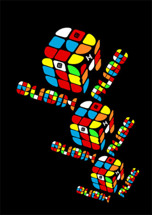
Cubix Rube
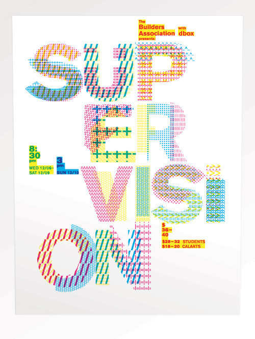
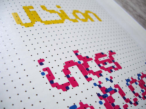
supervision
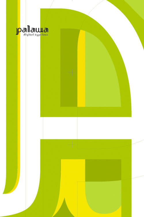
Palawa Poster
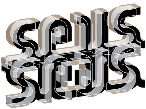
seis [cartel]
![Beauty of Typography - seis [cartel]](https://archive.smashing.media/assets/344dbf88-fdf9-42bb-adb4-46f01eedd629/e73e375a-3f9e-4fc9-8e0f-5fec28cb2621/026.jpg)
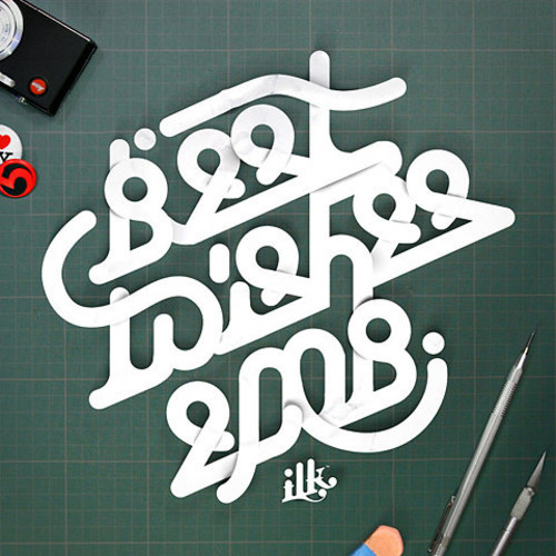
Wishes
Unusual type treatment which makes the wishes quite distinctive from the “usual” crowd.
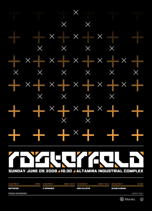
Rasterfeld Event Poster
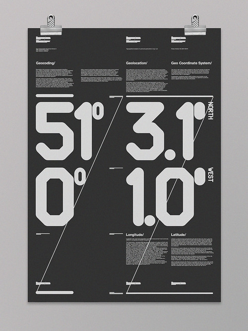
Personal Geocode
Cubix Rube Soft

font_code
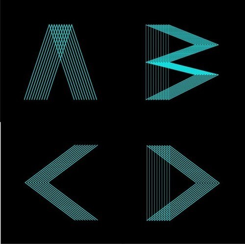
Experimenting with s
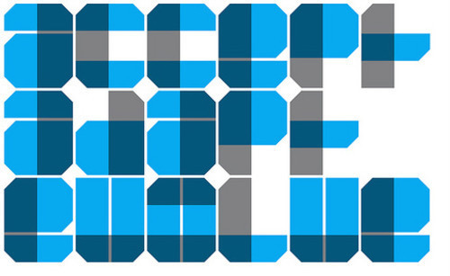
accept | adapt | evolve
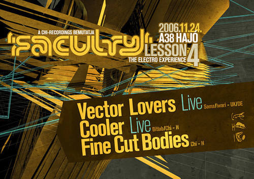
fac04_flyer_a
Doblette - Taller Tipografia (uy)
Bold type
These letters are really hard to read. Is it the purpose of typography? Well, it’s definitely an experiment. Cute, fat and bold type in use.
Extraverage x The KDU
Pattern is used to create letters.

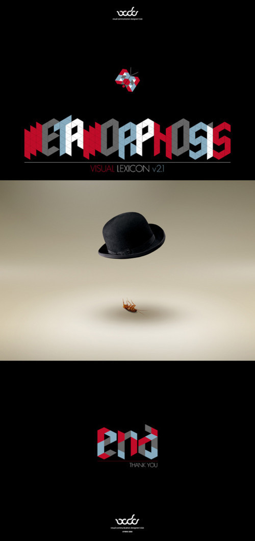
Visual Lexicon v 2.1 Metamorphosis
Type Area
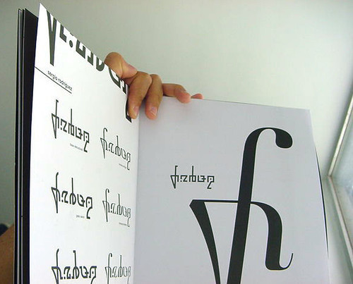
Wim Crouwel: New Alphabet book
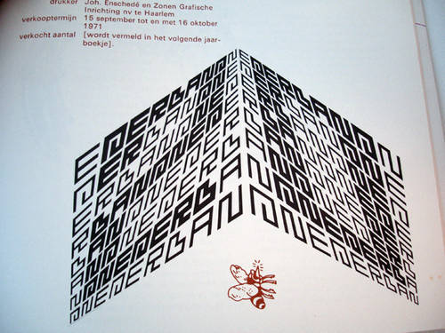
Nederlandse Postzegels 1971
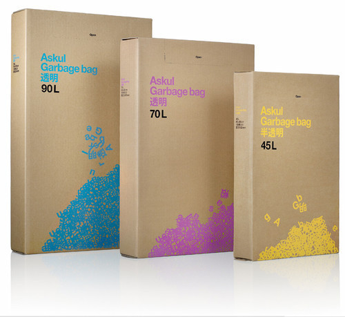
Askul
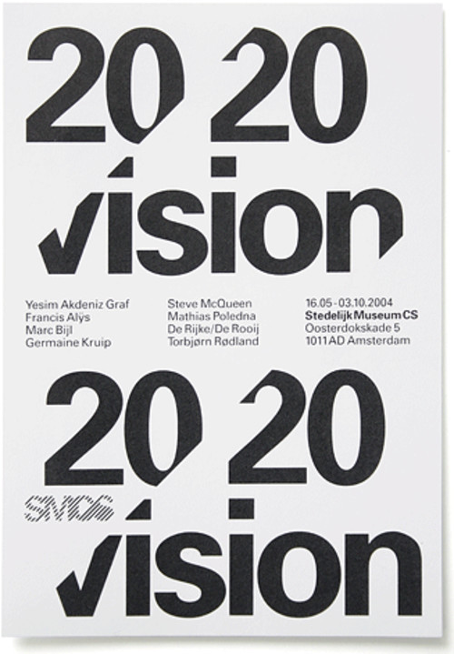
Experimental Jetset: SMCS Invitations
Triple O’s
Sometimes type doesn’t look like type at all.
TypeNeu
88. Geometric Type
This type is quite freaky. Dutch Graphic Design.
89. YOLO
A (really) striking poster designed by Martin Fewell from Manchester, UK.
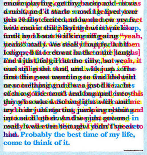
100. Best time of my life
Disturbing yet powerful. This poster delivers the message effectively.
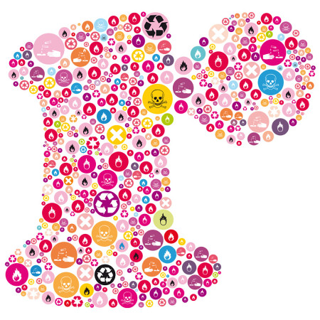
Recycle
Usually typography is used as a foundation for symbols. In this artwork it is the other way around. The yellow circle in the middle of the composition may be too striking, but it may be the designer’s intention. Designed by Satoboy.
Chaumont, festival international de l’affiche, version longue - Etienne Mineur archives
Last Click
Designed with the sole intention of not over complicating the design. Designed by Richard Shed.
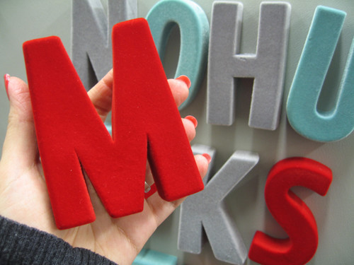
Holding type
These flocked magnets looks pretty sweet.
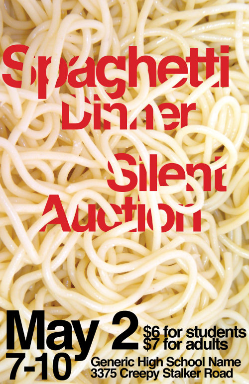
Spaghetti Dinner Poster
Beautiful integration of type into a photo.
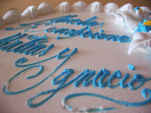
Matias Ignacio en crema
Ok, now it’s time for a coffee break.