Typography Guidelines And References

Email Newsletter
Weekly tips on front-end & UX.
Trusted by 182,000+ folks.
 Register for Free
 Custom Web Forms for Angular, React, & Vue. Your backend.


 Celebrating 10 million developers
Here are carefully selected articles about typography and type design that have been published in Smashing Magazine over all the years.
Quick Overview
- Respect Thy Typography
- The Perfect Paragraph
- When Typography Speaks Louder Than Words
- Why Subtle Typographic Choices Make All The Difference
- Weird And Wonderful, Yet Still Illegible
- The Beauty Of Typography: Writing Systems And Calligraphy Of The World
- The Beauty Of Typography: Writing Systems And Calligraphy, Part 2
- Japanese, A Beautifully Complex Writing System
- The Font Wars: A Story On Rivalry Between Type Foundries
- Mind Your En And Em Dashes: Typographic Etiquette
“What Font Should I Use?”: Five Principles for Choosing and Using Typefaces
Drop Caps: Historical Use And Current Best Practices With CSS
Respect Thy Typography
Good typography shouldn’t have to rely on ornamental crutches to stand tall. Yet despite all the tools and knowledge available to us, we readily embrace a flourishing, decorative typography, with cheap tricks used in a misguided attempt to make it “pop”. This ancient art may rapidly be gaining popularity, but are we paying it the respect it deserves?

Lovely examples of modern typographic icons.
Take a snapshot of the visual culture that surrounds you—magazines, movie posters, packaging, websites—how much of it relies on typography? How much of the typography around you is actually well considered? Chances are you’ll find a handful of beautifully crafted typographical designs competing with an avalanche of visually “rich”, image-heavy creations. Typography is then relegated to the role of “necessary evil” in order to display text, or ill-considered typographic pieces, where the meaning of MS WordArt has been interpreted a smidgen too literally… Why?
The Perfect Paragraph
In this article, I’d like to reacquaint you with the humble workhorse of communication that is the paragraph. Paragraphs are everywhere. In fact, at the high risk of stating the obvious, you are reading one now. Despite their ubiquity, we frequently neglect their presentation. This is a mistake. Here, we’ll refer to some time-honored typesetting conventions, with an emphasis on readability, and offer guidance on adapting them effectively for devices and screens. We’ll see that the ability to embed fonts with @font-face is not by itself a solution to all of our typographic challenges.
When Typography Speaks Louder Than Words
Clever graphic designers love to use typography to explore the interaction between the look of type and what type actually says. In communicating a message, a balance has to be achieved between the visual and the verbal aspects of a design.
Sometimes, however, designers explore the visual aspect of type to a much greater extent than the verbal. In these cases, the visual language does all the talking. This article explores when the visual elements of typography speak louder than words.

Cal Swan, author of Language and Typography, makes this point well when he says, “These two distinct areas often come together in practice as there is clearly a very strong relationship between the conception of the words as a message and their transmission in visible form.”
In this first of a two-part series, we will look at the powerful effect that typography has in taking control of meaning. We will discuss a range of examples, from verbal language that inspires and shapes visual treatment to visual language that dominates verbal meaning. The implications of typographic choices in meaning and interpretation will also be examined. And we will show how the same message can be presented in a number of ways to convey and encourage a diversity of responses.
Why Subtle Typographic Choices Make All The Difference
A strong understanding of how designers control meaning is essential for anyone interested in graphic design or typography. In a previous article, we discussed how sophisticated and complex visual and verbal language can get, examining instances that show how type can be used to effectively take control of meaning.

In this article, we’ll look at the reasons why subtle typographic changes can create considerable effect. We’ll refer to one or two linguistic and semiotic examples, as well as design case studies, to get to grips with why subtle changes can make all the difference.
Weird And Wonderful, Yet Still Illegible
The paradigm shift—wrought by the personal computer, Postscript and desktop publishing—should have had a massive impact on the shapes of our typographic characters, just as the advances of the World Wide Web further changed the way we viewed words (even though letterforms change at the pace of the most conservative reader). Thus, radical innovations like Kurt Schwitters’ Systemschrift, (a phoenetic alphabet from 1927), are doomed to fail.
Our writing, which is derived from either Roman or Gothic forms (and sometimes both), is historic and non-systematic, said Schwitters. His “optophoenetic” approach was to make the shapes of the letters more accurately reflect how they sounded. But in order for it to work, massive re-education would be required.
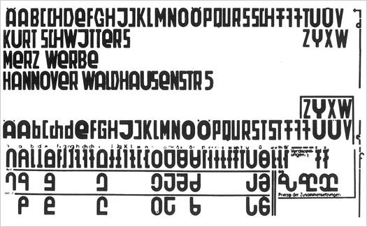
Kurt Schwitters’ “Systemschrift”, an attempt at developing a phoenetic alphabet.
Licko was paraphrasing Sir Cyril Burt who wrote, “almost everyone reads most easily matter set up in the style and size to which he has become habituated.” (A Psychological Study of Typography, Cambridge, 1959, p. 18). So we do not necessarily respond to “beautiful” type. You may find Centaur elegant, but others will find the spiky serifs distracting. For this reason, rather dull typefaces (like Times Roman), come to dominate our graphic landscape. My purpose here is to examine some failed attempts at creating economy, or furthering the cause of legibility.
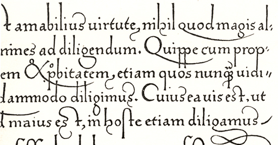
The Beauty Of Typography: Writing Systems And Calligraphy Of The World
The beauty of typography has no borders. While most of us work with the familiar Latin alphabet, international projects usually require quite extensive knowledge about less familiar writing systems from around the world. The aesthetics and structure of such designs can be strongly related to the shape and legibility of the letterforms, so learning about international writing systems will certainly help you create more attractive and engaging Web designs.
Pick any language you like: Arabic, Chinese, Japanese, maybe Nepali? Each is based on a different writing system, which makes it interesting to figure out how they work. Today, we'll cover five categories of writing systems. This may sound tedious and academic, but it's not. If you take the time to understand them, you'll find that they all give us something special. We've tried to present at least one special feature of each language from which you can draw inspiration and apply to your own typography work. We'll cover: East Asian writing systems, Arabic and Indic scripts (Brahmic). If you are interested, we will cover Cyrillic, Hebrew and other writing systems in the next post.
The Beauty Of Typography: Writing Systems And Calligraphy, Part 2
The beauty of writing systems is that each has something unique from which to draw inspiration. Two weeks ago, in the first part of this article, we covered Arabic and East-Asian languages (Chinese, Japanese, Korean and Vietnamese) and a few Indic scripts (Devanagari, Thai and Tibetan).
We are now back for the second (and last) part, which is a bit different but just as interesting. You will see that some features of the languages presented here clearly correspond to our Latin-based system, while others are unfamiliar. The point of this second part is to complete our look at writing systems of the world and to think more generally about what they signify. We'll cover Hebrew, Modern European scripts, Mongolian, Inuktitut and International Phonetic Alphabet.
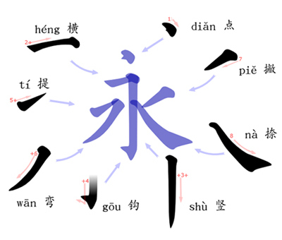
Japanese, A Beautifully Complex Writing System
As a Japanese person living in Europe, I’m sometimes asked: “Japanese is a difficult language, isn’t it?” Those asking are often surprised when my answer is a simple: “No, actually, it’s not.”
While it is true (at least to many Westerners) that Japanese is an exotic language, when compared to learning other European languages, it may seem harder because it has no relation to their own language. But from my own experiences of learning English and German (and also from seeing some European friends learning Japanese), I can say with confidence that learning spoken Japanese is, in fact, not so difficult. The grammar is in many ways simpler than most European languages. Take for example the fact that we don’t have cases, grammatical genders, nor articles. However, reading and writing in Japanese is… well, not so simple.
While discussing typography we most often focus on English language problems, which is only natural considering that the majority of design material is written in English. However, a lot can be gleamed by looking at how other languages are used as part of communication and design — it helps to lend context and a different point of view.
The Font Wars: A Story On Rivalry Between Type Foundries
I had thought terms like “intellectual property” and “intellectual theft” were of fairly recent provenance, so my eye was caught by the latter’s use in a headline of a 1930 edition of the US trade journal The American Printer.
The article it headed proved to be equally intriguing, a response by the president of American Type Founders (ATF) to a June 1929 article in the German journal Gebrauchsgraphik by the designer Rudolf Koch, calling the ATF a “highway robber of German intellectual property.” At issue was a typeface marketed by the ATF earlier in 1929 called Rivoli.
Mind Your En And Em Dashes: Typographic Etiquette
An understanding of typographic etiquette separates the master designers from the novices. A well-trained designer can tell within moments of viewing a design whether its creator knows how to work with typography. Typographic details aren’t just inside jokes among designers. They have been built up from thousands of years of written language, and applying them holds in place long-established principles that enable typography to communicate with efficiency and beauty.
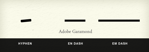
Handling these typographic details on the Web brings new challenges and restrictions that need to be considered. Below are a few rules of thumb that will have you using typography more lucidly than ever before.
Typographic Design Patterns and Best Practices
Even with a relatively limited set of options in CSS, typography can vary tremendously using pure CSS syntax. Serif or sans-serif? Large or small font? Line height, spacing, font size and padding... The list goes on and on.
To find typographic design patterns that are common in modern Web design and to resolve some common typographic issues, we conducted extensive research on 50 popular websites on which typography matters more than usual (or at least should matter more than usual). We've chosen popular newspapers, magazines and blogs as well as various typography-related websites.
We've carefully analyzed their typography and style sheets and searched for similarities and differences. We have also put together a spreadsheet of the study that displays the websites' various values (for example, the ratio between the line height and line length).
The Right Type: 5 Inspiring Typography Tales
Nowadays, typefaces are a dime a dozen; there's certainly no shortage of free fonts. But as in any artistic field, the standouts are rare, and understanding why they excel takes gradual experience.
In this yarn, we'll take a closer look at inspiring stories behind the design of typefaces that you may have seen or used but didn't know the history of. We'll explore the nooks and crannies — both literal and figurative — of the evolving printed word. By the end, we hope you come away with a better appreciation of how things came to be.
Read more...
How to Choose a Typeface
Choosing a typeface can be tricky. The beauty and complexity of type, combined with an inexhaustible supply of options to evaluate, can make your head spin. But don't be baffled — and don't despair. While there are no easy-to-follow rules on how best to choose a typeface, there are many tried-and-true principles you can quickly learn and apply to make an appropriate typeface choice. If you work systematically through the options below, you'll have a winning typeface choice in no time. Let's get started.
The first thing you have to do in order to choose a typeface is form a strong impression in your mind about how you want your audience to react to the text. This is your goal, and it will guide the process. You might provide this impression, or it might be dictated to you by your client, or it may be determined by your audience.
“What Font Should I Use?”: Five Principles for Choosing and Using Typefaces
For many beginners, the task of picking fonts is a mystifying process. There seem to be endless choices — from normal, conventional-looking fonts to novelty candy cane fonts and bunny fonts — with no way of understanding the options, only never-ending lists of categories and recommendations. Selecting the right typeface is a mixture of firm rules and loose intuition, and takes years of experience to develop a feeling for. Here are five guidelines for picking and using fonts that I’ve developed in the course of using and teaching typography.
Many of my beginning students go about picking a font as though they were searching for new music to listen to: they assess the personality of each face and look for something unique and distinctive that expresses their particular aesthetic taste, perspective and personal history. This approach is problematic, because it places too much importance on individuality.
How To Choose The Right Face For A Beautiful Body
What is it that makes a typeface into a text font, instead of a font for larger sizes? The answer differs slightly, depending on whether one aims for print or Web-based environments.
Nevertheless, there are certain features that most good text faces have in common. Familiarity with these helps to select the right fonts for a given project. This article presents a few criteria to help the process along.
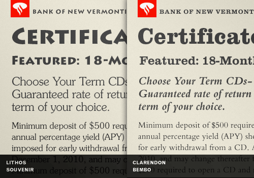
Best Practices of Combining Typefaces
Creating great typeface combinations is an art, not a science. Indeed, the beauty of typography has no borders. While there are no absolute rules to follow, it is crucial that you understand and apply some best practices when combining fonts in a design. When used with diligence and attention, these principles will always yield suitable results. Today we will take a close look at some the best practices for combining typefaces — as well as some blunders to avoid.
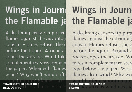
By far the most popular principle for creating typeface combinations is to pair a sans serif header typeface with a serif body typeface. This is a classic combination, and it's almost impossible to get wrong.
In the examples above — a typical article layout — we have Trade Gothic Bold No.2 paired with Bell Gothic on the left side. They are both sans serif typefaces. However, they have very different personalities. A good rule of thumb, when it comes to header and body copy design problems, is not to create undue attention to the personality of each font. Trade Gothic is arguably a no-nonsense typeface. Bell Gothic, on the other hand, is much more dynamic and outspoken.
16 Pixels for Body Copy. Anything Less is a Costly Mistake
I know what you’re thinking. “Did he just say 16 pixels? For body copy? Obnoxiously big! 12 pixels is ideal for most websites.”
I’d like to persuade you otherwise.
As usability expert Oliver Reichenstein says in “The 100% Easy-2-Read Standard”:
[16 pixels] is not big. It’s the text size browsers display by default. It’s the text size browsers were intended to display… It looks big at first, but once you use it you quickly realize why all browser makers chose this as the default text size.
In this article, I’ll explain why 16 pixels should generally be the minimum size for body copy in modern Web design. If I don’t change your mind, perhaps you could chip in at the end and let me know why.
You see, in most cases, if you’re building websites with the font size set between 10 and 15 pixels, you are costing your clients money. And I aim to prove it.
The @Font-Face Rule And Useful Web Font Tricks
The possibility of embedding any font you like into websites via @font-face is an additional stylistic device which promises to abolish the monotony of the usual system fonts. It surely would be all too easy if there was only one Web font format out there. Instead, there's quite a variety, as you will get to know in this article.
This quick introduction to @font-face will lead you towards a guide through the @font-face kit generator. If you want to make Web use of your already licensed desktop fonts, read up on how to embed them from your own server. Topped up with some helpful tips, tricks and workarounds, this article will hopefully provide some useful insights.
Review of Popular Web Font Embedding Services
Even though @font-face was introduced in the CSS2 spec in 1998, it wasn't until this past year that all in-use web browsers added support for it. This year we're seeing a wave of web font services being marketed, and this could have a profound impact on web typography.
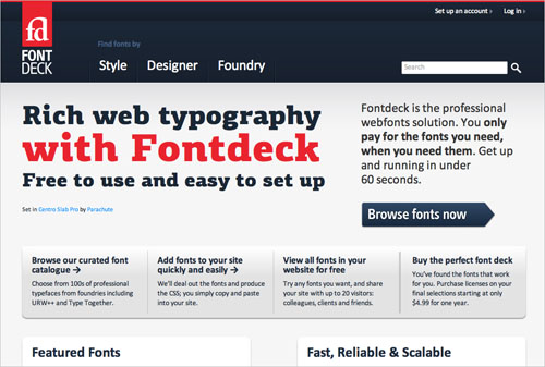
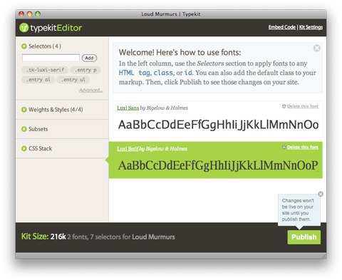
Web font services, like Typekit and now the Google Font API, have captured a lot of attention. But in the past 3 months there's been an explosion of new services; services like Fonts Live, Fontdeck, Webtype and others with conjugated names involving "Font" or "Type".
While all of these services are unique, they each provide a tool for web designers and developers to legally display professional fonts on their website. The guide below compares 10 of these services, breaking down the pros and cons of each. We hope this comparison will help you make a more informed decision on which service to use when you venture into the ever-growing, sometimes confusing, world of web fonts.
Drop Caps: Historical Use And Current Best Practices With CSS
The practice of using a large letter to mark the start of a text has been around for almost two thousand years. Illustrated caps increased usability by marking important passages and guiding readers through the text. Unlike their historic counterparts, drop caps on the Web don’t add value in terms of usability or readability—and they are hard for Web developers to control, often rendering differently across browsers.

Yet, front-end designers and clients often want to use drop caps as decorative elements. How should we implement them? Just as scribes, artisans, and early printers had a variety of methods for creating initial capitals, we Web designers have multiple methods to choose from. We can use an image of a letter, create a class to enlarge and place a letter, or use a first-child:first-letter to enlarge and place the first letter of the first paragraph. But which method should we use? Which method remains consistent across browsers? Which is most accessible?
A Closer Look At Font Rendering
The Web font revolution that started around two years ago has brought up a topic that many of us had merrily ignored for many years: font rendering. The newfound freedom Web fonts are giving us brings along new challenges. Choosing and using a font is not merely a stylistic issue, and it’s worth having a look at how the technology comes into play.

This article presents the mechanisms of type rendering, how they were developed, and how and why they are applied by the various operating systems and browsers—so that when it comes time to choose a font for your next project, you know what to look out for to ensure the quality of the typography is consistently high.
Applying Macrotypography For A More Readable Web Page
Any application of typography can be divided into two arenas: micro and macro. Understanding the difference between the two is especially useful when crafting a reading experience, because it allows the designer to know when to focus on legibility and when to focus on readability.

This article focuses mostly on a few simple macrotypographic techniques—with a dash of micro—and on how to combine them all to build a more harmonious, adaptable and, most importantly, readable Web page.
50 Helpful Typography Tools And Resources
We love beautiful typography, and we appreciate the efforts of designers who come up with great typographic techniques and tools or who just share their knowledge with fellow designers. We are always looking for such resources. We compile them, carefully select the best ones and then prepare them for our round-ups. And now it's time to present a beautiful fresh dose of typography-related resources.
To help you improve the typography in your designs, we're presenting here useful new articles, tools and resources related to typography. You will learn the fundamentals of typography, find out how to combine fonts and know what to keep in mind when choosing a typeface. We also present typography-related slideshows, glossaries, layouts and experiments.
Web Typography: Educational Resources, Tools and Techniques
Web typography has evolved a lot over the last years. Today we see rich, accessible typography, a plethora of type design choices for the web and a number of remarkable, type-based web designs. It's a great time for web design, and it's a great time for web typography. Still, being as excited as we are, we should not forget about the foundational principles of good type design on the web and use them properly within our projects. Great choice is good, but, most importantly, we should be making meaningful typographic choices in our designs.
In this post we present an extensive overview of educational resources, tools, articles, techniques and showcases all related to web typography. Please notice that the overview presents resources which we have stumbled upon, discovered, collected and reviewed over the last six months. This round-up is quite long, so save some time for a thorough study.
Rich Typography On The Web: Techniques and Tools
Let's face it: Web-safe fonts are very limiting. Maybe a dozen fonts are out there that are widely enough adopted to be considered "Web safe," and those ones aren't exactly spectacular for much other than body type. Sure, Georgia, Arial or Times New Roman work just fine for the bulk of the text on your website, but what if you want something different for, let's say, headings? Or pull quotes? What then?
You have a few options. Many people just opt for more elaborate CSS font stacks, with their preferred fonts up front. But that still leaves a big chunk of your visitors seeing the same old Web-safe fonts.
Enter dynamic text replacement. In addition to font stacks, why not replace the heading text with an image, embedded font, or bit of Flash? The methods described below are easier than they sound. And the end result is that the vast majority of users will see the beautiful typography you want them to see. A word of warning, though: don't use dynamic text replacement for all of the text on your page. All that would do is slow it down and frustrate your visitors. Instead, save it for headings, menu items, pull quotes and other small bits of text.
Expressive Web Typography: Useful Examples and Techniques
Wherever we turn online, typography jumps out at us — sometimes literally, with the assistance of some clever coding. And now more than ever, we are seeing greater focus on this design element and its varied implementations around the Web. With the growing popularity of font embedding services and @font-face, typography is the talk of the town, but even though it is a regular topic among communities, not all of our typographic efforts are successful. Sometimes we swing for the fences, only to miss or fall short.
This is what brings us together today. We have looked around the Web and checked some of the many typographic choices of website owners — some of which are successful, others not so much. Below is a selection of some elegant and interesting websites. We will critique the typography on them, in order to explore how we can improve the type on our own websites. Look through them to see whether you spot any typographical trespasses that you may have committed yourself.


