Beautiful and Expressive Packaging Design

Email Newsletter
Weekly tips on front-end & UX.
Trusted by 182,000+ folks.
 Register for Free
 Custom Web Forms for Angular, React, & Vue. Your backend.
 Celebrating 10 million developers

Packaging design has the primary goal to attract customers’ attention. For this purpose, package designs can not simply inform the customers, but also provoke feelings and communicate emotions. An effective packaging looks attractive, impresses with its creativity and is just nice to have on the shelf.
As an ongoing part of our monday inspiration series today we present excellent examples of beautiful, attractive and communicative packaging design. We have also tried to present creative and unusual ideas which you could use for your projects.
You may want to take a look at our related posts
- Beautiful and Original Product Designs
- Celebration of Vintage and Retro Design
- Innovative Designs and Devices
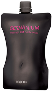
Packaging Design
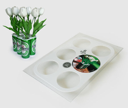
Atypyk!
Atypyk is an artistic group of French creative minds. Their products are smart yet ironic, and their ideas are packed into good packaging examples. The second picture is the packaging of a 6pack-vase (cans not included).
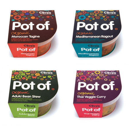
Pot Of
biz-R has recently completed a naming, brand direction and packaging project for Clive’s new ‘Potof’ range of fresh organic meals. a really bold, highly graphic, identity based on symbology,pattern and colour associated with each recipe’s origin. The eye-catching result communicates beautifully, on and off the shelf.
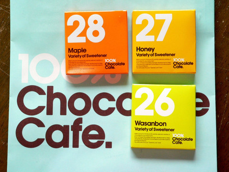
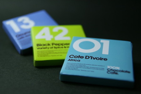
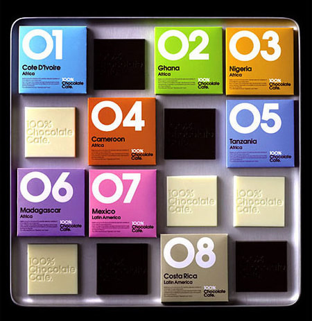
100% Chocolate Cafe
The concept behind Tokyo’s 100% Chocolate Cafe is to put your senses in the middle of a chocolate kitchen. They live up to their name with over 56 types of different chocolates, cheese and black pepper chocolates. They also serve chocolate drinks, chocolate pastries, chocolate ice cream, and even chocolate sandwiches. Colorful and clean packaging.
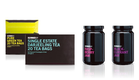
R Design Studio
Sexy, striking, catchy and beautiful — package design by R Design Studio from London. The choice of colors is remarkable.
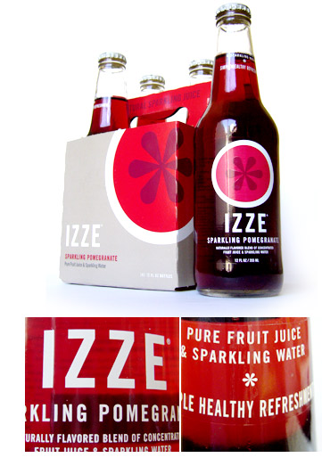
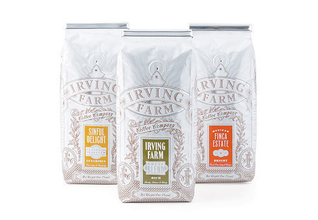
Tasty Type
Izze Beverage Co®. doesn’t boast their nonprofit mission on their label, but the design’s simplicity hints that they are a different kind of company. Izze’s sales grew 450% per year over the first two years without any TV, print, or online advertising. Surely their success is due in part to the bottle — clearly branded with Trade Gothic™ caps and a clever use of a Caslon™ asterisk, emulating a cross-section of the fruit contained therein.
Best Wishes Bag
This package is literally over 20 years old. The design is still amazing.
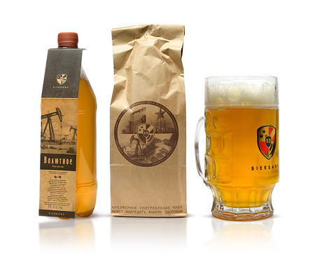
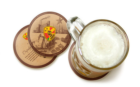
Beer Bank
Stylish, traditional packaging by designlab Fuerzza.
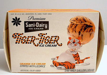
Tiger-Tiger Ice Cream
Flavor sounds like something from one of Miss Retro Modern’s or Charm & Poise’s challenged recipe cards!
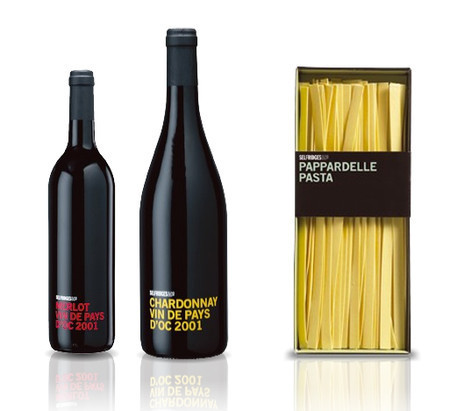
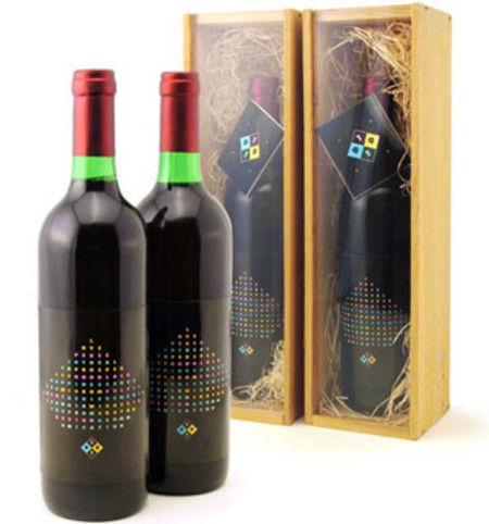
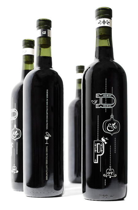
cd&c self-promotion > wine label & packaging
Wine label and packaging. The colors of dots on the wine bottle are chosen very carefully: notice how well they fit to the branding logo on the bottle.
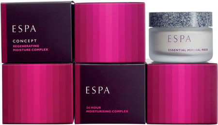
Espa Packaging
Packaging design for a range of advanced skin care products for one of spas. Strong, vibrant gradient in use.
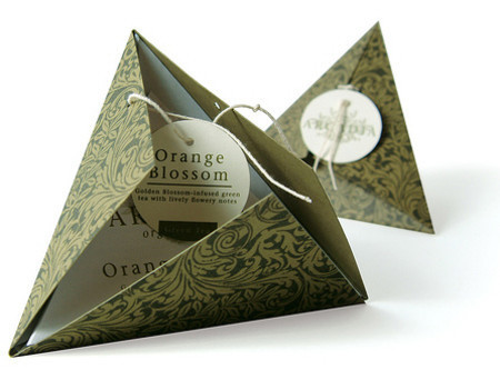
Arcadia Organic Tea
This packaging was hand made and assembled by me for a package design class as part of my BFA. The pattern was lacquer transfered to green paper. They come in a package of four so placed back-to-back all the little pyramids would nest together to make a larger pyramid.
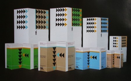
Graphis Packaging
Retro packaging with dominant geometric forms. Nowadays the design looks impressive and vibrant
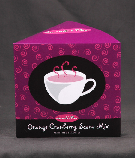
Scone Mix Package
Orange Cranberry Scone Mix designed by Montia. Simple yet attractive. Notice how well the package uses only three colors.
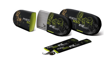
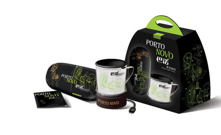
Porto Novo Caffee Package
Designed by Fizi Pao. Beautiful and elegant packaging.
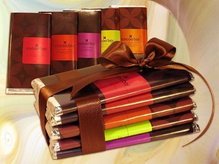
Cocoa Bar
Some pretty bar wrappers from Cocoa Bar, NYC.
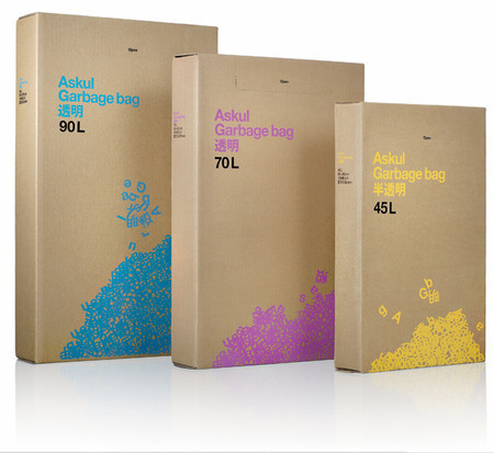
Askul Garbage Bag
Even although a package bag isn’t really something one would give a special attention to, some interesting solutions are possible. The design below makes use of colorful typography.
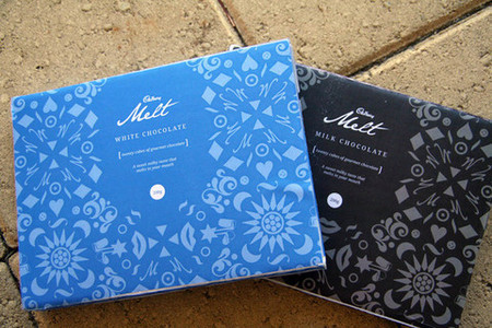
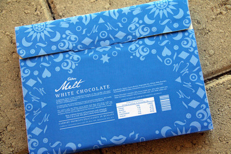
Cadbury Milk & White Chocolates
Cadbury Packaging Designs for ‘Gourmet Chocolates’. Designed by Daniel Elliott. Simple but sweet and attractive.
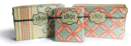
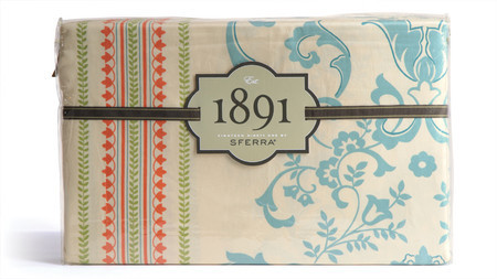
Sferra 1891
Packaging for Sferra’s recently debuted 1891 line. Linens packaging.
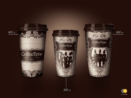
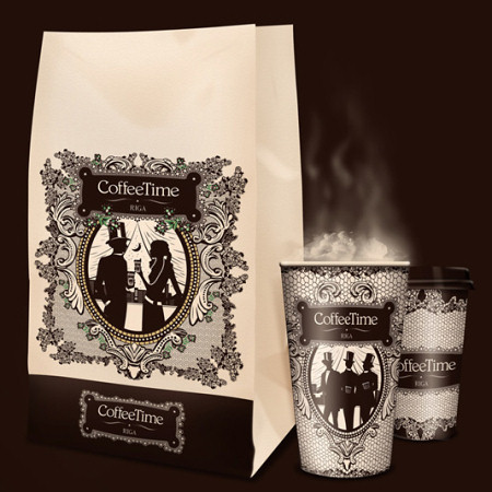
Coffee Time: Bag and Cups
S43 Agency for a CoffeeTime brand from Latvia.
Book Packaging
Peter&Wendy love typography and a strong typographic packaging. We love it too!
Typographic Packaging
Another example with typography in use. Sometimes all you need is just a title of what is inside the package.
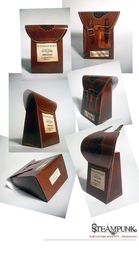
Steampunk Packaging
According to designer, the task for this design was to pick a subculture and design a series of pictograms/logos & etc for it, and then apply said logo(s) to a package for a set of information cards about that subculture. Designed by Rovina Cai from Australia.
Brad Surcey
Strong colors and beautiful compositions. Notice how well the title of the product is emphasized, ih4 strongly and clearly communicates what is inside without revealing too much unnecessary information.
Warming Little
Designed by Thirdperson, comprising a range of special winter soups with promotional heat resistant cardboard sleeves that slotted onto the existing cups. They’ve scooped a few awards, including Design Week 2008.
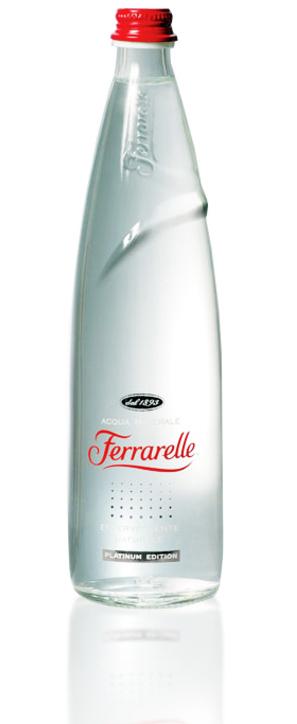
Ferrarelle
Clean minimalism at its best. Excellent packaging of a mineral water bottle.
Typography
Nothing can beat the old school typography.
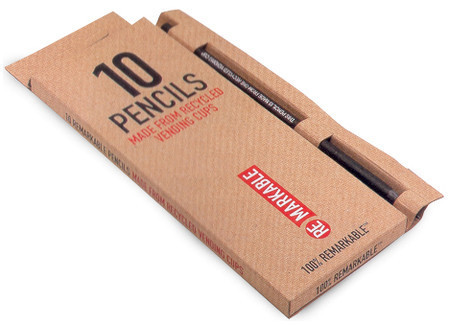
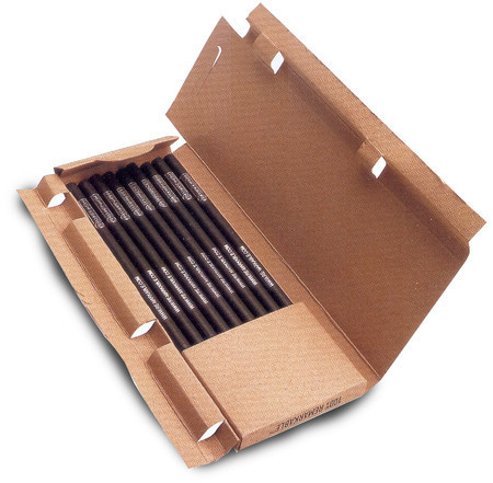
Remarkable Pencils
Apparently, the 10 pencils packaged into this box are 100% remarkable. Well, at least they have a remarkable packaging.
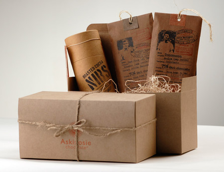
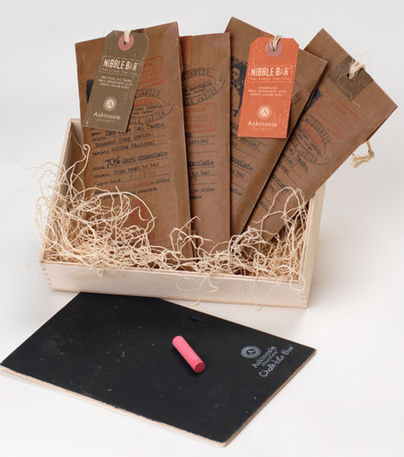
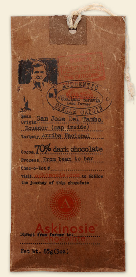
Askinosie Chocolate
When it comes to the design of chocolate packaging, there are a number of options available. For instance, you can provide the package with some further information about the chocolate and give it a more traditional, historic and authentic look.
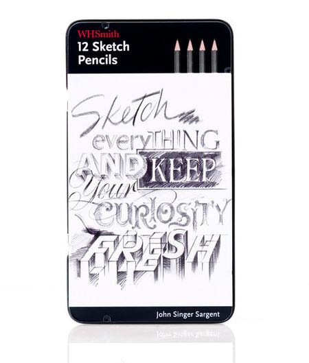
WH Smith
“Our brief was to create a compelling and inspirational solution. Because of copyright issues regarding artist’s work was a problem, our solution was to take inspiration from the though process behind how one paints and draws and to convey famous artists thoughts by choosing relevant quotes that captured the spirit of the product. We achieved this by commissioning different illustrators to recreate these quotes with the relevant use of materials.”
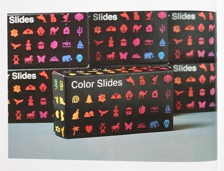
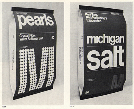
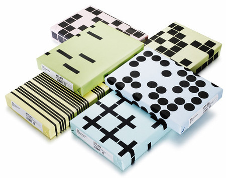
Askul
Original geometric forms can also be used for product packaging. And they are attractive, too!
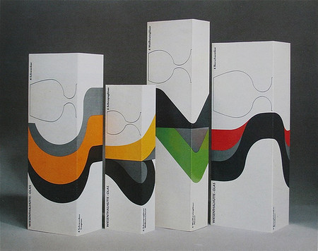
Visualization of CI
Clean and slick design by Martin Zampach.
Food Packaging
Nice old times strike back. Louise Fili with a traditional, old-times food packaging.
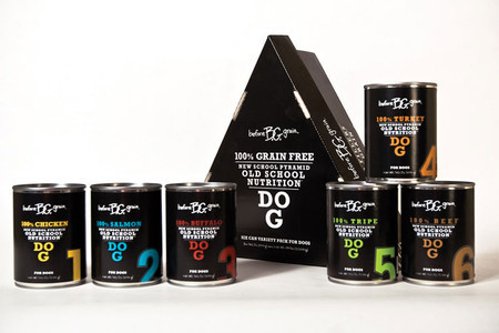
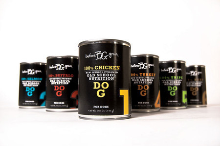
Before Grain Dog & Cat Food
Well, it is the packaging for dog and cat food, but it just look good. Notice how interesting the typography is used — the letters are building a pyramid.
Vintage Packaging
This design is more than 20 years, but it still looks very impressive. Beautiful color scheme for a vintage t-shirt packaging.
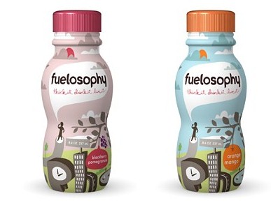
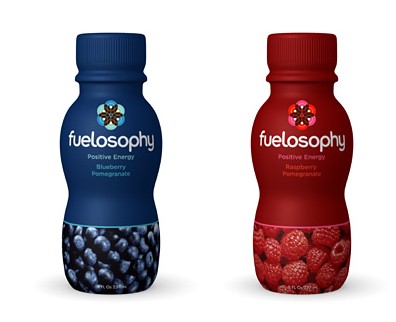
Fuelosophy
Fruit drinks designed by Templin Brink Design combine beautiful illustration and an interesting form of the bottle.
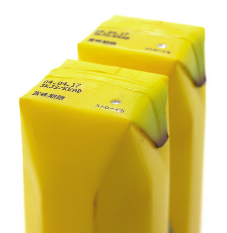
Banana Juice
Well, that’s an original design. Banana juice package in form of a banana! Designed by Naoto Fukasawa.
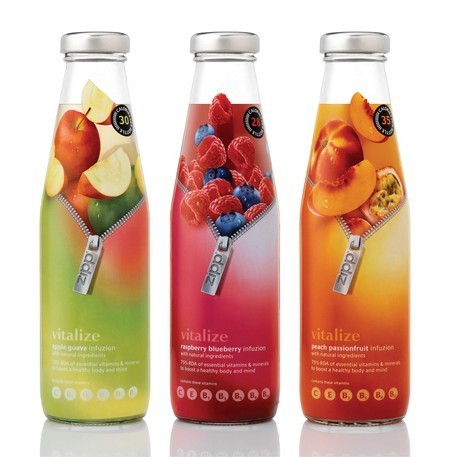
Infuzions
Creative packaging by Parker Williams Design.
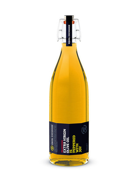
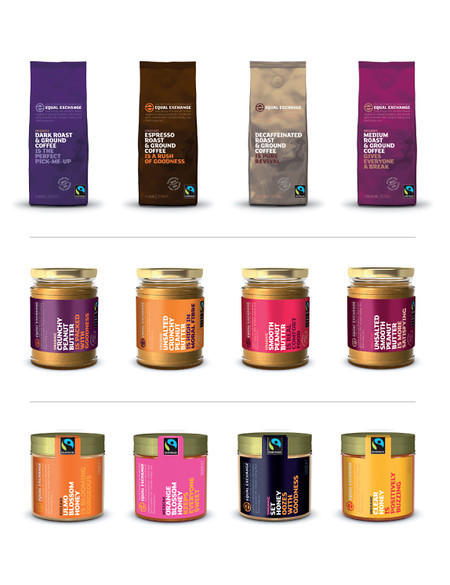
Equal Exchange
Designed by Good Digital Agency.
Typographic Packaging
Here the typography is pretty loud.
Tea packaging
Experimenting with typography.
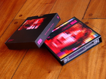
Beck 8-Bit
One more time experimental packaging.
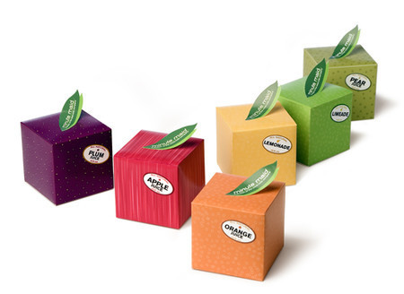
Fruits Packaging
Original packaging which may surprise and attract customer’s attention.
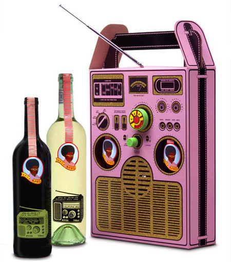
Afro Coffee Packaging
Afro by Dalla Cia: a Wine Box radio. Who thought that a radio on a wine label could actually work…
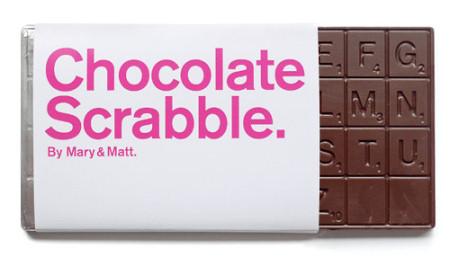
Chocolate Scrabble
Unfortunately, this item is no longer available.
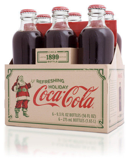
Coke Vintage Packaging
Old times, old times. We really miss packaging like this.
Japanese packaging
Really original design.
Last Click
Package design for Turkish Delight
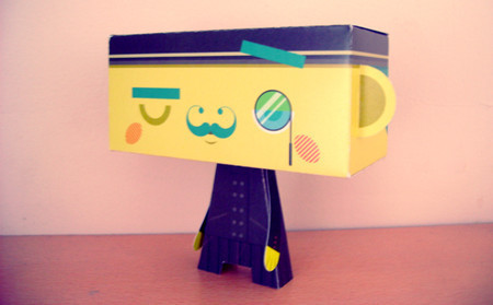
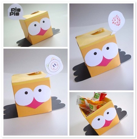
Sometimes packages can really communicate emotions. The intention of the design below was to attract children and provide sustainability instead of throwing it away after consuming this product. For this reason the package can turn into a paper toy. The children can put together the body which is inside the package, and the face.
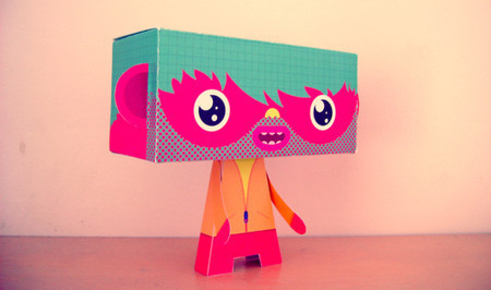
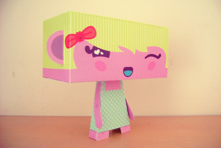
Pio Pio Cheep Cheep
A sweet paper toy one more time.
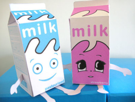
Milk Boxes in Love
Yeeeah! He found her! Or she found him! In any case, these milk boxes are now together. When buying a next milk package make sure to buy two — for Mr. Milky and his lah4ysad history. It is nice to know that everything is fine now.