Icon Design Tutorial: Drawing A Pencil Icon

Email Newsletter
Weekly tips on front-end & UX.
Trusted by 182,000+ folks.

 Custom Web Forms for Angular, React, & Vue. Your backend.


 Celebrating 10 million developers
Nowadays we can see icons everywhere, from a game console to web applications. Icons are getting more and more popular and play an important role, maybe the most important role in user interfaces. However, the resources about icon design are not that popular which is why when we have done our first steps in icon design, it was really hard to find a good starting point.

There were only a few in-depth tutorials or books about this subject. Which is why we would like to share some (hopefully useful) tips about how to create a simple icon set. This tutorial presents of course not everything you should know about how to master icon design, but we hope that it will help you, particularly if you have just started to learn, or want to learn more about icon design.
You may want to take a look at the following related posts:
- Easy Steps To Better Icon Design
- How To Create Icons In Adobe XD
- Designing A Rocket Icon In Adobe Fireworks
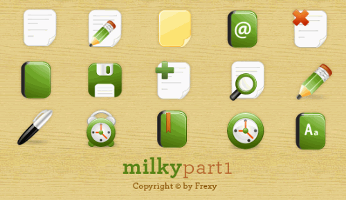
Few weeks ago we have released the Bright! Icon Set (see the image above) which is available for free download from our web-site. This article explains the process of designing a simple pencil icon, one of the icons of the icon set. The tutorial is very detailed and in-depth, so you will hopefully be able to follow each step without any problems.
Although we consider a basic example, the principles, conceptualization and techniques from this article can easily be applied to icon design in general. Although all tools we use in this guide are very simple and very easy to work with, your acquaintance with Adobe Illustrator is still requisite.
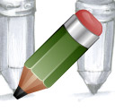
This is the result which we’ll come up with at the end of the article. You can download the source file as well.
So how do we start? Usually before starting, we have to gather some pencil pictures on the Web and pick up the details and traits out of those pictures and mix them all to create a style for some fresh pencil icon. We always start with a hand-drawn sketch.
1. Characteristics of a pencil icon
Drawing an icon means to draw the most typical characters of an object so that it can capture the icon’s action or represent the concept and nuance. As you might know, there are generally three kinds of pencils to select from:
- Prism-shaped body with a shiny glaze-coated end.
- Prism-shaped body with an eraser secured to the pencil body by a bright white metal ring.
- Cylinder-shaped body without an eraser.
We choose the second kind for the icon design because it has all necessary elements, making it easier for the viewer to recognize the image. After trying to sketch some upon the second kind, this is the sample sketch that matches the style of the set that we have in mind. Our favorite drawing tools are Copic Markers with 10%, 30%, 50% gray tones and a ballpoint pen. Some important things that should be followed as working on this icon:
- When an icon is designed in a large size, you need to pay close attention to details, and make sure that the two-point perspective is used. But in this article, because the icon is to be made and optimized in smaller sizes (64×64px and 48×48px), its concept should be as simple as possible, and the icon should be illustrated in one-point perspective.
- Light used in the icon must be harmonized.
- Perspective used for the icon must be identical in the iconset, making all the icons look like being in a family.
- Style should be a bit more manly-looking.
- Decisive color is green.
- Since the icon is to be saved in an EPS8 file, only gradient is used and all the paths must be connected (no open paths). It is also important to note that there is no transparent effect and no raster image invovled.
Okay, let’s get to the main part!
2. Sketches:
In our icon design sketches always come first.
We are going to scan these sketches into Illustrator.
3. Basic outline:
3.1. The pencil body
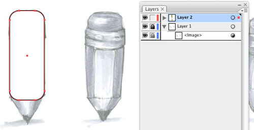
- Create a 64 x 64px document. Drag the image (the scanned sketch) into the artboard of the new document. Go to the Transparency palette and set the image’s opacity to 50. Lock this layer and save the document. Create a new layer and start to make outlines on it.
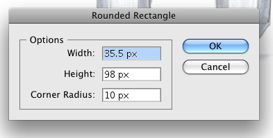
- Create a rounded rectangle path using the Rounded Rectangle tool and then click on the artboard to set the Corner Radius value to 10px. Click OK.
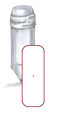
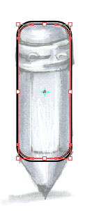
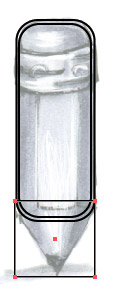
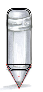
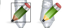
- Choose the Selection tool (V) and click on an edge of the rounded rectangle path and drag it over and make it fit tightly on the sketched image like the picture below.
- Select the round rectangle and set their color to none.
- The eraser looks smaller than the body, so it needs to be reformed. There may be several ways to redraw the eraser like using the Pen tool (P) but from my experience they didn’t give good results.
- Select the rounded rectangle path. Double-click on the Scale tool and check Uniform in the Scale dialog box. Set the scale value at 96%. Check Copy to create a replica as shown in the picture below.
- Choose the Rectangle tool and draw a new rectangle at the position of the eraser and over the rounded rectangle path.
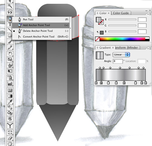
- Choose the Add Anchor Point tool (+) and click on the central point of the rectangle path (drawn in step 5) to add one more anchor point. Next, select the Delete Anchor Point tool (-) and delete 2 anchor points.
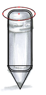
- Choose the Ellipse tool and draw an ellipse as shown below:
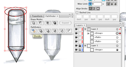
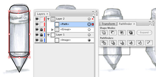
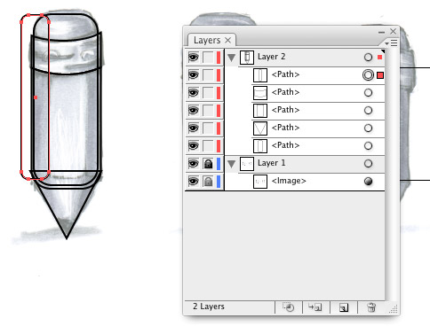
- Select the larger rounded rectangle path and the ellipse path. Go to the Pathfinder palette and click the Divide icon. A new group appears in the Layer palette. Any divided path will belong to this group.
- Go to the Layer palette and select two paths located below the new group, press Command/Ctrl + G to put them into a group and lock this group. Do that to make it easier to delete unused paths in step
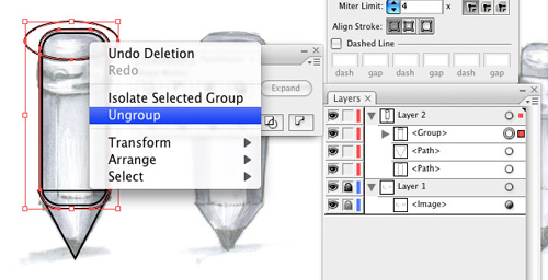
- Ungroup the group with divided paths (in step 8) by selecting the group and choosing the Ungroup command from the right-click menu.
- Delete unused paths until the result is achieved as below.
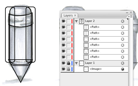
3.2. The metal ring
Just like the steps done with the eraser, for this path we’ll use a bigger ellipse and divide the pencil body path to detach the metal ring from the body.
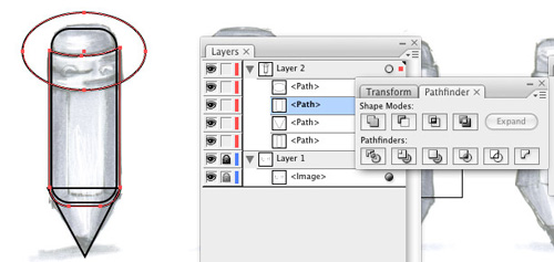
The shape of pencil now has been taken very basically. I think we can go into its details from this step on. What we have to do is cleaning up the pencil.
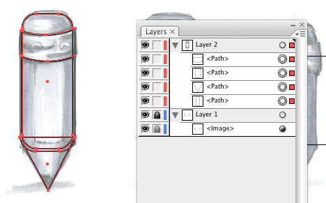
4. Details:
Create the outlines for a pencil with sharpened end by using the Rounded Rectangle tool and the Pathfinder palette. All we have to do with this path is make the pencil body in a prism shape and look being already sharpened.
- Select the Rounded Rectangle tool and draw a new rounded rectangle path with 4pt corner radius (like in step 2B).
- Make a duplicate of this rounded rectangle path by pressing “Copy and Paste in front” commands (Command/Ctrl + F )
- Move the duplicate path to the right.
- Select both rounded rectangle paths and the body path, and then divide them using the Divide option in the Pathfinder palette.
- Select the group with divided paths and ungroup it, and then delete unused paths. The result should be like this:
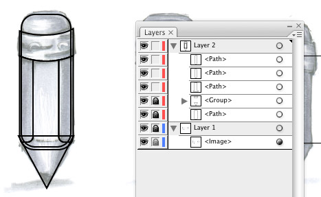
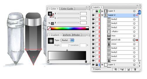
- Continue using the Rounded Rectangle tool to draw another rounded rectangle path, and then use the Divide option to cut the path in the middle of the pencil body to form a clear prism. Next, ungroup and unlock all the paths in Layer 2, and then change their names. See the result below.

5. Styling the Pencil:
And now we are going to give the icon some charm. The steps include:
5.1. Adding gradient
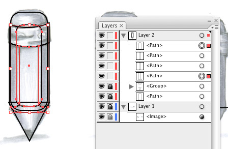
- Select all the paths and select the Gradient tool, and then go to the Swatches palette and choose a radial black-gray-white gradient.
- Select each path and drag the Gradient tool (G) across each of them until you see the result like the picture below:
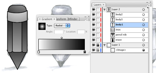
- Select all the paths and set their stroke weight to zero. The purpose is to preview the pencil in general.
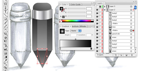
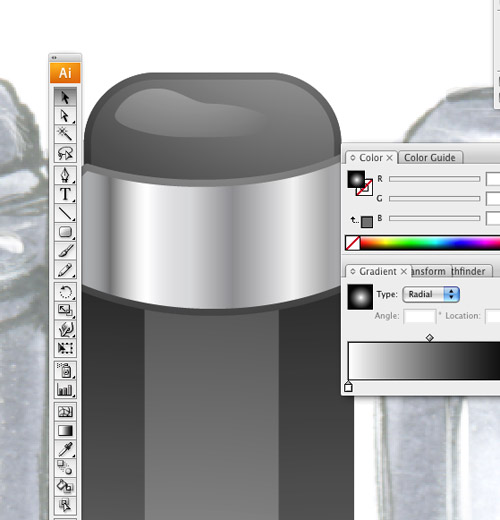
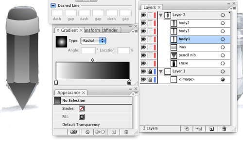 Well, light depicted in the pencil body looks fine, but the metal ring and the sharpened end need to be adjusted a bit.
 - Change the gradient type of this path to linear to create a new gradient as shown in the picture below. Hoping you could create the gradient like mine. In case you couldn’t make it yourself, just download the attached source file.
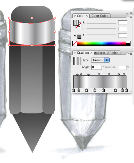
- The metal ring path should embrace the eraser tightly. To do this, use the Add Anchor Point tool (+) and add 4 more anchor points to the two ends of the metal ring path, and then delete 2 corner points. The result look like this:
 >
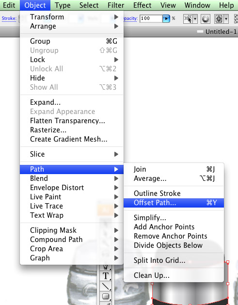
> - The metal ring path also needs to be a little thicker. The easiest way is use the Offset Path command. Select the path and then go to Object>Path>Offset Path. In the Offset Path dialog box, set the offset value to -1pt or less. You may check Preview to see the result and hit OK.
 Notes:
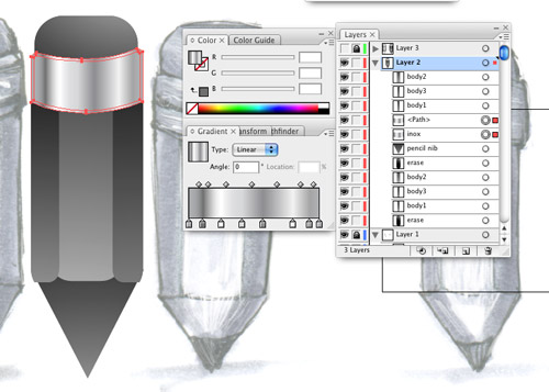
- Use the Offset path to make a duplicate over the metal ring path; change the gradient of the metal ring path (locating below the duplicate) to give depth.
- Whenever the Offset path is used, the default name of the duplicate is “path”.
- If the offset value is minus (-), the duplicate will stay upper.
- Apply the radial black-gray-white to the metal ring path, press G and drag the Gradient tool across the path until you get the result like the picture below: Okay, the metal ring looks acceptable to the eye. Now let’s mess with the sharpened end or the pencil nib path.
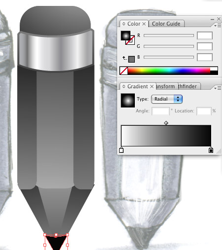
- Scale the pencil nib path so that it adjoins with the pencil body.
- Like in the sketch, the pencil nib path here needs a highlight piece located right at its center, making up its shape. Before doing this, remember that the icon is to be saved in EPS8 format and there’s no usage of effect, no blending mode or opacity adjustment but only paths or the blendshape. To make it simpler, use the Pen tool and draw a path over the pencil nib path.
- Change the direction and angle of the gradient until the pencil nib is taken shape properly.
- Draw the pencil lead using the Pen tool.
- Give a highlight piece to the eraser using the Pen tool and change the angle of the gradient to suggest the eraser shape.
- Use the Offset path command to make a duplicate of the eraser path. Change the gradient tone of the eraser path to make its contour look sharper.
5.2. Tweaking the color
In this stage, we’ll put each element of the pencil into each separate group (the body, the eraser, and the sharpened end).
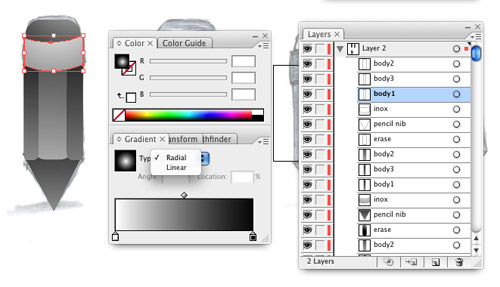
- Select the pencil body paths (including 3 paths). Go to Edit > Adjust Color Balance, check Preview and Convert in the Adjust dialog box, and then switch to RGB mode.
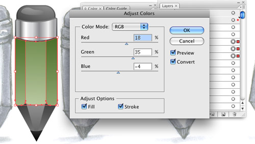
- Drag the slider to change the Red/Green/Blue values (to whatever color you like).
- Select the eraser and do the same Step 2.
- Select the sharpened end and change its color (do dittos).
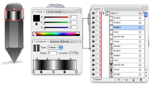
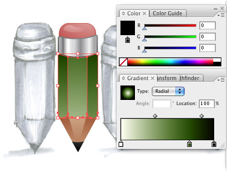
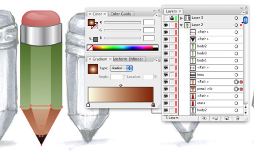 The pencil now looks flatter than it was initially. That’s because the gradient will lose the black color after adjusting the color balance. What we’re going to do next is go back to the three elements of the pencil and add the black color to their gradient so that the shapes of the elements will display clearer.
 - Grab the gradient slider and move the main color closer to the white. In the Color palette, drag that color down to the Gradient palette. Select the color just dragged (by clicking the gradient slider) and change its value to 0-0-0 (make sure the color mode is RGB). You may use the Color palette to change the gradient color.
6. Deeper details and style matching
After everything basic is done, switch to Pixel Preview mode from the View menu to see if the pixelation problem occurred.
We are almost done. Yet, as you see, the pencil lead looks very sharp-pointed, giving an unsafe feel. So we got to change that conical point to a frustum of a pyramid. Also, we need to add some extra paths to the pencil body as highlight pieces (using the Offset Path command). This is necessary because the outer housing of the pencil is a very shiny coating.
And the result is:
After the icon is rotated at 45-degree angle:
Well, one more thing, the pencil still looks so dark that can’t match the styleweI want to have, so we’ll make a change to its color. Just add some detail to the metal ring path by (1) duplicating the path and scale the duplicate a little bit, and then (2) make another duplicate and drag the gradient over it to make the icon more realistic.
Note: make sure both “Snap to Pixel” and “Snap to Point” have been checked after Pixel Preview mode is used.
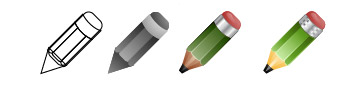
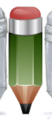
The final outcome:
Look at the final outcome. While the light direction comes from above, the lower part of the pencil body is lighter than the upper part. Yes, it’s the reflection of light. Many assume that it’s tough to draw icons with Illustrator due to difficulty in representing color and light. If you have a good sense of color you can change the gradient color and tone using the Color palette.
Anyway with Photoshop, you could do the following way:
- Export your vector to a PNG, then open it in Photoshop. Change the color and light level of the icon image by using Curves or Color Balance or Auto Levels (from Image menu > Adjustments), or using other techniques you knew in Photoshop. After editing, save the image file.
- Drag the edited image into Illustrator, then use the Eyedroper tool to pick up three main values of color – brightness, medium and darkness, and after every pick-up, drag the color into the Swatches palette to save.
- Drag your chosen color into the Gradient palette to make your own nice gradients, then applied to your icon. I used to do that way for a while and now I’ve owned a useful library of gradients, which I always use to style my icon sets.
7. Source files
You can download the source files of the icon in .eps and .ai for free:
- Download the source files (.ai, .eps)
Common Mistakes
Let us discuss some mistakes which are frequently occur when it comes to icon design using the example above.
- Create reflection and highlights in the icon by drawing a new path over the original path and add the while or black to it, then changing its opacity. This way will make the object color to be the silver gray, losing the clearness as it was, though it still can achieve glossiness.
- Use gaudy models of pencil and round cylinder shape to easily take shape of the pencil icon with only one gradient. But drawing icons is drawing anything most familiar and typical, and draw objects that best capture the icon’s action or gesture. A round-shaped pencil icon hardly can come with sharp corners and clear highlights.
- Rely on a prism-shaping gradient by using a path to demonstrate the pencil body and then apply the gradient that makes an object look like a prism shape to the path. This may be an easy way but very difficult to edit, and the gradient tends to be askew.
- Use the blendshape to cast shadow in EPS8 and the shadow changes from white to black without transparency. When the shadow casts on a background with color other than white, a white contour will appear.
Design comparisions
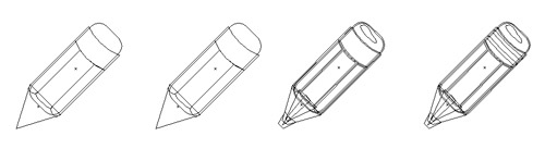
These are some typical designs we’d like to bring in and classify them upon some good and weak points. The final result above shows the pencil icons designed in one-point perspective. This is a perfect design that obtains all necessary components: lighting, shadow, color and composition, and especially, this design can be scaled down to any size without pixelation problem.
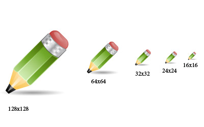
Figure 1 shows the pencil icons designed in two-point perspective. This design depicts good lighting, acceptable shadow and nice color, and does not encounter the pixilation problem. Yes, this design looks nice and cool. However, the composition and shape of the pencils may not be recognizable immediately to viewers, resulting in the violation of the main principle of icon design.
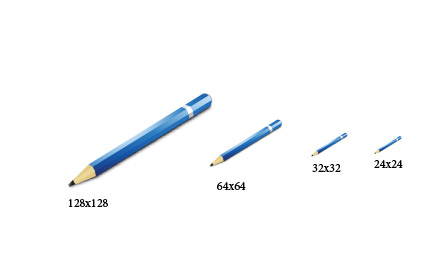
Figure 1
Figure 2 shows the folder icons designed in two-point perspective. The design looks nearly perfect with nice concept, a complete and proper composition. It’s also a good design as it depicts accurately the light direction that comes from above and casts a nice shadow, and the light reflection on the folder object is wonderful. Yet, pixelation problem occurs on the upper edges of the folders, causing the icon in 24x24px to lose sharpness.
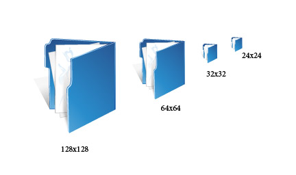
Figure 2
Conclusion
There are many different approaches to icon design, some use 3D application, others use Firework or Photoshop, but the goal in designing icons is the same, whatever tools we use. We need to keep the consistency through every icon in the set, and maintain recognization and simplicity. As we said in the beginning of this article, these are just some basic steps and principles of creating a beautiful and crisp icon. We hope you enjoy this tutorial. If you feel urged to learn more, please keep track on the free icon design book that we will make publicly available in July.


