The Best Free Fonts for Designers

Email Newsletter
Weekly tips on front-end & UX.
Trusted by 182,000+ folks.
 Register for Free
 Celebrating 10 million developers


 Custom Web Forms for Angular, React, & Vue. Your backend.
I’ve been meaning to write this post but just haven’t had the time to do so. I’ve received several messages and emails asking me about fonts that I use on some of my design projects. I have a pretty large font collection. Some of them are paid, but a lot of them are free! First of all, I suggest investing in some of the best typefaces out there but I also suggest that you take advantage of the free resources that can be found online.
Anyway, I just want to share with you some of my favorite websites to obtain some high-quality typefaces that you can immediately start using on your projects. By the way, a lot of the free fonts on these sites can also be used for @font-face implementation as well.
Further Reading on SmashingMag:
- 40+ Excellent Freefonts For Professional Design
- Free Fonts With Personality
- Industrial-Strength Types
- Beautiful High-Quality Free Fonts For Your Designs
Download Free Fonts from These Websites
- The League of Moveable Type This website has a great collection of free fonts including League Gothic, which has really become popular. I would suggest following them on Twitter or subscribing to their feed as well.
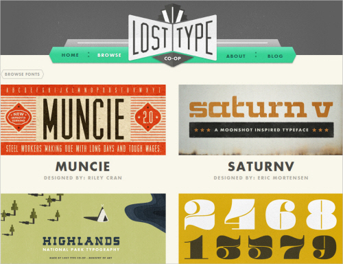
- Lost Type I just recently stumbled upon this website and they have lots of great fonts that are available for download. Although the fonts are free, I’m sure they would love your support so maybe donate a few dollars to them.
- Font Squirrel This is a great website with tons of high-quality fonts that are mostly @font-face compatible. You can also download their fonts as @font-face kits and they also have a @font-face generator. This is definitely a great resource.
- FontFabric They have a great freebie section with lots of nice fonts to download.
- DaFont There are a lot of fonts on this site. Sure, not all of them are the best quality, but I usually go to this site if I’m looking for a font to use with a particular look or theme. For example, if I wanted to use an Indiana Jones font or some other type of movie font, I would just do a search on this site.
Anivers Regular
Jos Buivenga has released an update for Anivers, a font which was originally designed to celebrate the first anniversary of Smashing Magazine. Now the new improved Anivers has been expanded and Anivers Regular undergone a major update. Changes: extended language support, improved glyph shapes and improved metrics and kerning.
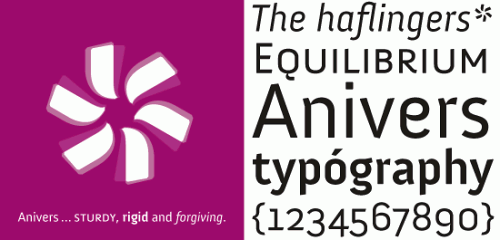
Jos Buivenga has extended Anivers to the Anivers family which now comes in regular, italic, bold and small caps and has some nice OpenType features. However, only Anivers regular is free. To download the free Regular you have to register at MyFonts.com. The rest of the family can be purchased on MyFonts.
Fertigo Pro
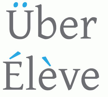
Jos Buivenga has updated the old freefont Fertigo and has now called it Fertigo Pro. Fertigo Pro is still free. Important changes are extended language support (more than 150 glyphs added), improved glyph shapes, 10 added ornaments/dingbats and improved metrics and kerning. Languages now (fully) supported: Latin, Central European, Croatian, Romanian, Icelandic, Turkish, Esperanto.
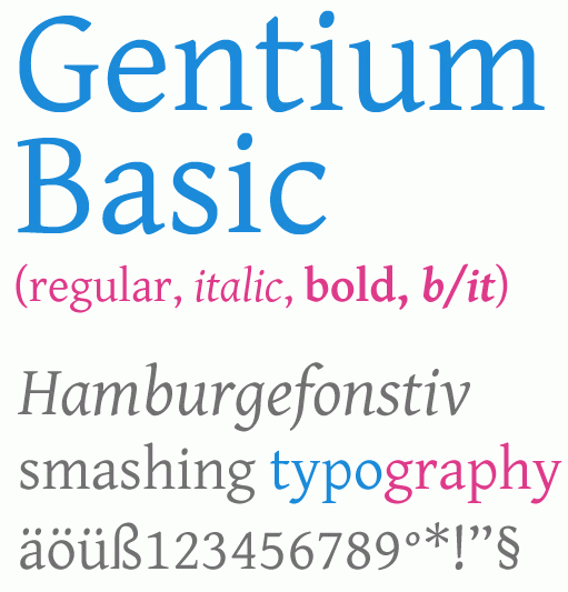
Gentium (specimen) and Gentium Basic
SIL International which has released Gentium few years ago, now released a modification of Gentium which is called Gentium Basic. Gentium is a typeface family designed to enable the diverse ethnic groups around the world who use the Latin and Greek scripts to produce readable, high-quality publications. It supports a wide range of Latin-based alphabets and includes glyphs that correspond to all the Latin ranges of Unicode.
Gentium Basic and Gentium Book Basic are font families based on the original Gentium design, but with additional weights. The “Book” family is slightly heavier. Both families come with a complete regular, bold, italic and bold italic set of fonts. The supported character set, however, is much smaller than for the main Gentium fonts. These “Basic” fonts support only the Basic Latin and Latin-1 Supplement Unicode ranges, plus a selection of the more commonly used extended Latin characters, with miscellaneous diacritical marks, symbols and punctuation. Designed by Victor Gaultney.
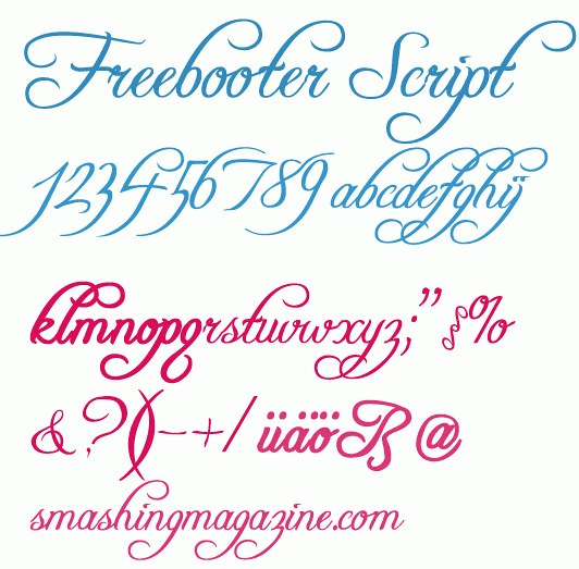
Freebooter Script
This script type literally impresses with its curves. Freebooter Script can be used for packaging design or some projects in old-style. Designed by Graham Meade, available in PC Type 1, PC True Type and Mac Type 1. Designed by Graham Meada.
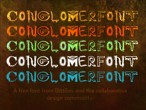
Conglomerfont
Conglomerfont is a free font created by Jay Hilgert (BittBox) and the design community from all over the world. Jay asked people to send individual letters to his inbox, and I coagulated the submissions into a single font, hence the name, Conglomerfont.
Walkway (TrueType)
Walkway is a large font family which consists of 31 font style, such as Rounded, SemiBold Reverse Oblique, Bold, Bold Reverse Oblique, Black, Black Reverse Oblique, UltraBold and further styles. The typeface looks elegant and modest and can be used best for headlines. Windows, Mac OS X, Linux.

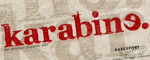
Karabine
Fancy “hand-drawing” typeface by Jonathan Paquette. A quite distinctive typeface in which capital letters are the reflection of “normal” letters. PC / Mac. Free for personal use only.
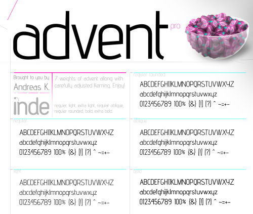
Advent Pro
A fresh, modern typeface coming in 7 weights — bold, bold extra, regular rounded, regular, regular oblique, light and light extra. Commercial work containing this typeface must include the reference to the author; personal projects don’t necessary need to have a reference. The advanced version of the font can be purchased.
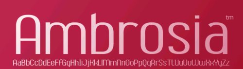
Ambrosia
This font is free to use for personal purposes only. This version doesn’t contain kerning, accented character and foreign currency symbols.
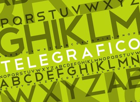
Telegrafico
Licensed under a Creative Commons Attribution-Noncommercial-Share Alike 3.0 License. TrueType (.ttf).
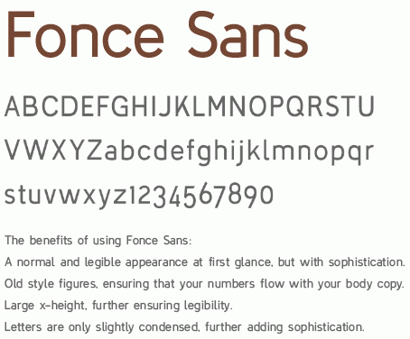
Fonce Sans Regular
A sans-serif typeface that includes old style (hanging) numbers, a number of english and non-english lettering, some additional symbols and complete punctuation. This typeface is considered a Trial Version, in which certain letterforms have been replaced. Available only for non-commercial use as .otf. The advanced version of the font can be purchased. This typeface is being released as a sort of “beta,” in which people might become accustomed to the typeface and also voice their opinions on its usability.
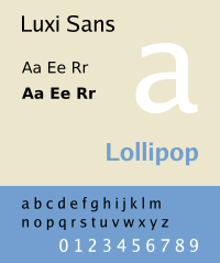
Luxi Family
Luxi fonts are commonly found on free software operating systems, such as Linux. They are the default fonts in Red Hat’s Bluecurve theme. This family includes Luxi Sans, a family of four sans-serif fonts, Luxi Serif, a family of four serif fonts and Luxi Mono, a family of four monospace fonts. These fonts can be downloaded using OpenOffice.org’s FontOOo wizard. (via Chris Apalodimas)
By the way, if you are a web designer and if you are looking for some free fonts to use for @font-face implementation, then I suggest Font-Squirrel or the Google Fonts.
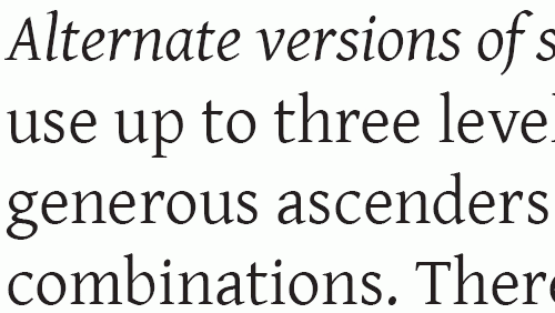
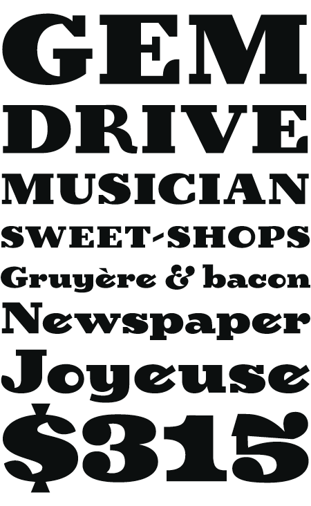
Megalopolis Extra [ Specimen | EULA License ]
Revamped version of the 2004 one. Now in OT with extended language support and OpenType features with alternates, ligatures, different styles of figures, etc. You can use it freely for all your personal and commercial work. [ via ]
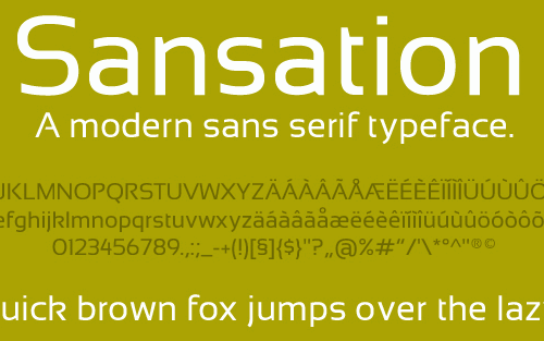
Sansation
A modern sans-serif, designed by Bernd Montag and available for free download and usage. PC / Mac OS X.
Birra Stout
Birra arose from years of compulsive doodling in pen and ink, and conjures the whimsy and syncopated contrast of novelty handlettering in the early 20th century. Birra Stout is a free font, made available by Darden Studio (registration is required).
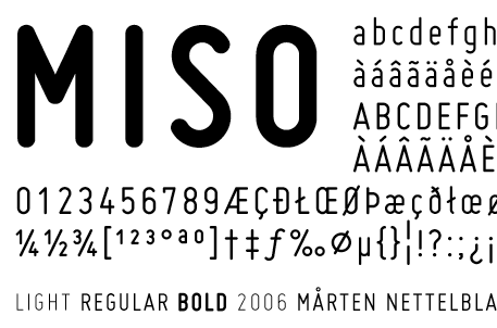
Miso [ Preview ]
MISO is an architectural lettering font completed in 2006 by Mårten Nettelbladt. It’s available in three weights (light, regular, bold) in TrueType format for Windows.
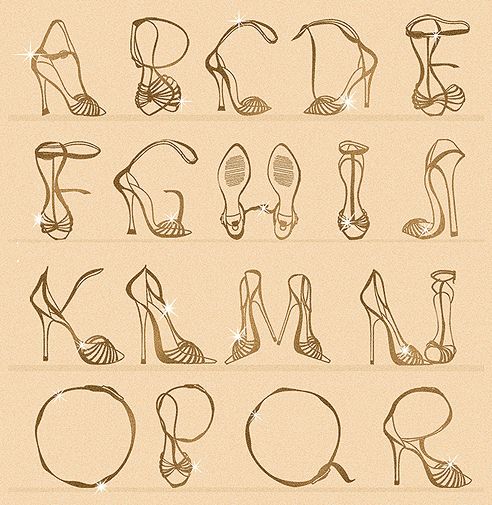
Last Click
High Heels Typeface This was a fun project overall because I got the chance to explore a diverse and massive collection of High-heeled shoes, which was the main inspiration for the typeface that I have created. Not available for download.
With Free Fonts Comes Great Responsibility
Now that you have visited these websites and have downloaded lots of free fonts, you need to learn how to use these fonts wisely. Here are some great articles that you should read to get you started on good web typography.
- More Meaningful Typography
- The Elements of Typographic Style Applied to the Web
- Typography Talk with Brian Hoff
- 30 Most Curious And Interesting Dingbats


