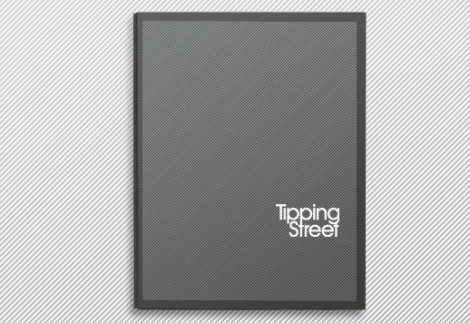
Beautiful Brochures and Booklets

Email Newsletter
Weekly tips on front-end & UX.
Trusted by 182,000+ folks.

 Celebrating 10 million developers


 Custom Web Forms for Angular, React, & Vue. Your backend.
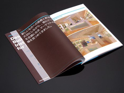
In corporate design brochures and booklets are a standard tool for promotion and advertising. They are little books or magazines which lay around in conference halls, offices and waiting rooms. Sometimes they contain an annual report of the company or showcase the portfolio of an artist. Brochures can also be included in CDs and DVDs; however, usually they are given away as freebies (e.g. they may contain a calendar or some poster inside).
In either case, booklets serve advertising purposes and since they are usually short (max. 25-30 pages) they need to look good and be informative to focus users’ attention and effectively convey the message. Unfortunately, only a few brochures are indeed designed with close attention to details. However, there are some options for creative and appealing booklet and brochure design.
This post showcases beautiful examples of brochure and booklet layout. We have tried to include creative, visually appealing and interesting design solutions; the booklets presented below are nice to have in the hand and take with you. Hopefully, everybody will find something interesting and unusual for herself or himself.
You may want to take a look at our related posts
- Beautiful and Expressive Packaging Design
- Excellent Book Covers and Paperbacks
- Breathtaking Typographic Posters
- Award-Winning Newspaper Designs
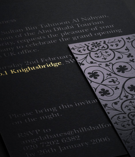
Brochures and Booklets
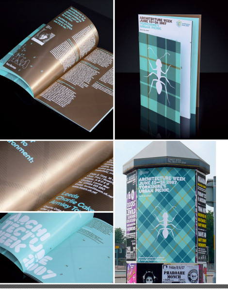
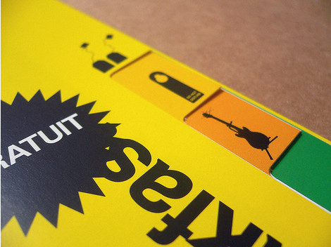
Urban Picnic
Ant and blanket pattern graphics are used to interpret the common picnic in this event brochure for Architecture Week. Using architecture stencils as the basis for the typography, the brochure has contrasting colours which reflect building materials. The choice of colors is impressive and eye-catching: this is what makes a good brochure design. Created by Rob Brearley, RGB design studio.
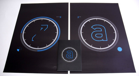
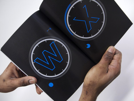
Alpha_Txt
ALPHA_TXT has developed into Typeface that represents the evolution of the English language. It reflects the way that we communicate due to our global society. ALPHA_TXT reflects this issue by abbreviating individual characters in the English alphabet. It is governed by same rules imposed as SMS messaging on a mobile telephone keypad. Designed by Viv Greywoode.
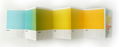
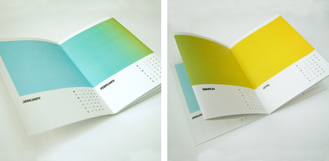
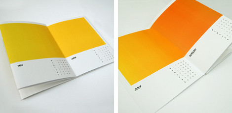
2008 Calendar
A pretty colorful calendar concept. Each month color is associated with a month — e.g. blue stands for January and red stands for July. The last page contains contact references to designer’s portfolio. That’s an effective brochure design. Designed by Jonathan Davies.
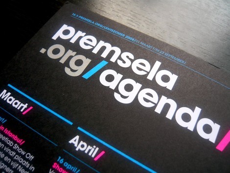
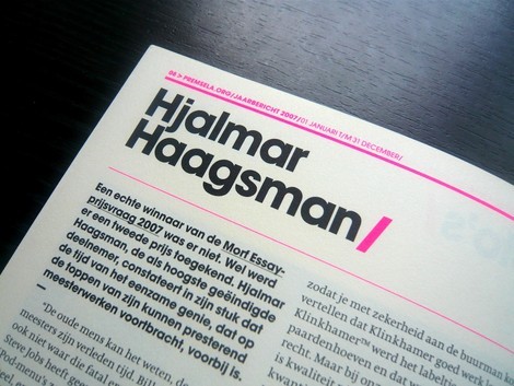
Premsela Booklets
Catchy colors meet dark booklet meet beautiful typography meet grids. Appealing editorial design by Robin Uleman.
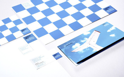
Capital Jest Booklet
Well, this is a sexy design. Notice how well tiny square at the right bottom corner of the cover stand for the corporate identity of the company: although being tiny, they are very distinctive and attractive. Corporate & brand identity by studio FIRMA for company Capital Jets, specialized in business aviation. Included creating logo, full brand identity, web design, copywriting, design of exhibition stands, corporate stuff, booklets, design of corporate cars and airplanes. Designed by Firma.
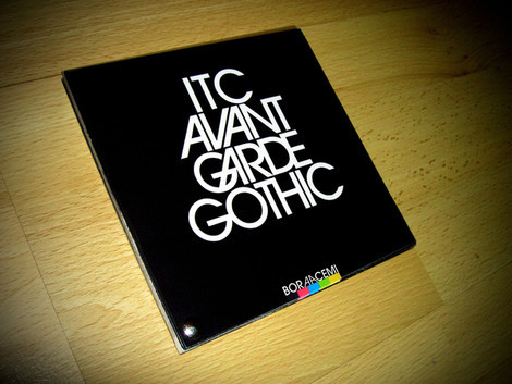
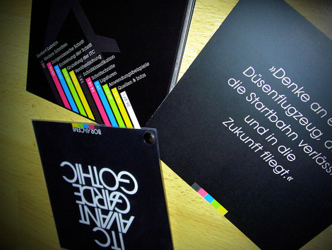
Avant Garde Gothic Typeface Booklet
Features 27 pages containing information on Herbert Lubalin, the establishment of the ITC, type-classification, font-weights, ligatures and much more. Designed by Bora Acemi.
Jeannette Weber
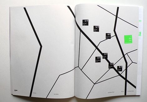
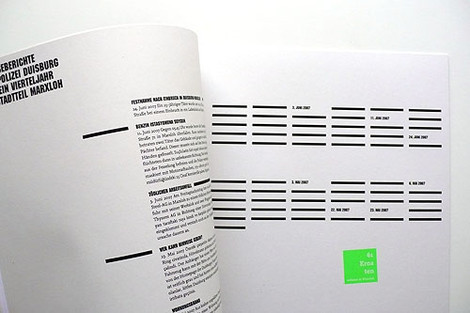
Die anderen - Leben in Marxloh. Minimalism, beautiful information design.
ERF
Designed by BaseDesign agency.
Usinesonore
Designed by ultra.li.
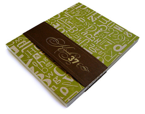
Kiosk 37
Designed by Luke Lisi, Ben Suh, Laura Rottinghaus, Tristan Telander and Chi Hiu Yim from the University of Kansas Design Program (thanks, dls).
Restaurants Identity book
No, it doesn’t really matter what is inside the brochure. The cover is striking and appealing and hence manages to attract readers’ attention. Unfortunately, we do not know how the brochure look like from inside out.
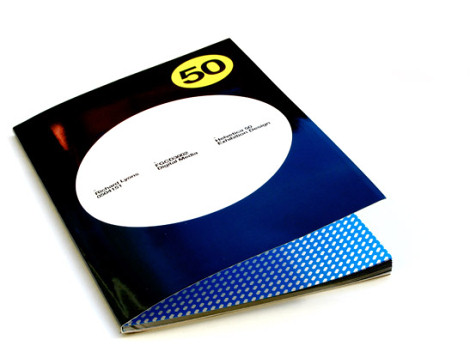
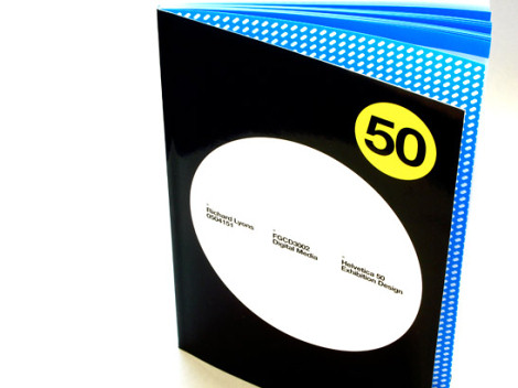
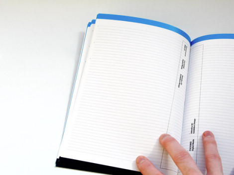
Helvetica 50 project workbook
Blank workbook designed for Graphic Communication 3rd year Digital Media brief - exhibition design for the 50th birthday of Helvetica. Designed by Breakmould design agency.
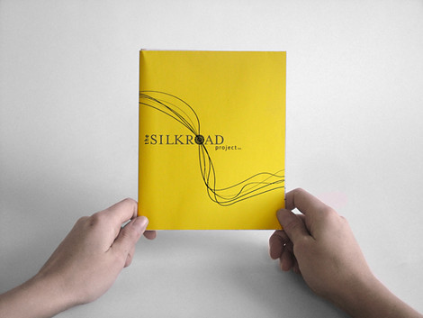
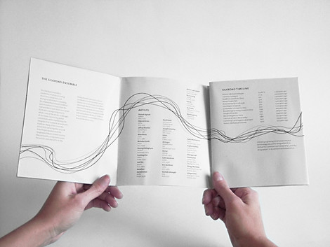
Silkroad
This is a brochure/poster for The Silkroad Project. The musical ensemble focuses on creating a flow of connectivity amongst different cultures across the world. This brochure has lines running and connecting through each fold and then folds out into a poster that acts as a calendar. Simple yet beautiful. Designed by Megan Brock.
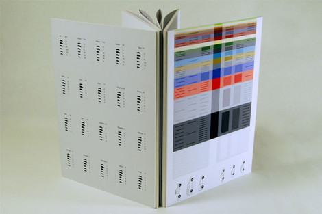
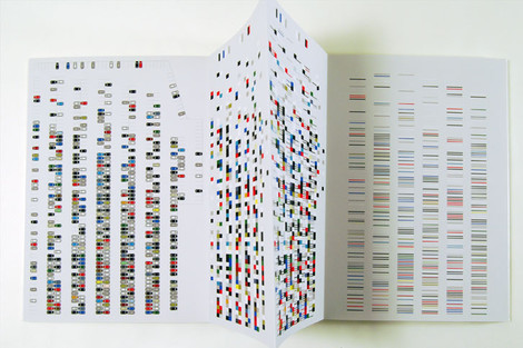
Car Color Timeline
The objective behind this piece was to come up with a method to organize information as simple as the color of cars in the most effective and interesting way. Using a timeline system, the structure of Art Center’s Hillside parking lot was organized in step-by-step panels.
The timeline starts with raw data taken from photos and information gathered from each individual car. The data is then broken down into abstract shapes and optical mixing, giving the viewer various choices depending on their personal visual preference. At the end the data is compiled in a fairly generic information graphic. Winner of Adobe Education 2007 Award. Designed by Aaron Kapor.
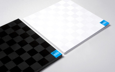
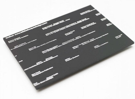
BibliotequeDesign
Original brochure design by a London-based design agency BibliothequeDesign. Take a look at the examples below: the agency combines strong typography with geometric forms and catching colors. And the result is pretty catching as well.
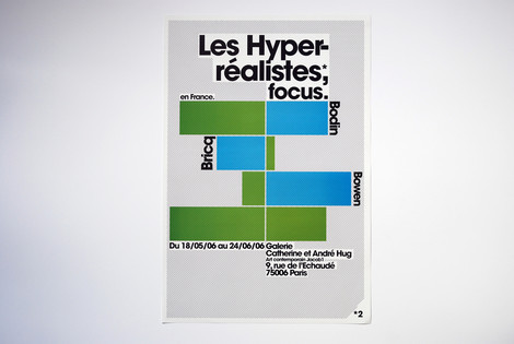
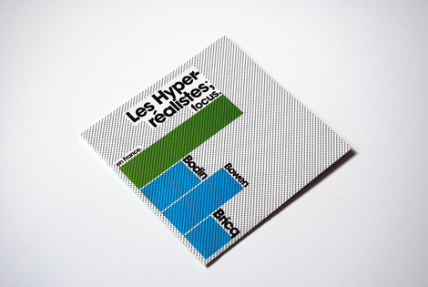
Rizo + Gobart
Art Direction for this flyer/poster for the promotion of “Les hyperréalistes en France” exhibition at the Catherine et André Hug Art gallery. Designed by Xavier Encinas.
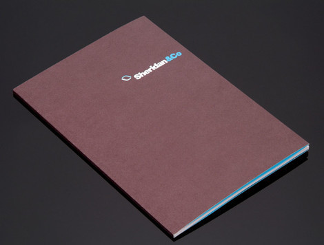
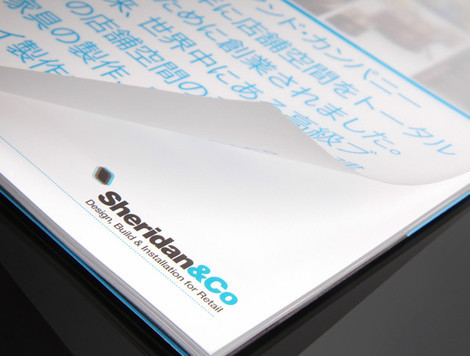
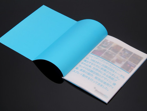
Sheridan & Co Brochure
Minimalism meets catchy colors. This is a booklet one would like to take with himself / herself. Designed by Un.titled.
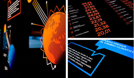
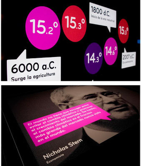
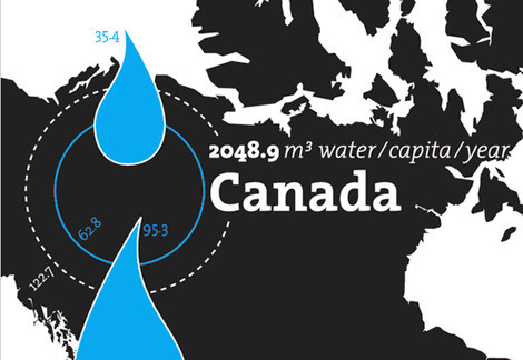
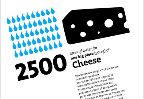
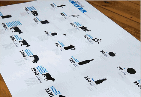
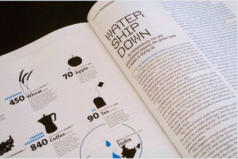
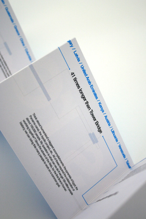
Virtual Water
Based on the data gathered by Hoeckstra et al. in their study »Water Footprint of Nations« German designer Timm Kekeritz created this double-sided poster and an accompanying brochure. One side is visualizing the water footprint of selected nations, emphasizing the im- and export of virtual water. The other side shows the virtual water content of selected foods and commodities.
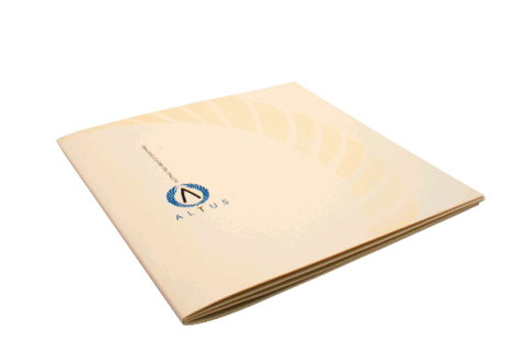
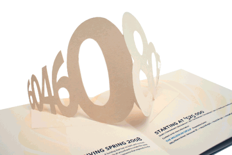
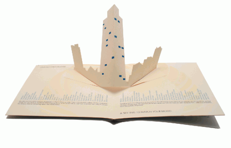
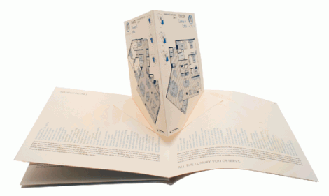
Altus
The concept focuses on putting the viewer in the position to imagine their perfect home with no images to cloud the potential buyers mind. Instead this brochure features pop-ups to enforce that living at Altus puts you above everything. The combination of textured paper, pop-ups and horizontal lists of various building and neighbourhood amenities lead to a brochure that genuinely display the uniqueness of the product. Designed by Andrew MacPhee.
Alphabet City 2007
A promotional booklet.
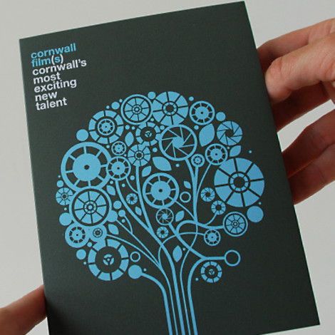
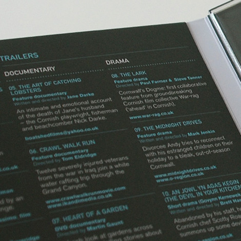
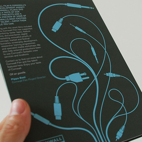
Cornwall Film
Scott Parker Design Limited.
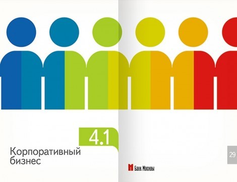
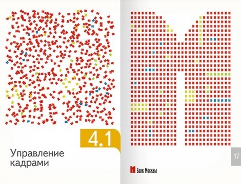
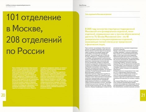
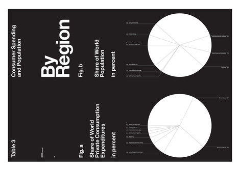
Annual report for Bank of Moscow
Designed by Danil Kryvoruchko.
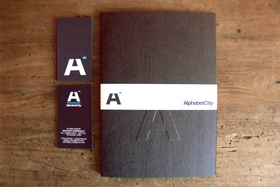
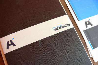
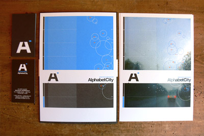
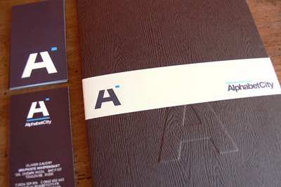
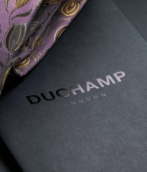
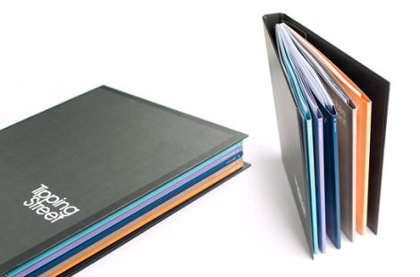
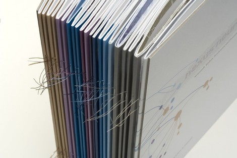
Four IV
Brochures can not only look good: you can use fabric to make the reader feel the high quality of the brochure as well. Example: the AlphabetCity brochure displayed below.
BB/Saunders
BB/Saunders agency combines a very modern look with creative design solutions. Apparently, the agency loves circles, dots and strange geometrics shapes.
Neuelaboratories
We have no idea what this image stands for. But maybe it was the designer’s decision to make us feel like this in this brochure?
Peter&Wendy
Peter&Wendy studio has its own unusual style when it comes to brochure design. The grid in the background and strong, bold typography make the brochure stand out; consequence: the booklet is distinctive and hard to overlook.
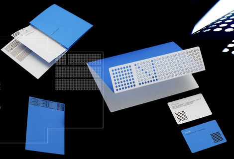
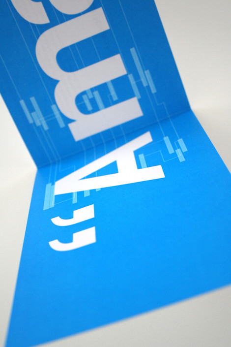
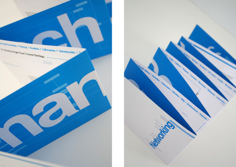
Benance Network Promo
Booklet containing information and research found during experimentation of Visualising Networks. The aim of the booklet is to promote the benefits of networking in this day and age, from students through to career professionals. The booklet is displayed with the instalation piece and is intended to be taken away with the viewer to keep.
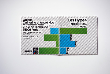
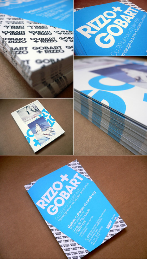
Rizzo + Gobart
Art Direction for this flyer/poster for the promotion of “Les hyperréalistes en France” exhibition at the Catherine et André Hug Art gallery. Designed by Xavier Encinas.
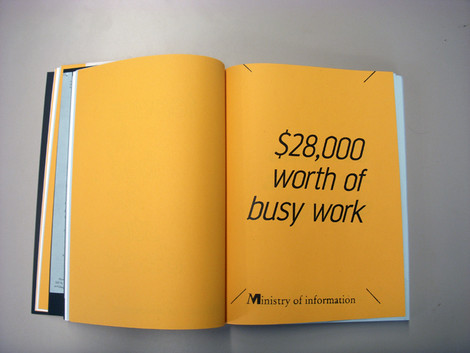
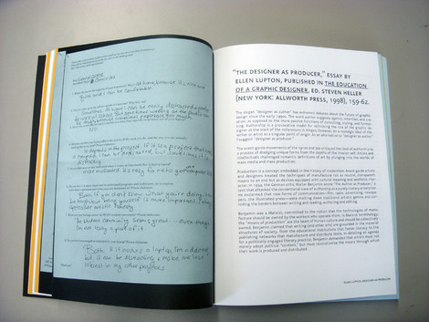
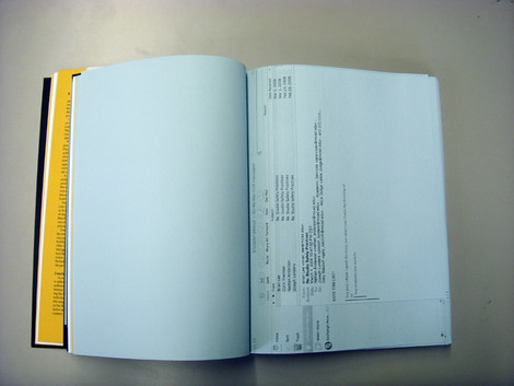
HelloLiz
What difference does it make who’s speaking? This brochure is a compendium of research on four different, but inter-related topics. Notes and essays concerning the ‘designer as author’ debate as well as the current state of art education are intermingled with personal investigation of self and the surrounding student community at MCAD. Unusual treatment of type, unusual booklet.
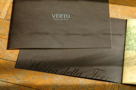
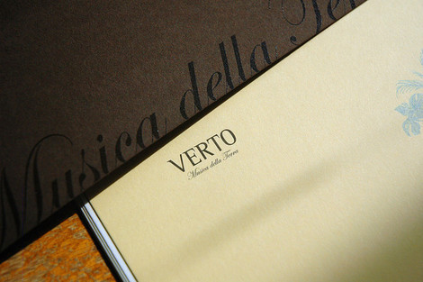
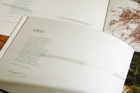
Verto Booklet
Classic and traditional brochure design which is often used for interior design promotions. Simple yet beautiful, this bookmarklet perfectly manages to communicate with its target group. Designed by Dmitry Galsan.
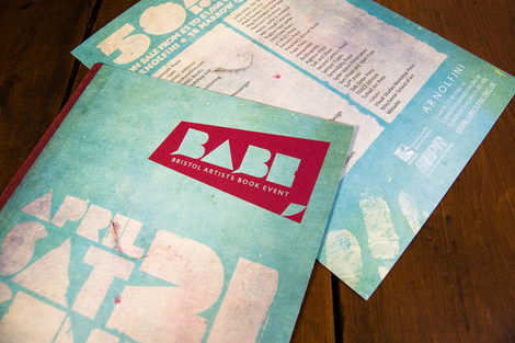
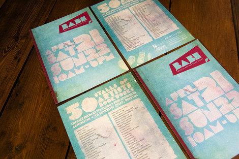
BabeRF
In April of 2007, 50 artist bookmakers from Bristol and around the world came together at the Arnolfini art gallery to show and sell their work. Ginger Monkey was asked to create an identity for this event that focused on the artistry and hand crafted techniques used to create the books. He came up with a grungy and dirty result which lets the brochure stand out.
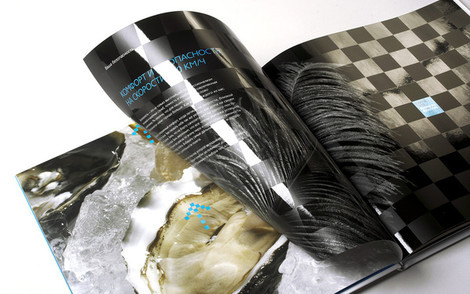
Glossyzine
These excerpts show that an annual report doesn’t have to be boring. However, it doesn’t have to be colorful neither. Used properly, black, white and typography can suffice.
Value and Service
Brochures can be printed not on simple paper, but on other materials. The booklet below shows how geometric shapes can be used to let the brochure not only look, but feel distinctive.
De Facto
Designed by De Facto.
September Industry
Strong grid structure meets strong typography.
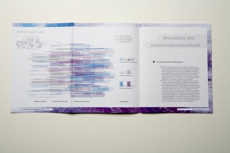
Nexus Neuronia
Brochure design doesn’t have to end with the deign inside out.
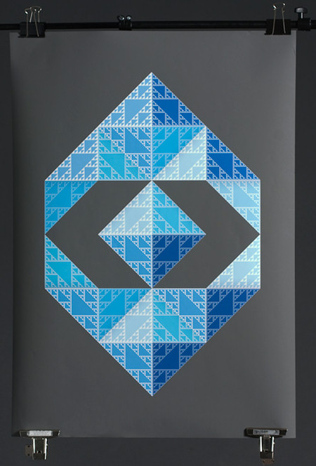
Siggi Oddsson
Unfortunately, Siggi Oddsson rarely designs brochures. Maybe he should. We would like to have the one with the image below.
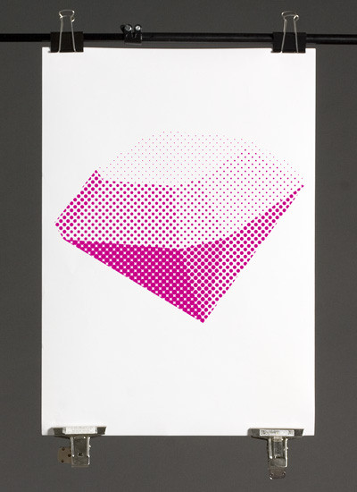
Gemstones
The same holds for Sveinn Porri Davíðsson…
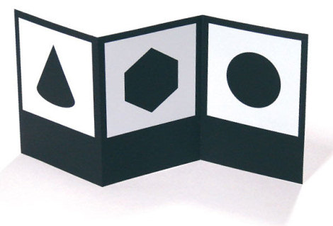
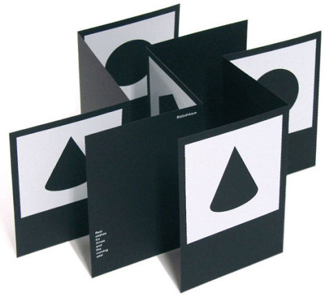
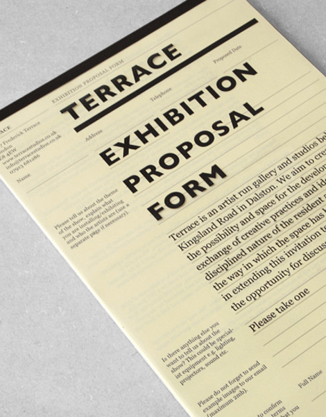
Terrace Exhibition Proposal
This is probably the sexiest form you ever saw. It was created by Ewan Robertson of Oscar And Ewan for Terrace Studios, a gallery in Dalston, London. The project includes identity, design and a website.
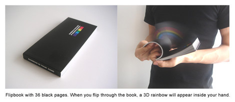
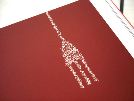
Rainbow in your hand
That’s creative. Flipbook with 36 black pages. When you flip through the book, a 3D rainbow will appear inside your hand.