Hand-Drawing Style In Web Design

Email Newsletter
Weekly tips on front-end & UX.
Trusted by 182,000+ folks.
 Register for Free

 Celebrating 10 million developers
 Custom Web Forms for Angular, React, & Vue. Your backend.

When it comes to web design too often perfect, colorful and boxy designs make the cut; however, the reality is different as it is hard to find objects with a perfect shape and a perfect color in our daily routine. To achieve a unique and communicative design we need to consider more creative approaches. For instance, we can draw sites by ourselves — or at least some parts of it.
The main purpose of hand-drawn elements lies in their ability to convey a personality and an individual note in times when perfect, boxy and rounded elements can be found almost everywhere. They look different and they can make a web-site look different. And this is what we usually are after in the first place. This post presents fresh examples of hand-drawing style in modern web design. All screenshots can be clicked and lead to the sites from which they’ve been taken.
What’s new?
Few months ago we’ve declared that, in our humble opinion, shiny and glossy design elements were officially outdated. We have also suggested that web designs will become more subtle, more user-centric, more content-oriented and less loud. Indeed, this is exactly what we observe at the moment. Hand-writing, earlier often taken to extreme, now seems to become subtle, supporting and less dominating. Below you’ll find some examples which are supposed to prove exactly that.
Hand-drawn elements are used moderately
In particular, since designers try to provide visitors with a comforting, user-friendly presentations, they tend to use hand-drawn and hand-written elements moderately. Sometimes, only few design elements are designed accordingly while the rest of the design is focuses on clean conten presentation and isn’t drawn at all. For instance, often only category headers, search boxes or navigation are hand-written.
However, it is important to understand that there are still many examples of exaggerated use of hand-writing and hand-drawn elements (see examples below). Yet we’ve observed a growing number of designs where such elements are used sparsely and accurately.
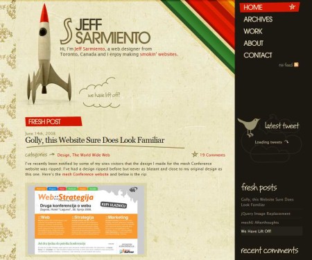
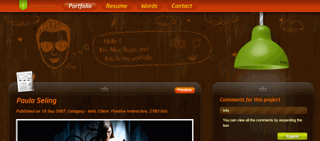
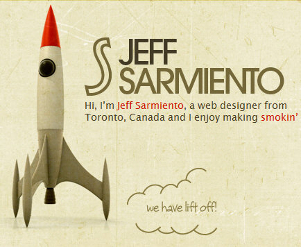
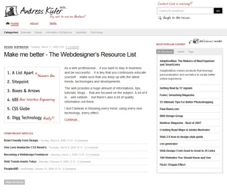
Jeff Sarmiento combines hand-written and hand-drawn elements with a classic retro-look. Although there are only few elements which are actually hand-drawn, they give the design an authentic style which perfectly fits to its look. More precisely, hand-drawing is used only for category headers,
Script fonts gain on popularity
Since hand-drawn elements become more subtle, designers often tend to imitate hand-writing instead of using it. For instance, this is done by using clean and sharp script fonts instead of literally hand-written or drawn sketches. This approach helps designers to make the layout cleaner and easier to scan.
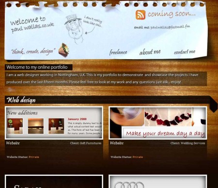
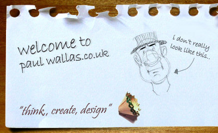
Paul Wallas uses script fonts in header and for category headings. The script font is, however, easy to read and perfectly fits to the informal style of the site.
Beware: usability issues!
Regarding the usability point of view we’ve managed to find some negative examples. Attempting to create a distinctive design, designers often tend to neglect usability issues. Whether some design element is hand-drawn or not, it is important that it successfully communicates its function and visitors are able to a) find it and b) immediately know how to use it.
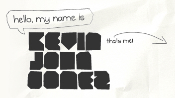
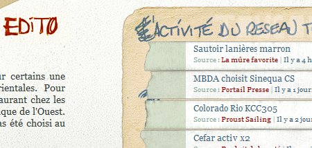
Hand-written navigation options. That may be too much hand-writing at once.
Mind Never (screenshot above) uses hand-writing for 6 design elements — logo, tagline, navigation, headers, illustration and all clickable elements. The main problem with the design is the simple fact that it is hard to scan.
Furthermore, links are styled differently — sometimes they are blue, sometimes black, sometimes they have a hover-effect, sometimes they don’t. That’s not effective and not user-friendly. Here one should reduce the number of hand-drawn elements and use standard design elements instead.
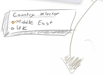
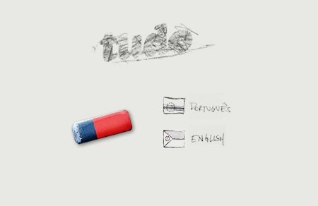
Consider another example above. Omnia.ae uses hand-drawn design elements for almost every possible element in the layout. The image displays a country selector which is a radio-button. Although this is definitely an interesting solution, this selection is easy to overlook as it appears to be rather a part of the background image than a standalone design element.

While the RSS-button and a sign-up-illustration are likely to be perceived as clickable design elements, in the language selection above it is not the case. Keep in mind: if your decision to use an artistic element instead of a standard solution raises some usability issues, you should prefer a standard solution.
Let’s now take a look at some examples of how hand-writing and hand-drawing are used in practice.
The most valuable and innovative ideas had all been handwritten first. That’s no big news, since designers tend to produce first sketches as paper prototypes anyway; still it’s important, because web design is different from “usual” design. Of course, it also has a personal note and it is hand-made, however users can’t see that. As CSS is “boxy but good”, designs tend to have a rather limited appearance — they are too boxy and too right-angled.
If designers want to achieve a different design, they have to draw their sites by themselves — or at least some parts of it. And in fact, this is done quite often: whether a blog, a shop, an ad, a private page, or some collaborative project — doesn’t matter whether with Flash or (X)HTML. The main purpose of hand-drawn elements lies in their ability to convey a personality and an individual note in times when colorful, sharp and rounded Web 2.0 elements can be found almost everywhere.
Sometimes designers create whole pages with paper, pencil and/or a tablet PC. More often single layout elements are designed in a special way — curved links, hand-made icons, backgrounds, notes, stickers and fuzzy lines are supposed to give the site a “human touch”. These elements makes a web-page which might not look different from dozens of similar pages, stand out and arise users’ curiosity. Caution: a quickly installed hand-written font can harm more than help (hint: Comic Sans is definitely not the way to go).
How impressive can the results be? And when can the hand-drawing style be used? Let’s take a look at some excellent examples of hand-drawing style in modern web design. All screenshots can be clicked and lead to the sites from which they’ve been taken.
Hand-drawing as artistic minimalism
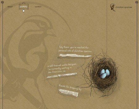
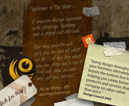
Since hand-drawing is a typical feature of graphic artists, designers and illustrators and is often associated with creativity and inspiration, it is often used in portfolios and showcases.
The interesting thing is that the hand-drawn style is often the only element which is used by designers to present their work on their site. Below some examples of the artistic minimalism at its best.
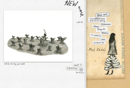
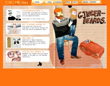
Mel Kadel draws everything — even herself.
Both start page (top) and internal page (bottom) on this Brazilian site have hand-drawn elements. All internal pages have its own, unique style.
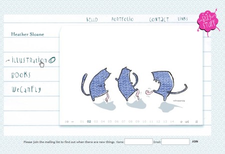
Heather Sloane illustrates with Flash.
Drawn elements complete a classic portfolio design. This design isn’t that minimalistic, but it doesn’t offer that much, neither.
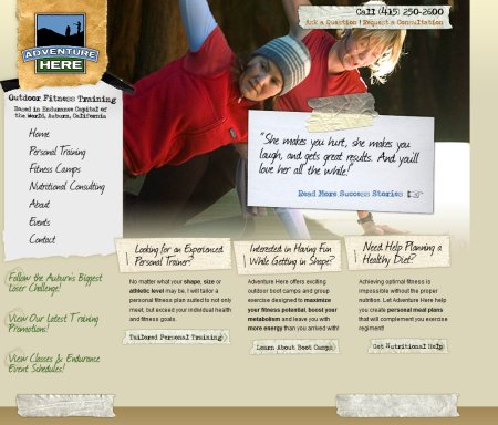
The style supports the content
In some cases designers experiment with hand-drawn doodles to support the main content of the site rather than use hand-writing for main design elements. For instance, sketches are sometimes placed on the background of the site. Sometimes it works quite well.
In the design below similar idea is used. However, only 20-30% of the page actually serves the content presentation. This is not what most users are expecting and this is exactly what make this site different. Jakob Nielsen wouldn’t be fascinated about the content presentation on this site.

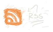
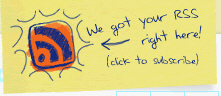
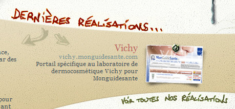
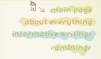
Also single design elements can be used in the hand-writing style. In the example below only an RSS-button on the right is hand-drawn.
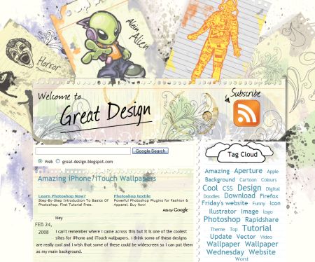
This example uses hand-written elements all across the site. It has a hand-written logo, hints, lines and even maps. The hand-drawn map on the start page contains links to single areas of the site.
While this is definitely an interesting and creative design, users might experience problems in finding the information they are looking for. In fact, visitors need to play around with the site to find out what information is actually presented.
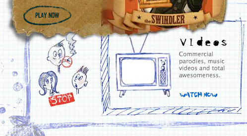
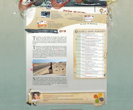
The design also includes hand-drawn elements throughout the site, e.g. to display videos a sketch of the TV set is used, and even tables follow this style.
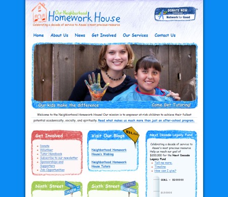
The content also incorporates the style in the HomeworkHouse (wax crayons).
An online-shop with a number of hand-drawn elements.
Simple yet impressive. Caution, Flash.
Hand-drawing combined with illustration
Since hand-drawn figures might sometimes lack visual appeal, this shortcoming is often addressed with the use of striking visual elements. The result is sometimes a wild, vivid, colorful — but always innovative design approach.
It’s important to note that such design decisions should be considered very precisely. It’s very easy to make the design more appealing by making it less intuitive at the same time. The design is different — not necessarily simplified or made more difficult to grasp. In fact, how well usability and accessibility issues are mastered depends mostly only on the developer’s skills.
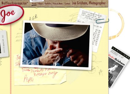 What you see looks like a prototype: Joe Grisham’s site looks authentic, hand-made and uses illustrations.
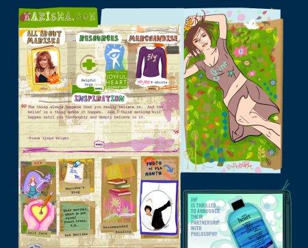
This design combines hand-drawing style and vivid illustrations (comics). It isn’t supposed to be a Web 2.0 design.
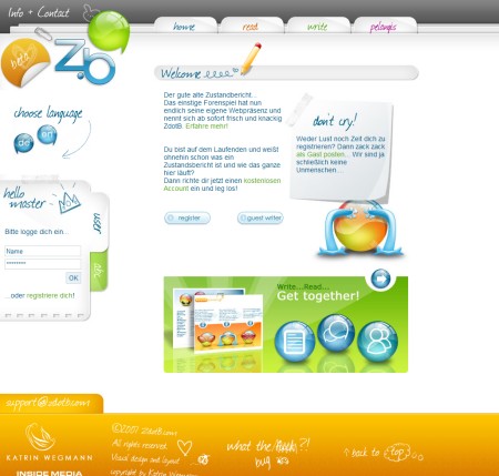
This is a typical Web 2.0 design — with glossy buttons, reflections and (guess what!) hand-drawing style used for navigation, content and footer.
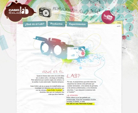
Hand-made style in the advertisement of a Casio-product. Flash in use.
Some designers intertwine the hand-drawing style with illustrations unifying them into a single design element. This produces an artistic, unexpected and intriguing design and motivates visitors to explore the site. Not all visitors will be willing to do that, actually.
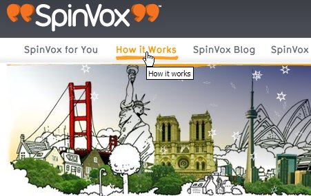
Hand-drawing style hidden in details: Spinvox uses curved lines for the hover-effect.
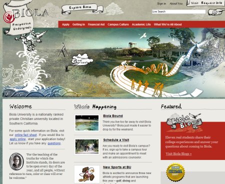
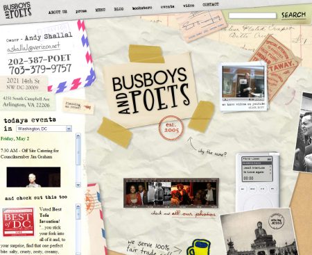
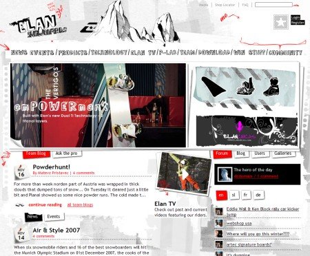
A classic web-site with individual hand-written elements. Actually, it’s a site of a university. More hand-drawn elements can be found across the site.
Hand-drawing delivers the message
This aspect becomes more apparent in Web 2.0-designs. Hand-drawing elements are used to make it easier for users to get the idea behind the product and service which is offered. This works pretty well in both web and print design, as it gives the provided explanation a more personal, emotional and informal nature. Take a look at the examples below.
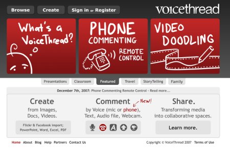
This is how a typical Web 2.0-site might look like once it’s provided with some additional visual cues.
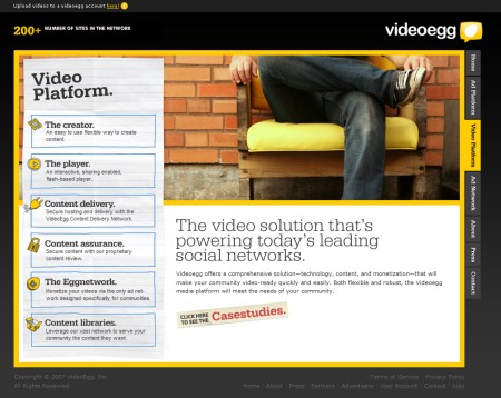
Videoegg uses artistic elements in the navigation menu.
Hand-drawing taken to extreme
Sometimes it’s the designer’s purpose to impress, shock or entice the reader to get noticed and create a lasting impression. While there are a number of ways to achieve this, an unusual design style is definitely one of them; it is also the only style that delivers the artistic side of the design extremely well. Of course, it doesn’t always lead to usable web-sites.
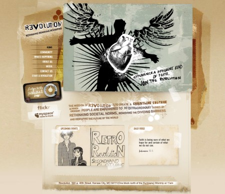
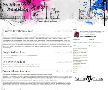
A “sketchy” weblog. Where do you look at when you visit the site at the first time?
A drawn navigation menu at the top of the site also has some cute hover-effects.
Retro lives in this site.
Experiments and artistic approaches
Designers are artists, or at least they should try to be. And as such, designers tend to take radical design decisions, exploring their imagination and challenging visitors’ creativity. This doesn’t always work, but sometimes it does.
This Flash-based site literally lets you play with its content.
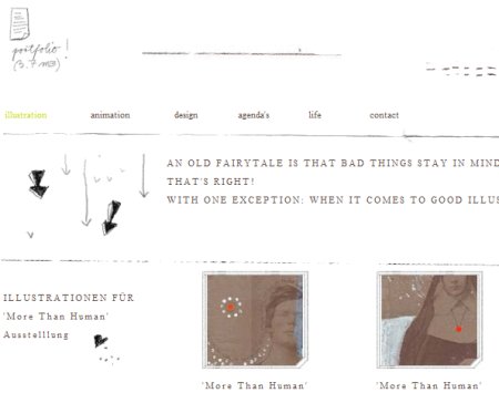
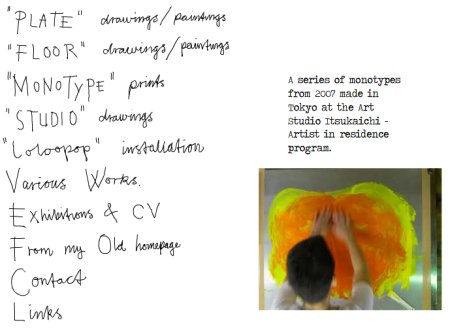
A portfolio with hand-writing: one more time.
An ultimate solution: Kuba Dabrowsky labels everything manually.
The style of street paintings. Yes, it looks quite trashy. But it is designed like this by purpose.
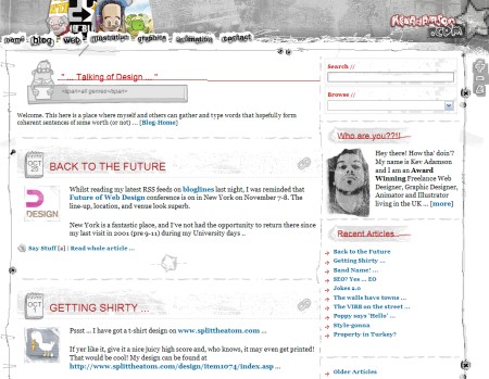
Kev Adamson: you won’t find any similar WordPress-template.
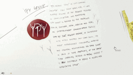
Maria Grossmann. The screenshot shows only a part of the page (Flash)
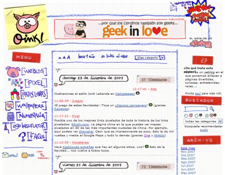
A weblog with a pig, curved lines, hand-drawn elements and a unique navigation menu. And, of course, the site also changes your cursor.
Portfolio designed with the the “old paper look” in mind.
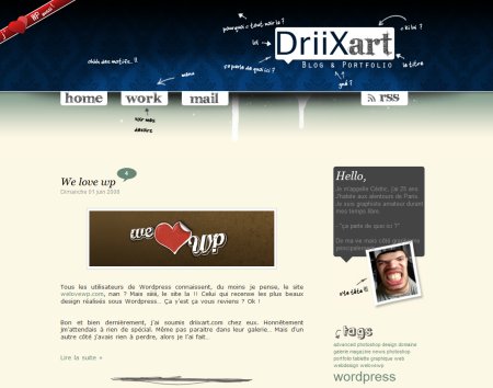
Hand-drawing in logos and headers
When hand-written elements are placed in logo or in a header, the designer makes sure that visitors will detect these elements. Since these areas are clicked more often than other layout elements, the “hand-drawn”-feeling will be conveyed. That’s what some designers are trying to achieve. Besides, if the designer wants its design to convey a personal note and some design elements are already hand-written, it makes sense to consider adding some hand-written notes to the header as well.
Logos
Headers
Single hand-drawn design elements
To give the layout a “hand-written”-style design elements need to be styled accordingly. In fact, you can apply the style to any part of your layout. Usually designers use hand-writing for teasers, RSS-buttons, navigation, input fields, headers and background images.
Teaser, Slogan


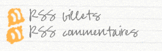
RSS-feeds
Input fields
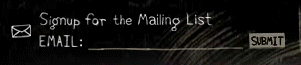
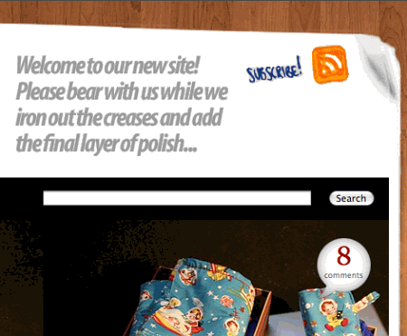
Newsletter Box
A classic web-site with individual hand-written elements. Actually, it’s a site of a university. More hand-drawn elements can be found across the site.
Hand-drawing delivers the message
This aspect becomes more apparent in Web 2.0-designs. Hand-drawing elements are used to make it easier for users to get the idea behind the product and service which is offered. This works pretty well in both web and print design, as it gives the provided explanation a more personal, emotional and informal nature. Take a look at the examples below.
This is how a typical Web 2.0-site might look like once it’s provided with some additional visual cues.
Videoegg uses artistic elements in the navigation menu.
Hand-drawing taken to extreme
Sometimes it’s the designer’s purpose to impress, shock or entice the reader to get noticed and create a lasting impression. While there are a number of ways to achieve this, an unusual design style is definitely one of them; it is also the only style that delivers the artistic side of the design extremely well. Of course, it doesn’t always lead to usable web-sites.
A “sketchy” weblog. Where do you look at when you visit the site at the first time?
A drawn navigation menu at the top of the site also has some cute hover-effects.
Retro lives in this site.
Experiments and artistic approaches
Designers are artists, or at least they should try to be. And as such, designers tend to take radical design decisions, exploring their imagination and challenging visitors’ creativity. This doesn’t always work, but sometimes it does.
This Flash-based site literally lets you play with its content.
A portfolio with hand-writing: one more time.
An ultimate solution: Kuba Dabrowsky labels everything manually.
The style of street paintings. Yes, it looks quite trashy. But it is designed like this by purpose.
Kev Adamson: you won’t find any similar WordPress-template.
Maria Grossmann. The screenshot shows only a part of the page (Flash)
A weblog with a pig, curved lines, hand-drawn elements and a unique navigation menu. And, of course, the site also changes your cursor.
Portfolio designed with the the “old paper look” in mind.
Hand-drawing in logos and headers
When hand-written elements are placed in logo or in a header, the designer makes sure that visitors will detect these elements. Since these areas are clicked more often than other layout elements, the “hand-drawn”-feeling will be conveyed. That’s what some designers are trying to achieve. Besides, if the designer wants its design to convey a personal note and some design elements are already hand-written, it makes sense to consider adding some hand-written notes to the header as well.
Logos
Headers
Single hand-drawn design elements
To give the layout a “hand-written”-style design elements need to be styled accordingly. In fact, you can apply the style to any part of your layout. Usually designers use hand-writing for teasers, RSS-buttons, navigation, input fields, headers and background images.
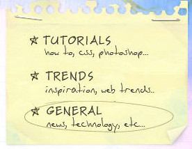
Teaser, Slogan
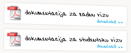
RSS-feeds
Input fields
Newsletter Box
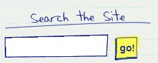
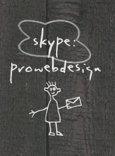
Search box
Illustration
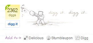
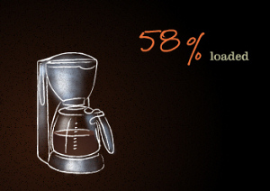
Preloaders

Header
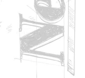
Background image
Hand-drawing in navigation
Navigation is the primary element of every site design. Designers know it and give it some unique artistic elements to make the design more unique and distinctive. However, you shouldn’t experiment too much with navigation. Make sure it works. The function is more important than the design. Below you’ll find some example of how one can effectively combine the hand-drawing-style with clear and intuitive navigation.
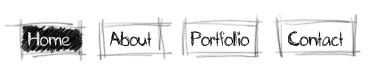
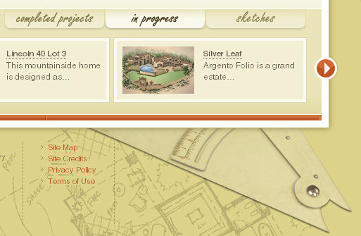
Hand-drawn rectangles for navigation options
Hand-drawing combined with hand-writing
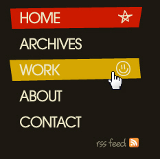
Hand-drawn icons appear when the navigation option is hovered
Hand-drawn icons are used to indicate navigation options
Hand-drawn icons appear when a section is hovered

A script font in use
Subtle hand-writing used for tabs
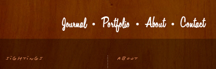
Tiny hand-writing for section headers and script font used to display navigation options
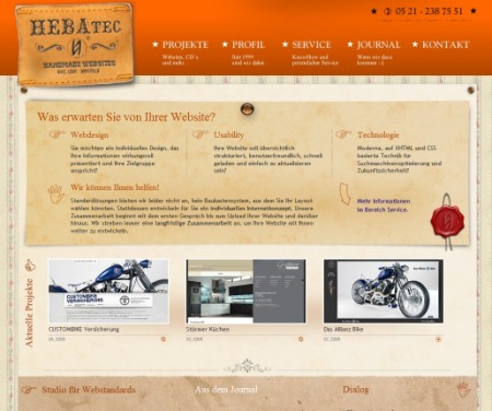
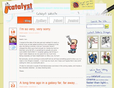
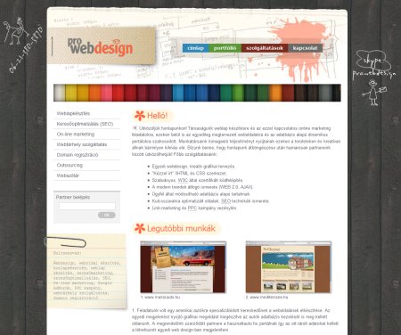
Hand-drawing used moderately.
As we have written above, designers attempt to make sure that the design looks distinctive without compromising the usability and user-friendliness of the design. In fact, it’s not that hard as it may look like. Consider the examples below.
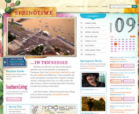
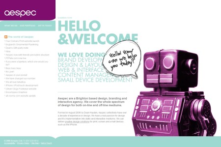
This is how we like it: huge typography, flashy colors, memorable favicon and a sweet roboter willing to help. Well, the roboter speaks hand-writing, of course.
The design become more interesting when standard-elements are mixed with some hand-written elements. In such cases visitors are offered the design which looks unusual and different. That'figure a good way to impress visitors with an unusual design approach. That's what Li Chin does. The navigation menu has hover-effects as well.
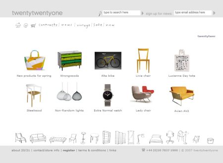
Icons, navigation and products in an online-shop
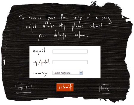
Coldplay offers some free downloads

Flash-based
Beware: Flash-based music player starts automatically
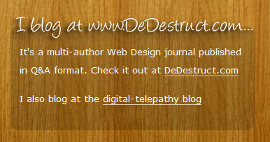
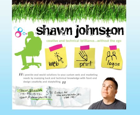
This is a pretty hand-drawn sidebar!
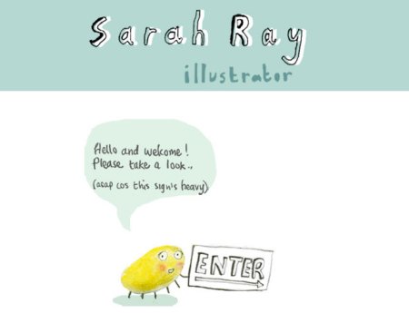
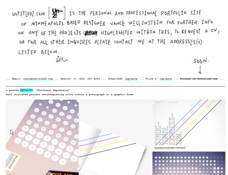
Graphic artists and illustrators seem to have no problems with drawing a web-site from scratch. This is how Sarah Rays has done it.
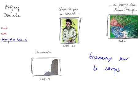
Grégory Dourdes with the same approach.
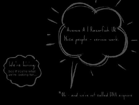
Hand-drawing used heavily
There are still many examples of exaggerated use of hand-writing and hand-drawn elements, however they seem to lose on popularity. It’s hard to say if it’s a trend or not — a simple explanation we can come up with is a fact that overcrowded, “too artistic” designs are likely to attract a limited target group while design with moderate use of hand-drawing can be aimed at everybody.
 Flash in use
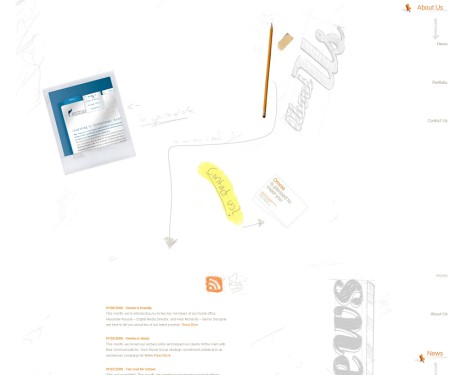
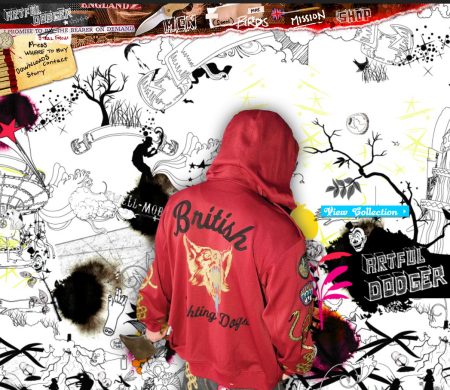
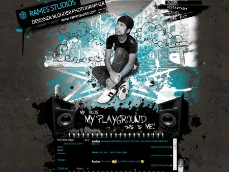
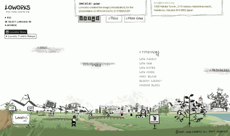
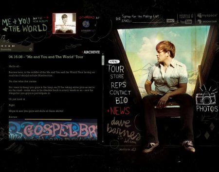
Probably the largest hand-drawn design out there
 Hand-drawn site layout
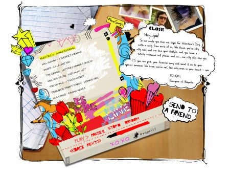
Creative chaos at its best