Flexible Layouts: Challenge For The Future

Email Newsletter
Weekly tips on front-end & UX.
Trusted by 182,000+ folks.
 See User Testing Live
 Custom Web Forms for Angular, React, & Vue. Your backend.
 Celebrating 10 million developers


This article is a guest post written by Dirk Jesse, the developer of YAML (Yet Another Multicolumn Layout), an (X)HTML&CSS framework which explains his motivation for YAML in the last paragraph of the article. This article is supposed to initiate the discussion about the need for more flexible layouts in modern web design and explain why flexible designs are still important — even despite the Full Page Zoom-functionality implemented in most modern browsers.
The new generation of web browsers — Firefox 3, Opera 9.5 and Internet Explorer 7 — provides a feature which seems to save a lot of work for web-developers in the future, namely the Full Page Zoom. Instead of allowing users to increase and decrease the font size on a given web-site, browsers now enable users to literally scale the rendered layout including visuals and background images. The whole design layout is scaled proportionally according to some adjusted zoom-factor, with all the elements of a page’s layout expanding equally. Consequently, every fixed, pixel-based layout becomes “scalable”; the content area always remains within the layout box it is supposed to be in and there is no chance of producing overlapping boxes as we’ve seen in the previous generations of web-browsers.
However, is the new zoom-technique indeed so advanced that we don’t need flexible layouts any longer? Just as this question is extensively discussed in the blogosphere, it is extensively answered with “yes”. And there is a good reason behind it. The coding of a fixed layout is much easier and, when used properly, produces exactly the results a designer is willing to achieve. With fixed layouts, designers can ensure the exact positioning of each pixel (a dream of many graphics designers comes true!) and the user can adjust the size of the layout with a scaling zoom on demand. No wonder that it’s tempting to motivate the switch to fixed layouts. However, as professionals, we need to consider how reasonable it is from the professional point of view.
In the following let’s discuss why we strongly believe that this paradigm won’t lead web design to more user-friendly and accessible web-sites, why flexible layouts still remain important today and why they will become even more important in the future.
Where Full Page Zoom doesn’t help at all
The main difference between fixed (px-based) and flexible (%-based) layouts is the simple fact that flexible layouts can better adapt to user’s viewing preferences. With flexible solutions, the width of the layout depends on the viewport of the browser and can perfectly fill the viewing space without any manual adjustments from the user’s side. Fixed layouts can’t do that. Full page zoom, when applied to fixed layouts, enables users to manually adjust the design after it has already been rendered.
Another important aspect which is worth keeping in mind: Internet Explorer 6, probably the nightmare of every web-developer out there, has a market share of almost 40% — and it doesn’t support zoom at all.
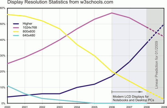
According to w3schools.com, the larger and wider screen resolutions (larger than 1024×768px) will become a standard in the future.
More problematic is the overwhelming confidence of developers that the individual decision-making is better for users from the accessibility point of view. When applied to fixed layouts the web-developer delivers a clear message:
Dear users, your browser can zoom my fixed layout - so please help yourself if you want or need to!
From designer’s perspective with this argument it is tempting to switch to a more comfortable (fixed) design solution at expense of accessibility. Why should a user adapt his viewing preferences to a web-site? Shouldn’t a web-site rather adapt itself to the viewing preferences of its users? If you think about it for a second, you have the same situation as in a cloth store where you are offered cloth only in some very specific size. If the size doesn’t fit to you, it’s your problem, not store’s owner. And if you want to you can take a needle, some fabric and create the cloth of its own choice for free. That is not user-friendly.
Even more crucial is the simple fact that full page zoom isn’t really feasible in practice. Let’s assume that the designers has a fixed layouts with the width of 960px. To zoom it using a 150% scale factor and still browse the page without horizontal scroll bar, users need to have at least the screen resolution of 1440px and a browser opened in the full-screen-mode. Is it really a path for the Web to take in the years to come? As Nancib states, “problem is that sometimes the font on a page is friggin’ tiny without zooming it in, but zooming the page (with the images) doesn’t just make it more readable.”
Web developers often tend to argue that flexible layouts are too complex and with full page zoom every fixed layout is becoming scalable anyway. That’s right, scalable, but not flexible. Why should a browser correct the mistakes a developer or designer has done when creating a site layout?
Flexible layouts are hard to control? That’s not true!
Whenever designers argue against flexible layouts they tend to use the following argument:
In flexible layouts the text flows in the width when expanding the browser window, making the content hard to read. This text flow is hard to control.
Wide text flow is definitely not a nice thing to offer your visitors. However, text flow doesn’t need to flow in the width when the browser window is expanded. To achieve attractive flexible designs one can use the properties min-width and max-width. Of course, Internet Explorer 6 doesn’t support both of them — just as it implements both hasLayout-model and the Float-model incorrectly. However, this is not the reason to not use floats for your design layouts, right?
To simulate max-width and min-width you can use various workarounds (JS Expressions); and to simulate min-width you can even use a pure CSS-solution. But what happens if the user’s browser doesn’t support JavaScript? Well, in this case a flexible Layout without max-width doesn’t necessarily destroy the layout, although the text flow may be too wide. But this is what the Progressive Enhancement is all about, so this is not that problematic.
How to find an ideal width for a flexible layout?
Let’s consider how wide the layout should be for an optimal flexible layout:
- Layout width: use
width:autoor any %-value to make sure that the layout makes use of the available width of the browser windows automatically. - Minimal width: use some px-value (e.g. 760px). This lower bound should be used for all pixel-based layouts, so the content remains readable when displayed in the minimal screen resolution.
- Maximal width: use an em-value (e.g. 90em). Thus the text flow doesn’t grow in width in an uncontrollable fashion, but remains constant for various screen resolutions. Side effect: the maximal width is scaled according to the font-size of the browser.
Also keep in mind that we, designers, don’t really have the design layout (whether fixed or flexible) under control as the presentation of our layouts depends on the browser, font size adjustments, operating system, alternative user-stylesheets etc.
The Holy Photoshop Mockup
The most frequent argument used to motivate the fixed layout solution is the fact that customers are confident that a perfect Photoshop mockup would look best when displayed 1:1 in user’s browser. Indeed, it is hard to explain to the customers that flexible solution, although looking differently in different context, has some advantages. After all, if the design doesn’t look as expected on senior project manager’s wide screen laptop, then this is not something the customer would agree on.
However, following customer’s decisions blindly you neglect your professional responsibility to develop accessible, user-friendly websites. It’s your duty to complement your customer’s wishes, compromise and seek the best possible solution for users and not for the senior manager. A brief argument that a user-friendly solution that doesn’t look best at some particular configuration would bring more satisfied customers and consequently more money in a long run usually suffices.
The end-result layout isn’t supposed to be used as a nice screenshot for one single portfolio. It has to serve users’ needs and enable them to get to the content of the site as quickly and as painlessly as possible. Take your time and go through some of the layouts presented in numerous CSS-showcases. In way too many cases the attractive pixel-based design breaks down completely when the browser window is resized or the content is scaled. A Photoshop Mockup isn’t necessarily easy to convert into a flexible design layout. However, it is worth consideration. Transparency, patterns and background images can lead to impressive and flexible results.
In most cases we design websites not to present some design, but to let the design help users to achieve some objectives such as finding the information they are looking for. Graphics-heavy flexible layouts are not easy to achieve and require planning, patience and confidence that the results are worth it. However, these efforts improve user experience and make the design medium-independent.
Mobile Browsers – Why flexible is better
Just one year ago my old mobile phone could access the Internet. However, it was extremely hard to browse web pages, read them and navigate. With the improved user interface of iPhone it has completely changed. Mobile web browsers (e.g. Opera Mini or Safari on the iPhone) have dramatically improved over the last two years — at the moment, it is almost natural that they render web pages without any considerable display errors.
My iPhone has no problem showing flexible layouts in the landscape format or portrait format; in fact, it automatically adjusts them to the best format that fills the whole iPhone window. At the same time I often experience problems when loading fixed layouts — from time to time they need to be zoomed in to fill in the whole browser window.
What holds for mobile devices also holds for printing devices. Ironically, nobody argues about the advantages that flexible layouts for print layouts manage to deliver. Flexible design allows to use portrait / landscape - formats for optimal printing.
The decision for flexible layouts against fixed layouts doesn’t only improve the accessibility on Desktop-PCs, but also creates robust and flexible medium-independent layouts which can be easily adapted to any output devices. After all, with flexible rules (relative measure units, minimal margin, and padding, alignment, etc.) instead of fixed rules (px) rendering engines can better consider the properties of the used media.
The future, the unexplored land
As mentioned above, the mobile Web is becoming more and more important. Are we now going to optimize layouts for 640×480 or 800×600? The screen resolutions are increasing, the prices for high-resolution displays are decreasing. At the same time the physical resolution of devices as well as the spatial printing resolution (dpi). Consequently, the absolute size of one pixel decreases. No wonder that pixel-based definitions are becoming less expressive.
The gap between low-resolution displays and high-resolution displays hasn’t bridged over the last ten years. On the contrary: the gap has increased dramatically. Websites are viewed in hundreds of possible screen resolutions while each user may have his preference for the viewport of his browser. This consideration alone explains how important flexible design layouts are today and how important they will be in the future. Consequently, fixed layouts won’t make the cut in the future as designers will need to consider more and more different devices to optimize the design for. What we need in web design to come to grips with all this variety are dominating relative measurement units.
Flexible Layouts with YAML
YAML (“Yet Another Multicolumn Layout”) is an (X)HTML/CSS-framework which was developed especially to meet the requirements of flexible and user-friendly design layouts. Since June 2007 YAML is available in English and provide an extensive documentation. Most CSS-Frameworks like Blueprint CSS or YUI Grids offer designers a predefined system of CSS-classes to create grid-based layouts visually. To create a layout designer needs to create a HTML-structure of the site and to assign CSS-classes to containers. The rest is automatically taken care of.
YAML takes a different route. The Framework supports the development of grid-based layouts as well as the development of the grid system - with the emphasis on flexible layouts. If a designer wants to create a grid-based layout he can use the basic skeleton with three columns, header and footer. Each element can be removed or adjusted to user’s needs. The actual design, the positioning of the columns, is done using CSS-definitions (and not HTML-structure as it is done in other CSS-frameworks). The benefit for designers: with YAML one has better options for defining his own system of classes, using any measurement units and getting clean code.
Based on the HTML-structure of YAML, the framework includes layout presets which already prevent IE-bugs; thus the framework makes it easier for designers to create a layout which works in both modern and older browsers. Layout examples provide an overview of what is possible with YAML and may deliver some ideas for your future layouts. Apart from that, YAML offers a set of flexible grid-components which you can use to create columns within columns and thus design a more complex but flexible Grid-layouts.
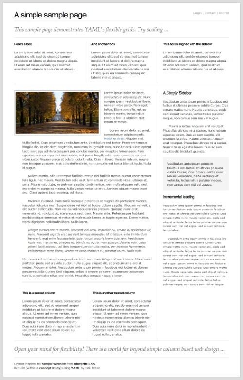
YAML Example: a demonstration of YAML's flexible grids.
Consider the example above. BluePrint CSS has a demo-page which displays a layout created with Blueprint CSS. And this is the result of the very same template created using the flexible grid-elements of YAML. The scaling works even in IE 5.5, including min-width and max-width.
Apart from layout design, YAML also delivers style sheets for print layouts, as well as components for horizontal and vertical navigation. YAML requires some time to climb the learning curve: the tool offers a variety of functions, and user-friendly flexible layouts are not easy to build.
The concept of YAML is, however, well documented in the online- and PDF-documentation and my provide beginners and professional with an excellent introduction to the framework. For practical purposes, you can also use YAML-Builder, a handy tool for visual development of YAML-based CSS layouts which allows you to put the containers of the design visually together via drag-n-drop. The valid HTML- and CSS-code is generated automatically on the fly.


