Table of Contents: Creative Examples

Email Newsletter
Weekly tips on front-end & UX.
Trusted by 182,000+ folks.


 Custom Web Forms for Angular, React, & Vue. Your backend.

 Celebrating 10 million developers
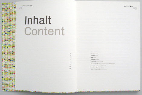
Table of contents is often considered to be one of the most unspectacular design elements ever invented. Because of its simple, usual form, table of contents is often not given the attention it may deserve — after all, it is just a list of the parts of a book or document organized in the order in which the parts appear. But why not use exactly that and surprise the reader of a booklet, brochure, annual report or a book with some beautiful and original table of contents? In fact, many creative approaches are possible. And this post attempts to prove exactly that.
This post showcases creative and/or beautiful tables of contents. We have tried to include creative, visually appealing and interesting design solutions. Hopefully, everybody will find something interesting and unusual for herself or himself. Please take a look at the references section at the end of the article — there you may find further examples of interesting and unusual tables of contents.
You may want to take a look at our related posts
- Beautiful Brochures and Booklets
- Data Visualization and Infographics
- Content-First Prototyping
- The Golden Rules Of Bottom Navigation Design
Please notice: some photos look not beautiful at all — here the idea matters more than the quality of the screenshot. The showcased tables of contents aren’t necessarily useful in practice as they may be hard to read; they should serve as the inspiration for your future works and show you that even in the design of table of contents some unusual approaches are possible.
Creative and beautiful examples
So how beautiful or creative can a table of contents be?
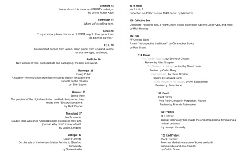
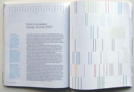
PRINT Magazine Spread: Table of contents
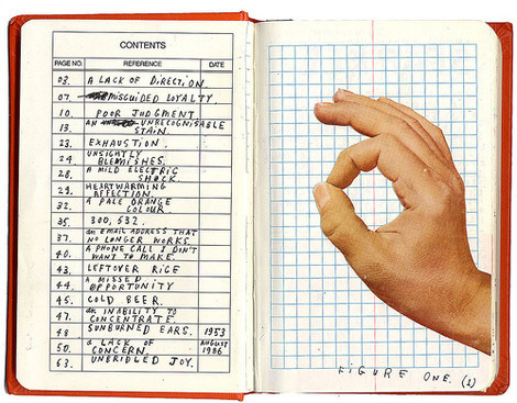
Guide to grammatical errors “Interesting table-of-contents page in a 1940s grammar guide, found in a thrift store in Roswell.”
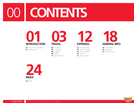
Sonic Travel Guide Illustrated section heads and selected pages from the Sonic Travel Guide book. Content pages are absent as they contain internal information about the organization. Designed by Jenkin Hammond.
Be somebody Acknowledgements, front matter, and table of contents from Lester’s Be Somebody (2008, Effing Press).
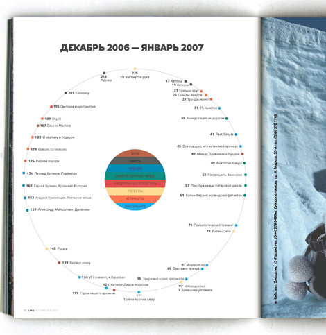
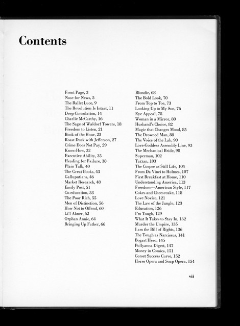
Flavors “Flavors” Mason Williams. Doubleday &Company, 1970 (design: Mason Williams).
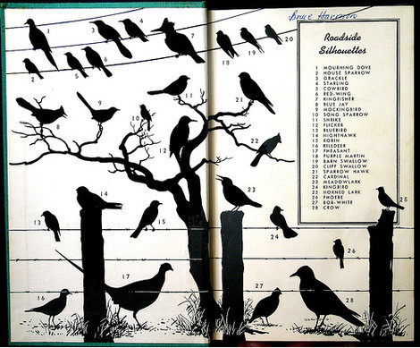
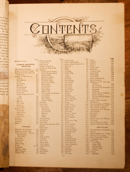
Peterson The inside cover of A Field Guide to the Birds (Peterson 1934).
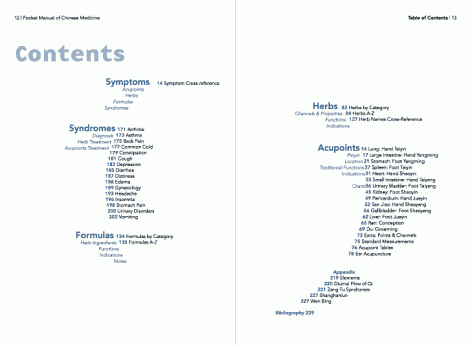
The Pocket Manual of Chinese Medicine
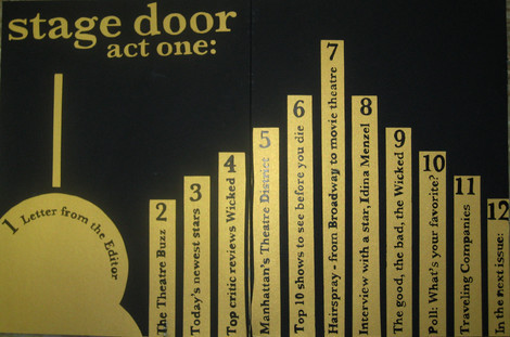
Stage door All of the lettering except or Stage Door act one, is pen and ink.
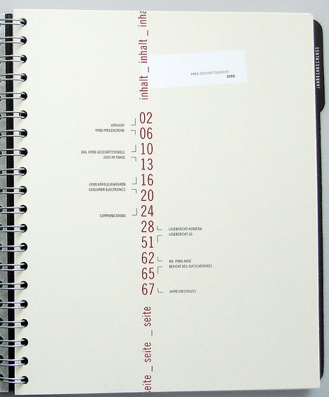
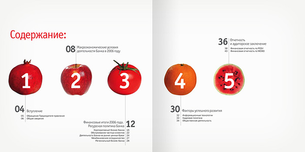
Annual report for SB bank Designed by Danil Kryvoruchko.
Restart Universe/Rizzoli, 2001. Design: Christian Küsters.
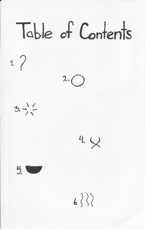
“Sense, Memory” Table of Contents “Ink. I want to use symbols to describe each of the pages content. I think I did an adequate job. In order: Introduction, Sight, Sound, Touch, Taste, Smell. The epilogue was included after this was made, but I felt it could easily be a back cover.”
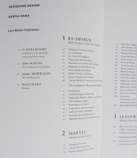
Designing Design by Kenya Hara
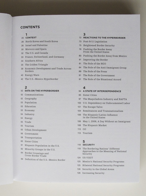
Hyperborder: The Contemporary U.S. - Mexico Border and It’s Future by Fernando Romero
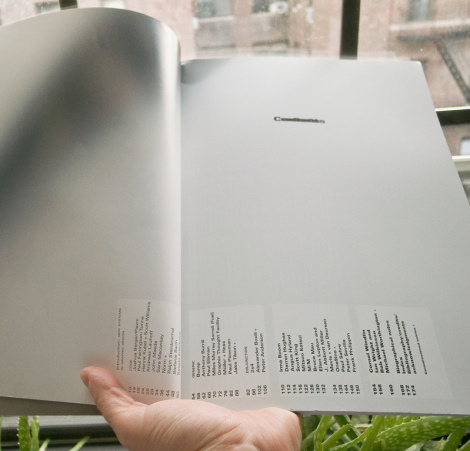
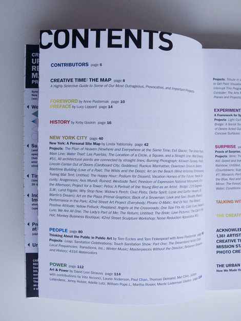
Creative Time: The Book by Anne Pasternak and Lucy Lippard
Examples with leaders
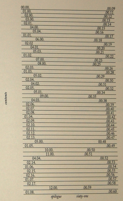
If the page numbers appear after the heading text, they might be preceded by characters called leaders, usually dots or periods, that run from the chapter or section titles on the opposite side of the page, or the page numbers might remain closer to the titles. In some cases, the page number appears before the text.
Book Paul Renner 1948 A classic.
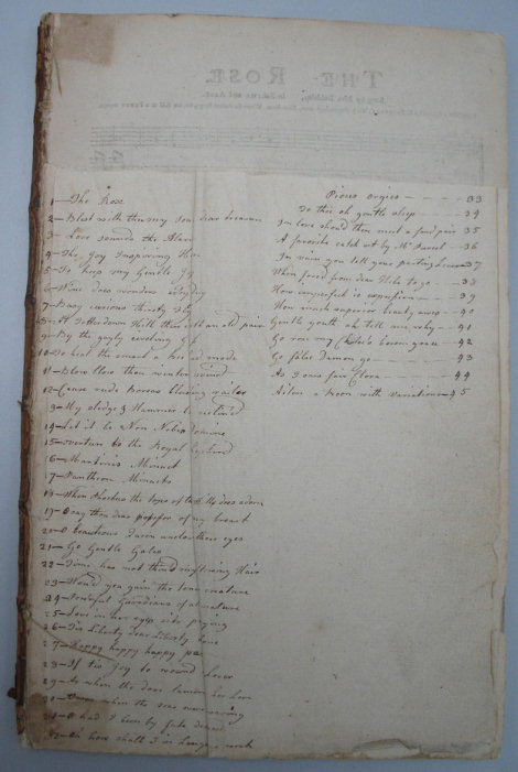
Endsheet table of contents Handwriting in use. Why not?
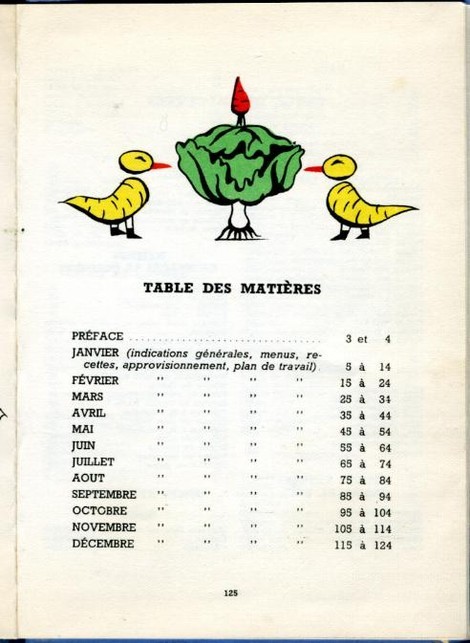
La cuisine au fils des mois by, Suzanne LABOUREUR Table
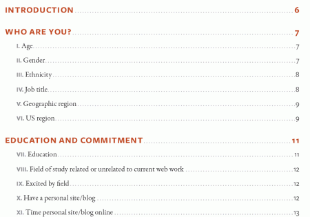
A List Apart 2007 Survey Results In April 2007, A List Apart and An Event Apart conducted a survey of people who make websites. The results represent the first data ever collected on the business of web design and development as practiced in the U.S. and worldwide.
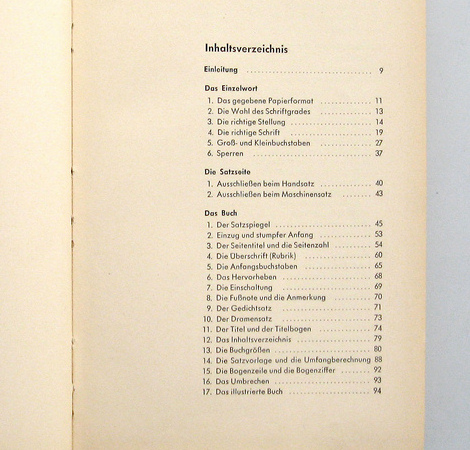
A. W. von Schlegel A. W. von Schlegel: Indische Bibliothek. Bd. 1 (1823). Inhaltsverzeichnis.

The Living World My great-grandfather’s book, published circa 1890.
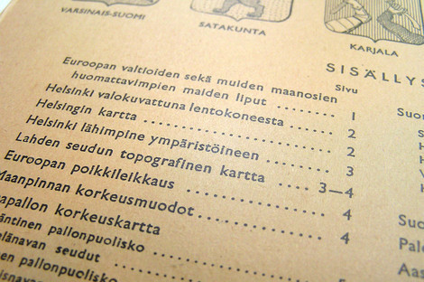
Atlas Table of Contents A Finnish atlas from 1958. “Isänmaan ja maailman kartasto” (Atlas of the Homeland and the World).
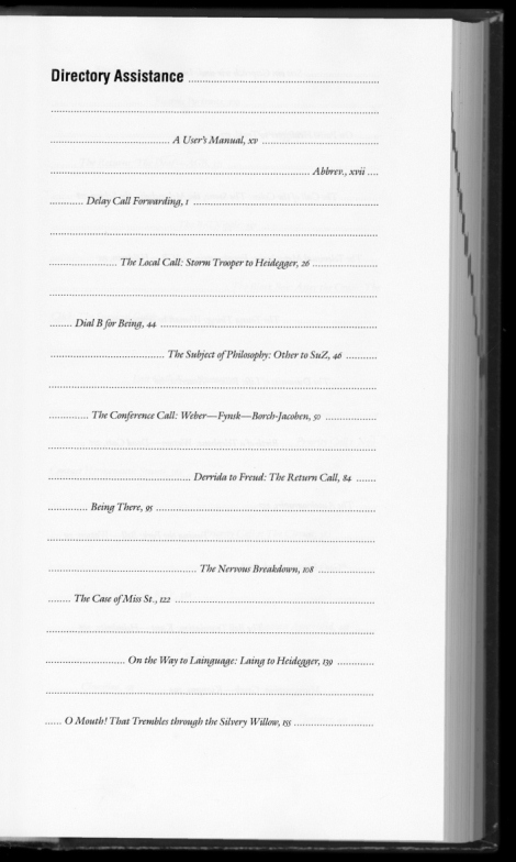
The Telephone Book “The Telephone Book: Technology, Schizophrenia, Electric Speech” Avital Ronell University of Nebraska Press, 1989 (design: Richard Eckersley).
Examples without leaders
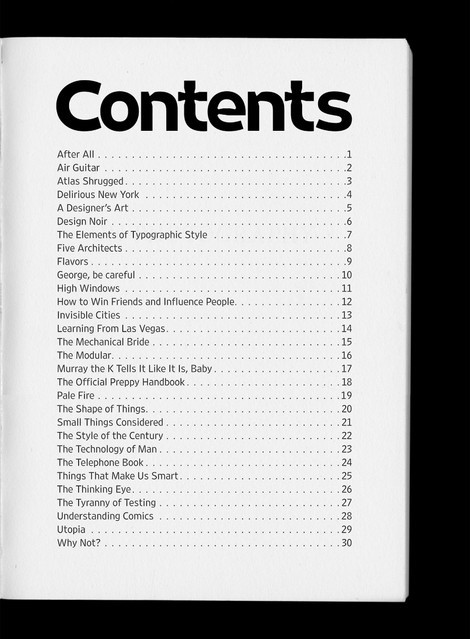
The Mechanical Bride “The Mechanical Bride: Folklore of Industrial Man” Herbert Marshall McLuhan. The Vanguard Press, 1951 (design: Ernst Reichl).
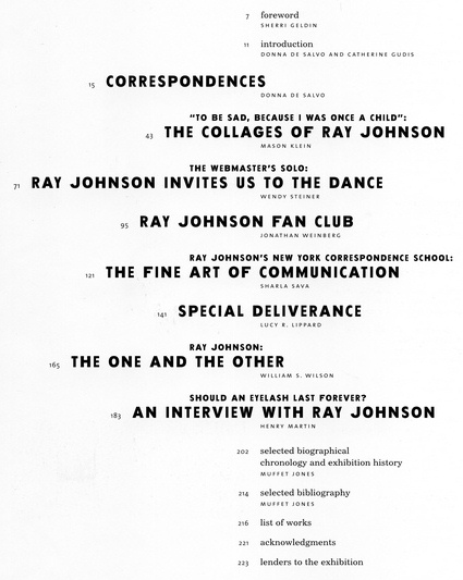
Glauber_Johnson 1999 Ray Johnson: Correspondences, 1999. Barbara Glauber, Beverly Joel/Heavy Meta, designer.
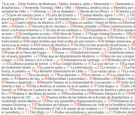
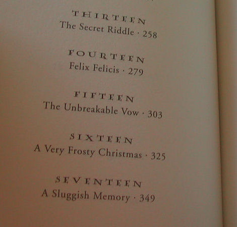
El Indice Capitulos Half-Blood Prince
Peterson The table of contents is repeated at the top of every page.
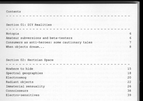
Design Noir “Design Noir: The Secret Life of Electronic Objects” Anthony Dunne & Fiona Raby. August/Birkhauser, 2001 (Design: Alex Rich)
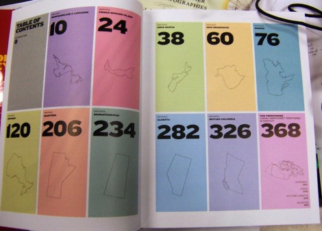
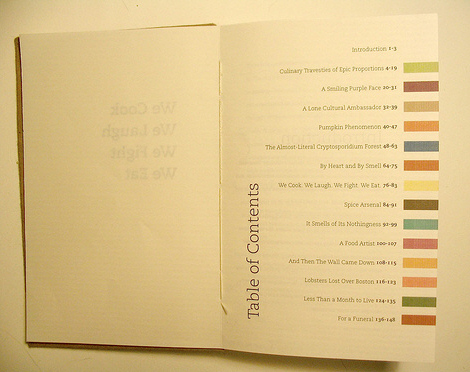
Complete book Each colored bar will repeat on the right hand page of the corresponding story.
Yeah, THAT Owen Wilson and THAT Wes Anderson
Ideas matter
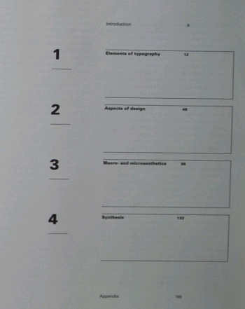
Macro- and Microaesthetics Niggli, 1998. Design: Willi Kunz.
Sewed table of contents What about sewing a table of content? This is exactly what Screaming Lulu did. Limited edition.
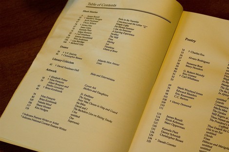
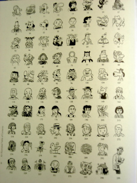
Brunetti’s Anthology Table of Contents This table of contents uses drawing and cartoons as metaphors for the chapters.
Last Click
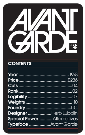
Type Trumps “A set of Type Trumps, a play on the game Top Trumps, in which different typefaces are attributed numerical values. These figures are then used to enable the cards to be won or lost using some of the fried and tested ‘Top Trumps’ rules.
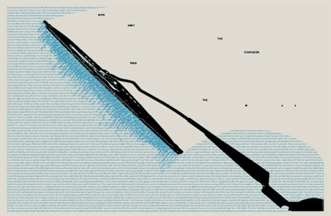
Shaz Madani’s poster No, it has nothing to do with tables of contents, but it somehow fits to the context. This is a response designed to promote the M25 motorway. On one side the poster gives exact directions that would have to be taken in order to travel from one side of London to the other illustrating the complexity and confusion involved in taking alternative routs through the centre of the city. The reverse side reads “wipe away the confusion take the M25”.

Sources and Resources
Annual report for SB bank Designed by Danil Kryvoruchko.
Restart Universe/Rizzoli, 2001. Design: Christian Küsters.
“Sense, Memory” Table of Contents “Ink. I want to use symbols to describe each of the pages content. I think I did an adequate job. In order: Introduction, Sight, Sound, Touch, Taste, Smell. The epilogue was included after this was made, but I felt it could easily be a back cover.”
Designing Design by Kenya Hara
Hyperborder: The Contemporary U.S. - Mexico Border and It’s Future by Fernando Romero
Creative Time: The Book by Anne Pasternak and Lucy Lippard
Examples with leaders
If the page numbers appear after the heading text, they might be preceded by characters called leaders, usually dots or periods, that run from the chapter or section titles on the opposite side of the page, or the page numbers might remain closer to the titles. In some cases, the page number appears before the text.
Book Paul Renner 1948 A classic.
Endsheet table of contents Handwriting in use. Why not?
La cuisine au fils des mois by, Suzanne LABOUREUR Table
A List Apart 2007 Survey Results In April 2007, A List Apart and An Event Apart conducted a survey of people who make websites. The results represent the first data ever collected on the business of web design and development as practiced in the U.S. and worldwide.
A. W. von Schlegel A. W. von Schlegel: Indische Bibliothek. Bd. 1 (1823). Inhaltsverzeichnis.
The Living World My great-grandfather’s book, published circa 1890.
Atlas Table of Contents A Finnish atlas from 1958. “Isänmaan ja maailman kartasto” (Atlas of the Homeland and the World).
The Telephone Book “The Telephone Book: Technology, Schizophrenia, Electric Speech” Avital Ronell University of Nebraska Press, 1989 (design: Richard Eckersley).
Examples without leaders
The Mechanical Bride “The Mechanical Bride: Folklore of Industrial Man” Herbert Marshall McLuhan. The Vanguard Press, 1951 (design: Ernst Reichl).
Glauber_Johnson 1999 Ray Johnson: Correspondences, 1999. Barbara Glauber, Beverly Joel/Heavy Meta, designer.
El Indice Capitulos Half-Blood Prince
Peterson The table of contents is repeated at the top of every page.
Design Noir “Design Noir: The Secret Life of Electronic Objects” Anthony Dunne & Fiona Raby. August/Birkhauser, 2001 (Design: Alex Rich)
Complete book Each colored bar will repeat on the right hand page of the corresponding story.
Yeah, THAT Owen Wilson and THAT Wes Anderson
Ideas matter
Macro- and Microaesthetics Niggli, 1998. Design: Willi Kunz.
Sewed table of contents What about sewing a table of content? This is exactly what Screaming Lulu did. Limited edition.
Brunetti’s Anthology Table of Contents This table of contents uses drawing and cartoons as metaphors for the chapters.
Last Click
Type Trumps “A set of Type Trumps, a play on the game Top Trumps, in which different typefaces are attributed numerical values. These figures are then used to enable the cards to be won or lost using some of the fried and tested ‘Top Trumps’ rules.
Shaz Madani’s poster No, it has nothing to do with tables of contents, but it somehow fits to the context. This is a response designed to promote the M25 motorway. On one side the poster gives exact directions that would have to be taken in order to travel from one side of London to the other illustrating the complexity and confusion involved in taking alternative routs through the centre of the city. The reverse side reads “wipe away the confusion take the M25”.


