Web Form Design Patterns: Sign-Up Forms, Part 2

Email Newsletter
Weekly tips on front-end & UX.
Trusted by 182,000+ folks.


 Agent Ready is the new Headless
 SurveyJS: White-Label Survey Solution for Your JS App
Last week we have presented first findings of our web forms survey. The main objective of the survey was to provide designers and developers with some intuition of how effective web forms are designed; we also presented some guidelines of how an effective and user-friendly web form can be achieved.
We have focused on sign-up forms as we wanted to consider further crucial forms (e.g. checkout forms) separately. Afterward, we’ve gone through each and every one sign-up form of the selected sites and analyzed the design approaches implemented in these forms. Below we present the second part of our findings — the results of our survey among web-forms of 100 popular websites where web-forms (should) matter.
You might be interested in the following related posts:
- Web Form Design: Showcases And Solutions
- Useful Ideas And Guidelines For Good Web Form Design
- An Extensive Guide To Web Form Usability
Please notice that this post is not about checkout forms — that’s a topic for another discussion, we may consider them separately in one of the upcoming posts. We would like to thank Wufoo for providing us with a framework to conduct our survey.
3. Functionality of the forms
In the first part of our research we have considered the placement of the sign-up links and sign-up forms as well as on the visual appearance of forms. However, no matter how nice a design looks like, if the form doesn’t work properly, the completion rates will remain low. Let us now consider the functionality of the sign-up forms as well as typical problems, patterns and solutions used when it comes to the design of these forms.
3.1. Hover, active, focus - effects in use?
Apparently, to improve form completion rates designers try to avoid all kind of distractions and offer a clear, unambiguous and simple web form. This is essentially the reason why any visual effects are used very moderately — if used at all.
- 84% of the web forms which we’ve reviewed didn’t have any kind of hover, active or focus-effects,
- 16% used very subtle hover-effects.
3.2. Help, support, tooltips: static or dynamic?
Sometimes the label of the input fields isn’t specific enough; however, users need to have a sufficient understanding of the information they need to provide. Which characters are allowed in the username? How many characters should a password have? Does a provided e-mail automatically become login to use the service?
Hints and tooltips provide assistance helping users to minimize the number of times an input should be reconsidered. Besides, there is nothing more annoying that some input field that doesn’t accept user’s input although it seems to be entirely correct. To avoid it, designers make use of (usually) unobtrusive and clear hints.
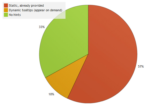
57% of the reviewed web forms provided “static” help — tips that are supposed to explain what is expected from the user’s input; these tips are obviously placed next to the input field. 10% of the tooltips appear on demand - usually, after some help icon is clicked or when the user is typing the information in the field of entry.
3.3. Help, support, tooltips: where are they placed?
When providing users with assistance, it is necessary to make sure not that the help is simply provided, but that it can be easily found and understood by users. It is crucial to make sure that users don’t make mistakes associating a hint to an input field. To achieve it you need to know where users expect hints to appear. So where are hints and help usually placed within the form?
If hints and help appear, they appear…
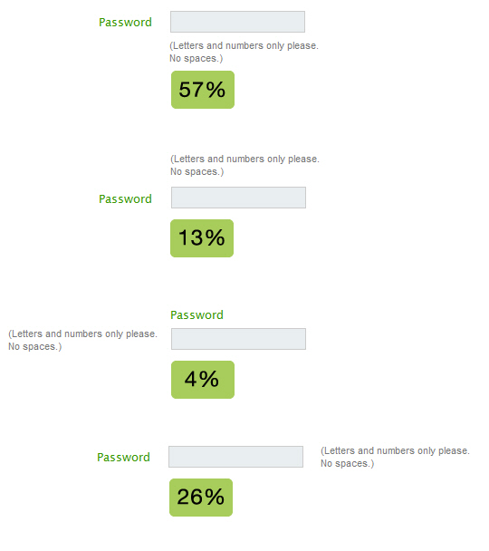
- below the field (57%)
- on the right side of the field (26%)
- above the field (13%)
- on the left side of the field (4%)
We have observed a strong trend toward hints placed directly below the input field. Usually such hints have a slightly different color, in most cases lighter than the main content.
3.4. Input validation: static or Ajax?
Although Ajax seems to have flooded websites with a rich user interaction over the last years, it still hasn’t managed to reach a critical mass among popular web-services. Surprisingly, we weren’t able to identify a trend toward Ajax. The “classic” validation techniques that validate input after the user has clicked on the submit button are more popular than real-time-validation with JavaScript.
According to our research,
- 30% of the forms displayed only an error-message at the top of the form (no input fields were highlighted),
- 29% had highlighted input fields with corresponding messages next to the input field (no error-messages were provided at the top of the page),
- 25% used both error-messages and input fields,
- 22% used real-time validation with Ajax,
- 14% used JavaScript-error warnings,
- 1% used a system-message with a “go back”-link.
3.5. Design of error messages
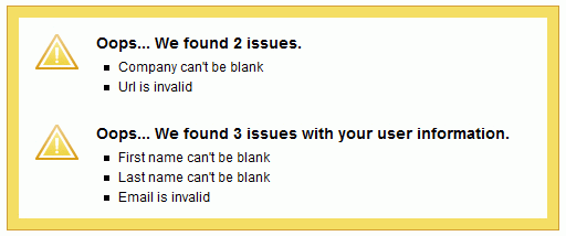
As you can see, we have identified six different types of error validation. It is remarkable that 14% of the forms still use Javascript-error-windows to communicate problems (e.g. YouSendIt, Mail.ru, Newsvine, Clipmarks, Yandex, see screenshot below) while only 22% had at least partial Ajax-validation (usually for checking available user names). It is also remarkable that not a single site had no validation whatsoever.
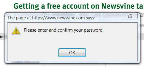
Newsvine uses JavaScript-error warnings to communicate problems.
Usually designers tend to report mistakes using a) error messages appearing after the submit-button is clicked and / or b) highlighting “incorrect” input fields visually. In the first case errors are usually bulleted and presented as a list at the top of the page, before the form. In the second case usually the color of the border of the “wrong” input field is highlighted together with the label of the field (in most cases with a red text color and red background color).
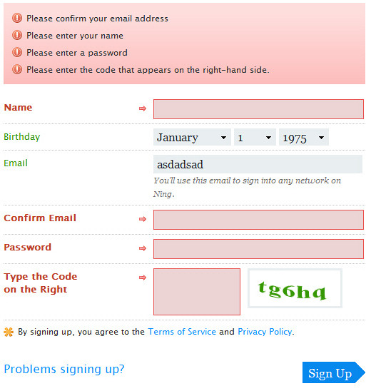
Sometimes designers combine both techniques and use error message as well as the input field highlighting. For instance, consider the sign-up form on Ning (see image below) which combines both techniques.
Usually, red is used to indicate mistakes; however it is not necessarily the case. Tickspot, Mixx.com and Furl use yellow to communicate problems occurred during the form completion.
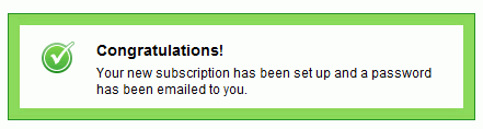
However, if any color is used at all to communicate a successful registration, then it is green. It was the case in 97% of web-sites where success was highlighted visually.
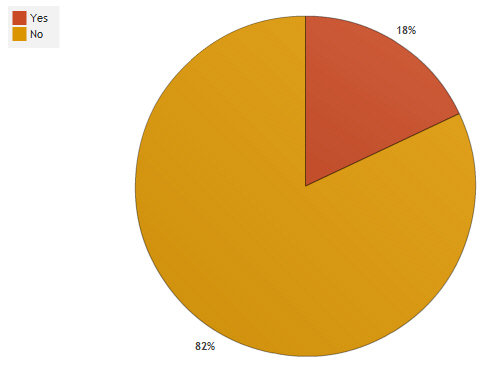
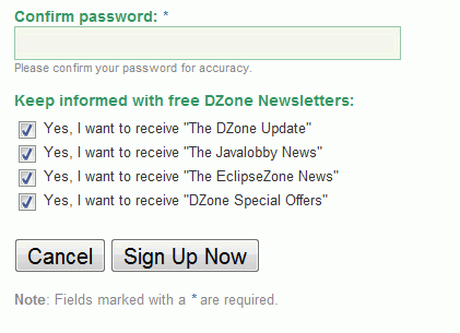
3.6. Is it necessary to confirm the e-mail?
Only in 18% of the cases it was necessary to confirm the e-mail (e.g. Odeo, Ning). To be honest, we don’t really see any rationale in asking users to re-type the e-mail — after all, users can see what they input because the e-mail field is not starred out (updated). Do you?
3.7. Is it necessary to confirm the password?
It sounds reasonable to ask the user to confirm the input as the user doesn’t see the information typed in (he/she sees asterisks instead). However, many sited decide to remove one input field to minimize the time required to complete the form.
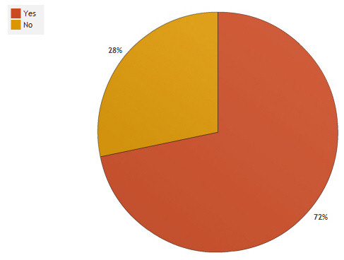
In 72% of the cases it was necessary to confirm the password. However, many large sites such as Facebook, Friendster, LinkedIn, Stumbleupon, Pownce and Twitter don’t require password confirmation.
3.8. Is captcha in use?
While users would definitely be glad if captchas were gone, they are necessary in practice, because web-sites need to make it impossible for spambots to create numerous accounts as otherwise they would need to filter spam accounts in the database.
According to our research,
- 52% of the sites don’t use captcha,
- in 39% of the cases it was impossible to reload the captcha without reloading the whole form. This is really dramatic from the usability point of view.
However, we couldn’t identify a trend toward sign-up forms with or without captchas. In any case, if you use a captcha, please make sure that it is either always easily readable or users can reload the image in case it is not readable. Some sites haven’t offered the possibility to reload the captcha, but Digg, AOL, Slashdot, Google and Last.fm have made it possible to the users to listen to it in case it is hard to recognize.
3.9. Cancel button in use?
When we were coming up with the design problems to consider when designing web forms, we have expected sign-up forms to not have a cancel-button, as it doesn’t really make much sense for the users to abort the form completion after all fields have been typed in. Yet we were partly wrong.
The cancel-button was used only in 8% of the cases. In some of these cases the “cancel”-button came right after the “terms and conditions”-section (e.g. Zoho Writer). Consequently, if users do not want to agree to the service conditions, they could abort the process. On the other side, some services offer a payment plan before the registration (e.g. Crazyegg). In case users have selected the wrong payment plan they can get back with the cancel-button and select another plan they prefer.
Apart from that: we just don’t understand why Dzone has a cancel-button placed on the left in its sign-up form.
If the cancel-button is used, it is placed on the right side of the submit-button (4%). Among the sites reviewed in the post cancel and submit-buttons didn’t have a strong visual difference and were placed next to each other. From the usability point of view it makes more sense to use a clear visual distinction between primary action buttons and secondary action buttons and introduce a significant amount of space to clearly separate them.
3.10. Alignment of the submit-button
Depending on the form layout it may make sense to align the submit-button on the left, on the right side or place it in the middle of the layout. Designers seem to have a strong preference toward left-aligned submit-buttons (56%), followed by centered buttons (26%).
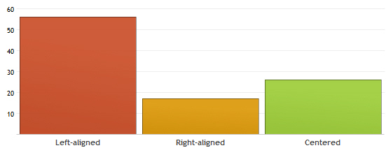
Right-aligned submit-button is still popular (17%), however it is often used when designers want to indicate the next step of the registration. In such cases submit-buttons are often titled “Continue” or “Next”. Reason: in usual desktop-applications “Next”-button is also often right-aligned.
3.11. Thank-you message
While few years ago most services offered a simple, basic thank-you message after a successful registration (usually with a link to the login-page), now most sites try to motivate users to explore the service immediately.
- 45% of the forms asked just registered users to proceed with submitting further information, finding friends in the networks, suggesting the site to friends or filling out his or her profile.
- 33% of the forms presented “places to go” and functions to explore in an engaging, user-friendly-tone,
- 4% offered a basic “thank you”-message,
- 2% had a redirect to the homepage.
Further findings
- tab index was used correctly in 99% of the cases (the only exception was Habrahabr)
- 24% of forms used conversational talk, trying to address users needs by speaking with them through labels. Informal phrases such as “What’s your name?”, “Your e-mail, please?” or “I’d like to…” are common in this context.
- 38% of sites prefer to remain formal and use business talk, asking users the required information user-friendly (e.g. “Your name”, “Confirm password” etc.),
- 38% of sites use system talk; here visitors are asked for their “Login”, “User password”, “Location” etc.
Bottom line
Let’s conclude with a brief overview of the findings presented above. Please keep in mind that we have considered only sign-up forms.
- sign-up forms don’t have any hover, active or focus-effects (84%),
- hints and help are either static (57%) or dynamic (33%) and appear below the input field (57%) or on the right side of the field (26%),
- static validation is as popular as dynamic validation — no trend toward Ajax;
- e-mail confirmation is not used (82%),
- password confirmation is used (72%),
- captcha can be used or not used (48% vs. 52%),
- cancel button is not used (92%),
- the submit-button is left-aligned (56%) or centered (26%),
- thank-you message motivates users to proceed with exploring the services of the site (45%).


