Popular Tags

Smashing Magazine - we smash you with the information that will make your life easier. really.

Textures and Patterns Design Showcase

Advertisement

Textures and patterns are used more often than one may think. The reason why we don’t see them is because they usually remain in the background, supporting the overall design, replacing a standard background color and creating a more inviting atmosphere. But they almost never stand out. Used primarily for background images, they need to fit to the overall design making the content easier to perceive. In fact, wood textures seem to have become so popular that designers suggest that wood is the new glossy style and wood is the new white.

Well, we don’t think that wood is a new revolutionary trend — after all, it was used and explored for years. However, since wood isn’t used everywhere — in correct and wrong contexts — experimenting with it makes perfectly sense. Still, there are a number of options beyond wood: e.g. fabric patterns, tiles, ground, stone, walls, bricks, stiches, cardboard, ceramics, decay, rust, old tapes, illustrations, plastic and glass.

In this post we present a showcase of sites using textures and patterns— we want to focus designer’s attention on design options available beyond wood. Reason: we strongly believe that vibrant, realistic background images are becoming a new trend. If it sounds familiar to you, you are absolutely right: we’ve seen the same trend 8-10 years ago. The sources for the background images are usually either photos (e.g. you can download free textures in the Smashing Texture Library) or illustrations created with Photoshop, Illustration etc.

You may want to take a look at the related articles:

Tiles, Patterns

How do I create a tile or a pattern?

Actually, that’s easier than one might think. For instance, you can use BgPatterns, a free “tiled background designer” which is basically a pattern library where you can find, create, rate and share patterns. You can select one of 68 images (scrolls, stars, flowers, hearts, signs, trees etc.) as well as pick a color of your tile and the pattern will be generated automatically.

Greenbg in Textures and Patterns Design Showcase

You can also apply some effects (dirty, rugged etc.) and rotate the pattern as you wish. The service has a nifty preview option which enables you to generate your background tiles on the fly, download them or store them.

Here is a compact overview of tiles which have been used on some sites presented below:

Pattern in Textures and Patterns Design Showcase

Showcase of tiles and patterns in modern web design

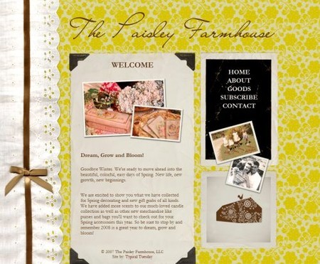
The Paisley Farmhouse uses nicely packaged retro wallpaper tiles as the background image.

Paisley in Textures and Patterns Design Showcase

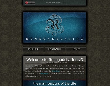
Renegade Latino uses dark tiles for the background image. The content should probably be larger.

25 in Textures and Patterns Design Showcase

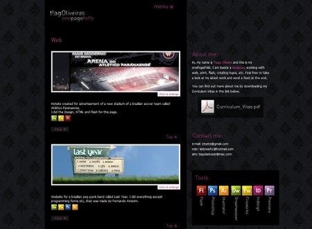
t!agOliveira uses a hardly recognizable, dark pattern as the background image. The image supports the content and fits to the overall site layout.

6 in Textures and Patterns Design Showcase

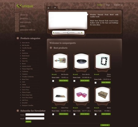
Uniquexports uses patterns and tiles for the background image for an online-shop. The pattern resembles a usual (not desktop) wallpaper. The design looks unusual yet attractive and definitely distinctive.

7 in Textures and Patterns Design Showcase

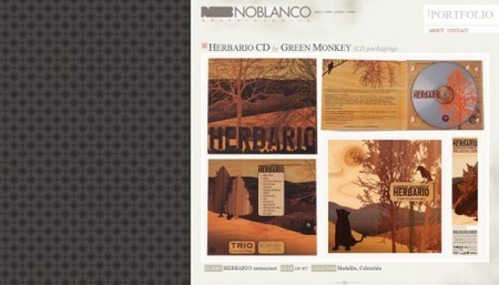
Noblanco with a background patterns on the left side of the page. The layout is right-aligned for some reason.

9 in Textures and Patterns Design Showcase

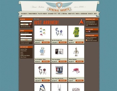
General Robots uses stars tiles on both the left and the right side of the centered layout. It is also an online-shop.

10 in Textures and Patterns Design Showcase

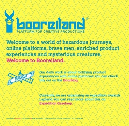
Booreiland: any friends of blue, pink and yellow out there?

11 in Textures and Patterns Design Showcase

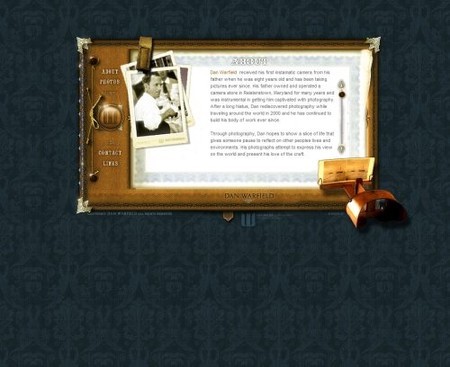
Warfield.net with a classic wallpaper patterns…

Danwarfield in Textures and Patterns Design Showcase

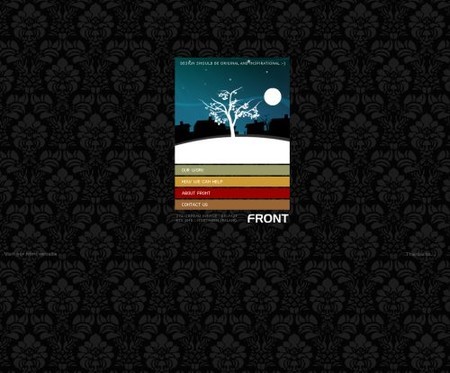
…and so does Designbyfront: the same theme, a different color.

Front in Textures and Patterns Design Showcase

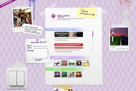
Falko Seidel with some tiles which one can find in old sweaters or on indoor walls.

12 in Textures and Patterns Design Showcase

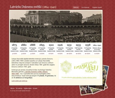
Latviešu Dziesmu svētki with traditional wallpaper tiles.

21 in Textures and Patterns Design Showcase

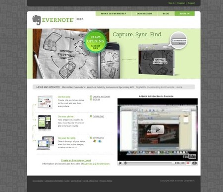
Evernote has a corporate design with quite strange background patterns.

14 in Textures and Patterns Design Showcase

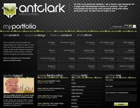
Anthony Clark uses a fading background pattern in the header of his portfolio.

22 in Textures and Patterns Design Showcase

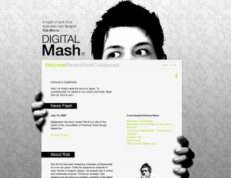
Rob Morris with a classic pattern used as the background image.

Morris in Textures and Patterns Design Showcase

Eden Organix is a wellness store with a classic wallpaper pattern.

39 in Textures and Patterns Design Showcase

MiniIcon keeps it to minimal; tiny content area is surrounded by background tiles.

Miniicon in Textures and Patterns Design Showcase

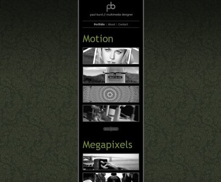
Paul Burd uses the same concept.

Paulbudd in Textures and Patterns Design Showcase

Images and Textures

Ground

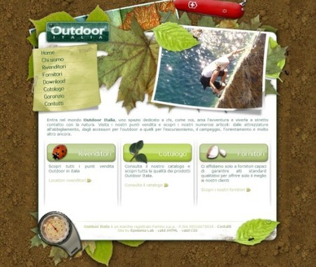
Outdoor Italia uses crumbly pieces of the ground as the background image. Other illustrations on the site fit to the background. The ants on the right hand side of the layout are pretty cool.

1 in Textures and Patterns Design Showcase

Stone and walls

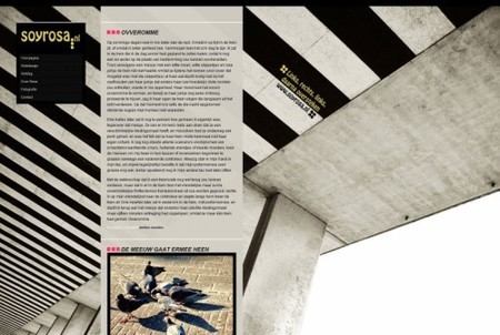
Soyrosa uses vibrant stone stripes as the background image.

5 in Textures and Patterns Design Showcase

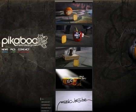
Pikaboo.be with hard, strong and dark stone and an unusual vertical scrolling.

Pikaboo in Textures and Patterns Design Showcase

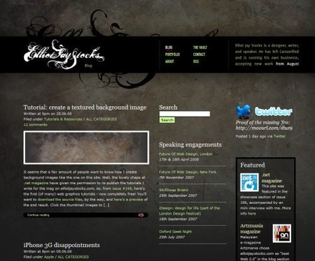
Elliot Jay Stocks uses stones as well and has even a tutorial which explains how to Create a textured background image

Stocks in Textures and Patterns Design Showcase

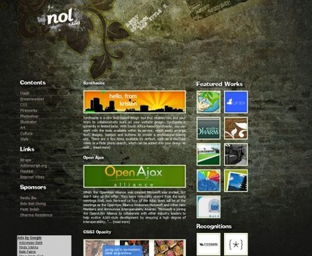
Nolgraphic makes it differently: a photo of a wall is used.

Nolbog in Textures and Patterns Design Showcase

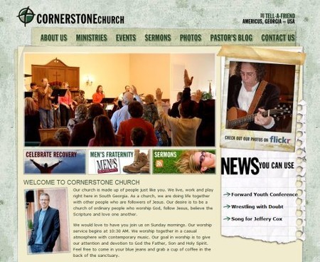
Corner Stone Americus is a church web-site with a grunge look.

Cornerstone in Textures and Patterns Design Showcase

Bricks

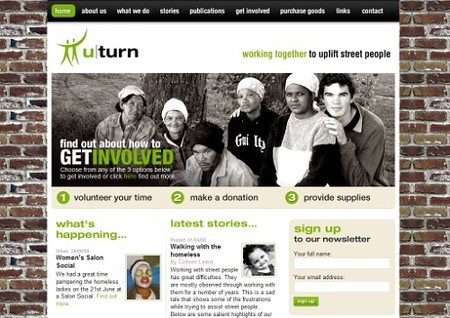
uturn with bricks used as the background image. Here the background fits to the theme of the site which aims to “work togther to uplift street people”.

17 in Textures and Patterns Design Showcase

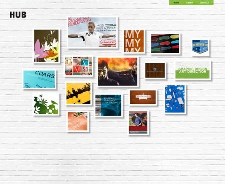
Hubltd.com with bricks painted in a white color.

Hub in Textures and Patterns Design Showcase

Illustrations

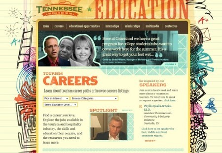
Tennessee Education uses a vibrant background image with lines from primary school writing books.

18 in Textures and Patterns Design Showcase

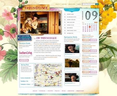
Springtime in Tennessee is a section on the same site and uses the same approach.

30 in Textures and Patterns Design Showcase

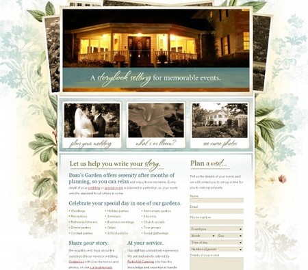
Dara’s Garden with beautiful flowers which make the background more lively and lovely.

29 in Textures and Patterns Design Showcase

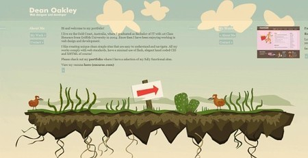
Dean Oakley’s design isn’t long but wide. Users need to scroll horizontally. The background image (illustration) always remains the same.

27 in Textures and Patterns Design Showcase

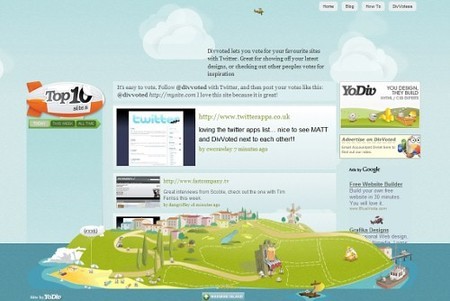
DivVoted fills the whole page with a vibrant background image.

33 in Textures and Patterns Design Showcase

Stiches and Fabric

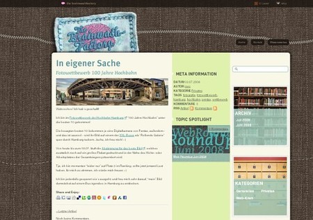
the brainwashfactory with stiches and fabric. Notice the sewed header at the top of the site.

31 in Textures and Patterns Design Showcase

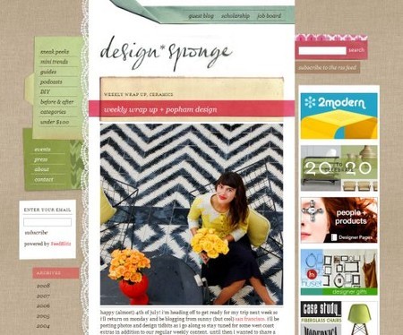
Design Sponge is dedicated to home and product design which explains why its background image is a fabric.

Songe in Textures and Patterns Design Showcase

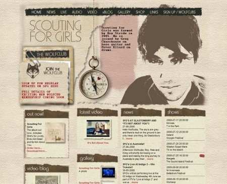
Scouting for Girls doesn’t only offer a “sewed” background image; it has a beautiful ladybug at the bottom as well.

Scouting in Textures and Patterns Design Showcase

Paper and Cardboard

Raufaser with an old paper pattern used as the background image.

Lorelei in Textures and Patterns Design Showcase

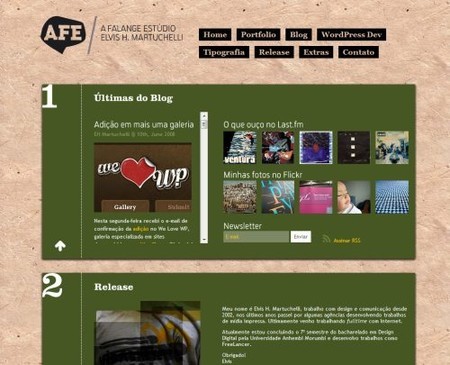
A-Falange.net uses old-looking paper…

Afe in Textures and Patterns Design Showcase

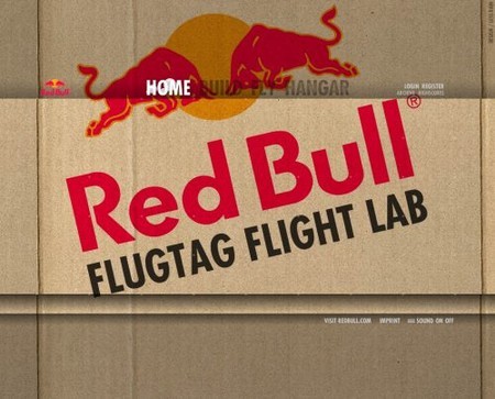
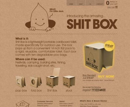
RedBull with a huge ragged cardboard. Flash in use.

Redbull in Textures and Patterns Design Showcase

The Brown Corporation uses a similar idea. The site name (Shitbox) is probably not the best title from the marketing perspective.

Shitbox in Textures and Patterns Design Showcase

Ceramics

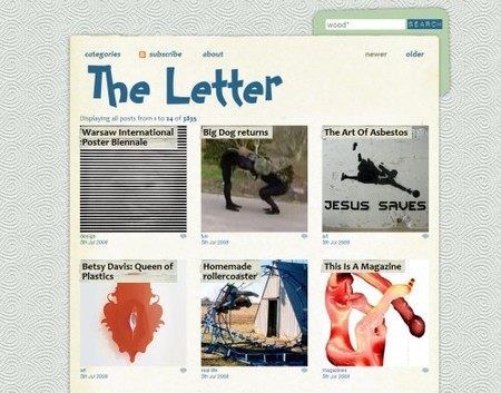
The Letter with a ceramics theme.

Theletter in Textures and Patterns Design Showcase

Decay, Dirt and Grunge

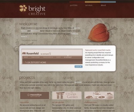
BrightCreative: ornaments and patterns in use.

Bright in Textures and Patterns Design Showcase

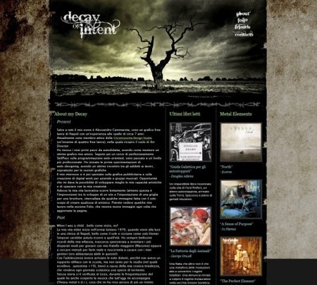
Decay of Intent: the title of the site defines the layout of Alessandro Cammarota’s portfolio. Apparently, the background image stands for decay, the main theme of the site.

37 in Textures and Patterns Design Showcase

Old movie-tape

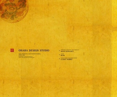
0hara uses an old movie-tape for the background.

Ohara in Textures and Patterns Design Showcase

Rust

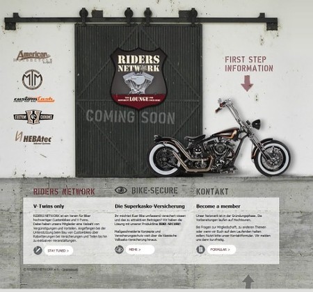
Riders network: riders drive on the roads which is why this riders’ club uses rusty road as the background image.

23 in Textures and Patterns Design Showcase

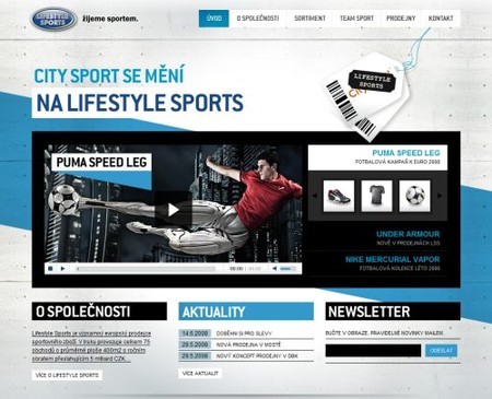
Life Style Sports has a rusty background image with asymmetric points spread across the background image.

Sprtovi in Textures and Patterns Design Showcase

Wood

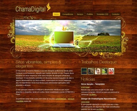
ChamaDigital with a “wood”-theme. Clean and beautiful design.

35 in Textures and Patterns Design Showcase

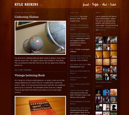
Kyle Haskins uses subtle “woody” background image which doesn’t stand out yet manages to support the content effectively. The design itself is clean and attractive.

26 in Textures and Patterns Design Showcase

Robert Strickland uses wood as the background image; the colors in the design are chosen accordingly.

34 in Textures and Patterns Design Showcase

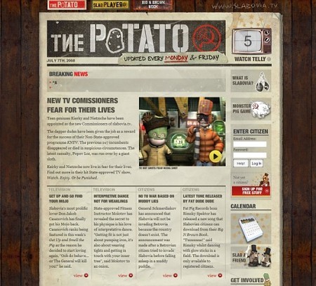
Slabovia.tv combine a unique retro-design with grid-based approach and with wood. The result is impressive.

13 in Textures and Patterns Design Showcase

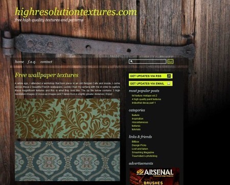
Highresolutiontextures with, well, high-resolution textures and the wood used as a background image.

15 in Textures and Patterns Design Showcase

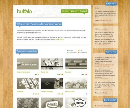
Built by Buffalo with a high-quality wood background.

Buffalo in Textures and Patterns Design Showcase

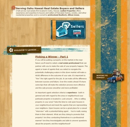
Oahu Hawaii real estate attempts to combine grunge with retro and wood. The result is definitely unusual, but in some sense quite appealing.

2 in Textures and Patterns Design Showcase

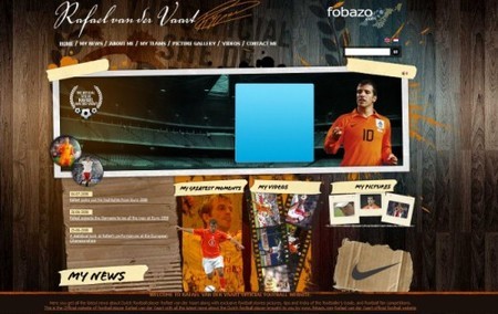
Rafael van der Vaart: the site uses wood as the background image. Beware: on the site music automatically starts to play.

3 in Textures and Patterns Design Showcase

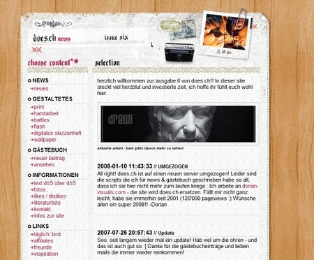
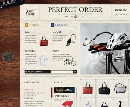
Does.ch uses wood, stiches, old paper and grunge together. Well, that’s an unusual combination.

36 in Textures and Patterns Design Showcase

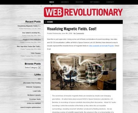
WebRevolutionary with the black-white wood.

Webrevo in Textures and Patterns Design Showcase

soulBlog uses a wood theme for a 4-column-based design layout. The color of links and headings fits to the theme.

16 in Textures and Patterns Design Showcase

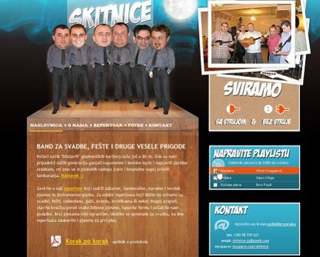
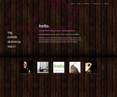
Skitnice uses wood not as the background image for the layout, but only as the background for the main content area.

20 in Textures and Patterns Design Showcase

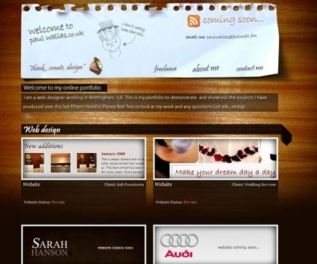
Paul Wallas with a light falling on the wood.

Paulwallas in Textures and Patterns Design Showcase

Perfect Order is a Japanese online store with a wooden background.

Bislex in Textures and Patterns Design Showcase

Bfrancesi.com with a dark sprayed “woody” background image.

Brooke in Textures and Patterns Design Showcase

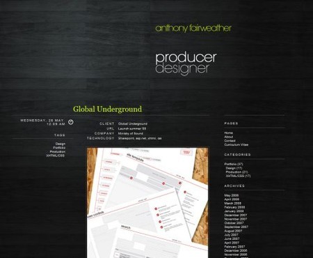
Anthonyfairweather is a producer and designer and he seems to love black wood.
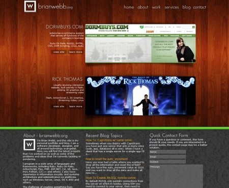
Anthony in Textures and Patterns Design Showcase

Brianwebb.org: surprise, surprise! This design combines two popular background themes, wood in the header and tiles in the footer.

Brianweb in Textures and Patterns Design Showcase

Sources and Resources

The Co-Founder of Smashing Magazine. Former writer, web designer, freelancer and webworker. Author of several books. Runs the business.

Post Rating
1 Star2 Stars3 Stars4 Stars5 Stars (No votes yet)
Loading ... Loading ...

Tags: , ,

Advertising
  1. 1
    Ryan Merket
    July 9th, 2008 3:44 pm

    Again, wonderful content. Thanks Smashing!

    /ryanmerket.com

  2. 2
    Dominik Porada
    July 9th, 2008 3:49 pm

    Kicks ass! Thank you SM. :)

  3. 3
    Fonzie
    July 9th, 2008 3:56 pm

    didn’t take very long for wood backgrounds to get old!

  4. 4
    Enrique Flouret
    July 9th, 2008 4:02 pm

    Thanks for mentioning my 30 Paper backgrounds and textures article.

    I also collected a few grunge textures here:
    http://www.photoshoproadmap.com/Photoshop-blog/2007/08/14/10-grunge-rusty-and-dirty-tileable-textures/

    Thanks again!

  5. 5
    Wayde Christie
    July 9th, 2008 4:08 pm

    René Drieënhuize’s site is a rip of http://digitalmash.com/

  6. 6
    brilliant
    July 9th, 2008 4:10 pm

    Brilliant!

  7. 7
    Eirik R
    July 9th, 2008 4:18 pm

    Oh please. This so-called modern and “in” stuff is not pretty at all. It is not good looking just because some artists who can draw lines in Illustrator or create a wooden-like pattern thinks it is.

    It really hurts the usability and is not exactly easy on the eye. Thanks god for so-called “glossy” pages instead.

  8. 8
    ilovecolors
    July 9th, 2008 4:29 pm

    Textures rocks! I’m using a texture in my portfolio site duoremix, and it’s a great support for the elements.
    I agree with Wayde Christie about the ripoff, Rob Morris is quite talented and doesn’t deserve that. The featuring should be changed from René to Rob Morris, but that’s up to SM editors.

  9. 9
    Matthew
    July 9th, 2008 4:32 pm

    Brilliant list! I have been trying to find some cool patterns and this just topped it. Keep it coming.

  10. 10
    Megan
    July 9th, 2008 5:48 pm

    Textures are my weak point so far in web design: my work looks ‘flat’ and uninteresting. This article has really given me a good kick in the pants: I was fascinated by the featured sites. I looked at every single one. Thank you as well for the link to the texture generator: I’ve been looking for a site like this and I was never able to track one down. You just saved me hours and hours and hours of fussing around trying to generate my own textured backgrounds. It’s a great resource.

  11. 11
    Grant Friedman
    July 9th, 2008 7:57 pm

    I have a lot of free high resolution textures on my site http://www.colorburned.com. Feel free to download them and use them in your designs.

  12. 12
    Quakeulf
    July 9th, 2008 10:35 pm

    Great stuff! This left me with a facial expression similar to this: :3~ (drool and all)

  13. 13
    Lucian Lature
    July 9th, 2008 10:55 pm

    Trully eyemazing!…

  14. 14
    Dominic
    July 9th, 2008 11:01 pm

    Wow! The samples are really awesome! I’ve never seen such designs like Renegade Latino’s or Uniquexport’s! Really amazing!

  15. 15
    Blair Millen
    July 9th, 2008 11:46 pm

    Thanks very much for the Ceramics category guys, much appreciated :-)

  16. 16
    Donovan
    July 9th, 2008 11:56 pm

    Wow, this is exactly what I’ve been looking for.
    Where to get good texture backgrounds AND a whole article on the subject.

    “A smashing article!”

  17. 17
    Jason
    July 9th, 2008 11:58 pm

    Some of these designs are really fantastic and seem quite usable, a few though seem to put design before usability.
    As they say: Design is nice but usability is nice too. :)

    Jason
    Designerbay.com

  18. 18
    Hinduismnet.com
    July 9th, 2008 11:59 pm

    While this post rocks as usual, but the sad part is the Web 2.0 look for all the sites… they all have the same bloggish design built on some wordpress or some CMS.

  19. 19
    Jason
    July 10th, 2008 12:08 am

    Some of these designs are really nice and seem quite usable, a few though seem to put design before usability.
    As they say: Design is nice but usability is nice too. :)

  20. 20
    MiSc
    July 10th, 2008 12:19 am

    Falko Seidel’s photo of the on/off-Switch could be a great style switcher as well!

  21. 21
    johnson
    July 10th, 2008 12:46 am

    great examples.

  22. 22
    liam
    July 10th, 2008 2:10 am

    Brilliant stuff, really loving this style

  23. 23
    Niki Brown
    July 10th, 2008 2:21 am

    IMO some of those backgrounds are a bit to busy and take away from the design. Pattern is good when its subtle.

  24. 24
    siubie
    July 10th, 2008 3:07 am

    briiliant :D

  25. 25
    Laura
    July 10th, 2008 4:25 am

    That’s given me some much-needed inspiration!

    I’m sure good designers could use textures well and still keep the usability of cleaner sites. It’s all about finding the balance.

  26. 26
    Valeriy Mishkorez
    July 10th, 2008 4:29 am

    i can’t belive it! Very impressive, thanks!

  27. 27
    keran
    July 10th, 2008 4:46 am

    cool
    ali me zanima ko radi recenzije ovih Hrvatskih sajtova?
    hvala

  28. 28
    brand
    July 10th, 2008 5:58 am

    http://www.restroom.nl/ is looking mighty similar to http://digitalmash.com

  29. 29
    William Li
    July 10th, 2008 7:17 am

    LMAO, Shitbox is genious!

    Anyway’s my site uses a natural background image, check it out:

  30. 30
    bjzaba
    July 10th, 2008 7:18 am

    Please change the link to restroom.nl to digitalmash.com, as it is a rip. Rob Morris deserves the exposure, not a lazy ripper.

  31. 31
    Brad Matthew
    July 10th, 2008 7:26 am

    Nice showcase

    Shit Box is a great title for marketing! You’ll never forget it. Lighten up…

  32. 32
    Pyetras
    July 10th, 2008 7:32 am

    Great list, thanks!

  33. 33
    Yoshua
    July 10th, 2008 8:23 am

    I think buzzine.com is another good example of retro tiles

  34. 34
    Glumchild
    July 10th, 2008 8:44 am

    It looks like Rene Dreieehuize and Rob Morris are “hand twins”

  35. 35
    Cosmi
    July 10th, 2008 8:45 am

    Amazing!

  36. 36
    JSHAW
    July 10th, 2008 10:10 am

    great collection this defiantly limits my bg search and is great inspiration.

  37. 37
    Sweet Gunner
    July 10th, 2008 12:16 pm

    I loved this post. Very useful :)

  38. 38
    Rose
    July 10th, 2008 12:21 pm

    Thanks for noticing my design! I’m using a photograph I made myself one day, a picture I instantly fell in love with. See this link for a full view of the picture.

  39. 39
    Bob
    July 10th, 2008 12:58 pm

    Some of these look great but it makes me wonder…

    What is the average document size people strive for nowadays?

    Some of these easily reach 900kb!

  40. 40
    Rob Morris
    July 10th, 2008 3:38 pm

    Please don’t encourage rippers.

    Not only has Rene Dreieehuize stolen my design concept, but he’s actually used the same images (of MY HANDS) on his website.

    The real website: http://www.digitalmash.com

  41. 41
    Kat
    July 10th, 2008 9:21 pm

    Thanks for the article. By any chance do you know of any tutorials about how to create tiling patterns for background use or for textiles? I’ve read Veerle’s which is very good but I’d like to see if there are any other out there.

  42. 42
    speedcu
    July 11th, 2008 1:19 am

    wow!! very good work above there!

    bin beeindruckt! good inspiration!

  43. 43
    Jan Dienstknecht
    July 11th, 2008 2:58 am

    Hi there!

    I found this nice character illustration pattern via a friends blog:
    http://www.jam-factory.com/

    Should be mentioned here!

    Greetings from Germany,

  44. 44
    foxytom
    July 11th, 2008 4:33 am

    René Drieënhuize’s site is a filthy rip of Link [digitalmash.com]

  45. 45
    Francois - Less is more -
    July 11th, 2008 6:21 am

    Merci beaucooup

  46. 46
    Little Jack
    July 11th, 2008 8:54 am

    Wow, thanks for including our Shit Box site [thebrowncorporation.com]

  47. 47
    Pavel Kapish
    July 12th, 2008 6:48 am

    Thanks for cool review ;).

    For example we use some interesting pattern for BG (http:www.driveblog.ru).

  48. 48
    dj
    July 14th, 2008 1:12 am

    Take down René Drieënhuize site, it is blatant rip

  49. 49
    ref
    July 14th, 2008 2:09 am

    Absolutely awesome. I wish I had that sort of artistic flair. Totally kick ass.

  50. 50
    DirtyKing
    July 14th, 2008 2:34 am

    Nice finds as usual… shame to see René Drieënhuize being featured though, when he’s shamelessly ripped off Rob Morris’ design http://www.digitalmash.com. I’ve noticed that he’s now removed the hands (Rob’s hands…). Nice admission of guilt there buddy. Now maybe get rid of the rest of the bits you stole and you might have an original design!

  51. 51
    bobo
    July 14th, 2008 6:02 am

    René Drieënhuize with a classic pattern used as the background image.

    René is also a THIEF

    None of his site’s design is original

    those hands are a direct rip, among other things

  52. 52
    RACH
    July 14th, 2008 1:07 pm

    I hope the SM magazine editors are reading this;

    I don’t know if you’ve been informed directly but you are crediting someone for violating someones copyright. René Drieënhuize shamelessly stole and ripped off from http://www.digitalmash.com. Looks VERY bad on you guys for posting this! You probably want to rectify this ASAP!

  53. 53
    Vitaly Friedman & Sven Lennartz
    July 14th, 2008 1:20 pm

    @Rach and other commenters: thanks, the link was replaced.

  54. 54
    Rob Morris
    July 15th, 2008 12:36 am

    Cheers guys.

  55. 55
    Agust Gudbjornsson
    July 15th, 2008 11:24 am

    Very nice article, but there is always little but…

    There are of course allot more sites in this style range but I´m dissapointed in you guys for not showing my site here hehe ;o) Since I have all my branding materials, even business card made out of wood ;o)

  56. 56
    Joro Yordanov
    July 21st, 2008 3:50 am

    Some textures here

  57. 57
    Ed Lynn
    July 24th, 2008 3:16 am

    I love Renegade Latino’s site but shame its totally knacked in IE6 and not too hot in IE7, presumably because of the lack of png support.

  58. 58
    Tiera
    August 16th, 2008 1:23 am

    What amazing designs. I feel so inspired!

  59. 59
    David
    August 22nd, 2008 8:50 am

    Awesome collection!

  60. 60
    josh
    August 27th, 2008 10:35 am

    Wow there are some great sites on here

  61. 61
    Greg
    September 12th, 2008 3:05 am

    SoulBlog should maybe create their own wooden background instead of stealing one that someone else has spent time creating!!

  62. 62
    jkb
    September 18th, 2008 5:40 am

    Ed Lynn, you got right. But doesnt anyone know how to avoid this png and IE problem? I think they should not make such a shadows because of this situation.

  63. 63
    Anselmo
    October 14th, 2008 5:37 pm

    Thanks Smashing for including my site in this great list

  64. 64
    Hasan Tayyar BEŞİK
    November 20th, 2008 9:12 am

    Really good collection.
    Usefull (if their bg.s are free to use), i don’t know the licences for all that sites.

  65. 65
    Alek
    January 3rd, 2009 8:18 pm

    Hi. Good site.

  66. 66
    HANNAH
    April 19th, 2009 2:36 am

    RUBBISH

  67. 67
    Brian
    June 1st, 2009 11:59 pm

    There are several really easy ways to get texture in Adobe Illustrator. If you go under “effect” towards the bottom of the drop down you will be given all kinds of options to edit your image.
    Have fun!
    -Brian
    Link

  1. 00

    There are no trackbacks at this time. If you are interested in leaving a trackback, please use this URL.

Leave a Comment

Make sure you enter the * required information where indicated. Please also rate the article as it will help us decide future content and posts. Comments are moderated – and rel="nofollow" is in use. Please no link dropping, no keywords or domains as names; do not spam, and do not advertise!


Advertisement Advertise with us!
Join in Smashing Forum
  • No items transmitted. Please check back later.
Post your job
Advertisement