How To Communicate Design Decisions To Clients?

Email Newsletter
Weekly tips on front-end & UX.
Trusted by 200,000+ folks.

 Flexible CMS. Headless & API 1st
You may have noticed that in certain business and marketing circles there exists a “backlash” against the design community. Despite the rise of attractive, user-friendly solutions, in such circles unattractive designs have somehow managed to remain at the verge of acceptance. You’ll hear ideas being thrown around like “design is a waste of time — we have a really ugly site that outsells our competitors 3 to 1” or “we are not worried about the design, we’ll outsource it or use a free Wordpress theme, let us focus more on the product”.
You can almost sense a little bit of pride in how ugly their web-site is, or that they are treating design as a commodity. However off base these types of thoughts might be, there is clearly a lack of respect for designers in the business community at times. I’d like to address how you can shatter this barrier and talk to business folk in a language they understand. See also
This article provides you with five guidelines you can use as a designer to “speak business” — even if it’s just to get your foot in the door or land a big project.
1. Pretty doesn’t mean effective: statistics are your friend!
Designers like to show off portfolios. It can look stunning, but business people like to see numbers. What was the conversion rate on that opt-in? What was the bounce rate and average time on site? What was the most clicked on link from the home page?
To a business person, “beautiful” or “visually stunning” are just a first step. They only really matter if “beautiful” or “visually stunning” turns into more sales. Probably the worst offender here is the classic “all flash” site that is gorgeous and completely impossible to use or update. Everything has a cost/benefits trade off, and that includes design.
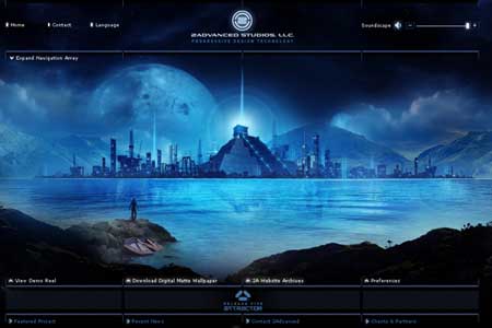
Compare these two sites for a moment. The first is from 2Advanced Studios and includes some fancy Flash animation.
The second is from Perry Marshall, who sells a book on Google Adwords.
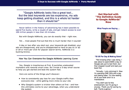
Despite being uglier, we can probably agree that Perry’s site is significantly better at getting new customers. It may not be better in other areas, but it all depends on what the goal of the site is. Speaking of which…
2. Every design should have a measurable goal
Saying that the goal is to “build the brand of XYZ” or “create an online presence” is meaningless to a business-minded person. A goal is only a goal if it is measurable.
What are some good examples of a measurable goal? Generating leads, making sales, a number of phone calls, opt-ins, subscribers, incoming links, PageRank, etc. Instead of trying to convince them that “attractive visual design of this sign-up form would attract more visitors” present them real numbers such as “in the past this design solution effectively increased the conversion rates by 35%”.
According to Luke Wroblewski's findings in his book "Web Form Design: Filling in the Blanks", one single design decision related to the design of sign-up forms has increased the conversion rates up to 40%.Try saying to a business person: "we split tested this design, and A converted 21% of subscribers while B converted 38%, and our confidence interval on this data is very narrow". Now you are speaking their language!Try to get inside the head of a prospective customer. Imagine them with a burning pain or question, frantically clicking back and forth on the first page of Google results that came up. Realistically, they are making a decision whether to stick around or try the next result after scanning your site for about 1 second. This brings me to my next point... ### 3. Your site should have one clear path As a customer comes to your site, you want to be in complete control of the 1st thing they see, the 2nd, the 3rd, and all the way down until they accomplish your goal that you've set. In other words, they have entered your sites "funnel" or "chute".
Research results from an eye-tracking study: users satisfice — they click the first possible solution that is easily presented to them and may lead to their goal. Source.The typical method of giving users lots of different options on a page has been tested and it doesn't work as well. People don't want to think hard to figure things out. Users satisfice — they want the first possible solution that is easily presented to them. You should be in control of things in every step of the way, and miraculous things happen when you start to think of your site as a set "process" instead of a maze of options.Please take a look at the first page of this site (the screenshot is displayed below). Really, go ahead and do it and then come back. I'll wait.
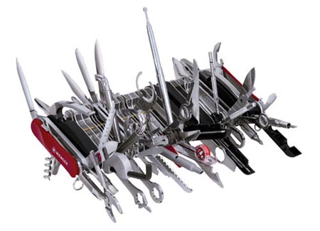
Think of an effective design like a Swiss army knife. It has tons of features neatly tucked away inside, but you don't see them all at once. Source. Keep the site simple with a clear path and purpose. Extra stuff on the page actually does have a detrimental effect in terms of confusion and distraction. Be adamant about eliminating unnecessary pieces of a design. ### 5. Provide performance metrics Finally, if you really want to impress business people, put together a little report of how a design performs. It doesn't have to be fancy — maybe a little spreadsheet (those business types do love Excel) with some basic metrics you can pull off of Google Analytics like visitors, time on site, most popular funnel path, and even a goal conversion rate.
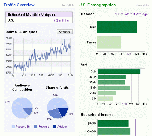
A spreadsheet with some basic metrics about like visitors, time on site, most popular funnel path, and even a goal conversion rate can make the difference. Example: Quantcast.Just putting in a little bit of effort here will instantly distinguish you from all the other designers out there who would never think to do something like this. Whoever your client is will be much more likely to say to a colleague, "you know they just get it, they not only design but they understand the purpose behind what we're doing, I really like that." And boom, you've got a referral to grow to the next level. ### Conclusion This article may offend some designers. You may think it's off topic, not your concern, or counterproductive to good design. That's fine — take what works for you and leave the rest. Speaking in a language the customer understands is key to good communication in any business. Whenever you get deep into a field and become an expert, it's easy to lose sight of the fact that the rest of the world doesn't think like you. Take doctors for instance. They go through so much schooling and learn so much science that it literally sounds like they are speaking a different language if you see a group of them together. But when it comes time to talk to the patient and explain what's wrong with them, they switch gears and speak in a language the customer understands. As a great designer, you can do the same thing and become that much more effective in bringing value to your customers.


