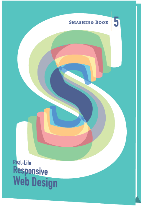
Smashing Book #5
Responsive design is a default these days, but we are all still figuring out just the right process and techniques to better craft responsive websites. That’s why we created a new book — to gather practical techniques and strategies from people who have learned how to get things done right, in actual projects with actual real-world challenges.
Neatly packed in a gorgeous hardcover, the book features practical front-end techniques and patterns from well-respected designers and developers. The book isn’t concerned with trends or short-lived workarounds — it should stand the test of time and as such, it’s focused on actual techniques used today in real-life projects. The techniques that you could apply to your websites today, too.
eBook
DRM-free, of course.
ePUB, Kindle, PDF.
Included with your Smashing Membership.
Download PDF, ePUB, Kindle.
Thanks for being smashing! ❤️
“Smashing Book #5 has completely changed the potential for books around the web. This thing is ridiculous in how it dives deep into a topic and continues to dive deeper until you feel as though your brain might explode from the knowledge.”
About The Book
Smashing Book 5: Real-Life Responsive Web Design is our brand new, upcoming book with smart front-end techniques and design patterns derived from real-life responsive projects. With 13 chapters on responsive workflow, SVG, Flexbox, Web fonts, responsive images, responsive email, content strategy, debugging, performance and offline experience, this is just the book you need to master all the tricky facets and hurdles of responsive design.
eBook
DRM-free, of course.
ePUB, Kindle, PDF.
Included with your Smashing Membership.
Download PDF, ePUB, Kindle.
Thanks for being smashing! ❤️
Table of Contents
We invited respected designers and developers who know a thing or two about responsive websites. The chapters have also been reviewed by active members of the community such as Jake Archibald, Dmitry Baranovsky—just to name a few.
- Preface
- As designers and developers, we solve problems for a living. Yet, these problems are often quite tricky and complex, and the context of these problems requires us to be creative and flexible in our workflows. With responsive design, we are prompted to create scalable design systems that work well in unpredictable environments. To do that, we need to be pragmatic and find solutions that work well within given constraints. That’s why we created this book: to find techniques that have actually worked in real-life projects with real-world challenges.
- Responsive Designer's Workflow
- In practice, responsive projects usually require more time, more skills, more testing and hence more flexibility in budgets. Addings changes late delays projects immensely, and process involving designers, developers and clients is usually tiring to say the least.
- Responsive Design Patterns & Components
- So, how do we deal with complex tables when building responsive websites? What about advanced interface components? Dashboards? What about the behaviour of web forms, navigation, mega-drop down menus, filters? Can we utilize vertical media queries and portrait/landscape orientation change? In this chapter, Vitaly will provide an overview of clever practical techniques for improving UX of responsive sites, with innovative approaches to designing “responsive modules” such as mega-drop downs, tables, calendars, accordions, maps, sliders, responsive PDF and responsive iconography — and a dash of anti-patterns to avoid as well.
- Structured Content for RWD
- Content created by one department is never updated by the next. Services get renamed in the navigation, but are still referenced by the old name in the body text. Important information is buried in the murky depths of flowery prose. Sounds familiar? Many issues in responsive projects aren’t related to technology, but to content: it’s either ill-formatted or priorities get lost across screen resolutions. Let’s fix it. In this chapter, Eileen shows how structured content can help refocus on what matters, and how we as designers can use the structure intelligently to provide users with information that they need, when they need it.
- Mastering SVG For RWD And Beyond
- This chapter has hands down on everything you need to know in order to start designing and building flexible components and visual assets with SVG. Sara will take you on a journey through SVG syntax, SVG accessibility, SVG viewport and viewBox, creating and exporting SVGs, embedding SVGs, building SVG sprites, creating SVG icon systems, using SVG Data URIs, optimizing SVG for performance, SVG conditional processing, clever SVG tricks and techniques and making SVG cross-browser responsive with CSS. Yep, everything you need to know about SVG, as promised.
- Building Responsive Components With Flexbox
- We can use Flexbox for a while now. In fact, Flexbox solves a lot of CSS shortcomings and makes building responsive layouts much easier than with floats or positioning. It gives you more control over the things you care about in a responsive layout (such as order, alignment, and proportional sizes of your boxes) and lets the browser figure out the rest; the math-y stuff that computers are good at, like the exact dimensions that are needed on the boxes to perfectly fill the available space. Zoe shares insights from her work at Booking.com, showing practical Flexbox-based techniques which make responsive sites much easier to build and maintain — even without media queries.
- Web Fonts Performance
- By default, web fonts block rendering, hiding content from the user. The only way to make content accessible as soon as possible is by treating web fonts as a progressive enhancement. This doesn’t mean web font performance is not an issue. You still need to load web fonts as quickly as possible so that users experience your site exactly how you designed and built it. Let’s fix this. In this chapter, Bram shares insights that he has learned from working at Typekit, covering web fonts and formats, font loading and font rendering, CSS Font Loading API, fallback fonts, caching, compression, inlining, subsetting and font loading strategies.
- Using Responsive Images, Today
- So you want to serve different images to different screens. Perhaps a Retina image (only) to Retina screens, or an art-directed image to small screens, or a portrait image for portrait orientation, or perhaps .webp to browsers supporting the format — without performance hits. Since images are the heaviest assets on the web, dealing with them intelligently is both our responsibility and opportunity for more dynamic layouts. That’s what native responsive images are for. In this chapter, Yoav discusses the different responsive images use cases and how we can use the native solution today to create performant responsive websites. We will also look at ways to make these solutions easier to deploy and maintain in real projects, with Picturefill and CMS plugins for Drupal and WordPress.
- The Dark Side Of Responsive HTML Email
- Explaining responsive HTML email is always an uphill battle, because just about every single designer and developer hates it. But there’s a lot of great, forward-looking innovation going on in the email design world. In fact, melding of responsive design techniques is absolutely possible. In this chapter, Fabio, the technical email maestro from Mailchimp, explores what you can achieve with media queries in responsive HTML email to ensure that your emails look just fine on major email clients across different devices, and looks even better in clients that do not support media queries (such as Gmail).
- Testing, Maintaining And Debugging RWD
- We talk a lot about designing and building responsive websites, but not so much about maintaining and testing them. Speaking from his experience at BBC, Tom has built up a way of working that minimizes the pain points that responsive web design has. The chapter shows how you can build future-friendly CSS that will scale up to support large responsive websites; get you to take testing seriously, but not overcomplicate your workflow; and finally, how to sanely prioritize and debug common problems (layout, images, complex UI components like tables) in all kinds of devices and browsers.
- Creativity Over Predictability
- Our responsive designs lack soul. You can think of many websites that are well presented, easy to use, triumphs of UX and technically competent, but few that might be remembered for years to come. Why do you think this is? Why are so few websites memorable? Could the design processes we’ve come to rely on, particularly in relation to responsive design, have hindered our creativity? Our modern web design magazines are full of advice about process, techniques and tools, but little about creativity, about humanity, or about ideas. In this chapter, Andrew takes a closer look at how we can combine creativity with predictable design systems to create unpredictable, dynamic and memorable responsive websites — with a framework and a mindset that will challenge you to think differently about crafting websites today.
- Beyond Responsive: Optimizing For Offline
- What if we told you that as a user, you don’t have to be online to use the web, and a website or a web application would respond to this accordingly? Think Offline First: “We can’t keep building apps with the desktop mindset of permanent, fast connectivity, where a temporary disconnection or slow service is regarded as a problem and communicated as an error.” John and Matt cover main technologies and practices that you’ll need to use to make your apps work as well offline, as they do online. We’ll discuss how to detect if we are online or not, HTML5 Application Cache, WebStorage and offline events, but most importantly Service Workers and how we can use them today to not only make content available offline, but also significantly improve performance and create snappy, fast experiences in (almost) no time.
- Efficient Responsive Process With Clients
- Design deliverable is one thing, an efficient collaboration between teams and stakeholders is a different beast entirely. This chapter provides strategies for keeping this collaboration sane and focused. You’ll learn how to build a good and efficient team, how to establish good pricing/time estimates for responsive projects, how to establish priorities with content priority guides and how to shift away from linear handoffs with multidisciplinary teams. A detailed chapter on getting things done, with clients, the proper way.
- Performance Optimization Roadmap
- If somebody tells you that responsive websites are bloated, heavy and slow by default, and that it’s very difficult to make them fast, don’t believe them — they are liars. If you set the priorities right and build the website with progressive enhancement in mind, you can create extremely fast responsive websites that work well across devices: with one code base working everywhere. In this chapter, yours truly will be sharing what we’ve learned over the last year about the performance challenges of this very website and about the work we’ve done in-house in big and small companies. If you want to craft a fast responsive website, you might find a few interesting nuggets worth considering.
Technical Details
- 584 pages
- 16.5 × 24.0 cm (6.5 × 9.5 in)
- Quality hardcover with stitched binding and ribbon page marker
- Released June 2015
- ISBN: 978-3-945749-21-0
- Free worldwide airmail shipping from Germany
eBook
DRM-free, of course.
ePUB, Kindle, PDF.
Included with your Smashing Membership.
Download PDF, ePUB, Kindle.
Thanks for being smashing! ❤️
Frequently Asked Questions
If you have any questions, we are right here to answer them. We love our customers, and we’d love to help you in any way or just listen to your story. So please feel free to ask questions via @smashingmag on Twitter — we’ll get back to you right away. Just in case: here are answers to some frequently asked questions.
- How much does shipping cost to my country?
No shipping costs — wherever you are in the world! We ship everywhere, worldwide, via airmail shipping. What you see is what you pay. No ifs or buts.
- Delivery times to my country?
All books are shipped via airmail to keep delivery times as short as possible. You can check the anticipated delivery times for your country.
- Is the eBook included with print?
When you purchase a printed book, you’ll get a friendly discount on the eBook. All eBooks are available in usual formats — PDF, ePUB, and Amazon Kindle.
- What payment methods are accepted?
PayPal, VISA, MasterCard and American Express. Of course, we use a secure connection, with 256-bit AES encryption and a green GeoTrust Extended Validation SSL CA certificate. And no, we don’t store your credit card data on our servers. (Obviously.)
- Is there a money-back guarantee?
Yes, absolutely! No risk at all — our 100-day full money-back guarantee keeps you safe. Don’t hesitate to return your purchase. You’ll get your money back without ifs or buts!
- I have a question that is not covered here.
No worries! Please get in touch with us via the contact form. We would love to help you as soon as we possibly can!
More Books

Accessible UX Research

Success At Scale
Interface Design Checklists
166 practical cards for common interface design challenges.

Understanding Privacy
How to put your users first and make a better web.
Touch Design for Mobile Interfaces
Want to learn how to improve the design of your mobile digital products? Learn how touchscreen devices really work — and how people really use them.

Image Optimization
Deliver high-quality responsive images in the best format and size, and at the moment your users need them.
TypeScript in 50 Lessons
Everything you need to know about TypeScript, its type system, and all its benefits in 50 lessons.

Click!
A guide to increasing conversion and driving sales sustainably.

The Ethical Design Handbook
A practical guide on ethical design for digital products.
Inclusive Components
Handbook for building robust, accessible interfaces.

Smashing Print
A printed magazine designed to make you think.
Art Direction for the Web
Creating engaging, art-directed experiences on the web.

Smashing Book 6
Exploring new frontiers in front-end and design.

Design Systems
Create effective design systems that empower teams to create great digital products.
Form Design Patterns
Designing and coding inclusive and usable web forms.
User Experience Revolution
Help organizations understand and embrace digital.

White Hat UX
How to avoid dark patterns and improve user experience.
Digital Adaptation
Helping traditional companies embrace and make use of digital.
Inclusive Design Patterns
Creating bulletproof, accessible HTML/CSS components.

The Sketch Handbook
Everything you need to know to understand and use Sketch.