Web Design Showcases From Various Industries

Email Newsletter
Weekly tips on front-end & UX.
Trusted by 182,000+ folks.

 Celebrating 10 million developers
 Register Free Now

 SurveyJS: White-Label Survey Solution for Your JS App
This overview features a hand-picked and organized selection of the most useful and popular Smashing Magazine’s articles related to Web Design Showcases and published here over all the years.
Quick Overview
- An Analysis Of Navigation In Portfolio Websites
- Appetizing Restaurant Websites
- Corporate Website Design
- Delicious Coffee Websites
- Sweet Chocolate Websites
- Academic and Higher Education Websites
- Real Estate Websites
- Movie Website Designs
- Sports Websites
- Fashion Websites
- Beer and Alcohol Websites
- Music Night Clubs Web Designs
- TV Show Web Designs
- Fashion Websites
- Winery Websites
- Photography Websites
- Best Practices For Designing Websites For Kids
- Designing Websites For Kids: Trends and Best Practices
- Online T-Shirt Stores
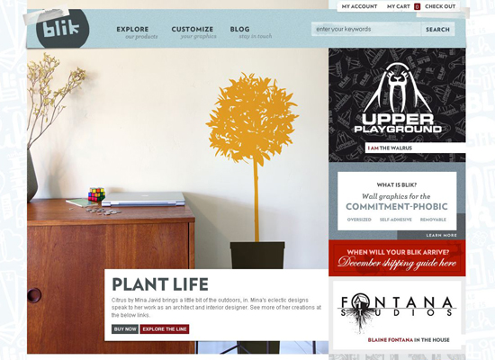
- Beautiful (or Creative) E-Commerce Websites
- Beautiful E-Commerce Websites
- Fresh and Well-Designed Online Shops
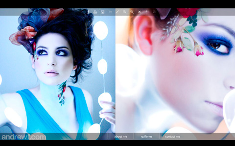
Can User Experience Be Beautiful? An Analysis Of Navigation In Portfolio Websites
When users land on your website, they typically read the content available. Then, the next thing that they will do is to try and familiarize themselves with your website. Most of the time this involves looking for navigation.
In this article, I’ll be analyzing the navigation elements of a particular category of websites, i.e. portfolios. Why portfolios, you ask? Because they represent an interesting blend of creativity and development techniques. As they offer an intriguing user interface and interaction, this often borderlines with what is ultimately defined as an enjoyable user experience. Should aesthetics, originality and creativity come at the expense of usability? Can they reside on the same website in harmony?

These themes will be explored through a brief analysis of eight portfolio websites, carefully selected by the Smashing Team and, well, scrutinized by me! My critique will encompass a blend of usability and user experience guidelines, as well as personal opinion based on my experience. Please feel free to provide your opinion in the comment section beneath this article. Also, kindly note that the websites are presented in no particular order.
Showcase Of Appetizing Restaurant Websites
They say the first bite is taken with the eye. If so, these appetizing restaurant websites succeed in whetting our appetites, inviting us to a savoury next bite. In these designs, color scheme and introductory copy show vastly different aspects of the restaurant experience. Moody warm tones create atmosphere, vibrant greens underscore freshness, and earthy colors communicate a relaxed, friendly attitude.
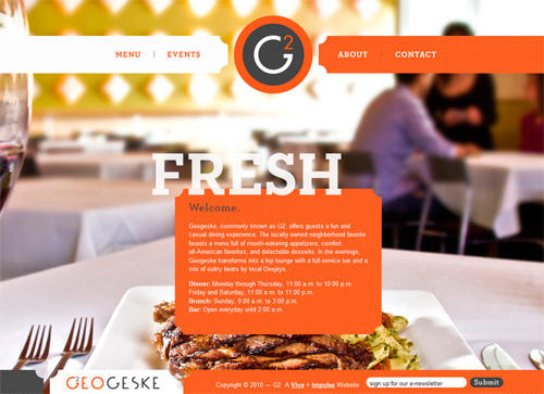
Because customers are increasingly using mobile browsers to make decisions on the spot, restaurant websites are doing a better job of communicating core information quickly. Similarly, full Flash websites with no mobile alternatives are seeing some decline. Especially interesting is how these businesses are improving their online menus by replacing PDF-only downloads with Web-optimized alternatives that are more readable and easier to navigate.
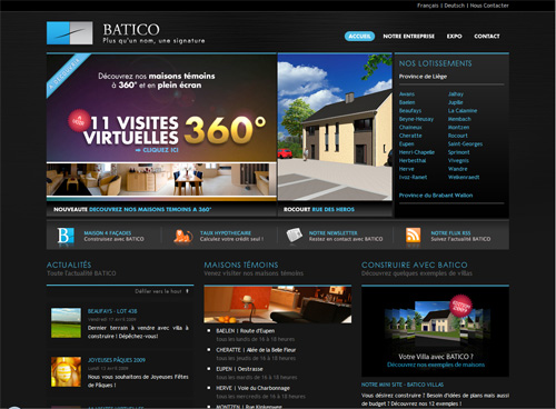
Corporate Website Design: Creative And Beautiful Solutions
What do corporate websites have in common with other people’s children? Three things: they have their charm, like finger-paintings on the refrigerator; they can be useful, if infrequently; they are usually admired only by the people who created them.
While designers know that a user’s experience on a website has a large impact on the way that customer will interact with them, impressing that concept on the corporate establishment has taken a very long time. Trends in design are making their way into corporate web, albeit slowly; with patience and a little luck, businesses will soon start to consider carefully coded and appropriately functional design as important as their mission statement and recent sustainability reports.
One unfortunate fact is evident above all else: despite having plenty of money at their disposal, many corporations are lost in sterile MS Word-esque designs that are more stagnant than a museum exhibit… though at least museums have dinosaurs and mummies and stuff. Here’s hoping we all will get new corporate clients soon.
Below, we present some interesting corporate websites, although the insight they offer may not be immediately apparent. This review is not about aesthetics or visual appeal, but rather about the design solutions the sites exhibit. In fact, corporate websites aren’t as visually arresting as you might think, so if the appeal isn’t immediately apparent in the previews below, take a moment to visit and interact with each of them.
Showcase Of Delicious Coffee Websites
For designers approaching a deadline, coffee is a delicious necessity. Lucky for us, having a coffee break is not really difficult. But it’s more than just a 3am fix. With every late-night run to the local coffee house, we contribute to a populous network of coffee trading, sales and experience.
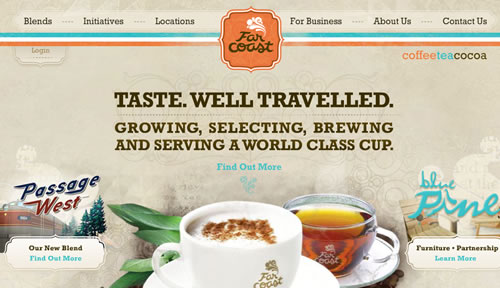
And in fact, coffee houses and suppliers are quite a business, with online presences ranging from simple layouts with striking typography to advanced layouts with remarkable photography. Coffee websites: how do they look like? What do they have in common? What metaphors, visuals and typography are they using? Well, this is where this showcase comes handy: let’s take a closer look at tasty coffee websites and examine their distinctive features and peculiarities.
Showcase Of Sweet Chocolate Websites
The word chocolate can be associated with many words: dark, white, milk, hot, sweet, spicy, etc. But have you tried to combine it with the word web design? We did. We searched the Web for websites in any way related to chocolate and what we found is worth to be collected in this showcase. The interesting thing is that you would probably never stumble upon some of the sites, so the overview below may provide you with a unique perspective and get your creative juices flowing.
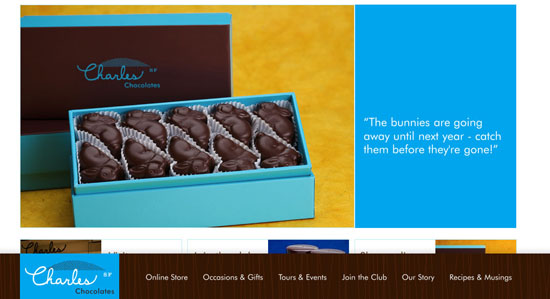
As one would expect, chocolate website often use an appetizing brown dominant color. If you take time to look at the panel of colors associated with it, you will find out that there is a lot of combination working really well. Apart from this component, each site is unique and features an original identity, depending on product presentation and given information.
Showcase Of Academic And Higher Education Websites
College and university websites have a lot of roles to fill. They need to provide information for prospective students (both new and transfer), parents of students and prospective students, current students, and alumni. In many cases, they’re also the gateway to the school’s intranet and the public face for both academics and athletics. They often need to include reams of information in a way that makes everything easy to find. It’s a huge challenge.
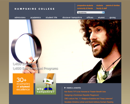
And the truth is: most collge and university websites are horribly designed. Either they look like they were designed fifteen years ago and then forgotten about, or they’re so overloaded with information that it’s almost impossible to find what you’re looking for.
30 Beautiful Real Estate Websites
Real estate is a valuable and often expensive purchase. Copious research is done by home buyers before venturing out to acquire real estate. In this day and age, gathering information about a property is typically done online, and an effective and captivating website design can make or break a home sale.
In this showcase, we’ll explore some great designs of real estate websites. We’ll also discuss some commonalities between them to tease out current trends in real estate websites.
Property realtors want to convey the message that they’re reliable and well-established. They want home buyers to feel that they will be purchasing property from a company that’s dependable, steadfast and time-tested. That’s why most of them opt for a classic and sophisticated theme for their websites, rather than a sleek, modern theme.
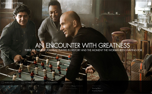
Movie Website Designs: Examples And Current Practices
It can be an interesting experience looking around at websites in particular industries to identify trends and see how they differ from those in other industries. In this article, we’ll take a look at the websites of major motion pictures to see what types of websites are being created. Movies are a big part of the entertainment industry, and in recent years their websites have become increasingly critical to their overall success.
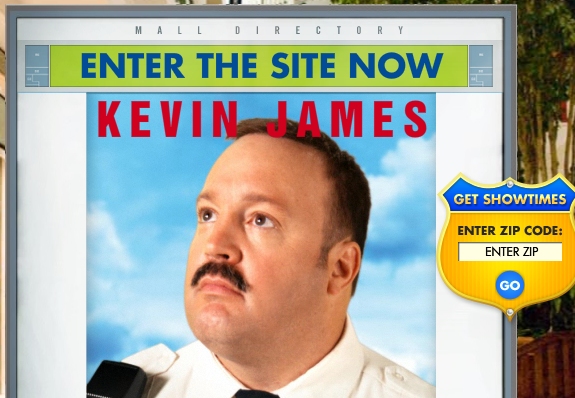
The purpose of movie websites. Before getting into the details of specific movie websites and discussing current trends, it’s important first to consider the primary purpose of movie websites. Obviously, in order for a movie to be financially successful, it needs to do well at the box office, and today many moviegoers use the Internet to find movies to see and to buy tickets. Having things like trailers and other video clips helps to engage visitors and encourages them to find show times and buy tickets online.
Movies are made to entertain audiences, and movie websites are much the same. In order to get visitors’ attention and encourage them to see the movie, a website needs to give them what they are looking for and provide some entertainment at the same time. Today’s movie websites make it easy to take a couple minutes and watch a few trailers before deciding which movie to see.
Showcase Of Beautiful Sports Websites
We recently showcased beautiful websites from the fashion industry, and in response to reader requests, we’ll do the same thing here for sports websites. This article showcases the most beautiful website designs from the North American sports industry, including ones for news, teams and leagues, sports apparel and more.
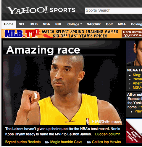
As in any industry, sports websites have their own trends, as you will see below. However, because the websites showcased here fall into a number of different categories and serve different purposes, not all of the trends we discuss will be relevant or applicable to all types of sports websites.
Fashion Websites: Trends, Showcase, Interviews
Fashion is a cultural phenomenon. It’s so often transient, but at the same time one of the most polished mirrors of our time. Unlike other art forms and creative media, fashion is a mode of self-expression for all players involved: the designer makes clothes to express their personality, and the consumer wears them for the same purpose. Fashion also accommodates a number of other creative professions, such as photography, make-up and hair-dressing and Web design.
In this post, we’ll look at websites from the fashion industry. We spoke with two developers whose websites differed in style and implementation to find out the considerations involved in designing a website for a fashion brand. Further below, you’ll find a collection of smart websites done by clothing designers, photographers, make-up artists and other players.
The Unusable And Superficial World Of Beer And Alcohol Websites
I was pretty excited when I came up with the idea of examining and showcasing some of the most famous beer and alcohol-related websites from a number of countries around the world. After all, who doesn’t like the odd drink now and again? (Well, besides me — I can’t stand alcohol in any form.) Surely this would make for an interesting article that would elicit quite a few comments. Well, if that’s the result, it wouldn’t be for the reasons I suspected when beginning to research this piece.
Instead, I’ve concluded — due to problems related to typography, accessibility, and usability — that the apparent “beauty” present on many of the websites related to this industry is merely “skin deep”. To put it quite bluntly, the designers and developers in the beer and alcohol website industry should be ashamed of themselves for creating such horrendous user experiences. My analysis here will attempt to inspire modern-day designers and developers to avoid imitating the superficial design and development techniques employed by these web professionals.
But I won’t just focus on the negative. There are some positive things to be mentioned, and a showcase of some of the nice sites is certainly in order, so that will round out the article (and might even fool a few of the “I’m here for the pictures” visitors).
Showcase Of Music Night Clubs Web Designs
The time has come for the first showcase of music night club websites here on Smashing Magazine. We’ve scanned the Web up and down to find the most original and interesting online club identities. As usual, we have Flash websites and CSS eye candy. Please notice that the aim of the post was to showcase current web designs of music night clubs, so the gallery doesn’t necessarily showcase most usable or most beautiful night club web designs out there.
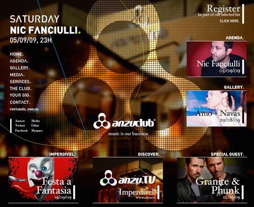
As we observed in the early Showcase of Fresh and Well-Designed Online Shops, the most obvious trend is the use of big bold pictures, either as backgrounds, headers or just side graphic elements thrown in the design mix. Most of them start playing music automatically (which is extremely annoying from the usability point of view), but in this case it’s not weird or off-putting because they are music club websites after all.
Another trend is the use of bright, vivid colors and intense color schemes, borrowed from the clubs themselves. Also, Flash clearly dominates in such web-sites, presenting some very unconventional navigation menus and very distinctive layouts that aren’t intuitive at all at the first glance.
TV Show Web Designs: Trends And Examples
Looking at websites from major industries that involve various forms of media can be interesting practice. In the past we have showcased websites from movies and from musicians on the Billboard charts, and today we’ll feature the websites of more than 50 TV shows.
The websites of TV shows are intended to generate interest in the show to improve ratings, and to provide information about the show (and sometimes past episodes) for those people who are already fans of the show. To accomplish this they attempt to create an attractive, interactive website that appeals to visitors.
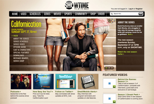
As you browse through the sites that are featured in this showcase, here are some of the trends that you may notice. Many, but not all, websites of TV shows are located on the networks domain. This helps to unify the websites of the various shows on the network and can even help visitors of the site to remember what network a particular show is on.
Showcase Of Beautiful Fashion Websites
From a web designer’s perspective, it can be very interesting to look at the top websites from a particular industry to see how they relate to their target audience, the different approaches that are used, and how they compare to websites in other industries. The fashion industry consists of companies that make their mark by designing beautiful and stylish items, and by setting trends for consumers, so one could expect to see some creativity and a focus on appearance in terms of their websites also.
In this article we’ll take a look at the websites of leading fashion companies, as well as some fashion news sites, and see when fashion, style and web design come together. As you browse through the sites that are showcased below, you’ll see some variety, but you will also notice the presence of certain trends. Here is a brief look at a few of them.
Captivating Winery Websites For Your Inspiration
From the Napa Wineries in California to the vineyards of Australia and France, the beautiful designs of these wine maker’s websites embody the spirit of the vine. Trends for winery websites have been leaning towards a dynamic Flash introduction, animation and beautiful graphics, which would give the best representation of the products for the target market.

Unfortunately, winery sites strongly focus on the visual design, while best usability practices are often ignored. For instance, some web-sites do not offer a search functionality and use hardly readable content (and the size of the text can not be increased, because the text is embedded into a Flash-animation). Besides, since many sites are Flash-based, it’s also impossible to bookmark a specific page, although (in general) it can be achieved in Flash).
With that in mind, we share with you 40 captivating wine maker’s websites displaying some examples how it can be a rewarding experience – please notice that these sites often can be improved in terms of usability.
35 Beautiful Photography Websites
Interest in photography has exploded over the last 10 years, largely thanks to the developments in digital photography. Cameras and computers have become cheaper and more powerful, software more sophistocated and printers can now print photos that are as good (if not better) than anything produced in a chemical darkroom. Now, once you’ve acquired a digital setup, the economic restrictions of film and development costs have been removed and the cost of photography is virtually nil.
Along with these developments in photography has been the parallel development of the Web. Ten years ago websites were largely clumsy, HTML driven constructions. Today, contemporary photographers have powerful tools such as Flash, WordPress and DreamWeaverwith which to develop their websites. Photographers can also sell their work through companies such as PhotoShelter or ImageKind, and through photo libraries such as Alamy and iStockPhoto, opening up new revenue streams.
The result is that photographers are finding new and exciting ways to showcase their best work online. We took a look at some of the beautiful photography websites that we could find, analyzing the design trends and the reasons why these websites work.
Best Practices For Designing Websites For Kids
Designing websites and related media for kids presents plenty of opportunities for Web designers. Openings are available at many businesses and schools, as well as through parents and kids themselves, giving designers many ways to find work on electronic and print projects that appeal to kids. The types of work range from interface designs for video games to websites for birthday parties.
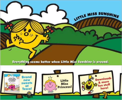
There was a time when kids’ websites were brash and busy, packed with colors and cartoon typography. Fortunately, the scale of the children’s market across most product ranges has resulted in rapid innovation in recent years. Most websites aimed at children (or children and adults) now follow principles that take some account of kids’ perspectives on Web design.
Designing Websites For Kids: Trends And Best Practices
How would you like to design a beautiful, colorful, stimulating website that is captivating, memorable, and allows you to let your creative juices flow without the need to worry too much about usability and best practices? In today’s web design market, it’s rare that such a project would present itself — unless you were asked to design a website for children!
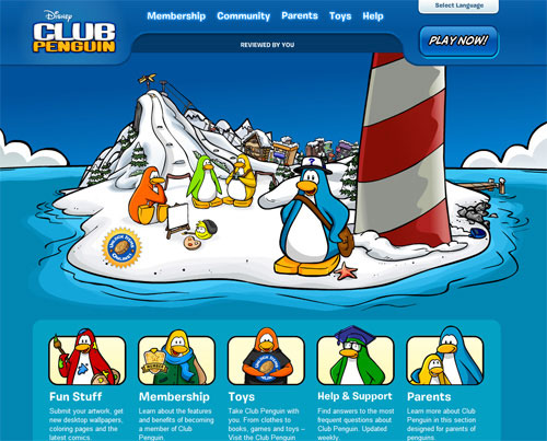
Websites designed for children have been largely overlooked in web design articles and design roundups, but there are many beautiful and interesting design elements and layouts presented on children’s websites that are worthy of discussion and analysis. There are also a number of best practices that are exclusive to web design for children’s sites — practices that should usually not be attempted on a typical website.
This article will showcase a number of popular commercial websites targeted towards children, with an analysis of trends, elements, and techniques used to help keep children interested and stimulated.
The Big Showcase Of Online T-Shirt Stores
T-shirts, as you’ll surely agree, play a big part in the design world. Sometimes, we designers don’t get the kinds of projects we want, and so we are left to apply our creativity in some other way, many of us opting to submit graphics in t-shirt competitions or printing them ourselves and selling them through shopping cart systems such as BigCartel.
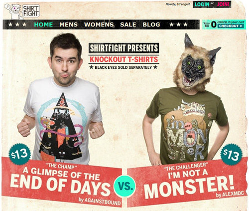
In this post, we bring you a showcase of online t-shirt store Web designs, all of which serves as a great source of inspiration for Web designers, graphic designers and even illustrators.
Showcase Of Beautiful (Or Creative) E-Commerce Websites E-Commerce Websites”)
Designers are constantly striving to create eye-catching designs without losing the usability features that add significant importance to the experience of online shopping. Today’s showcase presents a variety of websites with elegant design solutions and innovative design techniques. We have analyzed the designs and now discuss their advantages and disadvantages in this review. We also suggest improvements and further ideas that could help improve shopping experience on these sites. Hopefully, you can learn something useful from our thoughts.
Oi Polloi is small retail store based in the Northern Quarter, Manchester, UK. This website has a retro style, supported by the typewriter-style typograph and old print-style textures. They capture the Oi Polloi brand well. The navigation menu is a good old drop-down which doesn’t quite work, especially because the page has six of them on top. This requires a bit more clicks than you’re used to on an e-commerce website. When you roll over an item on a product page, a tooltip provides details about available (and unavailable) colours and sizes. It might be useful including these options in the search as well.
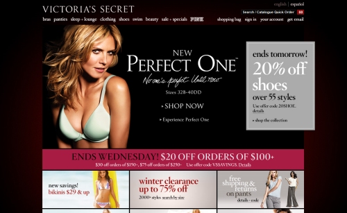
35 Beautiful E-Commerce Websites
Despite any financial recession and economic stress, online purchasing continues to grow. Expansion of the market and evolving technology that simplifies our daily lives help to set the pace of e-commerce design. Customers want the shopping process to be quick and easy, and merchants want to increase sales by making their stores attractive and popular. Thus, e-commerce design tends to combine a look and usability that is at once unique and eye-catching. In this post, we showcase 35 attractive online store designs.
One of the trends we observed from this collection is a minimalist design style. Small details and accents (e.g. unobtrusive background patterns, icons, pictograms and typography) reflect a brand’s spirit and match the character of its products. Some websites, though, are unconventional, rich in visual effects. Please note that the selection of stores featured in this showcase was based more on design aesthetics than usability. But we made sure that the websites included here provide at least an easy shopping experience, even for foreign visitors.
Showcase Of Fresh And Well-Designed Online Shops
E-Commerce websites are often thought of as typically being unattractive or poorly designed. In this post we will feature 35 appealing designs of online shops. Those featured in this post include examples from a variety of different industries and showcase several different styles of design.
Throughout this showcase the most noticeable trend of well-designed e-commerce sites is the use of high-quality photos. Many of the sites use large images on the homepage, and product and model photography is always important for creating interest from visitors.
Related Posts
You might be interested in the following “Best of” selections as well:
- Portfolio Web Design Showcases
- Global Web Design Showcases
- Professional Photoshop Techniques and Tutorials


