5 Useful Coding Solutions For Designers and Developers

Email Newsletter
Weekly tips on front-end & UX.
Trusted by 182,000+ folks.
 See the full picture →


 SurveyJS: White-Label Survey Solution for Your JS App
 Celebrating 10 million developers
Often creative and truly remarkable design solutions remain unknown because we, designers, simply overlook them. Being busy with our own projects, we sometimes try to grasp the intuition behind (probably) complex and cluttered code of other designers to understand how they manage to implement particular design ideas. In fact, by just observing the code of other developers we can learn a lot from them; we can find interesting ideas and improve the quality of our work.
As you know, we, at Smashing Magazine, are quite curious folks. We are truly interested in unusual design approaches and creative solutions. Therefore we are regularly looking for them and once we found them, we analyze them, try to understand them and try to figure out both advantages and disadvantages of the technique we have found. And in this post we want to share some of them with you.
You may want to take a look at related articles:
- 10 Useful CSS/JS-Coding Solutions For Web-Developers
- 5 More Coding Solutions For Designers And Developers
- Five Useful Design Techniques and Coding Solutions For Web Designers
We would like to start with 5 advanced elegant coding solutions and ask you if you are interested in this series and would like to have more similar articles. Please let us know what you think in the comments to this post. Now let’s dive in. You should probably have some CSS-knowledge already before starting reading this article.
1. Sliding vertical navigation + overlay
Over the last years we have discovered a strong trend toward sliding horizontal menus (also known as Coda Slider effect). In particular, they are often used in corporate designs where a product and its features are supposed to have the dominant position in the design layout. Kobe uses a similar yet different approach.
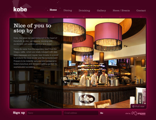
The navigation options at the top of the site are slightly animated yet creating an appropriate atmosphere. Once one of the sections is clicked, the main content area slides vertically — first the background image, then the content. If the content area also has some navigation options, they are slided vertically as well. In this situation it might be a slightly better design decision to use horizontal navigation instead to make it easier for visitors to distinguish between the primary and secondary navigation.
All content blocks are not loaded on demand via Ajax, but loaded up front when the page is loaded. All content blocks are loaded in the very beginning. Although the page seems to be animated, Flash is used sparsely — essentially, the design is a pure CSS+JavaScript-based solution. The main problem of the design is, however, that it’s just impossible to navigate the site if JavaScript is disabled. In fact, navigation options are not visible at all. As professional, you should always keep gradual degradation in mind.
How is it done? For the main horizontal navigation at the top of the site, kobe use CSS sprites. All navigation options are packed in one single image; the displayed chunk of the sprite is selected via background-position-attribute as usual. The sprite itself is a transparent .gif. The position of animated sparks is defined using JavaScript — depending on the currently selected navigation option and using absolute positioning.
The main content area consists of the background image and an overlay-layer which displays related information and (sometimes) further navigation options. All overlay-layers (for all navigation options) are loaded together with the main page and are not displayed unless an appropriate navigation option is selected. The sliding is created with the SlidePanel-component of the jQuery library.
The overlay image is semi-transparent and is positioned absolutely within the main content block upon the background image (using the z-index-attribute). The background image for each navigation section is defined via CSS for each overlay-layer.

A very similar overlay-approach is used to present the description of a project in Ivan Aleksić’s portfolio (see above). Initially the visitors see only thumbnails of the projects done so far. When one of the thumbnails is hovered, further information is displayed in an overlay beyond the thumbnail. This overlay always uses the space that was previously occupied by the hovered thumbnail and the one below it. The tiny arrow at the right of the site always allows users to jump to the top of the page.
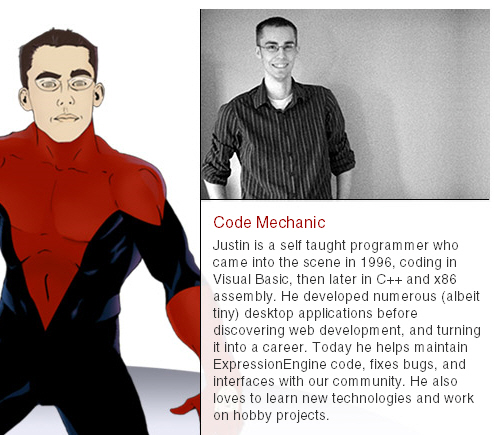
2. Neighbors navigation
EllisLab uses an interesting design approach to present the members of its team. Instead of listing each of them one after another, with small thumbnail and brief description, they use simple yet intuitive primary and secondary navigation menus placed next to each other. And to make sure that visitors are convinced that the team takes its work very seriously, quite esoteric cartoons are additionally placed next to the menus.
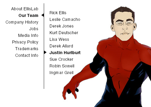
Both primary and secondary navigation menus use arrows and slight color indications to highlight where users are at the moment. Notice that the menus are not just placed next to each other, but divided via a sharp vertical line. Besides, the secondary menu is placed few pixels below the upper border of the left one, and thus indicates the hierarchy in the navigation.
The whole content area is divided into two main parts — the primary navigation at the left, and the content block at the right. The latter contains the secondary navigation and a sub-area for description on the right hand-side (see screenshot below). The background-images for the content block are defined via CSS and are applied via IDs. A semi-transparent background image is used for the description block on the right-hand side of the content block. The rest is pure CSS and (X)HTML. Simple yet elegant solution.
3. Panel block
Over last months it seems to have become a common practice to focus the design of a site on its main objective and display the unnecessary details on demand. For instance, Wishingline presents contact information and links to social networking profiles in a semi-transparent panel. This panel is opened when the user clicks on some specific link and is not displayed until then.
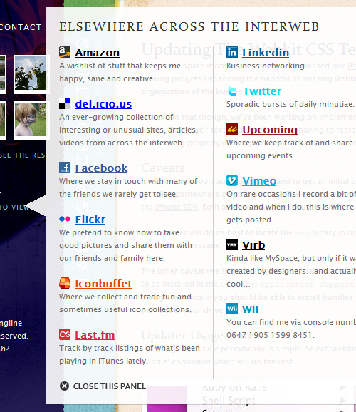
Notice that different services are highlighted differently — designers use both link colors and icons to precisely communicate links to external services. Usually it’s not the best decision to use multiple link colors for similar tasks, but in this case it works fairly well.
All “social” data is hidden in the panel — probably to not overcrowd the design with vivid symbols and icons which simply do not fit to the initial design. This design approach has advantage of offering clean layout and disadvantage of hiding secondary navigation options. The trade-off is, as always, designer’s decision, but in this case both options would probably work equally well.
How does it work? The panel itself has a semi-transparent background and is given a fixed position in the layout using absolute positioning and the z-index-attribute. Hence, it doesn’t change when the font-size is changed or the browser window is resized. That’s not necessarily a good thing, however, one can live with that.
To create a panel designers use two containers put next to each other and positioned absolutely. The first one has a transparent pointer as the background image and is placed next to “click to view”-link. The second container with a border-background-image is placed next to the first one, creating the illusion of a “bubble” panel. The single elements (links to social networking profiles) in the second div-container are marked up using a definition list <dl>.
Notice that designers also use a traditional UI element at the bottom of the panel to indicate that the panel can be closed. It would actually make more sense to place this button at the right-hand side at the top of the panel since this is the place where most users would expect the button to appear.
Antonio Lupetti uses a similar approach to display all options for RSS-feed-subscription. It would actually make sense to remove dots for the “Feed RSS”-link using outline: 0;-assignment (notice that one should be careful when using the outline property, since it is really useful to navigate through the page using keyboard).
4. Tags Chart List
There is a variety of ways to design tag clouds. Styled according to its weight, tags in tag clouds reveal the importance of a topic or site quality via an assigned visual weight (often color and font size). However, there is one important thing which “normal” tag clouds fail to do: they convey the big picture, but can’t reveal meaningful data, information in terms of how popular these tags are.
Jeff Croft uses a different approach for tags — tag chart list reveals not only most popular tags, but also how popular these tags are.
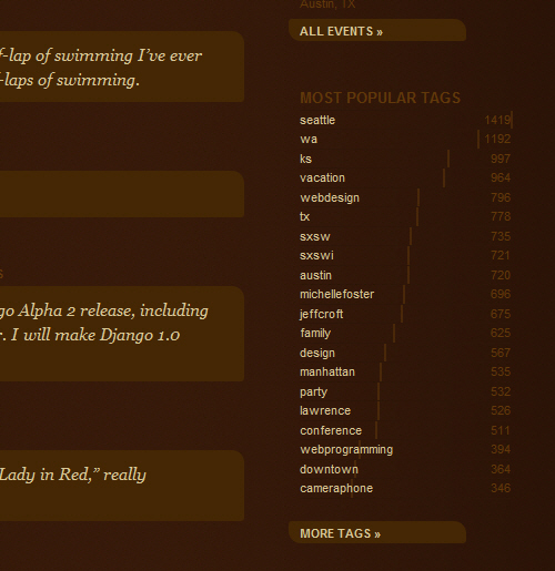
Apart from the actual tags “most popular tags”-section shows how often the tag was used and also displays a vertical bar which indicates its popularity compared to other tags. Notice that Jeff Croft uses three levels of visual communication (position of the tag in the list, vertical bar and the number on the right-hand side) — visual redundancy is often not superflous (as usually assumed) and useful to help readers understand the context in which data is presented.
Once some tag is hovered, the corresponding block-level-element is highlighted using a lighter background color. Notice that both bar and the figure are highlighted as well. How is it achieved? Jeff Croft uses an unordered list; each list item contains three block-level-elements: a link to the tag, a span-element (span.count) displaying the figure on the right-hand side and a span-element (span.index) displaying the bar (span-elements are inline-level-elements, of course, but they are declared to block-level-elements in Jeff Croft’s stylesheet).
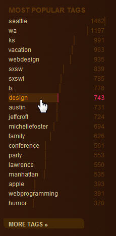
Tag links are aligned to the left using relative positioning, the figures on the right hand-side are pushed to the right using absolute positioning within relative positioning (standard approach also known as Making the Absolute, Relative). The bar is initially assigned the width of 100% for every tag. When the page is being loaded the width of the element is changed (probably via PHP Python on the fly) using style=“width: xx%”-assignment. Styling is defined in CSS, of course. The position of the bar is, again, defined using absolute positioning within the absolutely positioned list item-element. The hover-state is defined using li:hover .index, li:hover .count and li:hover-definitions.
It’s worth mentioning that Jeff Croff uses an accessible design approach: if no visual elements can be displayed, the index-element displays the percentage value of the popularity of the tag; otherwise this text is removed using the text-indent-attribute with CSS.
Notice that this solution is also flexible. For instance, if the sidebar will be expanded for some reason, the tags chart list will be expanded automatically since percentage values are used. That’s efficient.
5. Clever archive navigation
Designing archive navigation isn’t an easy task, particularly because designers don’t want to slam visitors with too much information and users often just want to quickly get the information they are looking for in the first place. Chris Shiflett uses an interesting approach to present a user-friendly, simple and compact archive navigation.
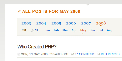
Jon Gibbins, Jon Tan and Chris Shiflett combined both levels of navigation — year and month navigation — within a compact two-lines-block. The current selection is clearly visually highlighted using colors and arrows. Available navigation options are clear as well. Once a visitor has decided to browse through the navigation section she has to select the year and the month; however, this can be done quickly since the the month selection is updated automatically when a new year is chosen.
The markup and JavaScript are quite straight-forward: the designer uses unordered lists and definitions lists to markup the year as well a special class to indicate currently chosen year and month. When some year is clicked, a new layer under the year navigation is displayed — there visitors can also define the month they are interested in. There seems to be a bug since in the very beginning when the page is being loaded, all navigation options for all years are displayed.
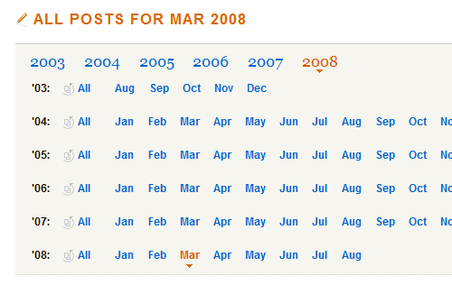
It’s a simple yet useful idea to present the archive navigation on each archive page, so the user can easily navigate through all posts without going to the archive-page and then to the post again. Please also notice the month navigation at the bottom of every archive page. Maybe it would actually make more sense to present the full archive navigation at the bottom of the page as well.


