Five Reasons Why Designers Developers are Switching to Mac

Email Newsletter
Weekly tips on front-end & UX.
Trusted by 182,000+ folks.
 SurveyJS: White-Label Survey Solution for Your JS App
 Celebrating 10 million developers
 Register Free Now
 Try ProtoPie AI free →
Designers and developers have many choices to make when it comes to getting work done, from what frameworks, languages, and image editing software to use, to what platform to run. The latter is an oft debated and controversial topic and the mere mention of it risks setting off flame wars of epic proportions, so in the interest of sanity, we’ll try to avoid any direct comparisons to other operating systems.
It’s no secret that there has been a growing trend in recent years toward developers, especially of the web variety, choosing a Mac as their main dev machine. In this two-part series, we will examine some of the reasons behind this trend, look at some of the pitfalls of switching to the Mac, and go over the must-have software and configurations every switcher should be aware of.
You might be interested in the following related posts:
- Why Web Developers Don’t Need A Mac
- 25 Free Mac Apps That Will Boost Your Productivity
- Mac Hacks: 17 AppleScripts To Make Your Life Easier
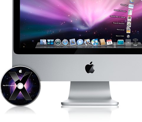
First Reason for Switching: Mac OS X
You may have noticed the rise in the number of colleagues and fellow developers who are choosing a Mac as their next computer. If you haven’t, you’re probably either working for Microsoft or you have an MBA. So why is it so compelling?
If you were to ask a die-hard Windows user why he or she thinks people like Macs, they would almost invariably say the reasons are purely about aesthetics. If you were to ask most web developers why they have switched to a mac, however, the refrain would be loud and unanimous: OSX. To be fair to Windows, in terms of raw capability the two offerings differ very little; with enough elbow grease, both systems can be configured in pretty much any way its users wish.
When pressured to explain why they prefer OSX, Mac users often rest on qualifiable and subjective arguments such as “it feels intuitive” or “I enjoy using it more” or even “I can’t explain why I like it better, I just do.” The Windows user, when presented with these arguments, usually rolls his or her eyes and continues on their way. It isn’t until someone truly makes up their own mind to give OSX an honest chance that they can understand what all the fuss is about.
A Few Quantifiable Benefits of OS X include:
1. Open Source Friendly
As a web developer, if there’s one skill you invariably have to develop, it’s the use of a *NIX terminal. Luckily, because OSX is built on top of UNIX, the terminal is ready and waiting. Every Apple ships with a wide variety of open source programming tools and frameworks built in such as PHP, Apache, and Ruby on Rails. Linux users who have grown tired of dealing with hardware issues, especially on laptops, often choose a Mac as their portable solution because it is UNIX based.
It means that the entire world of open source software out there is pretty much guaranteed to run without much hassle. In a world where open source software is a way of life, web developers need a friendly environment to operate in.
2. Quartz Extreme
Quartz is the OpenGL powered windowing system used by OSX. Quartz extreme utilizes the graphics card exclusively, which means no processor cycles are taxed. This allows for a variety of useful features such as Exposé, which dynamically resizes every window on the screen giving you a bird’s eye view of your entire workspace.
Spaces, a feature introduced in OSX 10.5 (Leopard) takes the bird’s eye view a step further by providing a view of multiple desktops. To further illustrate the point, you can activate Exposé inside Spaces and drag these windows from desktop to desktop – any videos that are playing will continue to play and the windows will dynamically resize to accommodate the extra window. Once you get used to this sort of thing, you wonder how you ever lived without it.
3. Core Animation
Core animation provides a way for developers to produce animated user interfaces via an implicit animation model as well as an ‘explicit’ model. In other words, it means some very flashy and useful features are going to start showing up in OS X applications much like the animated menu help system shown in the graphic above. Prodiving developers with a toolset to implement these types of animated effects means software will become more intuitive.
4. Built-in Tools
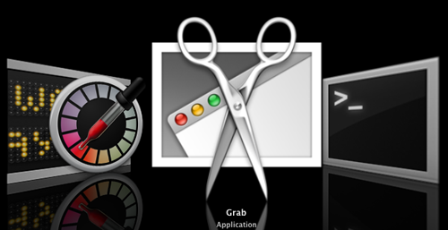
There are so many useful tools that are built in to the Mac that come in handy for designers and developers that it’s easy to see OSX was built with developers and creative professionals in mind. Take the built-in screen capturing utility “Grab” for OSX, which has a wide variety of options, from selecting down to the pixel the area you want to screenshot, to providing window captures complete with the window frame, to outputting directly to the desktop as a .PNG file.
In fact, some tools were created specifically for designers because Apple has long catered to the creative professional market (indeed, it sustained Apple during their darkest times). More built in tools include:
- The Digital Color Meter - a tool that allows you to grab the color value of any pixel on your screen.
- Console - Useful for viewing very large log files
- Terminal - Mentioned above, complete with many OSS tools like VIM
- XCode Tools - The Apple development IDE
- Zoom - easy-as-pie down-to-the-pixel zooming
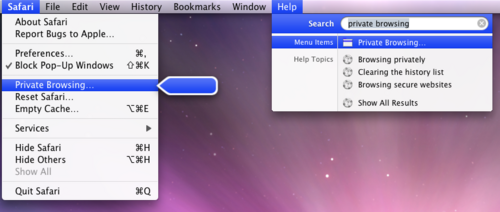
- Safari Debug Mode - Similar to Firebug for Firefox
- Time Machine - dead simple automated backups
5. Unified User Interface
As any student of design knows, consistency is one of the most important principles to adhere to, and it is clear the OSX UI was designed with this in mind. Because of the strict user interface guidelines provided by the Apple software development tools, applications and utilities on a Mac feel like they are all part of the same system.

The menu bar, which for some switchers can be a difficult feature to get used to, adheres to this unification by standardizing the location and layout of the menu options. Drag-and-drop functionality is ubiquitous. Being able to do things like drag an image off your web browser directly into your Photoshop project are a boon to productivity. If it feels as though you should be able to drag-and-drop something, you probably can.
6. Security
Now before you crack your knuckles and start composing your diatribe about why Macs aren’t any more secure than PCs, let me point out a trite but undebatable fact: there’s simply less malware out there for Macs than PCs – a LOT less (partly because Unix is inherently more secure than Windows and partly because Windows is just more wide-spread and Mac users aren’t targeted that often – read more in the article Is The Mac Really More Secure Than Windows?). If you are on a Mac, at least for the next few more years, you can pretty much rest assured your days of worrying about virus and spyware scans are a thing of the past.
7. Textmate, Growl, Quicksilver, and more
There is no shortage of text editors available to developers, but one that seems to keep coming up in recommendation after recommendation is Textmate, the lightweight GUI text editor for OSX. The project management drawer makes it easy to keep track of folders, which for monolithic MVC frameworks like Ruby on Rails and CakePHP is a godsend.

Nested scopes allow users to create their own syntax highlighting which is important in the ever changing world of web development. To speed up the development process, one can utilize “snippets” or pieces of reusable code that can be inserted with a few key strokes. While there aren’t any features that are revolutionary, they are combined in a way that makes for a very unobtrusive coding experience that seems very in tune with the overall feel of a Mac.
In addition to Textmate, there is a whole host of other beloved applications that seem to have been created by people who truly understand and want to emulate the Mac experience, like the quick-launch solution Quicksilver, the system notifications app Growl, and the chat client Adium. These are pieces of software of a caliber that is sometimes difficult to find on Windows. It seems that quality, not quantity, is the best way to describe the Mac software library.
8. Quick Look
OS X not only has icons that display an actual miniature version of the file they are representing, but it’s possible to view the contents of the file in their full glory without having to launch the program they are associated with simply by hitting the space bar. Furthermore, if a group of icons are highlighted, they can be expanded into a gallery view.
9. Virtualization
OSX is the only OS you can get that can virtualize all three major operating systems out of the box. This is a must have for checking browser compatibility. To make life even easier, you can do it right from within OSX using programs like Parallels, Virtualbox, and VMWare Fusion. And if you think web browsers render websites exactly the same regardless of the operating system they’re running on you are sorely mistaken.
Second Reason for Switching: Intel Inside
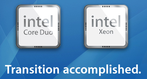
When Apple made the switch to Intel chips, it upset a lot of Mac fans out there who liked the fact that Apple wasn’t the same as any other X86 box on the market. With the rise in mobile computing, however, Apple was forced to face the fact that the PowerPC wasn’t offering as good a solution as Intel.
They also knew that by offering a system that could run Windows in addition to OS X they would put to rest any compatibility arguments. It turned out to be a good strategical move, and droves of would-be switchers were finally able to take the plunge without being forced to give up their entire libraries of Windows-based software.
OSX can virtualize all three major operating systems out of the box. This is a must have for checking browser compatibility. To make life even easier, you can do it right from within OSX using programs like Parallels, Virtualbox, and VMWare Fusion. And if you think web browsers render websites exactly the same regardless of the operating system they’re running on you are sorely mistaken.
Third Reason for Switching: Less Hassle
Opinionated Software
Some people like hassle. In fact, developers typically love getting their hands dirty customizing, maintaining, and tweaking their operating systems. If you fall under this category, Linux is probably your best fit, followed by Windows. OS X is more opinionated than other platforms. It’s more difficult to customize its look and feel, there’s no easy way to get it to run on anything but Apple hardware, and OS X can be very particular about the way certain things are done.
Opionated software, however, can have its benefits. While it may be more difficult to customize and hack every last aspect of your OS, sometimes it can be nice to have a system where a good many of these choices have already been made for you. Because Apple provides a complete solution, from the operating system to the hardware to a lot of the software that’s bundled in, they have an easier go of making sure the experience is seemless and well tested. Opinionated software can be a very polarizing concept, however.
Take Ruby on Rails for instance, a web development framework where many decisions are made for the developer based on the core contributors’ opinions about best practices. Rails has a preferred javascript framework, database ORM, templating system, and more. You can choose other configurations if you want to, but it shines brightest when you do things the “Rails Way.”
You spend less time customizing and more time actually developing. This hands-off approach can be a major turn off for some developers, but for others it removes a lot of the hassle and reinventing of the wheel. The high rate of Mac ownership among Rails developers could be directly attributed to the analogous nature of Apple and Rails. The analogy is made more apt by any number of PHP vs Ruby on Rails flame wars you can find out there.
Support

Because Apple provides the whole solution, they are obligated to provide support for the whole solution as well. Most developers are perfectly willing to trouble shoot their own computers, but when deadlines need to be met it can be nice knowing that you can offload some of that hassle to people who already know the system inside and out.
Apple has impressive customer service specifically because they support the entire system, rather than just one aspect of the system. It’s also handy to be able to take your machine into an actual brick-and-mortar store rather than deal with outsourced phone support.
Let’s face it, when it comes to a non-technical spouse or family member, we can expect to do a lot of troubleshooting. Just like its nice not to have to worry about troubleshooting your own computer, it’s even nicer not to have to worry as much about other people’s computers. It is reasonable to assume that because Macs typically have less security issues (at least for now), there’s less time spent trying to explain how to avoid malware and actually removing it.
Fourth Reason for Switching: Microsoft
If you like it or not: a big reason why developers have been flocking to Apple is in part due to the fact that it isn’t the big M. When personal computing was still in its infancy, the reverse was true. Microsoft understood that it was the developers (developers developers) that would make their OS successful while Apple’s closed model ended up being a huge mistake.
Once Microsoft started dominating the marketplace, however, the pungent stench of monopoly sparked the open source movement, and more and more developers were starting to wonder if there were better options out there.
Linux is of course the golden child of the open source movement, but despite the efforts of Ubuntu it is still a ways off in terms of being a turnkey solution for most people. Enter Apple: a Unix based system that despite being every bit as closed as Microsoft, is in large part the antithesis of Microsoft.
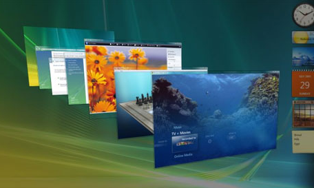
Microsoft software has the unfortunate feeling of having been designed by committee. Features are packed in with little regard to their usefulness, and aesthetics are seemingly an afterthought. When Vista first launched, the Aero user interface was so flashy it required higher end machines to even run it, somewhat defeating the argument Microsoft was making about the affordability of PCs. OSX was designed to run as well on the most expensive Mac Pro as it would an eight year old Powerbook because they control the solution from hardware to software.
Unfortunately, Windows doesn’t come bundled with PHP, Rails, or any other open-source web development frameworks or languages any time soon. More and more of what we do is in the cloud these days anyways and it is almost starting to feel quaint when you come across new software that runs solely as a desktop client. Microsoft has painted themselves into a corner – they rely on closed formats and standards in a world where open source software, open formats, and open standards are king.
Fifth Reason For Switching: Design and Minimalism
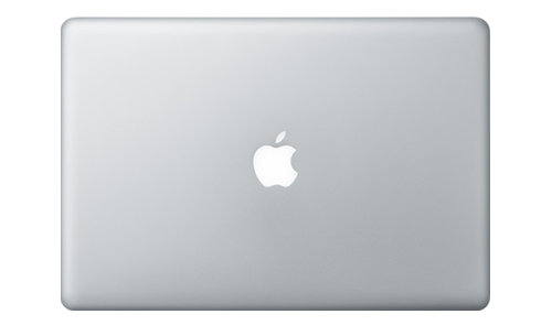
Good design gets out of the way. It doesn’t demand to be seen or appreciated. Most of all, good design is something you don’t even notice at first. Bang & Olufsen understands this, and Apple understands this. As of this writing, there are only two styles of Apple notebook: silver and white, and white is only available in the cheapest configuration. Apple notebooks are free of stickers, screws, vents, buttons, switches, and graphics.
What this leaves is a system with little to look at other than the screen in front of you, which is as it should be. The benefit of the entire product development cycle being done under one house is that Apple creates a system that truly feels as though it was created by one person.

At the heart of Apple’s design philosophy is the concept of minimalism. It is a concept that has worked well for companies such as Google. We all remember the gratuitous placement of links and ads on most search engines before Google came around with its simple search bar. After all, it was the search that was the important part, not the content the provider was hoping we would want. Apple figures if not including a feature angers 1% of their consumer base but makes things easier for the other 99% it’s probably worth doing.
Take, for instance, the lack of a second mouse buttom. It may seem like a glaring omission on Apple’s part, but it has had some unintended consequences: because developers can’t simple throw commands into a bloated right-click menu they are forced to think more about the one-click usability of their applications.
Minimalist design has its downsides too, however. Macs lack card readers, often have 2-3 less USB ports than even low end machines, and are typically difficult to customize. For those of you who value a product that gives you many choices, Apple is going to fall short. It is often pointed out that upgrading a Mac is easy: “Just throw it away and buy a new one.”
Humor aside, this isn’t too far from the truth but the good news is that Macs hold their value better than any computer on the market. Instead of throwing it away, sell it on Ebay for healthy head-start on a new machine.
Mac’s Pitfalls
It’s not all sunshine and rainbows for everyone who switches to a Mac. There are the inevitable bumps in the road that everyone experiences when making a major platform change, and for some people these bumps are outright road blocks. Here’s what to be aware of:
1. Control is now Command
Breaking the habit of using control as the main modifier key on your system can take a bit of time and some people never quite get the hang of it. Old habits die hard and muscle memory dies harder. This is a problem that can be solved by re-mapping command to the control key, but when you are using a system that assumes a certain configuration you may run into confusion later on.
2. No Second Mouse Button
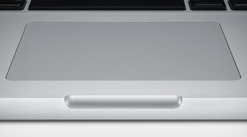
Unless you use an external mouse with your Apple laptop you will have to get used to the lack of a second mouse button. The truth is there is no optimal number of mouse buttons. Luckily, you can enable right-clicking in a number of ways on a mac, such as tapping the track pad with two fingers simultaneously or holding ctrl when clicking.
3. No Maximizing of Windows
This is actually starting to become less true as time goes on as ex-Windows users who develop software for the Mac include the feature (for instance, maximize on firefox for the Mac works as expected). But the typical maximize you are used to in Windows cannot be found on the Mac, and for some this can be extremely frustrating. In fact, the whole “stop-light” window controls can at times feel stale and unintuitive.
4. Lack of an “affordable” Mac
Perhaps the most popular sticking point of non-Mac users, price is always at the heart of the debate. Under $1200 or so, there is no question that byte for byte, ghz for ghz, you can get a better raw value by avoiding Apple. Apple has chosen not to enter the sub $1000 PC not because it doesn’t want to grow sales, but because it wants to avoid the dogfight that Sony, HP, and other brands are in for the lower end market.
Profit margins are razor thin in that range, after all. Apple is certainly catering to the botique style consumer. If you are pinching pennies these days the price issue may just be the one pitfall you can’t bring yourself to overcome.
5. Much Smaller Software Library
While this is somewhat mediated by the fact that you can virtualize Windows on a Mac, it is a far cry from being able to run your favorite programs natively on your system. If you are using software on a regular basis that only runs in the Windows environment, you may want to think hard about whether moving to a Mac is worth the trouble.
6. You Can’t Build a Mac (Easily)
Part of the success of Windows was the fact that they licensed it to run on any PC, anywhere. Apple has been closed since the word go, save a brief period where they allowed Mac clones to exist in what turned out to be a devastatingly bad idea. If you’re the type who loves building your own PC from scratch, a Mac is not going to offer much for you.
In general, even the most jaded Windows user is inevitably going to miss at least a few features or aspects of Windows during their switch to a Mac. The best policy to follow is to keep an open mind during the learning process. Try doing things “the Mac way” for a week and keep your skepticism to a minimum.
Above all, ask questions before you make assumptions. There’s a fervent Apple community out there (in case you haven’t noticed) that have solutions for every issue you find, thanks in part to the fact that most of them are switchers themselves. Remember, if you’re having the issue, chances are good some other switcher experienced it before you and created or found a solution.
Conclusion
While not the right solution for everyone, it’s clear that many people are switching to a Mac these days for a good many reasons. Nevertheless, Macs are expensive and require user’s patience and willingness to adapt his or her behavior to a compltely different interface. Mac is certainly not an option for every user, but it is definitely an option worth considering – particularly for designers or developers.


