Smashing Magazine - we smash you with the information that will make your life easier. really.
Ampersands With Attitude
By Huw Wilkins
Ampersands have long been the character in a typeface with which typographers can indulge themselves. Sweeping curves, flirtatious finishes and bold statements – these are the things that make ampersands an exciting character to use and, better still, to design.
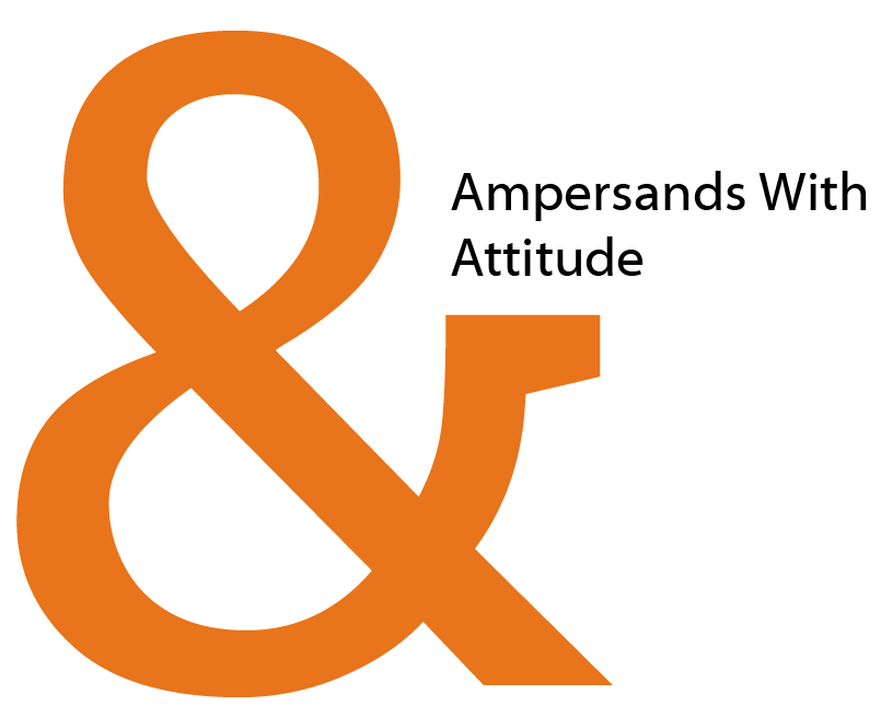
Can you spot what typeface is used to display the ampersand in the image above? Large view
There are, however, two problems. The first is that the English language gives us few situations to use such a daring character. We seldom get to show off these beautiful examples of typography. The second is that the poor little ampersand so often goes unnoticed.
Allow me to share with you my top 10 different styles of ampersands. Some are similar, but each have their own personality. In an effort to limit my sample selection, I have only chosen ampersands from freely available sans fonts.
1. Nilland

Here we have a pretty run-of-the-mill ampersand. It comes from the font Nilland. You see this style in common fonts like Helvetica and Arial. It has the classic one piece figure-of-eight body. The little horizontal tail finishes this character off nicely, it seems to give a certain perkiness that it otherwise might have lacked.
2. Bitstream Vera Sans

You might recognise this style as well. This particular character comes from Bitstream Vera Sans. There are a few ways to look at this ampersand, and this is one of the reasons this character works so well. It looks like the ampersand above, only with the top right side of the figure-of-eight cut out (yet it actually ends up not looking very much like the above character). It also looks like a sweeping back-to-front 3 with a extension from the middle (you can see this better if you turn your head so your left ear is pressed against your shoulder).
3. BPmono

This is where things start to get a little weird. Is it a ‘g’ gone wrong? Is it a swan? Is it a fishing hook? Actually it’s the ampersand from BPmono. I probably shouldn’t have likened it to a swan and a fish hook, because now you’re probably having a hard time seeing it for what it is… a sweet little ampersand with a cute tucked in style.
4. Kontrapunkt

Here we have another style entirely. It’s an evolution of what you might see in handwriting. However, on paper the line would be drawn down the middle of the ‘E’ shape. This is the font Kontrapunkt, so it’s been given angles and a lovely boldness.
5. Diavlo

Diavlo is a great font with nice tips, and this character is no exception. At this size it looks like it has an oriental brush stroke style.
6. La Peruta FLF

Oh! I’m glad someone managed to prop up that eight before it fell over… wait let’s make that into an ampersand. LaPerutaFLF, with a name like that, you have to be cheeky.
7. Skia

Another more classical approach from Skia. The nice variation here is how the two halves intersect in that off-set way.
8. Tuffy

And. There’s no confusion here. It knows what it’s there to do and does it. Somehow, though, in this font it looks great. Nice one, Tuffy.
9. Lacuna

I’ve decided to finish off with two italicized ampersands. This one is from Lacuna and looks like some kind of crazy ‘e’. Somehow, with that cross bar and the horizontal plate at the end, it still ends up feeling like an ampersand.
10. Fontin

And last, but certainly not least, here is the italicized ampersand from Fontin. It has a cheeky bulbous bottom and that classic plate finish.
So there we have it. 10 interesting takes on the ampersand. I hope you’ve been educated, I hope you have fallen in love with typography a little more, and I hope that next time you are creating a typeface you will be inspired to make an ampersand with attitude.
About the author
Huw Wilkins is the lead creative for a digital agency. He has a passion for user experience, usability, interfaces and good design. He also has a background in development. His little corner of the web is at huwshimi.com.
Some contributors with just a single posting.
- 65 Comments
- 1
- 2August 15th, 2008 6:51 am
Decent article, rated good for the typography exposure. Well-designed characters are always a plus in my book! :)
- 3August 15th, 2008 6:54 am
The first one is the only one that actually resembles an ampersand! The others either bear enough resemblance to other characters to cause confusion, or don’t look enough like an ampersand to be easily identifiable and could cause readers to wonder what character it actually is.
Flash design is all well and good, but function must come first, no matter how funky the form is.
- 4August 15th, 2008 6:57 am
great examples
i love the ampersand, and use it with fun
also i do write them a lot per hand… just tried… i guess i failed… weird… first try came out a b… - 5August 15th, 2008 6:57 am
You mention that number 9 looks like some kind of crazy e – it should! An ampersand is just a contracted version of the letters “et”, or French for “and”
- 6August 15th, 2008 6:59 am
Great article!
- 7August 15th, 2008 7:15 am
Dan Cederholm posted a similar article yesterday on Simple Bits showcasing Ampersands in different OSs
http://www.simplebits.com/notebook/2008/08/14/ampersands.html
- 8
- 9August 15th, 2008 7:33 am
there must be dozens of these ‘ampersand’ articles, all of them simply copying the same ampersands from post to post.
again, hard to believe these were among the ‘top 10′ articles selected?
also, we’ve been seen these top 10 articles for days now, so it looks more like top 20 than top 10, is smashing magazine running on fumes now that it resorts to these quick, save the day kind of posts?
hhmm…
- 11August 15th, 2008 7:47 am
i was hoping for actually designed ampersand… not just characters from a bunch of fonts smashing mag has already posted…
I do have my windows character map
I’ve seen plenty of ampersands that have been modified and improved on in print / graphic design… why not focus on those
- 12August 15th, 2008 7:49 am
Is this the last guest article?
I kinda expected better… - 13August 15th, 2008 7:53 am
im dont have an interest with ampersand.great effort anyways
- 14August 15th, 2008 8:53 am
Gordon [#3] is right on. Typography can be a wonderful way to make a statement. But when that statement is muddled by your typography being nearly unreadable or confusing, you’ve lost the whole point. Only a few of those ampersands even seemed like ampersands, and that’s to someone who knew this was an article on ampersands.
- 15August 15th, 2008 9:06 am
not French, but Latin
- 16August 15th, 2008 9:11 am
not wothy of my digg…
- 17August 15th, 2008 9:12 am
@hector, its the top 20 top 10 lists week ;)
- 18August 15th, 2008 9:30 am
Ampersands rocks! (my blog uses an ampersand in its logo)
Another great post, thanks Smashing Mag.Joffrey,
Geek&Hype - 19August 15th, 2008 9:57 am
I kinda disagree with Gordon & Josh. I’d admit that, on their own some of those ampersands are funky enough to be a little confusing. But I believe that all of these are readily identifiable as ampersands when viewed in context.
I’m drawn to ampersand as an easy, fun, & funky way to give your content a bit more of a personal & casual feel. I’ve tried not to overdo it, but the ampersand is peppered throughout my 2Dolphins site and used often within my blog posts.
- 20August 15th, 2008 10:06 am
http://www.rightreading.com/blog/2007/09/10/using-ampersands/
has a nice piece on anpersand - 21August 15th, 2008 10:32 am
“Can you spot what typeface is used to display the ampersand in the image above?”
So what typeface was used on the large orange ampersand…did I miss the answer to this??
- 22August 15th, 2008 10:49 am
Actually, the second from the bottom most closely resembles the “traditional” ampersand, which is nothing more than a ligature for the latin “et al”. The word ampersand comes from ‘and per se and’.
In a well designed font, the ampersand can be as “funky” as one wants, but should still fit in with the basic structure of the font (contrast, proportions, shape, etc…). If done right, one will be able to perceive it is an ampersand from context and from the shapes of other glyphs in the font.
To myself, and from what I’ve heard from several type designers (of which I am not…yet), the ampersand is one of those glyphs that can be a personal “signature” for a font. Not to say one should sacrifice the function of the font (which may not always be just for reading in books), but it is a glyph designers tend to like having fun with.
- 23August 15th, 2008 12:10 pm
I like this article. One of the more uncommon topics.
- 24August 15th, 2008 12:22 pm
NIce Top 10 :) I really enjoyed it.
- 25August 15th, 2008 2:13 pm
Well written and interesting. choices/topic. Really had the feel of a SM post. This post is a strong contender.
- 26August 15th, 2008 4:00 pm
Catchy name and idea. Seems simplistic at first but once you start to delve you realise there’s potential for a top 100 – I’m glad it’s limited (free sans serif fonts). I agree that good typography cannot be confusing or unreadable. However, all of these characters – perhaps even Lacuna which comes dangerously close to resembling an “e” – would be neither confusing nor unreadable when in context. Look at any character long enough on a sea of blank space and you’ll be questioning its readability too!
- 27August 15th, 2008 5:38 pm
Nice post! Thanks for drawing my attention to ampersands, I had never really looked at them in this light before. You quirky writing helped me see them in the fun light you obviously do!
I also would have to say that none of these ampersands would be confusing in context. Even having the word ‘and’ by itself on a blank space could be considered confusing, but it unlikely ever to happen, so I think that’s a moot point.
I’ll be paying more attention to ampersands from now on (just noticed the one in the footer on this page!)
- 28August 15th, 2008 5:40 pm
Oh also, @Gabe Diaz, I got the impression it was a challenge for readers to work out, not a rhetorical question to be answered later in the post.
I for one am stumped…
- 29August 15th, 2008 6:08 pm
Great article! This was funny, informative, and quirky. It made me laugh, and it educated me on an interesting topic. Nice job!
- 30August 15th, 2008 6:47 pm
Hrm, the above didn’t quite work…
Great post.
\m/ >. - 31August 15th, 2008 7:22 pm
Great article. I can’t say I’ve ever particularly cared much about fonts (so long as it’s legible, I like it!). But I have to say this entertaining article has sparked my interest. The author was able to engage the interest of someone who never knew anything about (or cared about) the topic. Good work!
- 32August 16th, 2008 12:37 am
I’m only recently starting to take a major interest in typography. While I do love the graphic aspect of many of these samples, some are so stylized that they almost lose their function.
- 33August 16th, 2008 7:28 pm
Great post. It really doesn’t matter if you agree which little ampersand is the cutest, this post is written in a style that excites interest and emotion for the subject … I’ll never look at an ampersand in the same way again . Great to see a font enthusiast with the writing flair of a wine buff. Good one Huw.
- 34August 16th, 2008 7:33 pm
Enjoyed your post Huw … never knew an ampersand personally before.
- 35August 16th, 2008 10:36 pm
This is a fantastic article. Your writing style really draws you in and smashes a simple character into a fabulous series of stories and oddities. Thanks. Keep it up! (I’ve tried so hard not to care about things like font – but you just broke me)
- 36August 17th, 2008 1:01 am
Just the article we need! We’ve decided to emphasize the ampersand for our journal (akaldankehendak.com). Thanks, real smashing!
- 37August 17th, 2008 9:10 am
Very interesting.
- 38August 17th, 2008 9:50 pm
Nice post Huwshimi. I can’t say I have ever been sexually advanced upon by an ampersand but now their beauty has been brought to light I may be offering them a wink and a smile in the future.
- 39August 18th, 2008 12:32 am
Try the italicized ampersand in Garamond. Pretty fancy.
- 40August 18th, 2008 1:46 am
Love a good ampersand usage… so much it is my logo feature at http://www.lassandbonnie.com
- 41August 18th, 2008 2:13 am
@Vitaly + Sven:
I hope this isn’t the last guest article? I know there will be plenty of people quite disappointed if it is! :)
- 42August 19th, 2008 4:53 am
Nice post,
but to me as a typographer, the examples seem randomly chosen and there is no typographical explanation.
i am a bit biased now, because on the one hand i like that there is typographical topics to smashing magazine, on the other hand theese topics will never achieve the quality the better typographic blogs have.
- 43August 19th, 2008 1:13 pm
The ampersand for the font Walkway (you guys offered it for free a while back) is pretty awesome too.
- 44August 19th, 2008 8:32 pm
So this is it? That’s all the guest articles?
- 45August 19th, 2008 11:58 pm
@kleight: Looks like it. Think this was some sort of racket or something…. some of the “finalists” were pretty bad.
Oh well, I guess no one is perfect, including people who run websites. :P
- 46August 20th, 2008 1:11 am
Bitstream Vera Sans is so beautiful. Typography at its fullest!
- 47August 20th, 2008 11:56 am
I love this comment because people so frequently ignore the origins of anything we use or come in contact with. And after that piece of information you can look at the collection in an entirely new light.
- 48August 22nd, 2008 1:38 am
The opening paragraph drew me into a topic I would not normally read and elevated ampersands to a great form for decoration of text without overstatement. I was even inspired by the article to decorate a cake with their ’sweeping curves, flirtatious finishes and bold statements’. No longer will I relegate these typographic designs to merely saving space!
Great article.
- 49August 22nd, 2008 8:02 pm
A great, fun and cheeky take on the design of ampersands in fonts and typography.
- 50
- 51August 30th, 2008 7:40 am
Interesting article
I´ve used another (in my humble opinion) quite interesting ampersand in my logo:
The font is “Art Gothic Extra Bold”
http://www.pixelunddesign.de
Thomas108 - 52August 30th, 2008 10:24 am
I really like the Garamond typeface. I even used a large one on my business card/bookmarks because of its clean serifs.
- 53September 6th, 2008 5:13 am
Between the faux pas that is “it looks like a crazy ‘e’” and the fact that this is just another boring top-X-things article, I am completely disappointed. I gather that this is a guest article, but it speaks volumes of the lack of editorial rigidity on this site. An article that displays such blatant ignorance regarding the very character it’s supposed to be written on should not see the light of day.
Smashing Magazine: “We smash you with any information that comes our way, regardless of how retardedly inaccurate it may be.” Perhaps you could go with a shorter —and way sweeter— tagline, from now on. Smashing Magazine: “We haven’t a clue.”
- 54December 30th, 2008 3:34 pm
Your graphic is too wide for 1024×768 screens. It reads: Ampersands With Attitud. It looks like a z-index/float issue, with the sidebar covering the image.
Just an FYI. You don’t want your 1024 readers to develop a negative attitud, do you?
:)
- 55January 6th, 2009 8:51 pm
Nice article!
- 56February 14th, 2009 12:29 am
Too bad you didn’t use my favourite ampersand, the one that looks like a backwards 3 with a line through it, like the dollar sign. You can see what I mean in the 8th and 9th row in this picture: http://abstractrandom.com/life/wp-content/uploads/2008/05/ampersand.jpg
- 00
There are no trackbacks at this time. If you are interested in leaving a trackback, please use this URL.
Leave a Comment
Make sure you enter the * required information where indicated. Please also rate the article as it will help us decide future content and posts. Comments are moderated – and rel="nofollow" is in use. Please no link dropping, no keywords or domains as names; do not spam, and do not advertise!
Interact
Popular
- 100 Wordpress Themes
- Photoshop Tutorials
- Fantastic Wallpapers
- 40+ Excellent Freefonts
- Dual-Screen Wallpapers
- Wordpress Themes for 2009
- Illustrator Tutorials
- Incredible Free Icon Sets
- High-Quality Free Fonts
- 30 Scripts For Galleries
- Photoshop Text Effects
- Useful Icon Sets
- Web Design Trends
- iPhone Wallpapers
- Before Launching a Website
- CSS Layouts And Templates
- Photoshop Actions
- Stunning Pictures and Photos
- Fantastic HDR Pictures
- Logo Design Tutorials
- Free Design Templates
- 10 Mistakes In Logo Design
- Photoshop Custom Shapes
- 40 Creative Design Layouts
- 8 Layout Solutions
- 53 CSS Techniques
- Photography Techniques
- Black & White Photography
- Styling Design Elements
- CSS-Based Forms
- 50 jQuery Techniques
- 50 Portfolio Websites
- 50 CSS Techniques
- Creative Logo Designs
- Desktop Wallpapers
- 25 Open Source Mac Apps
- 50 Free Icon Sets
- The Big Showcase Of Online T-Shirt Stores - http://bit.ly/5Tq8uA
- @ilmv oh ok then ;)
- @ilmv no, the SM Book will not be out of date :) We made sure it contains universal design, usability and marketing principles.
- Apple ad bombing Windows 7 on Google - http://bit.ly/28ctPq
- Atatonic - a fresh CSS framework - http://bit.ly/4oOV2w (via @umutm)
- @HrvojeKC yes, that's an interesting idea. Maybe when the waiting is over, we'll write a detailed post about it.


(2 votes, average: 3.50 out of 5)
Really liked this, so many different variations on one little character.. Thats why I love typography..