10 Futuristic User Interfaces
Good user interfaces are crucial for good user experience. It doesn’t matter how good a technology is — if we, designers, don’t manage to make user interface as intuitive and attractive as possible, the technology will hardly reach a breakthrough. To gain the interest in a new product or technology, users need to understand its advantages or find themselves impressed or involved.
And here is where creative ideas and unusual interface approaches become important. Innovative doesn’t mean usable and usable hardly means innovative. As usual, it’s necessary to find an optimal trade-off. And some user interfaces manage to achieve just that.
Below we present 10 recent developments in the field of user experience design. Most techniques may seem very futuristic, but some of them are already reality. And in fact, they are extremely impressive. Keep in mind: they can become ubiquitous in the next years.
You may also want to take a look at the related posts:
Fez: 2D/3D Gaming Experience
Over years we’ve managed to get used to traditional 2D gaming experience. Fez provides gamers with a new perspective for a new level of gaming experience. Things start to get interesting on 00:30. [via]
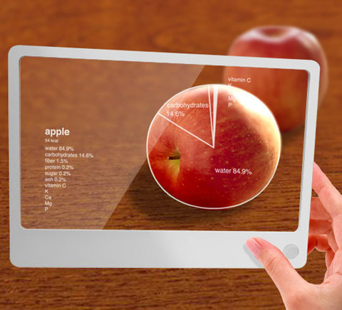
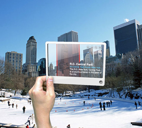
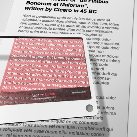
Futuristic Glass
This futuristic concept aims to integrate the capabilities of online-services in our daily life. Since web users can now access the Web everywhere and all the time, one can use their mobility for a number of useful applications. For instance, to provide assistance in a city guide, translate texts, look up some data in encyclopedia etc. A futuristic concept which is likely to become reality in the near future.
Aurora User Interface
Recently Adaptive Path has presented a new browser concept which was developed in partnership with Mozilla Labs and is an ongoing initiative to encourage designers and developers to contribute their own visions of the future of the browser and the Web.
The main idea of the concept is to represent users, places and virtual objects within a three-dimensional user interface (spatial view). The interaction with objects is intuitive and follows physical rules from our daily life: users can grab, lift, pull, push and drop everything.
The interface is event-based as users and updates are displayed on the screen on demand; communication and collaboration is embedded in the browser. Related objects are grouped into clusters which can be navigated using a dock at the bottom of the screen. The concept is released under Creative Commons Attribution-Noncommercial-Share Alike 3.0 license and is available on the Mozilla Labs site. Video Part 2, Video Part 3 [ via ].
jDome: New Level Of Gaming Experience
John Nilsson’s jDome lets gamers see about 50% more of the game they are playing. The main idea behind the interface to to alter the Field of View (FOV) in a game with a few simple commands and use a projector to provide gamers with a 180-degrees of game display.
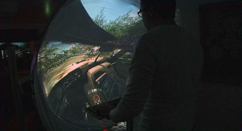
“Just put a jDome in front of a projector, mirror the image in the projector, start your game and change the Field of View in it. You don’t need special computer hardware or software — just one projector and a jDome display.” [via]
Motorolla Sparrow
Motorola Sparrow is supposed to provide retail stores with a mobile point of sale device to make it as easy for customers to pay for a product and leave the store. It combines a scanner, point of sale (POS) system, RFID, communication and credit card reading capabilities into one mobile device.
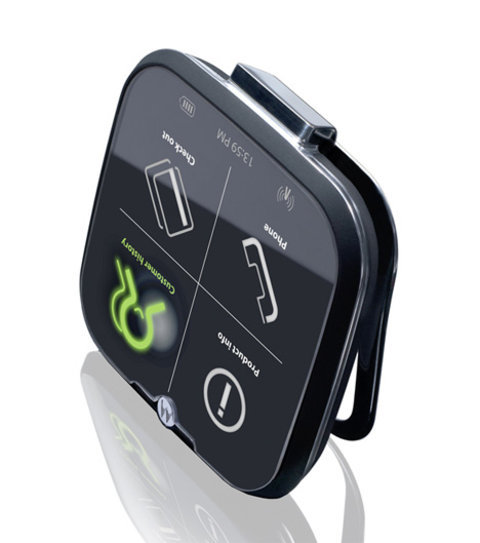
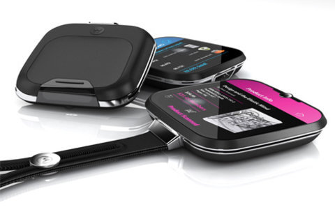
Both the front and back of the Sparrow are equipped with touch sensitive areas, supposedly making it easier to navigate and use. Beautiful design and really appealing user interface. Designed by Aruliden Studio. via]
Tilty Snake
Tilty Snake uses the accelerometer in a Monome 64 to create a new interface for the old mobile phone game Snake. Works out to be very tactile, intuitive, responsive and quite fun. Simple and beautiful. We, at Smashing Magazine, would love to see the same design for our beloved Tetris. Probably we’ll see more tactile interfaces in the future. And why is iPhone actually not tactile?
Brainloop: Thought Control
BrainLoop is an interactive performance platform that enables users to manipulate objects on the screen with pure brain — by imagining specific motor commands, without single touch or click. We are not sure how effective this approach is, but it is definitely an unusual user interface.
Eyeliner 3D
Eyeliner 3D is a high-definition projection system by Musion basically uses innovative HD video projection to produce three dimensional, holographic images within a stage setting. Recently, it was used to promote Toyota’s Auris at the Bluewater Shopping Centre in Europe, as well as for a fashion show. We’ll definitely see more holographic user interfaces in the future.
faceAPI
faceAPI is the technology whill will enable automated 3-dimensional tracking of heads and faces using a webcam along with a tracking software.
“This 3D head-tracking software from Seeing Machines can track head position in X,Y and Z – unlike the Sony headtracker. This means you miss out on the cool “zoom” effects when you get close to the screen, because the software has no understand of how far away you are from the screen. The faceAPI tracks head position in Z too, allowing much cooler effects – and more robust tracking.”
Ringo: Holographic User Interface
Ringo is a concept which demonstrates simple possibilities of having the holographic shadow instead of a PDA or a cell phone. It’s not produced and not developed yet. But it looks very promising and like something we may really get used to in the future. Developed by Ivan Tihienko.
Composition of the table
Composition of the table was designed by Toshio Iwai to create the mixed reailty experience: the user interface blends images and sounds for rich user interaction. “Projectors suspended from the ceiling project computer generated images onto the tables and interfaces. This images change in real time as if they were physically attached to the interfaces when players operate them.
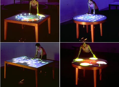
Also sounds are produced in relation to the movement of images. Since the interfaces have close relation to the reaction of images, players can operate images and sounds in the same way when they operates ordinary interfaces and gradually feels these illusions as equivalent as the actual objects. Push, Twist, Turn and Slide are the four features that each of the table specializes in.” [via]
uvLayer: Drag’n'Drop for videos online
uvLayer is a web application that is built using the AIR engine and offerse its visitors drag and drop user interface for videos. Users can move videos around, drag them, select the best ones visually and group them as one would do it in a real life. Such RIAs are expected to become a standard in the future. [via, thanks, Lionshare]
Last Click
Housed in the Comcast Center, this 10-million pixel video wall is touted as the largest four-millimeter LED screen in the world, measuring 83.3ft x 25.4ft. It’s an automated control room, home to 27 000 gigabytes of information, six dx-700 led digitizers, seven encore video processors and three matrixpro routers.
Related articles
You may also want to take a look at the related posts:


gabb
August 17th, 2008 4:58 pmAWESOME !!!
Steven Sergio
August 17th, 2008 4:59 pmYeeeeaaah, Smashing is back!!!
Jaclyn
August 17th, 2008 5:03 pmWow. What a great article!
lala
August 17th, 2008 5:26 pmgood!
lala
August 17th, 2008 5:30 pmI from china ,This website is very attractive
Mommy
January 6th, 2011 12:18 amChina? hahhaha, thats a country?
Mostafa
September 13th, 2012 6:30 pmRespect others dude
Adam
August 17th, 2008 5:50 pmThere actually is at least one accelerometer-controlled snake game for the iPhone.
pickupjojo
August 17th, 2008 6:04 pmWow, very nice! I really love Aurora even if I think it looks a bit confusing… I would be better with less things on the main screen. Thanks for this nice post!
Joffrey,
Geek and Hype
NaldzGraphics.com
August 17th, 2008 7:37 pma very great list.thanks for sharing.i really like the apple and the table like Micro surface.
check it
http://www.youtube.com/watch?v=b_MKMDLNXgg
Frank Jonen
August 17th, 2008 9:11 pmuhhm no mention AT ALL about the Iron Man HUD? If you call it futuristic that one has to be way up there. Just as the “fake” concept displays that only exist digitally the Iron Man’s HUD was thought up with real world problems in focus.
not overly impressed.
Lionshare
August 17th, 2008 9:40 pmNice finds.
How about an innovative, drag and drop UI for video — take a look at http://www.uvlayer.com.
also.. what about Perceptive Pixel?
NickG
August 17th, 2008 9:57 pmDidn’t the 2d to 3d UI appear in Super Paper Mario?
Adeel Shahid
August 17th, 2008 10:08 pmNice concepts
zero0x
August 17th, 2008 10:15 pmMATRIX is HERE :) (brainloop)
PrabhakaranG
August 17th, 2008 10:27 pmGud piece!
Roy
August 17th, 2008 10:30 pm@pickupjojo
Aurora can look a bit of the scale yes, but something needs to change the browser. Its one of the computers most important tools and its lookes and function has been the same since …. well forever
Think about it 10 years and now we got windows with tabs WOW! really, a tab, woohoo!
thank you Mozilla for stepping it up
African Boy
August 17th, 2008 11:13 pmSmashing, what have you guys done? How do I move to the next article without returning to the homepage?
Toni Trivković
August 17th, 2008 11:21 pmRingo: Holographic User Interface
wow that’s awesome
Mathiz
August 17th, 2008 11:25 pmGREAT!! Smashing Magazine back on track!!
aurora looks promissing! cant’t wait till the future is here!
Excelion
August 17th, 2008 11:59 pmReally great article.
I was very impressed by Ringo: Holographic User Interface it look like very good and practical idea.
And as a gamer i really liked the idea of jDome: New Level Of Gaming Experience
mohan asanga
August 18th, 2008 12:09 am——————————————–
the best article of this month
——————————————–
Yasir Imran
August 18th, 2008 12:23 amAwesome technology, Future is so bright
Vitaly Friedman & Sven Lennartz
August 18th, 2008 12:46 am@all: take a look at our previous posts, we have featured PerceptivePixel and Microsoft Surface already.
http://www.smashingmagazine.com/2007/11/26/monday-inspiration-user-experience-of-the-future/
http://www.smashingmagazine.com/2008/02/04/15-stunning-cutting-edge-gadgets-and-technologies/
Henriette Weber
August 18th, 2008 12:48 amthis is a great post, it really inspired me very much – thank you.
I love the technology of the future – especially the future glass in this post caught my attention =)
Milo Dlugic
August 18th, 2008 1:06 amPersonally I think that IronMan’s UI is pretty weak – it was nothing special and quite boring. Don’t know why you miss it.
Very nice and inspiring list, thank you!
Lucifix
August 18th, 2008 1:08 amI’m wondering why nobody has done till now GPRS navigation on futuristic glass?
Lawrence
August 18th, 2008 1:19 amSome very cool stuff there.
However, I admit, I’m not a fan of the Aurora UX. On a modern OS, it is much easier and quicker to do what we want, and looks far more attractive. Concepts like the radial menus have appeared in Microsoft’s patents for the last decade, stacks from Apples. If they want to do groundbreaking innovation, why don’t they focus on improving what we have, rather than abandoning it.
I know for one that that radial menu will annoy me, simply due to the tiny dots that have to be selected, and the amount of time wasted getting there.
Anyway, nice article.
Yuto
August 18th, 2008 1:49 amThank god, a real Smashing article again. I got tired of the recent wave of mediocre 200-words pieces.
Love the Fez game and Aurora, the jDome not so much.
Dave
August 18th, 2008 2:53 amAgree with Yuto. A nice return back to what Smashing does best.
searchgov
August 18th, 2008 3:21 amwe may think about adding goverment interface to this list?
Barend
August 18th, 2008 3:24 amFantastic. But where is the poll in this post?
Vitaly Friedman & Sven Lennartz
August 18th, 2008 3:45 am@Barend (#30): it’s not an article from our guest author contest, hence we don’t really see any need in a poll.
Robert Ronson
August 18th, 2008 3:54 amApple already do all of this and more. What these people forget is that it is not about the interface. It is about linking the interface to usability. Anyone can do eyecandy. Lokk at Vista,
Andrej Buday
August 18th, 2008 4:23 amHm, beautifull list. But something missing. FHS – http://www.freehandshow.site88.net/indexEN.html something which replace mouse :)) I like these guys.
Daemon
August 18th, 2008 4:28 amFuturistic Glass concept has a fundamental flaw. It works only in 2D environment. For example the first image here, the Apple one, if you would in real world tilt your head, the lines around apple would no longer match apple’s outer shape.
Basically, for this to work, device would need to have a sensor on the front end that detects where are my eyes located and where do they focus in the background.
I hope you understand what i mean =)
aardvarked
August 18th, 2008 5:08 amDid the video for the “jDome Project” remind anyone else of the Dharma Initiative videos from Lost?
Kyle
August 18th, 2008 5:40 amat NickG
“Didn’t the 2d to 3d UI appear in Super Paper Mario?”
Yup… a little over a year ago… http://www.gametrailers.com/player/18273.html.
Mike
August 18th, 2008 5:45 amHere is another new concept. http://www.nestedguis.com
Benedikt
August 18th, 2008 5:52 amGreat stuff ^^
Jurjen74
August 18th, 2008 6:02 amFez? Ever seen Echochrome?
BillBasher
August 18th, 2008 6:36 amyou forgot ms surface
anti-pixel
August 18th, 2008 7:05 amnice article with real content ^^
hdoug
August 18th, 2008 7:46 amNote to self-
Invest in Futuristic Glass
Brian
August 18th, 2008 8:29 amtoo bad half of them are red x
Alex
August 18th, 2008 10:10 am83.3ft x 25.4ft
XP
Please, use metric system.
Rafael Tosta
August 18th, 2008 10:18 amExcelent!
Brett
August 18th, 2008 10:50 amAurora is way, way too confusing.
tc
August 18th, 2008 11:16 am“the old mobile phone game Snake”
The kids these days!
Marie
August 18th, 2008 11:40 amMS Surface may be a better example than composition of the table…
James Deering
August 18th, 2008 12:14 pmWhy do you ignore SVG? It is happening now in web design. You can view its capabilities at:
Krazd
August 18th, 2008 12:26 pmIf you wanna try out the “composition table,” check out the INNOVENTIONS building at Disneyland. They have a bunch of cool stuff (lots of UI too)
grace
August 18th, 2008 1:22 pmI have Labyrinth LE on my iPhone and my neices and nephews would not put it down all vacation. It simulates the metal ball in the maze game we played as kids. It is stunning.
AHH
August 18th, 2008 2:06 pmThis is awesome! That ‘futuristic glass’ is straight out of either a sci-fi movie or some kind of spy movie. I love it.
Josh
August 18th, 2008 5:03 pmThere is a free version of Tilt Snake for iPhone in the app store. :)
Eoghan
August 19th, 2008 1:24 amI found it strange that Jeff Han’s multi touch interface (its on TED) has been omitted while Eyeliner isn’t even an interface?
Vitaly Friedman & Sven Lennartz
August 19th, 2008 4:50 am@Eoghan (#54): Jeff Han’s Multi Touch Interface was featured in our previous posts.
cafeine
August 19th, 2008 5:05 amdon’t forget to check out this extremely amazing website which provides an alternative to ebay, amazon etc….
Alan8
August 19th, 2008 5:39 amThe links to about half of the images didn’t show up for me; just the red X in the upper-left corner. Disappointing; these interfaces are quite innovative. We’ve come a long way since Pong!
Nancy Folsom
August 19th, 2008 6:13 amI always love Smashing Magazine because it inspires me to consider more the form as I’m developing software. You’re all about visual, of course, so this is out of your area of interest, but first the iPhone, then the Aurora Concept vids, and now the Motorola Sparrow leave me with an overwhelming sense of horror at how our futuristic visions leave, in particular, the blind completely out. My first thought when I saw the iPhone was that. If you can’t see, you clearly are NOT an Apple type of person. For pete’s sake. I’d like to see a future vision that gives people using the technology control or at least choice over aesthetics. So far what I see are designers who are deciding what is beautiful for me and proposing to give me ONE UI. I’ve argued elsewhere that different data/information need different presentations and that those presentations can be different for different individuals. Of course this is much more challenging, and I’m at fault as anyone. But, if we’re dreaming, let’s dream big, shall we?
Chema
August 19th, 2008 7:13 amwow
nina
August 19th, 2008 12:14 pmbruka brate,ne mogu da biliv!
leandro
August 19th, 2008 6:00 pmdear Smashing Magazine,
I love you.
Vitaly Friedman & Sven Lennartz
August 20th, 2008 3:34 am@leandro (#61): we love you too!
Stu Collett
August 20th, 2008 5:05 amWow! Our work is going to become even more exciting!
I love the Futuristic Glass.
girlseaunive
August 21st, 2008 3:58 amred microsoft google home letter english dog england clean head student dog busy bag key head
David
August 22nd, 2008 8:49 amSweet!
The future is going to be cool.
But not as cool until they invent the hover board.
IceSixxx
August 31st, 2008 5:23 amHi, great article.
You could have add the Reactable, made by the Barcelona University.
It’s a collaborative music interface, in some point similar to Composition of the Table.
The Reactable is entering production and should be available in December.
Pat Hope
September 3rd, 2008 1:23 pmRingo was pimpin’ – I’d love to see more about it, and hope it makes it in my generation.
Richard
September 8th, 2008 8:44 amYou misspelled “Motorola”
Stacey
October 1st, 2008 9:34 pmMy God! I feel like I’m living in a ancient world already.
cynthia
October 10th, 2008 1:48 amWhat I can say is just wonderful!
Thanks god, and thanks for the technology and the man behind it!
Micah
February 10th, 2009 8:27 amFor the love of god edit your article or find an editor before you post.
The number of grammar errors in this single article (that has more pictures and video than text) is staggering. The content was interesting, but reading the text was akin to speaking with someone who is still learning English.
J Foote
February 13th, 2009 8:00 pmSince when is a 2-D reflection a “holographic” display? Please get your terminology right. Reflection displays like “eyeliner” have been used for hundreds of years (the “Pepper’s Ghost” illusion) and are not and never will be holographs. Ringo is simulated 2-d projection: what exactly makes it holographic?
jose m batalla
May 3rd, 2009 9:15 pmcool.
I need more information about “LAST CLICK”
JamesD
June 11th, 2009 4:36 amThanks for the useful info. It’s so interesting
mauryn
March 2nd, 2011 5:16 ami think i would really love to try this out,they are great designs which i think are userfriendly
Bob
June 13th, 2011 8:18 amWhat was wrong with the plain old LCARS. Here are some interesting points we can adopt for the future:
http://andrewlowndes.wordpress.com/2011/06/02/lcars-ui-of-the-future/
Marcy
September 29th, 2011 12:37 amI’m trying to find some user interface designs for a ” how do I..” section on the site using both informational links and application links! I don’t want to confuse the user! Any ideas are apprecated
raj
October 20th, 2011 8:46 amThis is great stuff — keep them coming – I would love to see the world change to this in my lifetime !!
Tom Robbins
March 1st, 2012 3:44 amreally good!
KAMUS
March 9th, 2012 3:05 amthis is web is very nice